In this notebook we want to describe how to port a couple of classification examples from scikit-learn’s documentation (classifier comparison) to PyMC. We focus in the classical moons synthetic dataset.
Prepare Notebook
import arviz as az
import matplotlib.pyplot as plt
import numpy as np
import pandas as pd
import pymc as pm
import pymc.sampling_jax
import seaborn as sns
from sklearn.datasets import make_moons
from sklearn.metrics import accuracy_score
from sklearn.model_selection import train_test_split


plt.style.use("bmh")
plt.rcParams["figure.figsize"] = [8, 6]
plt.rcParams["figure.dpi"] = 100
plt.rcParams["figure.facecolor"] = "white"

%load_ext autoreload
%autoreload 2
%config InlineBackend.figure_format = "retina"
Generate Raw Data
We generate synthetic data using the moons function from sklearn.datasets and split it into a training and test set.
x, y = make_moons(n_samples=130, noise=0.2, random_state=0)
x_train, x_test, y_train, y_test = train_test_split(x, y, test_size=0.25, random_state=0)

n_train = x_train.shape[0]
n_test = x_test.shape[0]
n = n_train + n_test

idx_train = range(n_train)
idx_test = range(n_train, n_train + n_test)

domain_dim = x.shape[1]
Let’s look into the data:
fig, ax = plt.subplots(
    nrows=1, ncols=2, figsize=(12, 5), sharex=True, sharey=True, layout="constrained"
)
sns.scatterplot(x=x_train[:, 0], y=x_train[:, 1], s=50, hue=y_train, ax=ax[0])
ax[0].set(title="Raw Data - Training Set")
sns.scatterplot(x=x_test[:, 0], y=x_test[:, 1], s=50, hue=y_test, ax=ax[1])
ax[1].set(title="Raw Data - Test Set");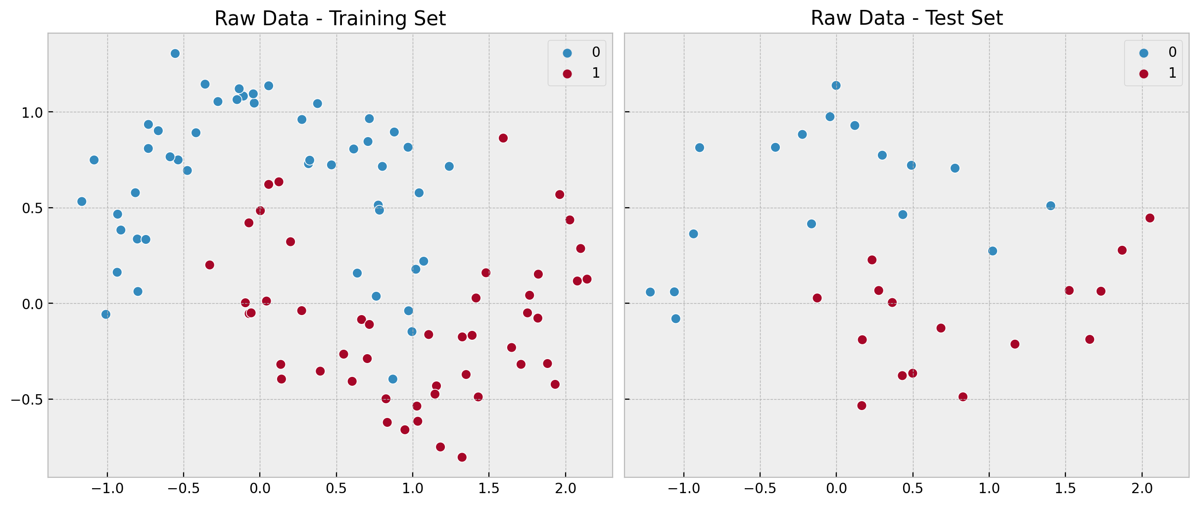
We clearly see the non-linearity of pattern.
Linear Model
First, we start with a simple linear model: Logistic Regression. Just because of the non-linearity of the data, we expect this model to perform poorly. Still, it serves as a baseline.
Remark: For details on the implementation, take a look into the slides of my talk Introduction to Bayesian Analysis with PyMC at PyCon Colombia 2022. Moreover, please make sure you check out the PyMC documentation (specially the examples section).
with pm.Model() as linear_model:
    # coordinates
    linear_model.add_coord(name="domain_dim", values=np.arange(domain_dim), mutable=False)
    linear_model.add_coord(name="idx", values=idx_train, mutable=True)
    # data containers
    x_ = pm.MutableData(name="x", value=x_train, dims=("idx", "domain_dim"))
    y_ = pm.MutableData(name="y", value=y_train, dims="idx")
    # priors
    a = pm.Normal(name="a", mu=0, sigma=2)
    b = pm.Normal(name="b", mu=0, sigma=2, dims="domain_dim")
    # model parametrization
    mu = pm.Deterministic(name="mu", var=pm.math.dot(x_, b) + a, dims="idx")
    p = pm.Deterministic(name="p", var=pm.math.invlogit(mu), dims="idx")
    # likelihood
    likelihood = pm.Bernoulli(name="likelihood", p=p, dims="idx", observed=y_)

pm.model_to_graphviz(model=linear_model)
We now fit the model.
with linear_model:
    linear_idata = pm.sampling_jax.sample_numpyro_nuts(draws=4000, chains=4)
    linear_posterior_predictive = pm.sample_posterior_predictive(trace=linear_idata)
Let’s look into some model diagnostics:
az.summary(data=linear_idata, var_names=["a", "b"])| mean | sd | hdi_3% | hdi_97% | mcse_mean | mcse_sd | ess_bulk | ess_tail | r_hat | |
|---|---|---|---|---|---|---|---|---|---|
| a | 0.298 | 0.405 | -0.455 | 1.075 | 0.004 | 0.003 | 9374.0 | 10373.0 | 1.0 |
| b[0] | 1.152 | 0.370 | 0.459 | 1.845 | 0.004 | 0.003 | 9628.0 | 10147.0 | 1.0 |
| b[1] | -3.305 | 0.691 | -4.630 | -2.021 | 0.007 | 0.005 | 9674.0 | 10096.0 | 1.0 |
axes = az.plot_trace(
    data=linear_idata,
    var_names=["a", "b"],
    compact=True,
    kind="rank_bars",
    backend_kwargs={"figsize": (10, 5), "layout": "constrained"},
)
plt.gcf().suptitle("Linear Model - Trace", fontsize=16);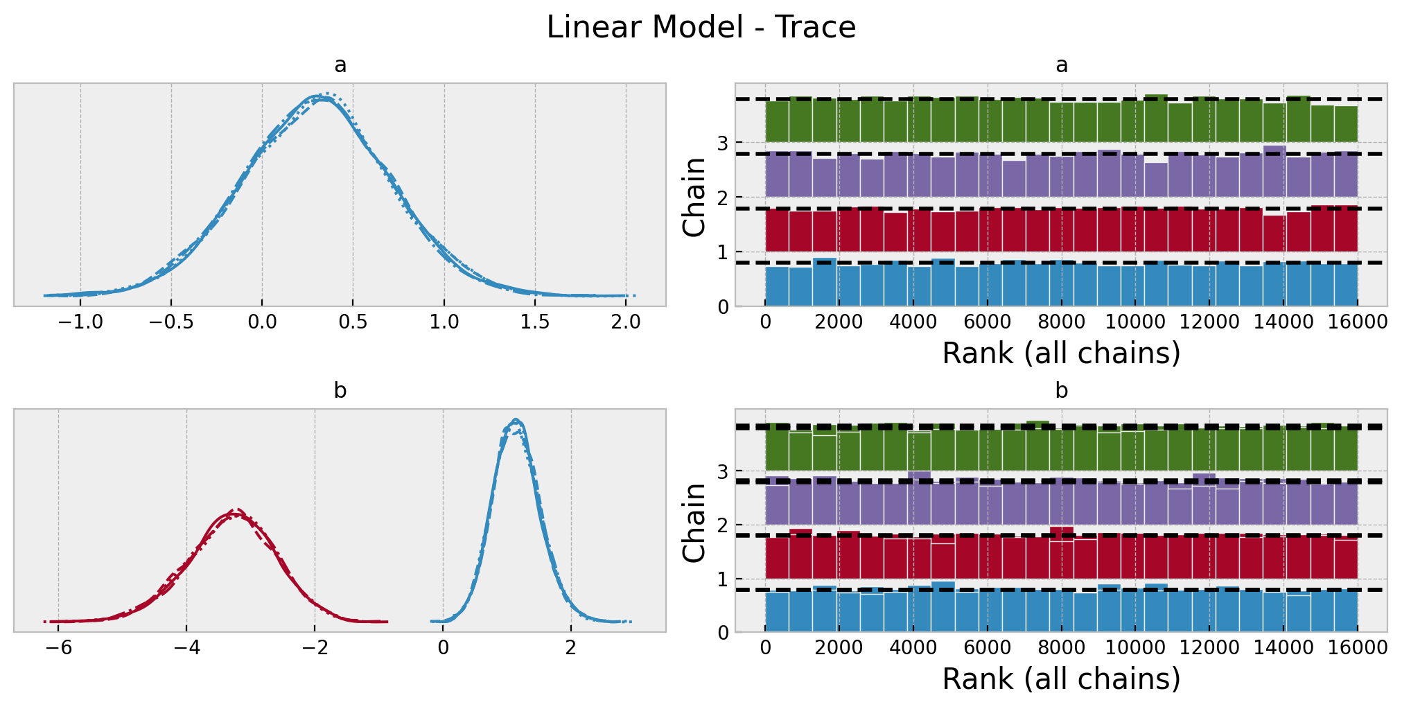
Next, we generate out-of-sample predictions.
with linear_model:
    pm.set_data(new_data={"x": x_test, "y": y_test}, coords={"idx": idx_test})
    linear_idata.extend(
        other=pm.sample_posterior_predictive(
            trace=linear_idata,
            var_names=["likelihood", "p"],
            idata_kwargs={"coords": {"idx": idx_test}},
        ),
        join="right",
    )
We can now compare the model in-sample and out-of-sample performance.
linear_posterior_predictive_mean_train = (
    linear_posterior_predictive.posterior_predictive["likelihood"]
    .stack(sample=("chain", "draw"))
    .mean(axis=1)
)

linear_posterior_predictive_mean_test = (
    linear_idata.posterior_predictive["likelihood"]
    .stack(sample=("chain", "draw"))
    .mean(axis=1)
)

fig, ax = plt.subplots(
    nrows=2, ncols=2, figsize=(12, 10), sharex=True, sharey=True, layout="constrained"
)

sns.scatterplot(x=x_train[:, 0], y=x_train[:, 1], s=50, hue=y_train, ax=ax[0, 0])
ax[0, 0].set(title="Raw Data - Training Set")

sns.scatterplot(
    x=x_train[:, 0],
    y=x_train[:, 1],
    s=50,
    hue=linear_posterior_predictive_mean_train,
    hue_norm=(0, 1),
    palette="coolwarm",
    ax=ax[0, 1],
)
ax[0, 1].legend(loc="upper left")
ax[0, 1].set(title="Posterior Predictive Mean - Training Set")

sns.scatterplot(x=x_test[:, 0], y=x_test[:, 1], s=50, hue=y_test, ax=ax[1, 0])
ax[1, 0].set(title="Raw Data - Test Set")

sns.scatterplot(
    x=x_test[:, 0],
    y=x_test[:, 1],
    s=50,
    hue=linear_posterior_predictive_mean_test,
    hue_norm=(0, 1),
    palette="coolwarm",
    ax=ax[1, 1],
)
ax[1, 1].legend(loc="upper left")
ax[1, 1].set(title="Posterior Predictive Mean - Test Set")
fig.suptitle("Linear Model - Posterior Predictive Mean", fontsize=16);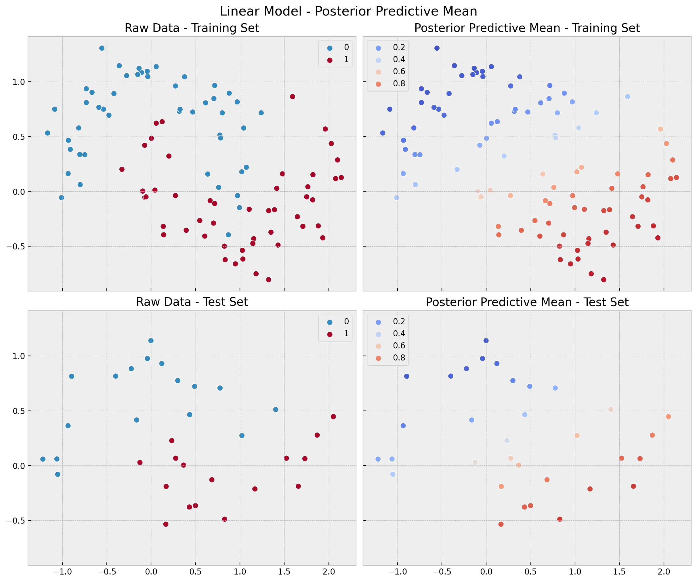
linear_errors_mean_train = (
    y_train[..., None]
    - linear_posterior_predictive.posterior_predictive["likelihood"].stack(
        sample=("chain", "draw")
    )
).mean(axis=1)

linear_errors_mean_test = (
    y_test[..., None]
    - linear_idata.posterior_predictive["likelihood"].stack(sample=("chain", "draw"))
).mean(axis=1)

fig, ax = plt.subplots(
    nrows=1, ncols=2, figsize=(12, 5), sharex=True, sharey=True, layout="constrained"
)
sns.scatterplot(
    x=x_train[:, 0],
    y=x_train[:, 1],
    s=50,
    edgecolor="black",
    hue=linear_errors_mean_train,
    hue_norm=(-1, 1),
    palette="PRGn",
    ax=ax[0],
)
ax[0].legend(title="mean error")
ax[0].set(title="Training Set")

sns.scatterplot(
    x=x_test[:, 0],
    y=x_test[:, 1],
    s=50,
    edgecolor="black",
    hue=linear_errors_mean_test,
    hue_norm=(-1, 1),
    palette="PRGn",
    ax=ax[1],
)
ax[1].legend(title="mean error")
ax[1].set(title="Test Set")
fig.suptitle("Linear Model - Posterior Predictive Mean Errors", fontsize=16);
It is also interesting to compare the \(94\%\) HDI (highest density interval) interval of the errors distribution obtained from the posterior mean.
ax, *_ = az.plot_forest(
    [
        az.convert_to_dataset(obj={"model": linear_errors_mean_train}),
        az.convert_to_dataset(obj={"model": linear_errors_mean_test}),
    ],
    model_names=["train", "test"],
    backend_kwargs={"layout": "constrained"},
)
ax.set(title="Linear Model - HDI Mean Errors");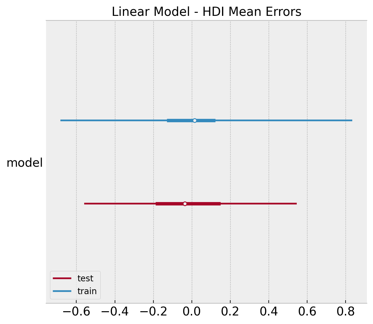
Finally, we compute the \(94/%\) HDI of accuracy distribution.
linear_acc_samples_train = np.apply_along_axis(
    func1d=lambda x: accuracy_score(y_true=y_train, y_pred=x),
    axis=0,
    arr=linear_posterior_predictive
    .posterior_predictive
    ["likelihood"]
    .stack(sample=("chain", "draw"))
)

linear_acc_samples_test = np.apply_along_axis(
    func1d=lambda x: accuracy_score(y_true=y_test, y_pred=x),
    axis=0,
    arr=linear_idata
    .posterior_predictive
    ["likelihood"]
    .stack(sample=("chain", "draw"))
)


ax, *_ = az.plot_forest(
    [
        az.convert_to_dataset(obj={"accuracy": linear_acc_samples_train}),
        az.convert_to_dataset(obj={"accuracy": linear_acc_samples_test}),
    ],
    model_names=["train", "test"],
    backend_kwargs={"layout": "constrained"},
)
ax.set(title="Linear Model - HDI Accuracy");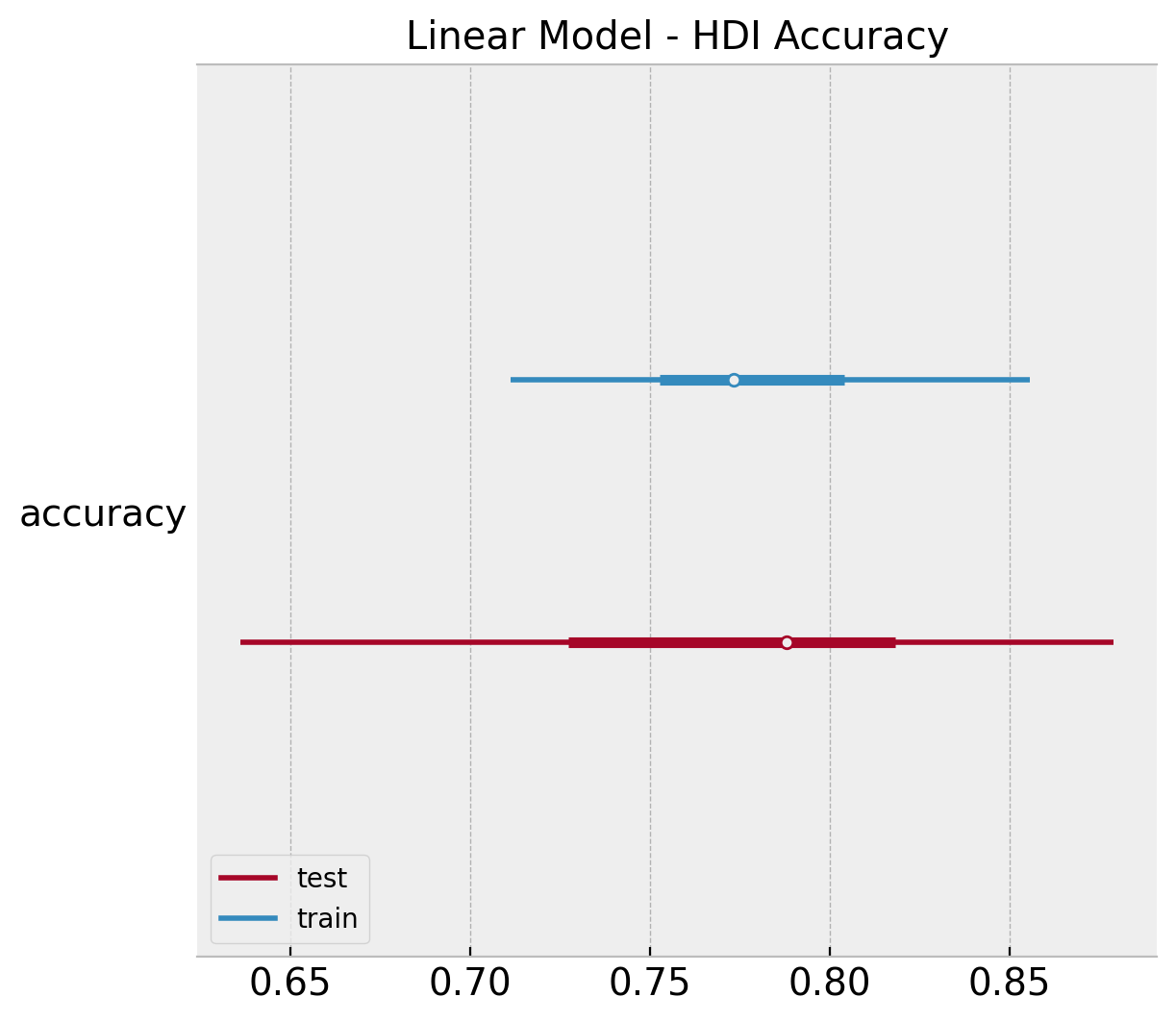
Gaussian Process
To account for non-linearity, we now fit a Gaussian Process Classifier.
References:
For more details about gaussian processes, please check out the Gaussian Processes for Machine Learning book by Rasmussen and Williams.
If you are interested in a more practical introduction you can take a look into a couple of blog posts Bayesian Regression as a Gaussian Process and An Introduction to Gaussian Process Regression.
For a practical introduction to Gaussian Processes in PyMC, please check out the examples Latent Variable Implementation and Marginal Likelihood Implementation.
with pm.Model(coords={"domain_dim": range(domain_dim)}) as gp_model:

    gp_model.add_coord(name="idx", values=idx_train, mutable=True)

    ls = pm.Gamma(name="ls", alpha=2, beta=1, dims="domain_dim")
    amplitude = pm.Gamma(name="amplitude", alpha=2, beta=1)
    cov = amplitude ** 2 * pm.gp.cov.ExpQuad(input_dim=2, ls=ls)

    gp= pm.gp.Latent(cov_func=cov)
    f = gp.prior(name="f", X=x_train, dims="idx")
    p = pm.Deterministic(name="p", var=pm.math.invlogit(f), dims="idx")
    # likelihood
    likelihood = pm.Bernoulli(name="likelihood", p=p, dims="idx", observed=y_train)

pm.model_to_graphviz(model=gp_model)
We now fit the model.
with gp_model:
    gp_idata = pm.sampling_jax.sample_numpyro_nuts(draws=4000, chains=4)
    gp_posterior_predictive = pm.sample_posterior_predictive(trace=gp_idata)
Again, we look into some model diagnostics:
az.summary(data=gp_idata, var_names=["ls", "amplitude"])| mean | sd | hdi_3% | hdi_97% | mcse_mean | mcse_sd | ess_bulk | ess_tail | r_hat | |
|---|---|---|---|---|---|---|---|---|---|
| ls[0] | 0.551 | 0.120 | 0.334 | 0.784 | 0.001 | 0.001 | 7028.0 | 8196.0 | 1.0 |
| ls[1] | 1.132 | 0.432 | 0.459 | 1.934 | 0.006 | 0.004 | 5184.0 | 8655.0 | 1.0 |
| amplitude | 6.769 | 2.010 | 3.390 | 10.516 | 0.018 | 0.013 | 12487.0 | 12276.0 | 1.0 |
axes = az.plot_trace(
    data=gp_idata,
    var_names=["ls", "amplitude"],
    compact=True,
    kind="rank_bars",
    backend_kwargs={"figsize": (10, 5), "layout": "constrained"},
)
plt.gcf().suptitle("Gaussian Process Model - Trace", fontsize=16);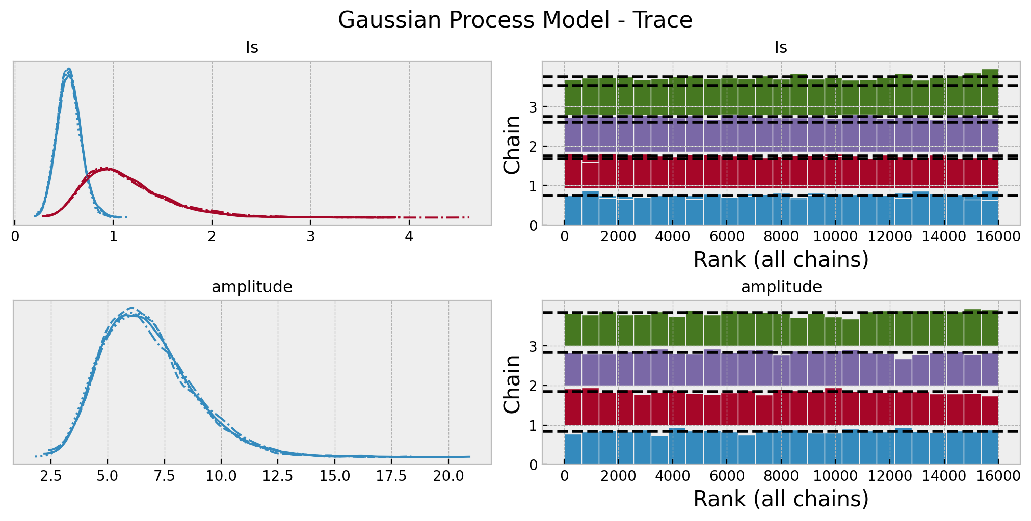
In order to generate out-of-sample predictions, we need to use the .conditional method (see Latent Variable Implementation) to get posterior predictive samples of the latent variable f. Then, we simply pass it through the invlink function to get the posterior predictive samples of the class probabilities.
with gp_model:
    f_pred = gp.conditional(name="f_pred", Xnew=x_test)
    p_pred = pm.Deterministic(name="p_pred", var=pm.math.invlogit(f_pred))
    likelihood_pred = pm.Bernoulli(name="likelihood_pred", p=p_pred)
    gp_posterior_predictive_test = pm.sample_posterior_predictive(
        trace=gp_idata, var_names=["f_pred", "p_pred", "likelihood_pred"]
    )

gp_p_pred_samples = gp_posterior_predictive_test.posterior_predictive["p_pred"].stack(
    sample=("chain", "draw")
)
gp_pred_test = np.random.binomial(n=1, p=gp_p_pred_samples)
Finally, we compute and visualize the predictions, errors and accuracy distributions.
gp_posterior_predictive_mean_train = (
    gp_posterior_predictive.posterior_predictive["likelihood"]
    .stack(sample=("chain", "draw"))
    .mean(axis=1)
)

gp_posterior_predictive_mean_test = (
    gp_posterior_predictive_test.posterior_predictive["likelihood_pred"]
    .stack(sample=("chain", "draw"))
    .mean(axis=1)
)

fig, ax = plt.subplots(
    nrows=2, ncols=2, figsize=(12, 10), sharex=True, sharey=True, layout="constrained"
)

sns.scatterplot(x=x_train[:, 0], y=x_train[:, 1], s=50, hue=y_train, ax=ax[0, 0])
ax[0, 0].set(title="Raw Data - Training Set")

sns.scatterplot(
    x=x_train[:, 0],
    y=x_train[:, 1],
    s=50,
    hue=gp_posterior_predictive_mean_train,
    hue_norm=(0, 1),
    palette="coolwarm",
    ax=ax[0, 1],
)
ax[0, 1].legend(loc="upper left")
ax[0, 1].set(title="Posterior Predictive Mean - Training Set")

sns.scatterplot(x=x_test[:, 0], y=x_test[:, 1], s=50, hue=y_test, ax=ax[1, 0])
ax[1, 0].set(title="Raw Data - Test Set")

sns.scatterplot(
    x=x_test[:, 0],
    y=x_test[:, 1],
    s=50,
    hue=gp_posterior_predictive_mean_test,
    hue_norm=(0, 1),
    palette="coolwarm",
    ax=ax[1, 1],
)
ax[1, 1].legend(loc="upper left")
ax[1, 1].set(title="Posterior Predictive Mean - Test Set")
fig.suptitle("Gaussian Process Model - Posterior Predictive Mean", fontsize=16);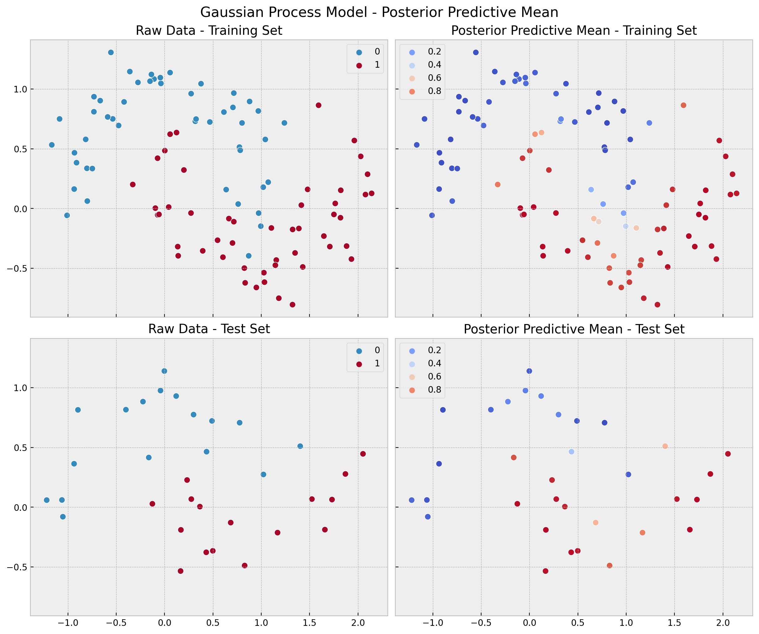
gp_errors_mean_train = (
    y_train[..., None]
    - gp_posterior_predictive.posterior_predictive["likelihood"].stack(
        sample=("chain", "draw")
    )
).mean(axis=1)

gp_errors_mean_test = (y_test[..., None] - gp_pred_test).mean(axis=1)

fig, ax = plt.subplots(
    nrows=1, ncols=2, figsize=(12, 5), sharex=True, sharey=True, layout="constrained"
)
sns.scatterplot(
    x=x_train[:, 0],
    y=x_train[:, 1],
    s=50,
    edgecolor="black",
    hue=gp_errors_mean_train,
    hue_norm=(-1, 1),
    palette="PRGn",
    ax=ax[0],
)
ax[0].legend(title="mean error")
ax[0].set(title="Training Set")

sns.scatterplot(
    x=x_test[:, 0],
    y=x_test[:, 1],
    s=50,
    edgecolor="black",
    hue=gp_errors_mean_test,
    hue_norm=(-1, 1),
    palette="PRGn",
    ax=ax[1],
)
ax[1].legend(title="mean error")
ax[1].set(title="Test Set")
fig.suptitle("Gaussian Process Model - Posterior Predictive Mean Errors", fontsize=16);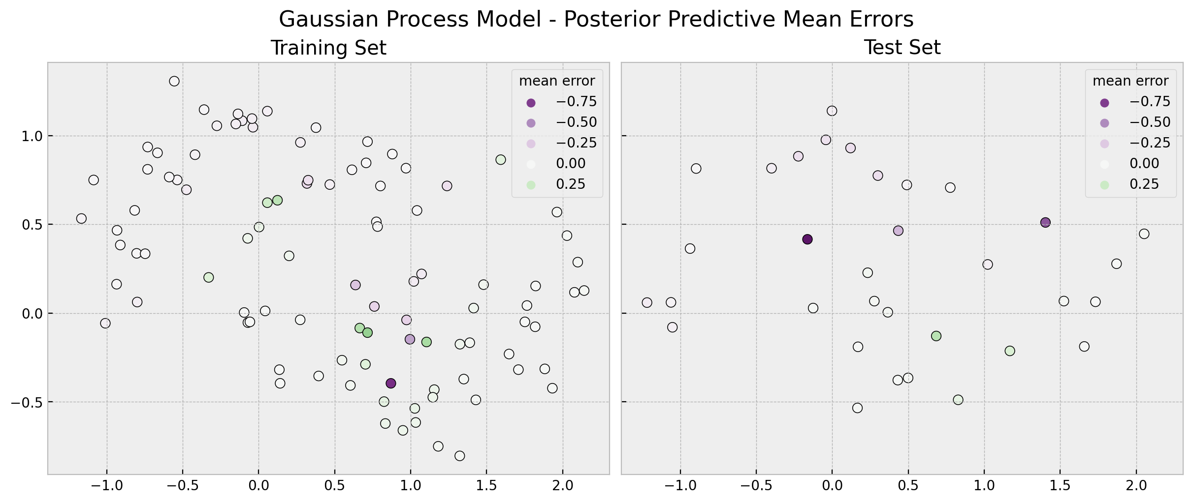
ax, *_ = az.plot_forest(
    [
        az.convert_to_dataset(obj={"model": gp_errors_mean_train}),
        az.convert_to_dataset(obj={"model": gp_errors_mean_test}),
    ],
    model_names=["train", "test"],
    backend_kwargs={"layout": "constrained"},
)
ax.set(title="Gaussian Process - HDI Mean Errors");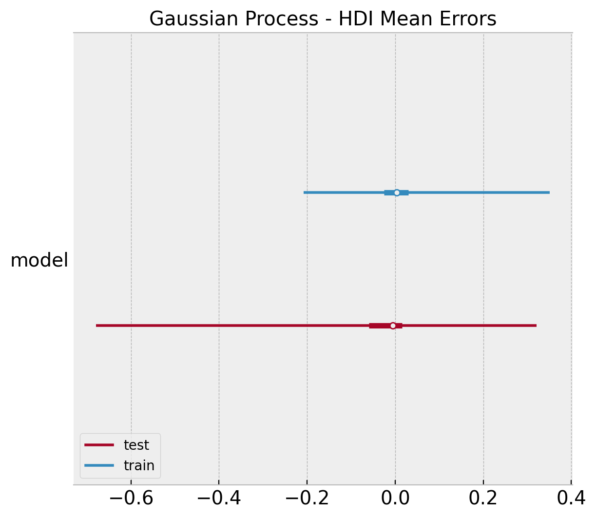
gp_acc_samples_train = np.apply_along_axis(
    func1d=lambda x: accuracy_score(y_true=y_train, y_pred=x),
    axis=0,
    arr=gp_posterior_predictive
    .posterior_predictive
    ["likelihood"]
    .stack(sample=("chain", "draw"))
    .to_numpy()
)

gp_acc_samples_test = np.apply_along_axis(
    func1d=lambda x: accuracy_score(y_true=y_test, y_pred=x),
    axis=0,
    arr=gp_pred_test
)

ax, *_ = az.plot_forest(
    [
        az.convert_to_dataset(obj={"accuracy": gp_acc_samples_train}),
        az.convert_to_dataset(obj={"accuracy": gp_acc_samples_test}),
    ],
    model_names=["train", "test"],
    backend_kwargs={"layout": "constrained"},
)
ax.set(title="Gaussian Process Model - HDI Accuracy");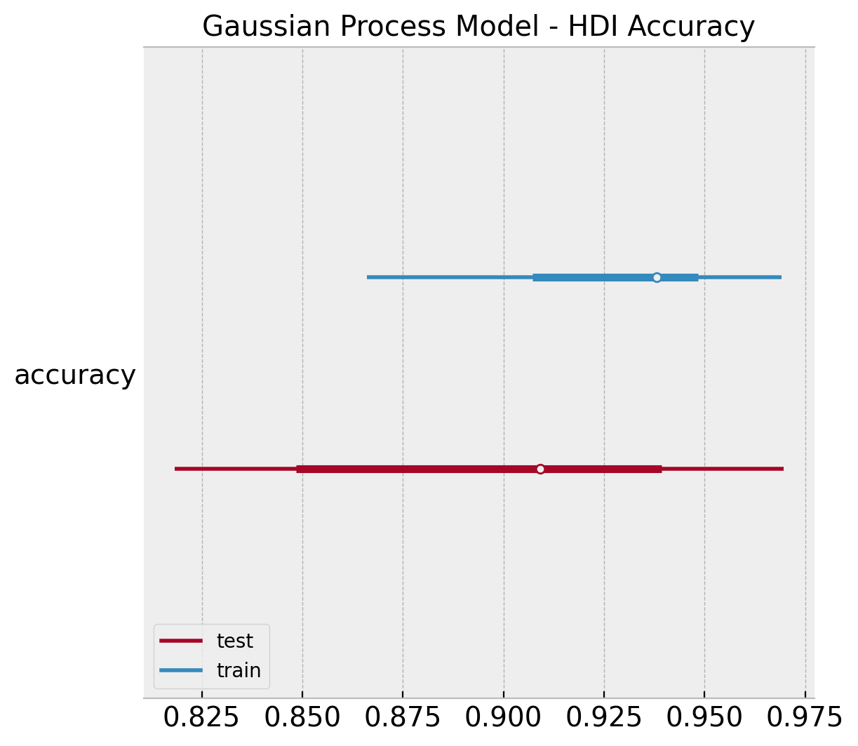
Model Comparison
By looking into the plots above we clearly see that the gaussian process model is a better model for this non-linear data. In this last section we hand to dig a bit deeper into model comparison. First, let’s look into the plot_separation function from arviz. According to the authors of the method:
It is a visual method for assessing the predictive power of models with binary outcomes. This technique allows the analyst to evaluate model fit based upon the models’ ability to consistently match high-probability predictions to actual occurrences of the event of interest, and low-probability predictions to nonoccurrences of the event of interest.
For more details see The Separation Plot: A New Visual Method for Evaluating the Fit of Binary Models.
fig, ax = plt.subplots(
        nrows=2, ncols=1, figsize=(9, 4), layout="constrained"
)
az.plot_separation(idata=linear_posterior_predictive, y="likelihood", ax=ax[0])
ax[0].set(title="Linear Model")
az.plot_separation(idata=gp_posterior_predictive, y="likelihood", ax=ax[1])
ax[1].set(title="Gaussian Process Model")
fig.suptitle("Separation Plot", fontsize=16);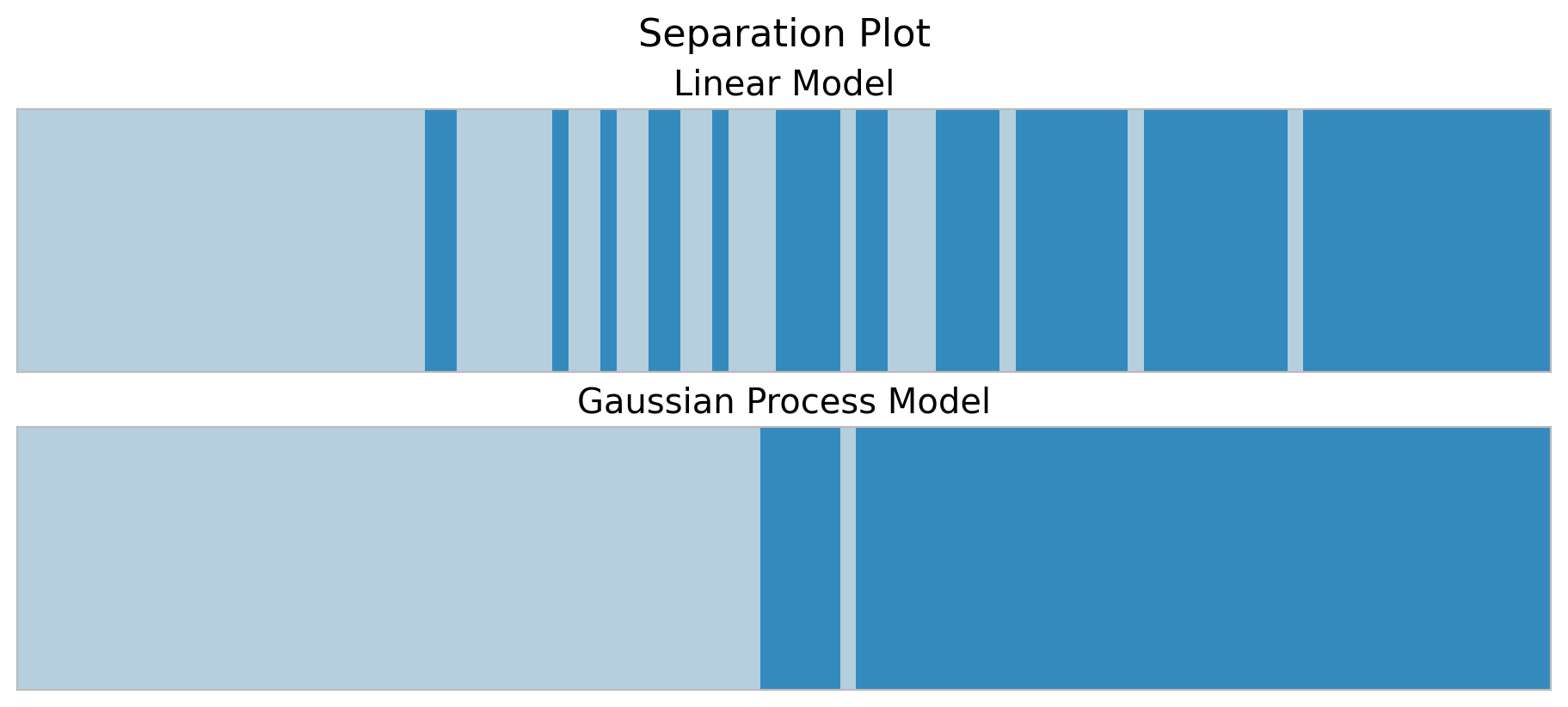
We indeed see that in the training set the gaussian process model separates the classes better.
We can try to generate a “separation” plot ourselves by looking into the posterior distribution of \(p\).
fig, ax = plt.subplots()
az.plot_hdi(
    x=range(n_train),
    y=linear_idata.posterior["p"][:, :, np.argsort(y_train)],
    color="C0",
    fill_kwargs={"label": "linear"},
    ax=ax,
)
az.plot_hdi(
    x=range(n_train),
    y=gp_idata.posterior["p"][:, :, np.argsort(y_train)],
    color="C1",
    fill_kwargs={"label": "gp"},
    ax=ax,
)
ax.legend()
ax.set(title="P Posterior Predictive HDI");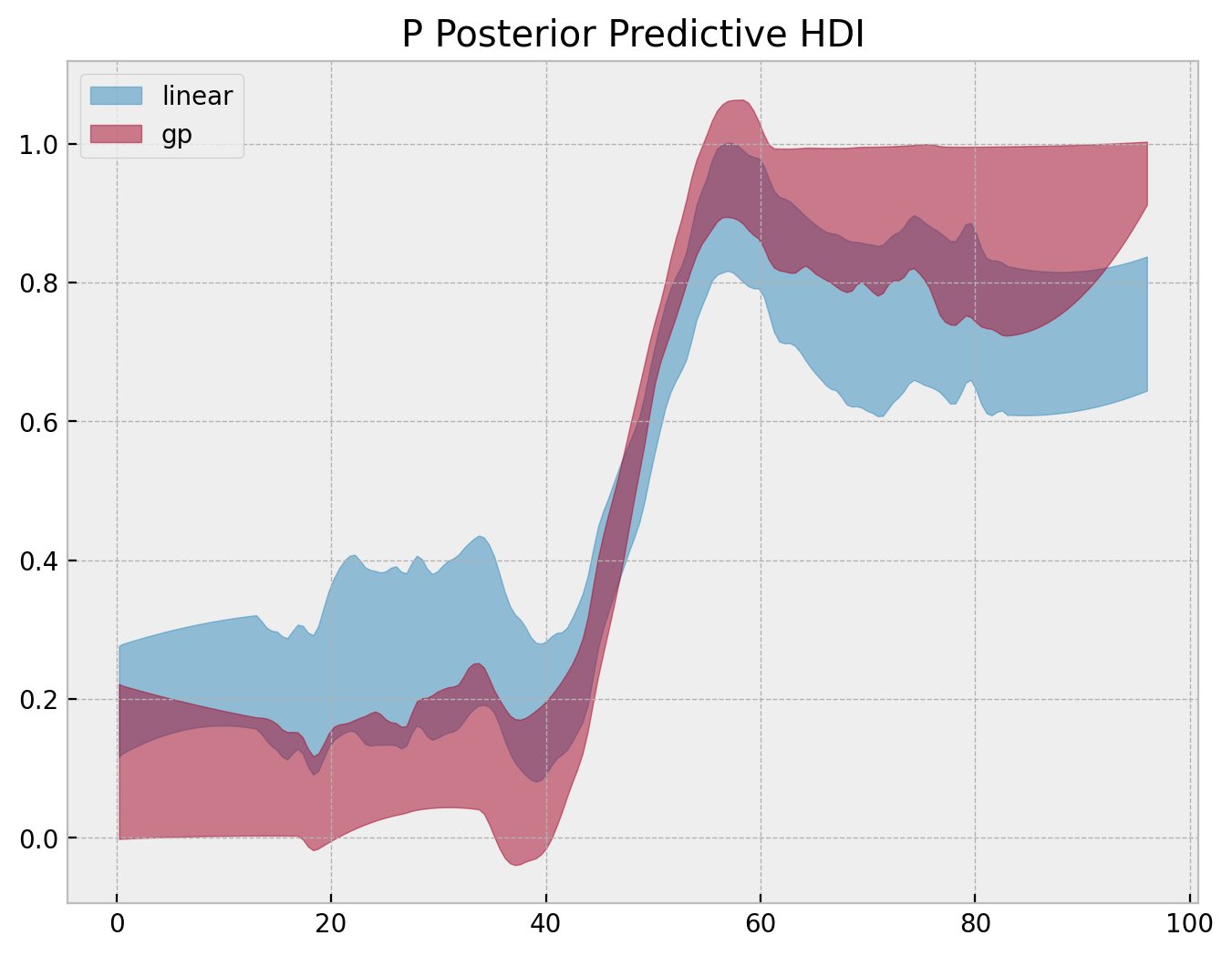
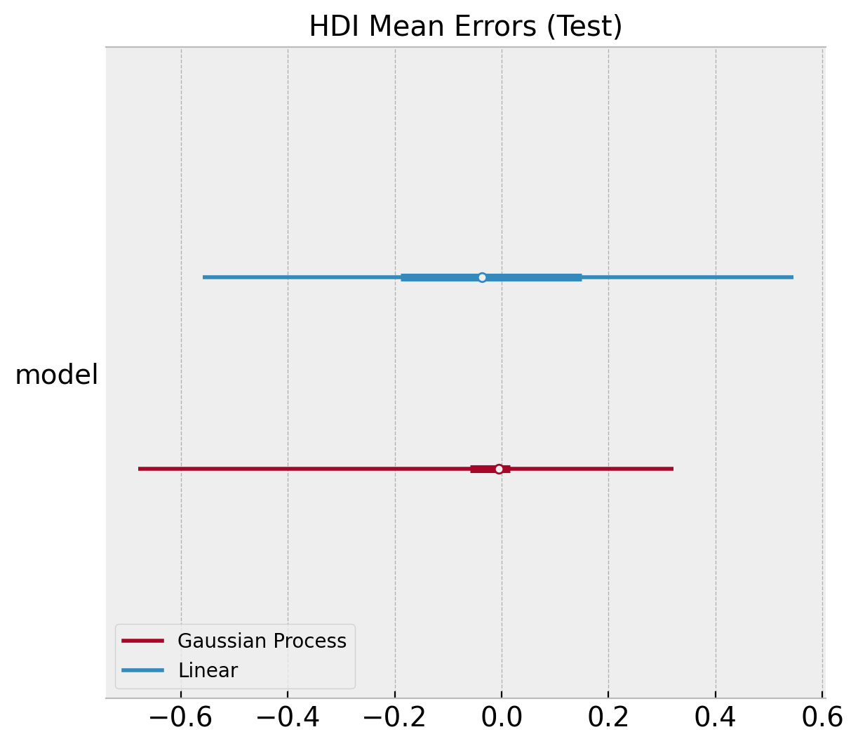
Next, we compare the errors of the posterior mean:
ax, *_ = az.plot_forest(
    [
        az.convert_to_dataset(obj={"model": linear_errors_mean_train.to_numpy()}),
        az.convert_to_dataset(obj={"model": gp_errors_mean_train.to_numpy()}),
    ],
    model_names=["Linear", "Gaussian Process"],
    backend_kwargs={"layout": "constrained"},
)
ax.set(title="HDI Mean Errors (Train)");

ax, *_ = az.plot_forest(
    [
        az.convert_to_dataset(obj={"model": linear_errors_mean_test.to_numpy()}),
        az.convert_to_dataset(obj={"model": gp_errors_mean_test}),
    ],
    model_names=["Linear", "Gaussian Process"],
    backend_kwargs={"layout": "constrained"},
)
ax.set(title="HDI Mean Errors (Test)");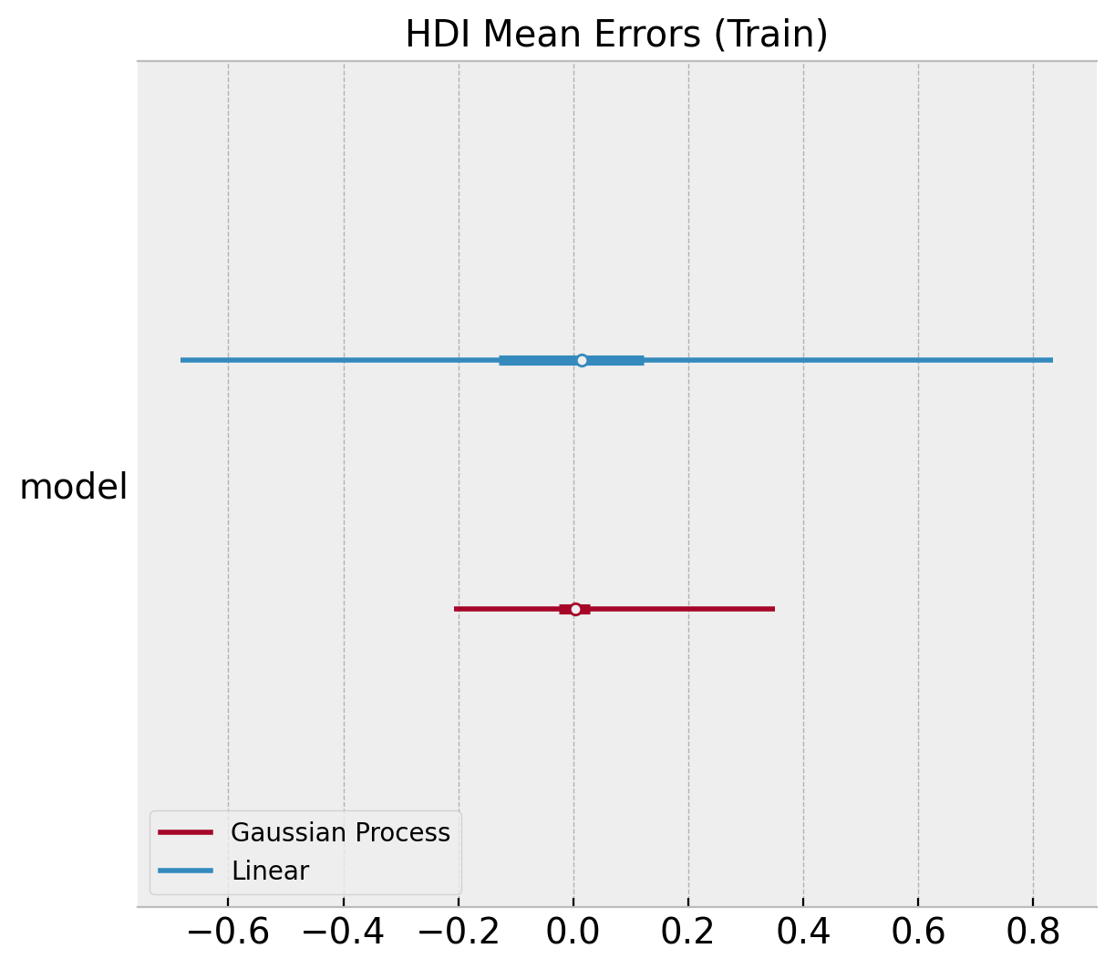
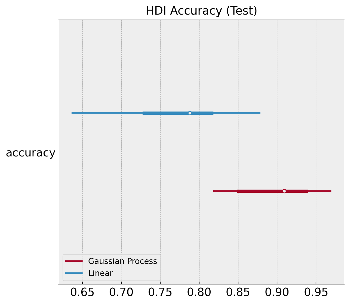
We can plot similar diagnostics for the accuracy distributions.
ax, *_ = az.plot_forest(
    [
        az.convert_to_dataset(obj={"accuracy": linear_acc_samples_train}),
        az.convert_to_dataset(obj={"accuracy": gp_acc_samples_train}),
    ],
    model_names=["Linear", "Gaussian Process"],
    backend_kwargs={"layout": "constrained"},
)
ax.set(title="HDI Accuracy (Train)");

ax, *_ = az.plot_forest(
    [
        az.convert_to_dataset(obj={"accuracy": linear_acc_samples_test}),
        az.convert_to_dataset(obj={"accuracy": gp_acc_samples_test}),
    ],
    model_names=["Linear", "Gaussian Process"],
    backend_kwargs={"layout": "constrained"},
)
ax.set(title="HDI Accuracy (Test)");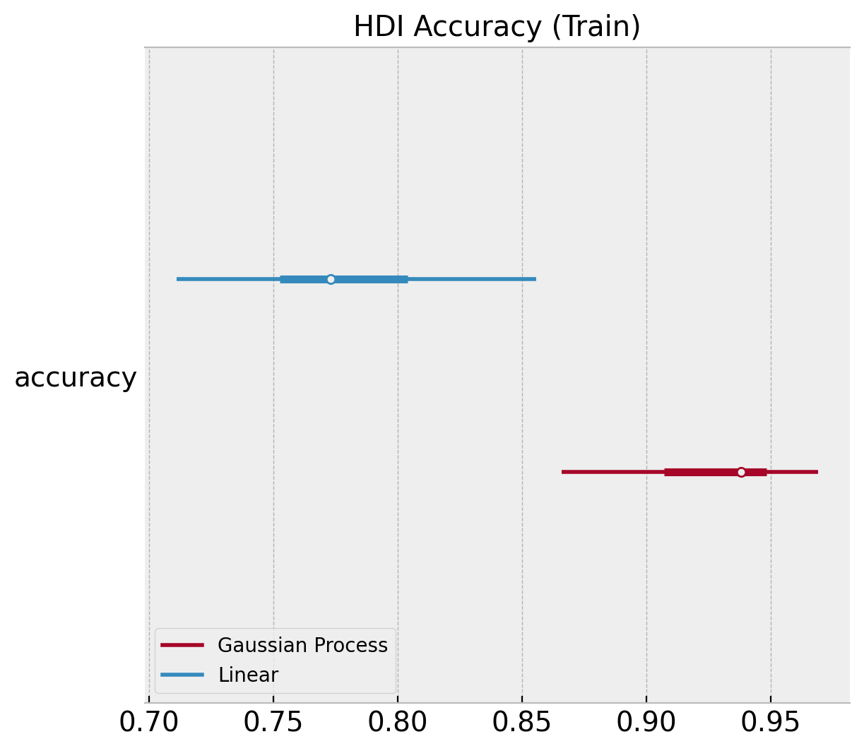
Finally, we can use the compare function from arviz:
comp_df = az.compare({"linear": linear_idata, "gp": gp_idata})
comp_df| rank | loo | p_loo | d_loo | weight | se | dse | warning | loo_scale | |
|---|---|---|---|---|---|---|---|---|---|
| gp | 0 | -11.810795 | 3.467666 | 0.000000 | 1.000000e+00 | 2.882276 | 0.000000 | True | log |
| linear | 1 | -36.181303 | 2.218763 | 24.370509 | 3.630873e-12 | 5.428638 | 4.262536 | False | log |
Here we use the expected log pointwise predictive density (ELPD) (see Practical Bayesian model evaluation using leave-one-out cross-validation and WAIC) metric to compare these two models. We clearly see that the gaussian process model is much better model that the logistic regression. Please refer the to the documentation arviz.plot_compare.
az.plot_compare(
  comp_df=comp_df, backend_kwargs={"figsize": (8, 4), "layout": "constrained"}
);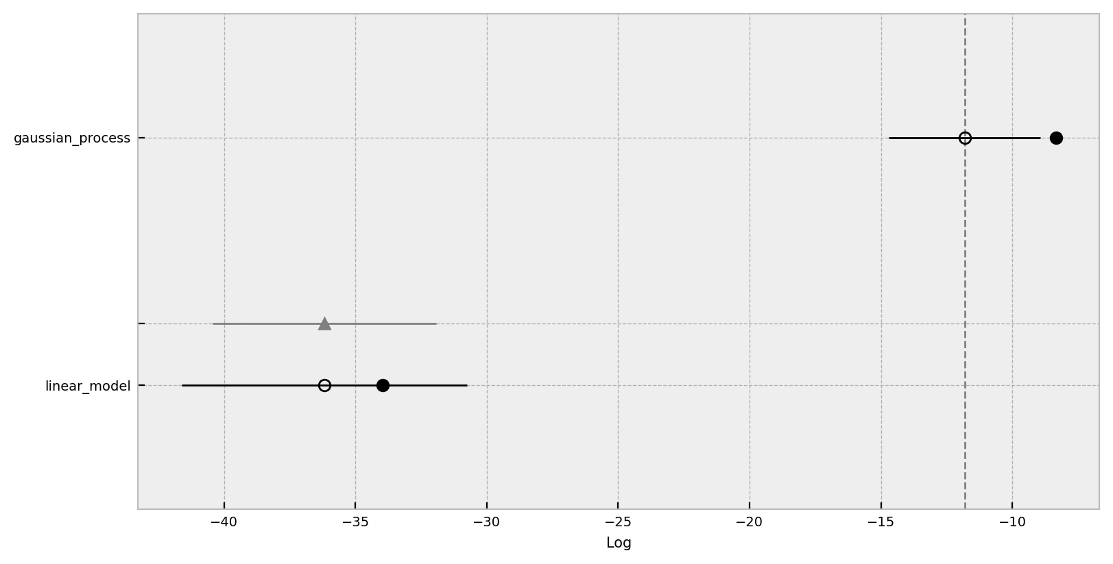
Regarding this compare plot:
This plot is in the style of the one used in the book Statistical Rethinking by Richard McElreath.Chapter 6 in the first edition or 7 in the second.
- Filled values are in-sample estimates.
- Open points are the ELPD values and the error bars are the standard deviations.
- The light gray line is the ELPD difference between the model and the best model.