In this post we study the Bayesian Regression model to explore and compare the weight and function space and views of Gaussian Process Regression as described in the book Gaussian Processes for Machine Learning, Ch 2. We follow this reference very closely (and encourage to read it!). Our main objective is to illustrate the concepts and results through a concrete example. We use PyMC3 to run bayesian sampling.
References:
- Gaussian Processes for Machine Learning, Carl Edward Rasmussen and Christopher K. I. Williams, MIT Press, 2006.
- See this post for an introduction to bayesian methods and PyMC3.
- Documentation of linear regression in PyMC3.
- Documentation for the multivariate normal distribution in PyMC3.
- Here is an Stackoverflow post which can help Mac OS users which might have problems with Theano after upgrading to Mojave.
Let us consider the model:
\[ f(x) = x^T b \quad \text{and} \quad y = f(x) + \varepsilon, \quad \text{with} \quad \varepsilon \sim N(0, \sigma_n^2) \]
where \(x \in \mathbb{R}^d\) is a vector of data and \(b \in \mathbb{R}^d\) is the vector of weights (parameters). We assume a bias weight (i.e. intercept) is included in \(b\).
Prepare Notebook
import numpy as np
import pymc3 as pm

import seaborn as sns; sns.set()

import matplotlib.pyplot as plt
%matplotlib inline
Generate Sample Data
Let us begin by generating sample data.
# Define dimension.
d = 2

# Number of samples.
n = 100

# Independent variable.
x = np.linspace(start=0, stop=1, num=n).reshape([1, n])

# Design matrix. We add a column of ones to account for the bias term.
X = np.append(np.ones(n).reshape([1, n]), x, axis=0)
Now we generate the response variable.
# True parameters.
b = np.zeros(d)
## Intercept.
b[0] = 1
## Slope.
b[1] = 3

b = b.reshape(d, 1)

# Error standard deviation.
sigma_n = 0.5

# Errors.
epsilon = np.random.normal(loc=0, scale=sigma_n, size=n).reshape([n, 1])

f = np.dot(X.T, b)

# Observed target variable.
y = f + epsilon
We visualize the data set.
plt.rcParams['figure.figsize'] = (10,7)

fig, ax = plt.subplots()
sns.distplot(epsilon, ax=ax)
ax.set_title('Error Distribution');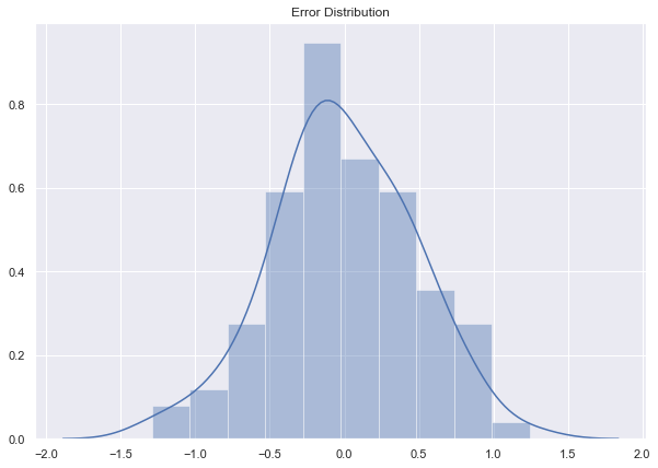
fig, ax = plt.subplots()
# Plot raw data.
sns.scatterplot(x=x.T.flatten(), y=y.flatten())
# Plot "true" linear fit.
sns.lineplot(x=x.T.flatten(), y=f.flatten(), color='red', label='true')

ax.set(title='Raw Data')
ax.legend(loc='lower right');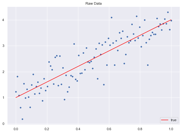
Likelihood
A straightforward calculation shows that the likelihood function is given by
\[ p(y|X, b) = \prod_{i=1}^{n} p(y_i|x_i, b) = \frac{1}{(2\pi \sigma_n^2)^{n/2}} \exp\left(-\frac{1}{2\sigma_n^2}||y - X^T b||^2\right) = N(X^T b, \sigma_n^2 I) \]
where \(X\in M_{d\times n}(\mathbb{R})\) is the design matrix which has the observations as rows.
Prior Distribution
We set a multivariate normal distribution with mean zero for the prior of the vector of weights \(b N(0, _p)\). Here \(p M{d}()\) denotes the covariance matrix.
# Mean vector.
mu_0 = np.zeros(d)
# Covariance matrix.
# Add small perturbation for numerical stability.
sigma_p = np.array([[2, 1], [1, 2]]) + 1e-12*np.eye(d)

sigma_p
array([[2., 1.],
[1., 2.]])Let us sample from the prior distribution to see the level curves (see this post).
# Set number of samples.
m = 10000
# Generate samples.
z = np.random.multivariate_normal(mean=mu_0, cov=sigma_p, size=m)
z = z.T
# PLot.
sns.jointplot(x=z[0], y=z[1], kind="kde", space=0, color='purple');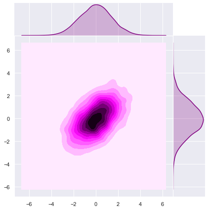
Note that the ellipse-like level curves are rotated (with respect the natural axis) due the fact that \(\Sigma_p\) is not diagonal.
Let us begin by sampling lines from the prior distribution.
# Number of samples to select.
m = 200
# Sample from prior distribution of the weight vector.
z_prior = np.random.multivariate_normal(mean=mu_0, cov=sigma_p, size=m)
# Compute prior lines.
lines_prior = np.dot(z_prior, X)
We visualize the sample lines.
fig, ax = plt.subplots()

# Loop over the line samples from the prior distribution.
for i in range(0, m):

    sns.lineplot(
        x=x.T.flatten(),
        y=lines_prior[i],
        color='purple',
        alpha=0.2
    )

# Plot raw data.
sns.scatterplot(x=x.T.flatten(), y=y.flatten())
# Plot "true" linear fit.
sns.lineplot(x=x.T.flatten(), y=f.flatten(), color='red', label='true')

ax.set(title='Curves drawn from the prior distribution of the weight vector')
ax.legend(loc='lower right');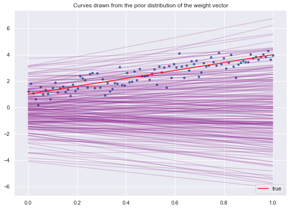
Posterior Distribution
Now we want to use the data to find the posterior distribution of the vector of weights. Recall that the posterior is obtained (from Bayes rule) by computing
\[ \text{posterior} = \frac{\text{likelihood × prior}}{\text{marginal likelihood}} \]
Concretely,
\[ p(b|y, X) = \frac{p(y|X, b)p(b)}{p(y|X)} \]
The marginal likelihood \(p(y|X)\), which is independent of \(b\), is calculated as
\[ p(y|X) = \int p(y|X, b)p(b) db \]
MCMC Sampling with PyMC3
Recall that we do not need to compute \(p(y|X)\) directly since we can sample from the posterior distribution using MCMC sampling. Again, see this post for more details.
import theano.tensor as tt

model = pm.Model()

with model:
    # Define prior.
    beta = pm.MvNormal('beta', mu=mu_0, cov=sigma_p, shape=d)
    # Define likelihood.
    likelihood = pm.Normal('y', mu=tt.dot(X.T, beta), sd=sigma_n, observed=y.squeeze())
    # Consider 6000 draws and 3 chains.
    trace = pm.sample(draws=7500, cores=3)
Auto-assigning NUTS sampler...
Initializing NUTS using jitter+adapt_diag...
Multiprocess sampling (3 chains in 3 jobs)
NUTS: [beta]
Sampling 3 chains: 100%|██████████| 24000/24000 [00:11<00:00, 2127.41draws/s]Let us visualize the posterior distributions.
pm.traceplot(trace, figsize=(12, 5));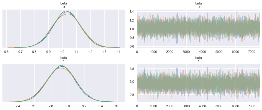
pm.plot_posterior(trace, figsize=(12, 5));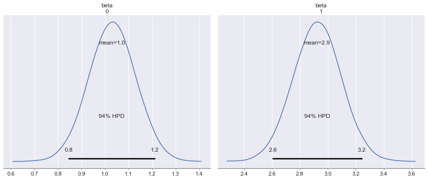
pm.summary(trace)| mean | sd | mc_error | hpd_2.5 | hpd_97.5 | n_eff | Rhat | |
|---|---|---|---|---|---|---|---|
| beta__0 | 0.944719 | 0.098275 | 0.001246 | 0.756161 | 1.137474 | 6275.837716 | 1.000179 |
| beta__1 | 3.082444 | 0.170306 | 0.002171 | 2.748780 | 3.412982 | 6351.843878 | 1.000169 |
Let us see the join posterior distribution.
sns.jointplot(x=trace['beta'].T[0],y=trace['beta'].T[1], kind='kde', color='green', space=0);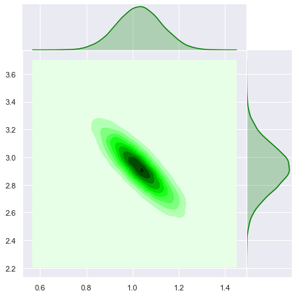
Now let us sample from the posterior distribution.
# Get a sub-sample of indices of length m.
sample_posterior_indices = np.random.choice(trace["beta"].shape[0], m, replace=False)
# Select samples from the trace of the posterior.
z_posterior = trace["beta"][sample_posterior_indices, ]
# Compute posterior lines.
lines_posterior = np.dot(z_posterior, X)
Similarly, let us plot the posterior samples.
fig, ax = plt.subplots()

# Loop over the line samples from the posterior distribution.
for i in range(0, m):

    sns.lineplot(
        x=x.T.flatten(),
        y=lines_posterior[i],
        color='green',
        alpha=0.2
    )

# Plot raw data.
sns.scatterplot(x=x.T.flatten(), y=y.flatten())
# Plot "true" linear fit.
sns.lineplot(x=x.T.flatten(), y=f.flatten(), color='red', label='true')

ax.set(title='Curves drawn from the posterior distribution of the weight vector')
ax.legend(loc='lower right');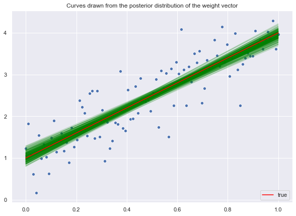
We see how the data makes the posterior distribution much more localized around the mean.
Predictions
Next, we use the posterior distribution of the weights vector to generate predictions.
Parameter Mean
Let us begin by using the mean of the posterior distribution of each parameter to find the linear fit.
# Compute mean of the posterior distribution.
beta_hat = np.apply_over_axes(func=np.mean, a=trace['beta'], axes=0).reshape(d,1)
# Compute linear fit.
y_hat = np.dot(X.T, beta_hat)
Let us plot the result.
fig, ax = plt.subplots()
# Plot raw data.
sns.scatterplot(x=x.T.flatten(), y=y.flatten())
# Plot "true" linear fit.
sns.lineplot(x=x.T.flatten(), y=f.flatten(), color='red', label='true')
# Plot line corresponding to the posterior mean of the weight vector.
sns.lineplot(x=x.T.flatten(), y=y_hat.flatten(), color='green', label='posterior mean')

ax.set(title='Linear fit for parameter posterior mean')
ax.legend(loc='lower right');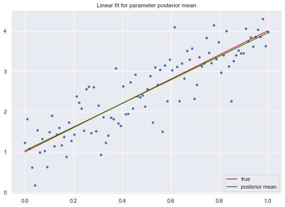
Credible Interval
Next, let us compute the credible interval for the fit.
# We sample from the posterior.
y_hat_samples = np.dot(X.T, trace['beta'].T)
# Compute the standard deviation.
y_hat_sd = np.apply_over_axes(func=np.std, a=y_hat_samples, axes=1).squeeze()Let us plot the credible interval corresponding to a corridor corresponding to two standard deviations.
fig, ax = plt.subplots()

# Plot credible interval.
plt.fill_between(
    x=x.T.reshape(n,),
    y1=(y_hat.reshape(n,) - 2*y_hat_sd),
    y2=(y_hat.reshape(n,) + 2*y_hat_sd),
    color = 'green',
    alpha = 0.3,
    label='credible interval: mean $\pm 2 \sigma$'
)

# Plot "true" linear fit.
sns.lineplot(x=x.T.flatten(), y=f.flatten(), color='red', label='true')
# Plot raw data.
sns.scatterplot(x=x.T.flatten(), y=y.flatten())
# Plot line corresponding to the posterior mean of the weight vector.
sns.lineplot(x=x.T.flatten(), y=y_hat.flatten(), color='green', label='posterior mean')

ax.set(title='Linear fit for parameter posterior mean')
ax.legend(loc='lower right');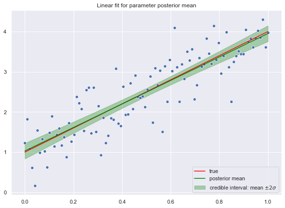
Test Set
Now, we write a function to generate predictions for a new data point.
def generate_prediction(x_star, trace):
    """
    Generate prediction for a new value given the
    posterior distribution()
    """
    # Compute prediction distribution.
    prob = np.dot(x_star.T, trace['beta'].T)
    # Sample from it.
    y_hat = np.random.choice(a=prob.squeeze())

    return y_hat
Let us generate a prediction for the value \(z_* = 0.85\)
z_star = np.array([[1], [0.85]])

y_hat_star = generate_prediction(z_star, trace)

y_hat_star
3.5449253914610828
fig, ax = plt.subplots()

# Plot credible interval.
plt.fill_between(
    x=x.T.reshape(n,),
    y1=(y_hat.reshape(n,) - 2*y_hat_sd),
    y2=(y_hat.reshape(n,) + 2*y_hat_sd),
    color = 'green',
    alpha = 0.3,
    label='credible interval: mean $\pm 2 \sigma$'
)

# Plot "true" linear fit.
sns.lineplot(x=x.T.flatten(), y=f.flatten(), color='red', label='true')
# Plot raw data.
sns.scatterplot(x=x.T.flatten(), y=y.flatten())
# Plot line corresponding to the posterior mean of the weight vector.
sns.lineplot(x=x.T.flatten(), y=y_hat.flatten(), color='green', label='posterior mean')
# Point prediction
sns.scatterplot(x=z_star[1], y=y_hat_star, color='black', label='point prediction $z_*$')

ax.set(title='Linear fit for parameter posterior mean & point prediction')
ax.legend(loc='lower right');
Analytical Solution
For this concrete example, we can find the analytical solution of the posterior distribution. Recall that this one is proportional to the product:
\[ p(b|y, X) \propto \exp\left( -\frac{1}{2\sigma_n^2}||y - X^T b||^2 \right) \exp\left( -\frac{1}{2} b^T \Sigma_p b \right) \]
The main idea to find the functional form of the posterior distribution is to “complete the square” of the exponents in the right hand side of the equation above. Specifically, let us define:
\[ A:= \sigma_n^{-2}XX^T + \Sigma_p^{-1} \in M_{d}(\mathbb{R}) \quad \text{and} \quad \bar{b}:= \sigma_n^{-2}A^{-1}Xy \in \mathbb{R}^d \]
Then,
\[ \sigma_n^{-2} ||y - X^T b||^2 + b^T \Sigma_p b = b^T A b - \sigma_n^{-2}(b^T Xy + (b^T Xy)^T) + \sigma_n^{-2}y^Ty. \]
The last term does not depend on \(b\) so we can ignore it for the calculation. Observe that \(\sigma_n^{-2} b^T Xy = \sigma_n^{-2} b^TAA^{-1}Xy = b^TA\bar{b}\), hence
\[ b^T A b - \sigma_n^{-2}(b^T Xy + (b^T Xy)^T) = b^T A b - b^TA\bar{b} - \bar{b}^TAb = b^T A b - b^TA\bar{b} - \bar{b}^TAb = (b - \bar{b})^TA(b - \bar{b}) - \bar{b}^TA\bar{b} \]
Again, the therm \(\bar{b}^TA\bar{b}\) does not depend on \(b\), so it is not relevant for the computation. We then recognize the form of the posterior distribution as gaussian with mean \(\bar{b}\) and covariance matrix \(A^{-1}\).
\[ p(b|y, X) \sim N \left( \bar{b}, A^{-1} \right) \]
Let us compute the analytic solution for this example:
# Compute A.
A = (sigma_n)**(-2)*np.dot(X, X.T) + np.linalg.inv(sigma_p)
# Compute its inverse.
A_inv = np.linalg.inv(A)
# Compute b_bar.
b_bar = (sigma_n)**(-2)*np.dot(A_inv, np.dot(X, y))
b_bararray([[0.94578232], [3.08015972]])
Note that these values coincide with the values above obtained from the MCMC sampling. Let us sample from the analytical solution of the posterior distribution.
# Set number of samples.
m = 10000
# Sample from the posterior distribution.
z = np.random.multivariate_normal(mean=b_bar.squeeze(), cov=A_inv, size=m)
z = z.T

sns.jointplot(x=z[0], y=z[1], kind='kde', color='green', space=0);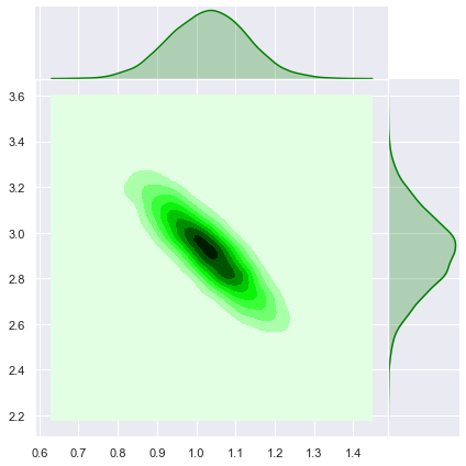
These level curves coincide with the ones obtained above.
A straightforward computation shows that the predictive posterior distribution is given by:
\[ p(y_*|z_*, X, y) = N\left(\frac{1}{\sigma_n^2}z_*^T A^{-1}Xy, z_*^TA^{-1}z_*\right) \]
Regularized Bayesian Linear Regression as a Gaussian Process
A gaussian process is a collection of random variables, any finite number of which have a joint gaussian distribution (See Gaussian Processes for Machine Learning, Ch2 - Section 2.2).
A Gaussian process \(f(x)\) is completely specified by its mean function \(m(x)\) and covariance function \(k(x, x')\). Here \(x \in \mathcal{X}\) denotes a point on the index set \(\mathcal{X}\). These functions are defined by
\[ m(x) = E[f(x)] \quad \text{and} \quad k(x, x') = E[(f(x) - m(x))(f(x') - m(x'))] \]
Claim: The map \(f(x) = x^T b \) defines a Gaussian process.
Proof:
- Let \(x_1, \cdots, x_N \in \mathcal{X}=\mathbb{R}^d\). As \(b\) has a multivariate normal distribution, then every linear combination of its components is normally distributed (see here). In particular, for any \(a_1, \cdots, a_N \in \mathbb{R}\), we see that
\[ \sum_{i=1}^N a_i f(x_i) = \sum_{i=1}^N a_i x_i^Tb = \left(\sum_{i=1}^N a_i x_i\right)^Tb \]
is a linear combination of the components of \(b\), thus is normally distributed. This shows that \(f(x)\) is a gaussian process.
Let us now compute the mean and covariance functions:
\(m (x) = E[f(x)] = x^T E[b] = 0\).
\(k(x, x') = E[f(x)f(x')] = E[x^T b (x')^T b] = E[x^T b b^T x'] = x^T E[bb^T]x' = x^T \Sigma_px'\).
Note that the posterior predictive distribution can be written in therms of this kernel function (more generally, even for non-linear regressions, this statement remains valid in therm of the so called “kernel trick”).
Function-Space View
We can understand a gaussian process, and in particular a regularized bayesian regression, as an inference directly in function space (see details in this post). The main difference in this change of perspective is that we do not sample from the parameters join distribution but rather on the space of functions themselves (to be precise, this function space is infinitely dimensional, so the function is characterized by evaluating it on a finite sample of points which we call the “test” set).
# Number of test points
n_star = 80
# Create test set.
x_star = np.linspace(start=0, stop=1, num=n_star).reshape([1, n_star])
# Add columns of ones.
X_star = np.append(np.ones(n_star).reshape([1, n_star]), x_star, axis=0)
From the calculation above, let us define the kernel function:
def kernel(x_1, x_2, k):
    """Kernel function."""
    z = np.dot(x_1.T, k)

    return np.dot(z, x_2)
Let us compute the kernel image between \(X\) and \(X_*\).
K = kernel(X, X, sigma_p)
K_star = kernel(X_star, X, sigma_p)
K_star_star = kernel(X_star, X_star, sigma_p)
In the function view of regularized linear regression, the kernel on the test set defines the prior distribution on the function space.
cov_prior = K_star_starLet us sample from the prior distribution:
# Number of samples to select.
m = 200

fig, ax = plt.subplots()

for i in range(0, m):

    points_sample = np.random.multivariate_normal(
        mean=np.zeros(n_star),
        cov=cov_prior
    )

    sns.lineplot(
        x=x_star.flatten(),
        y=points_sample,
        color='purple',
        alpha=0.2,
        ax=ax
    )

# Plot "true" linear fit.
sns.lineplot(x=x.T.flatten(), y=f.flatten(), color='red', label='true')
# Plot raw data.
sns.scatterplot(x=x.T.flatten(), y=y.flatten())

ax.set(title='Curves drawn from the GP prior distribution')
ax.legend(loc='lower right');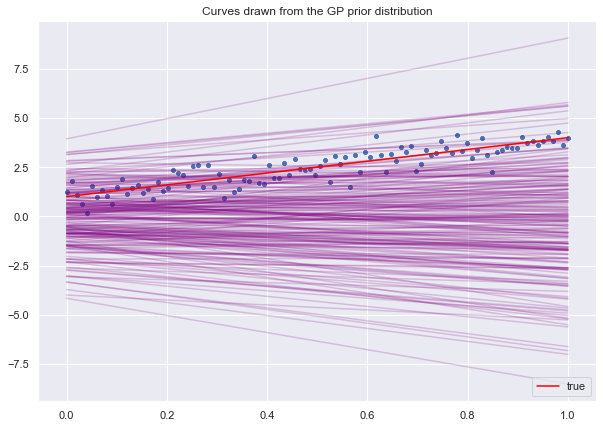
As pointed out above, we can express the posterior predictive distribution iin terms of the kernel function (refer to Gaussian Processes for Machine Learning, Ch 2.2):
mean_posterior = np.dot(np.dot(K_star, np.linalg.inv(K + sigma_n**2*np.eye(n))), y)

cov_posterior = K_star_star - np.dot(np.dot(K_star, np.linalg.inv(K + sigma_n**2*np.eye(n))), K_star.T)
Let us sample from the posterior distribution:
# Number of samples to select.
m = 200

fig, ax = plt.subplots()

for i in range(0, m):

    points_sample = np.random.multivariate_normal(
        mean=mean_posterior.flatten(),
        cov=cov_posterior
    )

    sns.lineplot(
        x=x_star.flatten(),
        y=points_sample,
        color='green',
        alpha=0.2,
        ax=ax
    )

# Plot "true" linear fit.
sns.lineplot(x=x.T.flatten(), y=f.flatten(), color='red', label='true')
# Plot raw data.
sns.scatterplot(x=x.T.flatten(), y=y.flatten())

ax.set(title='Curves drawn from the GP posterior distribution')
ax.legend(loc='lower right');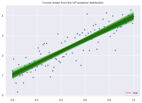
This analysis should give a better intuition on the definition of gaussian process, which at first glance might appear somehow mysterious. I will continue exploring this topic in future posts.