In this post we want to explore the semi-supervided algorithm presented Eldad Haber in the BMS Summer School 2019: Mathematics of Deep Learning, during 19 - 30 August 2019, at the Zuse Institute Berlin. He developed an implementation in Matlab which you can find in this GitHub repository. In addition, please find the corresponding slides here.
Prepare Notebook
import numpy as np
import pandas as pd
import matplotlib.pyplot as plt
import seaborn as sns; sns.set()

%matplotlib inline
Generate Sample Data
Let us generate the sample data as 3 concentric circles:
def generate_circle_sample_data(r, n, sigma):
    """Generates circle data with random gaussian noise."""
    angles = np.random.uniform(low=0, high=2*np.pi, size=n)

    x_epsilon = np.random.normal(loc=0.0, scale=sigma, size=n)
    y_epsilon = np.random.normal(loc=0.0, scale=sigma, size=n)

    x = r*np.cos(angles) + x_epsilon
    y = r*np.sin(angles) + y_epsilon

    return x, y
# Number of classes.
n_c = 3
# Number of samples per class (without label).
n_c_samples = 500
# Radius grid.
r1, r2, r3 = 2, 4, 6
# Noise standard deviation.
sigma = 0.4
x1, y1 = generate_circle_sample_data(r1, n_c_samples, sigma)
x2, y2 = generate_circle_sample_data(r2, n_c_samples, sigma)
x3, y3 = generate_circle_sample_data(r3, n_c_samples, sigma)Let us plot the sample data:
fig, ax = plt.subplots(figsize=(10, 10))

sns.scatterplot(x=x1, y=y1, ax=ax, color='k')
sns.scatterplot(x=x2, y=y2, ax=ax, color='k')
sns.scatterplot(x=x3, y=y3, ax=ax, color='k')

ax.set(title='Raw Data');
Add Labeled Data
Now we generate some labeled samples:
# Set number of labeled samples per class.
n_c_ex = 20
# Total number of labeled samples.
n_ex = n_c*n_c_ex
# Generate labeled data.
q1, p1 = generate_circle_sample_data(2, n_c_ex, sigma)
q2, p2 = generate_circle_sample_data(4, n_c_ex, sigma)
q3, p3 = generate_circle_sample_data(6, n_c_ex, sigma)
Let us plot the complete data set:
fig, ax = plt.subplots(figsize=(10, 10))

sns.scatterplot(x=x1, y=y1, ax=ax, color='k', alpha=0.1)
sns.scatterplot(x=x2, y=y2, ax=ax, color='k', alpha=0.1)
sns.scatterplot(x=x3, y=y3, ax=ax, color='k', alpha=0.1)

sns.scatterplot(x=q1, y=p1, ax=ax, color='b')
sns.scatterplot(x=q2, y=p2, ax=ax, color='r')
sns.scatterplot(x=q3, y=p3, ax=ax, color='g')

ax.set(title='Raw Data + Labeled Data');
# Merge Data
x = np.concatenate([x1, x2, x3, q1, q2, q3]).reshape(-1, 1)
y = np.concatenate([y1, y2, y3, p1, p2, p3]).reshape(-1, 1)

data_matrix = np.concatenate([x, y], axis=1)
Le tus compute the total number of points in the data set:
n = data_matrix.shape[0]
n1560# Common sense check:
n == n_c*(n_c_samples + n_c_ex)TrueGenerate Adjacency Matrix
In the same spirit as in the blog post PyData Berlin 2018: On Laplacian Eigenmaps for Dimensionality Reduction, we consider the adjacency matrix associated to the graph constructed from the data using the \(k\)-nearest neighbors. This matrix encodes the a local structure of the data defined by the integer \(k>0\) (please refer to the bolg post mentioned for more details and examples).
from sklearn.neighbors import kneighbors_graph

# Set nearest neighbors used to compute the graph.
nn = 7
# We compute the adjacency matrix and store it as s sparse matrix.
adjacency_matrix_s = kneighbors_graph(X=data_matrix,n_neighbors=nn)
Let us plot the adjacency matrix:
from scipy import sparse

# Convert to numpy array
adjacency_matrix = adjacency_matrix_s.toarray()

fig, ax = plt.subplots(figsize=(12, 10))
sns.heatmap(adjacency_matrix, ax=ax, cmap='viridis_r')
ax.set(title='Adjacency Matrix');
As the data was not not shuffled, we can see the “cluster” blocks. We also see the three small groups of labeled data on the right column.
Generate Graph Laplacian
Next, we compute the graph Laplacian,
\[L = D - A\]
where \(A\) and \(D\) are the adjacency matrix and the degree matrix of the graph respectively.
graph_laplacian_s = sparse.csgraph.laplacian(csgraph=adjacency_matrix_s, normed=False)graph_laplacian = graph_laplacian_s.toarray()
fig, ax = plt.subplots(figsize=(12, 10))
sns.heatmap(graph_laplacian, ax=ax, cmap='viridis_r')
ax.set(title='Graph Laplacian');
Learning Problem Description
Following the exposition of Eldad Haber, the loss function we want to minimize is:
\[ \min_{U}\mathcal{E}(U) = \min_{U} \left(\text{loss}(U, U_{obs}) + \frac{\alpha}{2} \text{tr}(U^T L U)\right) \]
where
\(\text{loss}(U, U_{obs})\) is the cost function associated with the labels (see details below).
\(\frac{\alpha}{2} \text{tr}(U^T L U)\) encodes the locality property: close points should be similar (to see this go to The Algorithm section of my PyData presentation). In Haber’s words: Try to find the non-constant vector with the minimal energy. The solution should be “smooth” on the graph.
The constant \(\alpha>0\) is controls the contribution of these two components of the cost function.
Construct Loss Function
- One-Hot Encoding of the labels
u_obs = np.zeros(shape=(n_ex, n_c))

# Encode the known labels for each class.
u_obs[0:n_c_ex, 0] = 1
u_obs[n_c_ex:2*n_c_ex, 1] = 1
u_obs[2*n_c_ex:3*n_c_ex, 2] = 1

u_obs.shape
(60, 3)# Get index of labeled data.
label_index = np.arange(start=n_c*n_c_samples, stop=n)# We define a function to project onto the labeled labels.
def project_to_labeled(u, label_index):
"""Project matrix into the set of labeled data."""
return u[label_index, :]- Softmax Loss
We define a function which computes the softmax loss functions of a vector of labels u_obs. Here the distance function is the cross entropy
\[ \text{loss}(U, U_{obs}) = - \frac{1}{m} U^T_{obs} \log(\text{softmax(U})) \]
where \(m\) is the number of labeled data points and
\[ \text{softmax}(z) = \frac{\exp(z)}{\sum \exp(z)} \]
from scipy.special import softmax

def sofmax_loss(c, c_obs):
    """Computes the softmax loss function of two vectors."""
    m = c.shape[0]
    soft_max = np.apply_along_axis(softmax, axis=1, arr=c)
    # Add small epsilon for numerical stability.
    loss = - (1/m)*np.dot(c_obs.T, np.log(soft_max + 0.001))
    loss = np.trace(loss)
return loss- Laplacian Loss
def laplacial_loss(c, graph_laplacian):
    """Loss function associated to the graph Laplacian."""
    loss = 0.5*np.dot(c.T, np.dot(graph_laplacian, c))
    loss = np.trace(loss)
    return loss
def loss(u, u_obs, label_index, graph_laplacian, alpha):
"""Loss function of the semi-supervised algorithm based
on the graph Laplacian.
"""
u_proj = project_to_labeled(u, label_index)
loss = sofmax_loss(u_proj, u_obs) + (alpha/2)*laplacial_loss(u, graph_laplacian)
return lossRun Optimizer
Next, we simply run an optimizer to find a solution for out problem.
Warning: This is done just for illustration purposes. This step must not be overlooked in applications. For example, in this Matlab code the solution is found using inexact Newton"s method.
from scipy.optimize import minimize

# Define initial estimate.
u0 = np.ones(shape=(n, n_c)) / 0.5

# Run optimizer.
optimizer_result = minimize(
    fun = lambda x: loss(x.reshape(n, n_c), u_obs, label_index, graph_laplacian, 1.0),
    x0=u0.flatten()
)
Predict Classes
Finally, let us see the predicted classes:
# Get best parameter.
u_best = optimizer_result.x.reshape(n, n_c)
# Compute classes
u_best_softmax = np.apply_along_axis(softmax, axis=1, arr=u_best)
u_pred = np.argmax(a=u_best_softmax, axis=1)
# Store in a dataframe.
data_df = pd.DataFrame(data_matrix, columns=['x', 'y'])
# Add one to have class labels starting form one.
data_df['pred_class'] = u_pred + 1
# Store as categorical variable.
data_df['pred_class'] = data_df['pred_class'].astype('category')
data_df.head()| x | y | pred_class | |
|---|---|---|---|
| 0 | 2.131937 | -0.026668 | 1 |
| 1 | -1.873468 | 0.788236 | 1 |
| 2 | 2.353201 | -0.567092 | 1 |
| 3 | -0.046962 | 2.220652 | 1 |
| 4 | 0.667804 | -2.905643 | 2 |
fig, ax = plt.subplots(figsize=(10, 10))

sns.scatterplot(
    x='x',
    y='y',
    data=data_df,
    hue='pred_class',
    palette=['b', 'r', 'g'],
    ax=ax
)

ax.set(title='Predicted Classes');
fig, (ax1, ax2) = plt.subplots(ncols=2, sharey=True, figsize=(20, 10))

sns.scatterplot(x=x1, y=y1, ax=ax1, color='k', alpha=0.1)
sns.scatterplot(x=x2, y=y2, ax=ax1, color='k', alpha=0.1)
sns.scatterplot(x=x3, y=y3, ax=ax1, color='k', alpha=0.1)

sns.scatterplot(x=q1, y=p1, ax=ax1, color='b')
sns.scatterplot(x=q2, y=p2, ax=ax1, color='r')
sns.scatterplot(x=q3, y=p3, ax=ax1, color='g')

ax1.set(title='Raw Data + Labeled Data', xlabel='x', ylabel='y')

sns.scatterplot(
    x='x',
    y='y',
    data=data_df,
    hue='pred_class',
    palette=['b', 'r', 'g'],
    ax=ax2
)

ax2.set(title='Predicted Classes');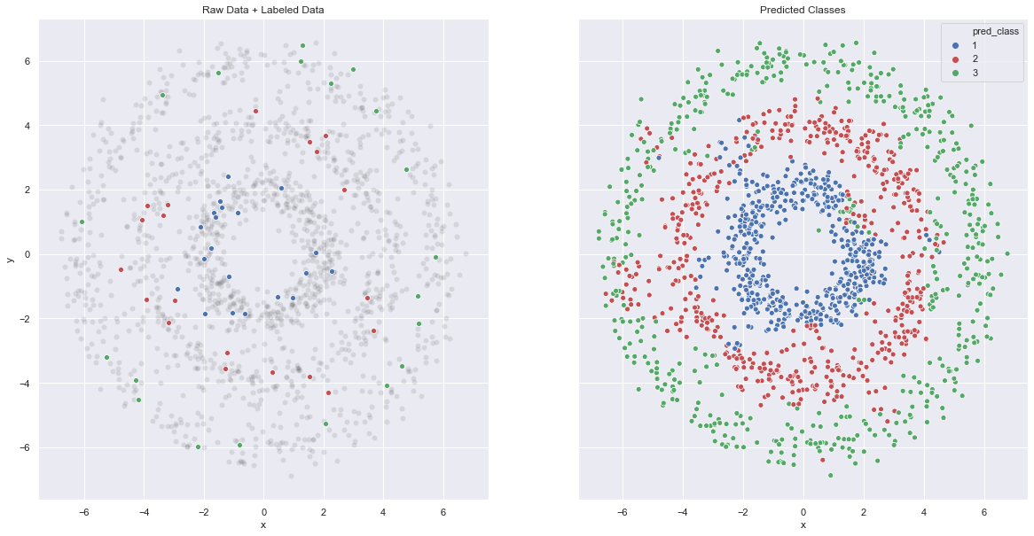
The results are pretty good! To conclude, this algorithm balances a given input of labels and local similarity based on the graph model (representation) of the data. For control on locality, the graph Laplacian (and its spectrum!) is a key ingredient.