In this notebook we study an alternative approach for the cohort analysis problem presented in A Simple Cohort Retention Analysis in PyMC. Instead of using a linear model to estimate the retention rate, we use a Bayesian Additive Regression Tree (BART) model(see pymc-bart). The BART model is a flexible non-parametric model that can be used to model complex relationships between the response and the predictors.
Prepare Notebook
import arviz as az
import matplotlib.pyplot as plt
import matplotlib.ticker as mtick
import numpy as np
import pandas as pd
import pymc as pm
import pymc_bart as pmb
import pytensor.tensor as pt
import seaborn as sns

from scipy.special import expit, logit
from sklearn.preprocessing import LabelEncoder
from pymc_bart.split_rules import ContinuousSplitRule, SubsetSplitRule

az.style.use("arviz-darkgrid")
plt.rcParams["figure.figsize"] = [12, 7]
plt.rcParams["figure.dpi"] = 100
plt.rcParams["figure.facecolor"] = "white"

%load_ext autoreload
%autoreload 2
%config InlineBackend.figure_format = "retina"
seed: int = sum(map(ord, "retention"))
rng: np.random.Generator = np.random.default_rng(seed=seed)Read Data
Here we simply read the data from the previous post.
data_df = pd.read_csv(
    "https://raw.githubusercontent.com/juanitorduz/website_projects/master/data/retention_data.csv",
    parse_dates=["cohort", "period"],
)

data_df.head()
| cohort | n_users | period | age | cohort_age | retention_true_mu | retention_true | n_active_users | revenue | retention | |
|---|---|---|---|---|---|---|---|---|---|---|
| 0 | 2020-01-01 | 150 | 2020-01-01 | 1430 | 0 | -1.807373 | 0.140956 | 150 | 14019.256906 | 1.000000 |
| 1 | 2020-01-01 | 150 | 2020-02-01 | 1430 | 31 | -1.474736 | 0.186224 | 25 | 1886.501237 | 0.166667 |
| 2 | 2020-01-01 | 150 | 2020-03-01 | 1430 | 60 | -2.281286 | 0.092685 | 13 | 1098.136314 | 0.086667 |
| 3 | 2020-01-01 | 150 | 2020-04-01 | 1430 | 91 | -3.206610 | 0.038918 | 6 | 477.852458 | 0.040000 |
| 4 | 2020-01-01 | 150 | 2020-05-01 | 1430 | 121 | -3.112983 | 0.042575 | 2 | 214.667937 | 0.013333 |
Remark: We study the revenue feature in the next post.
We make a data train-test split.
period_train_test_split = "2022-11-01"

train_data_df = data_df.query("period <= @period_train_test_split")
test_data_df = data_df.query("period > @period_train_test_split")
test_data_df = test_data_df[
    test_data_df["cohort"].isin(train_data_df["cohort"].unique())
]
EDA
For a detailed EDA of the data, please refer to the previous post. Here we simply display the most important plots. First, here is the retention matrix:
fig, ax = plt.subplots(figsize=(17, 9))

fmt = lambda y, _: f"{y :0.0%}"

(
    train_data_df.assign(
        cohort=lambda df: df["cohort"].dt.strftime("%Y-%m"),
        period=lambda df: df["period"].dt.strftime("%Y-%m"),
    )
    .query("cohort_age != 0")
    .filter(["cohort", "period", "retention"])
    .pivot(index="cohort", columns="period", values="retention")
    .pipe(
        (sns.heatmap, "data"),
        cmap="viridis_r",
        linewidths=0.2,
        linecolor="black",
        annot=True,
        fmt="0.0%",
        cbar_kws={"format": mtick.FuncFormatter(fmt)},
        ax=ax,
    )
)

ax.set_title("Retention by Cohort and Period")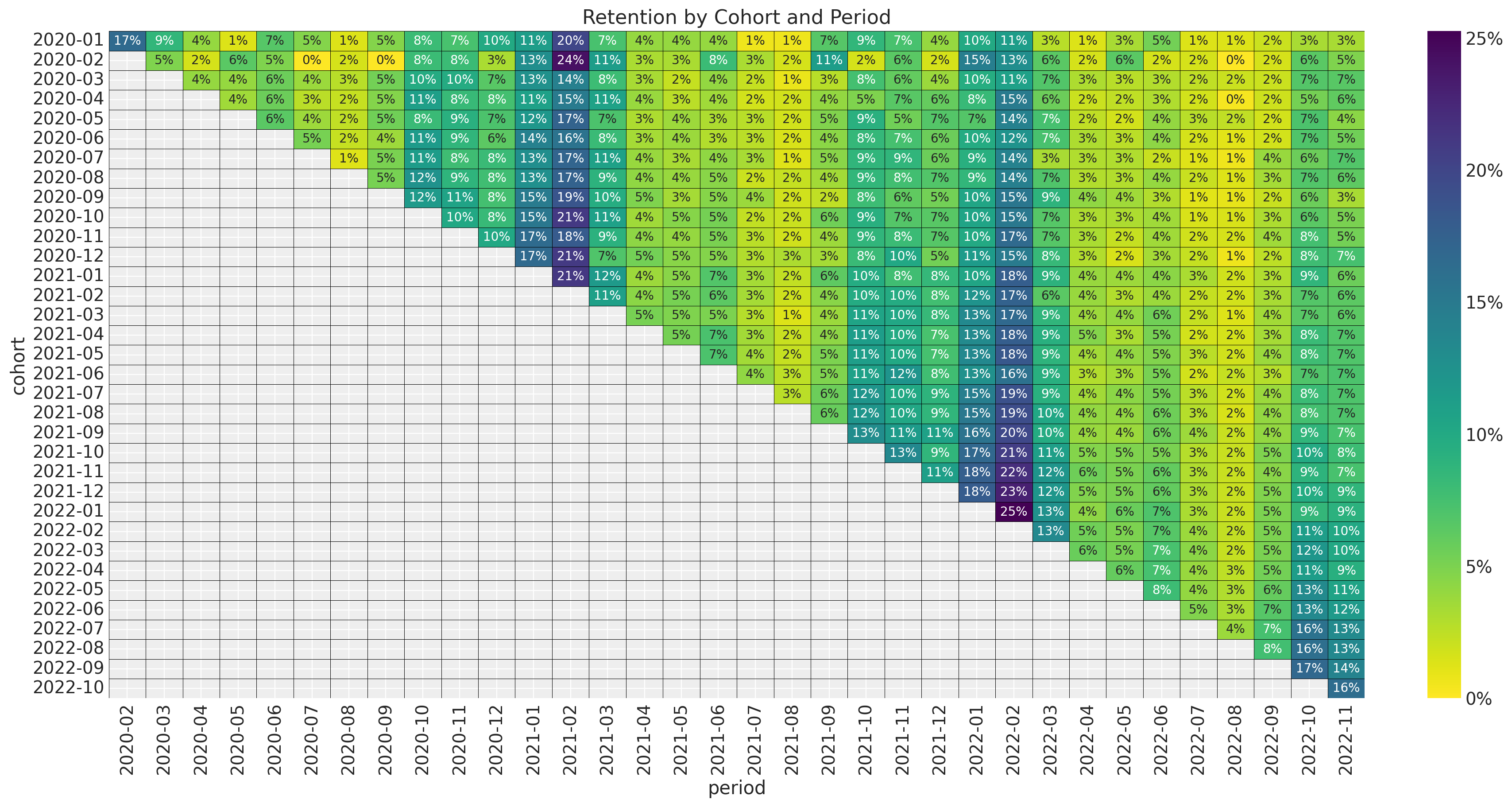
Next we plot the retention rate by cohort over time (period):
fig, ax = plt.subplots(figsize=(12, 7))
sns.lineplot(
    x="period",
    y="retention",
    hue="cohort",
    palette="viridis_r",
    alpha=0.8,
    data=train_data_df.query("cohort_age > 0").assign(
        cohort=lambda df: df["cohort"].dt.strftime("%Y-%m")
    ),
    ax=ax,
)
ax.legend(title="cohort", loc="center left", bbox_to_anchor=(1, 0.5), fontsize=7.5)
ax.set(title="Retention by Cohort and Period")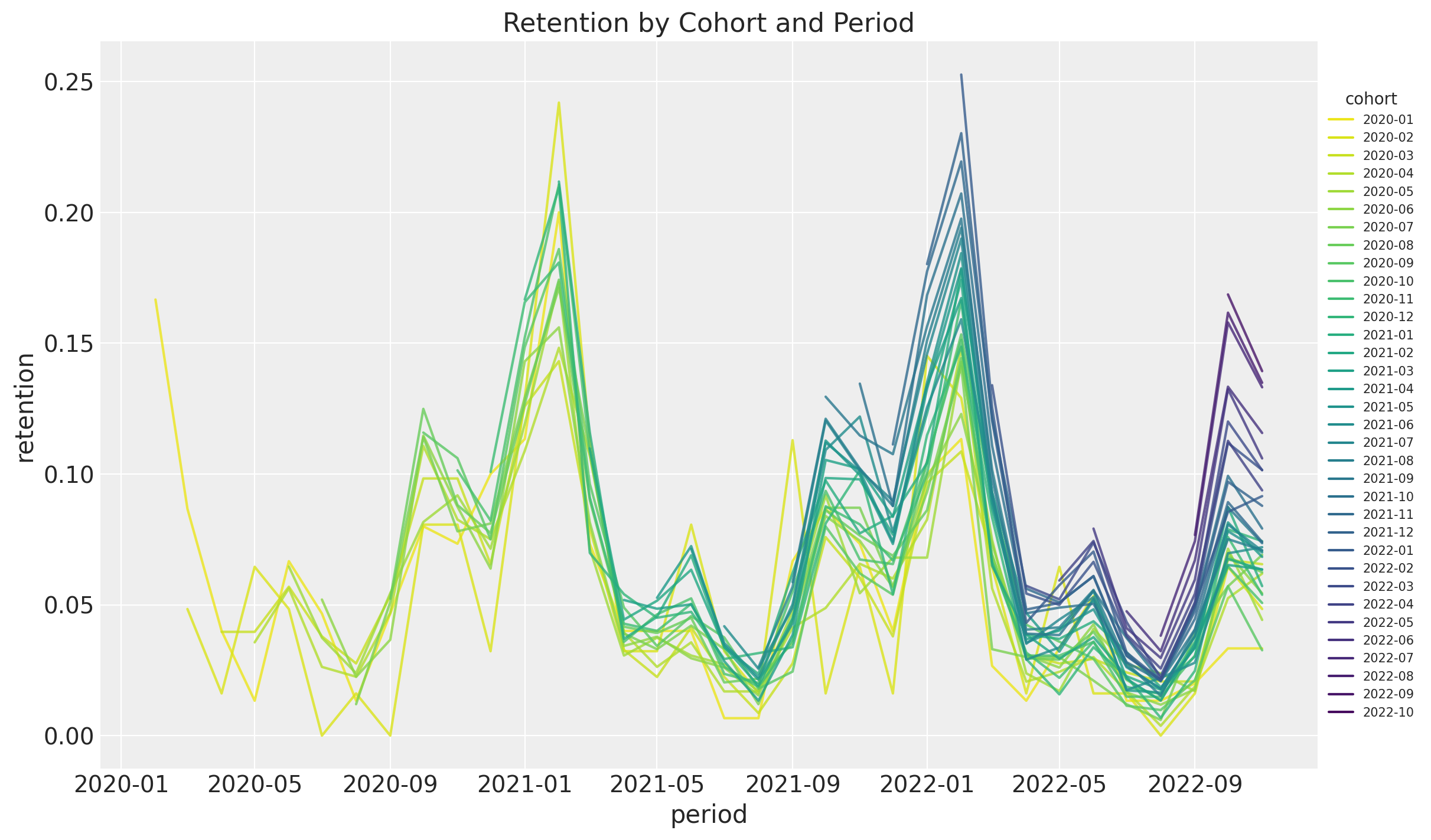
As mentioned in the previous post, we see the following:
- It seems that for a given period, the retention rates of the new cohorts are higher than the retention rates of the older cohorts. This is a clear indication that the retention rate is a function of the absolute cohort age.
- We also see a clear seasonality component in the retention rates.
- For a given cohort, seasonality peaks are decreasing as a function of time (period).
Model
The model we want to test is the following:
\[\begin{align*} N_{\text{active}} & \sim \text{Binomial}(N_{\text{total}}, p) \\ \textrm{logit}(p) & = \text{BART}(\text{cohort age}, \text{age}, \text{month}) \end{align*}\]
That is, we want to use a BART model to estimate the retention rate as a function of the absolute cohort age, the cohort age and the month. Note that we do not need to specify the relation between variables, the BART model will learn it from the data.
Data Transformations
We do similar transformations to the data as for the linear model.
eps = np.finfo(float).eps
train_data_red_df = train_data_df.query("cohort_age > 0").reset_index(drop=True)
train_obs_idx = train_data_red_df.index.to_numpy()
train_n_users = train_data_red_df["n_users"].to_numpy()
train_n_active_users = train_data_red_df["n_active_users"].to_numpy()
train_retention = train_data_red_df["retention"].to_numpy()
train_retention_logit = logit(train_retention + eps)
train_data_red_df["month"] = train_data_red_df["period"].dt.strftime("%m").astype(int)

train_cohort = train_data_red_df["cohort"].to_numpy()
train_cohort_encoder = LabelEncoder()
train_cohort_idx = train_cohort_encoder.fit_transform(train_cohort).flatten()
train_period = train_data_red_df["period"].to_numpy()
train_period_encoder = LabelEncoder()
train_period_idx = train_period_encoder.fit_transform(train_period).flatten()

features: list[str] = ["age", "cohort_age", "month"]
x_train = train_data_red_df[features]
Model Specification
We strongly recommend to take a look into the BART Overview section presented in the pymc-bart documentation. One thing to note is that in all examples presented, the BART model is used to model the expected value of the response variable. In our case, we have a Binomial likelihood, so we need to apply the logit link function to the BART component (Thank you Osvaldo A Martin for the support and indication on some numerical tips and tricks!, see this issue). Let’s see how to do it:
with pm.Model(coords={"feature": features}) as model:
    # --- Data ---
    model.add_coord(name="obs", values=train_obs_idx, mutable=True)
    x = pm.MutableData(name="x", value=x_train, dims=("obs", "feature"))
    n_users = pm.MutableData(name="n_users", value=train_n_users, dims="obs")
    n_active_users = pm.MutableData(
        name="n_active_users", value=train_n_active_users, dims="obs"
    )

    # --- Parametrization ---
    # The BART component models the image of the retention rate under the logit transform
    # so that the range is not constrained to [0, 1].
    mu = pmb.BART(
        name="mu",
        X=x,
        Y=train_retention_logit,
        m=100,
        response="mix",
        split_rules=[ContinuousSplitRule(), ContinuousSplitRule(), SubsetSplitRule()],
        dims="obs",
    )
    # We use the inverse logit transform to get the retention rate back into [0, 1].
    p = pm.Deterministic(name="p", var=pm.math.invlogit(mu), dims="obs")
    # We add a small epsilon to avoid numerical issues.
    p = pt.switch(pt.eq(p, 0), eps, p)
    p = pt.switch(pt.eq(p, 1), 1 - eps, p)

    # --- Likelihood ---
    pm.Binomial(name="likelihood", n=n_users, p=p, observed=n_active_users, dims="obs")

pm.model_to_graphviz(model=model)

Model Fitting
Now we are ready to fit the model.
with model:
    idata = pm.sample(draws=2_000, chains=5, random_seed=rng)
    posterior_predictive = pm.sample_posterior_predictive(trace=idata, random_seed=rng)
Model Diagnostics
We look into some simple diagnostics as described in the BART documentation(see convergence-diagnostics). We plot cumulative distributions for ESS and R-hat values. > For the ESS we want the entire curve above the dashed line, and for R-hat we want the curve to be entirely below the dashed line.
fig, ax = plt.subplots(
    nrows=1, ncols=2, figsize=(10, 4), sharex=False, sharey=True, layout="constrained"
)
pmb.plot_convergence(idata=idata, var_name="mu", kind="ecdf", ax=ax)
fig.suptitle("Diagnostics of the BART Component", y=1.06, fontsize=16)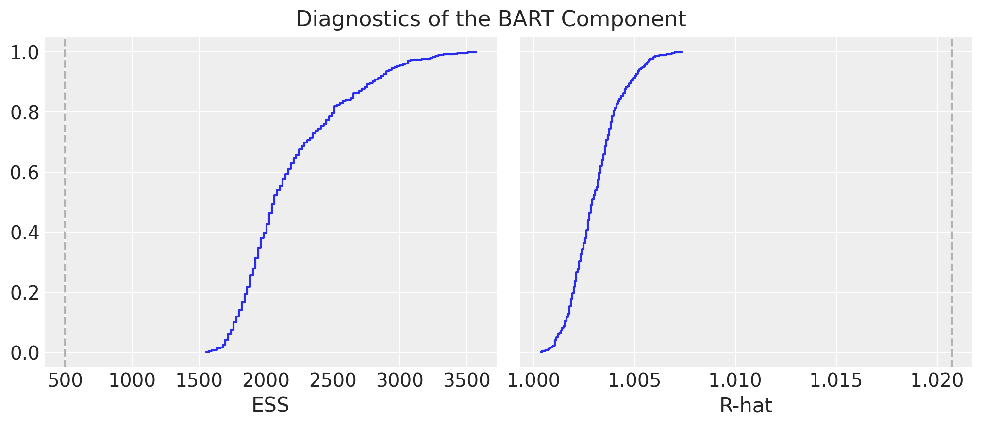
We look into the posterior predictive check:
ax = az.plot_ppc(
    data=posterior_predictive,
    kind="cumulative",
    observed_rug=True,
    random_seed=seed,
)
ax.set(
    title="Posterior Predictive Check",
    xscale="log",
    xlabel="likelihood (n_active_users) - log scale",
)
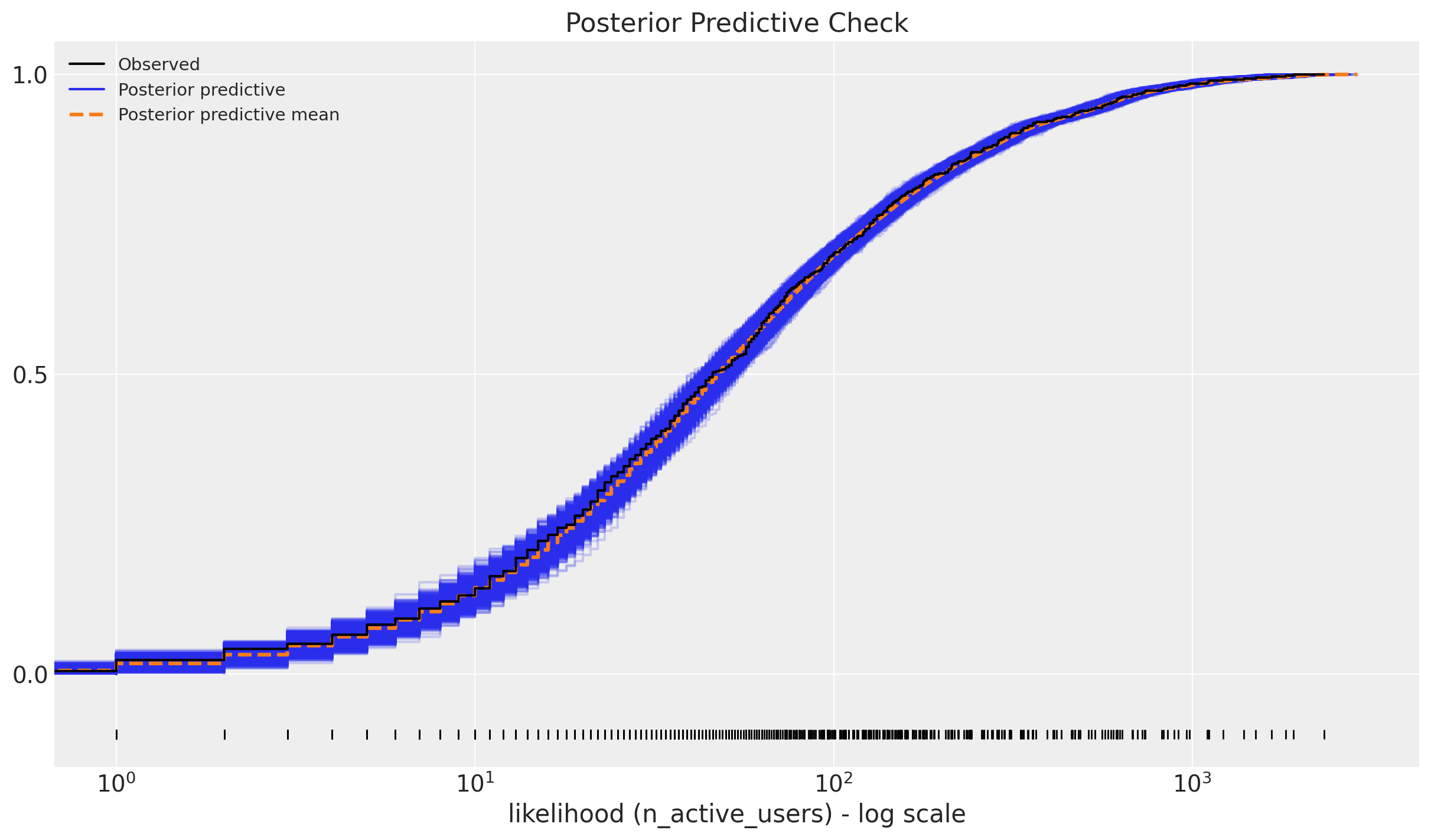
The model seems to be doing a good job 🙂 !
Retention Rate In-Sample Predictions
Let’s see how the model performs in-sample. We plot the retention rate posterior mean predictions for the training data:
train_posterior_retention = (
    posterior_predictive.posterior_predictive / train_n_users[np.newaxis, None]
)
train_posterior_retention_mean = az.extract(
    data=train_posterior_retention, var_names=["likelihood"]
).mean("sample")

fig, ax = plt.subplots(figsize=(10, 9))
sns.scatterplot(
    x="retention",
    y="posterior_retention_mean",
    data=train_data_red_df.assign(
        posterior_retention_mean=train_posterior_retention_mean
    ),
    hue="age",
    palette="viridis_r",
    size="n_users",
    ax=ax,
)
ax.axline(xy1=(0, 0), slope=1, color="black", linestyle="--", label="diagonal")
ax.legend()
ax.set(title="Posterior Predictive - Retention Mean")
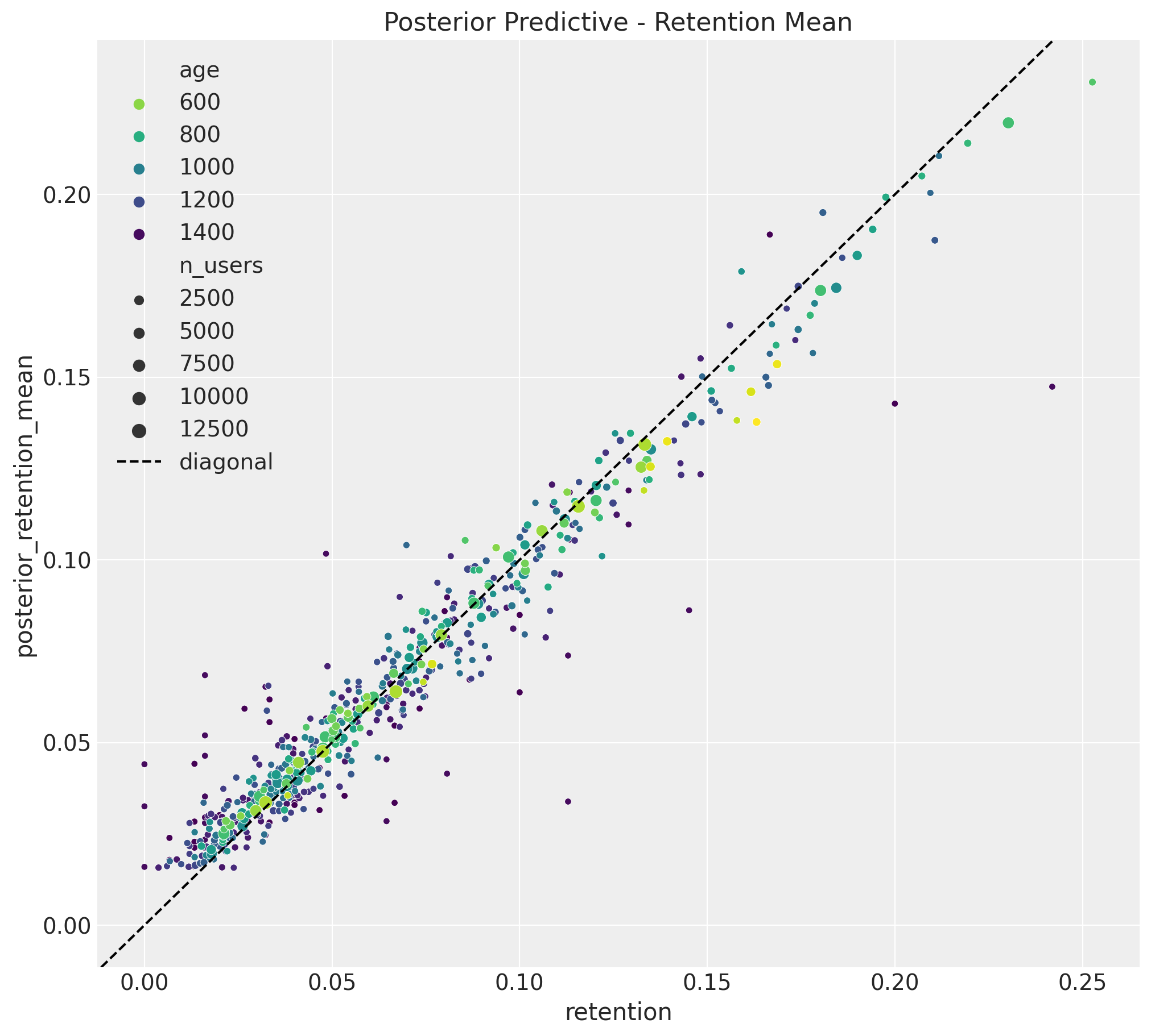
The results look quite good and similar to the linear model!
Next, we look into the uncertainty estimates for a subset of individual cohorts:
train_retention_hdi = az.hdi(ary=train_posterior_retention)["likelihood"]


def plot_train_retention_hdi_cohort(cohort_index: int, ax: plt.Axes) -> plt.Axes:
    mask = train_cohort_idx == cohort_index

    ax.fill_between(
        x=train_period[train_period_idx[mask]],
        y1=train_retention_hdi[mask, :][:, 0],
        y2=train_retention_hdi[mask, :][:, 1],
        alpha=0.3,
        color="C0",
        label="94% HDI (train)",
    )
    sns.lineplot(
        x=train_period[train_period_idx[mask]],
        y=train_retention[mask],
        color="C0",
        marker="o",
        label="observed (train)",
        ax=ax,
    )
    cohort_name = (
        pd.to_datetime(train_cohort_encoder.classes_[cohort_index]).date().isoformat()
    )
    ax.legend(loc="upper left")
    ax.set(title=f"Retention HDI - Cohort {cohort_name}")
    return ax


cohort_index_to_plot = [0, 1, 5, 10, 15, 20, 25, 30]

fig, axes = plt.subplots(
    nrows=np.ceil(len(cohort_index_to_plot) / 2).astype(int),
    ncols=2,
    figsize=(17, 11),
    sharex=True,
    sharey=True,
    layout="constrained",
)

for cohort_index, ax in zip(cohort_index_to_plot, axes.flatten()):
    plot_train_retention_hdi_cohort(cohort_index=cohort_index, ax=ax)

fig.suptitle("In-Sample Retention HDI", y=1.03, fontsize=20, fontweight="bold")
fig.autofmt_xdate()
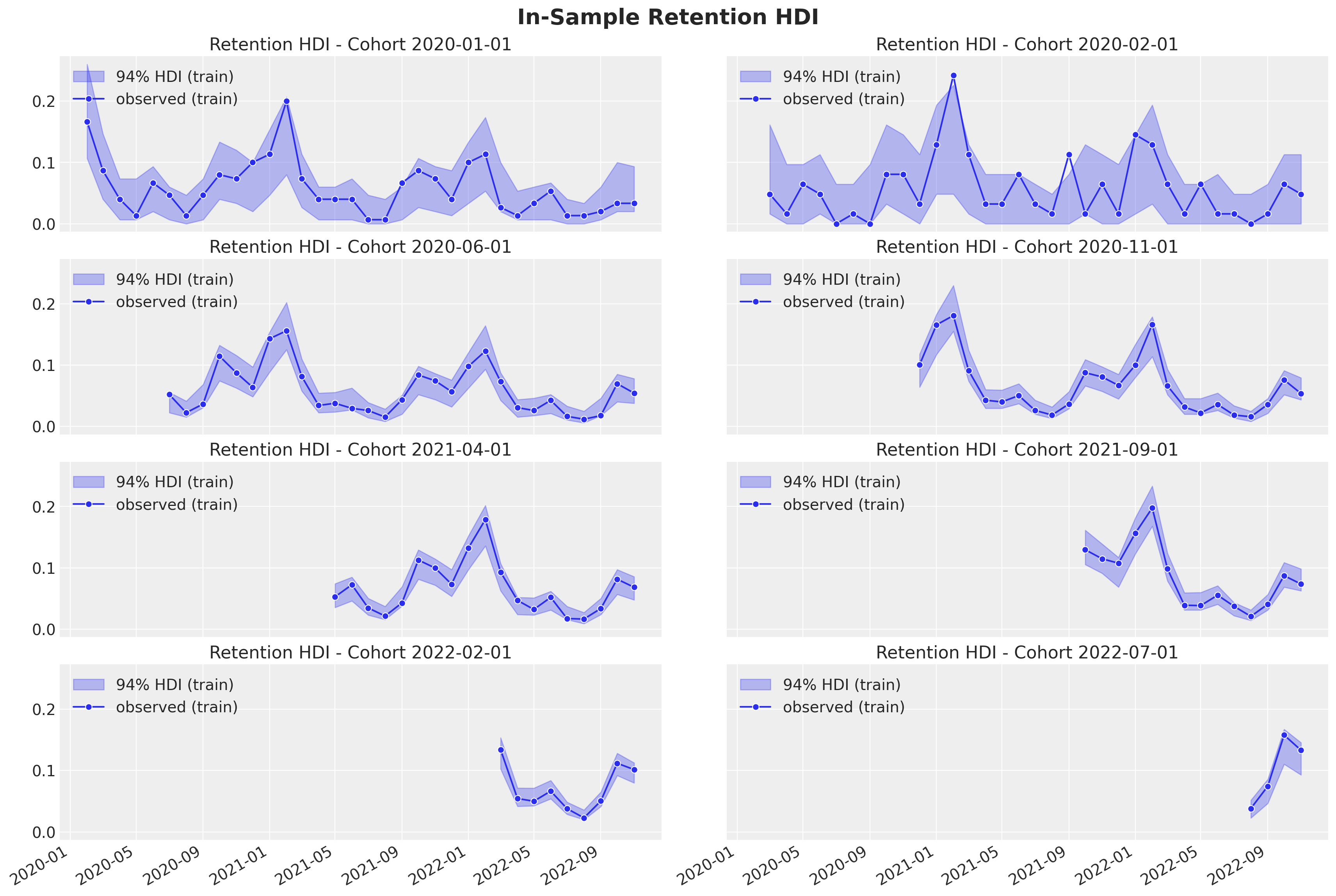
As in the linear model case, we are capturing the retention rate development over time. The uncertainty estimates are also quite similar to the linear model.
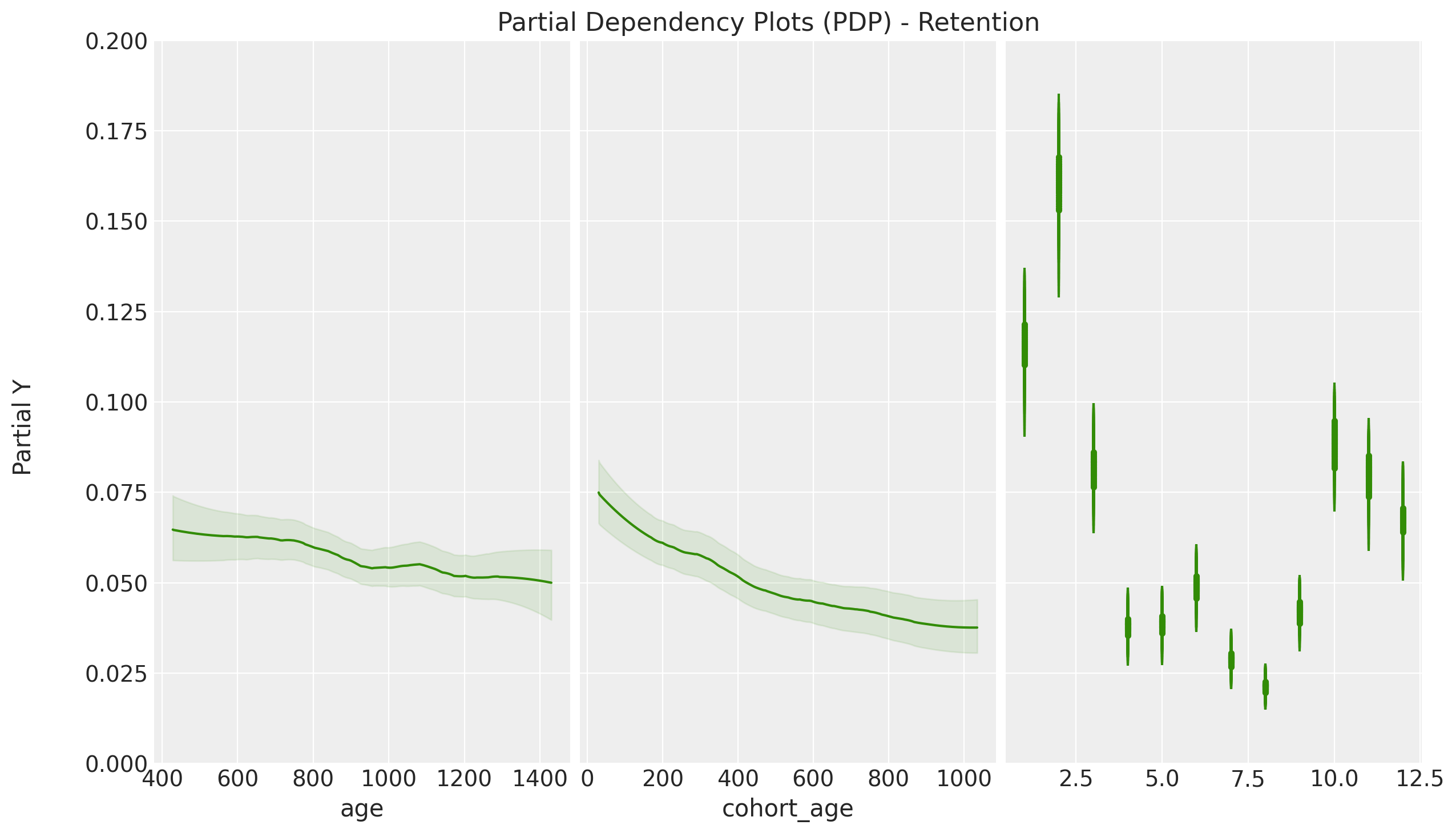
PDP / ICE Plots
One of the nice features of the pymc-bart implementation is that it allows to compute partial dependence plots (PDP) and individual conditional expectation (ICE) plots. These plots help to understand relationships between the response and the predictors. For more details, please refer to the great book Interpretable Machine Learning by Christoph Molnar. For a specific example in python with scikit-learn, please refer to the blog post Exploring Tools for Interpretable Machine Learning.
axes = pmb.plot_pdp(
    bartrv=mu,
    X=x_train,
    Y=train_retention,
    func=expit,
    xs_interval="insample",
    samples=1_000,
    grid="wide",
    color="C2",
    color_mean="C2",
    var_discrete=[2],
    figsize=(12, 7),
    random_seed=seed,
)
axes[0].set(ylim=(0, 0.2))
plt.gcf().suptitle(
    "Partial Dependency Plots (PDP) - Retention",
    fontsize=16,
    y=1.02,
)
axes = pmb.plot_ice(
    bartrv=mu,
    X=x_train,
    Y=train_retention,
    func=expit,
    xs_interval="insample",
    centered=False,
    samples=200,
    instances=20,
    grid="wide",
    color="C2",
    color_mean="C2",
    var_discrete=[2],
    figsize=(12, 7),
    random_seed=seed,
)
axes[0].set(ylim=(0, 0.2))
plt.gcf().suptitle(
    "Individual Conditional Expectation (ICE) Plots - Retention",
    fontsize=16,
    y=1.02,
)
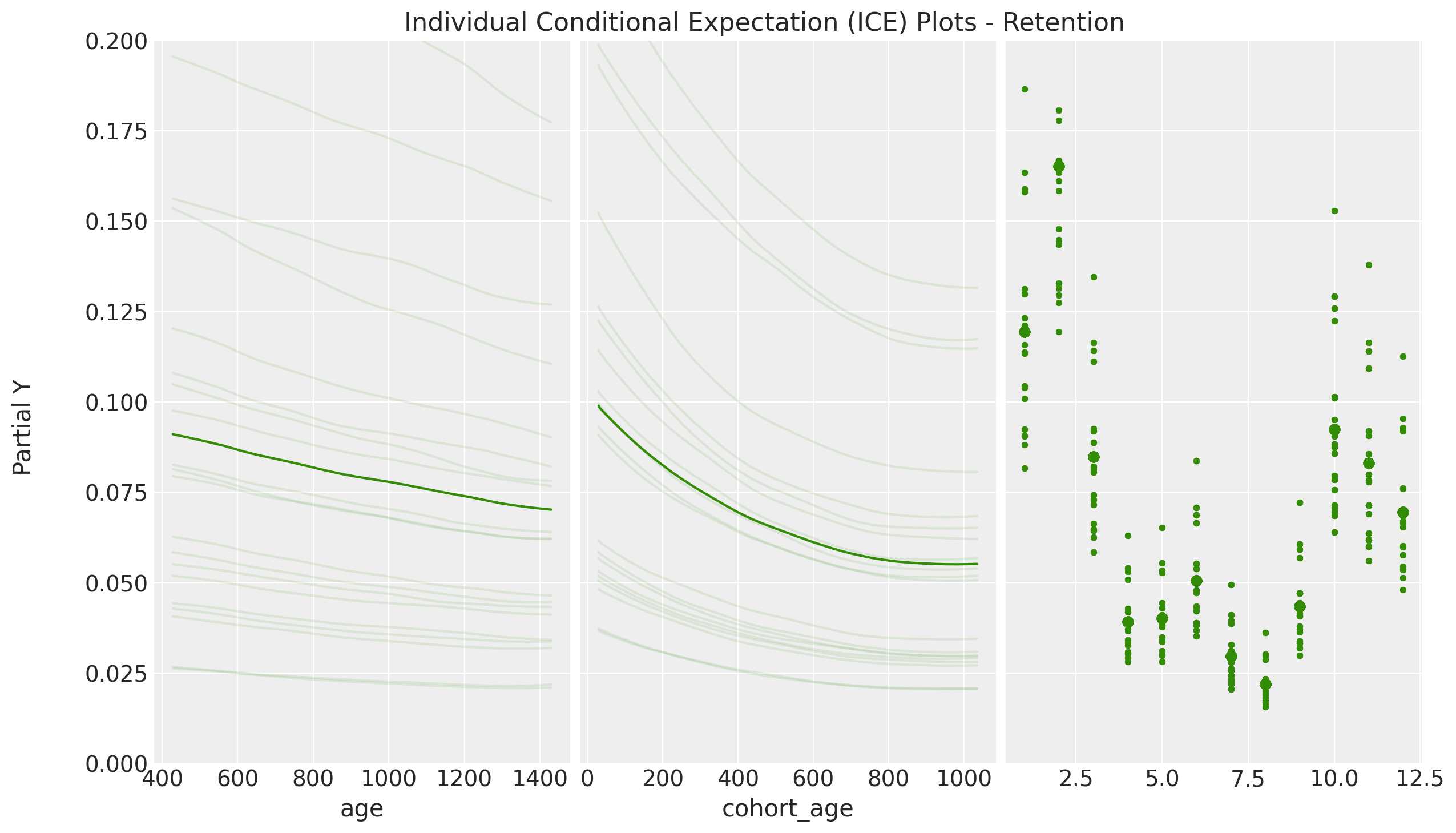
- The PDP / ICE plots how the retention rate decreases with both
cohort_ageandage. This is not surprising as we saw in the EDA. - We see that the ICE plots have a similar trend to the PDP plots. This hints that the interaction effects are not so important in this case. This is also something we saws in the linear model where the interaction coefficient was relatively small (see A Simple Cohort Retention Analysis in PyMC).
- We clearly see the seasonality component of the PDP / ICE plots resemble the regression coefficients in the linear model. This is simply representing the strong seasonal component of the data.
Variable Importance
BART models pymc implementation also provide a measure of variable importance. According to the documentation:
BART itself leads to a simple heuristic to estimate variable importance. That is simple count how many times a variable is included in all the regression trees. The intuition is that if a variable is important they it should appears more often in the fitted trees that less important variables. While this heuristic seems to provide reasonable results in practice, there is not too much theory justifying this procedure, at least not yet.
In addition, this BART implementation also provides a measure of variable importance based the contribution to the \(R^2\). For more details, please refer to the documentation regarding variable importance.
indices, axes = pmb.plot_variable_importance(
    idata=idata, bartrv=mu, X=x_train, random_seed=seed
)
plt.gcf().suptitle("Variable Importance", fontsize=16, y=1.05)
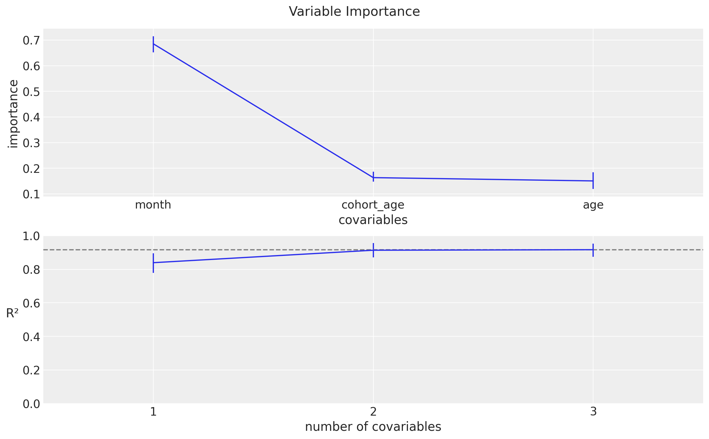
These plots suggest that the once we know the seasonal component and the cohort_age, the age variable is not so important.
Predictions
Now we transform the test data to the same format as the training data and use the model to predict the retention rates. Note that we are using the scalers and encoders from the training data.
Data Transformations
test_data_red_df = test_data_df.query("cohort_age > 0")
test_data_red_df = test_data_red_df[
    test_data_red_df["cohort"].isin(train_data_red_df["cohort"].unique())
].reset_index(drop=True)
test_obs_idx = test_data_red_df.index.to_numpy()
test_n_users = test_data_red_df["n_users"].to_numpy()
test_n_active_users = test_data_red_df["n_active_users"].to_numpy()
test_retention = test_data_red_df["retention"].to_numpy()

test_cohort = test_data_red_df["cohort"].to_numpy()
test_cohort_idx = train_cohort_encoder.transform(test_cohort).flatten()

test_data_red_df["month"] = test_data_red_df["period"].dt.strftime("%m").astype(int)
x_test = test_data_red_df[features]
Out-of-Sample Posterior Predictions
Now we want to see out-of-sample predictions from this model. To begin, we need to compute the posterior predictive distribution for the test data.
with model:
    pm.set_data(
        new_data={
            "x": x_test,
            "n_users": test_n_users,
            "n_active_users": np.ones_like(
                test_n_active_users
            ),  # Dummy data to make coords work! We are not using this at prediction time!
        },
        coords={"obs": test_obs_idx},
    )
    idata.extend(
        pm.sample_posterior_predictive(
            trace=idata,
            var_names=["likelihood", "p", "mu"],
            idata_kwargs={"coords": {"obs": test_obs_idx}},
        )
    )
Retention Rate Out-of-Sample Predictions
Finally we compute the posterior retention rate distributions for the test data and visualize the results.
test_posterior_retention = (
    idata.posterior_predictive["likelihood"] / test_n_users[np.newaxis, None]
)

test_retention_hdi = az.hdi(ary=test_posterior_retention)["likelihood"]
def plot_test_retention_hdi_cohort(cohort_index: int, ax: plt.Axes) -> plt.Axes:
    mask = test_cohort_idx == cohort_index

    test_period_range = test_data_red_df.query(
        f"cohort == '{train_cohort_encoder.classes_[cohort_index]}'"
    )["period"]

    ax.fill_between(
        x=test_period_range,
        y1=test_retention_hdi[mask, :][:, 0],
        y2=test_retention_hdi[mask, :][:, 1],
        alpha=0.3,
        color="C1",
        label="94% HDI (test)",
    )
    sns.lineplot(
        x=test_period_range,
        y=test_retention[mask],
        color="C1",
        marker="o",
        label="observed (test)",
        ax=ax,
    )
    return ax
cohort_index_to_plot = [0, 1, 5, 10, 15, 20, 25, 30]
fig, axes = plt.subplots(
nrows=len(cohort_index_to_plot),
ncols=1,
figsize=(15, 16),
sharex=True,
sharey=True,
layout="constrained",
)
for cohort_index, ax in zip(cohort_index_to_plot, axes.flatten()):
plot_train_retention_hdi_cohort(cohort_index=cohort_index, ax=ax)
plot_test_retention_hdi_cohort(cohort_index=cohort_index, ax=ax)
ax.axvline(
x=pd.to_datetime(period_train_test_split),
color="black",
linestyle="--",
label="train/test split",
)
ax.legend(loc="center left", bbox_to_anchor=(1, 0.5))
fig.suptitle("Retention Predictions", y=1.03, fontsize=20, fontweight="bold")
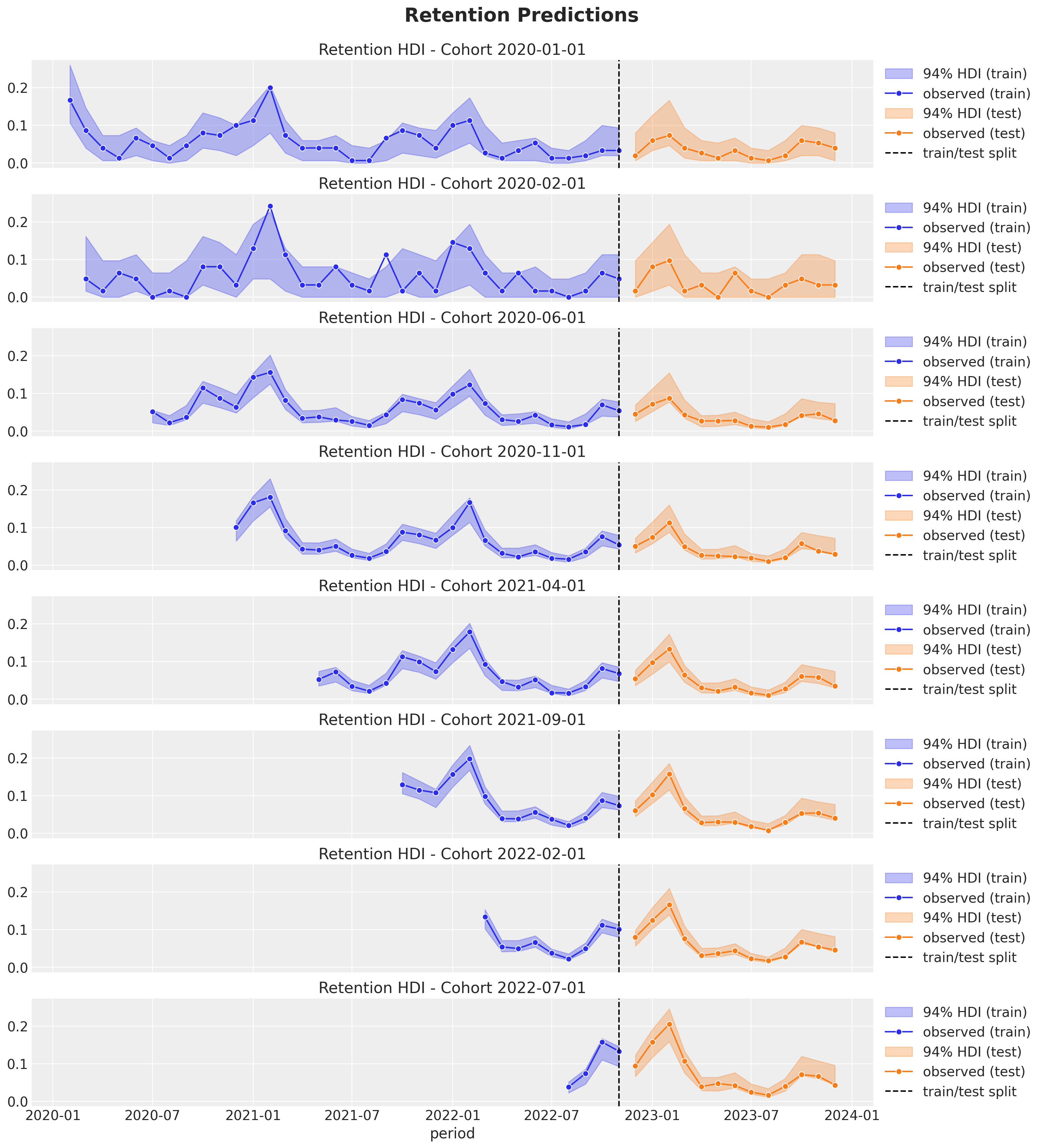
These predictions look quite good as well! They actually do not differ much from linear model. The reason might be that the interaction effects do not seem strong (according to the PDP / ICE plots). That being said, the BART model is more flexible and can capture more complex relationships between the response and the predictors. This could be useful in real-world applications where the data and relationships are more complex.