In this notebook we extend the cohort retention model presented in the post Cohort Retention Analysis with BART so that we just model retention and per cohort simultaneously (we recommend reading the referenced post before this one). The idea is to keep modeling the retention using a Bayesian Additive Regression Tree (BART) model (see pymc-bart) and linearly model the revenue per cohort using a Gamma distribution. We couple the retention and revenue components in a similar way as presented in the notebook Introduction to Bayesian A/B Testing. For this simulated example we use a synthetic data set, see the blog post A Simple Cohort Retention Analysis in PyMC For more details. Here you can find the data to reproduce the results.
Prepare Notebook
import arviz as az
import matplotlib.pyplot as plt
import matplotlib.ticker as mtick
import numpy as np
import pandas as pd
import pymc as pm
import pymc_bart as pmb
import pytensor.tensor as pt
import seaborn as sns

from pymc_bart.split_rules import ContinuousSplitRule, SubsetSplitRule
from scipy.special import logit
from sklearn.preprocessing import MaxAbsScaler, LabelEncoder

az.style.use("arviz-darkgrid")
plt.rcParams["figure.figsize"] = [12, 7]
plt.rcParams["figure.dpi"] = 100
plt.rcParams["figure.facecolor"] = "white"

%load_ext autoreload
%autoreload 2
%config InlineBackend.figure_format = "retina"
seed: int = sum(map(ord, "retention"))
rng: np.random.Generator = np.random.default_rng(seed=seed)Read Data
We start by reading the data from previous posts (see here for the code to generate the data).
data_df = pd.read_csv(
    "https://raw.githubusercontent.com/juanitorduz/website_projects/master/data/retention_data.csv",
    parse_dates=["cohort", "period"],
)

data_df.head()
| cohort | n_users | period | age | cohort_age | retention_true_mu | retention_true | n_active_users | revenue | retention | |
|---|---|---|---|---|---|---|---|---|---|---|
| 0 | 2020-01-01 | 150 | 2020-01-01 | 1430 | 0 | -1.807373 | 0.140956 | 150 | 14019.256906 | 1.000000 |
| 1 | 2020-01-01 | 150 | 2020-02-01 | 1430 | 31 | -1.474736 | 0.186224 | 25 | 1886.501237 | 0.166667 |
| 2 | 2020-01-01 | 150 | 2020-03-01 | 1430 | 60 | -2.281286 | 0.092685 | 13 | 1098.136314 | 0.086667 |
| 3 | 2020-01-01 | 150 | 2020-04-01 | 1430 | 91 | -3.206610 | 0.038918 | 6 | 477.852458 | 0.040000 |
| 4 | 2020-01-01 | 150 | 2020-05-01 | 1430 | 121 | -3.112983 | 0.042575 | 2 | 214.667937 | 0.013333 |
The new component that we have is revenue which represents the revenue per cohort.
data_df["revenue"].describe()
count    1.176000e+03
mean     2.783869e+04
std      1.292528e+05
min      0.000000e+00
25%      8.304124e+02
50%      2.807035e+03
75%      1.099646e+04
max      1.999798e+06
Name: revenue, dtype: float64
Data Preprocessing
In order to understand the user vs revenue relation, let’s compute the revenue per users and per active users. The former represent the overall cohort contribution and the latter the contribution of the active users.
data_df["revenue_per_users"] = data_df["revenue"] / data_df["n_users"]
data_df["revenue_per_active_users"] = data_df["revenue"] / data_df["n_active_users"]
Observe that we have certain periods where we do not have active users. This induces NaN values in the revenue_per_active_users.
data_df.query("revenue_per_active_users.isna()")
| cohort | n_users | period | age | cohort_age | retention_true_mu | retention_true | n_active_users | revenue | retention | revenue_per_users | revenue_per_active_users | |
|---|---|---|---|---|---|---|---|---|---|---|---|---|
| 53 | 2020-02-01 | 62 | 2020-07-01 | 1399 | 151 | -3.542850 | 0.028117 | 0 | 0.0 | 0.0 | 0.0 | NaN |
| 55 | 2020-02-01 | 62 | 2020-09-01 | 1399 | 213 | -3.111235 | 0.042646 | 0 | 0.0 | 0.0 | 0.0 | NaN |
| 78 | 2020-02-01 | 62 | 2022-08-01 | 1399 | 912 | -4.465784 | 0.011365 | 0 | 0.0 | 0.0 | 0.0 | NaN |
| 87 | 2020-02-01 | 62 | 2023-05-01 | 1399 | 1185 | -3.877776 | 0.020277 | 0 | 0.0 | 0.0 | 0.0 | NaN |
| 90 | 2020-02-01 | 62 | 2023-08-01 | 1399 | 1277 | -4.726498 | 0.008780 | 0 | 0.0 | 0.0 | 0.0 | NaN |
We fill these missing values with zero.
data_df.fillna(value={"revenue_per_active_users": 0.0}, inplace=True)
We make a data train-test split.
period_train_test_split = "2022-11-01"

train_data_df = data_df.query("period <= @period_train_test_split")
test_data_df = data_df.query("period > @period_train_test_split")
test_data_df = test_data_df[
    test_data_df["cohort"].isin(train_data_df["cohort"].unique())
]
EDA
For a detailed EDA of the data, please refer to the previous posts (A Simple Cohort Retention Analysis in PyMC and Cohort Retention Analysis with BART). Here we want to focus in the retention and revenue relation. First, let’s recall how the retention matrix looks like.
fig, ax = plt.subplots(figsize=(17, 9))

fmt = lambda y, _: f"{y :0.0%}"

(
    train_data_df.assign(
        cohort=lambda df: df["cohort"].dt.strftime("%Y-%m"),
        period=lambda df: df["period"].dt.strftime("%Y-%m"),
    )
    .query("cohort_age != 0")
    .filter(["cohort", "period", "retention"])
    .pivot(index="cohort", columns="period", values="retention")
    .pipe(
        (sns.heatmap, "data"),
        cmap="viridis_r",
        linewidths=0.2,
        linecolor="black",
        annot=True,
        fmt="0.0%",
        cbar_kws={"format": mtick.FuncFormatter(fmt)},
        ax=ax,
    )
)

ax.set_title("Retention by Cohort and Period")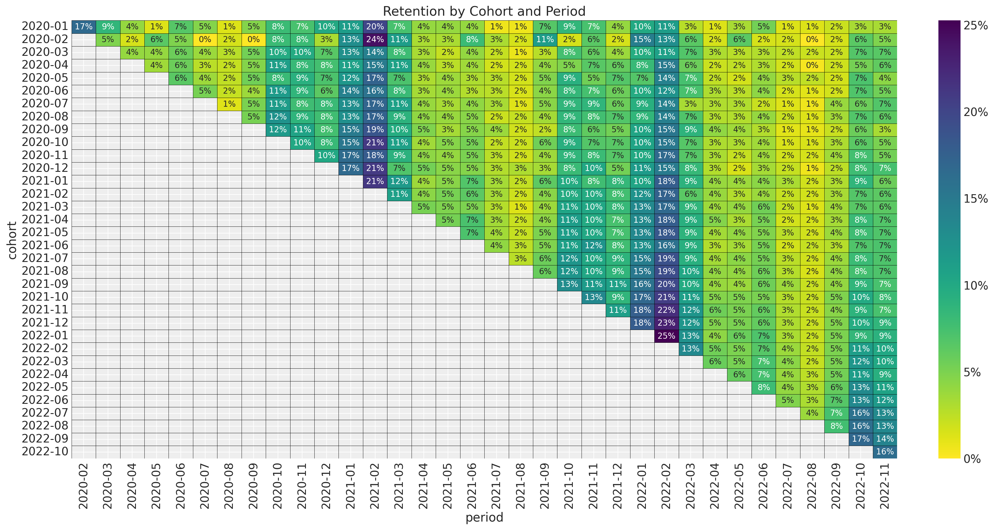
The key observation is that the retention matrix has a clear seasonality pattern (in the period, i.e. observation variable) and seems to be changing as a function of the cohort (i.e. the group variable). This motivates using is a BART model to capture complex interactions between the period, cohort and seasonal variables. In the next figure we plot the retention rate by cohort over time (period) to future illustrate the seasonality pattern.
fig, ax = plt.subplots(figsize=(12, 7))
sns.lineplot(
    x="period",
    y="retention",
    hue="cohort",
    palette="viridis_r",
    alpha=0.8,
    data=train_data_df.query("cohort_age > 0").assign(
        cohort=lambda df: df["cohort"].dt.strftime("%Y-%m")
    ),
    ax=ax,
)
ax.legend(title="cohort", loc="center left", bbox_to_anchor=(1, 0.5), fontsize=7.5)
ax.set(title="Retention by Cohort and Period")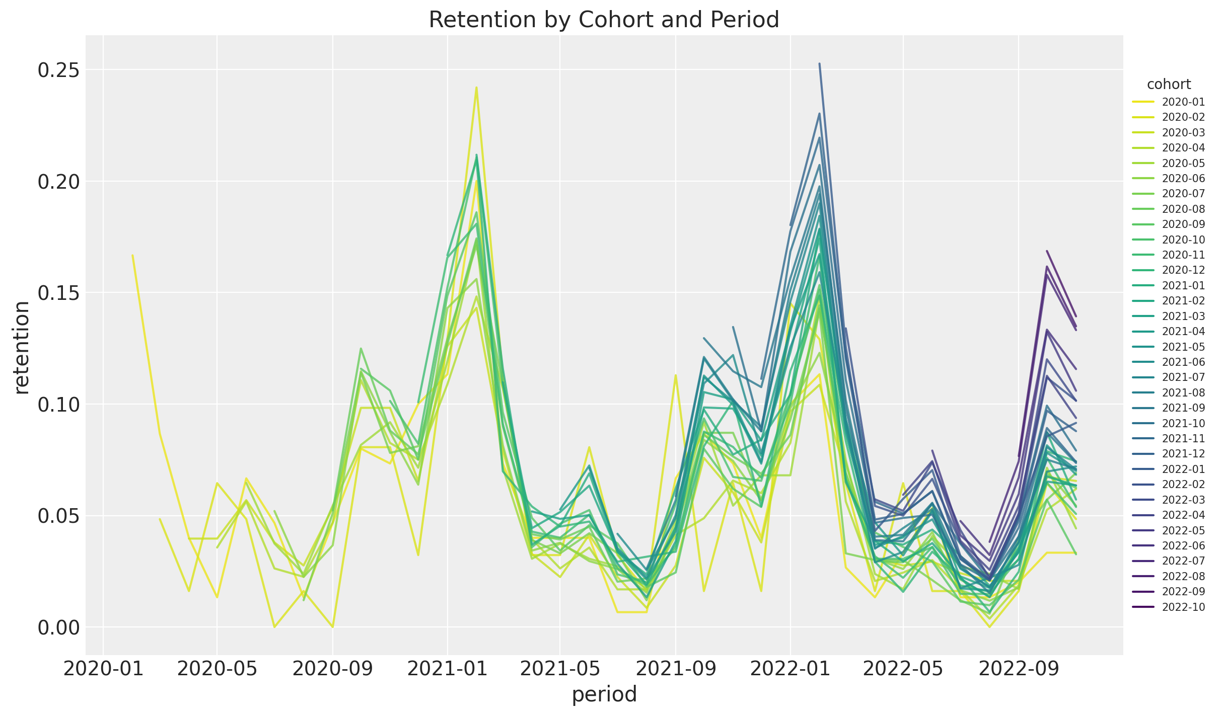
Note that the retention rate by itself hides how big is the cohort. At the very end, one os not just interested in the retention rate but in the value of the cohort. We can start by looking into absolute number of active users per cohort.
fig, ax = plt.subplots(figsize=(17, 9))

fmt = lambda y, _: f"{y :0.0f}"

(
    train_data_df.assign(
        cohort=lambda df: df["cohort"].dt.strftime("%Y-%m"),
        period=lambda df: df["period"].dt.strftime("%Y-%m"),
    )
    .query("cohort_age != 0")
    .filter(["cohort", "period", "n_active_users"])
    .pivot(index="cohort", columns="period", values="n_active_users")
    .pipe(
        (sns.heatmap, "data"),
        cmap="viridis_r",
        linewidths=0.2,
        linecolor="black",
        annot=True,
        annot_kws={"fontsize": 8},
        fmt="0.0f",
        cbar_kws={"format": mtick.FuncFormatter(fmt)},
        ax=ax,
    )
)

ax.set_title("Active Users by Cohort and Period")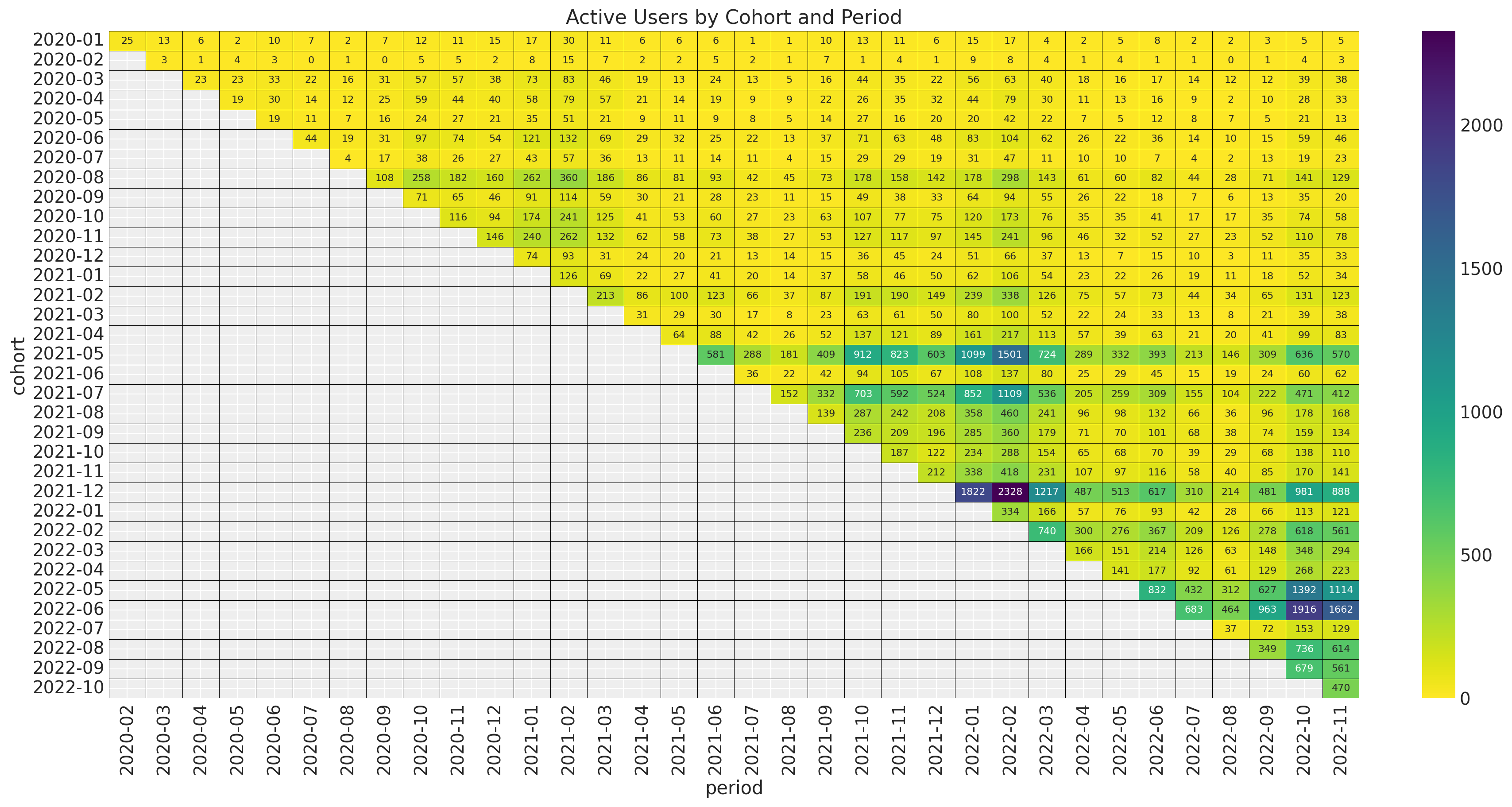
The younger cohorts are much smaller than the older cohorts. Next, we plot the revenue absolute values.
fig, ax = plt.subplots(figsize=(17, 9))

fmt = lambda y, _: f"{y :0.0f}"

(
    train_data_df.assign(
        cohort=lambda df: df["cohort"].dt.strftime("%Y-%m"),
        period=lambda df: df["period"].dt.strftime("%Y-%m"),
    )
    .query("cohort_age != 0")
    .filter(["cohort", "period", "revenue"])
    .pivot(index="cohort", columns="period", values="revenue")
    .pipe(
        (sns.heatmap, "data"),
        cmap="viridis_r",
        linewidths=0.2,
        linecolor="black",
        annot=True,
        annot_kws={"fontsize": 6},
        fmt="0.0f",
        cbar_kws={"format": mtick.FuncFormatter(fmt)},
        ax=ax,
    )
)

ax.set_title("Revenue by Cohort and Period")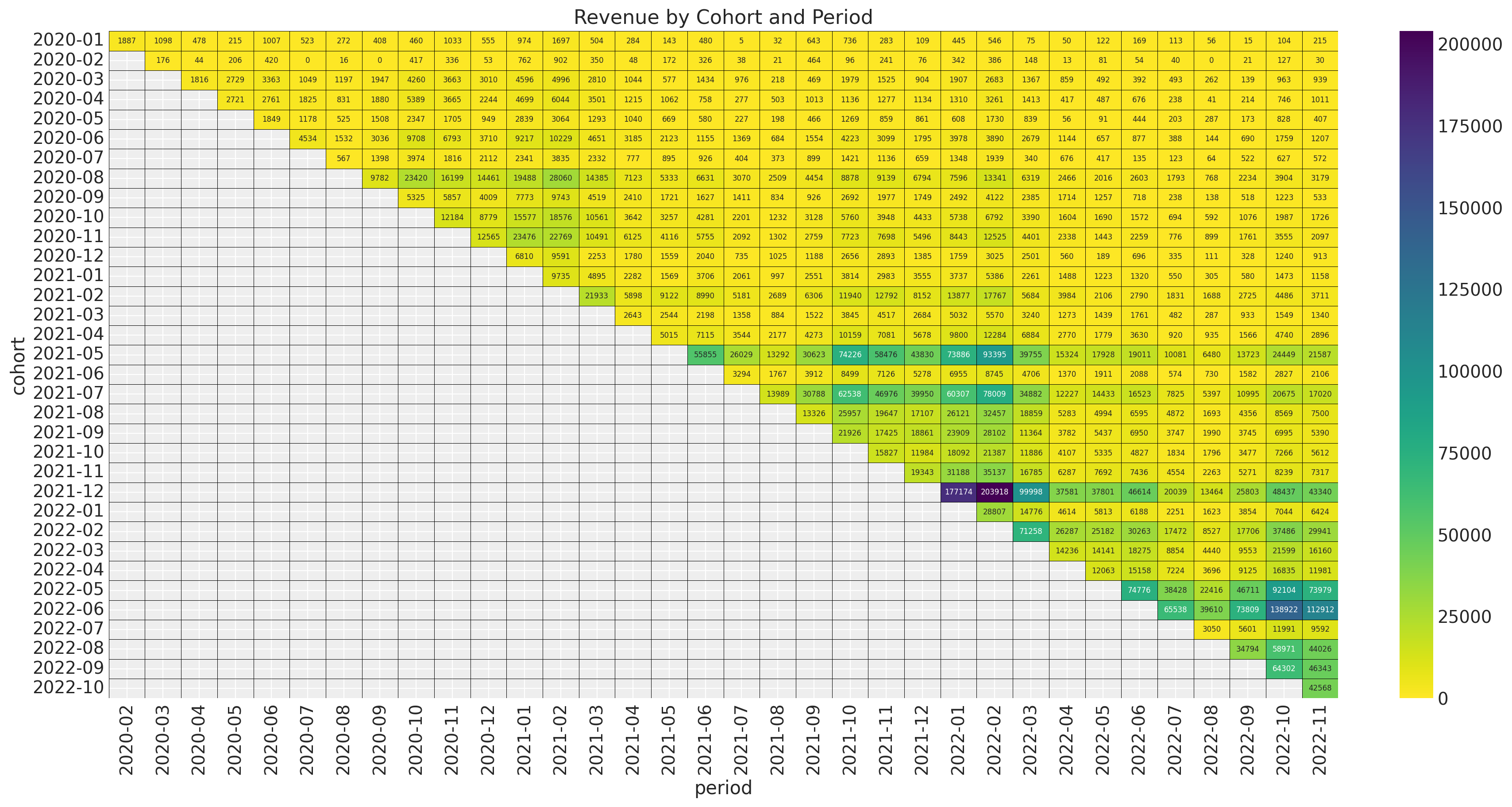
The pattern looks very similar as the number of active users. Hence, we expect the quotient revenue_per_active_users to be relatively stable across cohorts.
fig, ax = plt.subplots(figsize=(17, 9))

fmt = lambda y, _: f"{y :0.0f}"

(
    train_data_df.assign(
        cohort=lambda df: df["cohort"].dt.strftime("%Y-%m"),
        period=lambda df: df["period"].dt.strftime("%Y-%m"),
    )
    .query("cohort_age != 0")
    .filter(["cohort", "period", "revenue_per_active_users"])
    .pivot(index="cohort", columns="period", values="revenue_per_active_users")
    .pipe(
        (sns.heatmap, "data"),
        cmap="viridis_r",
        linewidths=0.2,
        linecolor="black",
        annot=True,
        annot_kws={"fontsize": 9},
        fmt="0.0f",
        cbar_kws={"format": mtick.FuncFormatter(fmt)},
        ax=ax,
    )
)

ax.set_title("Revenue per Active Users by Cohort and Period")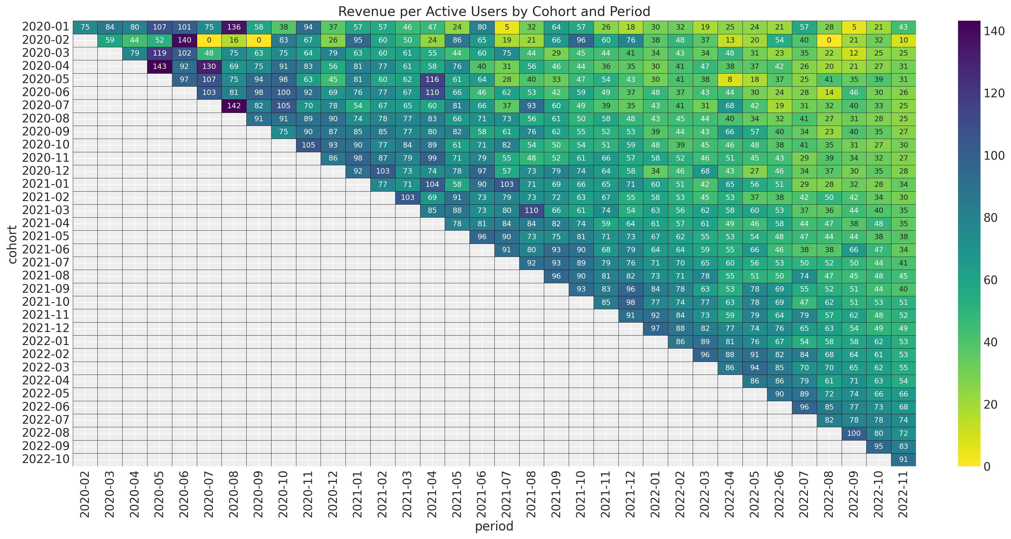
Observe that this ratio does not show a strong seasonality pattern. This suggest that for revenue the model we can simply add the seasonality pattern into the retention rate component. In addition, note that the revenue_per_active_users seems to decrease with the cohort_age linearly. In a similar manner, it seems to increase with the age of the cohort linearly as well.
Finally, we plot the revenue_per_users which includes also users which are not active.
fig, ax = plt.subplots(figsize=(17, 9))

fmt = lambda y, _: f"{y :0.0f}"

(
    train_data_df.assign(
        cohort=lambda df: df["cohort"].dt.strftime("%Y-%m"),
        period=lambda df: df["period"].dt.strftime("%Y-%m"),
    )
    .query("cohort_age != 0")
    .filter(["cohort", "period", "revenue_per_users"])
    .pivot(index="cohort", columns="period", values="revenue_per_users")
    .pipe(
        (sns.heatmap, "data"),
        cmap="viridis_r",
        linewidths=0.2,
        linecolor="black",
        annot=True,
        annot_kws={"fontsize": 9},
        fmt="0.0f",
        cbar_kws={"format": mtick.FuncFormatter(fmt)},
        ax=ax,
    )
)

ax.set_title("Revenue per Users by Cohort and Period")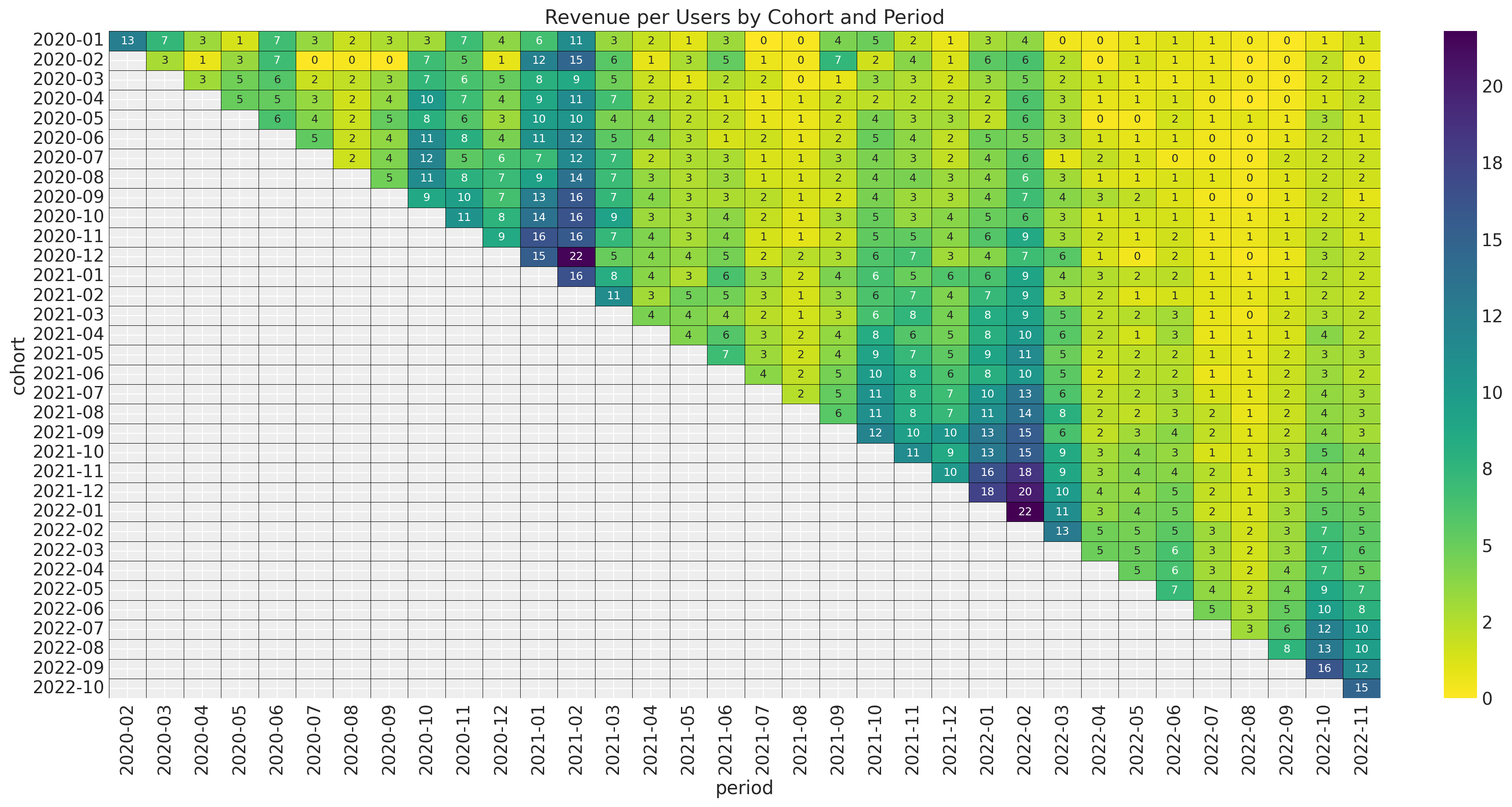
It is no surprise that we observe the seasonal component again (as the cohort size is fixed).
Model
Motivated by the analysis above we suggest the following retention-revenue model.
\[\begin{align*} \text{Revenue} & \sim \text{Gamma}(N_{\text{active}}, \lambda) \\ \log(\lambda) = (& \text{intercept} \\ & + \beta_{\text{cohort age}} \text{cohort age} \\ & + \beta_{\text{age}} \text{age} \\ & + \beta_{\text{cohort age} \times \text{age}} \text{cohort age} \times \text{age} ) \\ N_{\text{active}} & \sim \text{Binomial}(N_{\text{total}}, p) \\ \textrm{logit}(p) & = \text{BART}(\text{cohort age}, \text{age}, \text{month}) \end{align*}\]
Data Transformations
We do similar transformations as in the previous posts.
eps = np.finfo(float).eps
train_data_red_df = train_data_df.query("cohort_age > 0").reset_index(drop=True)
train_obs_idx = train_data_red_df.index.to_numpy()
train_n_users = train_data_red_df["n_users"].to_numpy()
train_n_active_users = train_data_red_df["n_active_users"].to_numpy()
train_retention = train_data_red_df["retention"].to_numpy()
train_retention_logit = logit(train_retention + eps)
train_data_red_df["month"] = train_data_red_df["period"].dt.strftime("%m").astype(int)
train_data_red_df["cohort_month"] = (
    train_data_red_df["cohort"].dt.strftime("%m").astype(int)
)
train_data_red_df["period_month"] = (
    train_data_red_df["period"].dt.strftime("%m").astype(int)
)
train_revenue = train_data_red_df["revenue"].to_numpy() + eps
train_revenue_per_user = train_revenue / (train_n_active_users + eps)

train_cohort = train_data_red_df["cohort"].to_numpy()
train_cohort_encoder = LabelEncoder()
train_cohort_idx = train_cohort_encoder.fit_transform(train_cohort).flatten()
train_period = train_data_red_df["period"].to_numpy()
train_period_encoder = LabelEncoder()
train_period_idx = train_period_encoder.fit_transform(train_period).flatten()

features: list[str] = ["age", "cohort_age", "month"]
x_train = train_data_red_df[features]

train_age = train_data_red_df["age"].to_numpy()
train_age_scaler = MaxAbsScaler()
train_age_scaled = train_age_scaler.fit_transform(train_age.reshape(-1, 1)).flatten()
train_cohort_age = train_data_red_df["cohort_age"].to_numpy()
train_cohort_age_scaler = MaxAbsScaler()
train_cohort_age_scaled = train_cohort_age_scaler.fit_transform(
    train_cohort_age.reshape(-1, 1)
).flatten()
Model Specification
Now we are ready to specify the model in PyMC. - For the retention component please see the details presented in the post Cohort Retention Analysis with BART. - The retention-revenue coupling is motivates by the model presented in the example notebook the post Introduction to Bayesian A/B Testing.
with pm.Model(coords={"feature": features}) as model:
    # --- Data ---
    model.add_coord(name="obs", values=train_obs_idx, mutable=True)
    age_scaled = pm.MutableData(name="age_scaled", value=train_age_scaled, dims="obs")
    cohort_age_scaled = pm.MutableData(
        name="cohort_age_scaled", value=train_cohort_age_scaled, dims="obs"
    )
    x = pm.MutableData(name="x", value=x_train, dims=("obs", "feature"))
    n_users = pm.MutableData(name="n_users", value=train_n_users, dims="obs")
    n_active_users = pm.MutableData(
        name="n_active_users", value=train_n_active_users, dims="obs"
    )
    revenue = pm.MutableData(name="revenue", value=train_revenue, dims="obs")

    # --- Priors ---
    intercept = pm.Normal(name="intercept", mu=0, sigma=1)
    b_age_scaled = pm.Normal(name="b_age_scaled", mu=0, sigma=1)
    b_cohort_age_scaled = pm.Normal(name="b_cohort_age_scaled", mu=0, sigma=1)
    b_age_cohort_age_interaction = pm.Normal(
        name="b_age_cohort_age_interaction", mu=0, sigma=1
    )

    # --- Parametrization ---
    # The BART component models the image of the retention rate under the
    # logit transform so that the range is not constrained to [0, 1].
    mu = pmb.BART(
        name="mu",
        X=x,
        Y=train_retention_logit,
        m=100,
        response="mix",
        split_rules=[ContinuousSplitRule(), ContinuousSplitRule(), SubsetSplitRule()],
        dims="obs",
    )
    # We use the inverse logit transform to get the retention rate back into [0, 1].
    p = pm.Deterministic(name="p", var=pm.math.invlogit(mu), dims="obs")
    # We add a small epsilon to avoid numerical issues.
    p = pt.switch(pt.eq(p, 0), eps, p)
    p = pt.switch(pt.eq(p, 1), 1 - eps, p)

    # For the revenue component we use a Gamma distribution where we combine the number
    # of estimated active users with the average revenue per user.
    lam_log = pm.Deterministic(
        name="lam_log",
        var=intercept
        + b_age_scaled * age_scaled
        + b_cohort_age_scaled * cohort_age_scaled
        + b_age_cohort_age_interaction * age_scaled * cohort_age_scaled,
        dims="obs",
    )

    lam = pm.Deterministic(name="lam", var=pm.math.exp(lam_log), dims="obs")

    # --- Likelihood ---
    n_active_users_estimated = pm.Binomial(
        name="n_active_users_estimated",
        n=n_users,
        p=p,
        observed=n_active_users,
        dims="obs",
    )

    x = pm.Gamma(
        name="revenue_estimated",
        alpha=n_active_users_estimated + eps,
        beta=lam,
        observed=revenue,
        dims="obs",
    )

    mean_revenue_per_active_user = pm.Deterministic(
        name="mean_revenue_per_active_user", var=(1 / lam), dims="obs"
    )
    pm.Deterministic(
        name="mean_revenue_per_user", var=p * mean_revenue_per_active_user, dims="obs"
    )

pm.model_to_graphviz(model=model)
Model Fitting
Now we proceed to fit the model.
with model:
    idata = pm.sample(draws=2_000, chains=5, random_seed=rng)
    posterior_predictive = pm.sample_posterior_predictive(trace=idata, random_seed=rng)
Model Diagnostics
We look into the posterior predictive check:
ax = az.plot_ppc(
    data=posterior_predictive,
    kind="cumulative",
    observed_rug=True,
    grid=(2, 1),
    figsize=(12, 10),
    random_seed=seed,
)
ax[0].set(
    title="Posterior Predictive Check (Retention)",
    xscale="log",
    xlabel="likelihood (n_active_users) - log scale",
)
ax[1].set(
    title="Posterior Predictive Check (Revenue)",
    xscale="log",
    xlabel="likelihood (revenue) - log scale",
    xlim=(1, None),  # to avoid plotting the clipped value `eps`.
)
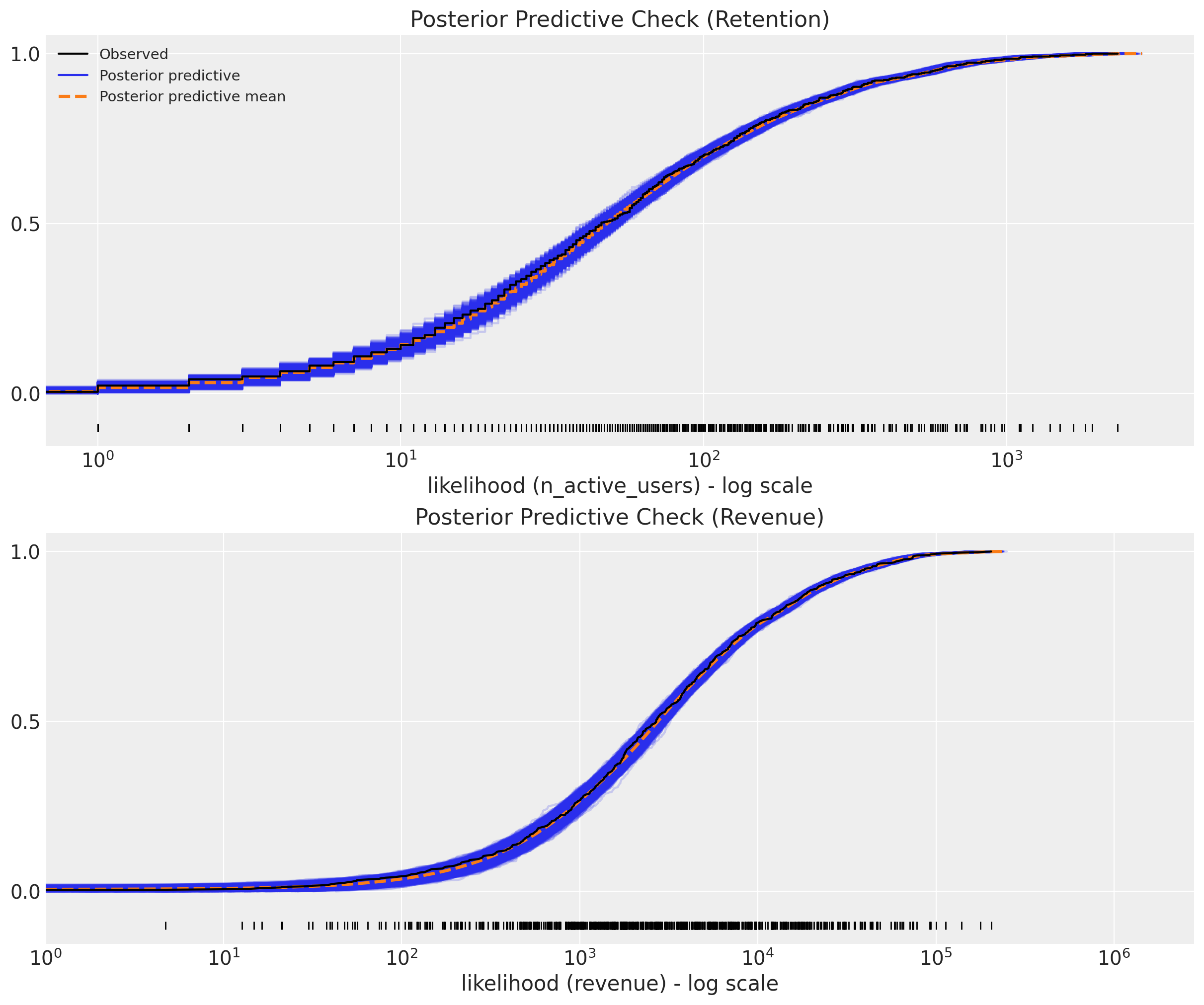
The model fit looks quite good 🚀! Let’s verify we do not have any divergences.
assert idata.sample_stats["diverging"].sum().item() == 0
We can also look into the posterior distribution for the revenue parameters.
_ = az.plot_trace(
    data=idata,
    var_names=[
        "intercept",
        "b_age_scaled",
        "b_cohort_age_scaled",
        "b_age_cohort_age_interaction",
    ],
    compact=True,
    kind="rank_bars",
    backend_kwargs={"figsize": (12, 9), "layout": "constrained"},
)
plt.gcf().suptitle("Model Trace", fontsize=16)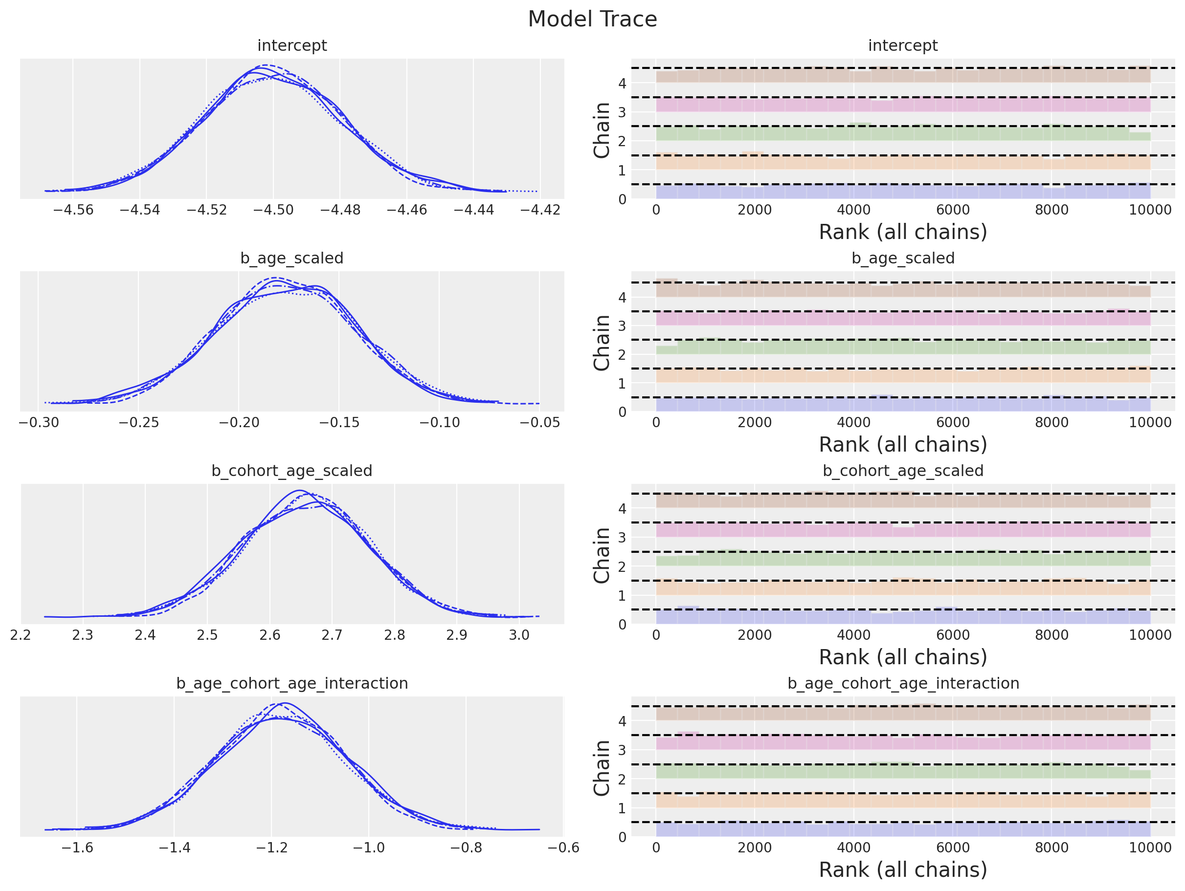
Note that the posterior distribution for the interaction term does not contain zero! We could even try to use another BART model for the revenue component 🤔.
In-Sample Predictions
Before jumping into the model predictions, we start by looking into the in-sample fit. First we consider the posterior means for retention and revenue.
Retention
train_posterior_retention = (
    posterior_predictive.posterior_predictive["n_active_users_estimated"]
    / train_n_users[np.newaxis, None]
)
train_posterior_retention_mean = az.extract(
    data=train_posterior_retention, var_names=["n_active_users_estimated"]
).mean("sample")

fig, ax = plt.subplots(figsize=(10, 9))
sns.scatterplot(
    x="retention",
    y="posterior_retention_mean",
    data=train_data_red_df.assign(
        posterior_retention_mean=train_posterior_retention_mean
    ),
    hue="age",
    palette="viridis_r",
    size="n_users",
    ax=ax,
)
ax.axline(xy1=(0.3, 0.3), slope=1, color="black", linestyle="--", label="diagonal")
ax.legend()
ax.set(title="Posterior Predictive - Retention Mean")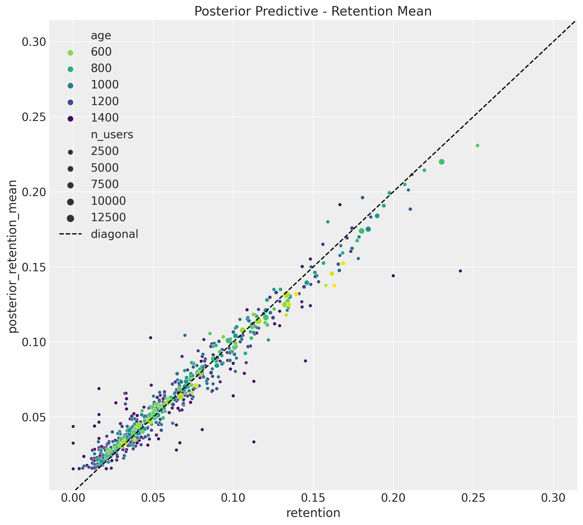
Revenue
train_posterior_revenue_mean = az.extract(
    data=posterior_predictive,
    group="posterior_predictive",
    var_names=["revenue_estimated"],
).mean("sample")

fig, ax = plt.subplots(figsize=(10, 9))
sns.scatterplot(
    x="revenue",
    y="posterior_revenue_mean",
    data=train_data_red_df.assign(posterior_revenue_mean=train_posterior_revenue_mean),
    hue="age",
    palette="viridis_r",
    size="n_users",
    ax=ax,
)
ax.axline(xy1=(1e5, 1e5), slope=1, color="black", linestyle="--", label="diagonal")
ax.legend()
ax.set(
    title="Posterior Predictive - Revenue Mean",
    xscale="log",
    yscale="log",
    xlabel="revenue (log)",
    ylabel="posterior_revenue_mean (log)",
)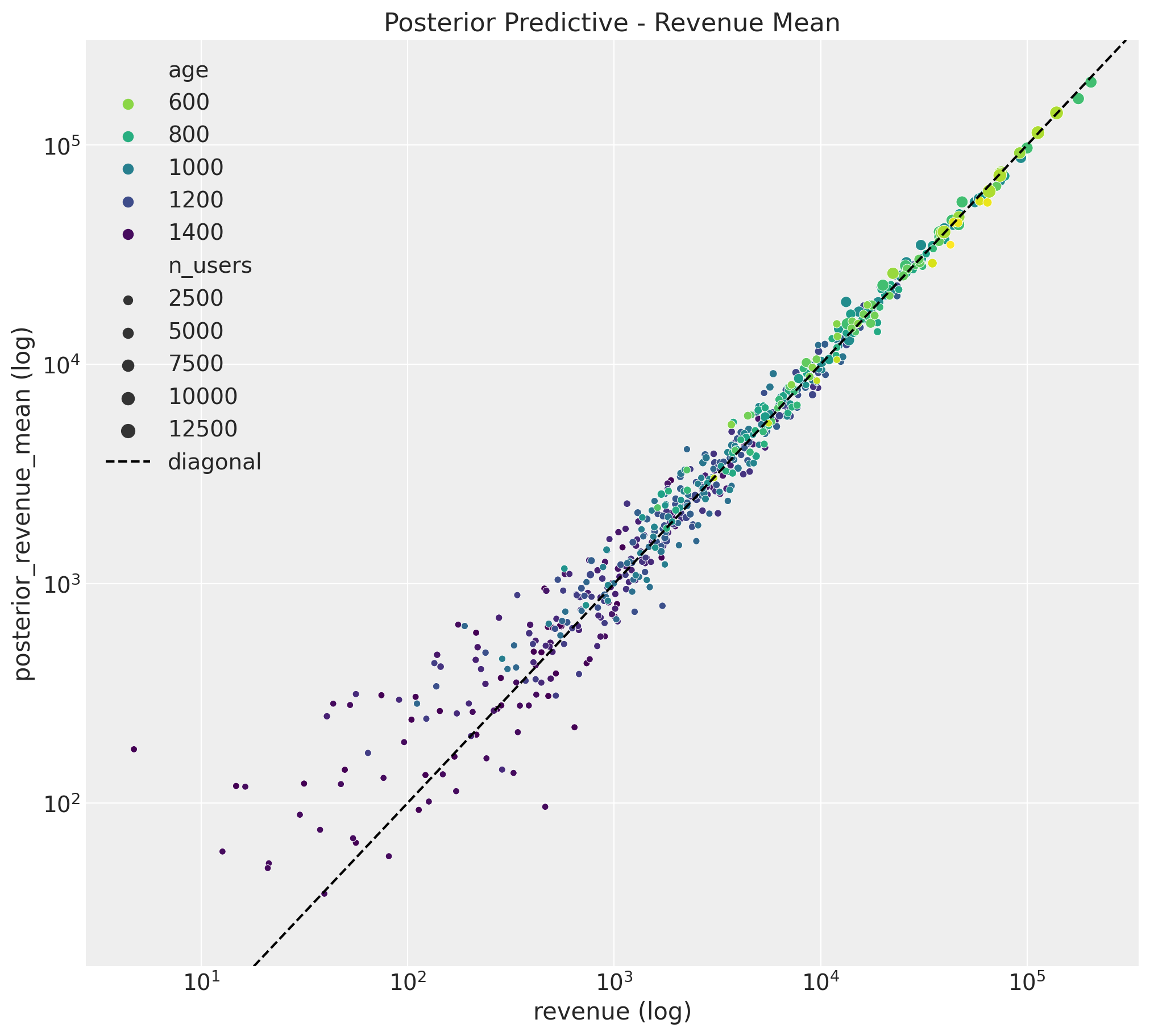
Both results look good!
We continue by looking into the uncertainty estimates for a subset of individual cohorts:
Retention
train_retention_hdi = az.hdi(ary=train_posterior_retention)["n_active_users_estimated"]


def plot_train_retention_hdi_cohort(cohort_index: int, ax: plt.Axes) -> plt.Axes:
    mask = train_cohort_idx == cohort_index

    ax.fill_between(
        x=train_period[train_period_idx[mask]],
        y1=train_retention_hdi[mask, :][:, 0],
        y2=train_retention_hdi[mask, :][:, 1],
        alpha=0.3,
        color="C0",
        label="94% HDI (train)",
    )
    sns.lineplot(
        x=train_period[train_period_idx[mask]],
        y=train_retention[mask],
        color="C0",
        marker="o",
        label="observed retention (train)",
        ax=ax,
    )
    cohort_name = (
        pd.to_datetime(train_cohort_encoder.classes_[cohort_index]).date().isoformat()
    )
    ax.legend(loc="upper left")
    ax.set(title=f"Retention HDI - Cohort {cohort_name}")
    return ax


cohort_index_to_plot = [0, 1, 5, 10, 15, 20, 25, 30]

fig, axes = plt.subplots(
    nrows=np.ceil(len(cohort_index_to_plot) / 2).astype(int),
    ncols=2,
    figsize=(17, 11),
    sharex=True,
    sharey=True,
    layout="constrained",
)

for cohort_index, ax in zip(cohort_index_to_plot, axes.flatten()):
    plot_train_retention_hdi_cohort(cohort_index=cohort_index, ax=ax)

fig.suptitle("In-Sample Retention HDI", y=1.03, fontsize=20, fontweight="bold")
fig.autofmt_xdate()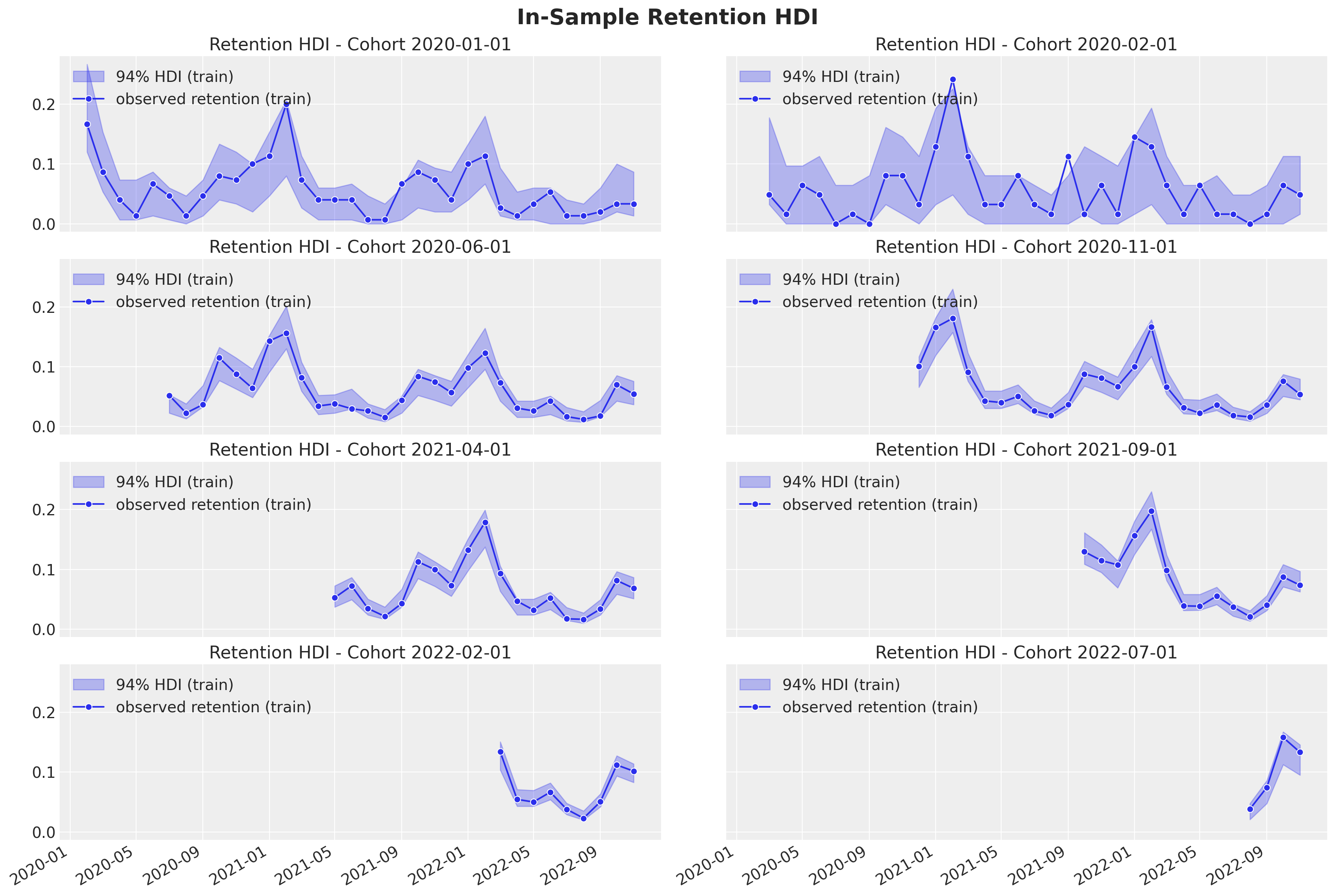
Revenue
train_revenue_hdi = az.hdi(ary=posterior_predictive.posterior_predictive)[
    "revenue_estimated"
]


def plot_train_revenue_hdi_cohort(cohort_index: int, ax: plt.Axes) -> plt.Axes:
    mask = train_cohort_idx == cohort_index

    ax.fill_between(
        x=train_period[train_period_idx[mask]],
        y1=train_revenue_hdi[mask, :][:, 0],
        y2=train_revenue_hdi[mask, :][:, 1],
        alpha=0.3,
        color="C0",
        label="94% HDI (train)",
    )
    sns.lineplot(
        x=train_period[train_period_idx[mask]],
        y=train_revenue[mask],
        color="C0",
        marker="o",
        label="observed revenue (train)",
        ax=ax,
    )
    cohort_name = (
        pd.to_datetime(train_cohort_encoder.classes_[cohort_index]).date().isoformat()
    )
    ax.legend(loc="upper left")
    ax.set(title=f"revenue HDI - Cohort {cohort_name}")
    return ax


cohort_index_to_plot = [0, 1, 5, 10, 15, 20, 25, 30]

fig, axes = plt.subplots(
    nrows=np.ceil(len(cohort_index_to_plot) / 2).astype(int),
    ncols=2,
    figsize=(17, 11),
    sharex=True,
    sharey=False,
    layout="constrained",
)

for cohort_index, ax in zip(cohort_index_to_plot, axes.flatten()):
    plot_train_revenue_hdi_cohort(cohort_index=cohort_index, ax=ax)

fig.suptitle("In-Sample Revenue HDI", y=1.03, fontsize=20, fontweight="bold")
fig.autofmt_xdate()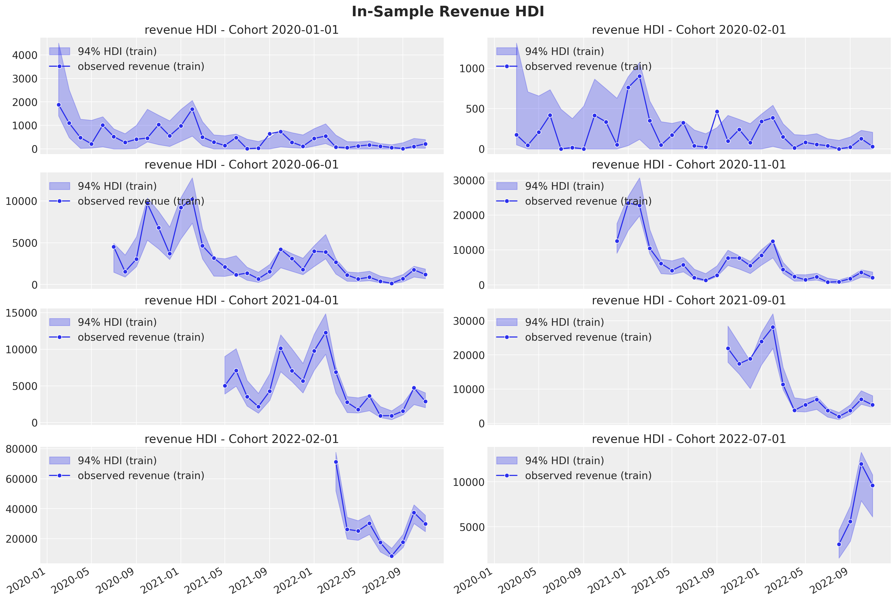
The model seems to be capturing the seasonality pattern in the revenue component quite well 🙌! Specially for the cohorts with a larger number of base users.
Revenue per User
We now deep dive into the revenue per user and revenue per active user. For visualization purposes, we analyze the posterior means.
fig, ax = plt.subplots(
    nrows=2,
    ncols=1,
    figsize=(10, 8),
    sharex=True,
    sharey=False,
    layout="constrained",
)

(
    train_data_red_df.assign(
        mean_revenue_per_user_mean=idata.posterior["mean_revenue_per_user"].mean(
            dim=["chain", "draw"]
        ),
    ).pipe(
        (sns.scatterplot, "data"),
        x="cohort_age",
        y="mean_revenue_per_user_mean",
        hue="age",
        palette="viridis_r",
        size="n_users",
        ax=ax[0],
    )
)
ax[0].legend(loc="center left", bbox_to_anchor=(1, 0.5))
ax[0].set(title="Mean Revenue Per User")

(
    train_data_red_df.assign(
        mean_revenue_per_active_user_mean=idata.posterior[
            "mean_revenue_per_active_user"
        ].mean(dim=["chain", "draw"]),
    ).pipe(
        (sns.scatterplot, "data"),
        x="cohort_age",
        y="mean_revenue_per_active_user_mean",
        hue="age",
        palette="viridis_r",
        size="n_users",
        ax=ax[1],
    )
)
ax[1].legend(loc="center left", bbox_to_anchor=(1, 0.5))
ax[1].set(title="Mean Revenue Per Active User")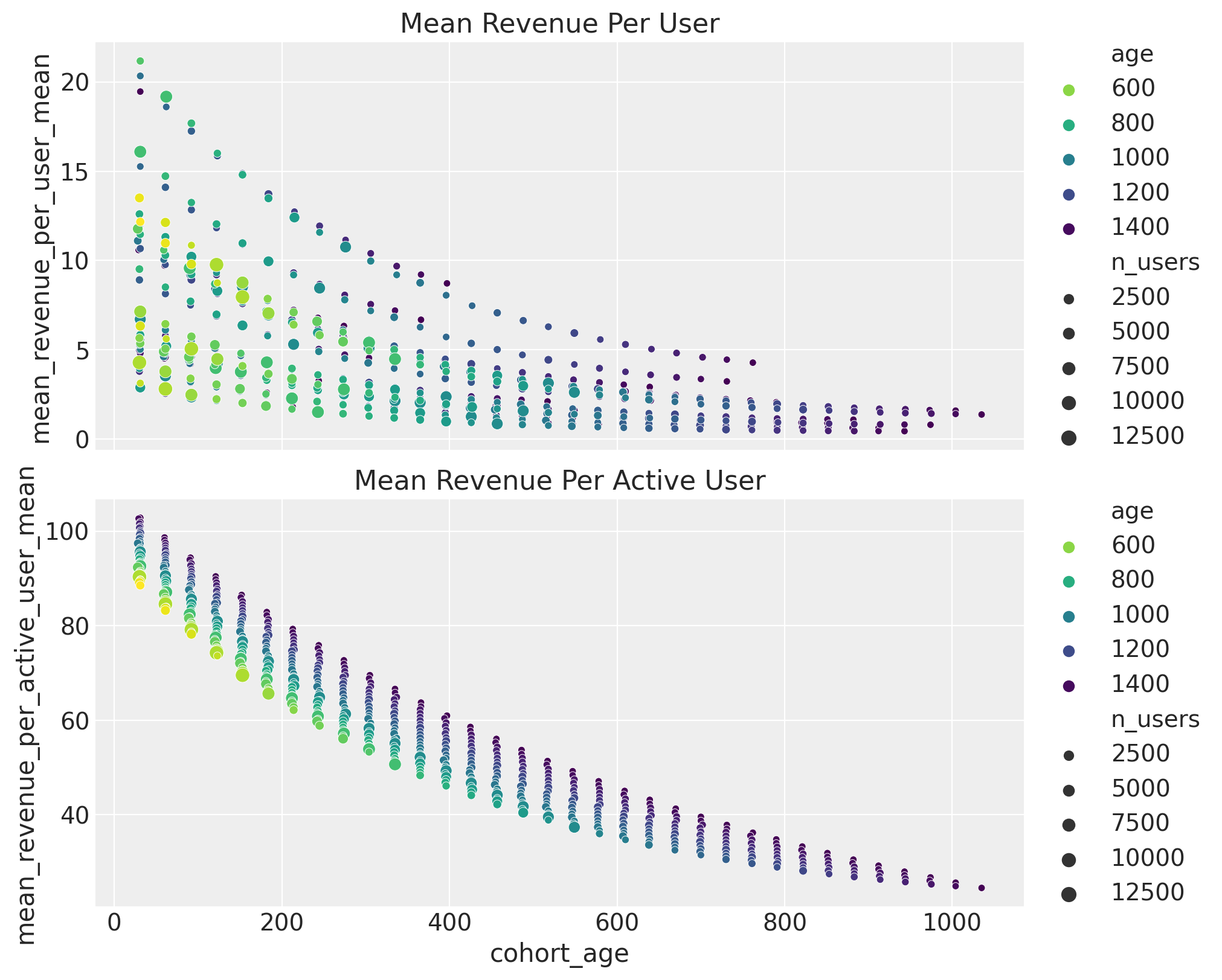
Here are some takeaways:
- The revenue per user decreases with the
cohort_age. - For a given
cohort_age, the revenue per user increases with theage. - The revenue per active user also decreases with the
cohort_age. Hence, active customers are spending less money.
Predictions
Finally, we look into the model out-of-sample predictions so that we can compare with our test set. As in previous posts, it is crucial to have a proper handling of the data transformations.
Data Transformations
test_data_red_df = test_data_df.query("cohort_age > 0")
test_data_red_df = test_data_red_df[
    test_data_red_df["cohort"].isin(train_data_red_df["cohort"].unique())
].reset_index(drop=True)
test_obs_idx = test_data_red_df.index.to_numpy()
test_n_users = test_data_red_df["n_users"].to_numpy()
test_n_active_users = test_data_red_df["n_active_users"].to_numpy()
test_retention = test_data_red_df["retention"].to_numpy()
test_revenue = test_data_red_df["revenue"].to_numpy()

test_cohort = test_data_red_df["cohort"].to_numpy()
test_cohort_idx = train_cohort_encoder.transform(test_cohort).flatten()

test_data_red_df["month"] = test_data_red_df["period"].dt.strftime("%m").astype(int)
test_data_red_df["cohort_month"] = (
    test_data_red_df["cohort"].dt.strftime("%m").astype(int)
)
test_data_red_df["period_month"] = (
    test_data_red_df["period"].dt.strftime("%m").astype(int)
)
x_test = test_data_red_df[features]

test_age = test_data_red_df["age"].to_numpy()
test_age_scaled = train_age_scaler.transform(test_age.reshape(-1, 1)).flatten()
test_cohort_age = test_data_red_df["cohort_age"].to_numpy()
test_cohort_age_scaled = train_cohort_age_scaler.transform(
    test_cohort_age.reshape(-1, 1)
).flatten()
Out-of-Sample Posterior Predictions
We now calculate the posterior predictive distribution for the test data.
with model:
    pm.set_data(
        new_data={
            "age_scaled": test_age_scaled,
            "cohort_age_scaled": test_cohort_age_scaled,
            "x": x_test,
            "n_users": test_n_users,
            "n_active_users": np.ones_like(
                test_n_active_users
            ),  # Dummy data to make coords work! We are not using this at prediction time!
            "revenue": np.ones_like(
                test_revenue
            ),  # Dummy data to make coords work! We are not using this at prediction time!
        },
        coords={"obs": test_obs_idx},
    )
    idata.extend(
        pm.sample_posterior_predictive(
            trace=idata,
            var_names=[
                "p",
                "mu",
                "n_active_users_estimated",
                "revenue_estimated",
                "mean_revenue_per_user",
                "mean_revenue_per_active_user",
            ],
            idata_kwargs={"coords": {"obs": test_obs_idx}},
            random_seed=rng,
        )
    )
Retention and Revenue Out-of-Sample Predictions
Similarly as above, we plot the posterior predictive distribution for the retention and revenue components for a subset of cohorts.
test_posterior_retention = (
    idata.posterior_predictive["n_active_users_estimated"]
    / test_n_users[np.newaxis, None]
)

test_retention_hdi = az.hdi(ary=test_posterior_retention)["n_active_users_estimated"]
test_revenue_hdi = az.hdi(ary=idata.posterior_predictive)["revenue_estimated"]
def plot_test_retention_hdi_cohort(cohort_index: int, ax: plt.Axes) -> plt.Axes:
mask = test_cohort_idx == cohort_index
test_period_range = test_data_red_df.query(
f"cohort == '{train_cohort_encoder.classes_[cohort_index]}'"
)["period"]
ax.fill_between(
x=test_period_range,
y1=test_retention_hdi[mask, :][:, 0],
y2=test_retention_hdi[mask, :][:, 1],
alpha=0.3,
color="C1",
label="94% HDI (test)",
)
sns.lineplot(
x=test_period_range,
y=test_retention[mask],
color="C1",
marker="o",
label="observed retention (test)",
ax=ax,
)
return ax
cohort_index_to_plot = [0, 1, 5, 10, 15, 20, 25, 30]

fig, axes = plt.subplots(
    nrows=len(cohort_index_to_plot),
    ncols=1,
    figsize=(15, 16),
    sharex=True,
    sharey=True,
    layout="constrained",
)

for cohort_index, ax in zip(cohort_index_to_plot, axes.flatten()):
    plot_train_retention_hdi_cohort(cohort_index=cohort_index, ax=ax)
    plot_test_retention_hdi_cohort(cohort_index=cohort_index, ax=ax)
    ax.axvline(
        x=pd.to_datetime(period_train_test_split),
        color="black",
        linestyle="--",
        label="train/test split",
    )
    ax.legend(loc="center left", bbox_to_anchor=(1, 0.5))
fig.suptitle("Retention Predictions", y=1.03, fontsize=20, fontweight="bold")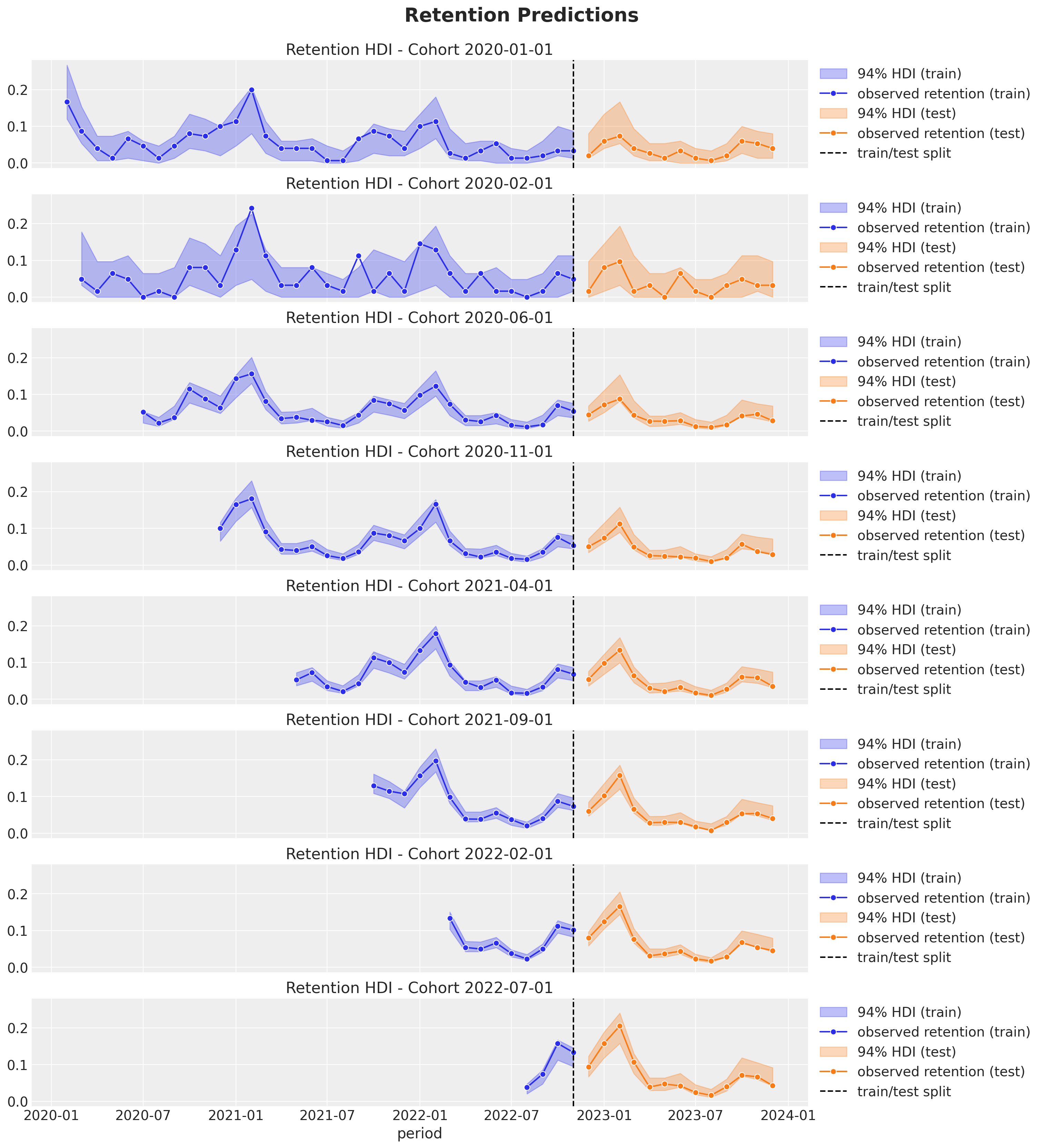
def plot_test_revenue_hdi_cohort(cohort_index: int, ax: plt.Axes) -> plt.Axes:
    mask = test_cohort_idx == cohort_index

    test_period_range = test_data_red_df.query(
        f"cohort == '{train_cohort_encoder.classes_[cohort_index]}'"
    )["period"]

    ax.fill_between(
        x=test_period_range,
        y1=test_revenue_hdi[mask, :][:, 0],
        y2=test_revenue_hdi[mask, :][:, 1],
        alpha=0.3,
        color="C1",
        label="94% HDI (test)",
    )
    sns.lineplot(
        x=test_period_range,
        y=test_revenue[mask],
        color="C1",
        marker="o",
        label="observed revenue (test)",
        ax=ax,
    )
    return ax
cohort_index_to_plot = [0, 1, 5, 10, 15, 20, 25, 30]

fig, axes = plt.subplots(
    nrows=len(cohort_index_to_plot),
    ncols=1,
    figsize=(15, 16),
    sharex=True,
    sharey=False,
    layout="constrained",
)

for cohort_index, ax in zip(cohort_index_to_plot, axes.flatten()):
    plot_train_revenue_hdi_cohort(cohort_index=cohort_index, ax=ax)
    plot_test_revenue_hdi_cohort(cohort_index=cohort_index, ax=ax)
    ax.axvline(
        x=pd.to_datetime(period_train_test_split),
        color="black",
        linestyle="--",
        label="train/pred split",
    )
    ax.legend(loc="center left", bbox_to_anchor=(1, 0.5))
fig.suptitle("Revenue Predictions", y=1.03, fontsize=20, fontweight="bold")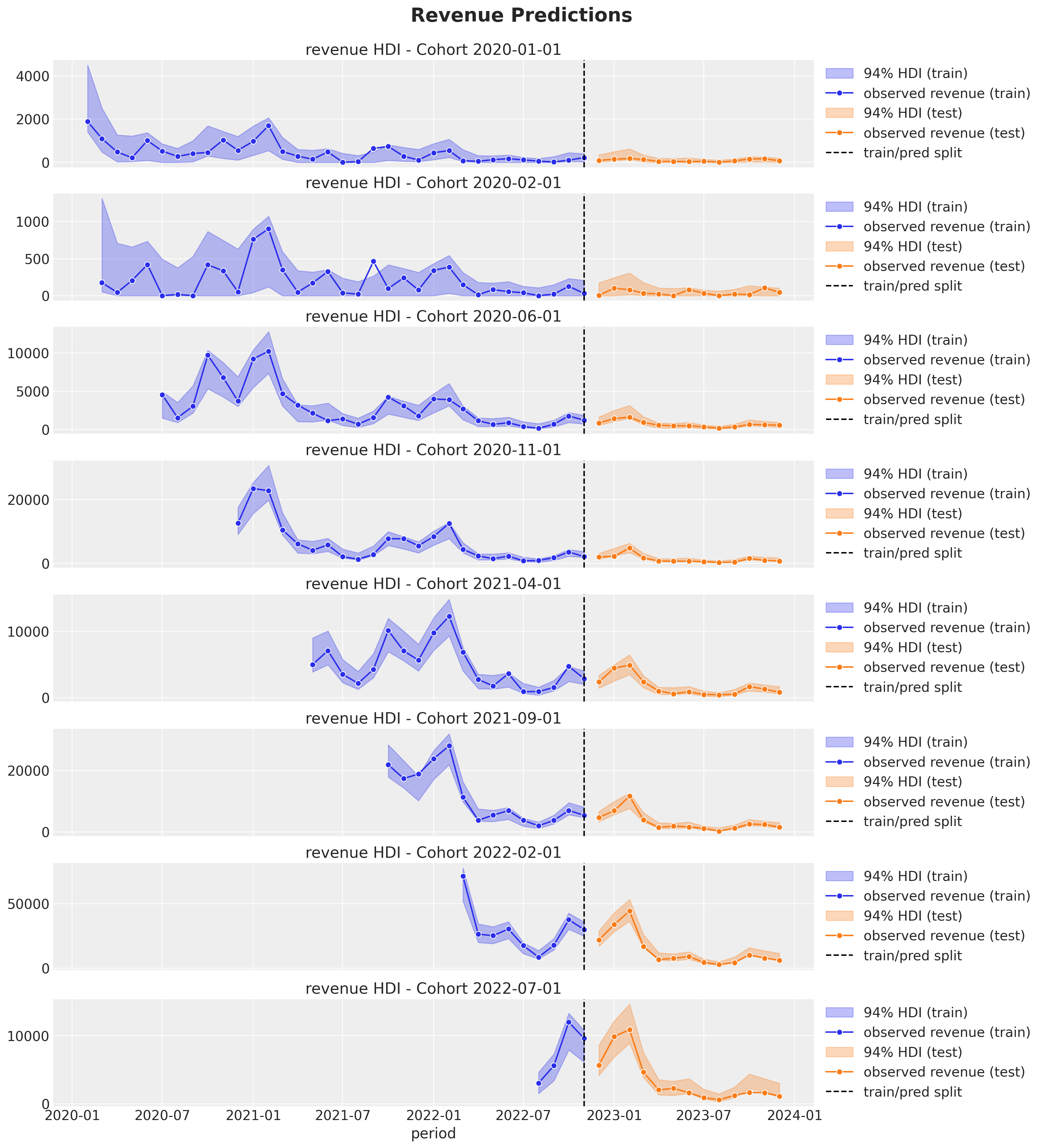
We clearly see how the out-of-sample predictions replicate the behavior of the test set 😎!
We of course do not expect this specific model to work for all data sets! Still, it could be a baseline to model more complex interactions between the retention and revenue components. Also, note that the model structure allows to easily add more regressors.