In this notebook we want to test various ways of getting a better understanding on how non-trivial machine learning models generate predictions and how features interact with each other. This is in general not straight forward and key components are (1) understanding on the input data and (2) domain knowledge on the problem. Two great references on the subject are:
- Interpretable Machine Learning, A Guide for Making Black Box Models Explainable by Christoph Molnar
- Interpretable Machine Learning with Python by Serg Masís
Note that the methods discussed in this notebook are not related with causality. I strongly recommend to refer to the article Be Careful When Interpreting Predictive Models in Search of Causal Insights by Scott Lundberg (one of the core developers of SHAP). The following are two references I have found particularly useful as an introduction to causal inference:
- Statistical Rethinking, A Bayesian Course with Examples in R and Stan by Richard McElreath.
- Causal Inference: The Mixtape by Scott Cunningham.
Remark: The article General Pitfalls of Model-Agnostic Interpretation Methods for Machine Learning Models is highly recommended to understand the challenges, limitations and recommendations for some of the model-agnostic methods discussed below.
Data
We are going to use the processed Bike Sharing Dataset Data Set described in Section 3.1 in Interpretable Machine Learning, A Guide for Making Black Box Models Explainable by Christoph Molnar. The prediction task is to predict daily counts of rented bicycles as a function of time and other external regressors like temperature and humidity. Note that the raw data can be downloaded from the UCI Machine Learning Repository. The preprocessing steps are described here.
Remark: This is an updated version of the initial notebook. The main changes are (1) There was a correction on the dataset (see this PR) and (2) update the scikit-learn api for version 1.0.1. Note that the overall results and conclusions were not affected much by this change.
The content of this blog post was presented at the PYDATA GLOBAL 2021, see Exploring Tools for Interpretable Machine Learning. I would like to thank the organizers of this wonderful event for giving me the opportunity to participate.
Slides: Here you can find the slides of the talk. Suggestions and comments are always welcome!
Part I: Model Development
In this first part we work on the modeling step on which we fit two machine learning models (linear and tree ensembles) for the bike daily counts prediction task. The intention of this notebook is not to build the best machine learning model but have two model flavors and compare the interpretability tools and methods on both of them.
Prepare Notebook
import numpy as np
import pandas as pd
import matplotlib.pyplot as plt
import matplotlib.ticker as mtick
import seaborn as sns
sns.set_style(
    style='darkgrid',
    rc={'axes.facecolor': '.9', 'grid.color': '.8'}
)
sns.set_palette(palette='deep')
sns_c = sns.color_palette(palette='deep')
plt.rcParams['figure.figsize'] = [10, 6]
plt.rcParams['figure.dpi'] = 100
Read Data
data_path = 'https://raw.githubusercontent.com/christophM/interpretable-ml-book/master/data/bike.csv'

raw_data_df = pd.read_csv(data_path)

raw_data_df.head(10)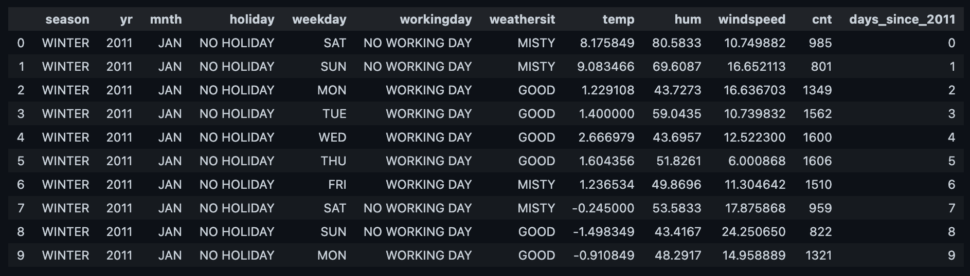
raw_data_df.info()<class 'pandas.core.frame.DataFrame'>
RangeIndex: 731 entries, 0 to 730
Data columns (total 12 columns):
# Column Non-Null Count Dtype
--- ------ -------------- -----
0 season 731 non-null object
1 yr 731 non-null int64
2 mnth 731 non-null object
3 holiday 731 non-null object
4 weekday 731 non-null object
5 workingday 731 non-null object
6 weathersit 731 non-null object
7 temp 731 non-null float64
8 hum 731 non-null float64
9 windspeed 731 non-null float64
10 cnt 731 non-null int64
11 days_since_2011 731 non-null int64
dtypes: float64(3), int64(3), object(6)
memory usage: 68.7+ KBNote that we do not have missing values (not representative of most real data sets).
The prediction task is to generate a model to predict the target variable cnt, which represents the number of bikes will be rented. Please visit the data description to get more information about the features. Most of them are self-explanatory.
EDA
The first step in any modeling task (after problem definition and data collection) is an exploratory data analysis to understand the available data. Let us start by plotting the distribution and development over time of the target variable cnt.
fig, ax = plt.subplots(nrows=2, ncols=1)
sns.kdeplot(x='cnt', data=raw_data_df, fill=True, color='black', ax=ax[0])
sns.lineplot(x='days_since_2011', y='cnt', data=raw_data_df, color='black', ax=ax[1])
fig.suptitle('cnt: Target Variable', y=0.95);
We have 2 years of data. We see a clear yearly seasonality and a slight positive trend.
- Numeric Features
Let us look into the numeric features:
numeric_features = [
    'temp',
    'hum',
    'windspeed',
    'days_since_2011',
    'yr',
]

target = 'cnt'

fig, axes = plt.subplots(
    nrows=len(numeric_features) + 1,
    ncols=1,
    figsize=(12, 13),
    constrained_layout=True
)

sns.lineplot(
        x='days_since_2011',
        y=target,
        data=raw_data_df,
        color='black',
        ax=axes[0]
    )
axes[0].set(title=target, ylabel=None)

for i, feature in enumerate(numeric_features):
    ax = axes[i + 1]
    sns.lineplot(
        x='days_since_2011',
        y=feature,
        data=raw_data_df,
        color=sns_c[i],
        ax=ax
    )
    ax.set(title=feature, ylabel=None)
Let us compute the correlation:
corr_df = raw_data_df[numeric_features + [target]].corr()

cmap = sns.diverging_palette(230, 20, as_cmap=True)
mask = np.triu(np.ones_like(corr_df, dtype=bool))

fig, ax = plt.subplots(figsize=(8, 7))
sns.heatmap(
    data=corr_df,
    mask=mask,
    cmap=cmap,
    vmax=1.0,
    vmin=-1.0,
    center=0,
    square=True,
    linewidths=0.5,
    linecolor='k',
    annot=True,
    fmt='.3f',
    ax=ax
)
ax.set(title='Correlation Numeric Features');
The variables temp and days_since_2011 have a high correlation with the target variable. The former is explaining the seasonality and the later the trend. This hints these could be good predictors. For completeness let us plot the joint distributions:
g = sns.pairplot(
    data=raw_data_df,
    diag_kind='kde',
    height=2,
    corner=False,
    plot_kws={'alpha': 0.3}
)
g.map_lower(sns.kdeplot, levels=5, color=sns_c[3])
g.map_upper(sns.regplot, color=sns_c[0], scatter_kws={'alpha': 0.1})
g.fig.suptitle('Pair Plot (Numeric Variables)', y=1.01);
- Categorical Features
Let us compute the mean of cnt per each categorical variable:
categorical_features = [
    'season',
    'mnth',
    'holiday',
    'weekday',
    'workingday',
    'weathersit',
]

fig, axes = plt.subplots(
    nrows=3,
    ncols=2,
    figsize=(12, 10),
    constrained_layout=True
)

axes = axes.flatten()

for i, feature in enumerate(categorical_features):
    ax = axes[i]

    feature_df = raw_data_df \
        .groupby(feature, as_index=False) \
        .agg({target: np.mean}) \
        .sort_values(target)

    sns.barplot(
        x=feature,
        y=target,
        data=feature_df,
        dodge=False,
        ax=ax
    )
    ax.set(title=feature, ylabel=None)

fig.suptitle(f'Mean {target} over categorical_features');
Let us now take a look into the distributions:
fig, axes = plt.subplots(
    nrows=3,
    ncols=2,
    figsize=(12, 10),
    constrained_layout=True
)

axes = axes.flatten()

for i, feature in enumerate(categorical_features):
    ax = axes[i]
    sns.stripplot(
        x=feature,
        y=target,
        data=raw_data_df,
        dodge=False,
        ax=ax
    )
    ax.set(title=feature, ylabel=None)
fig.suptitle(f'{target} distribution over categorical_features');
This plot also hints that the categorical features could serve as predictors as, for example, we clearly see how in cooler months the bike counts is lower than warmer months.
Remark: The variables season and mnth seem redundant. Still we want to include them both in the model to see how the tools to interpret the model react to it.
Train - Test Split
As we have a time series problem we do a train test split without shuffle.
from sklearn.model_selection import train_test_split

x = raw_data_df.copy().drop([target], axis=1)
y = raw_data_df.copy()[target]

x_train, x_test, y_train, y_test = train_test_split(
    x, y, test_size=0.20, random_state=42, shuffle=False
)
fig, ax = plt.subplots()
sns.lineplot(x=y_train.index, y=y_train, color='black', label='y_train', ax=ax)
sns.lineplot(x=y_test.index, y=y_test, color=sns_c[3], label='y_test', ax=ax)
ax.axvline(x=365, color=sns_c[6], linestyle='--', label=r'$2011 \rightarrow 2012$')
ax.axvline(x=y_train.shape[0], color='gray', linestyle='--', label='train-test-split')
ax.legend(loc='upper left')
ax.set(title='Train - Test Split');
Note that there seems to be a difference between the variance and trend between 2011 and 2012. This hints that the variable yr could be important for the prediction task.
Model Development
We want to train two kind of models: (1) a linear model (Lasso) and (2) a tree based model (xgboost). Our scoring metric is the mean-squared-error.
Let us now define some preprocessing steps: scaling and one-hot-encoding.
from sklearn.compose import ColumnTransformer
from sklearn.feature_selection import VarianceThreshold
from sklearn.linear_model import Lasso
from sklearn.pipeline import Pipeline
from sklearn.preprocessing import StandardScaler, OneHotEncoder, PolynomialFeatures
from sklearn.model_selection import GridSearchCV, TimeSeriesSplit
from xgboost import XGBRegressor

categorical_features = [
    'season',
    'mnth',
    'holiday',
    'weekday',
    'workingday',
    'weathersit',
]

numeric_features = [
    'temp',
    'hum',
    'windspeed',
    'days_since_2011',
    'yr',
]

features = categorical_features + numeric_features

x_train = x_train[features]
x_test = x_test[features]

numeric_transformer = Pipeline(steps=[
    ('scaler', StandardScaler())
])

categorical_transformer = Pipeline(steps=[
    ('one_hot', OneHotEncoder())
])
For future reference, let us get the names of the model features after the preprocessing step:
# Warning: One needs to be careful with the variables
# ordering in view of the ColumnTransformer steps below.
categorical_features_ext = list(
        categorical_transformer['one_hot'] \
        .fit(x_train[categorical_features]) \
        .get_feature_names_out(categorical_features)
    )
features_ext = categorical_features_ext + numeric_features

print(f'Number of features after pre-processing: {len(features_ext)}')
Number of features after pre-processing: 35', '.join(features_ext)'season_FALL, season_SPRING, season_SUMMER, season_WINTER, mnth_APR, mnth_AUG, mnth_DEC,
mnth_FEB, mnth_JAN, mnth_JUL, mnth_JUN, mnth_MAR, mnth_MAY, mnth_NOV, mnth_OCT, mnth_SEP,
holiday_HOLIDAY, holiday_NO HOLIDAY, weekday_FRI, weekday_MON, weekday_SAT, weekday_SUN,
weekday_THU, weekday_TUE, weekday_WED, workingday_NO WORKING DAY, workingday_WORKING DAY,
weathersit_GOOD, weathersit_MISTY, weathersit_RAIN/SNOW/STORM, temp, hum, windspeed,
days_since_2011, yr'Remark: Note that we have not drop any categorical variable from the one-hot-encoding as we will use regularization in our models, see on scikit-learn docs (…) dropping one category breaks the symmetry of the original representation and can therefore induce a bias in downstream models.
Linear Model
The first model is a (Lasso) regression with a second order multiplicative interaction between the input features (we actually remove the purely quadratic terms and just include the interactions). We use this type of model with \(L^1\)-regularization in order to do a variable selection via time-slice-cross validation. We remove zero-variance features (coming for example as an interaction of orthogonal features) with a VarianceThreshold transformer.
linear_preprocessor = ColumnTransformer(transformers=[
    ('cat', categorical_transformer, categorical_features),
    ('num', numeric_transformer, numeric_features),
], remainder='passthrough')

linear_feature_engineering = Pipeline(steps=[
    ('linear_preprocessor', linear_preprocessor),
    ('polynomial', PolynomialFeatures(degree=2, interaction_only=True, include_bias=False)),
    ('variance_threshold', VarianceThreshold()),
])

linear_pipeline = Pipeline(steps=[
    ('linear_feature_engineering', linear_feature_engineering),
    ('linear_regressor', Lasso())
])

linear_param_grid = {
    'linear_regressor__alpha': np.logspace(start=-3, stop=3, num=20),
}

cv = TimeSeriesSplit(n_splits=5, test_size=(7 * 2), gap=0)

linear_grid_search = GridSearchCV(
    estimator=linear_pipeline,
    param_grid=linear_param_grid,
    scoring='neg_root_mean_squared_error',
    cv=cv
)
# Fit the linear model.
linear_grid_search = linear_grid_search.fit(X=x_train, y=y_train)Let us see the linear model pipeline summary:
Tree Model
The second model is an xgboost model.
tree_preprocessor = ColumnTransformer(transformers=[
    ('cat', categorical_transformer, categorical_features)
], remainder='passthrough')

tree_feature_engineering = Pipeline(steps=[
    ('tree_preprocessor', tree_preprocessor)
])

tree_pipeline = Pipeline(steps=[
    ('tree_feature_engineering', tree_feature_engineering),
    ('tree_regressor',  XGBRegressor())
])

tree_param_grid = {
    'tree_regressor__min_child_weight': [0.01, 0.5, 1, 10],
    'tree_regressor__max_depth': [3, 5, 8, 13]
}

tree_grid_search = GridSearchCV(
    estimator=tree_pipeline,
    param_grid=tree_param_grid,
    scoring='neg_root_mean_squared_error',
    cv=cv
)
# Fit the model.
tree_grid_search = tree_grid_search.fit(X=x_train, y=y_train)Let us see the XGBoost pipeline summary:
Model Performance
Let us now compare the (in / out) sample performance of these models.
First let us generate predictions on the train and test sets:
y_train_pred_linear = linear_grid_search.predict(X=x_train)
y_test_pred_linear = linear_grid_search.predict(X=x_test)

y_train_pred_tree = tree_grid_search.predict(X=x_train)
y_test_pred_tree = tree_grid_search.predict(X=x_test)
from sklearn.metrics import mean_squared_error
print(f'''
--------------------------------
train mse (linear): {mean_squared_error(y_true=y_train, y_pred=y_train_pred_linear): 0.2f}
test mse (linear): {mean_squared_error(y_true=y_test, y_pred=y_test_pred_linear): 0.2f}
--------------------------------
train mse (tree) : {mean_squared_error(y_true=y_train, y_pred=y_train_pred_tree): 0.2f}
test mse (tree) : {mean_squared_error(y_true=y_test, y_pred=y_test_pred_tree): 0.2f}
--------------------------------
''')--------------------------------
train mse (linear): 213555.13
test mse (linear): 1363559.49
--------------------------------
train mse (tree) : 69297.93
test mse (tree) : 1317805.48
--------------------------------Both models have a similar out-sample performance (the tree one does a bit better). For in-sample performance the tree based model has less MSE.
Warning: One needs to be careful when using tee based model for time series forecasting as these models are not capable of capturing trend components. In this specific case the trend is no s strong and the overall range of the time series is bounded by the max / min of the training time series. This explains why the tree based model still performs well on the test set.
Let us plot the predictions and error distributions on the training and test sets:
# Compute errors.
error_train_linear = y_train - y_train_pred_linear
error_test_linear = y_test - y_test_pred_linear
error_train_tree = y_train - y_train_pred_tree
error_test_tree = y_test - y_test_pred_tree

fig, ax = plt.subplots(nrows=2, ncols=2, figsize=(10, 9), constrained_layout=True)

ax = ax.flatten()

sns.regplot(x=y_train, y=y_train_pred_linear, color=sns_c[0], label='linear', ax=ax[0])
sns.regplot(x=y_train, y=y_train_pred_tree, color=sns_c[1], label='tree', ax=ax[0])
ax[0].axline(xy1=(0,0), slope=1, color='gray', linestyle='--', label='diagonal')
ax[0].legend(loc='upper left')
ax[0].set(title='In-Sample Predictions', xlabel='y_test', ylabel='y_test_pred')

sns.regplot(x=y_test, y=y_test_pred_linear, color=sns_c[0], label='linear', ax=ax[1])
sns.regplot(x=y_test, y=y_test_pred_tree, color=sns_c[1], label='tree', ax=ax[1])
ax[1].axline(xy1=(0,0), slope=1, color='gray', linestyle='--', label='diagonal')
ax[1].legend(loc='upper left')
ax[1].set(title='Out-Sample Predictions', xlabel='y_test', ylabel='y_test_pred')

sns.kdeplot(x=error_train_linear, color=sns_c[0], label='linear', fill=True, alpha=0.1, ax=ax[2])
sns.kdeplot(x=error_train_tree, color=sns_c[1], label='tree', fill=True, alpha=0.1, ax=ax[2])
ax[2].axvline(x=error_train_linear.mean(), color=sns_c[0], linestyle='--', label='train_linear_mean')
ax[2].axvline(x=error_train_tree.mean(), color=sns_c[1], linestyle='--', label='train_tree_mean')
ax[2].legend(loc='upper left')
ax[2].set(title='In-Sample Errors', xlabel='error')

sns.kdeplot(x=error_test_linear, color=sns_c[0], label='linear', fill=True, alpha=0.1, ax=ax[3])
sns.kdeplot(x=error_test_tree, color=sns_c[1], label='tree', fill=True, alpha=0.1, ax=ax[3])
ax[3].axvline(x=error_test_linear.mean(), color=sns_c[0], linestyle='--', label='test_linear_mean')
ax[3].axvline(x=error_test_tree.mean(), color=sns_c[1], linestyle='--', label='test_tree_mean')
ax[3].legend(loc='upper left')
ax[3].set(title='Out-Sample Errors', xlabel='error');
Now let us visualize the predictions as a time series:
fig, ax = plt.subplots()

sns.lineplot(
    x=range(y_train_pred_linear.shape[0]),
    y=y_train_pred_linear,
    color=sns_c[0],
    label='linear',
    alpha=0.8,
    ax=ax
)

sns.lineplot(
    x=range(y_train_pred_linear.shape[0]),
    y=y_train_pred_tree,
    color=sns_c[1],
    label='tree',
    alpha=0.8,
    ax=ax
)

sns.lineplot(
    x=range(y_train.shape[0]),
    y=y_train,
    color='black',
    label='y_train',
    ax=ax
)

ax.set(title='In-Sample Predictions');
fig, ax = plt.subplots()

sns.lineplot(
    x=range(y_test_pred_linear.shape[0]),
    y=y_test_pred_linear,
    color=sns_c[0],
    marker='o',
    markersize=4,
    label='linear',
    ax=ax
)

sns.lineplot(
    x=range(y_test_pred_tree.shape[0]),
    y=y_test_pred_tree,
    color=sns_c[1],
    marker='o',
    markersize=4,
    label='tree',
    ax=ax
)

sns.lineplot(
    x=range(y_test.shape[0]),
    y=y_test,
    color='black',
    marker='o',
    markersize=4,
    label='y_test',
    ax=ax
)

ax.set(title='Out-Sample Predictions');
Part II: Model Interpretation
Now that we have fitted two machine learning models, we would like to try to understand how these models make predictions, e.g. which features are important? are there any interaction effects? what is the effect on certain feature on the final outcome? We will start to answer these questions by looking into the individual model structure and extract some insights based on the algorithm behind the model. After that, we will deep dive into model-agnostic methods.
Model Specific
Let us now dig deeper into model specific methods to understand the model predictions.
Linear Model
Linear models are arguably the most interpretable ones as the parametrization is very transparent. For a given target variable y and regressors x_k a linear model has the form
\[ y = \beta_{0} + x_{1}\beta_{1} + \cdots + \beta_{k}x_{k} + \cdots \beta_{p}x_{p} + \varepsilon \]
where the weights (beta coefficients) \(\beta_{i}\) are the parameters to be estimated from the data (\(\beta_{0}\) denotes the model intercept) and \(\varepsilon \sim N(0, \sigma^{2})\) is an error term. Still, one needs to be careful whenever there are highly correlated variables or multicollinearity. For details on interpretability of linear models see Section 4.1, Interpretable Machine Learning.
We want to compare and understand the beta coefficient of our linear model. First let us extract the features feeding the model:
from itertools import compress

# Polynomial feature names.
polynomial_features = linear_grid_search \
    .best_estimator_['linear_feature_engineering']['polynomial'] \
    .get_feature_names_out(features_ext)

# Mask for variables with zero-variance
variance_threshold_support = linear_grid_search \
    .best_estimator_['linear_feature_engineering']['variance_threshold'] \
    .get_support()

linear_features = list(
    compress(data=polynomial_features, selectors=variance_threshold_support)
)
Let us store the linear features after preprocessing in a dataframe.
linear_x_train = pd.DataFrame(
    data=linear_grid_search.best_estimator_['linear_feature_engineering'].transform(x_train),
    columns=linear_features
)
Next let us extract the model \(\beta\) coefficients.
linear_model_coef_df = pd.DataFrame(data={
    'linear_features': linear_features,
    'coef_': linear_grid_search.best_estimator_['linear_regressor'].coef_
})

linear_model_coef_df = linear_model_coef_df \
    .assign(abs_coef_ = lambda x: x['coef_'].abs()) \
    .sort_values('abs_coef_', ascending=False) \
    .reset_index(drop=True)

# Get top (abs) beta coefficients.
linear_model_coef_df \
    .head(20) \
    .style.background_gradient(
        cmap='viridis_r',
        axis=0,
        subset=['abs_coef_']
)| linear_features | coef_ | abs_coef_ | |
|---|---|---|---|
| 0 | weathersit_RAIN/SNOW/STORM | -1392.098957 | 1392.098957 |
| 1 | mnth_JUL | 983.547361 | 983.547361 |
| 2 | mnth_JUL temp | -925.255563 | 925.255563 |
| 3 | season_SUMMER temp | -833.410963 | 833.410963 |
| 4 | season_WINTER | -645.437011 | 645.437011 |
| 5 | mnth_APR temp | 554.073583 | 554.073583 |
| 6 | mnth_JUN temp | -522.243657 | 522.243657 |
| 7 | season_SUMMER | 508.974043 | 508.974043 |
| 8 | season_WINTER mnth_MAR | 483.987658 | 483.987658 |
| 9 | temp | 438.628918 | 438.628918 |
| 10 | season_WINTER weathersit_GOOD | -413.142154 | 413.142154 |
| 11 | holiday_NO HOLIDAY weathersit_GOOD | 380.804849 | 380.804849 |
| 12 | mnth_JUN weathersit_GOOD | 375.611725 | 375.611725 |
| 13 | season_WINTER temp | 373.476690 | 373.476690 |
| 14 | weathersit_MISTY temp | 366.752970 | 366.752970 |
| 15 | days_since_2011 yr | 348.500690 | 348.500690 |
| 16 | mnth_MAR temp | 322.106230 | 322.106230 |
| 17 | season_SPRING days_since_2011 | 319.606243 | 319.606243 |
| 18 | mnth_NOV weathersit_GOOD | -300.470775 | 300.470775 |
| 19 | mnth_DEC workingday_NO WORKING DAY | -297.718280 | 297.718280 |
Here are a few observations:
- The variable with highest beta coefficient is
weathersit_RAIN/SNOW/STORM, which hints that days with particularly bad weather have lower rental counts. - Even though
mnth_JULandtemphave positive beta coefficients, the interaction termmnth_JUL temphas a very low beta coefficient. This decreases the effect of temperature (see weight effect below) in the month of July as compared to other month. Something similar happens withtempandseason_SUMMER.
# Let us get the model intercept.
linear_model_intercept = linear_grid_search.best_estimator_['linear_regressor'].intercept_
These coefficients depend on the scale of each variable (note that we normalized all the features in the pre-processing step). To get a scale-free weight effect we multiply these coefficients with each feature instance, so that the effect on the variable \(x_{k}\) on the data instance \((y^{i}, x^{i})\) is \(\beta_{k}x_{k}^{i}\).
linear_model_effects = np.multiply(
    linear_grid_search.best_estimator_['linear_regressor'].coef_,
    linear_grid_search.best_estimator_['linear_feature_engineering'].transform(x_train)
)

linear_model_effects_df = pd.DataFrame(
    data=linear_model_effects,
    columns=linear_features
)
Let us plot top weight effects:
fig, ax = plt.subplots(nrows=1, ncols=2, figsize=(15, 8), constrained_layout=True)
# Weight effects distribution of the all linear terms.
sns.stripplot(
    data=linear_model_effects_df[features_ext[::-1]],
    orient='h',
    color=sns_c[1],
    alpha=0.2,
    ax=ax[0]
)
ax[0].set(
    title='Linear Features',
    xlabel='weight effect'
)
# Weight effects distribution of the terms
# (including intraction) with highest beta coefficients;
sns.stripplot(
    data=linear_model_effects_df[linear_model_coef_df.head(20)['linear_features']],
    orient='h',
    color=sns_c[2],
    alpha=0.2,
    ax=ax[1]
)
ax[1].set(
    title='Features with Highest Beta Coefficients',
    xlabel='weight effect'
)
fig.suptitle('Effect Weight Distribution');
fig, ax = plt.subplots(figsize=(5, 7))
linear_model_effects_df \
    .abs() \
    .mean(axis=0) \
    .sort_values() \
    .tail(25) \
    .plot(
        kind='barh',
        ax=ax
    )
ax.set(
    title='Mean Absolute Weight Effect - Linear Model (Top 25)',
    xlabel='weight effect'
);
Note that temp, and days_since_2011 with the interaction with yr are the top 3 features. This can be seen as the main components explaining the trend, seasonality and increasing variance. However … TODO: Add explanation other variables.
Let us deep dive into some individual features. For example, lets see at which temperature the effect of this variable is negative:
fig, ax = plt.subplots(figsize=(9, 6))

sns.scatterplot(
    x=x_train['temp'],
    y=linear_model_effects_df['temp'],
    hue=linear_model_effects_df['temp'].rename('weight_effect'),
    palette='coolwarm',
    ax=ax
)
# Compute sign change point.
cp = x_train['temp'].iloc[linear_model_effects_df['temp'].abs().argmin(), ]
ax.axvline(
    x=cp,
    color='gray',
    linestyle='--',
    label=f'weight effect sign change ({cp: 0.1f})'
)
# Estimated line fit. We take the inverse z-transform of the estimated beta coefficient.
beta_temp = linear_model_coef_df.query('linear_features == "temp"')['coef_'].values[0]
ax.axline(
    xy1=(x_train['temp'].mean(), 0),
    slope= beta_temp / x_train['temp'].std(),
    color='black',
    linestyle='--',
    label=r'estimated fit (z-transform $\beta_{temp}$)'
)
ax.legend()
ax.set(title='Weight Effect Linear Model', xlabel='temp', ylabel='weight_effect');
Warning: This plot just shows the effect of the linear term temp and not the interactions.
We can do something similar to visualize the interaction of 2 features. For example for temp and hum we compute the total weight effect as
\[
\beta_{temp}x_{temp} + \beta_{hum}x_{hum} + \beta_{temp \times hum}x_{temp} \times x_{hum}
\]
import matplotlib.cm as cm

fig, ax = plt.subplots()
# Compute total weight effect.
sns.kdeplot(
    x=x_train['temp'],
    y=x_train['hum'],
    levels=10,
    hue=(linear_model_effects_df['temp']
         + linear_model_effects_df['hum']
         + linear_model_effects_df['temp hum']
    ) > 0,
    hue_order=[True, False],
    palette=[
        cm.get_cmap('coolwarm_r')(1),
        cm.get_cmap('coolwarm')(1)
    ],
    alpha=0.2,
    fill=True,
    ax=ax
)
# Data Density.
sns.scatterplot(
    x=x_train['temp'],
    y=x_train['hum'],
    hue=(linear_model_effects_df['temp']
         + linear_model_effects_df['hum']
         + linear_model_effects_df['temp hum']
    ),
    palette='coolwarm',
    edgecolor='black',
    ax=ax
)
ax.legend(title='weight_effect', loc='lower left')
ax.set(title='Temperature and Humidity Interaction Weight Effect Linear Model');
Similarly for hum and windspeed:
fig, ax = plt.subplots()
# Compute total weight effect.
sns.kdeplot(
    x=x_train['hum'],
    y=x_train['windspeed'],
    levels=10,
    hue=(linear_model_effects_df['windspeed']
         + linear_model_effects_df['hum']
        + linear_model_effects_df['hum windspeed']
    ) > 0,
    hue_order=[True, False],
    palette=[
        cm.get_cmap('coolwarm_r')(1),
        cm.get_cmap('coolwarm')(1)
    ],
    alpha=0.2,
    fill=True,
    ax=ax
)
# Data Density.
sns.scatterplot(
    x=x_train['hum'],
    y=x_train['windspeed'],
    hue=(linear_model_effects_df['windspeed']
         + linear_model_effects_df['hum']
         + linear_model_effects_df['hum windspeed']
    ),
    palette='coolwarm',
    edgecolor='black',
    ax=ax
)
ax.legend(title='weight_effect', loc='lower left')
ax.set(title='Humidity and Wind Speed Interaction Weight Effect Linear Model');
We can also investigate how the model features affect individual predictions:
# Compare with FIGURE 5.49 in https://christophm.github.io/interpretable-ml-book/shapley.html.
# Input Features for specific observation.
obs_index = (285 - 1) # Python indexing starts in 0 and not 1 as in R.
x_train_obs = x_train.iloc[obs_index, :]
x_train_obs
season FALL
mnth OCT
holiday NO HOLIDAY
weekday WED
workingday WORKING DAY
weathersit RAIN/SNOW/STORM
temp 17.536651
hum 90.625
windspeed 16.62605
days_since_2011 284
yr 2011
Name: 284, dtype: objectprint(f'prediction for observation {obs_index} = {y_train_pred_linear[obs_index]: 0.2f}')prediction for observation 284 = 2274.26fig, ax = plt.subplots(nrows=1, ncols=2, figsize=(15, 7), constrained_layout=True)
# All features.
linear_model_effects_df.iloc[obs_index, ] \
.to_frame() \
.rename(columns={obs_index: 'effect'}) \
.query('effect != 0') \
.reset_index(drop=False) \
.sort_values('effect', ascending=False) \
.pipe((sns.barplot, 'data'),
x='effect',
y='index',
color=sns_c[3],
ax=ax[0]
)
ax[0].set(
title=f'Weight Effects for Observation {obs_index}',
xlabel='weight effect',
ylabel=''
)
# Linear features.
linear_model_effects_df.iloc[obs_index, ] \
.to_frame() \
.rename(columns={obs_index: 'effect'}) \
.query('effect != 0 and index in @features_ext') \
.reset_index(drop=False) \
.sort_values('effect', ascending=False) \
.pipe((sns.barplot, 'data'),
x='effect',
y='index',
color=sns_c[4],
ax=ax[1]
)
ax[1].set(
title=f'Weight Effects for Observation {obs_index} (linear terms)',
xlabel='weight effect',
ylabel=''
);
Let us verify that these weight effects add up to the model prediction (including the intercept term):
linear_model_effects_df.iloc[obs_index, ].sum() \
    + linear_model_intercept \
- y_train_pred_linear[obs_index]-4.547473508864641e-13Tree Model
Single decision trees are also quite explicit about their interpretation. Moving to ensembles can be a bit tricky, I recommend the section Introduction to Boosted Trees on XGBoost documentation. One of the highest benefits of tree ensembles is the ability to learn complex and non-linear relations from the data.
To begin, let us compute the preprocessing step output of the tree model:
tree_x_train = pd.DataFrame(
    data=tree_grid_search.best_estimator_['tree_feature_engineering'].transform(x_train),
    columns=features_ext
)

tree_x_train.shape
(584, 35)XGBoost model provides various measures of importance, see Understand your dataset with XGBoost. From the XGBoost documentation:
Gainis the improvement in accuracy brought by a feature to the branches it is on.
Covermeasures the relative quantity of observations concerned by a feature.
Frequency/Weightis a simpler way to measure theGain. It just counts the number of times a feature is used in all generated trees.
See also The Multiple faces of ‘Feature importance’ in XGBoost. Let us compute all of them and compare their relative values:
importance_type = [
    'weight',
    'gain',
    'cover',
    'total_gain',
    'total_cover'
]
# Compute and format variable importance metrics.
tree_feature_importance_df = pd.concat(
    [
        pd.DataFrame.from_dict(
            data=(
                tree_grid_search
                .best_estimator_['tree_regressor']
                .get_booster()
                .get_score(importance_type=t)
            ),
            orient='index',
            columns=[t]
        )
        for t in importance_type
    ],
    axis=1
)

tree_feature_importance_df = tree_feature_importance_df \
    .reset_index(drop=False) \
    .assign(
        index = lambda x: x['index'].str.replace(pat='f', repl='').astype(int)
    )

# Map genertic features of the form f<NUMBER> to the original feature names.
tree_features_idx_map = tree_feature_importance_df['index'].apply(lambda idx: features_ext[idx])

# Relative feature importance.
tree_feature_importance_rel_df = tree_feature_importance_df / tree_feature_importance_df.sum(axis=0)
tree_feature_importance_rel_df = tree_feature_importance_rel_df \
    .assign(feature = tree_features_idx_map) \
    .drop('index', axis=1)
Let us plot the results:
fig, ax = plt.subplots(figsize=(7, 15))
sns.barplot(
    x='value',
    y='feature',
    data=(
        tree_feature_importance_rel_df \
        .melt(id_vars='feature')[::-1]
    ),
    hue='variable',
    dodge=True,
    ax=ax
)
ax.legend(title='importance type')
ax.xaxis.set_major_formatter(
    mtick.FuncFormatter(lambda y, _: f'{y: .0%}')
)
ax.set(
    title='Relative Feature Importances of the Tree Model',
    xlabel='relative importance',
    ylabel=''
);
For this tree based model days_from_2011 and the continuous meteorological features temp, hum and windspeed are among the most important variables. The indicator variable weathersit_RAIN/SNOW/STORM is also quite important for the model.
Waring: Zero-importance features are not included.
print(f'''
Zero-importance features:
{[x for x in features_ext if x not in tree_feature_importance_rel_df['feature'].values]}
''')
Zero-importance features:
['mnth_APR', 'mnth_FEB', 'mnth_OCT', 'holiday_NO HOLIDAY', 'workingday_WORKING DAY', 'weathersit_MISTY', 'yr']Partial Dependence Plot (PDP) & Individual Conditional Expectation (ICE)
In this section we describe the first model-agnostic method to understand how features interact to generate predictions in a machine learning model. Some recommended references on the subject are:
PDP
ICE
Let us start by quoting the description of partial dependency plots from the scikit-learn docs: > Partial dependence plots (PDP) show the dependence between the target response and a set of input features of interest, marginalizing over the values of all other input features.
Let us be more concrete. For a regression problem (like in this example) we can estimate the partial dependence function (which is the plot of interest) as follows: Let \(x_S\) be the features for which the partial dependence function should be plotted (usually not more than 2 variables) and \(x_C\) be other features used in the machine learning model. One can estimate the partial dependence function as
\[ \hat{f}_{x_{S}}(x_{s}) = \frac{1}{n} \sum_{i=1}^{n} \hat{f}(x_{S}, x_{C}^{i}) \]
where \(\hat{f}\) is the model prediction function, \(x_{C}^{i}\) are actual feature values (not in \(S\)) and \(n\) is the number points. The following is one of the key assumptions of this method (see Section 5.1, Interpretable Machine Learning)
For example, given a trained model \(\hat{f}\), we compute for \(\color{red}{temp=8}\) \[ \begin{align*} \hat{f}_{temp}(\color{red}{temp=8}) = \frac{1}{146} & \left(\hat{f}(\color{red}{temp=8}, hum=80, \cdots) \right.\\ & \left. + \hat{f}(\color{red}{temp=8}, hum=70, \cdots) + \cdots \right) \end{align*} \]
An assumption of the PDP is that the features in \(C\) are not correlated with the features in \(S\). If this assumption is violated, the averages calculated for the partial dependence plot will include data points that are very unlikely or even impossible.
In view of the correlation matrix computed above for the numeric features, we see that the assumption holds true. However, the categorical variables are not independent, e.g. season and mnth.
Similar to a PDP, an individual conditional expectation (ICE) plot shows one line per instance. That is, for each instance in \(\{(x_{S}^{i}, x_{C}^{i})\}_{i=1}^{n}\), we plot \(\hat{f}_{S}\) as a function of \(x_{S}^{i}\) while leaving \(x_{C}^{i}\) fixed. Hence, the PDP plot is the average of the lines of an ICE plot. Note that the additional information provided by ICE plots are interaction effects between the features. In PDPs these interactions are untraceable after the aggregation.
Let us plot these curves for the linear model:
from sklearn.inspection import PartialDependenceDisplay

features_to_display = ['temp', 'hum', 'windspeed']

fig, ax = plt.subplots(figsize=(15, 7))

display_linear = PartialDependenceDisplay.from_estimator(
       estimator=linear_grid_search,
       X=x_train,
       features=features_to_display,
       kind='both',
       subsample=50,
       n_jobs=3,
       grid_resolution=20,
       random_state=42,
       ax=ax
)

fig.suptitle(
       'Single ICE Plot - Linear Model', y=0.95
);
As expected all the PDP curves are straight lines. Note however that even though the beta coefficient for temp is positive, there are ICE lines in the temp plot, which have negative slope. This is an indication of interaction effects, which are hidden by aggregation in the PDP plot. For example, let us plot these lines again just for the month of July, which as a high negative interaction effect with temp.
fig, ax = plt.subplots(figsize=(7, 7))

display_linear = PartialDependenceDisplay.from_estimator(
       estimator=linear_grid_search,
       X=x_train.query('mnth == "JUL"'),
       features=['temp'],
       kind='both',
       subsample=50,
       n_jobs=3,
       grid_resolution=20,
       random_state=42,
       pd_line_kw={'color': sns_c[4]},
       ice_lines_kw={'color': sns_c[4]},
       ax=ax
)

fig.suptitle(
       'Single ICE Plot - Linear Model -  Filtering for mnth = JUL', y=0.95
);
Let us now compute the PDP for pairs of numeric features.
fig, ax = plt.subplots(figsize=(15, 7))

features_to_display = [
    ('temp', 'hum'),
    ('temp', 'windspeed'),
    ('hum', 'windspeed')
]

display_linear = PartialDependenceDisplay.from_estimator(
       estimator=linear_grid_search,
       X=x_train,
       features=features_to_display,
       subsample=50,
       n_jobs=3,
       grid_resolution=20,
       random_state=42,
       contour_kw={'cmap': 'viridis_r'},
       ax=ax
)

fig.suptitle(
       'Pair ICE Plot - Linear Model', y=0.95
);
Note that for the temp plots the relation with the other features seem quite linear (also compare with the weight effects scatter plots of the linear model above). On the other hand the hum vs windspeed PDP is not completely linear. Let us try to understand this by looking into the \(\beta\) coefficients:
mask = linear_model_coef_df['linear_features'].isin(
    ["temp", "hum", "windspeed", "temp hum", "temp windspeed", "hum windspeed"]
)

linear_model_coef_df[mask] \
.style.background_gradient(
        cmap='viridis_r',
        axis=0,
        subset=['abs_coef_']
)| linear_features | coef_ | abs_coef_ | |
|---|---|---|---|
| 9 | temp | 438.628918 | 438.628918 |
| 44 | hum | -137.549606 | 137.549606 |
| 58 | windspeed | -99.599452 | 99.599452 |
| 90 | hum windspeed | -36.603826 | 36.603826 |
| 232 | temp hum | -0.000000 | 0.000000 |
| 264 | temp windspeed | -0.000000 | 0.000000 |
The only non-zero \(\beta\) coefficient of the interactions is indeed the one corresponding to hum windspeed.
Now let us generate the plots for the tree based model:
features_to_display = ['temp', 'hum', 'windspeed']

fig, ax = plt.subplots(figsize=(15, 7))

display_tree = PartialDependenceDisplay.from_estimator(
       estimator=tree_grid_search,
       X=x_train,
       features=features_to_display,
       kind='both',
       subsample=50,
       n_jobs=3,
       grid_resolution=20,
       random_state=42,
       ax=ax
)

fig.suptitle(
       'Single ICE Plot - Tree Model', y=0.95
);
The plot above reproduces Figure 5.7 in Section 5.2, Interpretable Machine Learning:
For warm but not too hot weather, the model predicts on average a high number of rented bicycles. Potential bikers are increasingly inhibited in renting a bike when humidity exceeds 60%. In addition, the more wind the fewer people like to cycle, which makes sense. Interestingly, the predicted number of bike rentals does not fall when wind speed increases from 25 to 35 km/h, but there is not much training data, so the machine learning model could probably not learn a meaningful prediction for this range. At least intuitively, I would expect the number of bicycles to decrease with increasing wind speed, especially when the wind speed is very high.
Let us now plot the pair PDP:
fig, ax = plt.subplots(figsize=(15, 7))

features_to_display = [
    ('temp', 'hum'),
    ('temp', 'windspeed'),
    ('hum', 'windspeed')
]

display_tree = PartialDependenceDisplay.from_estimator(
       estimator=tree_grid_search,
       X=x_train,
       features=features_to_display,
       subsample=50,
       n_jobs=3,
       grid_resolution=20,
       random_state=42,
       contour_kw={'cmap': 'viridis_r'},
       ax=ax
)

fig.suptitle(
       'Pair ICE Plot - Tree Model', y=0.95
);
Let us now plot the first plot above in 3-dimensions (see scikit-learn: 3D interaction plots):
from sklearn.inspection import partial_dependence
from mpl_toolkits.mplot3d import Axes3D

features_to_display = ('temp', 'hum')

pdp = partial_dependence(
    estimator=tree_grid_search,
    X=x_train,
    features=features_to_display,
    kind='average',
    grid_resolution=25
)

XX, YY = np.meshgrid(pdp['values'][0], pdp['values'][1])
Z = pdp.average[0].T

fig = plt.figure(figsize=(10, 6))
ax = Axes3D(fig, auto_add_to_figure=False)
fig.add_axes(ax)
surf = ax.plot_surface(
    XX,
    YY,
    Z,
    rstride=1,
    cstride=1,
    cmap='viridis_r',
    edgecolor='black'
)
ax.view_init(elev=7, azim=-60)
ax.set(
    title='Patial Dependency Plot temp vs humidity - Tree Model',
    xlabel=features_to_display[0],
    ylabel=features_to_display[1],
    zlabel='partial dependence'
)
fig.colorbar(surf);
Finally, let us compare the ICE plots of both models together:
features_to_display = ['temp', 'hum', 'windspeed']

fig, ax = plt.subplots(nrows=1, ncols=3, figsize=(15, 7))

display_tree = PartialDependenceDisplay.from_estimator(
       estimator=tree_grid_search,
       X=x_train,
       features=features_to_display,
       kind='both',
       subsample=50,
       n_jobs=3,
       grid_resolution=20,
       random_state=42,
       line_kw={
           'color': sns_c[1],
           'label': 'tree_model(average)'
        },
       ax=ax
)

display_linear = PartialDependenceDisplay.from_estimator(
       estimator=linear_grid_search,
       X=x_train,
       features=features_to_display,
       kind='both',
       subsample=50,
       n_jobs=3,
       grid_resolution=20,
       random_state=42,
       line_kw={
           'color': sns_c[0], 'label':
           'linear_model (average)'
        },
       ax=ax
)

fig.suptitle('Single ICE Plot', y=0.95);
Were we can appreciate the clear difference of the temp feature in both models. We can also filter for the month of July and plot the ICE plots for temp:
fig, ax = plt.subplots(figsize=(7, 7))

display_tree = PartialDependenceDisplay.from_estimator(
       estimator=tree_grid_search,
       X=x_train.query('mnth == "JUL"'),
       features=['temp'],
       kind='both',
       subsample=50,
       n_jobs=3,
       grid_resolution=20,
       random_state=42,
       line_kw={
           'color': sns_c[1],
           'label': 'tree_model (average)'
        },
       ax=ax
)

display_linear = PartialDependenceDisplay.from_estimator(
       estimator=linear_grid_search,
       X=x_train.query('mnth == "JUL"'),
       features=['temp'],
       kind='both',
       subsample=50,
       n_jobs=3,
       grid_resolution=20,
       random_state=42,
       line_kw={
           'color': sns_c[0], 'label':
           'linear_model (average)'
        },
       ax=display_tree.axes_
)
display_tree.axes_[0][0].legend(loc='center left', bbox_to_anchor=(1, 0.5))
fig.suptitle('Single ICE Plot - Filtering for mnth = JUL', y=0.95);
In this case the models have more similar behavior.
Other useful inspection plots are accumulated local effects (ALE) plots, see Section 5.3, Interpretable Machine Learning and the PyALE package.
Permutation Importance
Next, let us discuss permutation feature importance, see Section 5.6, Interpretable Machine Learning:
Permutation feature importance measures the increase in the prediction error of the model after we permuted the feature’s values, which breaks the relationship between the feature and the true outcome.
Remark I encourage you to read Section 5.5.2, Interpretable Machine Learning where the author discuss whether we should evaluate the feature importance in the train or the test set. In Interpretable Machine Learning with Python by Serg Masís, the author provides a similar discussion and decides to evaluate on the test set. In this notebook we do in on the training set in order to be able to reproduce the results in Interpretable Machine Learning, A Guide for Making Black Box Models Explainable by Christoph Molnar.
Let us compute the permutation feature importance for both models:
from sklearn.inspection import permutation_importance

linear_pi = permutation_importance(
    estimator=linear_grid_search,
    X=x_train,
    y=y_train,
    n_repeats=10
)

tree_pi = permutation_importance(
    estimator=tree_grid_search,
    X=x_train,
    y=y_train,
    n_repeats=10
)
Now lets plot them side-by-side:
linear_perm_sorted_idx = linear_pi.importances_mean.argsort()[::-1]
tree_perm_sorted_idx = tree_pi.importances_mean.argsort()[::-1]

fig, ax = plt.subplots(nrows=1, ncols=2, figsize=(10, 5), constrained_layout=True)

sns.barplot(
    x=linear_pi.importances_mean[linear_perm_sorted_idx],
    y=x_train.columns[linear_perm_sorted_idx],
    orient='h',
    color=sns_c[0],
    ax=ax[0]
)
ax[0].set(title='Linear Model');

sns.barplot(
    x=tree_pi.importances_mean[tree_perm_sorted_idx],
    y=x_train.columns[tree_perm_sorted_idx],
    orient='h',
    color=sns_c[1],
    ax=ax[1]
)
ax[1].set(title='Tree Model')

fig.suptitle('Permutation Importance');
It is interesting to see that the permutation importance for these two models have days_since_2021 and temp on their top 3 ranking, which partially explain the trend and seasonality components respectively (compare with FIGURE 5.32). Also, these rankings mostly agree with the model-dependent feature importance metrics illustrated above, with the difference that these permutation importance rankings can be obtained at feature level and not per individual one-hot-instance.
Warning: Similarly as partial dependency plots, permutation importance can also be biased by unlikely points in the input data distribution, see Permutation Importance with Multicollinear or Correlated Features.
In order to analyze the permutation importance ranking while considering the correlation, it useful to have a hierarchical clustering diagram generated from a similarity metric. For example, we can use Spearman’s rank correlation coefficient (to include categorical variables) as suggested in scikit-learn: Handling Multicollinear Features
from scipy.stats import spearmanr
from scipy.cluster import hierarchy

corr = spearmanr(a=x_train).correlation
corr_linkage = hierarchy.ward(y=corr)

fig, ax = plt.subplots(figsize=(7, 6))
dendro = hierarchy.dendrogram(
    Z=corr_linkage,
    labels=x_train.columns,
    orientation='right',
    ax=ax
)
ax.set(title="Hierarchical Clustering (Ward) based on Spearman's correlation");
Note for example how related features like days_since_2011 and yr differ on their rankings for the tree model. Similarly for mnth and season in the linear model.
SHAP
SHAP (SHapley Additive exPlanations) (Section 5.11, Interpretable Machine Learning) are based on the concept of Shapley Values (see Section 5.9, Interpretable Machine Learning), which have their origin in game theory. The main idea is to consider the model as a game (prediction task) and each model feature as a player. Features can be grouped in teams (coalitions) to play thr game, i.e. generate predictions. It is important to remark that the “gain” is the actual prediction for this for the coalition minus the average prediction for all instances, so that:
The Shapley value is the average contribution of a feature value to the prediction in different coalitions.
Warning: The Shapley value is NOT the difference in prediction when we would remove the feature from the model.
Please visit the references provided for a detailed explanation on Shapley Values.
Sample coalitions \(z'\in\{0, 1\}^{M}\), where \(M\), is the maximum coalition size.
Get prediction for each \(z'\). For features not in the coalition we replace their values with random samples from the dataset (background data).
Compute the weight for each \(z'\), with the SHAP kernel,
\[\pi_{x}(z') = \frac{(M-1)}{\binom{M}{|z'|}|z'|(M-|z'|)}\]
Fit weighted linear model.
Return Shapley values, i.e. the coefficients from the linear model.
Example:
Let us consider a simplified model on only 3 features
temp,humandwindspeed. Consider the data instance x = (temp,hum,windspeed) = (15, 60, 14).We consider the coalition of size 2, i.e.
z' = (1, 1, 0)(i.e.tempandhum).We get predictions for the instance (
temp,hum,windspeed) = (15, 60, 11). Note we have replaced thewindspeedvalue with a random sample from the background data. Let us say the prediction is \(4000\).We compute the weights: \(M=3, |z'|=2 \Rightarrow \pi_{x}(z') = (3 - 1)/(3 \times 2\times(3 - 2)) = 1/3.\)
We fit a linear model with the weights. In this case the target value is \(4000\) and the model becomes \(4000 = \phi_0 + \frac{1}{3}\phi_{temp} + \frac{1}{3}\phi_{hum} + \varepsilon\).
We are going to use the python SHAP package to run the SHAP analysis.
Linear Model
We can use the general KernelShap, a generic way to compute the SHAP values as follows:
import shap

# Get background data: to sample from whenever a feature is missing in a coalition.
linear_x_train_summary = shap.kmeans(X=linear_x_train, k=20)

linear_shap_explainer = shap.KernelExplainer(
    model=linear_grid_search.best_estimator_['linear_regressor'].predict,
    data=linear_x_train_summary,
)
Nevertheless, we can also use optimized implementations for each model type.
linear_shap_explainer = shap.LinearExplainer(
    model=linear_grid_search.best_estimator_['linear_regressor'],
    masker=shap.maskers.Independent(data=linear_x_train, max_samples=500) # Background data.
)

linear_shap_values = linear_shap_explainer(linear_x_train)
Let us plot the SHAP values for the linear model:
shap.summary_plot(
    shap_values=linear_shap_values,
    features=linear_x_train,
    show=False
)
plt.title(f'Linear SHAP');
We can also plot the mean of the absolute value of the SHAP values to get a summary:
shap.plots.bar(shap_values=linear_shap_values, max_display=20, show=False)
plt.title('SHAP Values Aggregation Linear Model');
Observe that temp has the highest SHAP values. similarly to the height effect and permutation importance ranking.
Let us now plot the SHAP values for as a function of temp:
idx_1 = np.argwhere(np.array(linear_features) == 'temp')[0][0]

shap.plots.scatter(
    shap_values=linear_shap_values[:, idx_1],
    color=linear_shap_values[:, idx_1]
)
The plot is very similar to the weight effect plot above except we have now the scaled tmp on the x-axis. Note that this line passes through the origin (as expected).
We can also add a color dimension. Let us add the season_SUMMER:
idx_1 = np.argwhere(np.array(linear_features) == 'temp')[0][0]
idx_2 = np.argwhere(np.array(linear_features) == 'season_SUMMER')[0][0]

shap.plots.scatter(
    shap_values=linear_shap_values[:, idx_1],
    color=linear_shap_values[:, idx_2]
)
We can also plot the explanation for an individual data instance. For example:
shap.plots.waterfall(
    shap_values=linear_shap_values[obs_index],
    max_display=20,
    show=False
)
plt.title(f'Linear SHAP effects Observation {obs_index}');
Note that within the top \(3\) negative features we have weathersit_RAIN/SNOW/STORM and hum as in the weight effect plot for the linear model above. Note however that the top positive feature is season_SUMMER temp, which is quite strange as the data instance is from mnth=OKT. This is however indicated by having value \(0\) on the left name of the variable. Here is a way to get just the features with non-zero entries:
from shap._explanation import Explanation

mask = linear_shap_values[obs_index].data != 0
linear_shap_values_mask = linear_shap_values[obs_index][mask]

explanation_mask = Explanation(
        values=linear_shap_values_mask.values,
        base_values=linear_shap_values_mask.base_values,
        data=linear_shap_values_mask.data,
        feature_names=np.array(linear_shap_values[obs_index].feature_names)[mask]
    )

shap.plots.waterfall(
    shap_values=explanation_mask,
    max_display=20,
    show=False
)
plt.title(f'Linear SHAP effects Observation {obs_index} (non-zero features)');
Tree Model
We can proceed similarly for the tree model:
tree_shap_explainer = shap.TreeExplainer(
    model=tree_grid_search.best_estimator_['tree_regressor'],
    masker=shap.maskers.Independent(data=tree_x_train, max_samples=500)

)

tree_shap_values = tree_shap_explainer(tree_x_train)
shap.summary_plot(
shap_values=tree_shap_values,
features=tree_x_train,
show=False
)
plt.title(f'Tree SHAP');
shap.plots.bar(
    shap_values=tree_shap_values,
    max_display=20,
    show=False
)
plt.title('SHAP Values Aggregation Tree Model');
Here are some remarks on the results: - The SHAP ranking looks quite similar to the tree-native feature importance metrics. - Similarly, this SHAP ranking is quite similar to the one obtained via permutation importance.
Let us now plot the SAHP values as a function of temp.
idx_1 = np.argwhere(np.array(features_ext) == 'temp')[0][0]

shap.plots.scatter(
    shap_values=tree_shap_values[:, idx_1],
    color=tree_shap_values[:, idx_1]
)
Similarly as before we can add other dimension to the plot.
idx_1 = np.argwhere(np.array(features_ext) == 'temp')[0][0]
idx_2 = np.argwhere(np.array(features_ext) == 'season_SUMMER')[0][0]

shap.plots.scatter(
    shap_values=tree_shap_values[:, idx_1],
    color=tree_shap_values[:, idx_2]
)
This plot looks quite similar to the PDP above.
Now let us take a look into the SHAP explanation for the single data instance:
shap.plots.waterfall(
    shap_values=tree_shap_values[obs_index],
    max_display=20,
    show=False
)
plt.title(f'Tree SHAP effects Observation {obs_index}');
The explanation looks very similar to the linear model: hum and weathersit_RAIN/SNOW/STORM are in the top \(3\) of the highest negative weight effects and temp the main positive weight effect.
There are many other plots available, see SHAP documentation.