Introduction
In this notebook I describe and present an implementation of the time based regression (TBR) approach to marketing campaign analysis in the context of geo experimentation presented in the paper Estimating Ad Effectiveness using Geo Experiments in a Time-Based Regression Framework by Jouni Kerman, Peng Wang and Jon Vaver (Google, Inc. 2017). I strongly recommend reading the paper as it is quite clear in the exposition of the approach and presents some simulation results. Here I will focus on the basic model specification and on the implementation in PyMC.
The Data
The motivating example of this case is study was presented in the talk I gave at the Helsinki Data Science Meetup hosted by Wolt. Here you can find the recording of the talk and the data generating process. Here you can find the raw data.
We generated an artificial dataset for a geo-experiment with the following characteristics: We have a city with \(40\) zip codes where we ran a marketing campaign for a subset of them (treated geos). The campaign period was \(30\) days and it began at the same time. Our objective is to estimate the effect of the campaign on the number of orders.
The Model
Let \(G=\{g_1, g_2, \cdots, g_{n_{c}}, \cdots , g_{n_c + n_t}\}\) denote the set of geos (zip codes) of our city. Without loss of generality we assume that the first \(n_c\) geos are part of the control group (\(\mathcal{C} \subset G\))and the rest are the treated ones (\(\mathcal{T} \subset G\)). We would like to find a subset \(\mathcal{C'} \subseteq \mathcal{C}\) of geos in he the control group which are similar to the treated ones in the pre-campaign period. In the time based regression model “similar” means that there is a linear relationship between the number of orders in the pre-campaign period. Concretely, if \(y_{g_{i}, t}\) denotes the number of orders at time \(t\) for the geo \(g_i\) then we assume that
\[ \sum_{g_{i} \in \mathcal{T}} y_{g_{i}, t} = \alpha + \beta \sum_{g_{j} \in \mathcal{C'}} y_{g_{j}, t} + \varepsilon_t, \quad \text{$t$ in pretest period} \]
where \(\alpha\) is the intercept and \(\beta\) the regression coefficient which are both independent on t and the geos. We further assume that the errors \(\varepsilon_t\) are independent Normal errors with standard deviation \(\sigma\). The objective is now to estimate \(\alpha\), \(\beta\) and \(\sigma\) so that we can estimate the effect of the campaign comparing with the predicted counterfactual number of orders in the treated geos. That is, we use the fitted parameters of the model to predict the number of orders in the treated geos in the post-campaign period and compare it with the actual number of orders. The difference between the actual and the predicted number of orders is the estimated effect of the campaign. For details, please see Section 3.2 - TBR Causal Effect Analysis from the original paper.
Remarks
- This approach is similar to the CausalImpact model by Google where a bayesian structural time series model is used to estimate the counterfactual. In practice, one is often faced with geos which are relative new and there is no enough data to estimate a time series model. In this case, the time based regression model is a good alternative (another alternative is to transfer the trend an seasonality from other geos as described in Modeling Short Time Series with Prior Knowledge in PyMC, but this is a bit trickier to implement for real datasets).
- One interesting feature of the paper is the uncertainty estimation. The author suggest to generate a sequence of prediction intervals by simulating artificial test sets (see Section 4 - Design Process for TBR). We will go through the details later in this in the notebook.
- This approach is sometimes known as interrupted time series analysis. A PyMC implementation is presented by Benjamin T. Vincent on this example notebook (also see the
CausalPypython package). Here we focus in the uncertainty estimation approach of the original paper. - There are methods to efficiently select the geos to treat. See for example A Time-Based Regression Matched Markets Approach for Designing Geo Experiments with the python implementation https://github.com/google/matched_markets.
Now, let’s move to the concrete example.
Prepare Notebook
import arviz as az
from datetime import datetime
from itertools import chain
import matplotlib.pyplot as plt
import matplotlib.ticker as mtick
import numpy as np
import numpy.typing as npt
import pandas as pd
import pymc as pm
import pymc.sampling_jax
from sklearn.preprocessing import StandardScaler
import seaborn as sns
from tqdm.notebook import tqdm
from xarray import DataArray, Dataset


plt.style.use("bmh")
plt.rcParams["figure.figsize"] = [12, 7]
plt.rcParams["figure.dpi"] = 100
plt.rcParams["figure.facecolor"] = "white"

%load_ext autoreload
%autoreload 2
%config InlineBackend.figure_format = "retina"
Read Data
data_path = "https://raw.githubusercontent.com/juanitorduz/website_projects/master/data/zipcodes_data.csv"

data_df = pd.read_csv(data_path, parse_dates=["date"])
Let’s take a look at the data for each zip code:
start_campaign = datetime(2022, 7, 1)

fig, ax = plt.subplots()

for i, variant in enumerate(["control", "treatment"]):
    for j, (_, df) in enumerate(
        data_df.query("variant == @variant").groupby("zipcode")
    ):
        label = variant if j == 0 else None
        sns.lineplot(
            x="date", y="orders", data=df, color=f"C{i}", alpha=0.8, label=label, ax=ax
        )

ax.axvline(x=start_campaign, color="black", linestyle="--", label="campaign start")
ax.legend(loc="center left", bbox_to_anchor=(1, 0.5))
ax.set(title="Orders per day per zipcode", xlabel="date", ylabel="orders");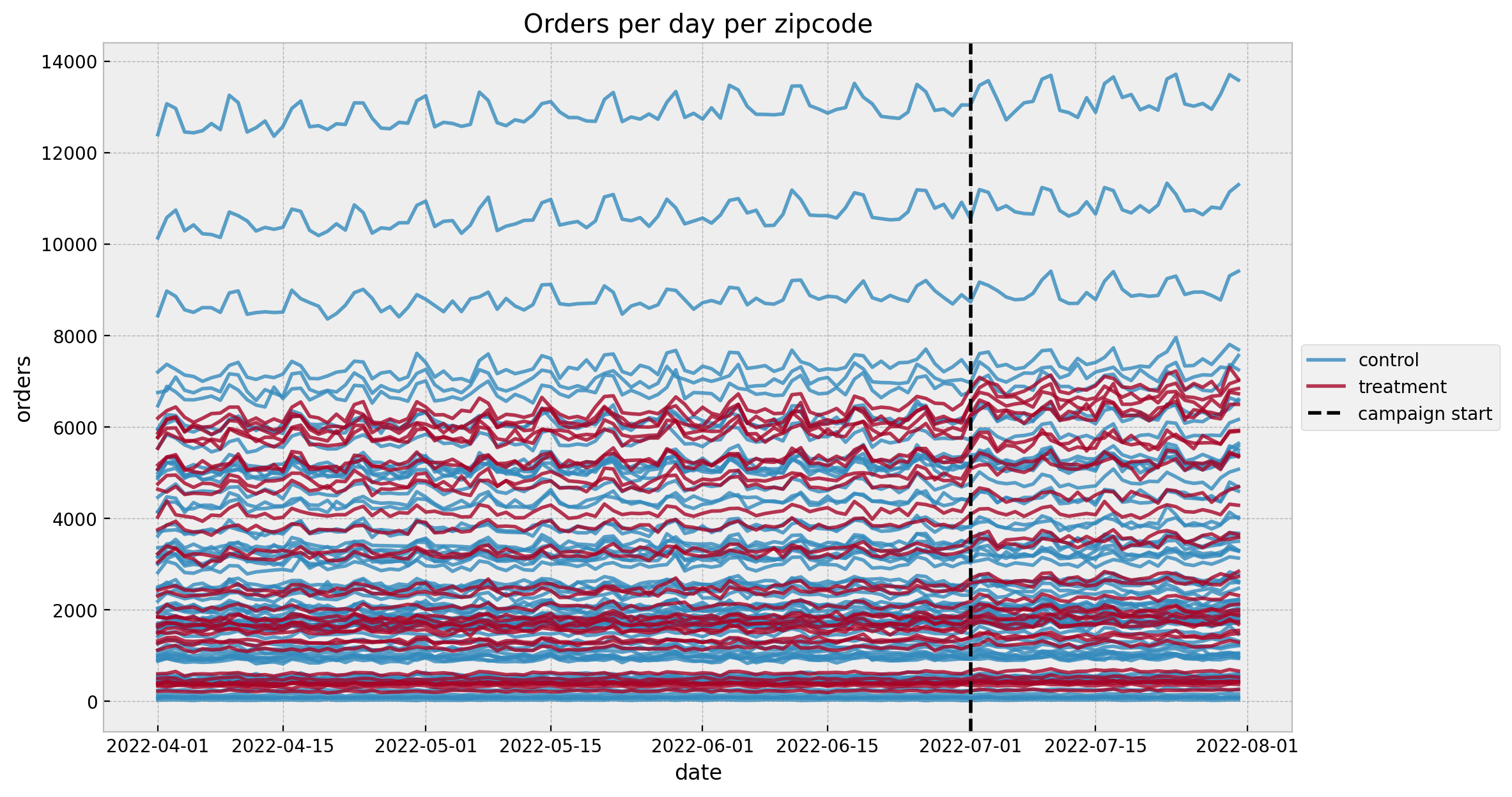
We see a mild positive trend and a weekly seasonality (which is no surprise given the data generation process).
Prepare Data
Now we prepare the data for the model, which in this case is a simple aggregation over all geos. In practice, the selection of the control geos can be done manually (given some business requirements and constraints) or semi-automatic (using some optimization algorithm as for example A Time-Based Regression Matched Markets Approach for Designing Geo Experiments). Note that one has to “prove” the pre-campaign linearity assumption. There are many options to do this. There are some statistical test (see the main reference for details) or one could use a time-varying coefficients model (like Uber’s Orbit-KTR model or with a simple Gaussian random walk as described here).
agg_data_df = (
    data_df
    .groupby(["date", "is_campaign", "variant"], as_index=False)
    .agg({"orders": np.sum})
)

data_train = (
    agg_data_df.query("~ is_campaign")
    .pivot(index="date", columns="variant", values="orders")
    .reset_index()
)

data_test = (
    agg_data_df.query("is_campaign")
    .pivot(index="date", columns="variant", values="orders")
    .reset_index()
)
Next, we do a pre and post campaign split of the data.
date_train = data_train["date"].to_numpy()
y_control_train = data_train["control"].to_numpy()
y_treatment_train = data_train["treatment"].to_numpy()

date_test = data_test["date"].to_numpy()
y_control_test = data_test["control"].to_numpy()
y_treatment_test = data_test["treatment"].to_numpy()

n_train = data_train.shape[0]
n_test = data_test.shape[0]
n = n_train + n_test
idx_train = range(n_train)
idx_test = range(n_train, n)
In order to stablish suitable priors we scale the data (as suggested by Richard McElreath in Statistical Rethinking):
scaler_control = StandardScaler()
scaler_treatment = StandardScaler()

scaler_control.fit(X=y_control_train[..., None])
scaler_treatment.fit(X=y_treatment_train[..., None])

y_control_train_scaled = scaler_control.transform(
    X=y_control_train[..., None]
).flatten()
y_treatment_train_scaled = scaler_treatment.transform(
    X=y_treatment_train[..., None]
).flatten()

y_control_test_scaled = scaler_control.transform(X=y_control_test[..., None]).flatten()
y_treatment_test_scaled = scaler_treatment.transform(
    X=y_treatment_test[..., None]
).flatten()
Let’s take a look at the scaled data:
fig, ax = plt.subplots()
sns.lineplot(
    x=date_train, y=y_control_train_scaled, color="C0", label="control (train)", ax=ax
)
sns.lineplot(
    x=date_train,
    y=y_treatment_train_scaled,
    color="C1",
    label="treatment (train)",
    ax=ax,
)
sns.lineplot(
    x=date_test, y=y_control_test_scaled, color="C2", label="control (test)", ax=ax
)
sns.lineplot(
    x=date_test,
    y=y_treatment_test_scaled,
    color="C3",
    label="treatment (test)",
    ax=ax,
)
ax.axvline(x=start_campaign, color="gray", linestyle="--", label="campaign start")
ax.legend(loc="upper left")
ax.set(title="Orders (Scaled)");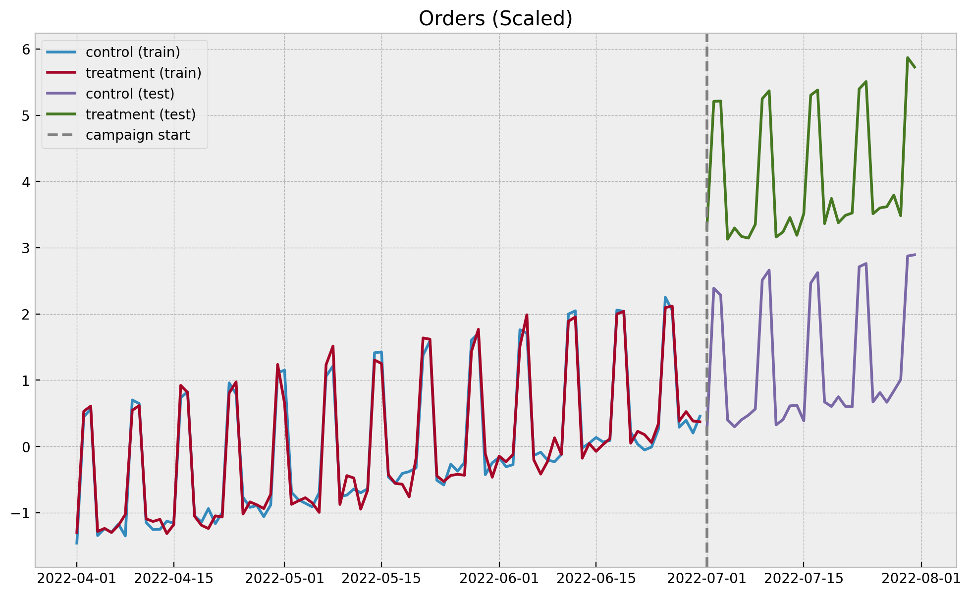
In this simulated example the pre-campaign linearity assumption seems to hold.
Define Model
Now we define the linear regression model. One of the benefits of the Bayesian approach is the ability to encode domain knowledge. In this example we impose the regression coefficient \(\beta\) to be positive, which is reasonable given the pre-campaign data. In addition, we use a Student-t likelihood to account for potential outliers in the data.
with pm.Model() as model:
    # --- Data Containers ---
    model.add_coord(name="date", values=date_train, mutable=True)
    y_control_data = pm.MutableData(
        name="y_control_data", value=y_control_train_scaled, dims="date"
    )
    y_treatment_data = pm.MutableData(
        name="y_treatment_data", value=y_treatment_train_scaled, dims="date"
    )
    # --- Priors ---
    intercept = pm.Normal(name="intercept", mu=0, sigma=1)
    beta = pm.HalfNormal(name="beta", sigma=2)
    sigma = pm.HalfNormal(name="sigma", sigma=2)
    nu = pm.Gamma(name="nu", alpha=20, beta=2)
    # --- Model Parametrization ---
    mu = pm.Deterministic(name="mu", var=intercept + beta * y_control_data, dims="date")
    # --- Likelihood ---
    likelihood = pm.StudentT(
        "likelihood", mu=mu, nu=nu, sigma=sigma, observed=y_treatment_data, dims="date"
    )

pm.model_to_graphviz(model=model)
Prior Predictive Check
Before fitting the model, we run some prior predictive checks. This is a good way to check that the model is well defined and that the priors are reasonable.
with model:
    prior_predictive: az.InferenceData = pm.sample_prior_predictive(samples=1000)
palette = "Spectral_r"
cmap = plt.get_cmap(palette)
percs = np.linspace(51, 99, 100)
colors = (percs - np.min(percs)) / (np.max(percs) - np.min(percs))
fig, ax = plt.subplots()
for i, p in enumerate(percs[::-1]):
upper = np.percentile(prior_predictive.prior_predictive["likelihood"], p, axis=1)
lower = np.percentile(
prior_predictive.prior_predictive["likelihood"], 100 - p, axis=1
)
color_val = colors[i]
ax.fill_between(
x=date_train,
y1=upper.flatten(),
y2=lower.flatten(),
color=cmap(color_val),
alpha=0.1,
)
sns.lineplot(
x=date_train,
y=y_treatment_train_scaled,
label="orders (scaled)",
color="black",
ax=ax,
)
ax.legend(loc="upper left")
ax.set(title="Prior Predictive Samples", xlabel="date", ylabel="orders (scaled)");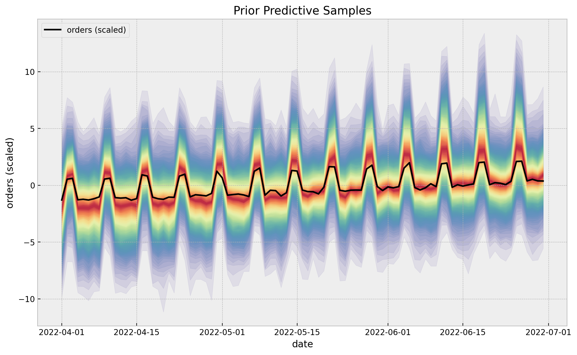
The prior predictive check looks good!
Fit Model
with model:
    idata: az.InferenceData = pm.sampling_jax.sample_numpyro_nuts(draws=5000, chains=4)
    posterior_predictive: az.InferenceData = pm.sample_posterior_predictive(trace=idata)
Model Diagnostics
We can now look into some model diagnostics.
var_names: list[str] = ["intercept","beta", "sigma", "nu"]

az.summary(data=idata, var_names=var_names)| mean | sd | hdi_3% | hdi_97% | mcse_mean | mcse_sd | ess_bulk | ess_tail | r_hat | |
|---|---|---|---|---|---|---|---|---|---|
| intercept | 0.003 | 0.018 | -0.031 | 0.036 | 0.000 | 0.000 | 20287.0 | 14796.0 | 1.0 |
| beta | 0.985 | 0.018 | 0.951 | 1.018 | 0.000 | 0.000 | 21524.0 | 15726.0 | 1.0 |
| sigma | 0.157 | 0.014 | 0.132 | 0.184 | 0.000 | 0.000 | 19883.0 | 15327.0 | 1.0 |
| nu | 10.356 | 2.230 | 6.320 | 14.570 | 0.016 | 0.011 | 19400.0 | 13328.0 | 1.0 |
axes = az.plot_trace(
    data=idata,
    var_names=var_names,
    compact=True,
    kind="rank_bars",
    backend_kwargs={"figsize": (12, 7), "layout": "constrained"},
)
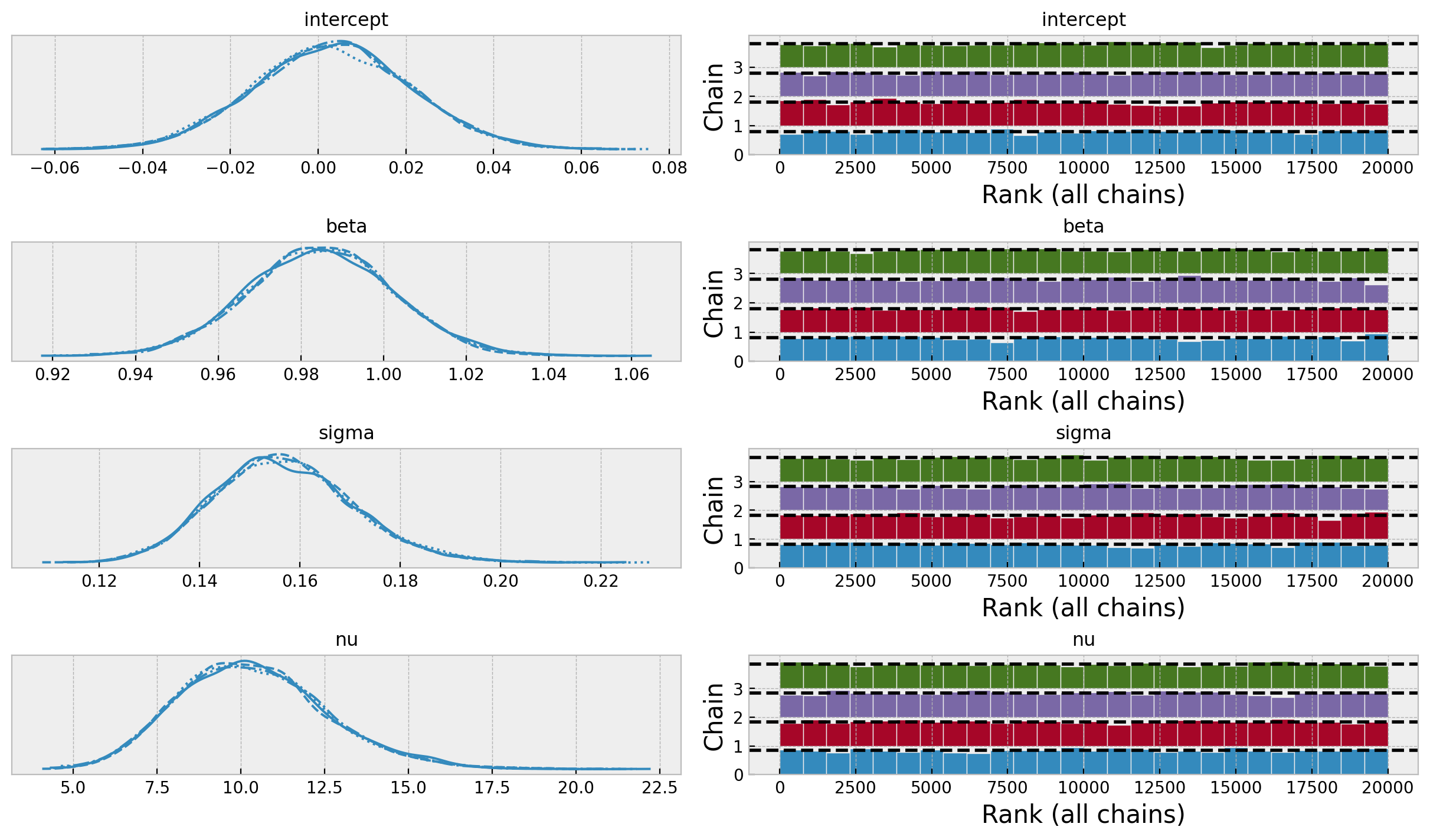
The model posterior distributions look good. In particular, note that the intercept and the regression coefficient are centered around zero and one respectively. This is to be expected given the scaling of the data.
Posterior Predictive (Train)
We now look at the posterior predictive distribution for the training (pre-campaign) data
posterior_predictive_likelihood_train: DataArray = az.extract(
    data=posterior_predictive, group="posterior_predictive", var_names=["likelihood"]
)

fig, ax = plt.subplots()

for i, p in enumerate(percs[::-1]):
    upper = np.percentile(posterior_predictive_likelihood_train, p, axis=1)
    lower = np.percentile(posterior_predictive_likelihood_train, 100 - p, axis=1)
    color_val = colors[i]
    ax.fill_between(
        x=date_train,
        y1=upper,
        y2=lower,
        color=cmap(color_val),
        alpha=0.1,
    )

sns.lineplot(
    x=date_train,
    y=posterior_predictive_likelihood_train.mean(axis=1),
    color="C1",
    label="posterior predictive mean",
    ax=ax,
)
sns.lineplot(
    x=date_train,
    y=y_treatment_train_scaled,
    color="black",
    label="orders (scaled)",
    ax=ax,
)
ax.legend(loc="upper left")
ax.set(
    title="Posterior Predictive Samples (Train) - Orders (Scaled)",
    xlabel="date",
    ylabel="orders (scaled)",
);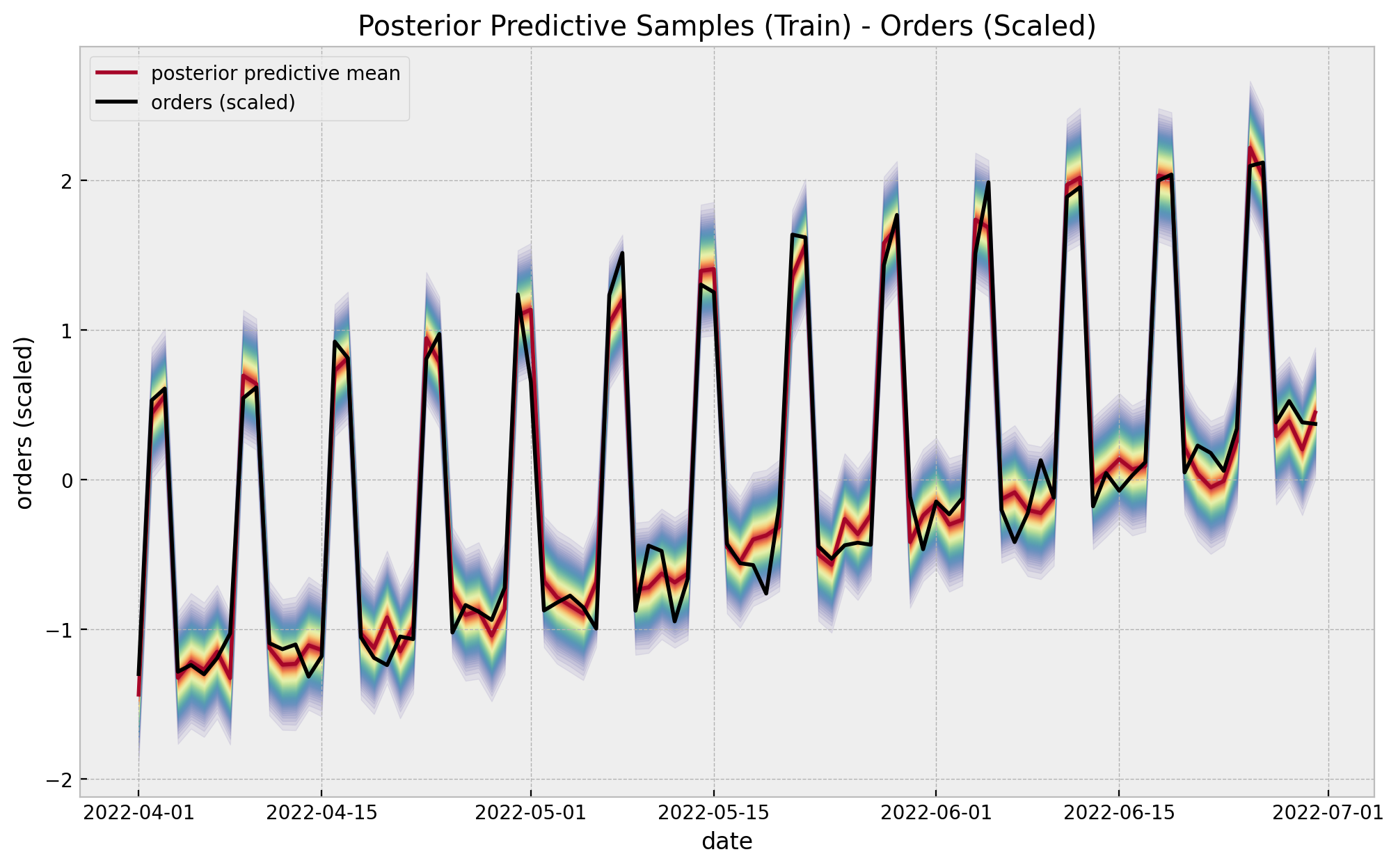
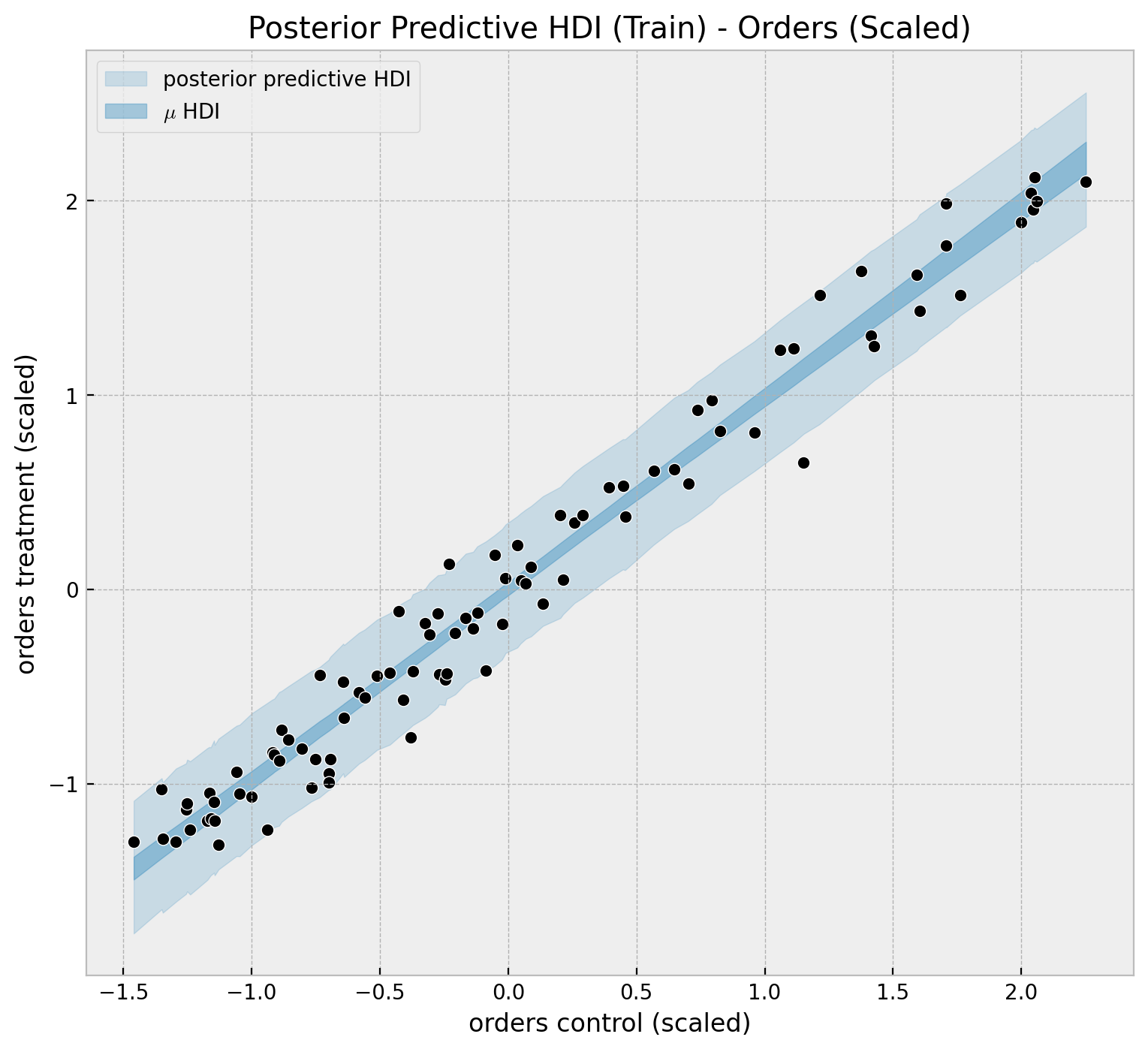
We can visualize the predictions in a different way to clearly see linear relationship.
hdi_train_likelihood: DataArray = az.hdi(
    ary=posterior_predictive, group="posterior_predictive"
)["likelihood"]

hdi_train_mu: DataArray = az.hdi(ary=idata, group="posterior")["mu"]

idx_train_sorted = np.argsort(a=y_control_train_scaled)

fig, ax = plt.subplots(figsize=(9, 8))
ax.fill_between(
    x=y_control_train_scaled[idx_train_sorted],
    y1=hdi_train_likelihood[:, 0][idx_train_sorted],
    y2=hdi_train_likelihood[:, 1][idx_train_sorted],
    color="C0",
    alpha=0.2,
    label="posterior predictive HDI",
)
ax.fill_between(
    x=y_control_train_scaled[idx_train_sorted],
    y1=hdi_train_mu[:, 0][idx_train_sorted],
    y2=hdi_train_mu[:, 1][idx_train_sorted],
    color="C0",
    alpha=0.4,
    label=r"$\mu$ HDI",
)
sns.scatterplot(
    x=y_control_train_scaled[idx_train_sorted],
    y=y_treatment_train_scaled[idx_train_sorted],
    color="black",
    ax=ax,
)
ax.legend(loc="upper left")
ax.set(
    title="Posterior Predictive HDI (Train) - Orders (Scaled)",
    xlabel="orders control (scaled)",
    ylabel="orders treatment (scaled)",
);
We can compute the errors distribution of the model:
errors_train: DataArray = (
    posterior_predictive_likelihood_train - y_treatment_train_scaled[..., None]
)

fig, ax = plt.subplots(figsize=(15, 7))

for i, p in enumerate(percs[::-1]):
    upper = np.percentile(a=errors_train, q=p, axis=1)
    lower = np.percentile(a=errors_train, q=100 - p, axis=1)
    color_val = colors[i]
    ax.fill_between(x=date_train, y1=upper, y2=lower, color=cmap(color_val), alpha=0.2)

ax.axhline(y=0, color="C1", linestyle="--")
ax.set(
    title="Posterior Errors Distribution (Train)",
    xlabel="date",
    ylabel=r"$\hat{y} - y$",
);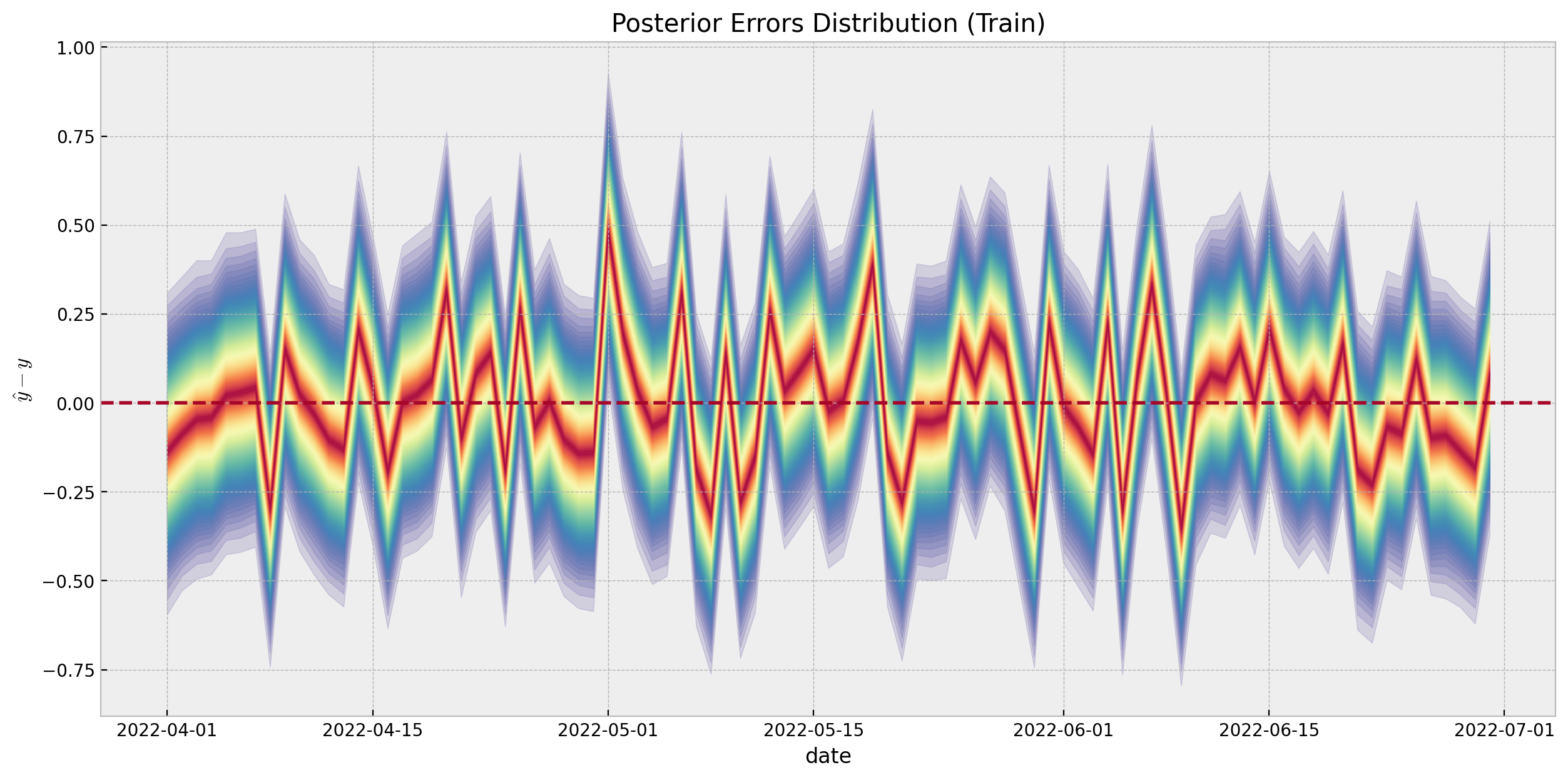
We do not see any patterns or weird behavior in the errors distribution.
Uncertainty Quantification
Even though the bayesian framework provides a transparent uncertainty quantification on out-of-sample predictions, the paper suggest a cross-validation approach to have a clearer way to measure uncertainty by simulating pseudo geo experiment data sets from the historical data. I think the motivation behind it is that in real applications the data is very noisy and the linear relationship will probably to hold true completely.
Cross Validation: Folds Generation
Idea: Generate a sequence of simulated “pseudo geo experiment data sets,” that is, full data sets of length the length of the experiment \(N_{exp}\), constructed from intervals extracted from the available historical time series data. Each of these simulated data sets represents a possible outcome in the future experiment
How? To generate the sequence of such data sets, we use the following procedure. Let \(t = 1, \cdots, T\) index each available date in the historical time series.
We extract a data set \(D_i\) , indexed similarly by \(i = 1, \cdots, T\) starting from a date \(t = i\) onward consisting of \(N_{exp}\) days.
When the end date of the pseudo geo experiment extends beyond date \(T\), complement the time series by adding dates starting from \(t = 1\), thus “recycling” data points as necessary. For example, assuming daily data, a data set \(D_{T − 1}\) contains data from days \(\{T −1, T, 1, 2, 3, . . . , N_{exp} − 2\}\).
Each of the data sets \(i\) is assigned a new, consecutive range of dates. Thus we obtain \(T\) unique data sets in total.
Let’s encode this logic in a function:
def generate_folds_indices(n_train: int, n_test: int) -> npt.NDArray[np.int_]:
    """Generate cyclic folds indices."""
    return np.array(
        [np.arange(start=i, stop=i + n_test) % n_train for i in range(n_train)]
    )


folds_indices: npt.NDArray[np.int_] = generate_folds_indices(n_train=n_train, n_test=n_test)

# Let's see the folds indices
folds_indices
array([[ 0, 1, 2, ..., 28, 29, 30],
[ 1, 2, 3, ..., 29, 30, 31],
[ 2, 3, 4, ..., 30, 31, 32],
...,
[88, 89, 90, ..., 25, 26, 27],
[89, 90, 0, ..., 26, 27, 28],
[90, 0, 1, ..., 27, 28, 29]])The following figure shows the folds as in a continuous color palette.
fig, ax = plt.subplots(figsize=(15, 7))
sns.heatmap(data=folds_indices.T, cmap="Spectral_r", ax=ax)
ax.set(title="Folds Indices", xlabel="train index", ylabel="fold index");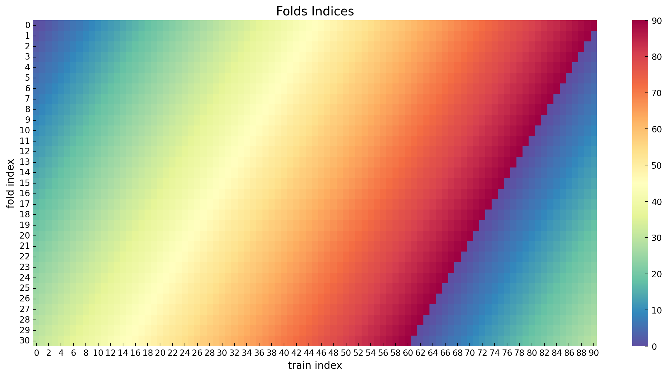
Generate predictions for each fold
We now generate predictions (in the original scale!) for each fold using the same fitted model. We also compute the errors and HDI intervals.
folds_errors_list: list[npt.NDArray[np.float_]] = []
# generate prediction for each fold and compute the errors (original scale).
for i in tqdm(range(n_train)):
    idx = folds_indices[i, :]
    likelihood_fold = posterior_predictive_likelihood_train[idx, :]
    y_control_fold_scaled_pred = scaler_control.inverse_transform(X=likelihood_fold)
    y_control_fold_scaled = y_control_train[idx]
    error_control_fold = y_control_fold_scaled[..., None] - y_control_fold_scaled_pred
    folds_errors_list.append(error_control_fold)

folds_errors = np.array(folds_errors_list)

# compute the HDI and the median across folds.
folds_hdi = az.hdi(ary=np.moveaxis(a=folds_errors, source=0, destination=2))
folds_hdi_median = np.median(a=folds_hdi, axis=0)
Let’s visualize the errors distribution.
fig, ax = plt.subplots()

for i in range(n_train):
    ax.vlines(
        x=i,
        ymin=folds_hdi[i, 0],
        ymax=folds_hdi[i, 1],
        linestyle="solid",
        linewidth=0.5,
    )
ax.plot(
    np.median(folds_errors.reshape(n_train, -1), axis=1),
    color="C0",
    linestyle="dashed",
    label="errors median",
)
ax.axhline(
    y=folds_hdi_median[0], color="C1", linestyle="dashed", label="Median HDI (lower)"
)
ax.axhline(
    y=folds_hdi_median[1], color="C3", linestyle="dashed", label="Median HDI (upper)"
)
ax.axhline(y=0.0, color="gray", linestyle="--", label="zero")
ax.legend(loc="center left", bbox_to_anchor=(1, 0.5))
ax.set(title="HDI Folds Errors", xlabel="fold", ylabel="error");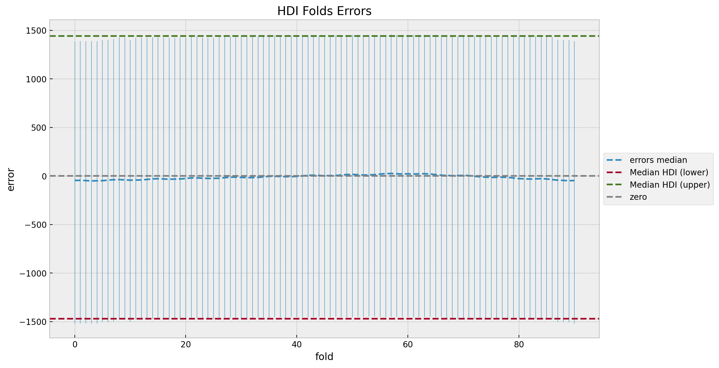
We do not see any patterns or weird behavior in the errors distribution. Also, the median error is close to zero (which is not always the case for real data). We can now take a look into the cumulative errors distribution.
folds_errors_cumsum = folds_errors.cumsum(axis=1)
folds_cumsum_hdi = az.hdi(ary=np.moveaxis(a=folds_errors_cumsum, source=0, destination=2))
folds_cumsum_hdi_median = np.median(a=folds_cumsum_hdi, axis=0)
median_folds_errors_cumsum = np.median(folds_errors_cumsum.reshape(n_train, -1), axis=1)
fig, ax = plt.subplots()
for i in range(n_train):
ax.vlines(
x=i,
ymin=folds_cumsum_hdi[i, 0],
ymax=folds_cumsum_hdi[i, 1],
linestyle="solid",
linewidth=0.5,
)
ax.plot(
median_folds_errors_cumsum,
color="C0",
linestyle="dashed",
label="errors cumsum median",
)
ax.axhline(
y=folds_cumsum_hdi_median[0],
color="C1",
linestyle="dashed",
label="Median HDI (lower)",
)
ax.axhline(
y=folds_cumsum_hdi_median[1],
color="C3",
linestyle="dashed",
label="Median HDI (upper)",
)
ax.axhline(y=0.0, color="gray", linestyle="--", label="zero")
ax.legend(loc="center left", bbox_to_anchor=(1, 0.5))
ax.set(title="HDI Cumsum Errors Folds", xlabel="fold", ylabel="cumulative error");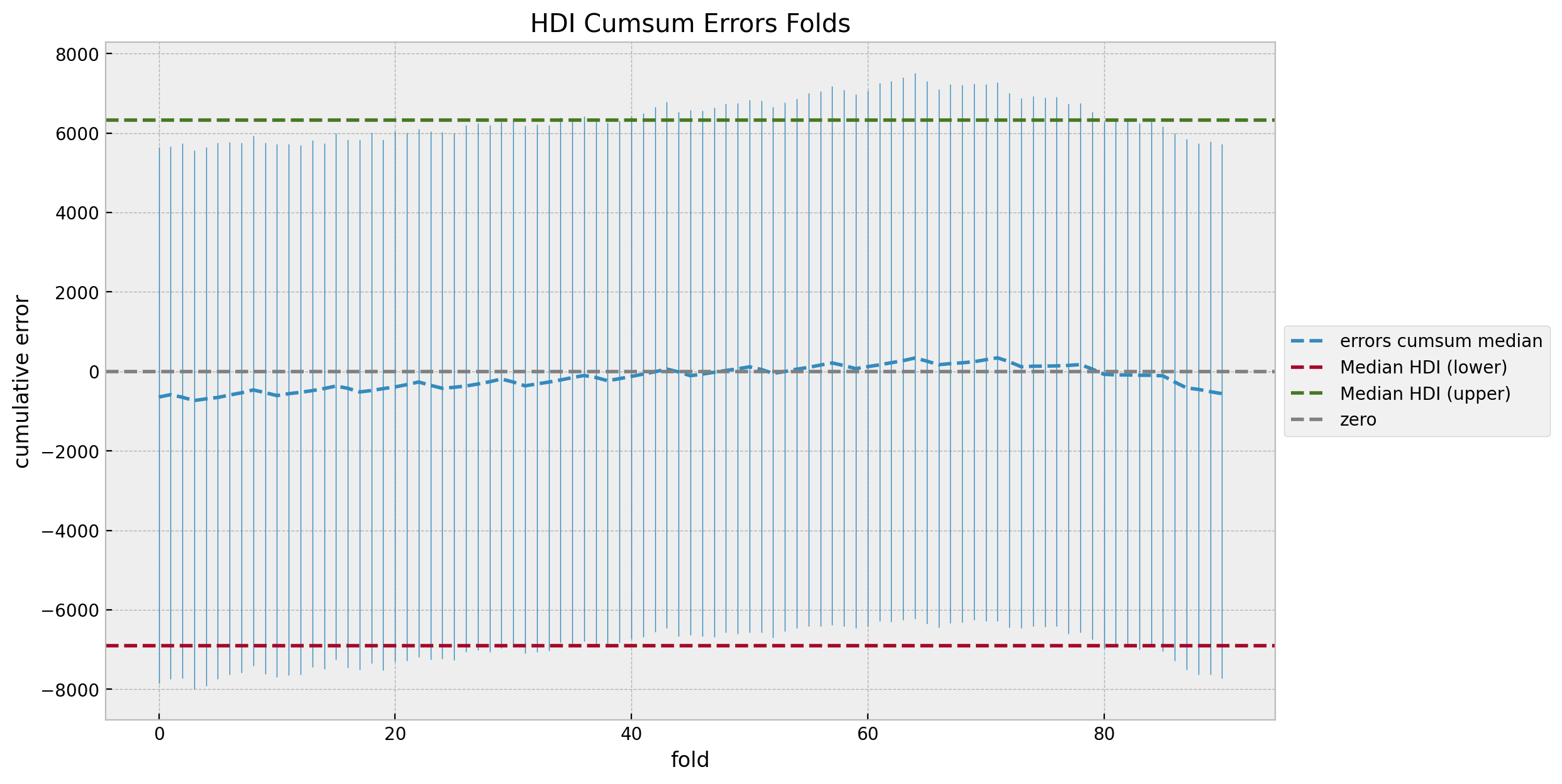
The cumulative errors distribution looks also quite even and centered around zero. We can also sort the errors by the median to study the trend.
sorted_idx = np.argsort(a=median_folds_errors_cumsum)


fig, ax = plt.subplots()

for i in range(n_train):
    ymin = folds_cumsum_hdi[sorted_idx][i, 0]
    ymax = folds_cumsum_hdi[sorted_idx][i, 1]
    outside_condition = (ymin < folds_cumsum_hdi_median[0]) or (
        ymax > folds_cumsum_hdi_median[1]
    )
    ax.vlines(
        x=i + 1,
        ymin=ymin,
        ymax=ymax,
        color="C0",
        linestyle="solid",
        linewidth=0.5,
    )
ax.plot(
    median_folds_errors_cumsum[sorted_idx],
    color="C0",
    linestyle="dashed",
    label="errors cumsum median",
)
ax.axhline(
    y=folds_cumsum_hdi_median[0],
    color="C1",
    linestyle="dashed",
    label="Median HDI (lower)",
)
ax.axhline(
    y=folds_cumsum_hdi_median[1],
    color="C3",
    linestyle="dashed",
    label="Median HDI (upper)",
)
ax.axhline(y=0.0, color="gray", linestyle="--", label="zero")
ax.legend(loc="center left", bbox_to_anchor=(1, 0.5))
ax.set(title="HDI Cumsum Errors Folds (Sorted)", xlabel="fold (sorted)", ylabel="cumulative error");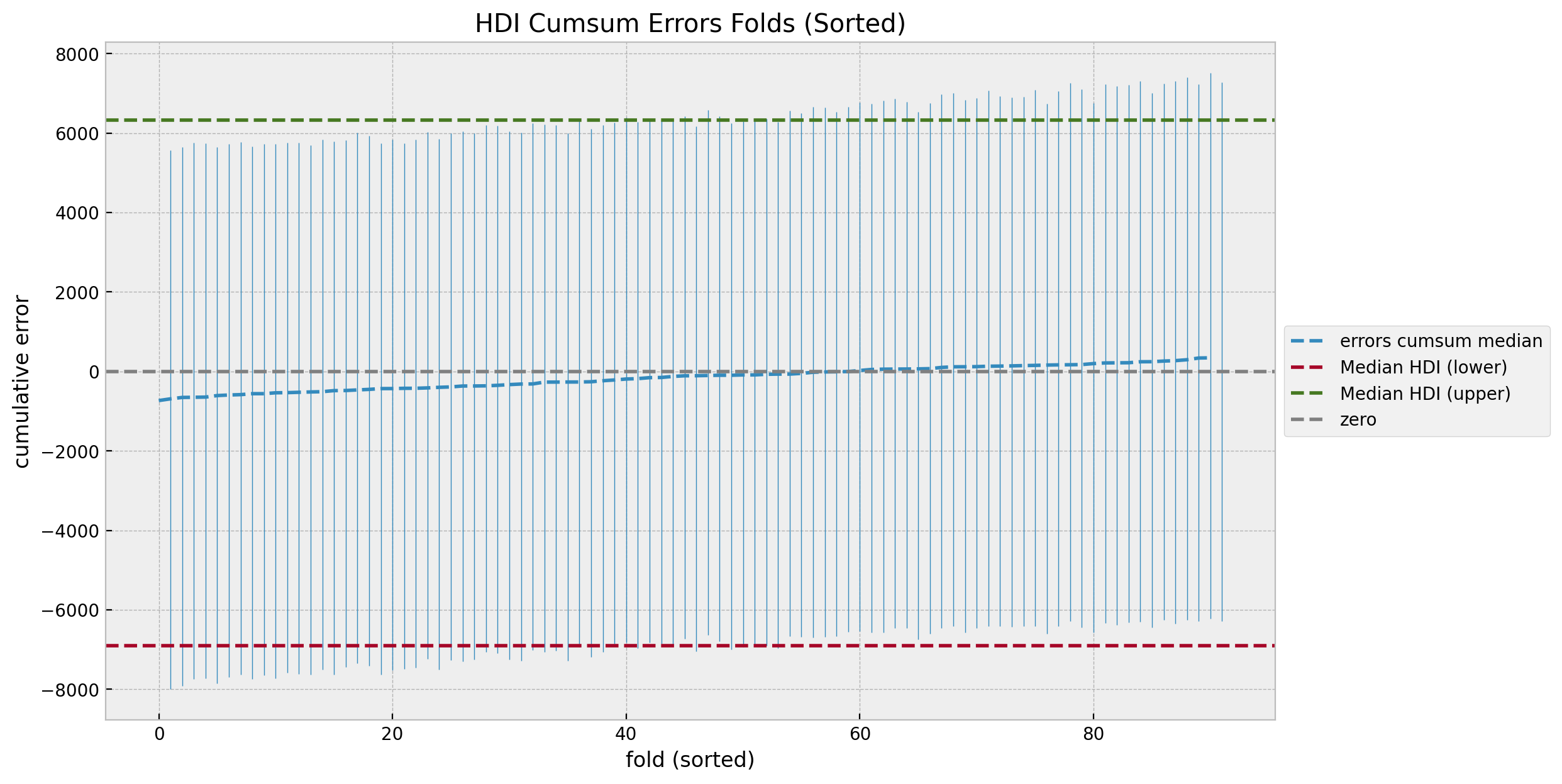
After we compare with the counterfactual predictions against the true values we will revisit these uncertainty plots.
Posterior Predictive (Test)
Now generate predictions for the test (post-campaign) period.
with model:
pm.set_data(
new_data={
"y_control_data": y_control_test_scaled,
"y_treatment_data": y_treatment_test_scaled,
},
coords={"date": date_test},
)
idata.extend(
pm.sample_posterior_predictive(
trace=idata,
var_names=["likelihood", "mu"],
idata_kwargs={"coords": {"date": date_test}},
)
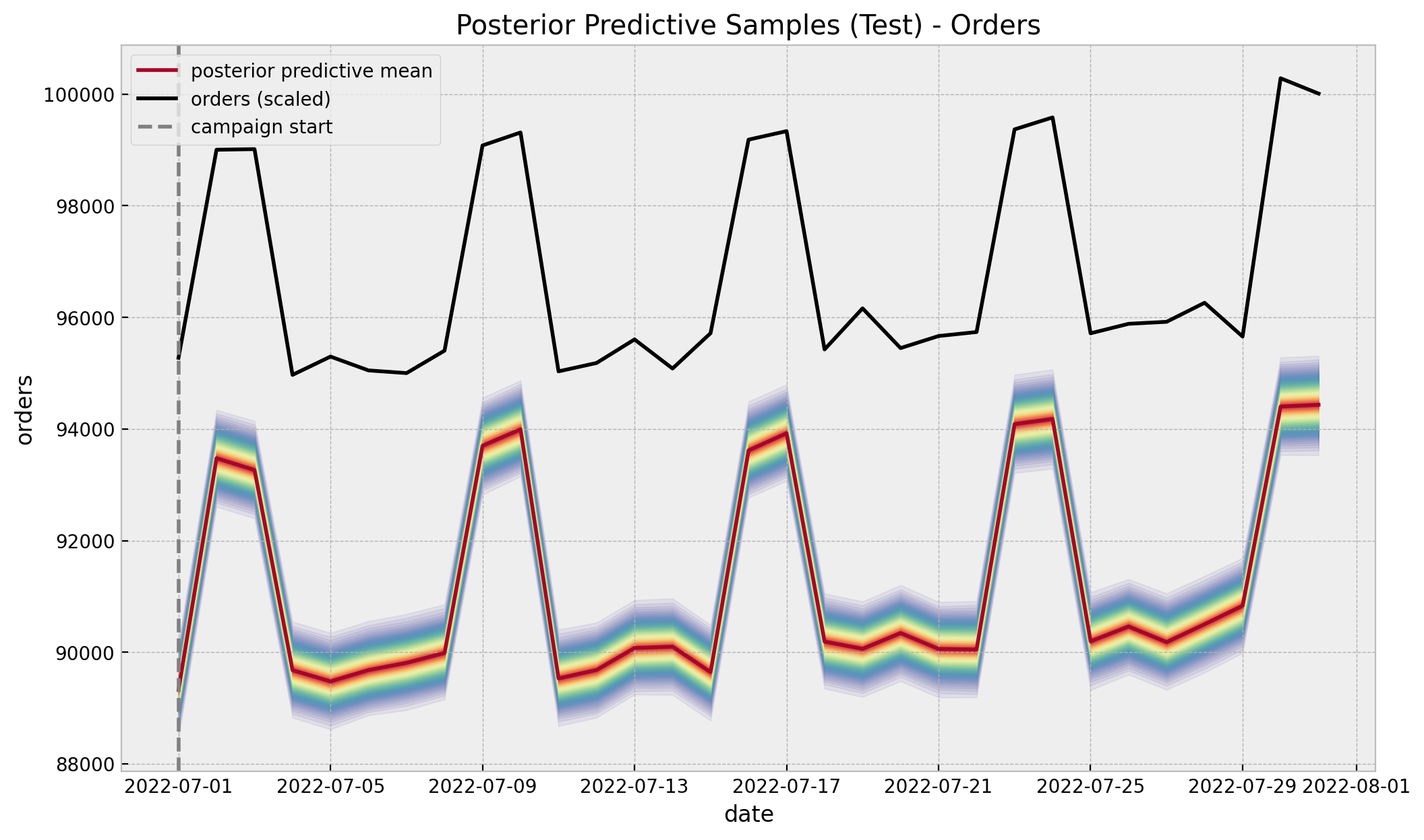
)Now we compare the counterfactual predictions against the true values in the original scale.
posterior_predictive_likelihood_test = az.extract(
    data=idata, group="posterior_predictive", var_names=["likelihood"]
)

posterior_predictive_likelihood_test_inv = scaler_treatment.inverse_transform(
    X=posterior_predictive_likelihood_test
)

fig, ax = plt.subplots()

for i, p in enumerate(percs[::-1]):
    upper = np.percentile(a=posterior_predictive_likelihood_test_inv, q=p, axis=1)
    lower = np.percentile(a=posterior_predictive_likelihood_test_inv, q=100 - p, axis=1)
    color_val = colors[i]
    ax.fill_between(
        x=date_test,
        y1=upper,
        y2=lower,
        color=cmap(color_val),
        alpha=0.1,
    )

sns.lineplot(
    x=date_test,
    y=posterior_predictive_likelihood_test_inv.mean(axis=1),
    color="C1",
    label="posterior predictive mean",
    ax=ax,
)
sns.lineplot(
    x=date_test,
    y=y_treatment_test,
    color="black",
    label="orders (scaled)",
    ax=ax,
)
ax.axvline(x=start_campaign, color="gray", linestyle="--", label="campaign start")
ax.legend(loc="upper left")
ax.set(
    title="Posterior Predictive Samples (Test) - Orders",
    xlabel="date",
    ylabel="orders",
);
errors_test_inv = y_treatment_test[..., None] - posterior_predictive_likelihood_test_inv
fig, ax = plt.subplots()
for i, p in enumerate(percs[::-1]):
upper = np.percentile(a=errors_test_inv, q=p, axis=1)
lower = np.percentile(a=errors_test_inv, q=100 - p, axis=1)
color_val = colors[i]
ax.fill_between(x=date_test, y1=upper, y2=lower, color=cmap(color_val), alpha=0.2)
ax.axhline(y=0, color="C1", linestyle="--")
ax.axvline(x=start_campaign, color="gray", linestyle="--", label="campaign start")
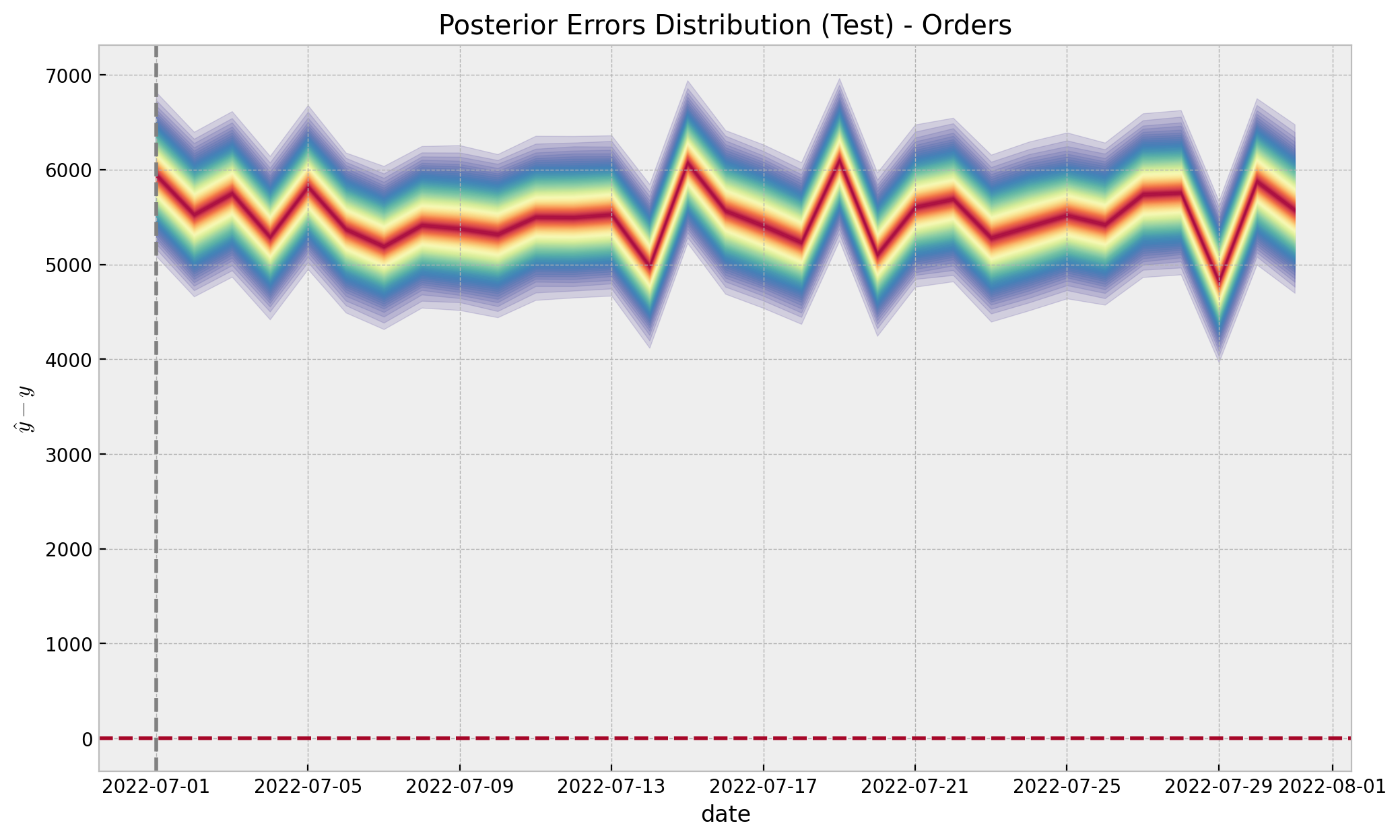
ax.set(
title="Posterior Errors Distribution (Test) - Orders",
xlabel="date",
ylabel=r"$\hat{y} - y$",
);
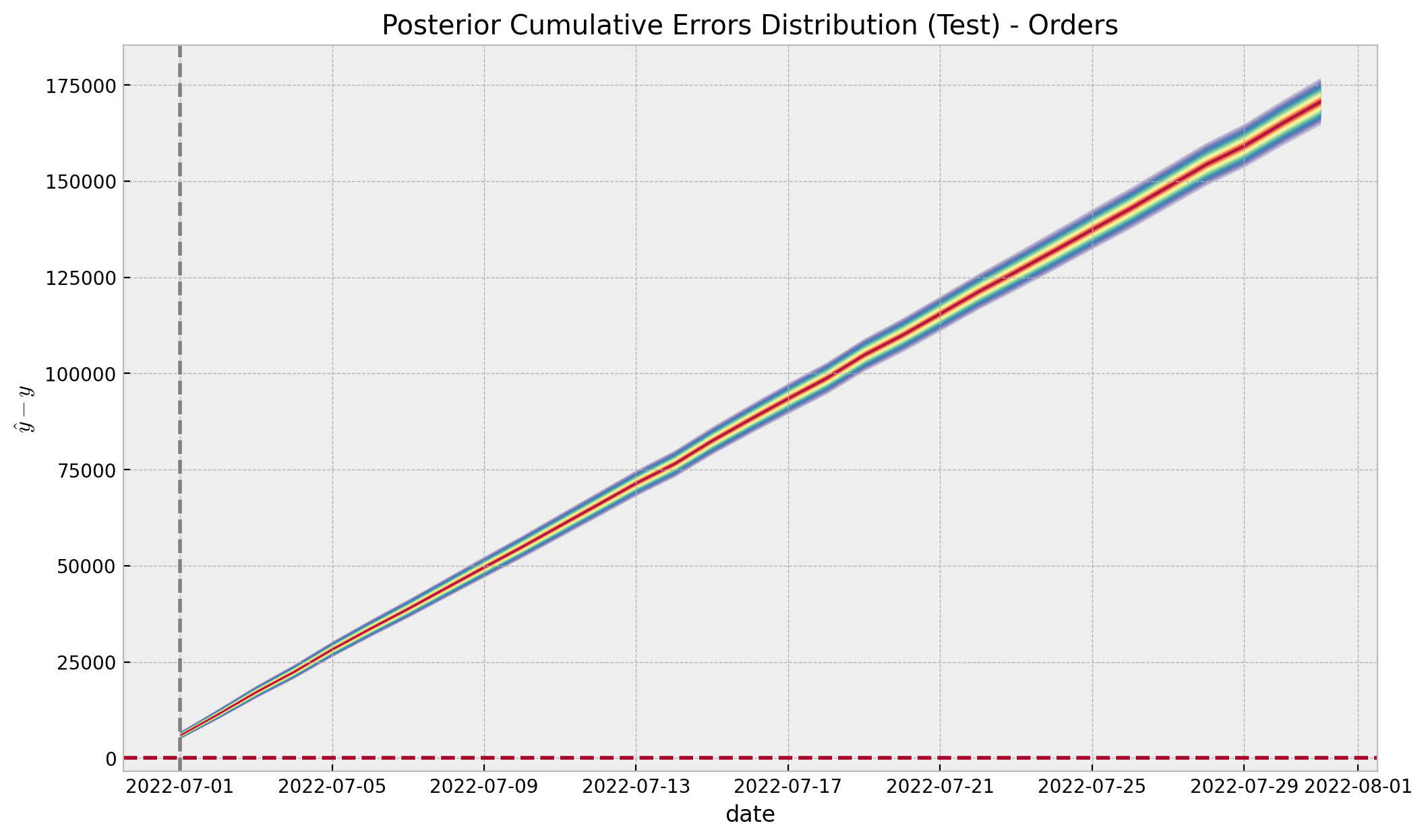
Finally, we are mainly interested in the cumulative effect:
errors_test_cumsum = errors_test_inv.cumsum(axis=0)
errors_test_cumsum_hdi = az.hdi(ary=errors_test_cumsum.T)[-1, :]


fig, ax = plt.subplots()

for i, p in enumerate(percs[::-1]):
    upper = np.percentile(a=errors_test_cumsum, q=p, axis=1)
    lower = np.percentile(a=errors_test_cumsum, q=100 - p, axis=1)
    color_val = colors[i]
    ax.fill_between(x=date_test, y1=upper, y2=lower, color=cmap(color_val), alpha=0.2)

ax.axhline(y=0, color="C1", linestyle="--")
ax.axvline(x=start_campaign, color="gray", linestyle="--", label="campaign start")
ax.set(
    title="Posterior Cumulative Errors Distribution (Test) - Orders",
    xlabel="date",
    ylabel=r"$\hat{y} - y$",
);
g = sns.displot(data=errors_test_cumsum[-1, :],  kde=True, rug=True, height=4.5, aspect=2)
g.fig.suptitle("Posterior Cumulative Errors Distribution (Test) - Orders", y=1.05);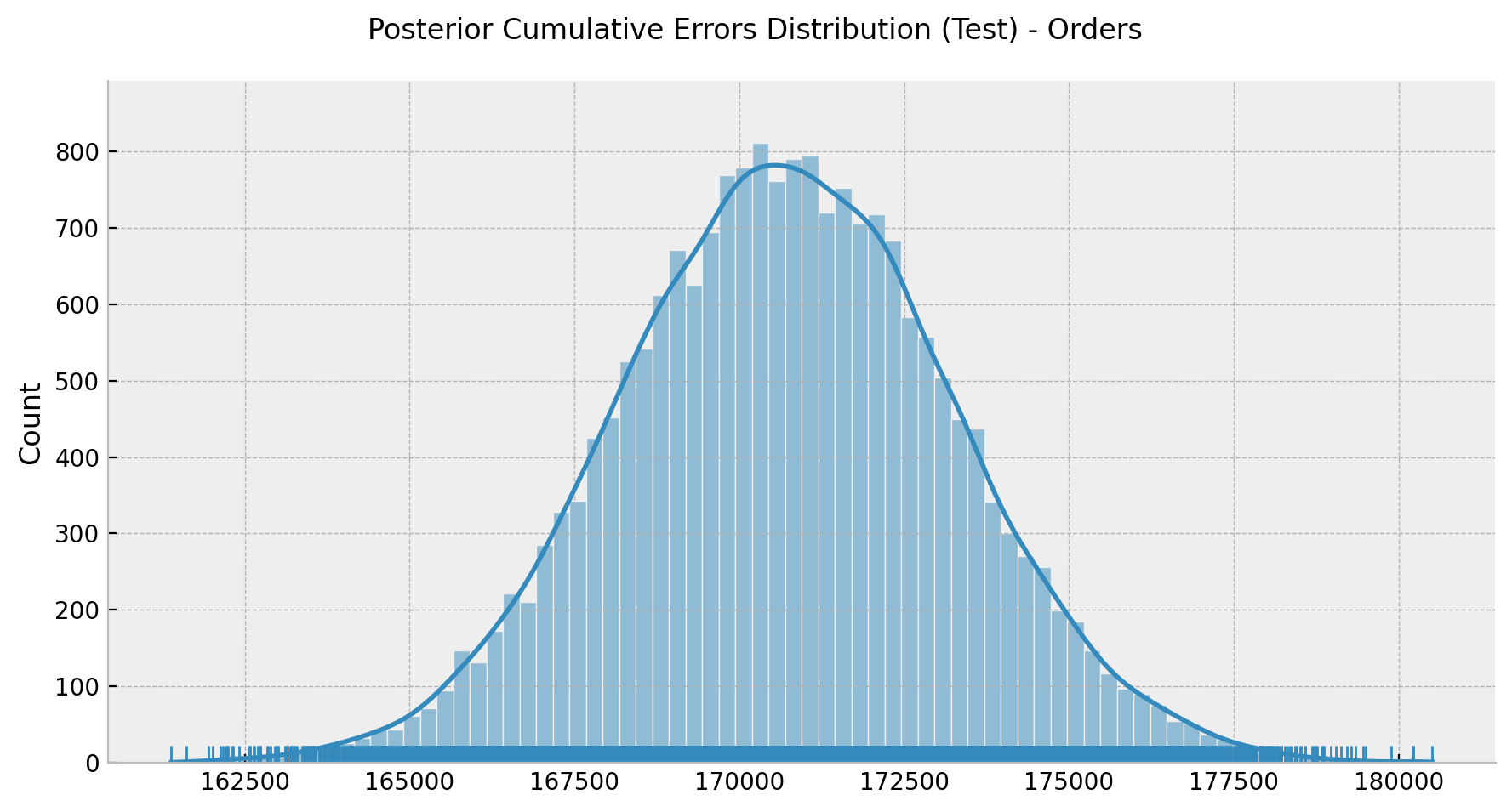
Lastly, we can take a look into the uncertainty plots again against the estimated cumulative effect.
sorted_idx = np.argsort(a=median_folds_errors_cumsum)


fig, ax = plt.subplots()

for i in range(n_train):
    ymin = folds_cumsum_hdi[sorted_idx][i, 0]
    ymax = folds_cumsum_hdi[sorted_idx][i, 1]
    outside_condition = (ymin < folds_cumsum_hdi_median[0]) or (
        ymax > folds_cumsum_hdi_median[1]
    )
    ax.vlines(
        x=i + 1,
        ymin=ymin,
        ymax=ymax,
        color="C0",
        linestyle="solid",
        linewidth=0.5,
    )
ax.plot(
    median_folds_errors_cumsum[sorted_idx],
    color="C0",
    linestyle="dashed",
    label="errors cumsum median",
)
ax.axhline(
    y=folds_cumsum_hdi_median[0],
    color="C1",
    linestyle="dashed",
    label="Median HDI (lower)",
)
ax.axhline(
    y=folds_cumsum_hdi_median[1],
    color="C3",
    linestyle="dashed",
    label="Median HDI (upper)",
)
ax.axhline(y=0.0, color="gray", linestyle="--", label="zero")
ax.vlines(
        x=0,
        ymin=errors_test_cumsum_hdi[0],
        ymax=errors_test_cumsum_hdi[1],
        color="black",
        linestyle="solid",
        linewidth=3,
        label="HDI test",
    )
ax.legend(loc="center left", bbox_to_anchor=(1, 0.5))
ax.set(title="HDI Cumsum Errors Folds (Sorted)", xlabel="fold (sorted)", ylabel="cumulative error");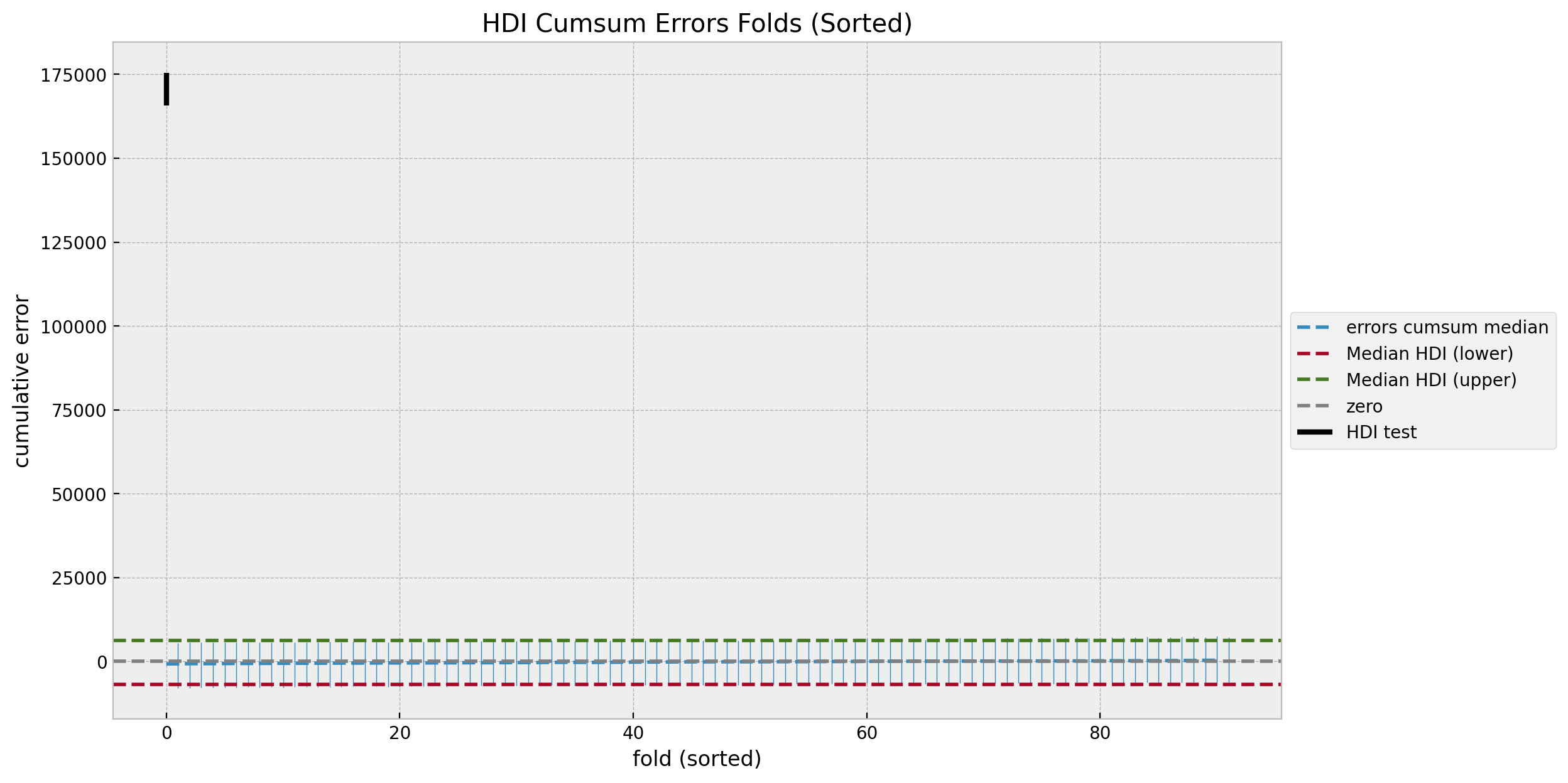
This makes clear that we are certain about the effect of the campaign.
Note however we are not done yet! We have estimated the effect in orders, but we need to factor in the costs. The true quantity of interest is the iROAS (incremental return on advertising spend).This should not be hard after having done the conterfactual estimation above. See Section 3.4 - TBR Incremental ROAS Analysis for details.