In this notebook we want to reproduce a classical example of using Gaussian processes to model time series data: The birthdays data set. I first encountered this example in the seminal book Chapter 21, Bayesian Data Analysis (Third edition) when learning about the subject. One thing I rapidly realized was that fitting these types of models in practice is very computationally expensive and sometimes almost infeasible for real industry applications where the data size is larger than all of these academic examples. Recently, there has been a lot of progress in approximation methods to speed up the computations. We investigate one such method: the Hilbert Space Gaussian Process (HSGP) approximation introduced in Hilbert space methods for reduced-rank Gaussian process regression. The main idea of this method relies on the Laplacian’s spectral decomposition to approximate kernels’ spectral measures as a function of basis functions. The key observation is that the basis functions in the reduced-rank approximation do not depend on the hyperparameters of the covariance function for the Gaussian process. This allows us to speed up the computations tremendously. We do not go into the mathematical details here (we might do this in a future post), as the original article is very well written and easy to follow (see also the great paper Practical Hilbert space approximate Bayesian Gaussian processes for probabilistic programming). Instead, we reproduce this classical example using PyMC using a very raw implementation from NumPyro Docs - Example: Hilbert space approximation for Gaussian processes, which is a great resource to learn about the method internals (so it is also strongly recommended!).
Remark [Bayesian Workflow Book]: The model I implemented is a fairly complex one, and it is not simple enough for a first iteration. Instead I reproduced every single model from the amazing guide: Bayesian workflow book - Birthdays by Aki Vehtari. This is a step-by-step to develop this model in Stan. All the code can be found on this repository. The Stan code is very readable but I should confess I personally find the PyMC API much nicer to iterate on. I also find the PyMC code much more readable, but this is a matter of taste. I strongly recommend reading the guide and the code to understand the model and the data.
Prepare Notebook
import arviz as az
import matplotlib.pyplot as plt
import numpy as np
import pandas as pd
import preliz as pz
import pymc as pm
import pytensor.tensor as pt
import seaborn as sns
import xarray as xr
from matplotlib.ticker import MaxNLocator
from sklearn.pipeline import Pipeline
from sklearn.preprocessing import FunctionTransformer, StandardScaler

az.style.use("arviz-darkgrid")
plt.rcParams["figure.figsize"] = [12, 7]
plt.rcParams["figure.dpi"] = 100
plt.rcParams["figure.facecolor"] = "white"

%load_ext autoreload
%autoreload 2
%config InlineBackend.figure_format = "retina"
seed: int = sum(map(ord, "birthdays"))
rng: np.random.Generator = np.random.default_rng(seed=seed)Read Data
We read the data from the repository Bayesian workflow book - Birthdays by Aki Vehtari.
raw_df = pd.read_csv(
    "https://raw.githubusercontent.com/avehtari/casestudies/master/Birthdays/data/births_usa_1969.csv",
)

raw_df.info()
<class 'pandas.core.frame.DataFrame'>
RangeIndex: 7305 entries, 0 to 7304
Data columns (total 8 columns):
# Column Non-Null Count Dtype
--- ------ -------------- -----
0 year 7305 non-null int64
1 month 7305 non-null int64
2 day 7305 non-null int64
3 births 7305 non-null int64
4 day_of_year 7305 non-null int64
5 day_of_week 7305 non-null int64
6 id 7305 non-null int64
7 day_of_year2 7305 non-null int64
dtypes: int64(8)
memory usage: 456.7 KBThe data set contains the number of births per day in USA in the period 1969-1988. All the columns are self-explanatory except for day_of_year2 which is the day of the year (from 1 to 366) with leap day being 60 and 1st March 61 also on non-leap-years.
EDA and Feature Engineering
Let us look into the data and create the features we will use in the model.
raw_df.head()| year | month | day | births | day_of_year | day_of_week | id | day_of_year2 | |
|---|---|---|---|---|---|---|---|---|
| 0 | 1969 | 1 | 1 | 8486 | 1 | 3 | 1 | 1 |
| 1 | 1969 | 1 | 2 | 9002 | 2 | 4 | 2 | 2 |
| 2 | 1969 | 1 | 3 | 9542 | 3 | 5 | 3 | 3 |
| 3 | 1969 | 1 | 4 | 8960 | 4 | 6 | 4 | 4 |
| 4 | 1969 | 1 | 5 | 8390 | 5 | 7 | 5 | 5 |
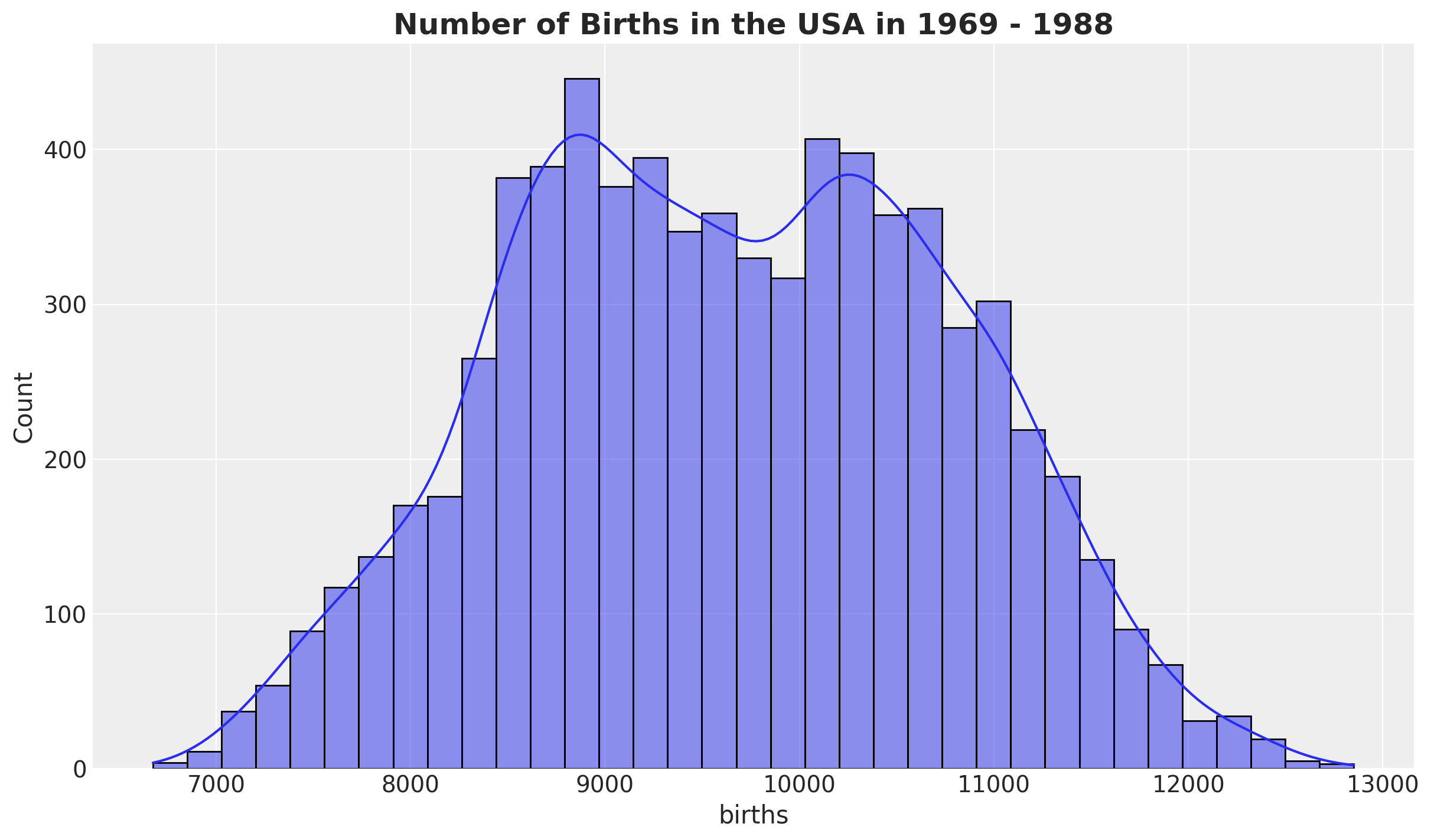
First, we look into the births distribution:
fig, ax = plt.subplots()
sns.histplot(data=raw_df, x="births", kde=True, ax=ax)
ax.set_title(
    label="Number of Births in the USA in 1969 - 1988",
    fontsize=18,
    fontweight="bold",
)
We create a couple of features:
- A
datestamp. births_relative100: the number of births relative to \(100\).time: data index.
data_df = raw_df.copy().assign(
    date=lambda x: pd.to_datetime(x[["year", "month", "day"]]),
    births_relative100=lambda x: x["births"] / x["births"].mean() * 100,
    time=lambda x: x.index,
)
Now, let’s look into the development over time of the relative births, which is the target variable we will model.
fig, ax = plt.subplots()
sns.scatterplot(data=data_df, x="date", y="births_relative100", c="C0", s=8, ax=ax)
ax.axhline(100, color="black", linestyle="--", label="mean level")
ax.legend()
ax.set(xlabel="date", ylabel="relative number of births")
ax.set_title(
    label="Relative Births in the USA in 1969 - 1988", fontsize=18, fontweight="bold"
)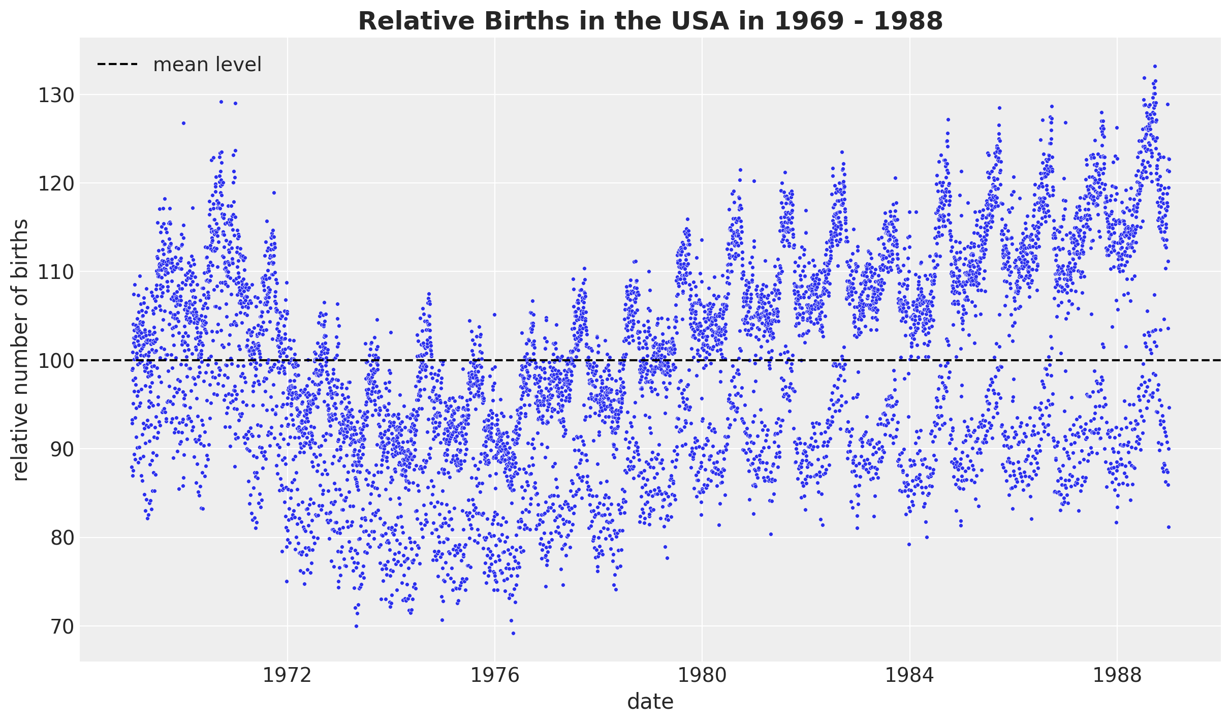
We see a clear long term trend component and a clear yearly seasonality. Let’s deep dive into the yearly seasonality.
fig, ax = plt.subplots()
(
    data_df.groupby(["day_of_year2"], as_index=False)
    .agg(meanbirths=("births_relative100", "mean"))
    .pipe((sns.scatterplot, "data"), x="day_of_year2", y="meanbirths", c="C0", ax=ax)
)
ax.axhline(100, color="black", linestyle="--", label="mean level")
ax.legend()
ax.set(xlabel="day of year", ylabel="relative number of births per day of year")
ax.set_title(
    label="Relative Births in the USA in 1969 - 1988\nMean over Day of Year",
    fontsize=18,
    fontweight="bold",
)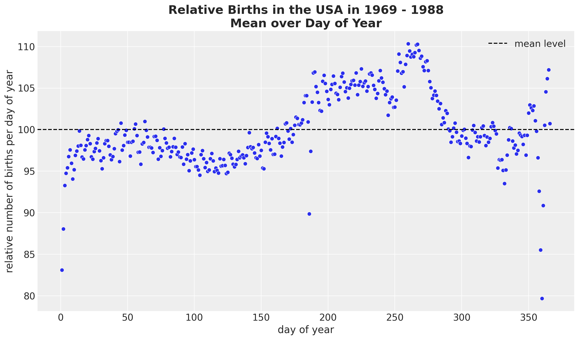
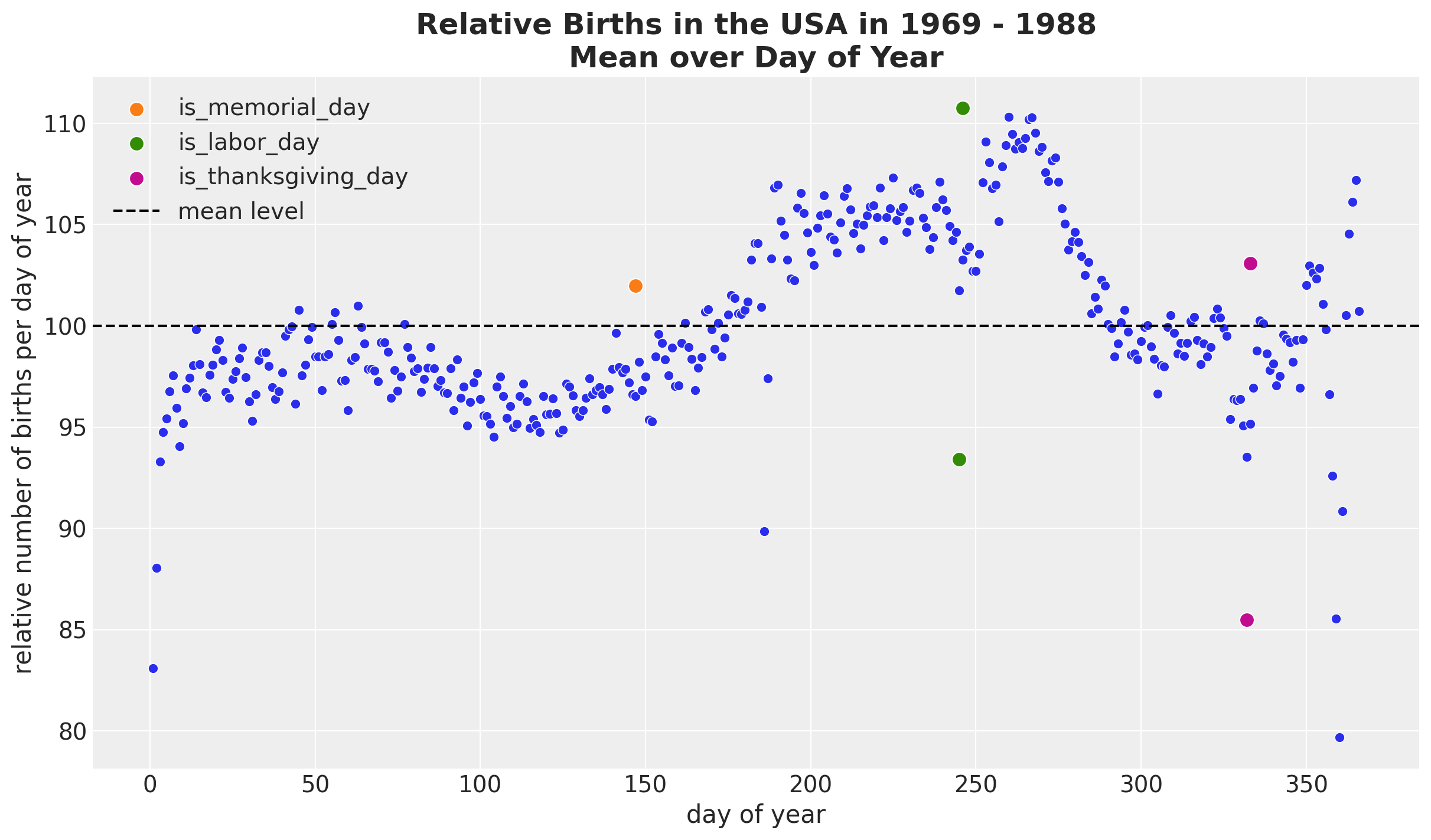
We see a relatively smooth pattern, except for some specific dates which correspond to holidays. In particular, we see the clear drop at the end of the year. In addition, there are some special holidays which span over a week: memorial day, labor day and thanksgiving. Let’s add these features to the dataset.
memorial_days = data_df.query("month == 5 & day_of_week == 1 & day >=25")["date"]

labor_days = data_df.query("month == 9 & day_of_week == 1 & day <=7")["date"]
labor_days = pd.concat(
    [labor_days, labor_days + pd.Timedelta(days=1)], axis=0
).sort_values()

thanksgiving_days = data_df.query("month == 11 & day_of_week == 4 & 22 <=day <=28")[
    "date"
]
thanksgiving_days = pd.concat(
    [thanksgiving_days, thanksgiving_days + pd.Timedelta(days=1)], axis=0
).sort_values()

data_df["is_memorial_day"] = data_df["date"].isin(memorial_days).astype(int)
data_df["is_labor_day"] = data_df["date"].isin(labor_days).astype(int)
data_df["is_thanksgiving_day"] = data_df["date"].isin(thanksgiving_days).astype(int)
fig, ax = plt.subplots()
(
data_df.groupby(["day_of_year2"], as_index=False)
.agg(meanbirths=("births_relative100", "mean"))
.pipe((sns.scatterplot, "data"), x="day_of_year2", y="meanbirths", c="C0", ax=ax)
)
for i, day in enumerate(["is_memorial_day", "is_labor_day", "is_thanksgiving_day"]):
sns.scatterplot(
data=data_df.query(f"{day} == 1 and year == 1969"),
x="day_of_year2",
y="births_relative100",
c=f"C{i + 1}",
s=80,
label=day,
ax=ax,
)
ax.axhline(100, color="black", linestyle="--", label="mean level")
ax.legend(loc="upper left")
ax.set(xlabel="day of year", ylabel="relative number of births per day of year")
ax.set_title(
label="Relative Births in the USA in 1969 - 1988\nMean over Day of Year",
fontsize=18,
fontweight="bold",
)
Next, we split by month and year.
fig, ax = plt.subplots()
(
    data_df.groupby(["year", "month"], as_index=False)
    .agg(meanbirths=("births_relative100", "mean"))
    .assign(month=lambda x: pd.Categorical(x["month"]))
    .pipe(
        (sns.lineplot, "data"),
        x="year",
        y="meanbirths",
        marker="o",
        markersize=7,
        hue="month",
        palette="tab20",
    )
)
ax.xaxis.set_major_locator(MaxNLocator(integer=True))
ax.legend(title="month", loc="center left", bbox_to_anchor=(1, 0.5))
ax.set(xlabel="year", ylabel="relative number of births")
ax.set_title(
    label="Relative Births in the USA in 1969 - 1988\nMean over Month and Year",
    fontsize=18,
    fontweight="bold",
)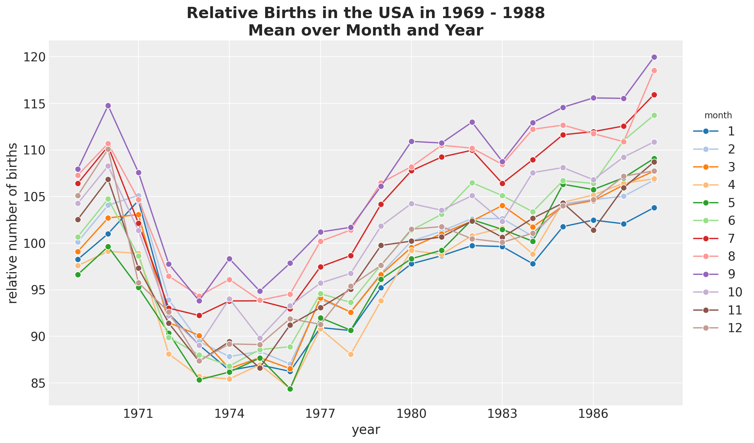
Besides the global trend, we do not see any clear differences between months.
We continue looking into the weekly seasonality.
fig, ax = plt.subplots()
(
    data_df.groupby(["day_of_week"], as_index=False)
    .agg(meanbirths=("births_relative100", "mean"))
    .pipe(
        (sns.lineplot, "data"),
        x="day_of_week",
        y="meanbirths",
        marker="o",
        c="C0",
        markersize=10,
        ax=ax,
    )
)
ax.axhline(100, color="black", linestyle="--", label="mean level")
ax.legend()
ax.set(xlabel="day of week", ylabel="relative number of births per day of week")
ax.set_title(
    label="Relative Births in the USA in 1969 - 1988\nMean over Day of Week",
    fontsize=18,
    fontweight="bold",
)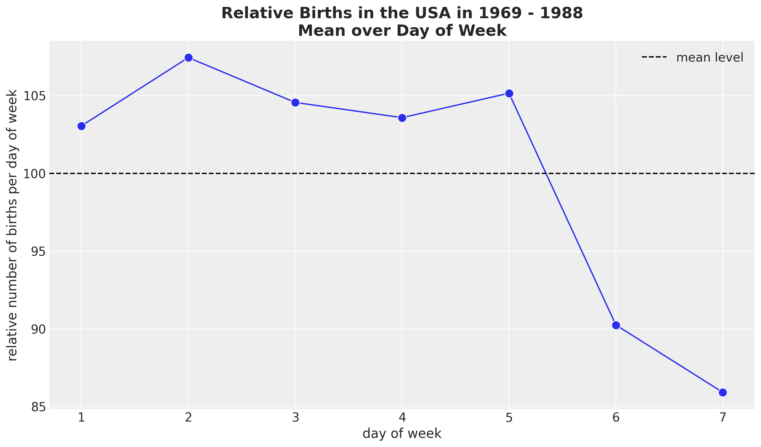
It seems that there are on average less births during the weekend. We can also plot the time development over the years.
fig, ax = plt.subplots()
(
    data_df.groupby(["year", "day_of_week"], as_index=False)
    .agg(meanbirths=("births_relative100", "mean"))
    .assign(day_of_week=lambda x: pd.Categorical(x["day_of_week"]))
    .pipe(
        (sns.lineplot, "data"),
        x="year",
        y="meanbirths",
        marker="o",
        markersize=7,
        hue="day_of_week",
    )
)
ax.xaxis.set_major_locator(MaxNLocator(integer=True))
ax.legend(title="day of week", loc="center left", bbox_to_anchor=(1, 0.5))
ax.set(xlabel="year", ylabel="relative number of births per day of week")
ax.set_title(
    label="Relative Births in the USA in 1969 - 1988\nMean over Day of Week and Year",
    fontsize=18,
    fontweight="bold",
)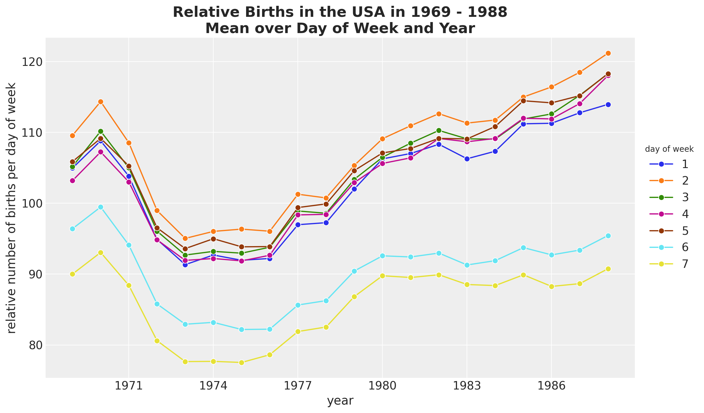
We see that the trends behave differently over the years for weekdays and weekends.
Data Pre-Processing
After having a better understanding of the data and the patters we want to capture with the model, we can proceed to pre-process the data.
- Extract relevant features
n = data_df.shape[0]
time = data_df["time"].to_numpy()
date = data_df["date"].to_numpy()
year = data_df["year"].to_numpy()
day_of_week_idx, day_of_week = data_df["day_of_week"].factorize(sort=True)
day_of_year2_idx, day_of_year2 = data_df["day_of_year2"].factorize(sort=True)
memorial_days = data_df["is_memorial_day"].to_numpy()
labor_days = data_df["is_labor_day"].to_numpy()
thanksgiving_days = data_df["is_thanksgiving_day"].to_numpy()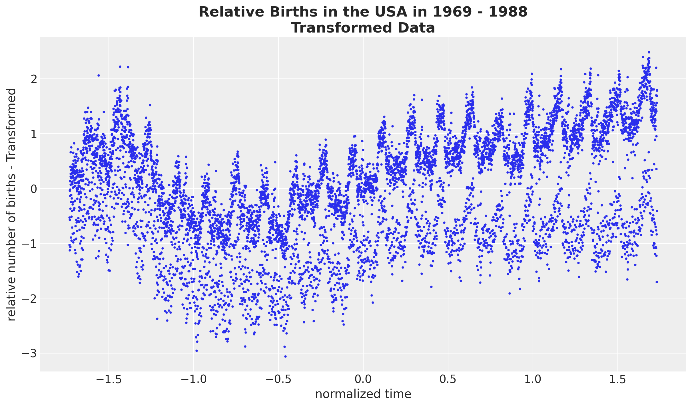
births_relative100 = data_df["births_relative100"].to_numpy()- We want to work on the normalized log scale of the relative births data
# we want to use the scale of the data size to set up the priors.
# we are mainly interested in the standard deviation.
time_pipeline = Pipeline(steps=[("scaler", StandardScaler())])
time_pipeline.fit(time.reshape(-1, 1))
normalized_time = time_pipeline.transform(time.reshape(-1, 1)).flatten()
time_std = time_pipeline["scaler"].scale_.item()

# we first take a log transform and then normalize the data.
births_relative100_pipeline = Pipeline(
    steps=[
        ("log", FunctionTransformer(func=np.log, inverse_func=np.exp)),
        ("scaler", StandardScaler()),
    ]
)
births_relative100_pipeline.fit(births_relative100.reshape(-1, 1))
normalized_log_births_relative100 = births_relative100_pipeline.transform(
    births_relative100.reshape(-1, 1)
).flatten()
normalized_log_births_relative100_std = births_relative100_pipeline[
    "scaler"
].scale_.item()
fig, ax = plt.subplots()
ax.plot(normalized_time, normalized_log_births_relative100, "o", c="C0", markersize=2)
ax.set(xlabel="normalized time", ylabel="relative number of births - Transformed")
ax.set_title(
label="Relative Births in the USA in 1969 - 1988\nTransformed Data",
fontsize=18,
fontweight="bold",
)
Model Specification
In this section we implement one of the final models described in Bayesian workflow book - Birthdays. I really (really!) recommend looking into that blog post as it has a lot of insights and retails regarding the iterative modeling process and the motivation of the different modeling choices. When implementing this model I build it in this iterative process and it was very instructive. Of course I did not re-write everything again, so here I show one og the final models.
Model Components
Let’s describe the model components. All of these building blocks should not come as a surprise after looking into the EDA section.
- Global trend. We use a Gaussian process with an exponential quadratic kernel.
- Periodicity over years: We use a Gaussian process with a periodic kernel. Observe that, since we are working on the normalized scale, the period should be
period=365.25 / time_std(and notperiod=365.25!). - Weekly seasonality: We use a zero-sum-normal distribution to capture the relative difference across weekdays. We couple it with a multiplicative factor parametrized by a Gaussian process (through an exponential function).
- Yearly seasonality: We use a Student-t distribution over the
day_of_year2. - Likelihood: We use a Gaussian distribution.
For all of the Gaussian processes components we use the Hilbert Space Gaussian Process (HSGP) approximation.
Remark [Periodic Kernel]: I decided to work on this example motivated by the fact that the HSGP approximation for periodic kernel was recently added to PyMC in pymc/#6877. This was a non-trivial task as the periodic kernel does not have a well-defined spectral density, but there is nevertheless a way to approximate it using the HSGP method.
Remark [Likelihood]: I also tried a Student-t likelihood, but the results were not good.
Remark Horseshoe Prior: Aki Vehtari suggest using a horseshoe prior for the day-of-year contribution as a way of regularizing the model (by enforcing many day contributions to be zero). At the end, I did not see a great benefit and the diagnostics (e.g. r-hat and divergences) were not good at all. If you find I am doing something wrong, please let me know! Here is the snippet of code I used (following NumPyro Docs - Example: Hilbert space approximation for Gaussian processes):
slab_df = 50
slab_scale = 2
scale_global = 0.1
tau = pm.HalfNormal(name="tau", sigma=2 * scale_global)
c_aux = pm.InverseGamma(name="c_aux", alpha=slab_df / 2, beta=slab_df / 2)
c = pm.Deterministic(name="c", var=slab_scale * pt.sqrt(c_aux))
lam = pm.HalfCauchy(name="lam", beta=1, dims="day_of_year2")

lam_tilde = pm.Deterministic(
    name="lam_tilde",
    var=pt.sqrt(c) * lam / pt.sqrt(c + (tau * lam) ** 2),
    dims="day_of_year2",
)

b_day_of_year2 = pm.Normal(
    name="b_day_of_year2", mu=0, sigma=tau * lam_tilde, dims="day_of_year2"
)
Still, it was a great opportunity to learn about this technique and I can only recommend the blog post The Hierarchical Regularized Horseshoe Prior in PyMC3 by Austin Rochford. As always, very insightful and well written.
Prior Specifications
Most of the priors are not very informative. The only tricky part here is to think that we are working on the normalized log scale of the relative births data. For example, for the global trend we use a Gaussian process with an exponential quadratic kernel. We use the following priors for the length scale:
fig, ax = plt.subplots()
pz.LogNormal(mu=np.log(700 / time_std), sigma=1).plot_pdf(ax=ax)
ax.set(xlim=(None, 4))
ax.set_title(
    label="Prior distribution for the global trend Gaussian process",
    fontsize=18,
    fontweight="bold",
)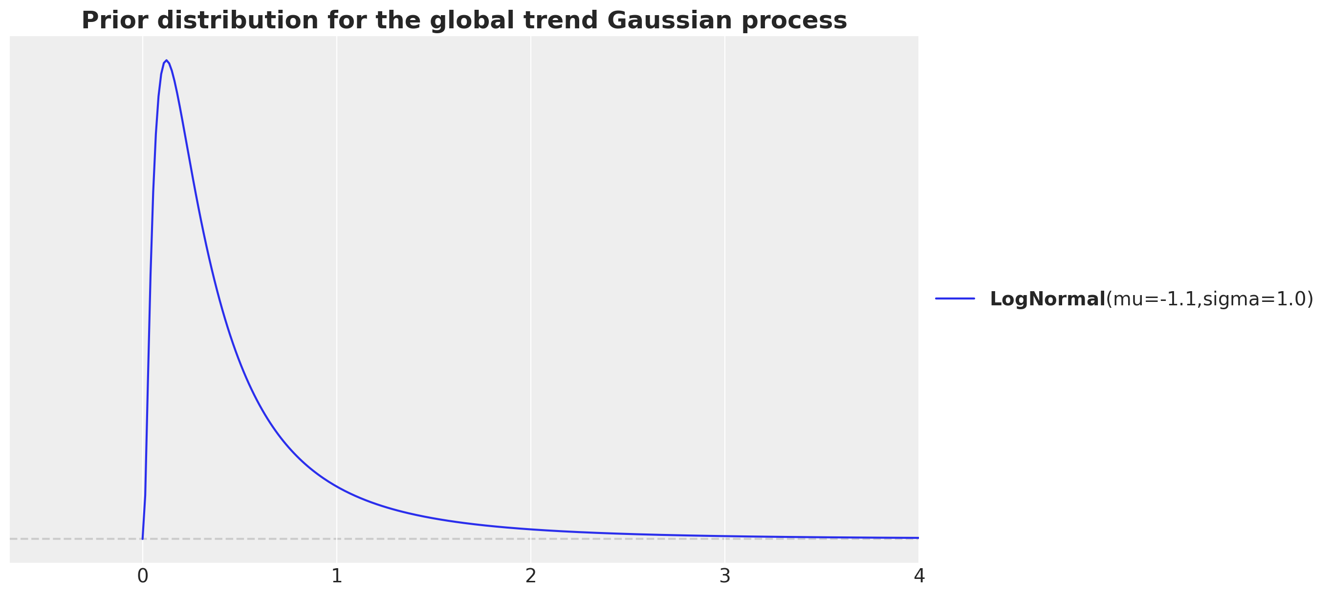
The motivation is that we have around \(7.3\)K data points and whe want to consider the in between data points distance in the normalized scale. That is why we consider the ratio 7_000 / time_str. Note that we want to capture the long term trend, so we want to consider a length scale that is larger than the data points distance. We increase the order of magnitude by dividing by \(10\). We then take a log transform as we are using a log-normal prior.
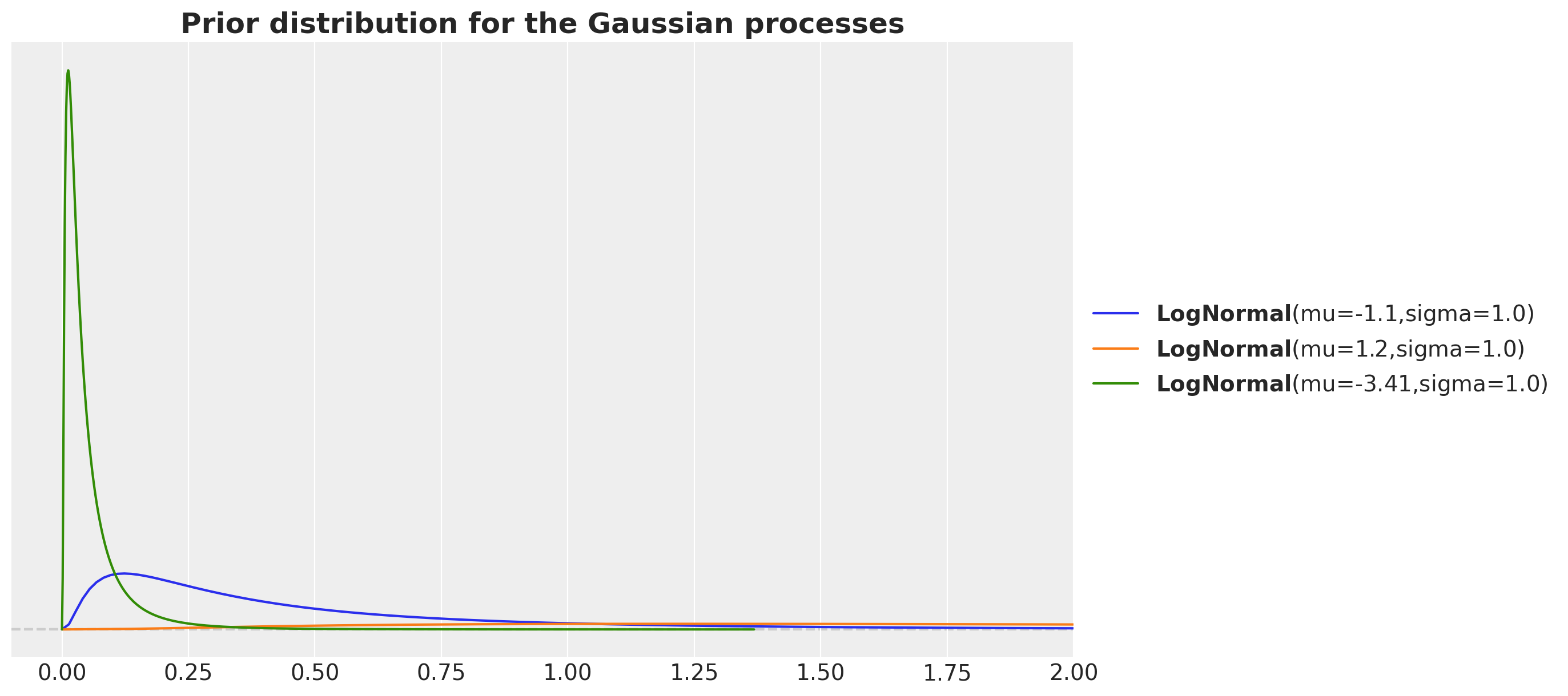
For the day-of-week Gaussian process we consider a length scale much larger as we want this variation to be less than the global trend. Similarly, por the periodic length scale we expect it to be smaller than the global trend.
fig, ax = plt.subplots()
pz.LogNormal(mu=np.log(700 / time_std), sigma=1).plot_pdf(ax=ax)
pz.LogNormal(mu=np.log(7_000 / time_std), sigma=1).plot_pdf(ax=ax)
pz.LogNormal(mu=np.log(70 / time_std), sigma=1).plot_pdf(ax=ax)
ax.set(xlim=(-0.1, 2))
ax.set_title(
    label="Prior distribution for the Gaussian processes",
    fontsize=18,
    fontweight="bold",
)
Model Implementation
We now specify the model in PyMC. Note how similar the model implementation is to the mathematical description. This is, in my personal opinion, one of the biggest strengths of PyMC.
coords = {"time": time, "day_of_week": day_of_week, "day_of_year2": day_of_year2}

with pm.Model(coords=coords) as model:
    # --- Data Containers ---

    normalized_time_data = pm.Data(
        name="normalized_time_data", value=normalized_time, mutable=False, dims="time"
    )

    day_of_week_idx_data = pm.Data(
        name="day_of_week_idx_data", value=day_of_week_idx, mutable=False, dims="time"
    )

    day_of_year2_idx_data = pm.Data(
        name="day_of_year2_idx_data", value=day_of_year2_idx, mutable=False, dims="time"
    )

    memorial_days_data = pm.Data(
        name="memorial_days_data", value=memorial_days, mutable=False, dims="time"
    )

    labor_days_data = pm.Data(
        name="labor_days_data", value=labor_days, mutable=False, dims="time"
    )

    thanksgiving_days_data = pm.Data(
        name="thanksgiving_days_data",
        value=thanksgiving_days,
        mutable=False,
        dims="time",
    )

    normalized_log_births_relative100_data = pm.Data(
        name="log_births_relative100",
        value=normalized_log_births_relative100,
        mutable=False,
        dims="time",
    )

    # --- Priors ---

    ## global trend
    amplitude_trend = pm.HalfNormal(name="amplitude_trend", sigma=1.0)
    ls_trend = pm.LogNormal(name="ls_trend", mu=np.log(700 / time_std), sigma=1)
    cov_trend = amplitude_trend * pm.gp.cov.ExpQuad(input_dim=1, ls=ls_trend)
    gp_trend = pm.gp.HSGP(m=[20], c=1.5, cov_func=cov_trend)
    f_trend = gp_trend.prior(name="f_trend", X=normalized_time_data[:, None], dims="time")

    ## year periodic
    amplitude_year_periodic = pm.HalfNormal(name="amplitude_year_periodic", sigma=1)
    ls_year_periodic = pm.LogNormal(
        name="ls_year_periodic", mu=np.log(7_000 / time_std), sigma=1
    )
    gp_year_periodic = pm.gp.HSGPPeriodic(
        m=20,
        scale=amplitude_year_periodic,
        cov_func=pm.gp.cov.Periodic(
            input_dim=1, period=365.25 / time_std, ls=ls_year_periodic
        ),
    )
    f_year_periodic = gp_year_periodic.prior(
        name="f_year_periodic", X=normalized_time_data[:, None], dims="time"
    )

    ## day of week GP global scale
    amplitude_day_of_week = pm.HalfNormal(name="amplitude_day_of_week", sigma=1)
    ls_day_of_week = pm.LogNormal(
        name="ls_day_of_week", mu=np.log(70 / time_std), sigma=1
    )
    cov_day_of_week = amplitude_day_of_week * pm.gp.cov.ExpQuad(
        input_dim=1, ls=ls_day_of_week
    )
    gp_day_of_week = pm.gp.HSGP(m=[5], c=1.5, cov_func=cov_day_of_week)
    log_f_day_of_week = gp_day_of_week.prior(
        name="log_f_day_of_week", X=normalized_time_data[:, None], dims="time"
    )
    f_day_of_week = pm.Deterministic(
        name="f_day_of_week", var=pt.exp(log_f_day_of_week), dims="time"
    )

    b_day_of_week = pm.ZeroSumNormal(name="b_day_of_week", sigma=1, dims="day_of_week")

    ## day of year
    sigma_day_of_year2 = pm.HalfNormal(name="sigma_day_of_year2", sigma=0.5)
    nu_day_of_year2 = pm.Gamma(name="nu_day_of_year2", alpha=3, beta=0.1)
    b_day_of_year2 = pm.StudentT(
        name="b_day_of_year2",
        mu=0,
        sigma=sigma_day_of_year2,
        nu=nu_day_of_year2,
        dims="day_of_year2",
    )

    # special holidays
    b_memorial_day = pm.Normal(name="b_memorial_day", mu=0, sigma=1)
    b_labor_day = pm.Normal(name="b_labor_day", mu=0, sigma=1)
    b_thanksgiving_day = pm.Normal(name="b_thanksgiving_day", mu=0, sigma=1)

    # global noise
    sigma = pm.HalfNormal(name="sigma", sigma=0.5)

    # --- Parametrization ---
    mu = pm.Deterministic(
        name="mu",
        var=f_trend
        + f_year_periodic
        + f_day_of_week * b_day_of_week[day_of_week_idx_data]
        + b_day_of_year2[day_of_year2_idx_data]
        + b_memorial_day * memorial_days_data
        + b_labor_day * labor_days_data
        + b_thanksgiving_day * thanksgiving_days_data,
        dims="time",
    )

    # --- Likelihood ---
    pm.Normal(
        name="likelihood",
        mu=mu,
        sigma=sigma,
        observed=normalized_log_births_relative100_data,
        dims="time",
    )

pm.model_to_graphviz(model=model)
Prior Predictive Checks
We run the model with the prior predictive checks to see if the model is able to generate data in a similar scale as the data.
with model:
    prior_predictive = pm.sample_prior_predictive(samples=2_000, random_seed=rng)
fig, ax = plt.subplots()
az.plot_ppc(data=prior_predictive, group="prior", kind="kde", ax=ax)
ax.set_title(label="Prior Predictive", fontsize=18, fontweight="bold")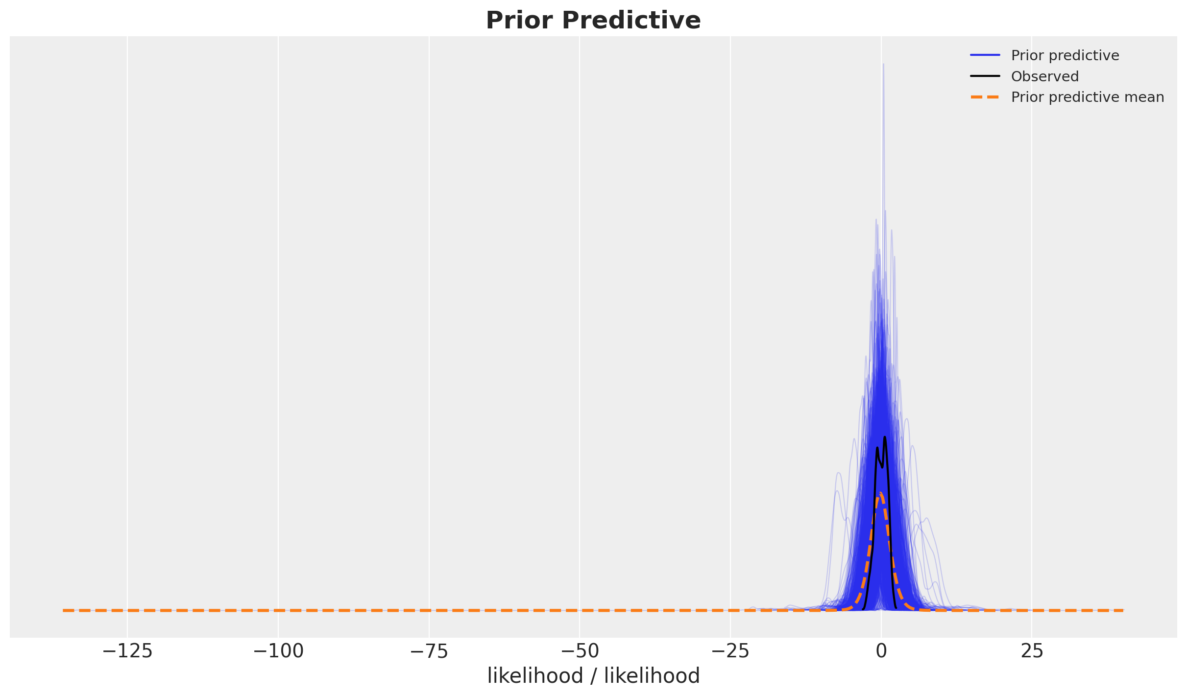
Model Fitting and Diagnostics
We now proceed to fit the model using the Numpyro sampler. It takes around \(20\) minutes to run the model locally (Intel MacBook Pro, \(4\) cores, \(16\) GB RAM).
with model:
    idata = pm.sample(
        target_accept=0.95,
        draws=2_000,
        chains=4,
        nuts_sampler="numpyro",
        random_seed=rng,
    )
    posterior_predictive = pm.sample_posterior_predictive(trace=idata, random_seed=rng)
Diagnostics
We do not see any divergences or very high r-hat values.
idata["sample_stats"]["diverging"].sum().item()0var_names = [
"amplitude_trend",
"ls_trend",
"amplitude_year_periodic",
"ls_year_periodic",
"ls_day_of_week",
"b_day_of_week",
"sigma_day_of_year2",
"nu_day_of_year2",
"b_memorial_day",
"b_labor_day",
"b_thanksgiving_day",
"sigma",
]
az.summary(data=idata, var_names=var_names, round_to=3)| mean | sd | hdi_3% | hdi_97% | mcse_mean | mcse_sd | ess_bulk | ess_tail | r_hat | |
|---|---|---|---|---|---|---|---|---|---|
| amplitude_trend | 0.441 | 0.211 | 0.156 | 0.825 | 0.004 | 0.003 | 2861.721 | 4571.089 | 1.001 |
| ls_trend | 0.192 | 0.045 | 0.104 | 0.271 | 0.001 | 0.001 | 1836.581 | 1226.614 | 1.003 |
| amplitude_year_periodic | 0.965 | 0.142 | 0.712 | 1.228 | 0.004 | 0.003 | 1432.702 | 2629.018 | 1.004 |
| ls_year_periodic | 0.147 | 0.010 | 0.127 | 0.166 | 0.000 | 0.000 | 1809.155 | 2725.739 | 1.001 |
| ls_day_of_week | 0.044 | 0.053 | 0.004 | 0.113 | 0.001 | 0.001 | 7698.161 | 6383.154 | 1.002 |
| b_day_of_week[1] | 0.293 | 0.031 | 0.235 | 0.354 | 0.001 | 0.000 | 2460.771 | 3248.552 | 1.001 |
| b_day_of_week[2] | 0.613 | 0.064 | 0.492 | 0.738 | 0.001 | 0.001 | 2426.709 | 3150.868 | 1.002 |
| b_day_of_week[3] | 0.382 | 0.040 | 0.308 | 0.462 | 0.001 | 0.001 | 2494.189 | 3190.484 | 1.002 |
| b_day_of_week[4] | 0.332 | 0.035 | 0.262 | 0.397 | 0.001 | 0.001 | 2422.496 | 3125.097 | 1.002 |
| b_day_of_week[5] | 0.455 | 0.048 | 0.367 | 0.551 | 0.001 | 0.001 | 2453.775 | 3230.309 | 1.002 |
| b_day_of_week[6] | -0.840 | 0.088 | -1.013 | -0.676 | 0.002 | 0.001 | 2424.470 | 3183.280 | 1.002 |
| b_day_of_week[7] | -1.234 | 0.129 | -1.490 | -0.996 | 0.003 | 0.002 | 2404.679 | 3155.249 | 1.002 |
| sigma_day_of_year2 | 0.005 | 0.003 | 0.001 | 0.009 | 0.001 | 0.000 | 19.610 | 55.847 | 1.152 |
| nu_day_of_year2 | 0.765 | 0.136 | 0.524 | 1.024 | 0.025 | 0.018 | 26.560 | 106.853 | 1.104 |
| b_memorial_day | -1.238 | 0.054 | -1.339 | -1.138 | 0.000 | 0.000 | 14142.638 | 5844.987 | 1.002 |
| b_labor_day | -0.901 | 0.040 | -0.976 | -0.825 | 0.000 | 0.000 | 13492.083 | 6177.131 | 1.002 |
| b_thanksgiving_day | -1.308 | 0.041 | -1.388 | -1.234 | 0.000 | 0.000 | 10185.410 | 5180.619 | 1.000 |
| sigma | 0.229 | 0.002 | 0.226 | 0.233 | 0.000 | 0.000 | 8495.983 | 4798.312 | 1.001 |
We can also look into the trace plots.
axes = az.plot_trace(
    data=idata,
    var_names=var_names,
    compact=True,
    backend_kwargs={"figsize": (15, 17), "layout": "constrained"},
)
plt.gcf().suptitle("Trace", fontsize=16)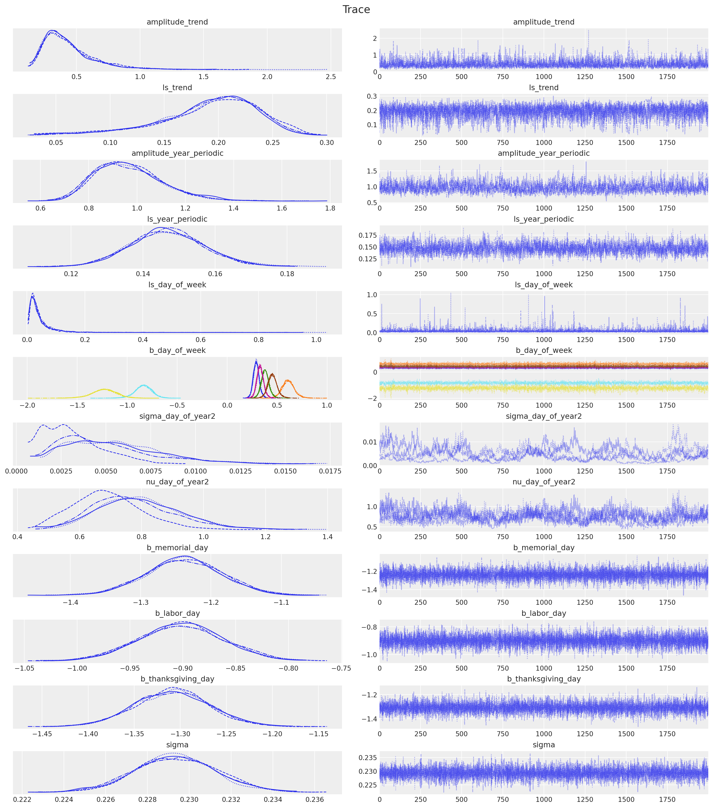
Posterior Distribution Analysis
Now we want to do a deep dive into the posterior distribution of the model and its components. We want to do this in the original scale. Therefore the first step is to transform the posterior samples back to the original scale.
- Model Components
pp_vars_original_scale = {
    var_name: xr.apply_ufunc(
        births_relative100_pipeline.inverse_transform,
        idata["posterior"][var_name].expand_dims(dim={"_": 1}, axis=-1),
        input_core_dims=[["time", "_"]],
        output_core_dims=[["time", "_"]],
        vectorize=True,
    ).squeeze(dim="_")
    for var_name in ["mu", "f_trend", "f_year_periodic", "f_day_of_week"]
}- Likelihood
pp_likelihood_original_scale = xr.apply_ufunc(
    births_relative100_pipeline.inverse_transform,
    posterior_predictive["posterior_predictive"]["likelihood"].expand_dims(
        dim={"_": 1}, axis=-1
    ),
    input_core_dims=[["time", "_"]],
    output_core_dims=[["time", "_"]],
    vectorize=True,
).squeeze(dim="_")
We start by plotting the likelihood.
fig, ax = plt.subplots(figsize=(15, 9))
sns.scatterplot(
    data=data_df, x="date", y="births_relative100", c="C0", s=8, label="data", ax=ax
)
ax.axhline(100, color="black", linestyle="--", label="mean level")
az.plot_hdi(
    x=date,
    y=pp_likelihood_original_scale,
    hdi_prob=0.94,
    color="C1",
    fill_kwargs={"alpha": 0.2, "label": r"likelihood $94\%$ HDI"},
    smooth=False,
    ax=ax,
)
az.plot_hdi(
    x=date,
    y=pp_likelihood_original_scale,
    hdi_prob=0.5,
    color="C1",
    fill_kwargs={"alpha": 0.6, "label": r"likelihood $50\%$ HDI"},
    smooth=False,
    ax=ax,
)

ax.legend(loc="upper center", bbox_to_anchor=(0.5, -0.07), ncol=4)
ax.set(xlabel="date", ylabel="relative number of births")
ax.set_title(
    label="""Relative Births in the USA in 1969 - 1988
    Posterior Predictive (Likelihood)""",
    fontsize=18,
    fontweight="bold",
)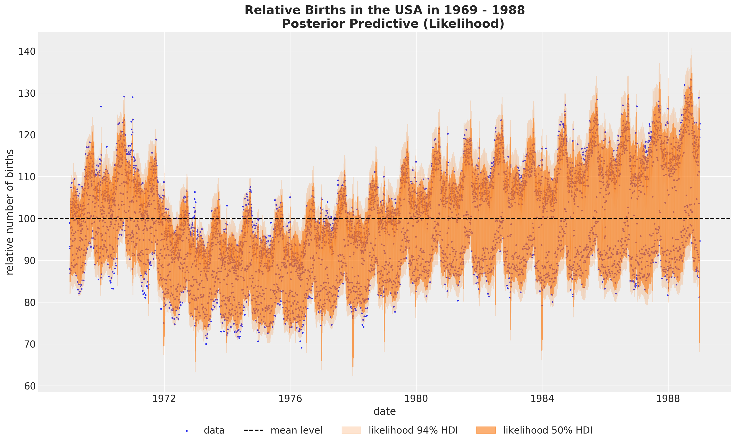
It looks that we are capturing the global variation. Let’s look into the posterior distribution plot to get a better understanding of the model.
fig, ax = plt.subplots()
az.plot_ppc(
    data=posterior_predictive,
    num_pp_samples=1_000,
    observed_rug=True,
    random_seed=seed,
    ax=ax,
)
ax.set_title(label="Posterior Predictive", fontsize=18, fontweight="bold")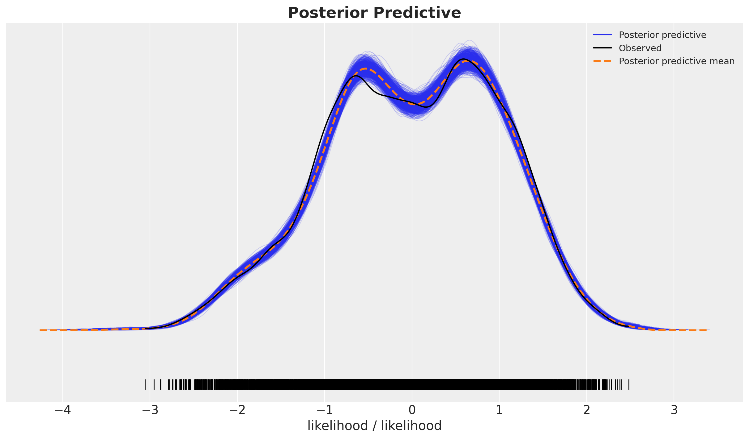
Overall, it looks very good.
We can now plot the posterior predictive distribution of the mean component \(\mu\).
fig, ax = plt.subplots(figsize=(15, 9))
sns.scatterplot(
    data=data_df, x="date", y="births_relative100", c="C0", s=8, label="data", ax=ax
)
ax.axhline(100, color="black", linestyle="--", label="mean level")
az.plot_hdi(
    x=date,
    y=pp_vars_original_scale["mu"],
    hdi_prob=0.94,
    color="C2",
    fill_kwargs={"alpha": 0.2, "label": r"$\mu$ $94\%$ HDI"},
    smooth=False,
    ax=ax,
)
az.plot_hdi(
    x=date,
    y=pp_vars_original_scale["mu"],
    hdi_prob=0.5,
    color="C2",
    fill_kwargs={"alpha": 0.6, "label": r"$\mu$ $50\%$ HDI"},
    smooth=False,
    ax=ax,
)
ax.legend(loc="upper center", bbox_to_anchor=(0.5, -0.07), ncol=4)
ax.set(xlabel="date", ylabel="relative number of births")
ax.set_title(
    label=r"Relative Births in the USA in 1969-1988\nPosterior Predictive (Mean $\mu$)",
    fontsize=18,
    fontweight="bold",
)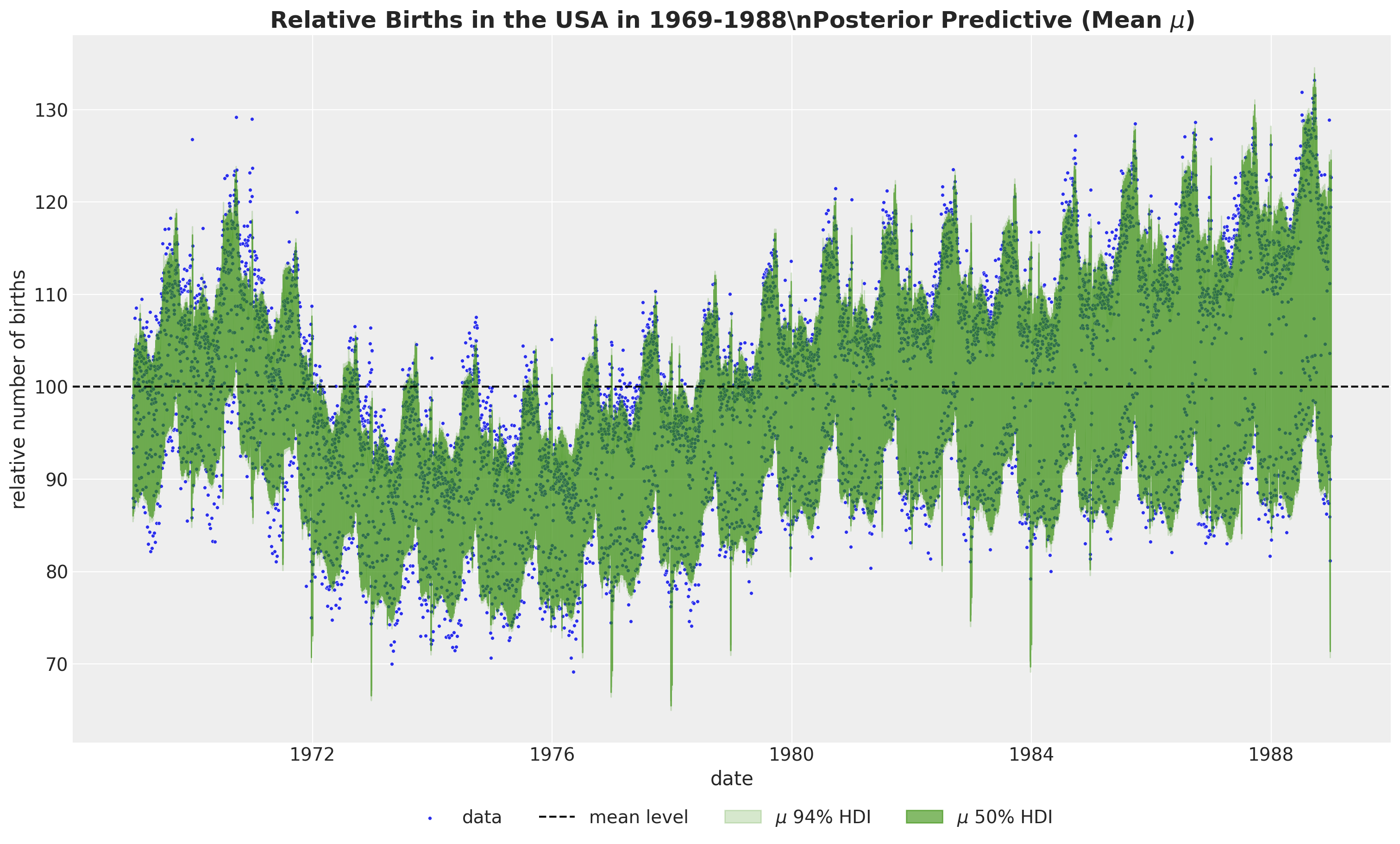
To get a better understanding of the model fit, we need to look into the individual components.
Model Components
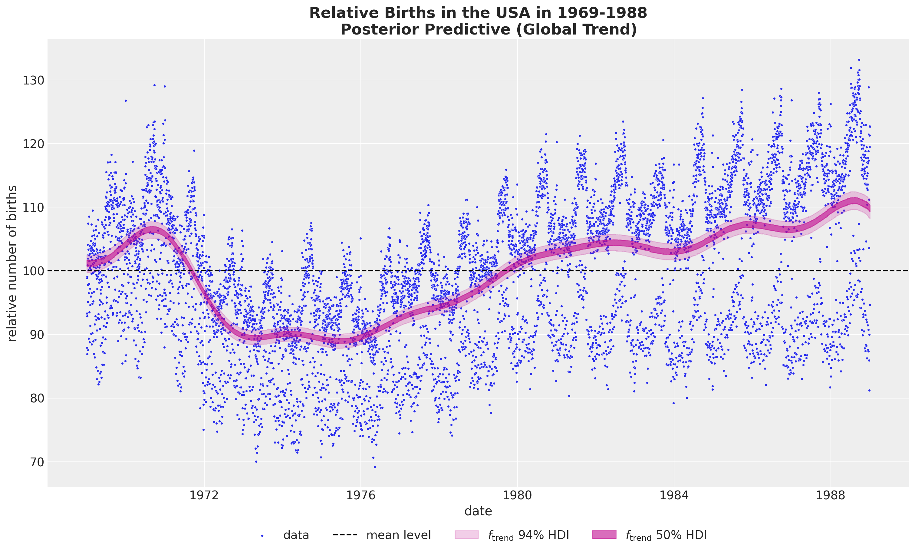
- Global Trend
fig, ax = plt.subplots(figsize=(15, 9))
sns.scatterplot(
    data=data_df, x="date", y="births_relative100", c="C0", s=8, label="data", ax=ax
)
ax.axhline(100, color="black", linestyle="--", label="mean level")
az.plot_hdi(
    x=date,
    y=pp_vars_original_scale["f_trend"],
    hdi_prob=0.94,
    color="C3",
    fill_kwargs={"alpha": 0.2, "label": r"$f_\text{trend}$ $94\%$ HDI"},
    smooth=False,
    ax=ax,
)
az.plot_hdi(
    x=date,
    y=pp_vars_original_scale["f_trend"],
    hdi_prob=0.5,
    color="C3",
    fill_kwargs={"alpha": 0.6, "label": r"$f_\text{trend}$ $50\%$ HDI"},
    smooth=False,
    ax=ax,
)
ax.legend(loc="upper center", bbox_to_anchor=(0.5, -0.07), ncol=4)
ax.set(xlabel="date", ylabel="relative number of births")
ax.set_title(
    label="""Relative Births in the USA in 1969-1988
    Posterior Predictive (Global Trend)""",
    fontsize=18,
    fontweight="bold",
)
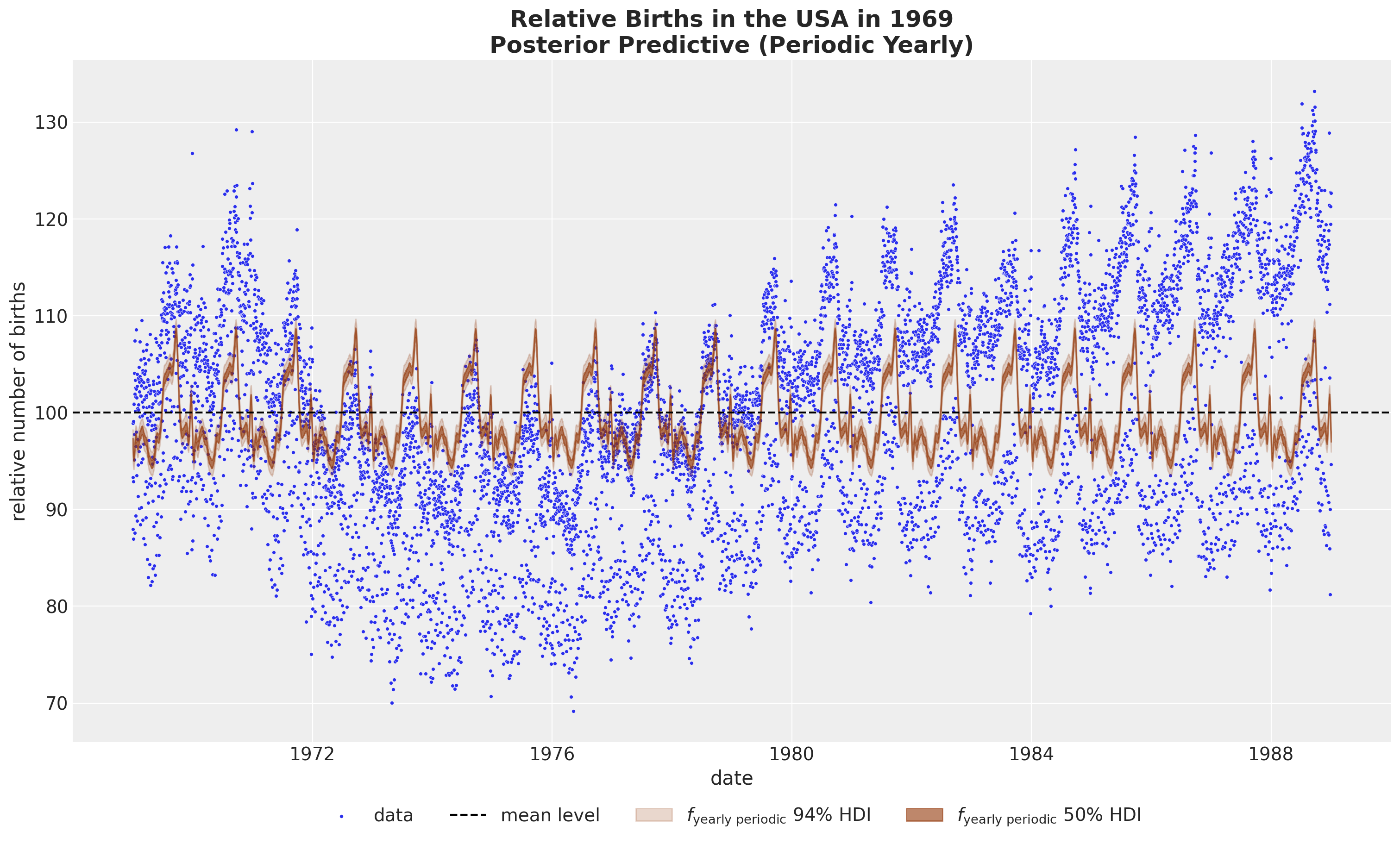
- Yearly Periodicity
fig, ax = plt.subplots(figsize=(15, 9))
sns.scatterplot(
    data=data_df, x="date", y="births_relative100", c="C0", s=8, label="data", ax=ax
)
ax.axhline(100, color="black", linestyle="--", label="mean level")
az.plot_hdi(
    x=date,
    y=pp_vars_original_scale["f_year_periodic"],
    hdi_prob=0.94,
    color="C4",
    fill_kwargs={"alpha": 0.2, "label": r"$f_\text{yearly periodic}$ $94\%$ HDI"},
    smooth=False,
    ax=ax,
)
az.plot_hdi(
    x=date,
    y=pp_vars_original_scale["f_year_periodic"],
    hdi_prob=0.5,
    color="C4",
    fill_kwargs={"alpha": 0.6, "label": r"$f_\text{yearly periodic}$ $50\%$ HDI"},
    smooth=False,
    ax=ax,
)
ax.legend(loc="upper center", bbox_to_anchor=(0.5, -0.07), ncol=4)
ax.set(xlabel="date", ylabel="relative number of births")
ax.set_title(
    label="Relative Births in the USA in 1969\nPosterior Predictive (Periodic Yearly)",
    fontsize=18,
    fontweight="bold",
)
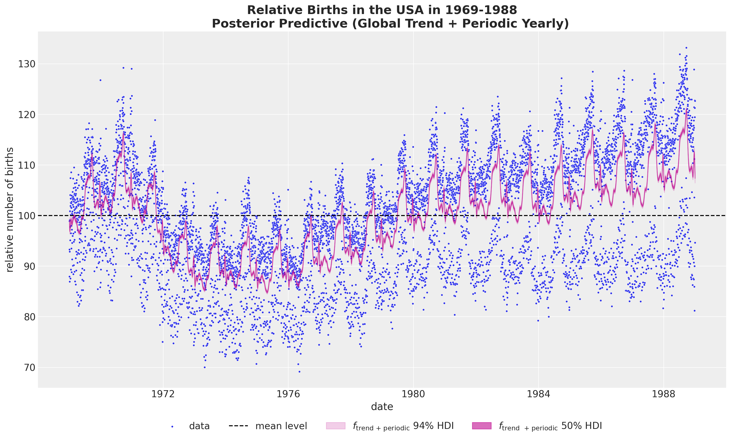
- Global Trend plus Yearly Periodicity
If we want to combine the global trend and the yearly periodicity, we can not simply sum the to components in the original scale as we would be adding the mean term twice. Instead we need to first sum the posterior samples and then take the inverse transform (these operation do not commute!).
pp_vars_original_scale["f_trend_periodic"] = xr.apply_ufunc(
    births_relative100_pipeline.inverse_transform,
    (idata["posterior"]["f_trend"] + idata["posterior"]["f_year_periodic"]).expand_dims(
        dim={"_": 1}, axis=-1
    ),
    input_core_dims=[["time", "_"]],
    output_core_dims=[["time", "_"]],
    vectorize=True,
).squeeze(dim="_")
fig, ax = plt.subplots(figsize=(15, 9))
sns.scatterplot(
data=data_df, x="date", y="births_relative100", c="C0", s=8, label="data", ax=ax
)
ax.axhline(100, color="black", linestyle="--", label="mean level")
az.plot_hdi(
x=date,
y=pp_vars_original_scale["f_trend_periodic"],
hdi_prob=0.94,
color="C3",
fill_kwargs={"alpha": 0.2, "label": r"$f_\text{trend + periodic}$ $94\%$ HDI"},
smooth=False,
ax=ax,
)
az.plot_hdi(
x=date,
y=pp_vars_original_scale["f_trend_periodic"],
hdi_prob=0.5,
color="C3",
fill_kwargs={"alpha": 0.6, "label": r"$f_\text{trend + periodic}$ $50\%$ HDI"},
smooth=False,
ax=ax,
)
ax.legend(loc="upper center", bbox_to_anchor=(0.5, -0.07), ncol=4)
ax.set(xlabel="date", ylabel="relative number of births")
ax.set_title(
label="""Relative Births in the USA in 1969-1988
Posterior Predictive (Global Trend + Periodic Yearly)""",
fontsize=18,
fontweight="bold",
)
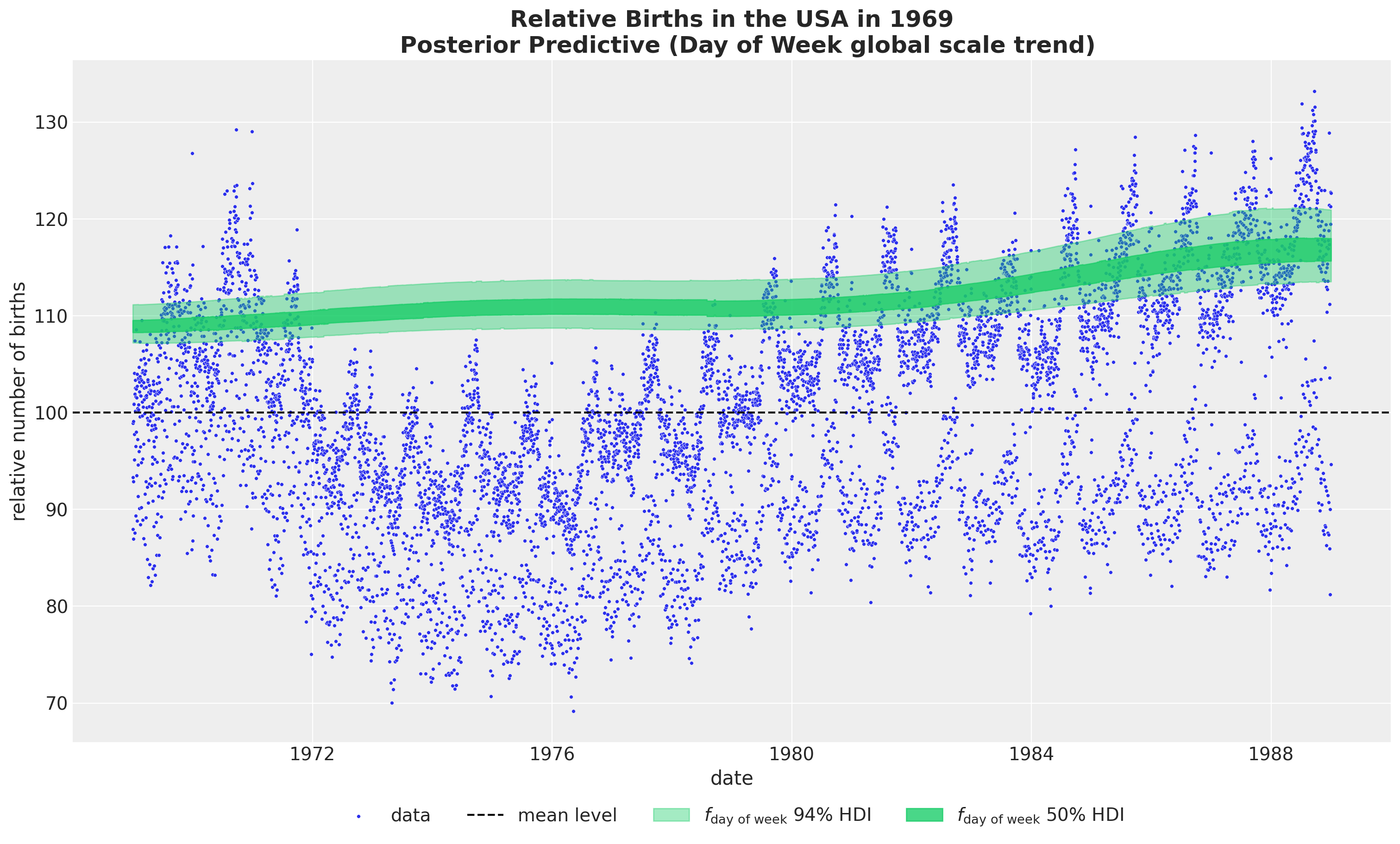
- Day of Week global scale trend
fig, ax = plt.subplots(figsize=(15, 9))
sns.scatterplot(
    data=data_df, x="date", y="births_relative100", c="C0", s=8, label="data", ax=ax
)
ax.axhline(100, color="black", linestyle="--", label="mean level")
az.plot_hdi(
    x=date,
    y=pp_vars_original_scale["f_day_of_week"],
    hdi_prob=0.94,
    color="C7",
    fill_kwargs={"alpha": 0.4, "label": r"$f_\text{day of week}$ $94\%$ HDI"},
    smooth=False,
    ax=ax,
)
az.plot_hdi(
    x=date,
    y=pp_vars_original_scale["f_day_of_week"],
    hdi_prob=0.5,
    color="C7",
    fill_kwargs={"alpha": 0.8, "label": r"$f_\text{day of week}$ $50\%$ HDI"},
    smooth=False,
    ax=ax,
)
ax.legend(loc="upper center", bbox_to_anchor=(0.5, -0.07), ncol=4)
ax.set(xlabel="date", ylabel="relative number of births")
ax.set_title(
    label="""Relative Births in the USA in 1969
    Posterior Predictive (Day of Week global scale trend)""",
    fontsize=18,
    fontweight="bold",
)
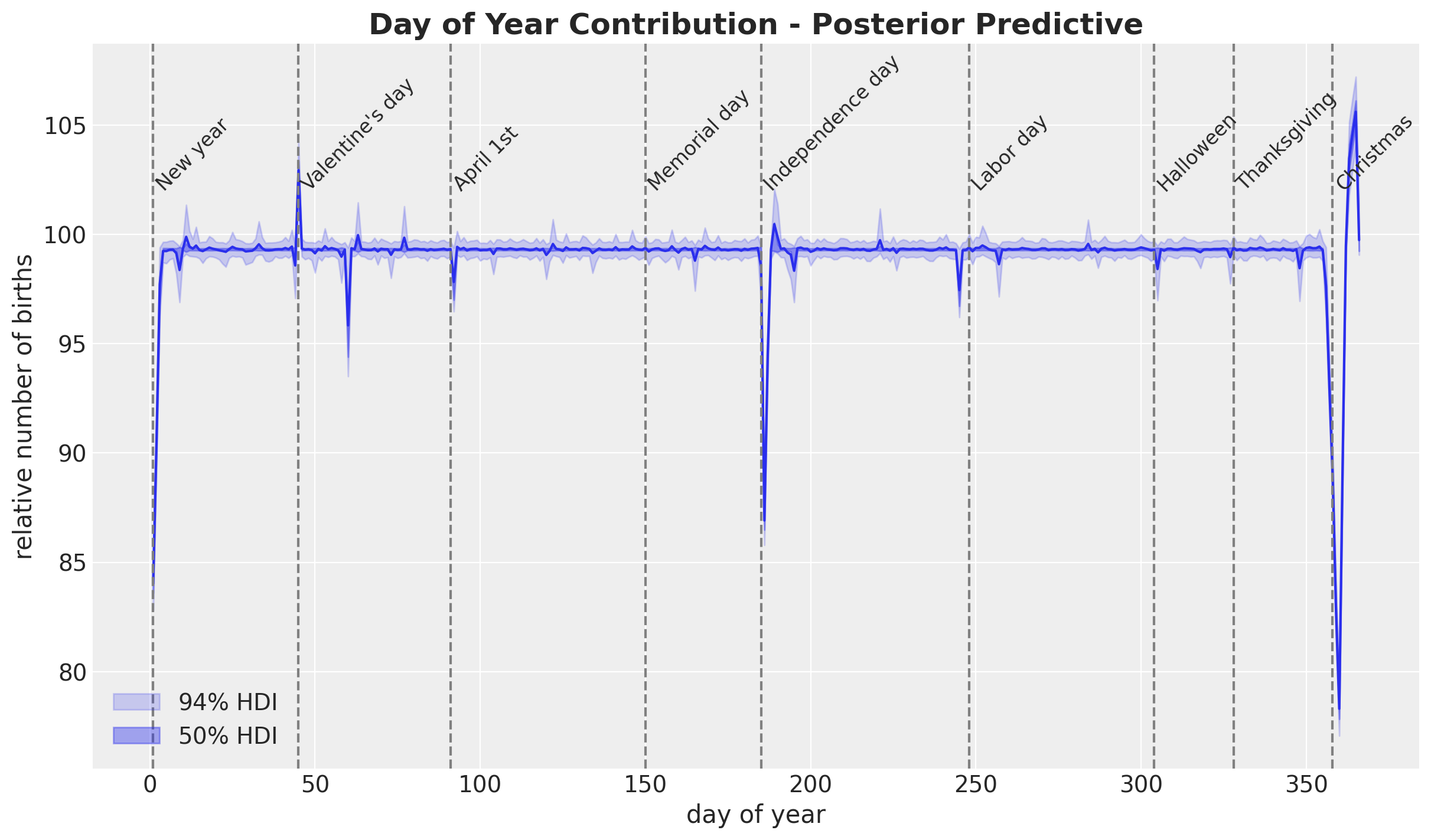
- Day of Year
pp_b_day_of_year2_original_scale = xr.apply_ufunc(
    births_relative100_pipeline.inverse_transform,
    idata["posterior"]["b_day_of_year2"].expand_dims(dim={"_": 1}, axis=-1),
    input_core_dims=[["day_of_year2", "_"]],
    output_core_dims=[["day_of_year2", "_"]],
    vectorize=True,
).squeeze(dim="_")
fig, ax = plt.subplots()
ax.plot(
day_of_year2, pp_b_day_of_year2_original_scale.mean(dim=("chain", "draw")), c="C0"
)
az.plot_hdi(
x=day_of_year2,
y=pp_b_day_of_year2_original_scale,
hdi_prob=0.94,
color="C0",
fill_kwargs={"alpha": 0.2, "label": r"$94\%$ HDI"},
smooth=False,
ax=ax,
)
az.plot_hdi(
x=day_of_year2,
y=pp_b_day_of_year2_original_scale,
hdi_prob=0.5,
color="C0",
fill_kwargs={"alpha": 0.4, "label": r"$50\%$ HDI"},
smooth=False,
ax=ax,
)
ax.legend(loc="lower left")
for day_date, label in zip(
[
"1969-01-01",
"1969-02-14",
"1969-04-01",
"1969-07-04",
"1969-10-31",
"1969-12-24",
"1969-05-30",
"1969-09-05",
"1969-11-24",
],
[
"New year",
"Valentine's day",
"April 1st",
"Independence day",
"Halloween",
"Christmas",
"Memorial day",
"Labor day",
"Thanksgiving",
],
strict=True,
):
doy = np.argwhere(day_of_year2 == pd.to_datetime(day_date).dayofyear).item() + 1
ax.annotate(text=label, xy=(doy, 102), fontsize=12, rotation=45)
ax.axvline(x=doy, color="gray", linestyle="--")
ax.set(xlabel="day of year", ylabel="relative number of births")
ax.set_title(
label="Day of Year Contribution - Posterior Predictive",
fontsize=18,
fontweight="bold",
)
Final Remarks
This was a very fun and challenging notebook to work on. If you are interested in getting into the details I strongly recommend working on this model iteratively!