In this notebook we present an alternative implementation of the cohort-revenue-retention model presented in the blog post Cohort Revenue & Retention Analysis: A Bayesian Approach where we show how to replace the BART retention component with a general neural network implemented with Flax. This allows faster inference, as we can use NumPyro’s NUTS sampler or any of the stochastic variational inference (SVI) algorithms available. We could even use a wider family of samplers using the newly released package Bayeux or the great BlackJax (see for example, the MLP Classifier Example). We use the same simulated dataset to be able to compare the approaches. Overall, the retention and revenue in and out-of sample predictions, as well as the credible intervals are very similar to the ones obtained with the BART model.
Remark: On the other hand, we loose the PDP and ICE plots, which are useful to understand the influence of regressors on the target variable. We could of course trying implementing it by hand, but it would not be straightforward to make it fast, at least in my view (please let me know if you have any ideas on how to do it.)
Prepare Notebook
import arviz as az
import jax.numpy as jnp
import matplotlib.pyplot as plt
import matplotlib.ticker as mtick
import numpy as np
import numpyro
import numpyro.distributions as dist
import pandas as pd
import seaborn as sns
from flax import linen as nn
from jax import random
from numpyro.contrib.module import random_flax_module
from numpyro.infer import SVI, Trace_ELBO
from numpyro.infer.autoguide import AutoNormal
from numpyro.infer.util import Predictive
from scipy.special import logit
from sklearn.compose import ColumnTransformer
from sklearn.pipeline import Pipeline
from sklearn.preprocessing import (
    LabelEncoder,
    MaxAbsScaler,
    OneHotEncoder,
    StandardScaler,
)

numpyro.set_host_device_count(n=4)

rng_key = random.PRNGKey(seed=42)

az.style.use("arviz-darkgrid")
plt.rcParams["figure.figsize"] = [12, 7]
plt.rcParams["figure.dpi"] = 100
plt.rcParams["figure.facecolor"] = "white"

%load_ext autoreload
%autoreload 2
%config InlineBackend.figure_format = "retina"
seed: int = sum(map(ord, "retention"))
rng: np.random.Generator = np.random.default_rng(seed=seed)Read Data
We start by reading the data from previous posts (see here for the code to generate the data).
data_df = pd.read_csv(
    "https://raw.githubusercontent.com/juanitorduz/website_projects/master/data/retention_data.csv",
    parse_dates=["cohort", "period"],
)

data_df.head()| cohort | n_users | period | age | cohort_age | retention_true_mu | retention_true | n_active_users | revenue | retention | |
|---|---|---|---|---|---|---|---|---|---|---|
| 0 | 2020-01-01 | 150 | 2020-01-01 | 1430 | 0 | -1.807373 | 0.140956 | 150 | 14019.256906 | 1.000000 |
| 1 | 2020-01-01 | 150 | 2020-02-01 | 1430 | 31 | -1.474736 | 0.186224 | 25 | 1886.501237 | 0.166667 |
| 2 | 2020-01-01 | 150 | 2020-03-01 | 1430 | 60 | -2.281286 | 0.092685 | 13 | 1098.136314 | 0.086667 |
| 3 | 2020-01-01 | 150 | 2020-04-01 | 1430 | 91 | -3.206610 | 0.038918 | 6 | 477.852458 | 0.040000 |
| 4 | 2020-01-01 | 150 | 2020-05-01 | 1430 | 121 | -3.112983 | 0.042575 | 2 | 214.667937 | 0.013333 |
Data Preprocessing
We make a data train-test split as in the previous post.
period_train_test_split = "2022-11-01"

train_data_df = data_df.query("period <= @period_train_test_split")
test_data_df = data_df.query("period > @period_train_test_split")
test_data_df = test_data_df[
    test_data_df["cohort"].isin(train_data_df["cohort"].unique())
]
EDA
For a detailed EDA of the data, please refer to the previous posts (A Simple Cohort Retention Analysis in PyMC, Cohort Retention Analysis with BART and Cohort Revenue & Retention Analysis: A Bayesian Approach). We assume you are familiar with the dataset.
Let’s recall how the retention matrix looks like:
fig, ax = plt.subplots(figsize=(17, 9))

(
    train_data_df.assign(
        cohort=lambda df: df["cohort"].dt.strftime("%Y-%m"),
        period=lambda df: df["period"].dt.strftime("%Y-%m"),
    )
    .query("cohort_age != 0")
    .filter(["cohort", "period", "retention"])
    .pivot_table(index="cohort", columns="period", values="retention")
    .pipe(
        (sns.heatmap, "data"),
        cmap="viridis_r",
        linewidths=0.2,
        linecolor="black",
        annot=True,
        fmt="0.0%",
        cbar_kws={"format": mtick.FuncFormatter(func=lambda y, _: f"{y :0.0%}")},
        ax=ax,
    )
)

ax.set_title("Retention by Cohort and Period")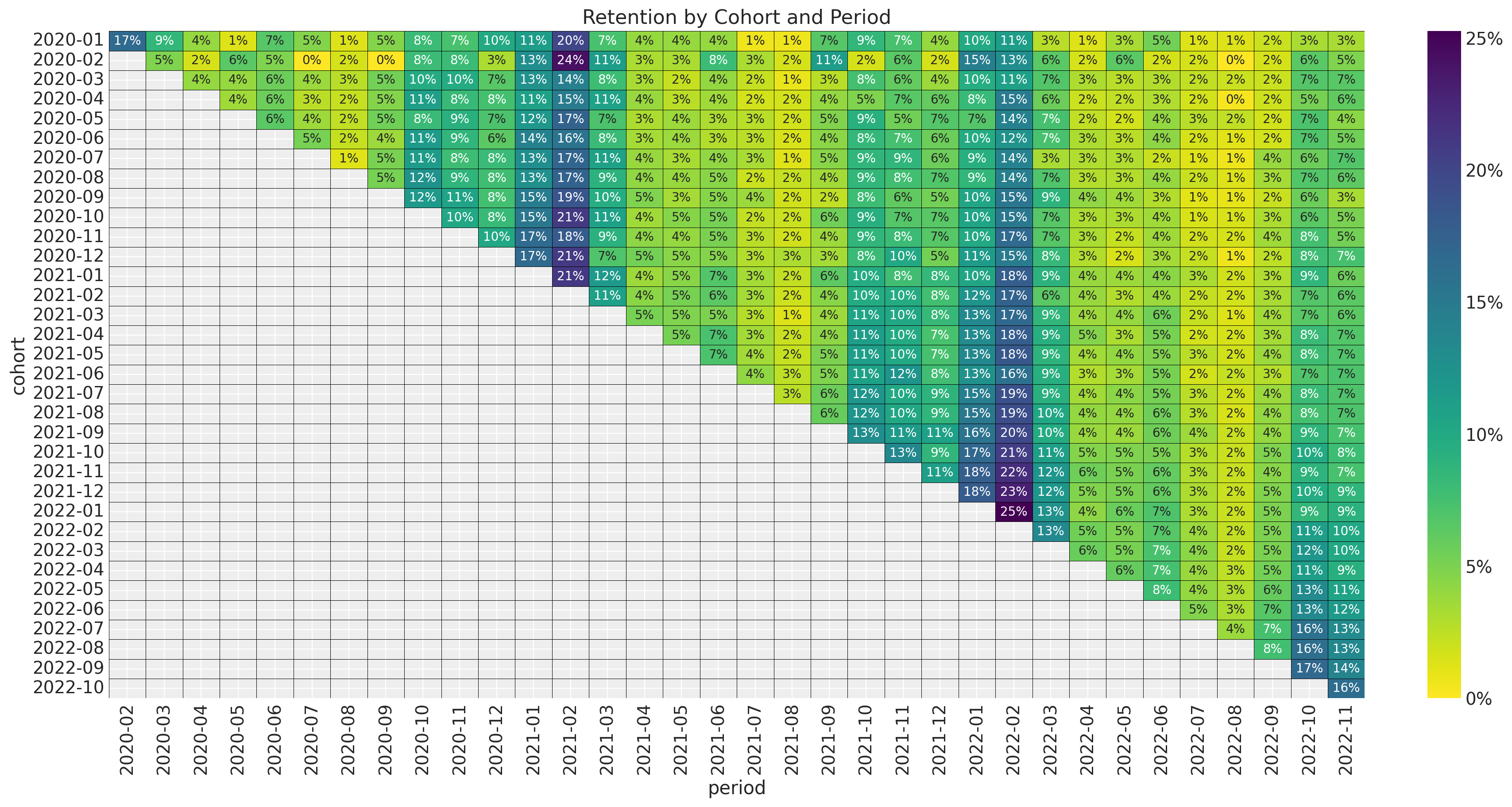
Similarly we can plot the revenue matrix:
fig, ax = plt.subplots(figsize=(17, 9))


(
    train_data_df.assign(
        cohort=lambda df: df["cohort"].dt.strftime("%Y-%m"),
        period=lambda df: df["period"].dt.strftime("%Y-%m"),
    )
    .query("cohort_age != 0")
    .filter(["cohort", "period", "revenue"])
    .pivot_table(index="cohort", columns="period", values="revenue")
    .pipe(
        (sns.heatmap, "data"),
        cmap="viridis_r",
        linewidths=0.2,
        linecolor="black",
        annot=True,
        annot_kws={"fontsize": 6},
        fmt="0.0f",
        cbar_kws={"format": mtick.FuncFormatter(lambda y, _: f"{y :0.0f}")},
        ax=ax,
    )
)

ax.set_title("Revenue by Cohort and Period")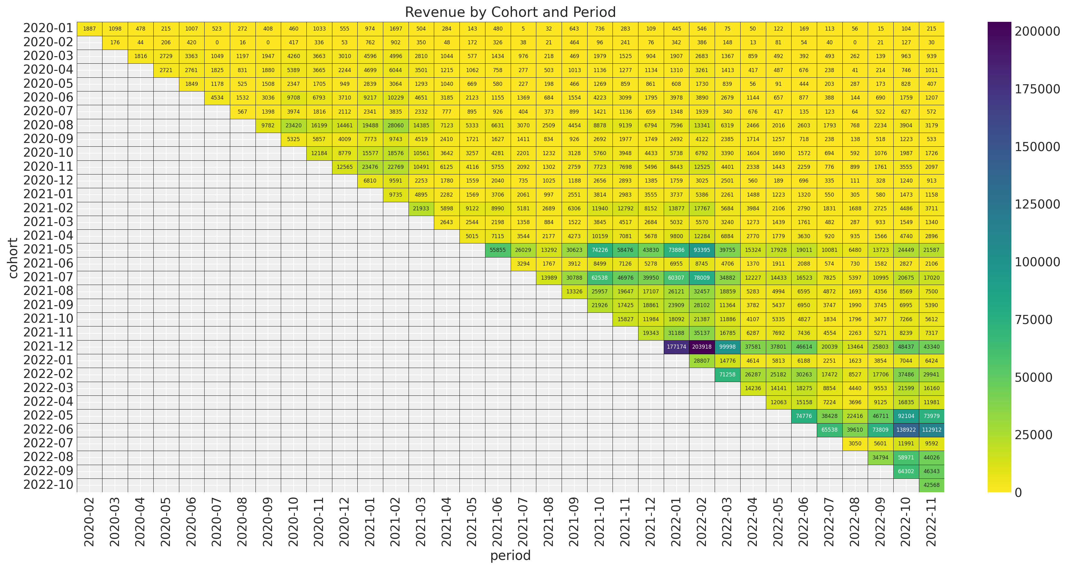
Our objective is to model both components as the same time as we expect the revenue to depend on the retention levels.
Model
Motivated by the analysis above we suggest the following retention-revenue model.
\[\begin{align*} \text{Revenue} & \sim \text{Gamma}(N_{\text{active}}, \lambda) \\ \log(\lambda) = (& \text{intercept} \\ & + \beta_{\text{cohort age}} \text{cohort age} \\ & + \beta_{\text{age}} \text{age} \\ & + \beta_{\text{cohort age} \times \text{age}} \text{cohort age} \times \text{age} ) \\ N_{\text{active}} & \sim \text{Binomial}(N_{\text{total}}, p) \\ \textrm{logit}(p) & = \text{NN}(\text{cohort age}, \text{age}, \text{month}) \end{align*}\]
where \(\text{NN}\) is a neural network implemented with Flax. We use a simple architecture with one hidden layers with \(4\) units each and sigmoid activation functions. For this simple case this architecture is enough. You can of course try more complex models.
The magic for this approach lies in the NumPyro module numpyro/contrib/module.py where we have very useful functions to integrate Flax models with NumPyro. In particular, we will use the random_flax_module which allow us to set priors on the layers weights and biases. You can find a simple example of this approach in the blog post Flax and NumPyro Toy Example.
Data Transformations
We do similar transformations as in the previous posts.
eps = np.finfo(float).eps
train_data_red_df = train_data_df.query("cohort_age > 0").reset_index(drop=True)
train_obs_idx = train_data_red_df.index.to_numpy()
train_n_users = train_data_red_df["n_users"].to_numpy()
train_n_active_users = train_data_red_df["n_active_users"].to_numpy()
train_retention = train_data_red_df["retention"].to_numpy()
train_retention_logit = logit(train_retention + eps)
train_data_red_df["month"] = train_data_red_df["period"].dt.strftime("%m").astype(int)
train_data_red_df["cohort_month"] = (
    train_data_red_df["cohort"].dt.strftime("%m").astype(int)
)
train_data_red_df["period_month"] = (
    train_data_red_df["period"].dt.strftime("%m").astype(int)
)
train_revenue = train_data_red_df["revenue"].to_numpy() + eps
train_revenue_per_user = train_revenue / (train_n_active_users + eps)

train_cohort = train_data_red_df["cohort"].to_numpy()
train_cohort_encoder = LabelEncoder()
train_cohort_idx = train_cohort_encoder.fit_transform(train_cohort).flatten()
train_period = train_data_red_df["period"].to_numpy()
train_period_encoder = LabelEncoder()
train_period_idx = train_period_encoder.fit_transform(train_period).flatten()

features: list[str] = ["age", "cohort_age", "month"]
x_train = train_data_red_df[features]

train_age = train_data_red_df["age"].to_numpy()
train_age_scaler = MaxAbsScaler()
train_age_scaled = train_age_scaler.fit_transform(train_age.reshape(-1, 1)).flatten()
train_cohort_age = train_data_red_df["cohort_age"].to_numpy()
train_cohort_age_scaler = MaxAbsScaler()
train_cohort_age_scaled = train_cohort_age_scaler.fit_transform(
    train_cohort_age.reshape(-1, 1)
).flatten()
For the variables entering into the model we need to convert them to jnp.array objects.
train_n_users = jnp.array(train_n_users)
train_n_active_users = jnp.array(train_n_active_users)
train_revenue = jnp.array(train_revenue)
Moreover, for the design matrix feeding the neural network we also need to scale the features (Note this was not necessary with the BART model). We also one-hot-encode the month variable.
numerical_features = ["age", "cohort_age"]
categorical_features = ["month"]

numerical_transformer = Pipeline(steps=[("scaler", StandardScaler())])
categorical_features_transformer = Pipeline(
    steps=[("onehot", OneHotEncoder(drop="first", sparse_output=False))]
)

preprocessor = ColumnTransformer(
    transformers=[
        ("num", numerical_transformer, numerical_features),
        ("cat", categorical_features_transformer, categorical_features),
    ]
).set_output(transform="pandas")

preprocessor.fit(x_train)
x_train_preprocessed = preprocessor.transform(x_train)

x_train_preprocessed.info()
<class 'pandas.core.frame.DataFrame'>
RangeIndex: 595 entries, 0 to 594
Data columns (total 13 columns):
# Column Non-Null Count Dtype
--- ------ -------------- -----
0 num__age 595 non-null float64
1 num__cohort_age 595 non-null float64
2 cat__month_2 595 non-null float64
3 cat__month_3 595 non-null float64
4 cat__month_4 595 non-null float64
5 cat__month_5 595 non-null float64
6 cat__month_6 595 non-null float64
7 cat__month_7 595 non-null float64
8 cat__month_8 595 non-null float64
9 cat__month_9 595 non-null float64
10 cat__month_10 595 non-null float64
11 cat__month_11 595 non-null float64
12 cat__month_12 595 non-null float64
dtypes: float64(13)
memory usage: 60.6 KBFinally, we convert the transformed design matrix to a jnp.array object.
x_train_preprocessed_array = jnp.array(x_train_preprocessed)Model Specification
We are now ready to write the model. First we define the neural network architecture in Flax.
class RetentionMLP(nn.Module):
    layers: list[int]

    @nn.compact
    def __call__(self, x):
        for num_features in self.layers:
            x = nn.sigmoid(nn.Dense(features=num_features)(x))
        return x
Now we write the NumPyro model. For the weights and biases we use set Normal priors centered around zero with unit variance.
def model(x, age, cohort_age, n_users, revenue=None, n_active_users=None):
    eps = np.finfo(float).eps

    retention_nn = random_flax_module(
        "retention_nn",
        RetentionMLP(layers=[4, 1]),
        prior=dist.Laplace(loc=0, scale=1),
        input_shape=(x.shape[1],),
    )
    retention = numpyro.deterministic("retention", retention_nn(x).squeeze(-1))

    intercept = numpyro.sample("intercept", dist.Normal(loc=0, scale=1))
    b_age = numpyro.sample("b_age", dist.Normal(loc=0, scale=1))
    b_cohort_age = numpyro.sample("b_cohort_age", dist.Normal(loc=0, scale=1))
    b_interaction = numpyro.sample("b_interaction", dist.Normal(loc=0, scale=1))

    lam_log = numpyro.deterministic(
        "lam_log",
        intercept
        + b_age * age
        + b_cohort_age * cohort_age
        + b_interaction * age * cohort_age,
    )

    lam = numpyro.deterministic("lam", jnp.exp(lam_log))

    with numpyro.plate("data", len(x)):
        n_active_users_estimated = numpyro.sample(
            "n_active_users_estimated",
            dist.Binomial(total_count=n_users, probs=retention),
            obs=n_active_users,
        )

        numpyro.deterministic("retention_estimated", n_active_users_estimated / n_users)

        numpyro.sample(
            "revenue_estimated",
            dist.Gamma(concentration=n_active_users_estimated + eps, rate=lam),
            obs=revenue,
        )
We can visualize the model using structure.
numpyro.render_model(
    model=model,
    model_kwargs={
        "x": x_train_preprocessed_array,
        "age": train_age_scaled,
        "cohort_age": train_cohort_age_scaled,
        "n_users": train_n_users,
        "revenue": train_revenue,
        "n_active_users": train_n_active_users,
    },
    render_distributions=True,
    render_params=True,
)
Inference: SVI
We use stochastic variational inference (SVI) to fit the model. We also se a AutoNormal guide as a variational distribution.
guide = AutoNormal(model=model)
optimizer = numpyro.optim.Adam(step_size=0.02)
svi = SVI(model, guide, optimizer, loss=Trace_ELBO())
n_samples = 15_000
rng_key, rng_subkey = random.split(key=rng_key)
svi_result = svi.run(
    rng_subkey,
    n_samples,
    x_train_preprocessed_array,
    train_age_scaled,
    train_cohort_age_scaled,
    train_n_users,
    train_revenue,
    train_n_active_users,
)

fig, ax = plt.subplots(figsize=(9, 6))
ax.plot(svi_result.losses)
ax.set(yscale="log")
ax.set_title("ELBO loss", fontsize=18, fontweight="bold")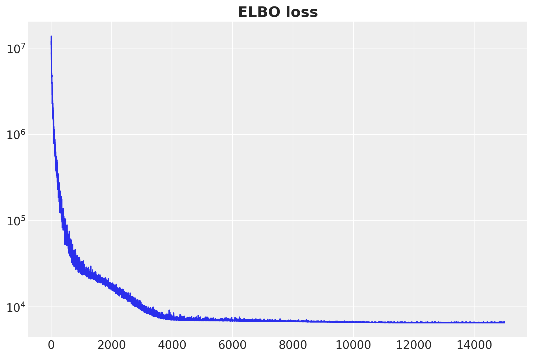
We see a nicely decaying ELBO curve.
Next we sample from the posterior distribution.
params = svi_result.params

posterior_predictive = Predictive(
    model=model, guide=guide, params=params, num_samples=4 * 2_000
)
rng_key, rng_subkey = random.split(key=rng_key)
posterior_predictive_samples = posterior_predictive(
    rng_subkey,
    x_train_preprocessed_array,
    train_age_scaled,
    train_cohort_age_scaled,
    train_n_users,
)
We structure the samples as an az.InferenceData object.
idata_svi = az.from_dict(
    posterior_predictive={
        k: np.expand_dims(a=np.asarray(v), axis=0)
        for k, v in posterior_predictive_samples.items()
    },
    coords={"obs_idx": train_obs_idx},
    dims={
        "retention": ["obs_idx"],
        "n_active_users_estimated": ["obs_idx"],
        "retention_estimated": ["obs_idx"],
        "revenue_estimated": ["obs_idx"],
    },
)
In-Sample Predictions
We now look at the in-sample fit. First we start with retention:
fig, ax = plt.subplots(figsize=(9, 7))
sns.scatterplot(
    x=train_retention,
    y=idata_svi["posterior_predictive"]["retention_estimated"].mean(
        dim=["chain", "draw"]
    ),
    color="C0",
    label="Mean Predicted Retention",
    ax=ax,
)
az.plot_hdi(
    x=train_retention,
    y=idata_svi["posterior_predictive"]["retention_estimated"],
    hdi_prob=0.94,
    color="C0",
    fill_kwargs={"alpha": 0.2, "label": "$94\\%$ HDI"},
    ax=ax,
)
az.plot_hdi(
    x=train_retention,
    y=idata_svi["posterior_predictive"]["retention_estimated"],
    hdi_prob=0.5,
    color="C0",
    fill_kwargs={"alpha": 0.4, "label": "$50\\%$ HDI"},
    ax=ax,
)
ax.axline((0, 0), slope=1, color="black", linestyle="--", label="diagonal")
ax.legend(loc="upper left")
ax.set(xlabel="True Retention", ylabel="Predicted Retention")
ax.set_title(
    label="True vs Predicted Retention (Train)", fontsize=18, fontweight="bold"
)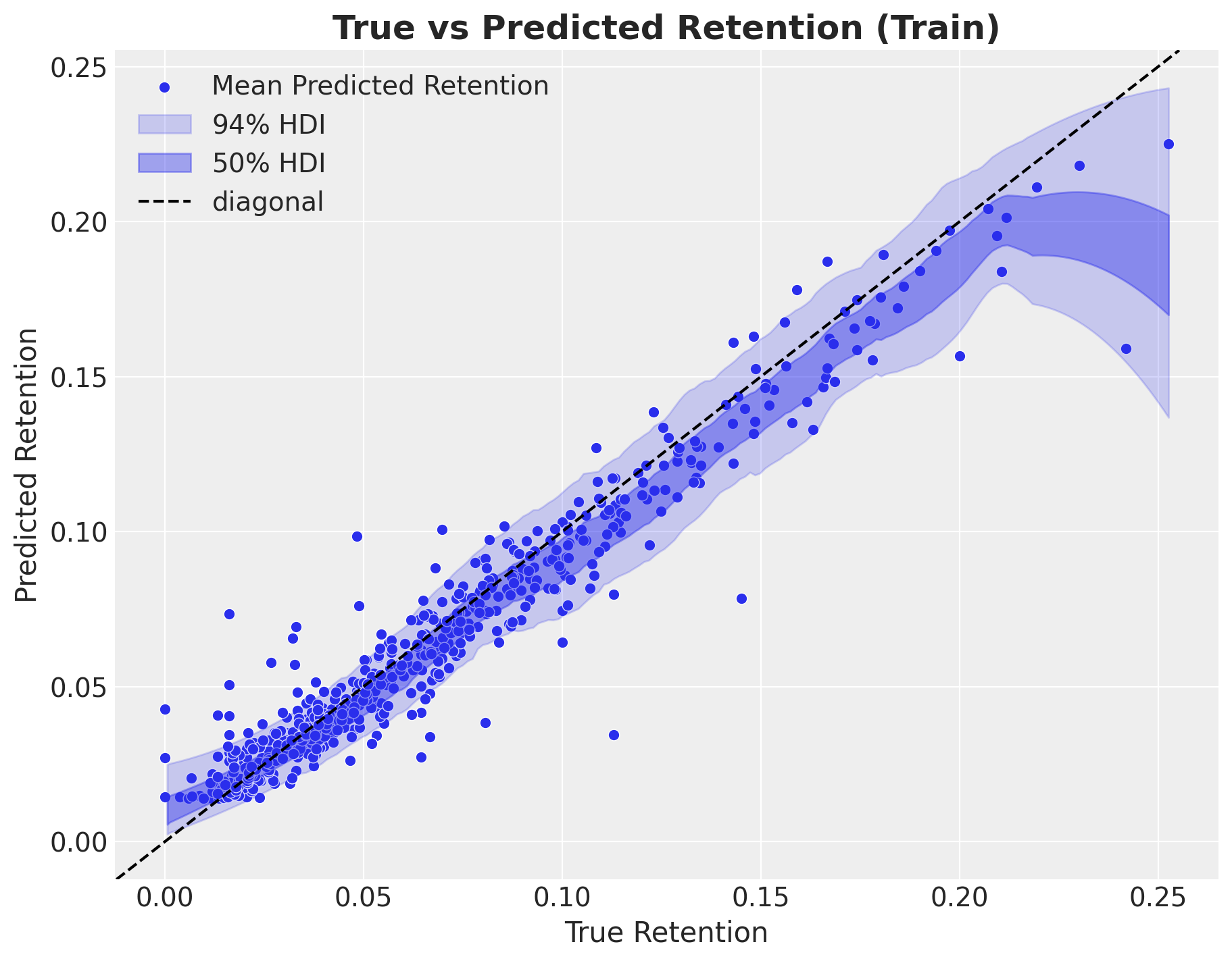
Overall it looks very reasonable. There are some point the model does not properly catch, but the previous BART model had the same issue.
The revenue in-sample predictions are also very similar to the ones obtained with the BART model.
fig, ax = plt.subplots(figsize=(9, 7))
sns.scatterplot(
    x=train_revenue,
    y=idata_svi["posterior_predictive"]["revenue_estimated"].mean(
        dim=["chain", "draw"]
    ),
    color="C0",
    label="Mean Predicted revenue_estimated",
    ax=ax,
)
az.plot_hdi(
    x=train_revenue,
    y=idata_svi["posterior_predictive"]["revenue_estimated"],
    hdi_prob=0.94,
    color="C0",
    fill_kwargs={"alpha": 0.2, "label": "$94\\%$ HDI"},
    ax=ax,
)
az.plot_hdi(
    x=train_revenue,
    y=idata_svi["posterior_predictive"]["revenue_estimated"],
    hdi_prob=0.5,
    color="C0",
    fill_kwargs={"alpha": 0.4, "label": "$50\\%$ HDI"},
    ax=ax,
)
ax.axline((0, 0), slope=1, color="black", linestyle="--", label="diagonal")
ax.legend(loc="upper left")
ax.set(xlabel="True Revenue", ylabel="Predicted Revenue")
ax.set_title(label="True vs Predicted Revenue (Train)", fontsize=18, fontweight="bold")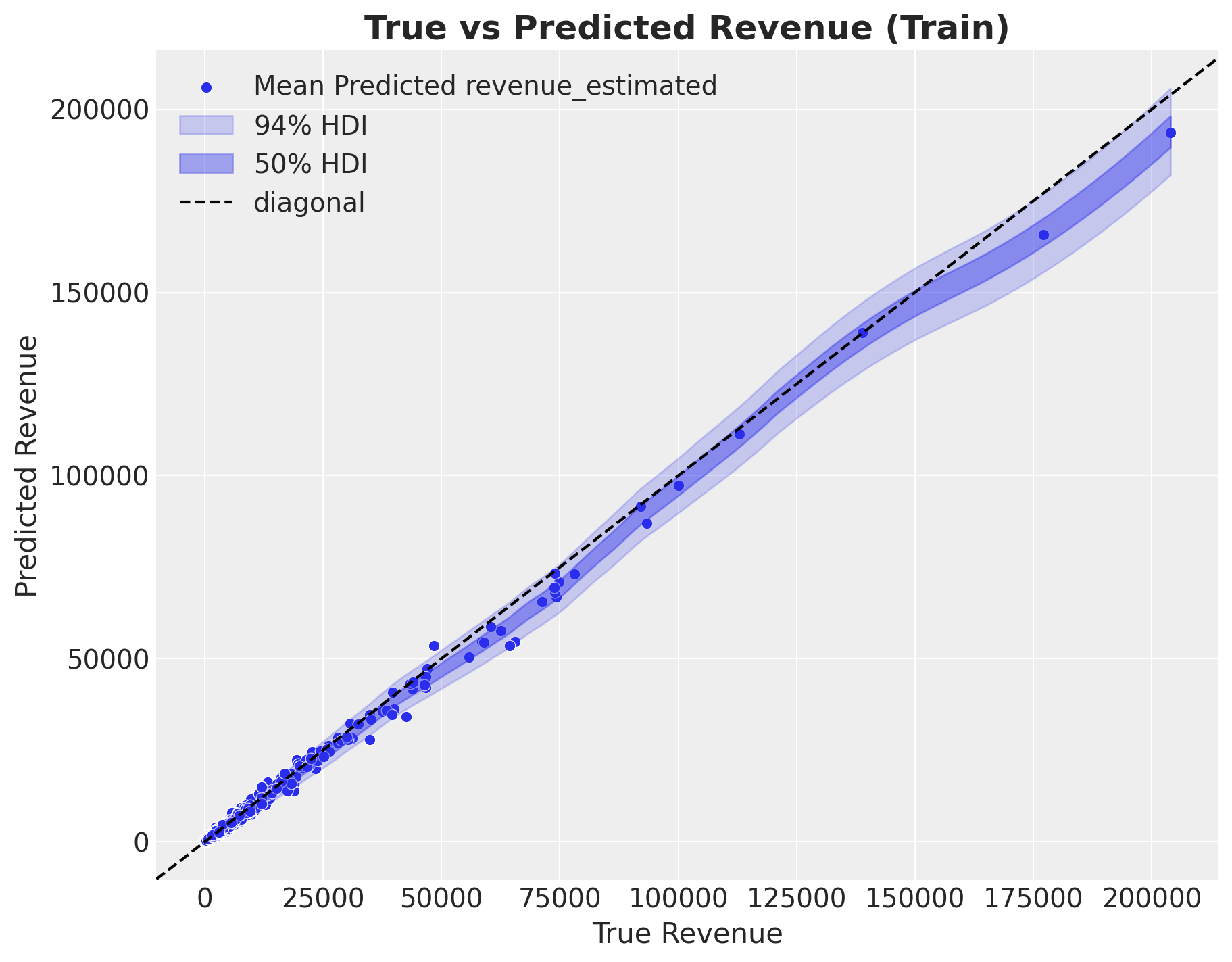
As in the previous post, we select a couple of example cohorts to visualize the predictions:
- Retention
train_retention_hdi = az.hdi(ary=idata_svi["posterior_predictive"])[
    "retention_estimated"
]


def plot_train_retention_hdi_cohort(cohort_index: int, ax: plt.Axes) -> plt.Axes:
    mask = train_cohort_idx == cohort_index

    ax.fill_between(
        x=train_period[train_period_idx[mask]],
        y1=train_retention_hdi[mask, :][:, 0],
        y2=train_retention_hdi[mask, :][:, 1],
        alpha=0.2,
        color="C3",
        label="94% HDI",
    )
    sns.lineplot(
        x=train_period[train_period_idx[mask]],
        y=idata_svi["posterior_predictive"]["retention_estimated"].mean(
            dim=["chain", "draw"]
        )[mask],
        marker="o",
        color="C3",
        label="predicted",
        ax=ax,
    )
    sns.lineplot(
        x=train_period[train_period_idx[mask]],
        y=train_retention[mask],
        color="C0",
        marker="o",
        label="observed",
        ax=ax,
    )
    cohort_name = (
        pd.to_datetime(train_cohort_encoder.classes_[cohort_index]).date().isoformat()
    )
    ax.legend(loc="upper left")
    ax.set(title=f"Retention - Cohort {cohort_name}")
    return ax


cohort_index_to_plot = [0, 1, 5, 10, 15, 20, 25, 30]

fig, axes = plt.subplots(
    nrows=np.ceil(len(cohort_index_to_plot) / 2).astype(int),
    ncols=2,
    figsize=(17, 11),
    sharex=True,
    sharey=True,
    layout="constrained",
)

for cohort_index, ax in zip(cohort_index_to_plot, axes.flatten(), strict=True):
    plot_train_retention_hdi_cohort(cohort_index=cohort_index, ax=ax)

fig.suptitle("In-Sample Retention", y=1.03, fontsize=20, fontweight="bold")
fig.autofmt_xdate()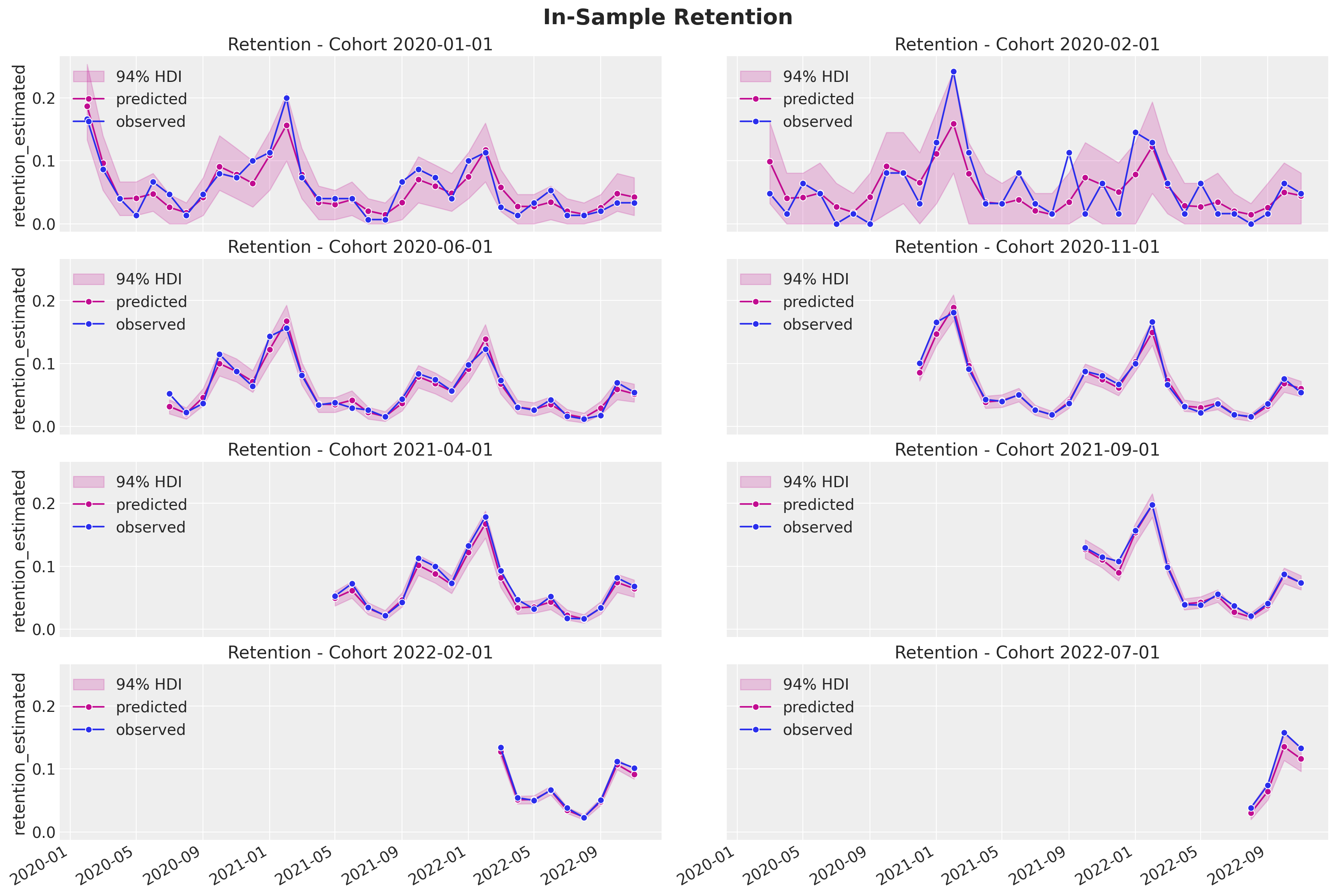
- Revenue
train_revenue_estimated_hdi = az.hdi(ary=idata_svi["posterior_predictive"])[
    "revenue_estimated"
]


def plot_train_revenue_hdi_cohort(cohort_index: int, ax: plt.Axes) -> plt.Axes:
    mask = train_cohort_idx == cohort_index

    ax.fill_between(
        x=train_period[train_period_idx[mask]],
        y1=train_revenue_estimated_hdi[mask, :][:, 0],
        y2=train_revenue_estimated_hdi[mask, :][:, 1],
        alpha=0.2,
        color="C3",
        label="94% HDI",
    )
    sns.lineplot(
        x=train_period[train_period_idx[mask]],
        y=idata_svi["posterior_predictive"]["revenue_estimated"].mean(
            dim=["chain", "draw"]
        )[mask],
        marker="o",
        color="C3",
        label="predicted",
        ax=ax,
    )
    sns.lineplot(
        x=train_period[train_period_idx[mask]],
        y=train_revenue[mask],
        color="C0",
        marker="o",
        label="observed",
        ax=ax,
    )
    cohort_name = (
        pd.to_datetime(train_cohort_encoder.classes_[cohort_index]).date().isoformat()
    )
    ax.legend(loc="upper left")
    ax.set(title=f"revenue_estimated - Cohort {cohort_name}")
    return ax


cohort_index_to_plot = [0, 1, 5, 10, 15, 20, 25, 30]

fig, axes = plt.subplots(
    nrows=np.ceil(len(cohort_index_to_plot) / 2).astype(int),
    ncols=2,
    figsize=(17, 11),
    sharex=True,
    sharey=False,
    layout="constrained",
)

for cohort_index, ax in zip(cohort_index_to_plot, axes.flatten(), strict=True):
    plot_train_revenue_hdi_cohort(cohort_index=cohort_index, ax=ax)

fig.suptitle("In-Sample Revenue", y=1.03, fontsize=20, fontweight="bold")
fig.autofmt_xdate()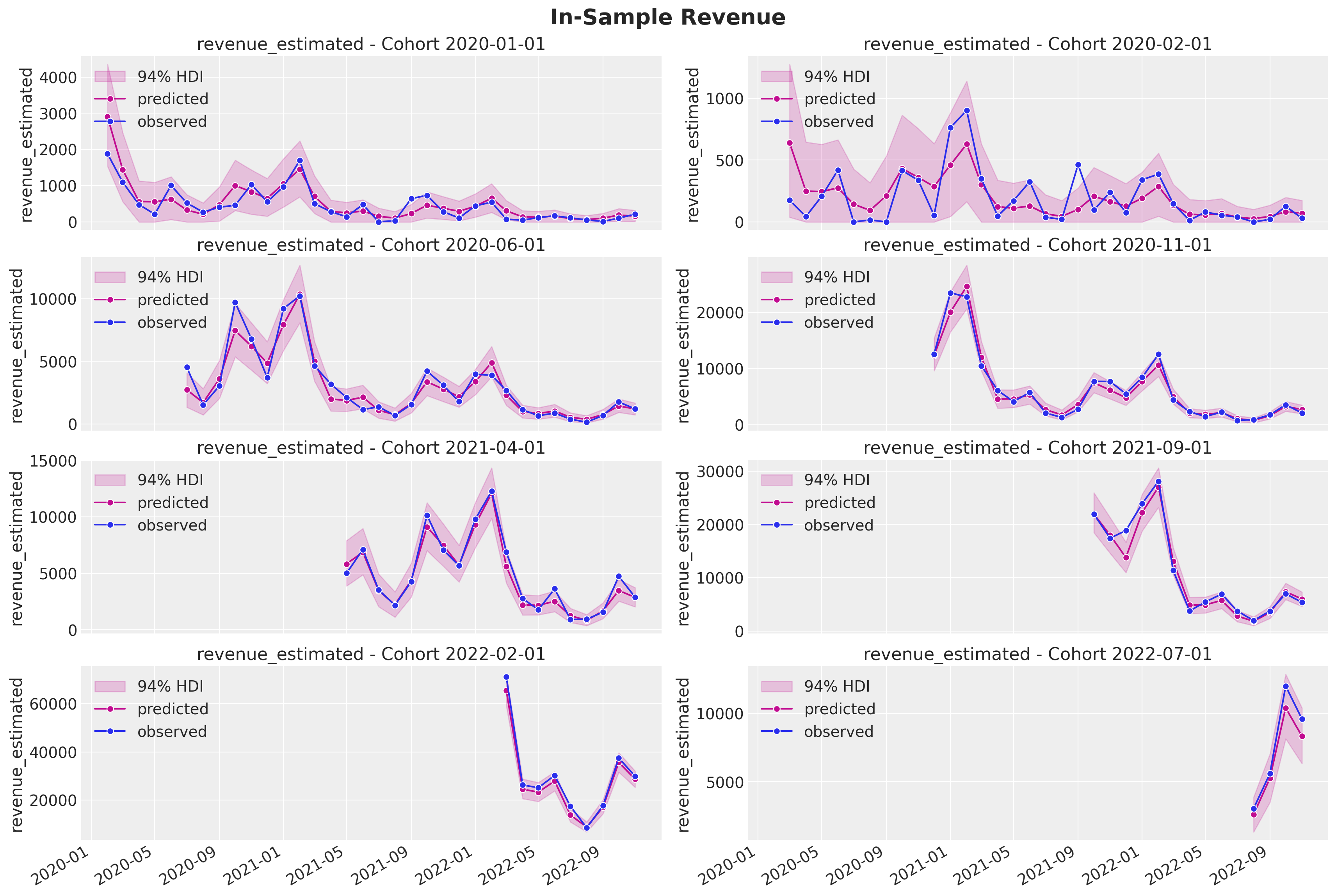
The fit look very good and are very similar to the ones obtained with the BART model! Note that the HDI intervals are wider for smaller cohorts as expected.
Out-of-Sample Predictions
Now we prepare the data for the out-of-sample predictions.
test_data_red_df = test_data_df.query("cohort_age > 0")
test_data_red_df = test_data_red_df[
    test_data_red_df["cohort"].isin(train_data_red_df["cohort"].unique())
].reset_index(drop=True)
test_obs_idx = test_data_red_df.index.to_numpy()
test_n_users = test_data_red_df["n_users"].to_numpy()
test_n_active_users = test_data_red_df["n_active_users"].to_numpy()
test_retention = test_data_red_df["retention"].to_numpy()
test_revenue = test_data_red_df["revenue"].to_numpy()

test_cohort = test_data_red_df["cohort"].to_numpy()
test_cohort_idx = train_cohort_encoder.transform(test_cohort).flatten()

test_data_red_df["month"] = test_data_red_df["period"].dt.strftime("%m").astype(int)
test_data_red_df["cohort_month"] = (
    test_data_red_df["cohort"].dt.strftime("%m").astype(int)
)
test_data_red_df["period_month"] = (
    test_data_red_df["period"].dt.strftime("%m").astype(int)
)
x_test = test_data_red_df[features]

test_age = test_data_red_df["age"].to_numpy()
test_age_scaled = train_age_scaler.transform(test_age.reshape(-1, 1)).flatten()
test_cohort_age = test_data_red_df["cohort_age"].to_numpy()
test_cohort_age_scaled = train_cohort_age_scaler.transform(
    test_cohort_age.reshape(-1, 1)
).flatten()
test_n_users = jnp.array(test_n_users)
test_n_active_users = jnp.array(test_n_active_users)
test_revenue = jnp.array(test_revenue)
x_test_preprocessed = preprocessor.transform(x_test)
x_test_preprocessed_array = jnp.array(x_test_preprocessed)Now we are ready to sample from the posterior distribution.
test_predictive = Predictive(
    model=model, guide=guide, params=params, num_samples=4 * 2_000
)
rng_key, rng_subkey = random.split(key=rng_key)
test_posterior_predictive_samples = test_predictive(
    rng_subkey,
    x_test_preprocessed_array,
    test_age_scaled,
    test_cohort_age_scaled,
    test_n_users,
)
Again, we structure the samples as an az.InferenceData object.
test_idata_svi = az.from_dict(
    posterior_predictive={
        k: np.expand_dims(a=np.asarray(v), axis=0)
        for k, v in test_posterior_predictive_samples.items()
    },
    coords={"obs_idx": test_obs_idx},
    dims={
        "retention": ["obs_idx"],
        "n_active_users_estimates": ["obs_idx"],
        "revenue_estimated": ["obs_idx"],
    },
)
Let’s now look at the actual against the predictions.
- Retention
fig, ax = plt.subplots(figsize=(9, 7))
sns.scatterplot(
    x=test_retention,
    y=test_idata_svi["posterior_predictive"]["retention_estimated"].mean(
        dim=["chain", "draw"]
    ),
    color="C1",
    label="Mean Predicted Retention",
    ax=ax,
)
az.plot_hdi(
    x=test_retention,
    y=test_idata_svi["posterior_predictive"]["retention_estimated"],
    hdi_prob=0.94,
    color="C1",
    fill_kwargs={"alpha": 0.2, "label": "$94\\%$ HDI"},
    ax=ax,
)
az.plot_hdi(
    x=test_retention,
    y=test_idata_svi["posterior_predictive"]["retention_estimated"],
    hdi_prob=0.5,
    color="C1",
    fill_kwargs={"alpha": 0.4, "label": "$50\\%$ HDI"},
    ax=ax,
)
ax.axline((0, 0), slope=1, color="black", linestyle="--", label="diagonal")
ax.legend(loc="upper left")
ax.set(xlabel="True Retention", ylabel="Predicted Retention")
ax.set_title(label="True vs Predicted Retention (test)", fontsize=18, fontweight="bold")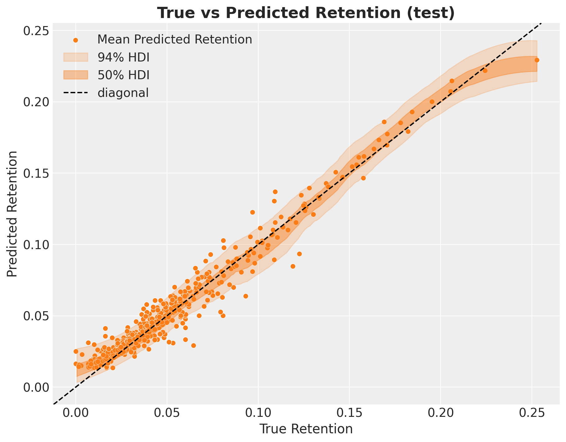
- Revenue
fig, ax = plt.subplots(figsize=(9, 7))
sns.scatterplot(
    x=test_revenue,
    y=test_idata_svi["posterior_predictive"]["revenue_estimated"].mean(
        dim=["chain", "draw"]
    ),
    color="C1",
    label="Mean Predicted revenue_estimated",
    ax=ax,
)
az.plot_hdi(
    x=test_revenue,
    y=test_idata_svi["posterior_predictive"]["revenue_estimated"],
    hdi_prob=0.94,
    color="C1",
    fill_kwargs={"alpha": 0.2, "label": "$94\\%$ HDI"},
    ax=ax,
)
az.plot_hdi(
    x=test_revenue,
    y=test_idata_svi["posterior_predictive"]["revenue_estimated"],
    hdi_prob=0.5,
    color="C1",
    fill_kwargs={"alpha": 0.4, "label": "$50\\%$ HDI"},
    ax=ax,
)
ax.axline((0, 0), slope=1, color="black", linestyle="--", label="diagonal")
ax.legend(loc="upper left")
ax.set(xlabel="True revenue_estimated", ylabel="Predicted revenue_estimated")
ax.set_title(label="True vs Predicted Revenue (test)", fontsize=18, fontweight="bold")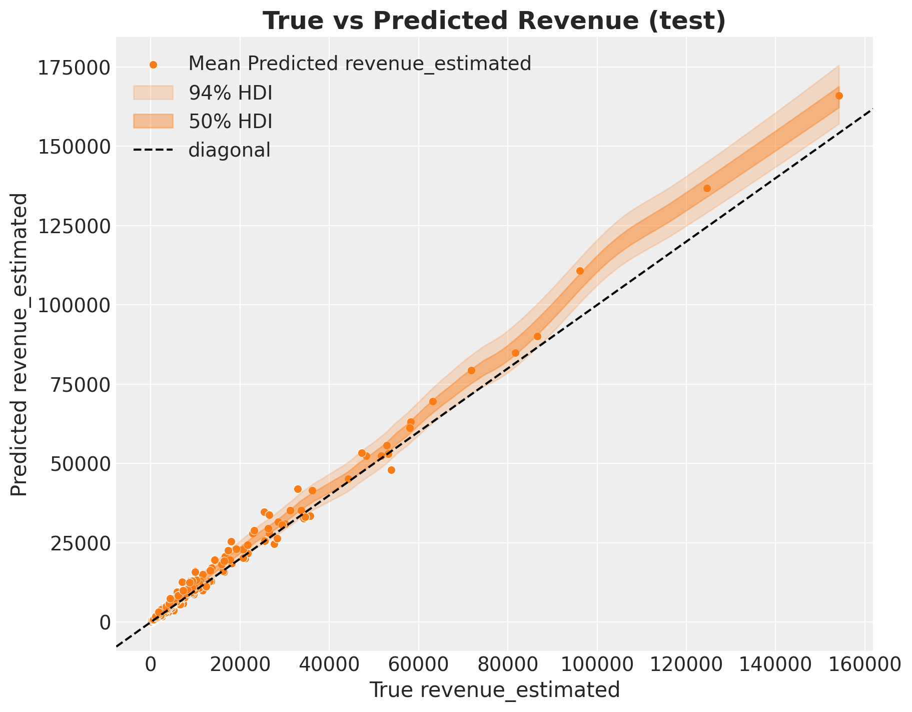
The retention predictions look very good whereas the revenue ones seem a bit higher for cohorts with higher revenue. This is also similar to the BART model.
Finally, lets get out of sample predictions for the selected subset of cohorts.
- Retention
test_retention_hdi = az.hdi(ary=test_idata_svi["posterior_predictive"])[
    "retention_estimated"
]


def plot_test_retention_hdi_cohort(cohort_index: int, ax: plt.Axes) -> plt.Axes:
    mask = test_cohort_idx == cohort_index

    test_period_range = test_data_red_df.query(
        f"cohort == '{train_cohort_encoder.classes_[cohort_index]}'"
    )["period"]

    ax.fill_between(
        x=test_period_range,
        y1=test_retention_hdi[mask, :][:, 0],
        y2=test_retention_hdi[mask, :][:, 1],
        alpha=0.2,
        color="C3",
    )

    sns.lineplot(
        x=test_period_range,
        y=test_idata_svi["posterior_predictive"]["retention_estimated"].mean(
            dim=["chain", "draw"]
        )[mask],
        marker="o",
        color="C3",
        ax=ax,
    )
    sns.lineplot(
        x=test_period_range,
        y=test_retention[mask],
        color="C1",
        marker="o",
        label="observed (test)",
        ax=ax,
    )
    return ax
cohort_index_to_plot = [0, 1, 5, 10, 15, 20, 25, 30]
fig, axes = plt.subplots(
nrows=len(cohort_index_to_plot),
ncols=1,
figsize=(15, 16),
sharex=True,
sharey=True,
layout="constrained",
)
for cohort_index, ax in zip(cohort_index_to_plot, axes.flatten(), strict=True):
plot_train_retention_hdi_cohort(cohort_index=cohort_index, ax=ax)
plot_test_retention_hdi_cohort(cohort_index=cohort_index, ax=ax)
ax.axvline(
x=pd.to_datetime(period_train_test_split),
color="black",
linestyle="--",
label="train/test split",
)
ax.legend(loc="center left", bbox_to_anchor=(1, 0.5))
fig.suptitle("Retention Predictions", y=1.03, fontsize=20, fontweight="bold")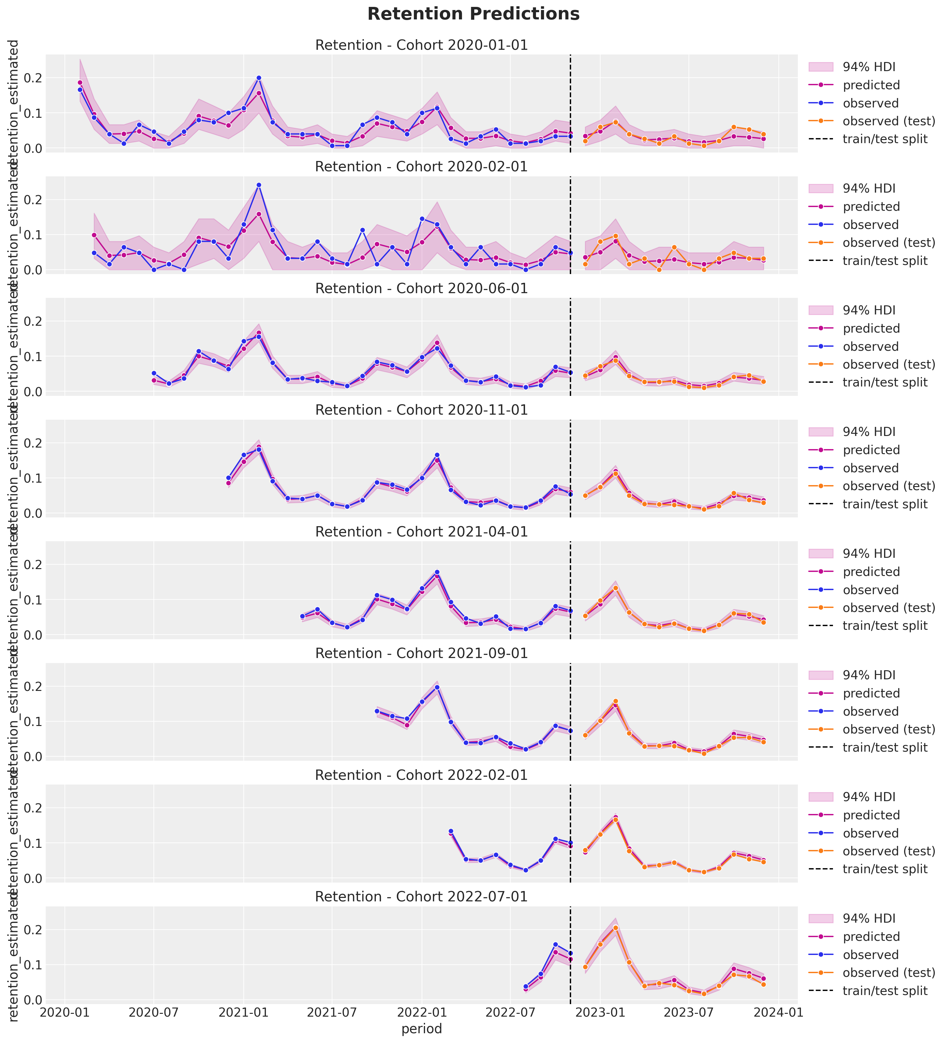
- Revenue
test_revenue_estimated_hdi = az.hdi(ary=test_idata_svi["posterior_predictive"])[
    "revenue_estimated"
]


def plot_test_revenue_hdi_cohort(cohort_index: int, ax: plt.Axes) -> plt.Axes:
    mask = test_cohort_idx == cohort_index

    test_period_range = test_data_red_df.query(
        f"cohort == '{train_cohort_encoder.classes_[cohort_index]}'"
    )["period"]

    ax.fill_between(
        x=test_period_range,
        y1=test_revenue_estimated_hdi[mask, :][:, 0],
        y2=test_revenue_estimated_hdi[mask, :][:, 1],
        alpha=0.2,
        color="C3",
    )

    sns.lineplot(
        x=test_period_range,
        y=test_idata_svi["posterior_predictive"]["revenue_estimated"].mean(
            dim=["chain", "draw"]
        )[mask],
        marker="o",
        color="C3",
        ax=ax,
    )
    sns.lineplot(
        x=test_period_range,
        y=test_revenue[mask],
        color="C1",
        marker="o",
        label="observed (test)",
        ax=ax,
    )
    return ax
cohort_index_to_plot = [0, 1, 5, 10, 15, 20, 25, 30]
fig, axes = plt.subplots(
nrows=len(cohort_index_to_plot),
ncols=1,
figsize=(15, 16),
sharex=True,
sharey=False,
layout="constrained",
)
for cohort_index, ax in zip(cohort_index_to_plot, axes.flatten(), strict=True):
plot_train_revenue_hdi_cohort(cohort_index=cohort_index, ax=ax)
plot_test_revenue_hdi_cohort(cohort_index=cohort_index, ax=ax)
ax.axvline(
x=pd.to_datetime(period_train_test_split),
color="black",
linestyle="--",
label="train/test split",
)
ax.legend(loc="center left", bbox_to_anchor=(1, 0.5))
fig.suptitle("Revenue Predictions", y=1.03, fontsize=20, fontweight="bold")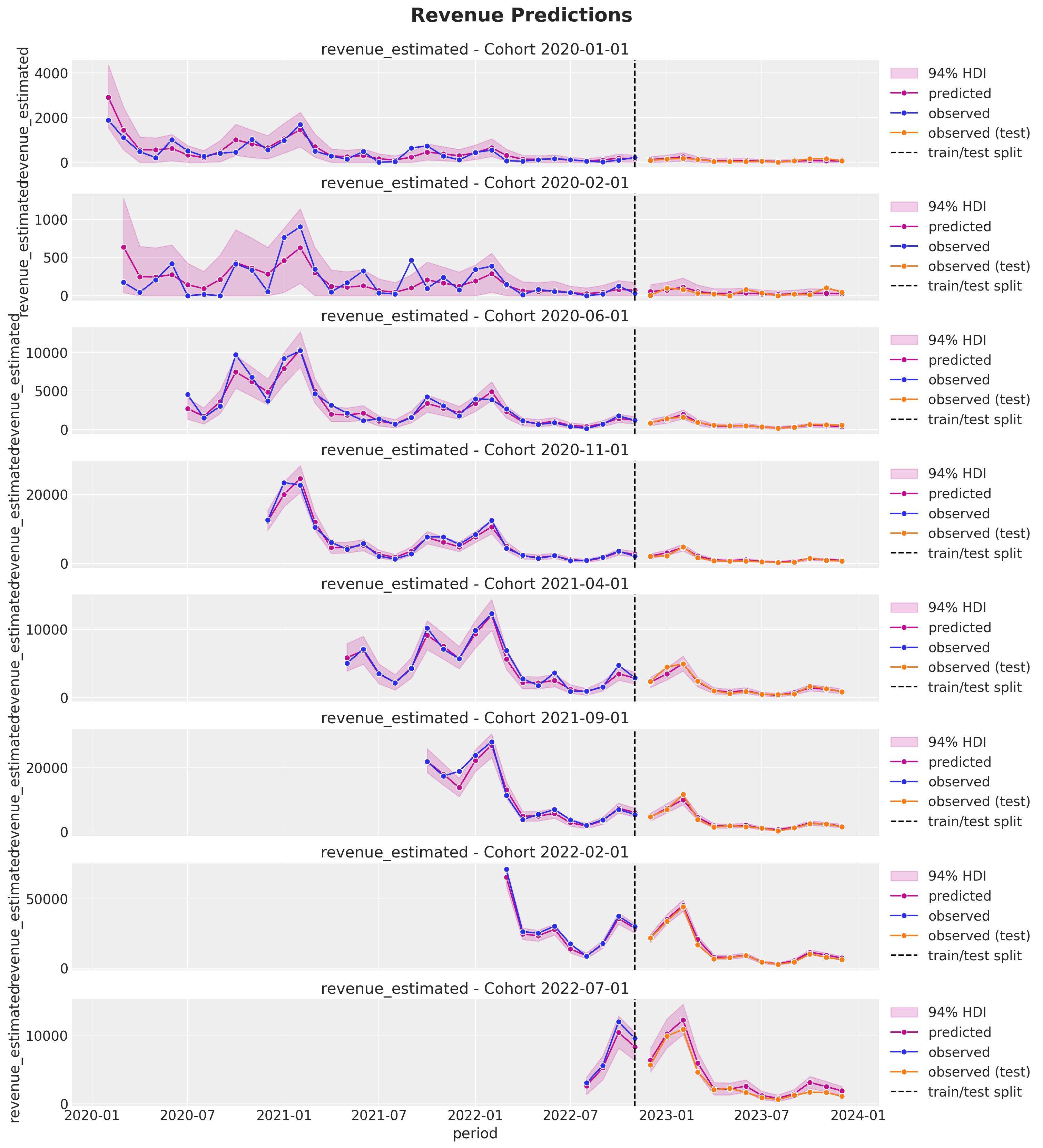
The results look very good! Both the posterior mean and the uncertainty as a function of the cohort size.
This extension of the model allow us for greater flexibility without compromising the inference speed (it is actually much faster) or accuracy. We could actually iterate on the model development with SVI and then get posterior samples via full HMC (NUTS). This is also fast for the typical dataset sizes we have in this type of problems.