In this notebook, we present a complete simulation study of the media mix model (MMM) and experimental calibration method presented in the paper “Media Mix Model Calibration With Bayesian Priors”, by Zhang, et al., where the authors propose a convenient parametrization the regression model in terms of the ROAs (return on advertising spend) instead of the classical regression (beta) coefficients. The benefit of this parametrization is that it allows for using Bayesian priors on the ROAS, which typically come from previous experiments or domain knowledge. Providing this information to the model is essential in real-life MMM applications, as biases and noise can easily fool us. Similar to the author’s paper, we show that the proposed method can provide better ROAS estimation when we have a bias due to missing covariates or omitted variables. We work out an example of the classical media mix model presented in the paper “Bayesian Methods for Media Mix Modeling with Carryover and Shape Effects”, by Jin, et al.. I strongly recommend taking a look in too these two papers before reading this notebook. Reading them in parallel with this notebook is also a good alternative.
For an introduction to the topic I recommend my two previous posts:
- Media Effect Estimation with Orbit’s KTR Model
- Media Effect Estimation with PyMC: Adstock, Saturation & Diminishing Returns
and the PyMC-Marketing MMM example.
Outline
Here is the outline of the study.
Data Generating Process
ROAS Computation (Analytically)
Data Preparation
Models:
Model 1 (Causal Model): Model with all variables needed to specify causal effects of media channels. We test parameter recovery from the data generating process.
Model 2 (Unobserved Confounder): Model with out a confounding variable. We show how the ROAS estimation in this case is quite off due omitted variable bias (confounding).
Model 3 (ROAS Calibration): We keep out the confounding variable as in Model 2, but we set up priors in the ROAS instead of the regression (beta) coefficients of the media variables. When setting informative priors on the ROAS, we show the biad due the missing confounding variable decreases significantly. This implies this technique can be very effective to calibrate media mix models.
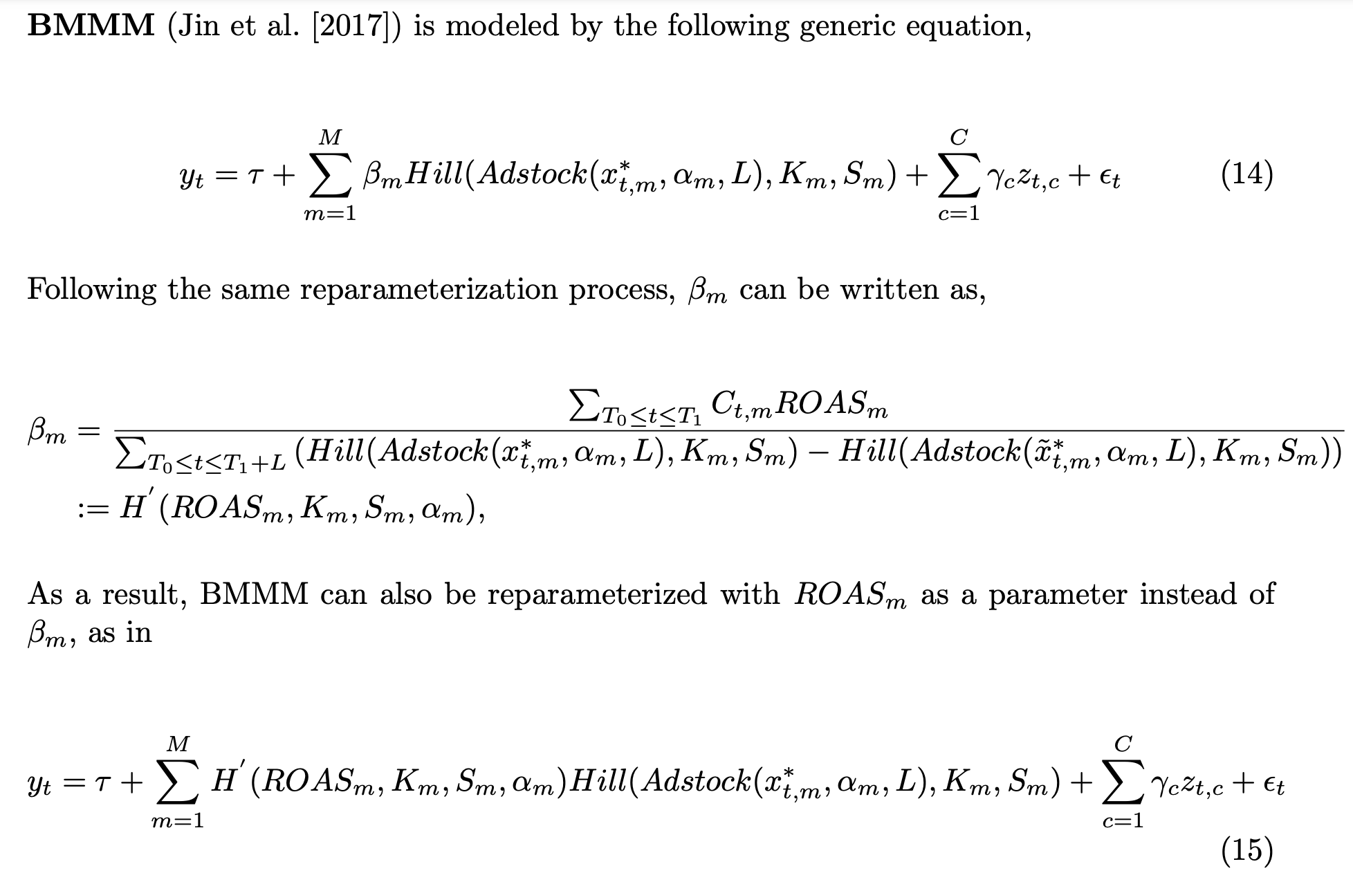
All the results are fully reproducible!
Prepare Notebook
import arviz as az
import graphviz as gr
import matplotlib.pyplot as plt
import matplotlib.ticker as mtick
import numpy as np
import pandas as pd
import preliz as pz
import pymc as pm
import pytensor.tensor as pt
import seaborn as sns
import xarray as xr
from dowhy import CausalModel
from sklearn import set_config
from sklearn.preprocessing import MaxAbsScaler
from tqdm.notebook import tqdm

set_config(transform_output="pandas")


az.style.use("arviz-darkgrid")
plt.rcParams["figure.figsize"] = [12, 7]
plt.rcParams["figure.dpi"] = 100
plt.rcParams["figure.facecolor"] = "white"


%load_ext autoreload
%autoreload 2
%config InlineBackend.figure_format = "retina"
seed: int = sum(map(ord, "mmm_roas"))
rng: np.random.Generator = np.random.default_rng(seed=seed)Data Generating Process
We begin by generating a synthetic data set to be able to compare the estimates of various models against the ground truth. We follow a similar strategy as in the PyMC-Marketing MMM example. However, the main difference is that we add a confounder variable which a causal effect on a specific channel and the target. The following DAG represents the data generating process and the causal dependencies between the variables.
g = gr.Digraph()
g.node(name="seasonality", label="seasonality", color="lightgray", style="filled")
g.node(name="trend", label="trend")
g.node(name="z", label="z", color="lightgray", style="filled")
g.node(name="x1", label="x1", color="#2a2eec80", style="filled")
g.node(name="x2", label="x2", color="#fa7c1780", style="filled")
g.node(name="y", label="y", color="#328c0680", style="filled")
g.edge(tail_name="seasonality", head_name="x1")
g.edge(tail_name="z", head_name="x1")
g.edge(tail_name="x1", head_name="y")
g.edge(tail_name="seasonality", head_name="y")
g.edge(tail_name="trend", head_name="y")
g.edge(tail_name="z", head_name="y")
g.edge(tail_name="x2", head_name="y")
g
Here \(x_1\) and \(x_2\) represent two media channels and \(y\) our target variable (e.g. sales). The confounder \(z\) has a causal effect on \(x_1\) and \(y\).
Remark: If you are a color geek like me, you can get the color palette color codes of the arviz theme here. Note that you can add them with transparency as described here. Note that the transparency is specified by the las two characters of the hex code.
We not proceed to generate weekly data for \(2.5\) years. In the following snippet of code we generate the date range, seasonality and trend components and, the covariate \(z\), which is always positive.
# date range
min_date = pd.to_datetime("2021-10-02")
max_date = pd.to_datetime("2024-03-30")

data_df = pd.DataFrame(
    data={"date": pd.date_range(start=min_date, end=max_date, freq="W-SAT")}
)

n = data_df.shape[0]

data_df["dayofyear"] = data_df["date"].dt.dayofyear
data_df["quarter"] = data_df["date"].dt.to_period("Q").dt.strftime("%YQ%q")
data_df["trend"] = (np.linspace(start=0.0, stop=50, num=n) + 10) ** (1 / 3) - 1
data_df["cs"] = -np.sin(2 * 2 * np.pi * data_df["dayofyear"] / 365.25)
data_df["cc"] = np.cos(1 * 2 * np.pi * data_df["dayofyear"] / 365.25)
data_df["seasonality"] = 0.3 * (data_df["cs"] + data_df["cc"])
data_df["z"] = 0.3 * rng.gamma(shape=1, scale=2 / 3, size=n)
The following plot shows the time series development of these features (and the aggregation).
fig, ax = plt.subplots(
    nrows=2,
    ncols=1,
    figsize=(12, 9),
    sharex=True,
    sharey=False,
    layout="constrained",
)
sns.lineplot(
    data=data_df,
    x="date",
    y="trend",
    color="C0",
    label="trend",
    ax=ax[0],
)
sns.lineplot(
    data=data_df,
    x="date",
    y="seasonality",
    color="C1",
    label="seasonality",
    ax=ax[0],
)
sns.lineplot(data=data_df, x="date", y="z", color="C2", label="z", ax=ax[0])
ax[0].legend(loc="upper left")
ax[0].set(xlabel="date", ylabel=None)

sns.lineplot(
    data=data_df.eval("sum = trend + seasonality + z"),
    x="date",
    y="sum",
    color="black",
    label="trend + seasonality + z",
    ax=ax[1],
)
ax[1].legend(loc="upper left")

fig.suptitle(t="Data Components", fontsize=18, fontweight="bold")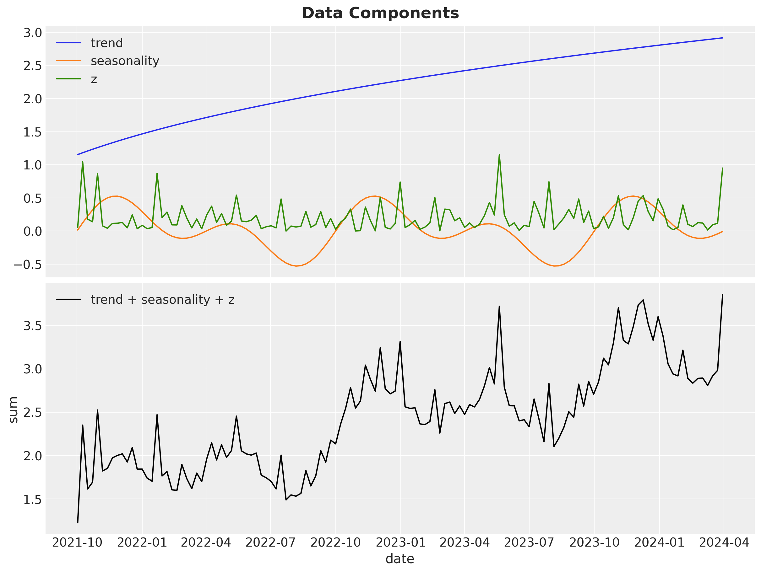
Next, we generate the media channels \(x_1\) and \(x_2\). Note that the channel spend \(x_1\) depends both the seasonality component and the \(z\) variable. We also generate Gaussian noise to be added to the target variable \(y\).
data_df["x1"] = 1.2 * (
    0.5
    + 0.4 * data_df["seasonality"]
    + 0.6 * data_df["z"]
    + 0.1 * rng.poisson(lam=1 / 2, size=n)
)

data_df["x2"] = 0.3 * rng.gamma(shape=1, scale=1, size=n)

data_df["epsilon"] = rng.normal(loc=0, scale=0.1, size=n)
We now can visualize all the components:
fig, ax = plt.subplots(
    nrows=2,
    ncols=1,
    figsize=(15, 10),
    sharex=True,
    sharey=False,
    layout="constrained",
)
sns.lineplot(
    data=data_df,
    x="date",
    y="trend",
    color="C0",
    alpha=0.5,
    label="trend",
    ax=ax[0],
)
sns.lineplot(
    data=data_df,
    x="date",
    y="seasonality",
    color="C1",
    alpha=0.5,
    label="seasonality",
    ax=ax[0],
)
sns.lineplot(data=data_df, x="date", y="z", color="C2", alpha=0.5, label="z", ax=ax[0])
sns.lineplot(
    data=data_df, x="date", y="x1", color="C3", linewidth=2.5, label="x1", ax=ax[0]
)
sns.lineplot(
    data=data_df, x="date", y="x2", color="C4", linewidth=2.5, label="x2", ax=ax[0]
)
sns.lineplot(
    data=data_df,
    x="date",
    y="epsilon",
    color="C5",
    linewidth=2.5,
    label="epsilon",
    ax=ax[0],
)
ax[0].legend(loc="upper left")
ax[0].set(xlabel="date", ylabel=None)

sns.lineplot(
    data=data_df.eval("sum = trend + seasonality + z + x1 + x2 + epsilon"),
    x="date",
    y="sum",
    color="black",
    linewidth=2.5,
    label="trend + seasonality + z + x1 + x2 + epsilon",
    ax=ax[1],
)
ax[1].legend(loc="upper left")

fig.suptitle(t="Data Components", fontsize=18, fontweight="bold")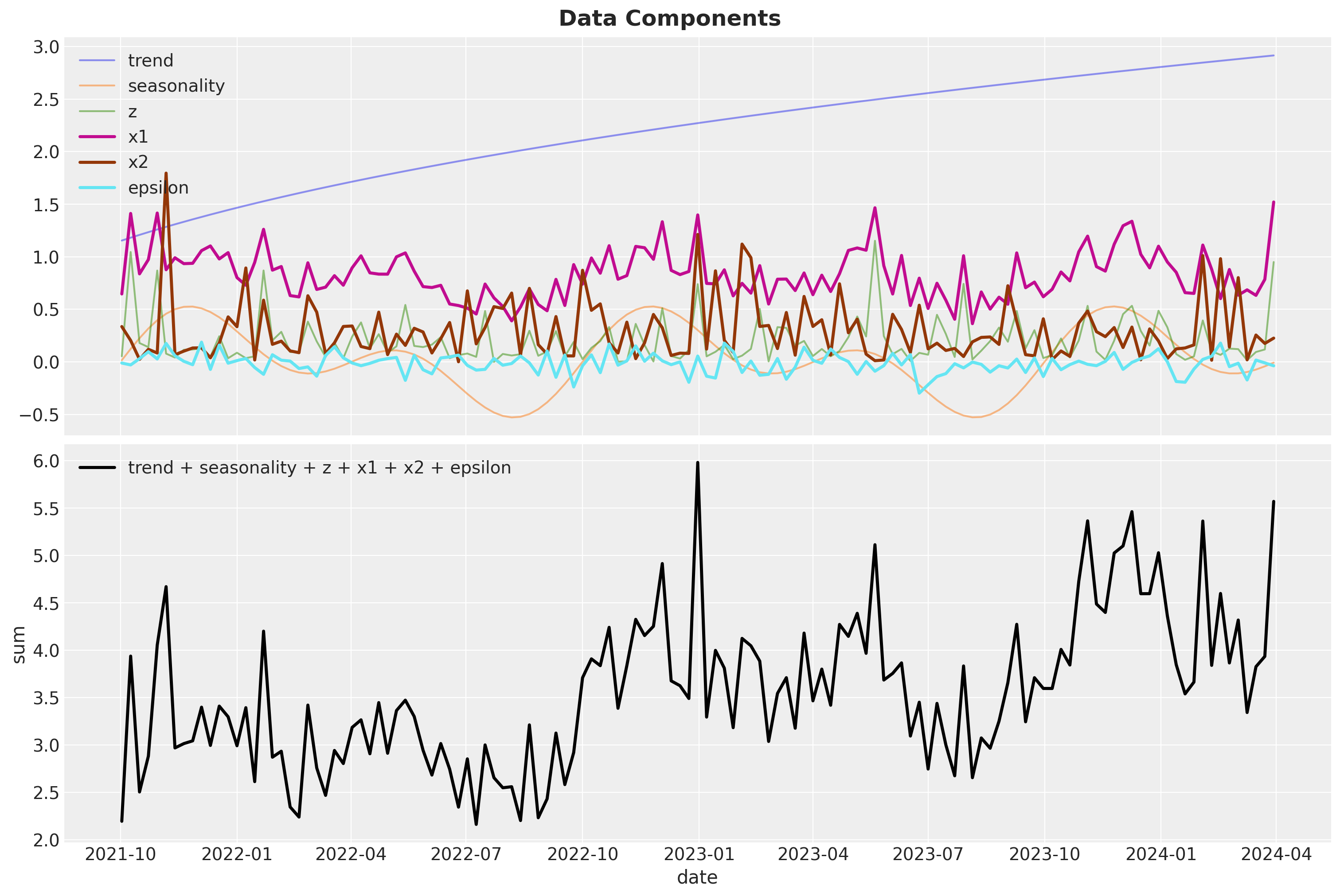
Note that we have not yet added the non-linear effects of the media channels. This is a key component in media mix models as we expect that the media signal to have carryover (adstock) and saturation effects (for a detailed description of these transformation and alternative parametrizations see the paper “Bayesian Methods for Media Mix Modeling with Carryover and Shape Effects”, by Jin, et al.). We add these two transformations using some helper functions (the code is not that important):
def geometric_adstock(x, alpha, l_max, normalize):
    """Vectorized geometric adstock transformation."""
    cycles = [
        pt.concatenate(tensor_list=[pt.zeros(shape=x.shape)[:i], x[: x.shape[0] - i]])
        for i in range(l_max)
    ]
    x_cycle = pt.stack(cycles)
    x_cycle = pt.transpose(x=x_cycle, axes=[1, 2, 0])
    w = pt.as_tensor_variable([pt.power(alpha, i) for i in range(l_max)])
    w = pt.transpose(w)[None, ...]
    w = w / pt.sum(w, axis=2, keepdims=True) if normalize else w
    return pt.sum(pt.mul(x_cycle, w), axis=2)


def logistic_saturation(x, lam):
    """Logistic saturation transformation."""
    return (1 - pt.exp(-lam * x)) / (1 + pt.exp(-lam * x))
First, we apply the adstock transformation. The strength of the carryover effect is controlled by the decay parameter \(0\leq \alpha \leq 1\).
# adstock maximum lag
l_max = 4
# apply geometric adstock transformation
alpha1 = 0.3
alpha2 = 0.5

alpha = np.array([alpha1, alpha2])

data_df[["x1_adstock", "x2_adstock"]] = geometric_adstock(
    x=data_df[["x1", "x2"]], alpha=alpha, l_max=l_max, normalize=True
).eval()
Let’s visualize the raw and transformed data:
fig, ax = plt.subplots(
    nrows=2, ncols=1, figsize=(12, 7), sharex=True, sharey=False, layout="constrained"
)
sns.lineplot(x="date", y="x1", data=data_df, color="C0", label="x1", ax=ax[0])
sns.lineplot(
    x="date",
    y="x1_adstock",
    data=data_df,
    color="C1",
    label="x1_adstock",
    ax=ax[0],
)
sns.lineplot(x="date", y="x2", data=data_df, color="C0", label="x2", ax=ax[1])
sns.lineplot(
    x="date",
    y="x2_adstock",
    data=data_df,
    color="C1",
    label="x2_adstock",
    ax=ax[1],
)

fig.suptitle("Adstock Transformation", fontsize=18, fontweight="bold")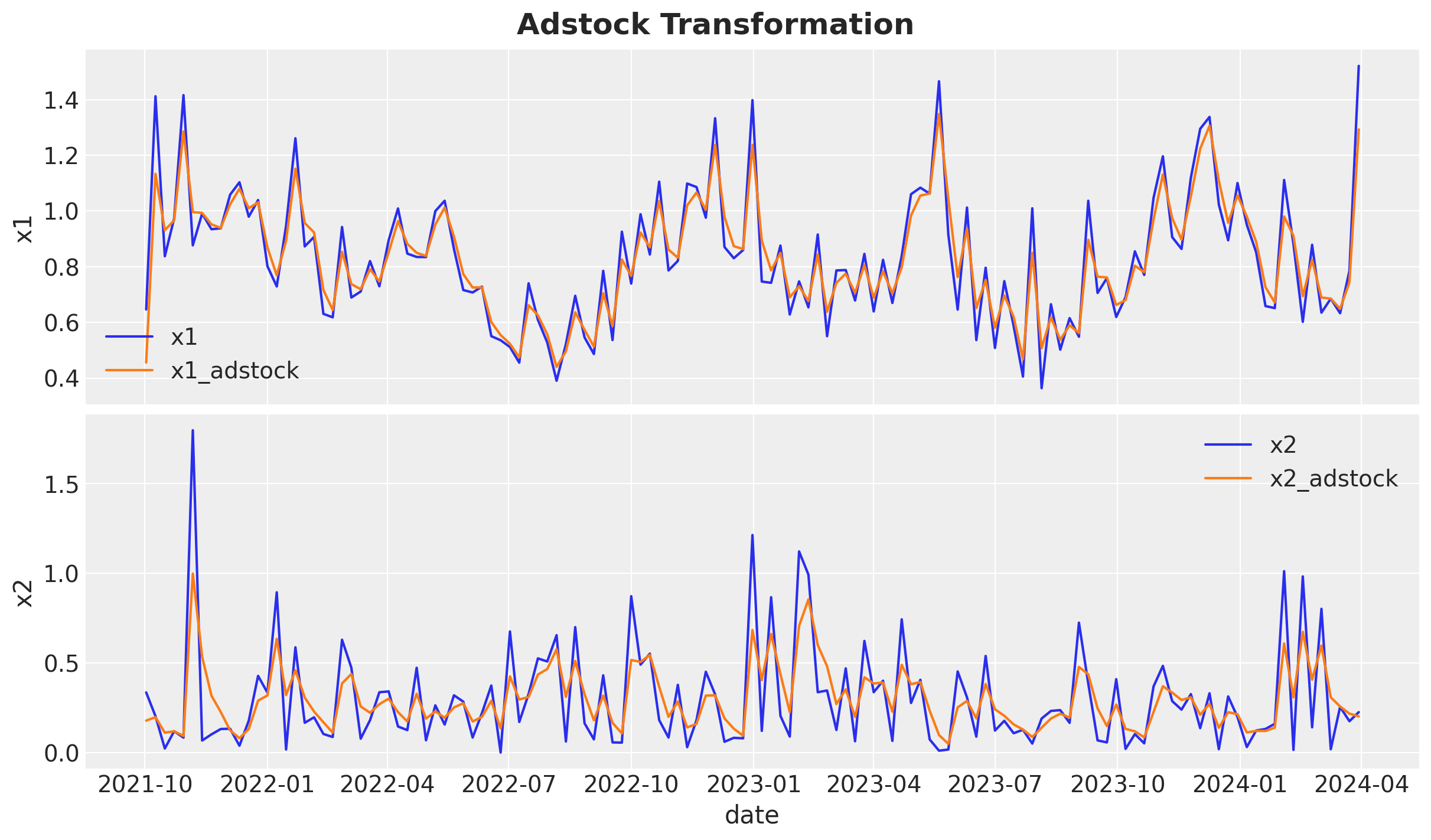
Observe that the adstock transformation has the effect of smoothing the media signal.
We continue by applying the saturation transformation:
# apply saturation transformation
lam1 = 1.0
lam2 = 2.5

lam = np.array([lam1, lam2])

data_df[["x1_adstock_saturated", "x2_adstock_saturated"]] = logistic_saturation(
    x=data_df[["x1_adstock", "x2_adstock"]], lam=lam
).eval()
This transformation simply compresses peaks. Let;s first visualize the saturation function (which depends on a parameter \(\lambda > 0\)).
x_range = np.linspace(start=0, stop=1.4, num=100)

fig, ax = plt.subplots(figsize=(8, 7))
sns.lineplot(
    data=data_df,
    x="x1_adstock",
    y="x1_adstock_saturated",
    linewidth=3,
    label="x1",
    ax=ax,
)
sns.lineplot(
    x=x_range,
    y=logistic_saturation(x=x_range, lam=lam1).eval(),
    color="C0",
    linestyle="--",
    ax=ax,
)
sns.lineplot(
    data=data_df,
    x="x2_adstock",
    y="x2_adstock_saturated",
    linewidth=3,
    label="x2",
    ax=ax,
)
sns.lineplot(
    x=x_range,
    y=logistic_saturation(x=x_range, lam=lam2).eval(),
    color="C1",
    linestyle="--",
    ax=ax,
)
ax.axline(
    (0, 0), slope=1, color="black", linestyle="--", linewidth=2.5, label="diagonal"
)
ax.legend(loc="upper left")
ax.set_title("Saturation Transformation", fontsize=18, fontweight="bold")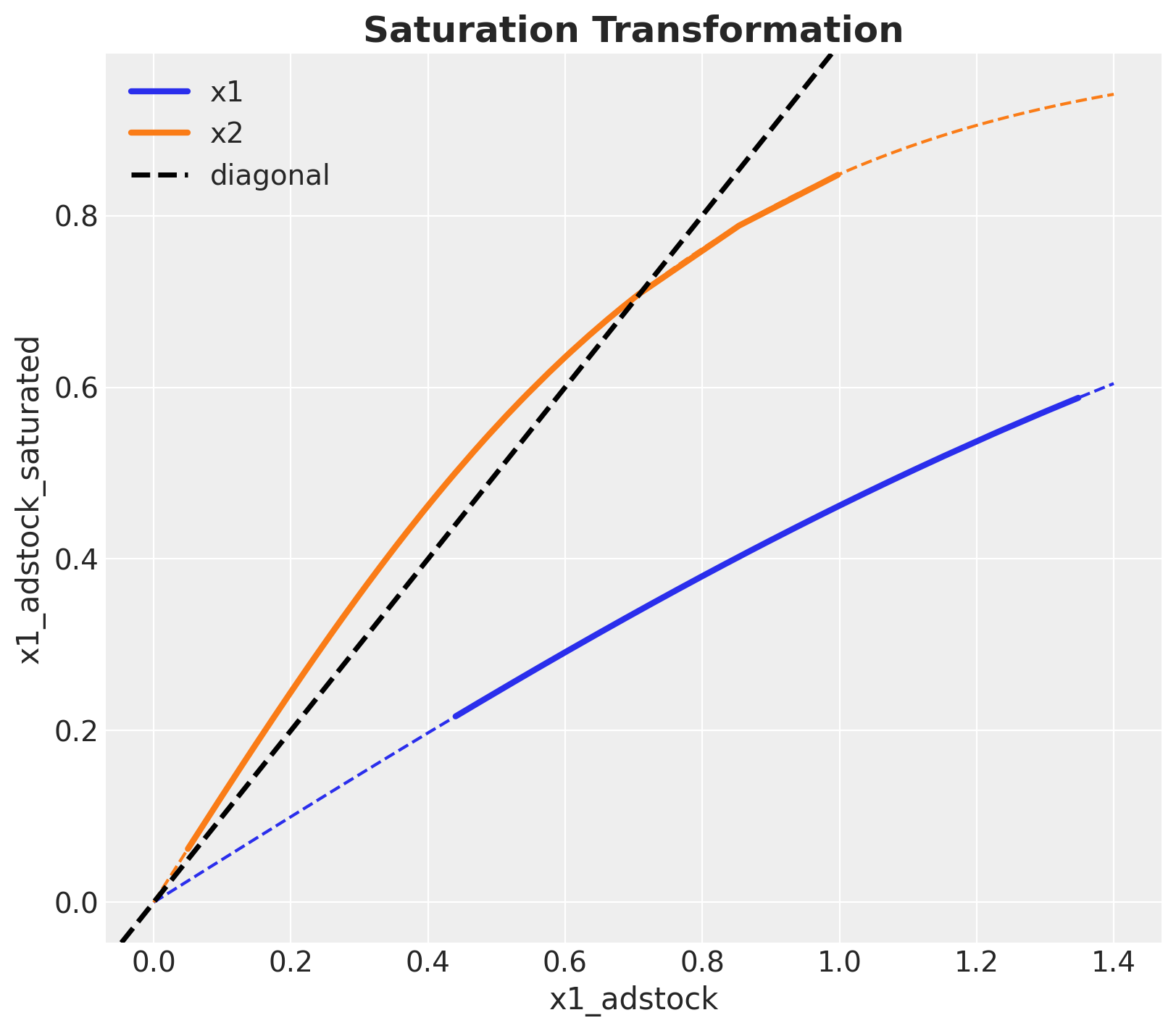
We can now compare the initial signal and how is transformed by these two on-linear transformations:
fig, ax = plt.subplots(
    nrows=3, ncols=2, figsize=(15, 10), sharex=True, sharey=False, layout="constrained"
)
sns.lineplot(x="date", y="x1", data=data_df, color="C0", ax=ax[0, 0])
sns.lineplot(x="date", y="x2", data=data_df, color="C1", ax=ax[0, 1])
sns.lineplot(x="date", y="x1_adstock", data=data_df, color="C0", ax=ax[1, 0])
sns.lineplot(x="date", y="x2_adstock", data=data_df, color="C1", ax=ax[1, 1])
sns.lineplot(x="date", y="x1_adstock_saturated", data=data_df, color="C0", ax=ax[2, 0])
sns.lineplot(x="date", y="x2_adstock_saturated", data=data_df, color="C1", ax=ax[2, 1])
fig.autofmt_xdate()
fig.suptitle("Media Costs Data - Transformed", fontsize=18, fontweight="bold")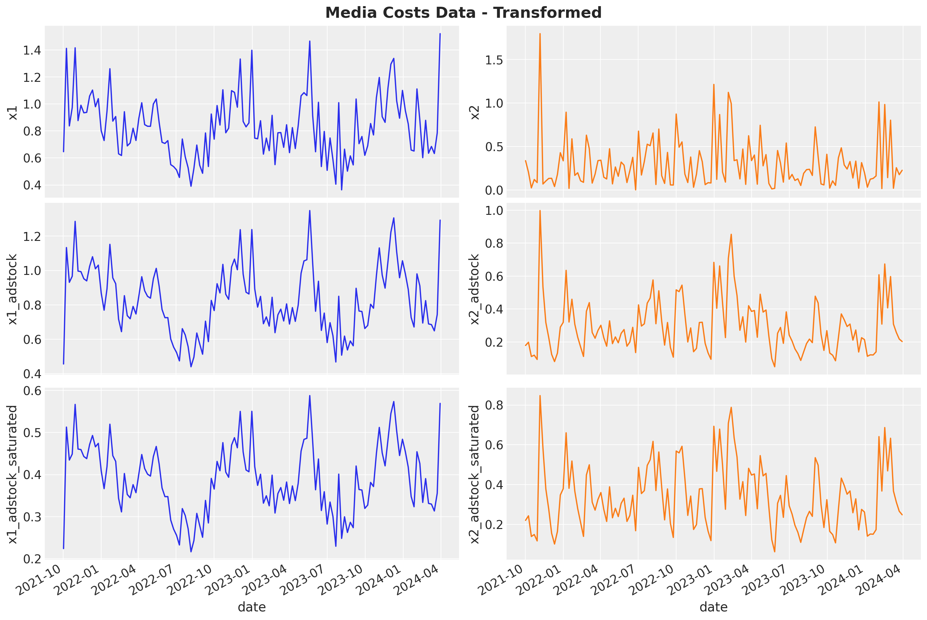
Now we are ready to put everything together and generate the target variable \(y\). We just need to apply some weights \(\beta\) to the transformed media data (i.e. specifying the regression coefficients).
beta1 = 2.0
beta2 = 1.5
amplitude = 100

data_df = data_df.eval(
    f"""
    x1_effect = {beta1} * x1_adstock_saturated
    x2_effect = {beta2} * x2_adstock_saturated
    y = {amplitude} * (trend + seasonality + z + x1_effect + x2_effect + epsilon)
    y01 = {amplitude} * (trend + seasonality + z + x2_effect + epsilon)
    y02 = {amplitude} * (trend + seasonality + z + x1_effect + epsilon)
    """
)
Finally, we can see the components and the final target variable:
fig, ax = plt.subplots(
    nrows=2,
    ncols=1,
    figsize=(15, 10),
    sharex=True,
    sharey=False,
    layout="constrained",
)
sns.lineplot(
    data=data_df,
    x="date",
    y="trend",
    color="C0",
    alpha=0.5,
    label="trend",
    ax=ax[0],
)
sns.lineplot(
    data=data_df,
    x="date",
    y="seasonality",
    color="C1",
    alpha=0.5,
    label="seasonality",
    ax=ax[0],
)
sns.lineplot(data=data_df, x="date", y="z", color="C2", alpha=0.5, label="z", ax=ax[0])
sns.lineplot(
    data=data_df,
    x="date",
    y="x1_effect",
    color="C3",
    linewidth=2.5,
    label="x1_effect",
    ax=ax[0],
)
sns.lineplot(
    data=data_df,
    x="date",
    y="x2_effect",
    color="C4",
    linewidth=2.5,
    label="x2_effect",
    ax=ax[0],
)
sns.lineplot(
    data=data_df,
    x="date",
    y="epsilon",
    color="C5",
    linewidth=2.5,
    label="epsilon",
    ax=ax[0],
)
ax[0].legend(loc="upper left")
ax[0].set(title="Components", xlabel="date", ylabel=None)

sns.lineplot(
    data=data_df,
    x="date",
    y="y",
    color="black",
    linewidth=2.5,
    label="100 x (trend + seasonality + z + x1_effect + x2_effect + epsilon)",
    ax=ax[1],
)
ax[1].legend(loc="lower right")
ax[1].set(title="Target")

fig.suptitle(t="Data Generating Process", fontsize=18, fontweight="bold")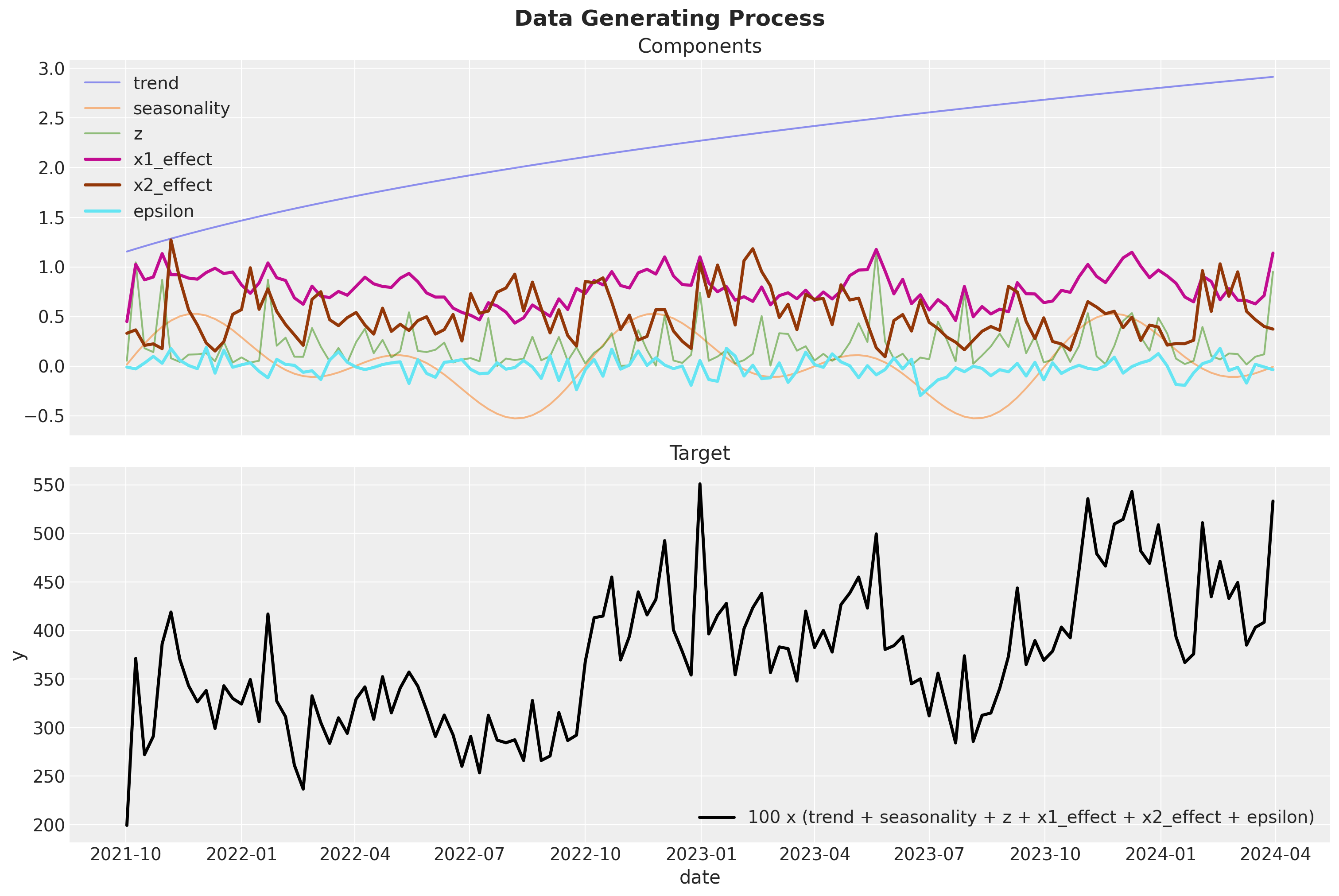
Remark: We are computing quantities y01 and y01 as the potential outcome sales when channels \(x_1\) and \(x_2\) are set to \(0\). This is useful to compute the global ROAS (see below).
data_df.info()<class 'pandas.core.frame.DataFrame'>
RangeIndex: 131 entries, 0 to 130
Data columns (total 20 columns):
# Column Non-Null Count Dtype
--- ------ -------------- -----
0 date 131 non-null datetime64[ns]
1 dayofyear 131 non-null int32
2 quarter 131 non-null object
3 trend 131 non-null float64
4 cs 131 non-null float64
5 cc 131 non-null float64
6 seasonality 131 non-null float64
7 z 131 non-null float64
8 x1 131 non-null float64
9 x2 131 non-null float64
10 epsilon 131 non-null float64
11 x1_adstock 131 non-null float64
12 x2_adstock 131 non-null float64
13 x1_adstock_saturated 131 non-null float64
14 x2_adstock_saturated 131 non-null float64
15 x1_effect 131 non-null float64
16 x2_effect 131 non-null float64
17 y 131 non-null float64
18 y01 131 non-null float64
19 y02 131 non-null float64
dtypes: datetime64[ns](1), float64(17), int32(1), object(1)
memory usage: 20.1+ KBROAS
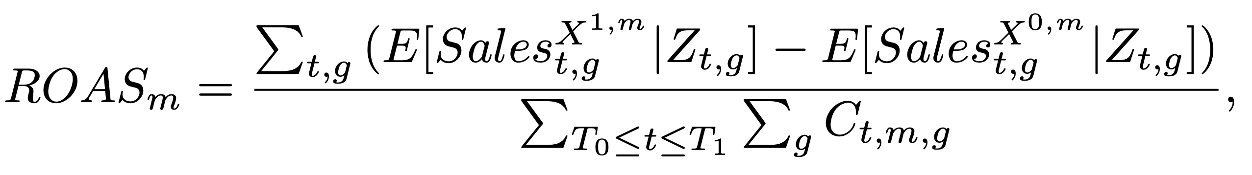
One of the key outputs of media mix models is the ROAS (return on advertising spend) which is defined as the ratio between the incremental sales and the media spend. In the following snippet of code we compute the ROAS analytically for each channel.
Recall from “Media Mix Model Calibration With Bayesian Priors”, by Zhang, et al., the definition of ROAS:
We compute a global ROAS as well as a quarterly ROAS. One has to be careful with the computation as we want to make sure we consider the carryover effects of the media channels. For example, if we compute the ROAS for the first week of the year, we need to consider the carryover effects of the media spend from the previous year.
The following function generate the sales when a given channel is turned off during a given period (note it mimics the data generating process described above). In the language of causal inference, this function computes the potential outcome when a given channel is turned off.
def generate_potential_y(
    dataset, alpha, l_max, lambda_, beta1, beta2, amplitude, channel, t0, t1
):
    dataset = dataset.copy()
    dataset["mask"] = ~dataset["date"].between(left=t0, right=t1, inclusive="both")
    dataset[channel] = dataset[channel].where(cond=dataset["mask"], other=0)
    dataset[["x1_adstock", "x2_adstock"]] = geometric_adstock(
        x=dataset[["x1", "x2"]], alpha=alpha, l_max=l_max, normalize=True
    ).eval()
    dataset[["x1_adstock_saturated", "x2_adstock_saturated"]] = logistic_saturation(
        x=dataset[["x1_adstock", "x2_adstock"]], lam=lambda_
    ).eval()
    return dataset.eval(
        f"""
        x1_effect = {beta1} * x1_adstock_saturated
        x2_effect = {beta2} * x2_adstock_saturated
        y = {amplitude} * (trend + seasonality + z + x1_effect + x2_effect + epsilon)
        """
    )
Let’s test this function does generates our dataset above when we do not turn off any channel. We achieve this by setting the t0 and t1 arguments (which define the turn off period) outside of the data range.
for channel in ["x1", "x2"]:
    temp_df = generate_potential_y(
        dataset=data_df,
        alpha=alpha,
        l_max=l_max,
        lambda_=lam,
        beta1=beta1,
        beta2=beta2,
        amplitude=amplitude,
        channel=channel,
        t0=min_date - pd.Timedelta(days=7),
        t1=min_date - pd.Timedelta(days=7),
    )

    pd.testing.assert_frame_equal(left=temp_df[data_df.columns], right=data_df)
We proceed to generate the potential outcome sales for each channel and each quarter.
quarter_ranges = data_df.groupby("quarter", as_index=False).agg(
    {"date": ["min", "max"]}
)

quarter_ranges.head()| quarter | date | ||
|---|---|---|---|
| min | max | ||
| 0 | 2021Q4 | 2021-10-02 | 2021-12-25 |
| 1 | 2022Q1 | 2022-01-01 | 2022-03-26 |
| 2 | 2022Q2 | 2022-04-02 | 2022-06-25 |
| 3 | 2022Q3 | 2022-07-02 | 2022-09-24 |
| 4 | 2022Q4 | 2022-10-01 | 2022-12-31 |
roas_data = {
    channel: {
        row["quarter"].item(): generate_potential_y(
            dataset=data_df,
            alpha=alpha,
            l_max=l_max,
            lambda_=lam,
            beta1=beta1,
            beta2=beta2,
            amplitude=amplitude,
            channel=channel,
            t0=row["date"]["min"],
            t1=row["date"]["max"],
        )
        for _, row in tqdm(quarter_ranges.iterrows())
    }
    for channel in ["x1", "x2"]
}
We can visualize the potential outcome against the true sales for each quarter for the first channel \(x_1\).
fig, axes = plt.subplots(
    nrows=quarter_ranges.quarter.nunique(),
    ncols=1,
    figsize=(15, 17),
    sharex=True,
    sharey=True,
    layout="constrained",
)

axes = axes.flatten()

for i, (q, q_df) in enumerate(roas_data["x1"].items()):
    ax = axes[i]
    ax_twin = ax.twinx()

    sns.lineplot(
        data=data_df, x="date", y="y", color="black", label="$y (actual)$", ax=ax
    )
    sns.lineplot(data=q_df, x="date", y="y", color="C0", label="$y (potential)$", ax=ax)
    sns.lineplot(data=q_df, x="date", y="mask", color="C1", ax=ax_twin)
    ax.set_title(f"Quarter {q}")
    ax_twin.grid(None)

fig.suptitle(t="Actual vs Potential - x1", fontsize=18, fontweight="bold")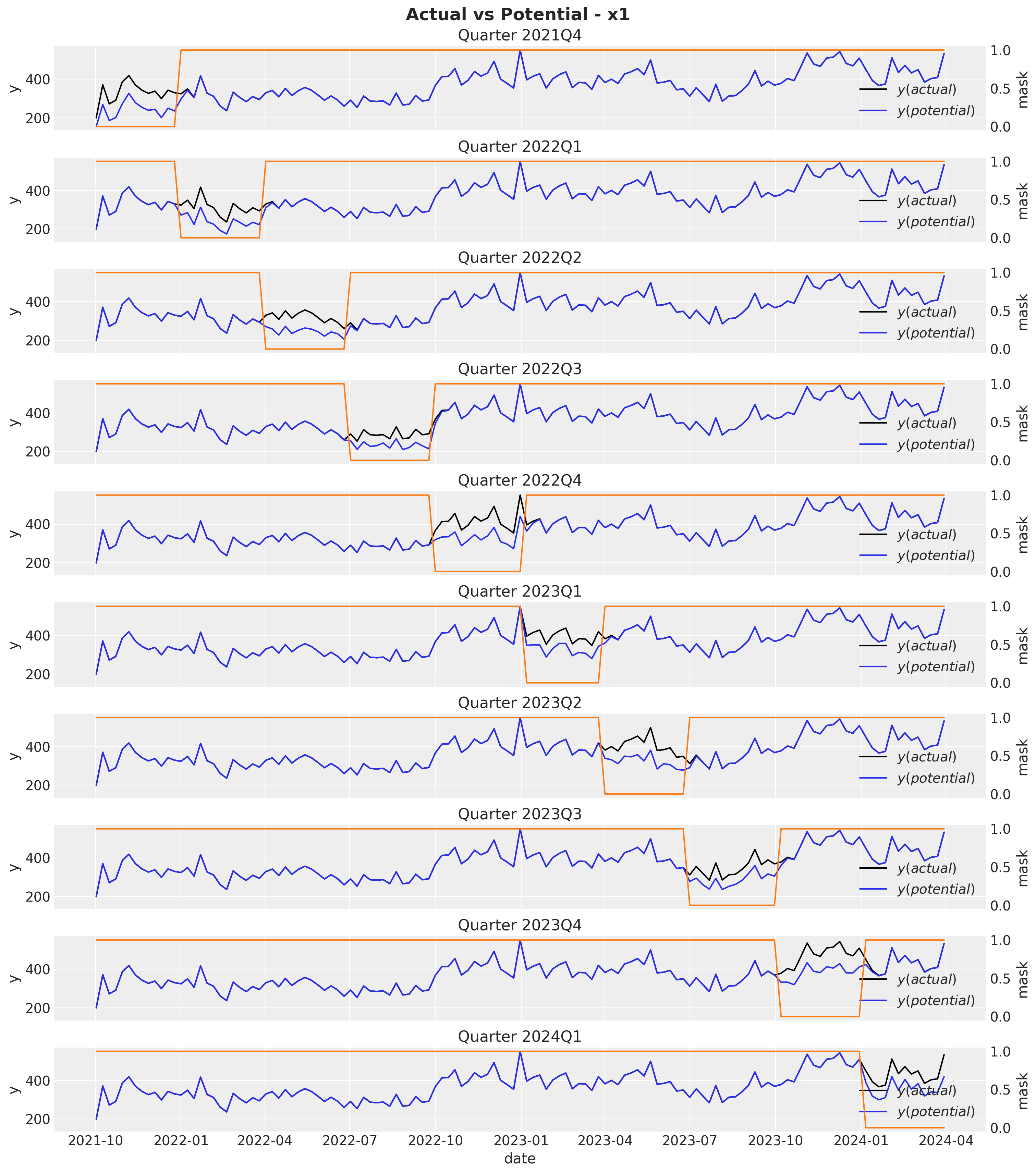
Observe that the potential sales and the true sales differ immediately after the mask period as a result of the carryover effect of the media spend. Next, we compute the ROAS for each each quarter by simply dividing the difference between the potential sales and the true sales by the media spend.
roas_x1 = pd.DataFrame.from_dict(
    data={
        q: (
            (data_df["y"].sum() - q_df["y"].sum())
            / data_df.query("quarter == @q")["x1"].sum()
        )
        for q, q_df in roas_data["x1"].items()
    },
    orient="index",
    columns=["roas"],
).assign(channel="x1")
We can do the exact same procedure for channel \(x_2\).
fig, axes = plt.subplots(
    nrows=quarter_ranges.quarter.nunique(),
    ncols=1,
    figsize=(15, 17),
    sharex=True,
    sharey=True,
    layout="constrained",
)

axes = axes.flatten()

for i, (q, q_df) in enumerate(roas_data["x2"].items()):
    ax = axes[i]
    ax_twin = ax.twinx()

    sns.lineplot(
        data=data_df, x="date", y="y", color="black", label="$y (actual)$", ax=ax
    )
    sns.lineplot(data=q_df, x="date", y="y", color="C0", label="$y (potential)$", ax=ax)
    sns.lineplot(data=q_df, x="date", y="mask", color="C1", ax=ax_twin)
    ax.set_title(f"Quarter {q}")
    ax_twin.grid(None)

fig.suptitle(t="Actual vs Potential - x2", fontsize=18, fontweight="bold")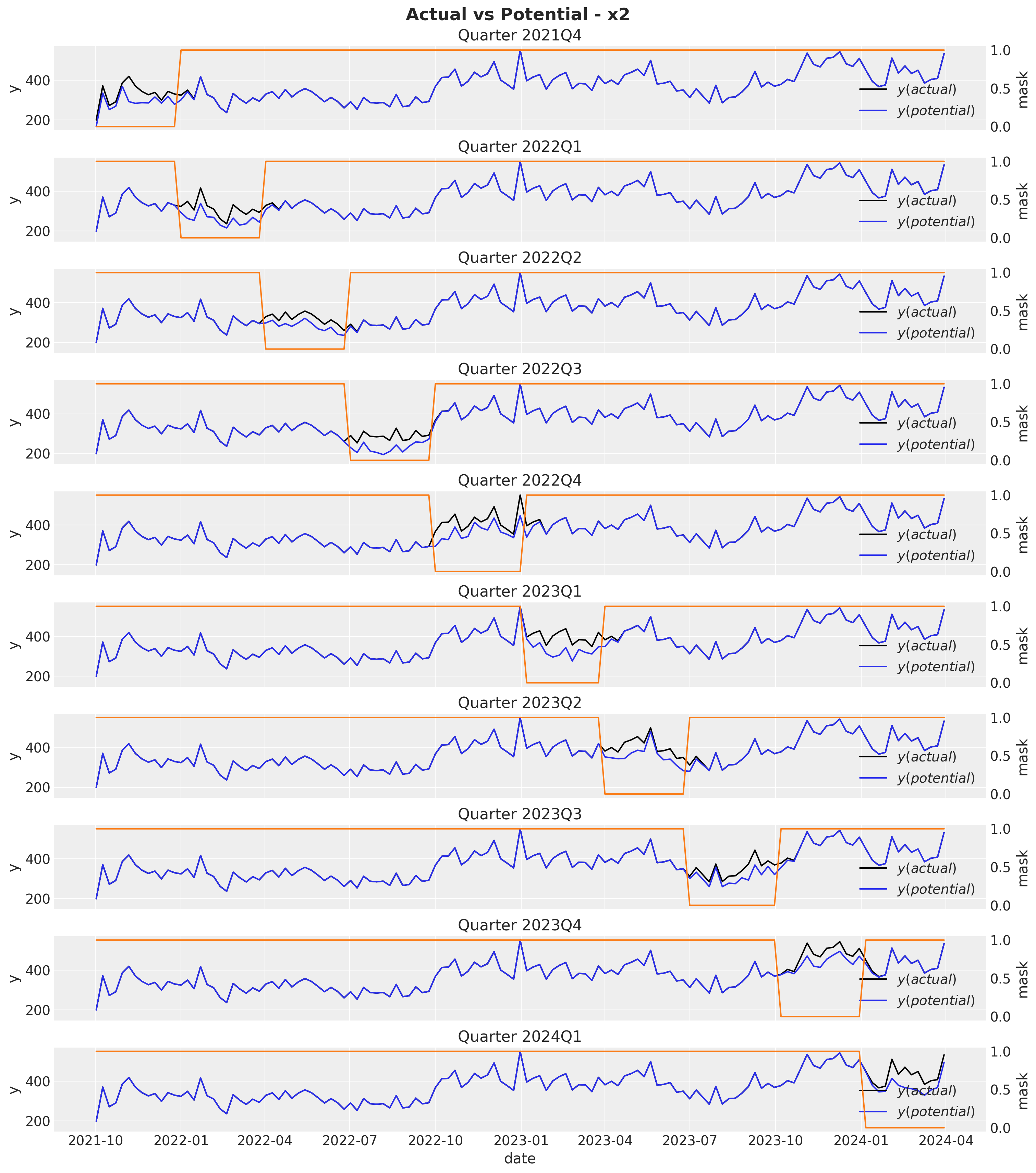
roas_x2 = pd.DataFrame.from_dict(
    data={
        q: (
            (data_df["y"].sum() - q_df["y"].sum())
            / data_df.query("quarter == @q")["x2"].sum()
        )
        for q, q_df in roas_data["x2"].items()
    },
    orient="index",
    columns=["roas"],
).assign(channel="x2")
Moreover, we can easily compute the global ROAS:
roas_all_1 = (data_df["y"] - data_df["y01"]).sum() / data_df["x1"].sum()

roas_all_2 = (data_df["y"] - data_df["y02"]).sum() / data_df["x2"].sum()
Let’s visualize the quarterly and global ROAS for each channel:
roas = (
    pd.concat(objs=[roas_x1, roas_x2], axis=0)
    .reset_index(drop=False)
    .rename(columns={"index": "quarter"})
)

g = sns.catplot(
    data=roas.assign(quarter_num=lambda df: df.quarter.str[4:]),
    x="quarter",
    y="roas",
    row="channel",
    hue="quarter_num",
    kind="bar",
    height=4,
    aspect=3,
    alpha=0.7,
    sharey=False,
)

ax = g.axes.flatten()
ax[0].axhline(
    y=roas_all_1, color="black", linestyle="--", linewidth=2.5, label="roas (all)"
)
ax[1].axhline(
    y=roas_all_2, color="black", linestyle="--", linewidth=2.5, label="roas (all)"
)

g.fig.suptitle(t="True ROAS", fontsize=18, fontweight="bold", y=1.03)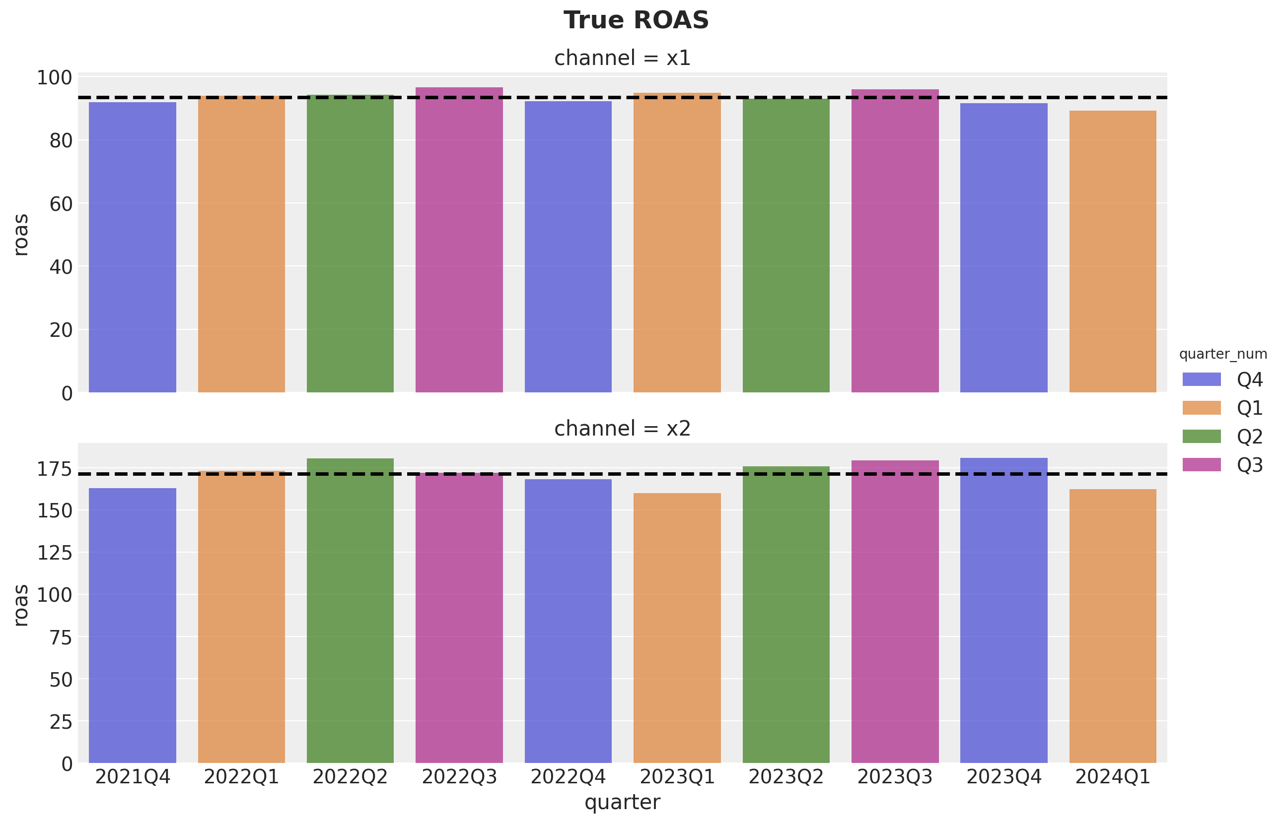
We see that channel \(x_2\) has approximately \(75\%\) higher ROAS as compared to channel \(x_1\).
Data Preparation
Now that we have generated the data, we can proceed to prepare it for the media mix model. We start by selecting the features we would have in a real scenario. Note that in such a case we would not have x1_effect or x2_effect as this is precisely what we want to estimate.
columns_to_keep = [
    "date",
    "dayofyear",
    "z",
    "x1",
    "x2",
    "y",
]

model_df = data_df[columns_to_keep]

model_df.head()| date | dayofyear | z | x1 | x2 | y | |
|---|---|---|---|---|---|---|
| 0 | 2021-10-02 | 275 | 0.053693 | 0.646554 | 0.336188 | 199.329637 |
| 1 | 2021-10-09 | 282 | 1.045243 | 1.411917 | 0.203931 | 371.237041 |
| 2 | 2021-10-16 | 289 | 0.179703 | 0.837610 | 0.024026 | 272.215933 |
| 3 | 2021-10-23 | 296 | 0.140496 | 0.973612 | 0.120257 | 291.104040 |
| 4 | 2021-10-30 | 303 | 0.869155 | 1.415985 | 0.084630 | 386.243000 |
Next, we proceed to scale the data with a MaxAbsScaler. For more details about the scaling please see the previous post Media Effect Estimation with PyMC: Adstock, Saturation & Diminishing Returns.
date = model_df["date"]

index_scaler = MaxAbsScaler()
index_scaled = index_scaler.fit_transform(model_df.reset_index(drop=False)[["index"]])

target = "y"
target_scaler = MaxAbsScaler()
target_scaled = target_scaler.fit_transform(model_df[[target]])

channels = ["x1", "x2"]
channels_scaler = MaxAbsScaler()
channels_scaled = channels_scaler.fit_transform(model_df[channels])

controls = ["z"]
controls_scaler = MaxAbsScaler()
controls_scaled = controls_scaler.fit_transform(model_df[controls])
To model the yearly seasonality we generate some Fourier modes to include them into the regression model.
n_order = 3
periods = model_df["dayofyear"] / 365.25
fourier_features = pd.DataFrame(
    {
        f"{func}_order_{order}": getattr(np, func)(2 * np.pi * periods * order)
        for order in range(1, n_order + 1)
        for func in ("sin", "cos")
    }
)
Now we are ready to start with the media mix model.
Model 1: Causal Model
In this first model we simply add the features from our causal graph. We should be able to recover the parameters and the ROAS from the data generating process. Before jumping into the model lets look closer the the causal structure.
Causal Model
It is very important to view media mix models from a causal perspective. We can not simply add a bunch of variables and hope for the best! See for example Using Data Science for Bad Decision-Making: A Case Study. There is a systematic way to select the variables we should / should not add into the model. To see this how this works in practice, let’s use DoWhy to get the set of variables for our model. First we need to define the DAG (this is where domain knowledge from the marketing mechanism comes into place!).
gml_graph = """
graph [
    directed 1

    node [
        id x1
        label "x1"
    ]
    node [
        id x2
        label "x2"
    ]
    node [
        id z
        label "z"
    ]
    node [
        id seasonality
        label "seasonality"
    ]
    node [
        id trend
        label "trend"
    ]
    node [
        id y
        label "y"
    ]
    edge [
        source seasonality
        target x1
    ]
    edge [
        source z
        target x1
    ]
    edge [
        source seasonality
        target y
    ]
    edge [
        source trend
        target y
    ]
    edge [
        source z
        target y
    ]
    edge [
        source x1
        target y
    ]
    edge [
        source x2
        target y
    ]
]
"""
We want to see if we can find a set of variables which we can put in a regression model to estimate the effect of \(x_1\) and \(x_2\) on \(y\). Hence, we define to causal models:
causal_model_1 = CausalModel(
    data=model_df,
    graph=gml_graph,
    treatment="x1",
    outcome="y",
)

causal_model_2 = CausalModel(
    data=model_df,
    graph=gml_graph,
    treatment="x2",
    outcome="y",
)

causal_model_1.view_model()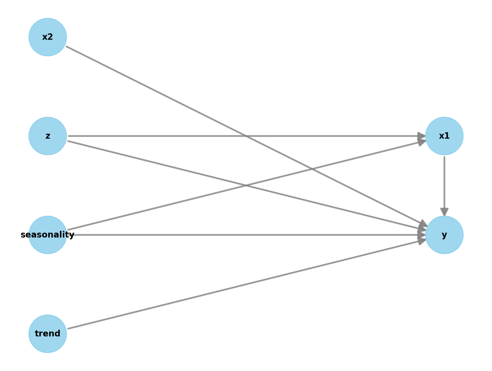
We can now query for backdoor paths between the treatment and the outcome:
causal_model_1._graph.get_backdoor_paths(nodes1=["x1"], nodes2=["y"])[['x1', 'z', 'y'], ['x1', 'seasonality', 'y']]causal_model_2._graph.get_backdoor_paths(nodes1=["x2"], nodes2=["y"])[]Note that for \(x_1\) we need to add \(z\) and seasonality, otherwise we would have open paths:
causal_model_1._graph.check_valid_backdoor_set(nodes1=["x1"], nodes2=["y"], nodes3=[]){'is_dseparated': False}Therefore the set of variables we should add to the model are \(x_1\), \(x_2\), \(z\), seasonality and trend (the trend component will allow us to reduce the variance on the estimate).
causal_model_1._graph.check_valid_backdoor_set(
    nodes1=["x1"], nodes2=["y"], nodes3=["z", "seasonality", "trend"]
)
{'is_dseparated': True}causal_model_1._graph.check_valid_backdoor_set(
nodes1=["x2"], nodes2=["y"], nodes3=["z", "seasonality", "trend"]
){'is_dseparated': True}Prior Specification
Bayesian models provide great flexibility to add domain knowledge into the model through the prior distributions. PreliZ is a great library to study and set priors.
For example, what should be the prior for the adstock parameter \(\alpha\)? We know it should be between zero and one. We also do not expect the carry over to be very strong. Hence, we can use a Beta distribution with the mass a bit towards zero.
fig, ax = plt.subplots(figsize=(10, 6))
pz.Beta(alpha=2, beta=3).plot_pdf(ax=ax)
ax.set(xlabel=r"$\alpha$")
ax.set_title(label=r"Prior Distribution $\alpha$", fontsize=18, fontweight="bold")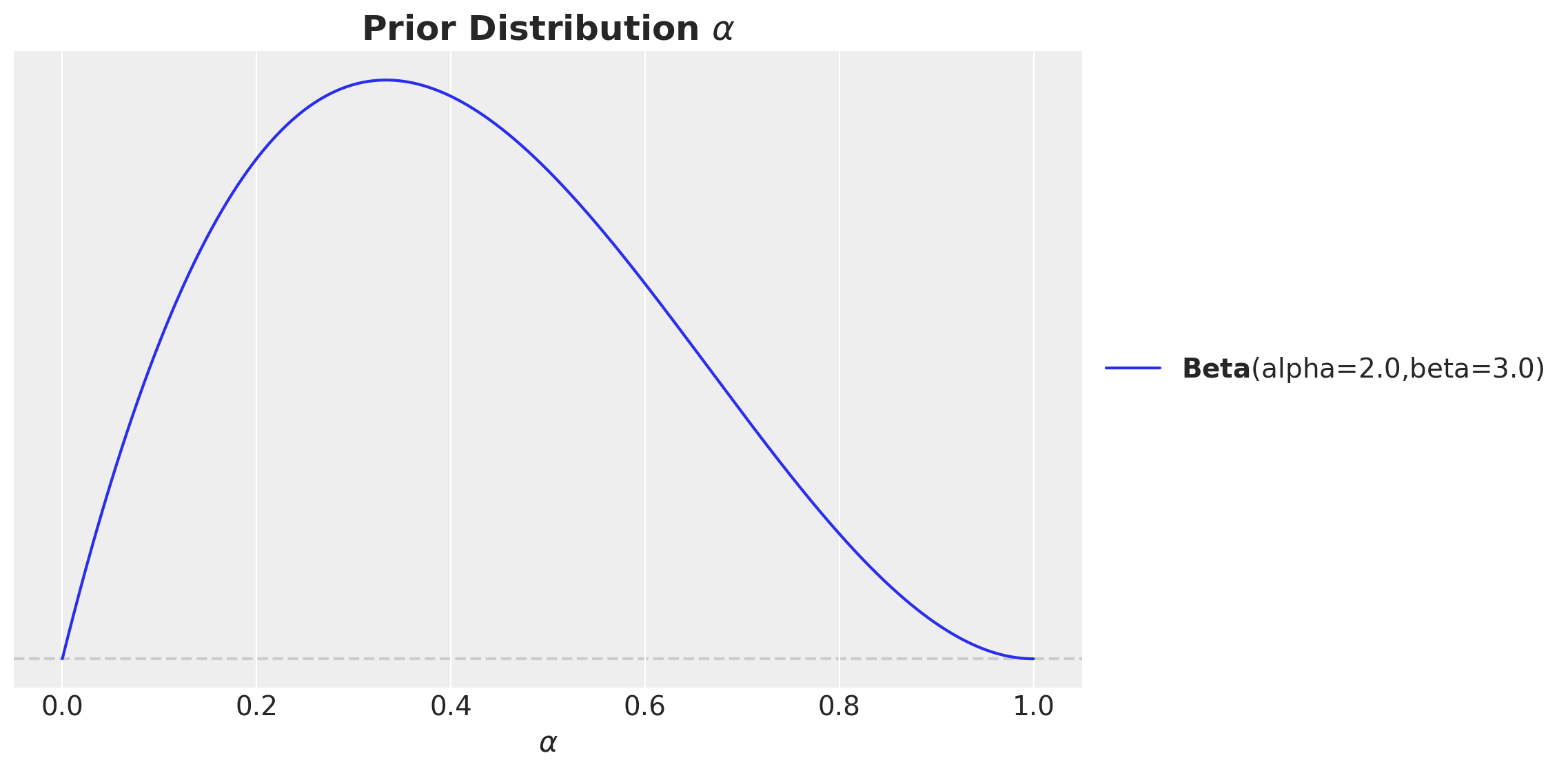
For \(\lambda\) we could also argue similarly: it is a positive number and we expect a mild saturation. Hence, we can use a Gamma distribution with mean close to one. Still, we make sure it is not concentrated to much around one in order to allow for some flexibility.
fig, ax = plt.subplots(figsize=(10, 6))
pz.Gamma(alpha=2, beta=2).plot_pdf(ax=ax)
ax.set(xlabel=r"$\lambda$")
ax.set_title(label=r"Prior Distribution $\lambda$", fontsize=18, fontweight="bold")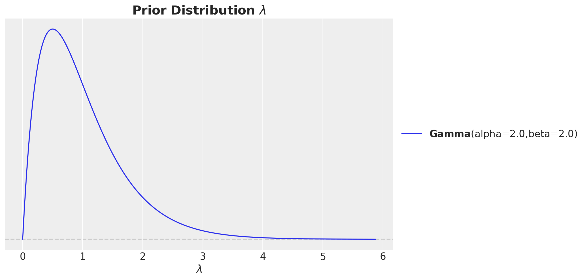
A much harder choice for prior are the regression coefficients of the media variables. Without any prior information on channel performance a common choice is to use a weakly informative prior driven by the investment share. The idea motivation behind it is that we expect (without seeing the data!) that channels where we spend the most to contribute more to sales. This can actually not be the case once we see the data. Nevertheless, is a good guidance if you do not have any other information. One could put the same prior for all channels, but in practice I have seen in practice that, given the small sample sizes, smaller channels can get very high contributions just because of the noise (I have also tested via simulations). It is important to emphasize that there is no right answer here. It is a matter of what you believe and what you want to test.
For this example, let’s use such a prior. In addition, note we expect the effect to be always positive. Hence, we can use a half-normal distribution to enforce this.
channel_share = data_df[channels].sum() / data_df[channels].sum().sum()

fig, ax = plt.subplots(figsize=(10, 6))
sns.barplot(
    x=channel_share.index, y=channel_share.values, hue=channel_share.index, ax=ax
)
ax.yaxis.set_major_formatter(mtick.PercentFormatter(xmax=1))
ax.set(xlabel="channel", ylabel="share")
ax.set_title(label="Channel Spend Share", fontsize=18, fontweight="bold")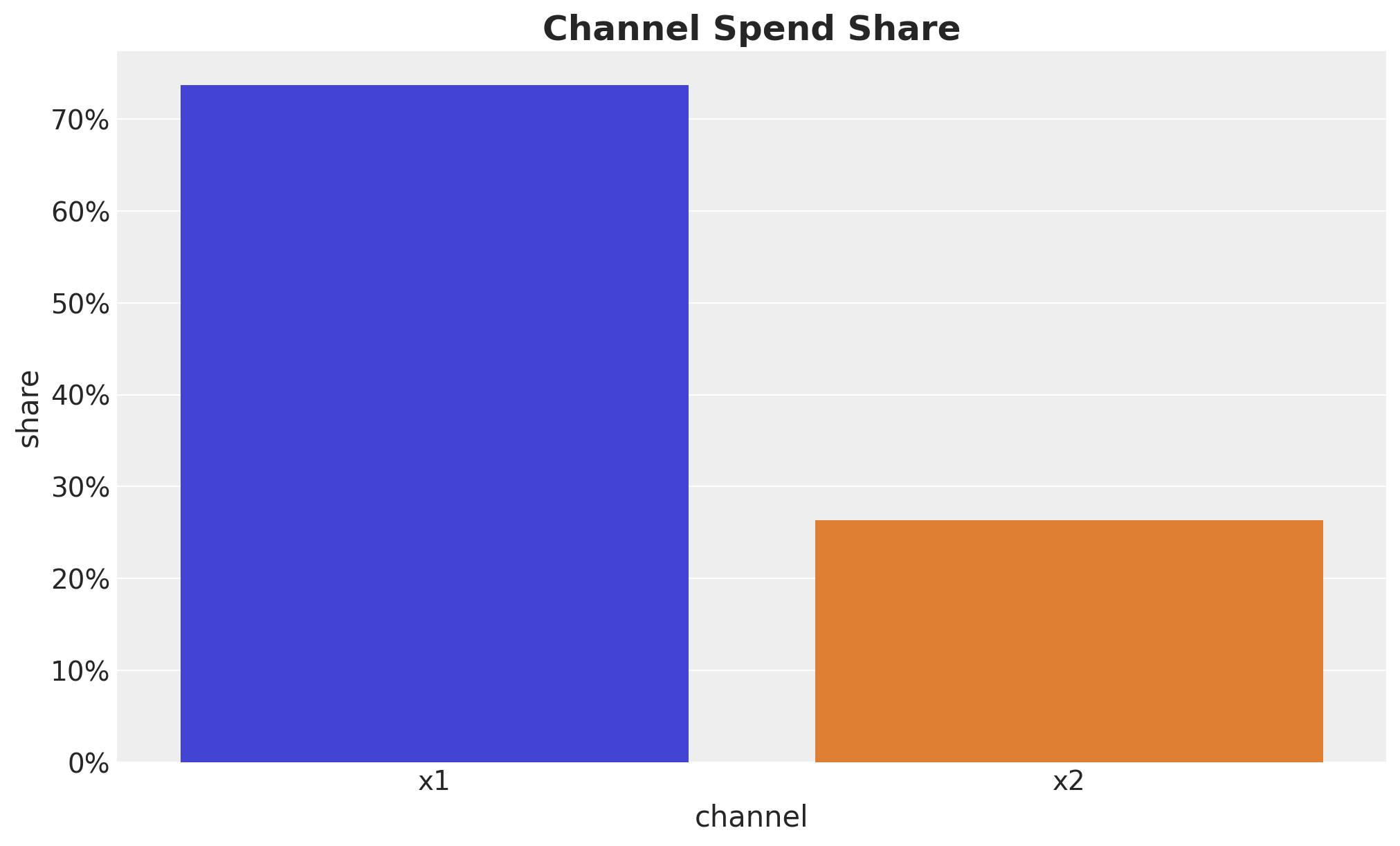
fig, ax = plt.subplots(figsize=(10, 6))
pz.HalfNormal(sigma=channel_share.loc["x1"]).plot_pdf(ax=ax)
pz.HalfNormal(sigma=channel_share.loc["x2"]).plot_pdf(ax=ax)
ax.set(xlabel=r"$\beta$")
ax.set_title(label=r"Prior Distribution $\beta$", fontsize=18, fontweight="bold")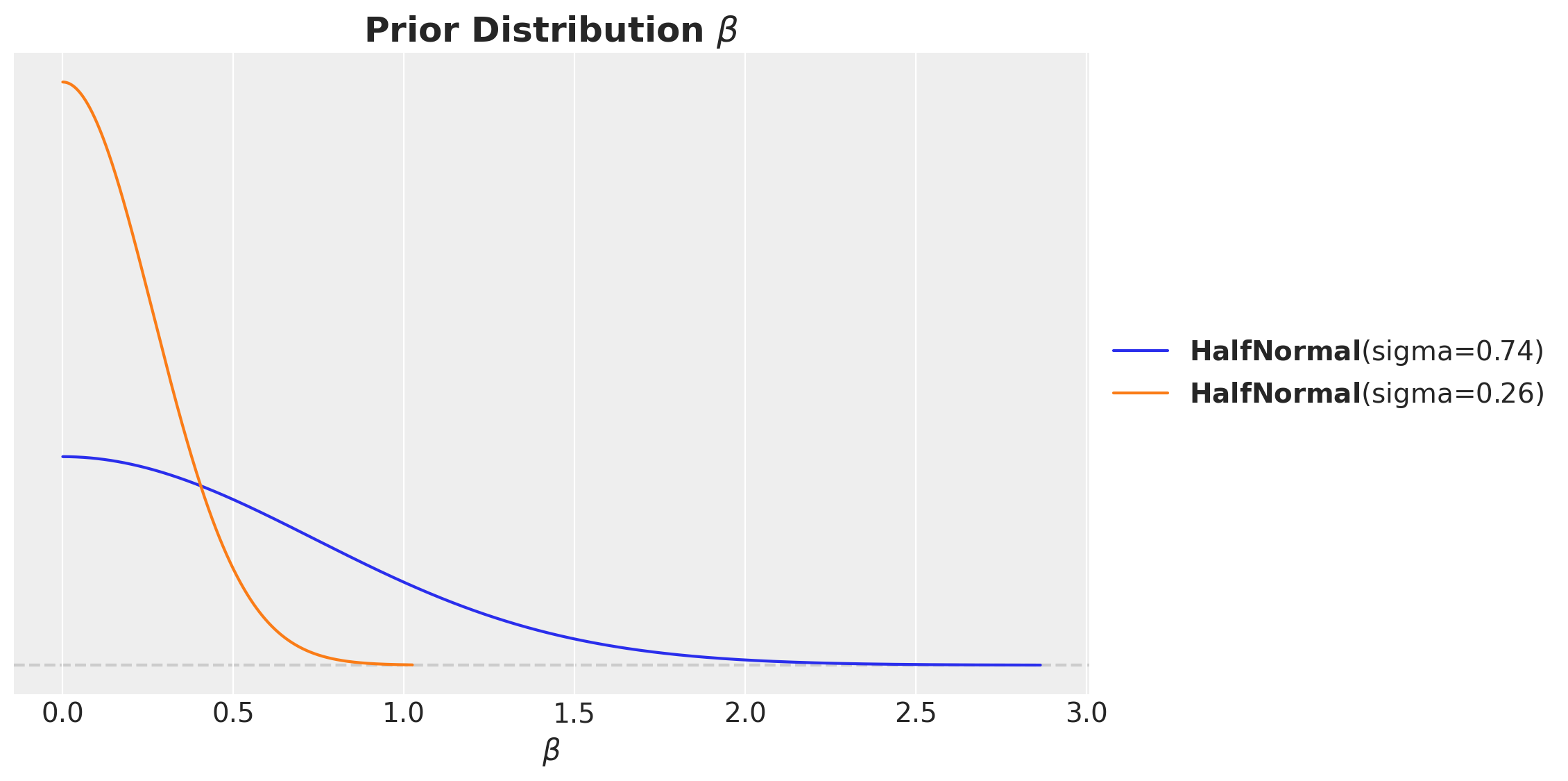
Model Specification
We are now ready to specify the model. We will not go into details as we are implementing the classical model from “Media Mix Model Calibration With Bayesian Priors”, by Zhang, et al., which is described in detail in the the previous post Media Effect Estimation with PyMC: Adstock, Saturation & Diminishing Returns.
The only difference it we do not add an explicit trend variable but we use a Gaussian process to model this latent variable (therefore we also remove an intercept) as described in the post Estimating the Long-Term Base in Marketing-Mix Models. We are using the same technique as described in the example Time Series Modeling with HSGP: Baby Births Example.
coords = {"date": date, "channel": channels, "fourier_mode": np.arange(2 * n_order)}with pm.Model(coords=coords) as model_1:
# --- Data Containers ---
index_scaled_data = pm.Data(
name="index_scaled",
value=index_scaled.to_numpy().flatten(),
mutable=True,
dims="date",
)
channels_scaled_data = pm.Data(
name="channels_scaled",
value=channels_scaled,
mutable=True,
dims=("date", "channel"),
)
z_scaled_data = pm.Data(
name="z_scaled",
value=controls_scaled.to_numpy().flatten(),
mutable=True,
dims="date",
)
fourier_features_data = pm.Data(
name="fourier_features",
value=fourier_features,
mutable=True,
dims=("date", "fourier_mode"),
)
y_scaled_data = pm.Data(
name="y_scaled",
value=target_scaled.to_numpy().flatten(),
mutable=True,
dims="date",
)
# --- Priors ---
amplitude_trend = pm.HalfNormal(name="amplitude_trend", sigma=1)
ls_trend_params = pm.find_constrained_prior(
distribution=pm.InverseGamma,
lower=0.1,
upper=0.9,
init_guess={"alpha": 3, "beta": 1},
mass=0.95,
)
ls_trend = pm.InverseGamma(name="ls_trend", **ls_trend_params)
alpha = pm.Beta(name="alpha", alpha=2, beta=3, dims="channel")
lam = pm.Gamma(name="lam", alpha=2, beta=2, dims="channel")
beta_channel = pm.HalfNormal(
name="beta_channel",
sigma=channel_share.to_numpy(),
dims="channel",
)
beta_z = pm.Normal(name="beta_z", mu=0, sigma=1)
beta_fourier = pm.Normal(name="beta_fourier", mu=0, sigma=1, dims="fourier_mode")
sigma = pm.HalfNormal(name="sigma", sigma=1)
nu = pm.Gamma(name="nu", alpha=25, beta=2)
# --- Parametrization ---
cov_trend = amplitude_trend * pm.gp.cov.ExpQuad(input_dim=1, ls=ls_trend)
gp_trend = pm.gp.HSGP(m=[20], c=1.5, cov_func=cov_trend)
f_trend = gp_trend.prior(name="f_trend", X=index_scaled_data[:, None], dims="date")
channel_adstock = pm.Deterministic(
name="channel_adstock",
var=geometric_adstock(
x=channels_scaled_data,
alpha=alpha,
l_max=l_max,
normalize=True,
),
dims=("date", "channel"),
)
channel_adstock_saturated = pm.Deterministic(
name="channel_adstock_saturated",
var=logistic_saturation(x=channel_adstock, lam=lam),
dims=("date", "channel"),
)
channel_contributions = pm.Deterministic(
name="channel_contributions",
var=channel_adstock_saturated * beta_channel,
dims=("date", "channel"),
)
fourier_contribution = pm.Deterministic(
name="fourier_contribution",
var=pt.dot(fourier_features_data, beta_fourier),
dims="date",
)
z_contribution = pm.Deterministic(
name="z_contribution",
var=z_scaled_data * beta_z,
dims="date",
)
mu = pm.Deterministic(
name="mu",
var=f_trend
+ channel_contributions.sum(axis=-1)
+ z_contribution
+ fourier_contribution,
dims="date",
)
# --- Likelihood ---
y = pm.StudentT(
name="y",
nu=nu,
mu=mu,
sigma=sigma,
observed=y_scaled_data,
dims="date",
)
pm.model_to_graphviz(model=model_1)
Prior Predictive Checks
Before fitting the model, it is always a good idea to check the prior predictive distribution. This is a way to see if the model is able to generate data that is consistent with our prior beliefs. We can do this by sampling from the prior and plotting the results.
with model_1:
    prior_predictive_1 = pm.sample_prior_predictive(samples=2_000, random_seed=rng)
fig, ax = plt.subplots()
az.plot_ppc(data=prior_predictive_1, group="prior", kind="kde", ax=ax)
ax.set_title(label="Prior Predictive - Model 1", fontsize=18, fontweight="bold")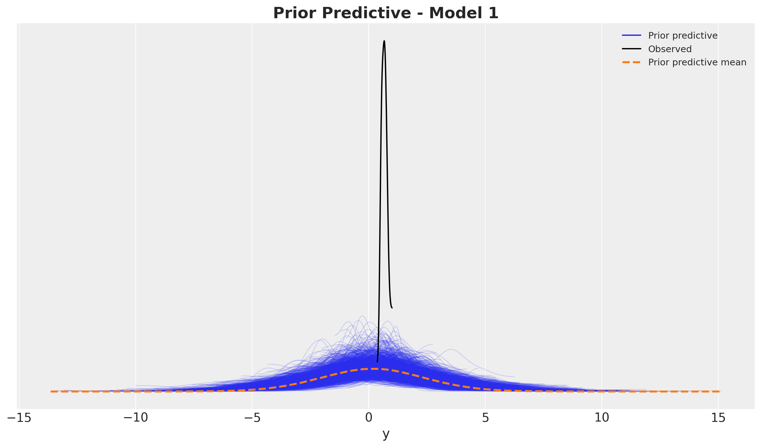
It looks quite reasonable.
Model Fitting
We now fit the model using the No-U-Turn Sampler (NUTS) algorithm. We will run four chains in parallel and sample \(2000\) draws from each chain. We use NumPyro as the backend for the model fitting (it is super fast).
with model_1:
    idata_1 = pm.sample(
        target_accept=0.9,
        draws=2_000,
        chains=4,
        nuts_sampler="numpyro",
        random_seed=rng,
    )
    posterior_predictive_1 = pm.sample_posterior_predictive(
        trace=idata_1, random_seed=rng
    )
Model Diagnostics
First we verify we do not have divergences:
idata_1["sample_stats"]["diverging"].sum().item()\(\displaystyle 0\)
Next, we look into the posterior distribution of the parameters.
var_names = [
    "amplitude_trend",
    "ls_trend",
    "alpha",
    "lam",
    "beta_channel",
    "beta_z",
    "beta_fourier",
    "sigma",
    "nu",
]

az.summary(data=idata_1, var_names=var_names, round_to=3)| mean | sd | hdi_3% | hdi_97% | mcse_mean | mcse_sd | ess_bulk | ess_tail | r_hat | |
|---|---|---|---|---|---|---|---|---|---|
| amplitude_trend | 0.380 | 0.339 | 0.031 | 1.024 | 0.006 | 0.004 | 2216.743 | 3547.131 | 1.001 |
| ls_trend | 0.307 | 0.042 | 0.224 | 0.380 | 0.001 | 0.001 | 2068.505 | 2892.961 | 1.003 |
| alpha[x1] | 0.318 | 0.072 | 0.181 | 0.449 | 0.001 | 0.001 | 7797.458 | 6545.114 | 1.000 |
| alpha[x2] | 0.493 | 0.028 | 0.440 | 0.544 | 0.000 | 0.000 | 10193.826 | 5924.861 | 1.001 |
| lam[x1] | 0.973 | 0.452 | 0.276 | 1.806 | 0.006 | 0.004 | 5677.231 | 6177.363 | 1.000 |
| lam[x2] | 2.812 | 0.687 | 1.548 | 4.070 | 0.009 | 0.006 | 6103.450 | 5004.784 | 1.001 |
| beta_channel[x1] | 0.709 | 0.312 | 0.262 | 1.288 | 0.004 | 0.003 | 5211.349 | 6102.915 | 1.000 |
| beta_channel[x2] | 0.404 | 0.094 | 0.268 | 0.581 | 0.001 | 0.001 | 5946.573 | 4792.955 | 1.001 |
| beta_z | 0.190 | 0.017 | 0.158 | 0.222 | 0.000 | 0.000 | 7142.269 | 5758.734 | 1.000 |
| beta_fourier[0] | 0.000 | 0.008 | -0.015 | 0.012 | 0.000 | 0.000 | 3680.755 | 3103.355 | 1.000 |
| beta_fourier[1] | 0.047 | 0.007 | 0.034 | 0.060 | 0.000 | 0.000 | 5009.843 | 3406.016 | 1.001 |
| beta_fourier[2] | -0.055 | 0.004 | -0.063 | -0.047 | 0.000 | 0.000 | 7868.972 | 6689.172 | 1.001 |
| beta_fourier[3] | -0.004 | 0.002 | -0.008 | 0.000 | 0.000 | 0.000 | 10720.589 | 7004.293 | 1.001 |
| beta_fourier[4] | -0.004 | 0.002 | -0.008 | -0.000 | 0.000 | 0.000 | 10558.562 | 6143.012 | 1.000 |
| beta_fourier[5] | -0.000 | 0.002 | -0.004 | 0.004 | 0.000 | 0.000 | 10858.069 | 5358.714 | 1.000 |
| sigma | 0.015 | 0.001 | 0.013 | 0.018 | 0.000 | 0.000 | 9595.037 | 5908.872 | 1.000 |
| nu | 12.606 | 2.482 | 8.049 | 17.155 | 0.023 | 0.017 | 12003.132 | 6203.788 | 1.001 |
axes = az.plot_trace(
    data=idata_1,
    var_names=var_names,
    compact=True,
    kind="rank_bars",
    backend_kwargs={"figsize": (15, 17), "layout": "constrained"},
)
plt.gcf().suptitle("Trace - Model 1", fontsize=16)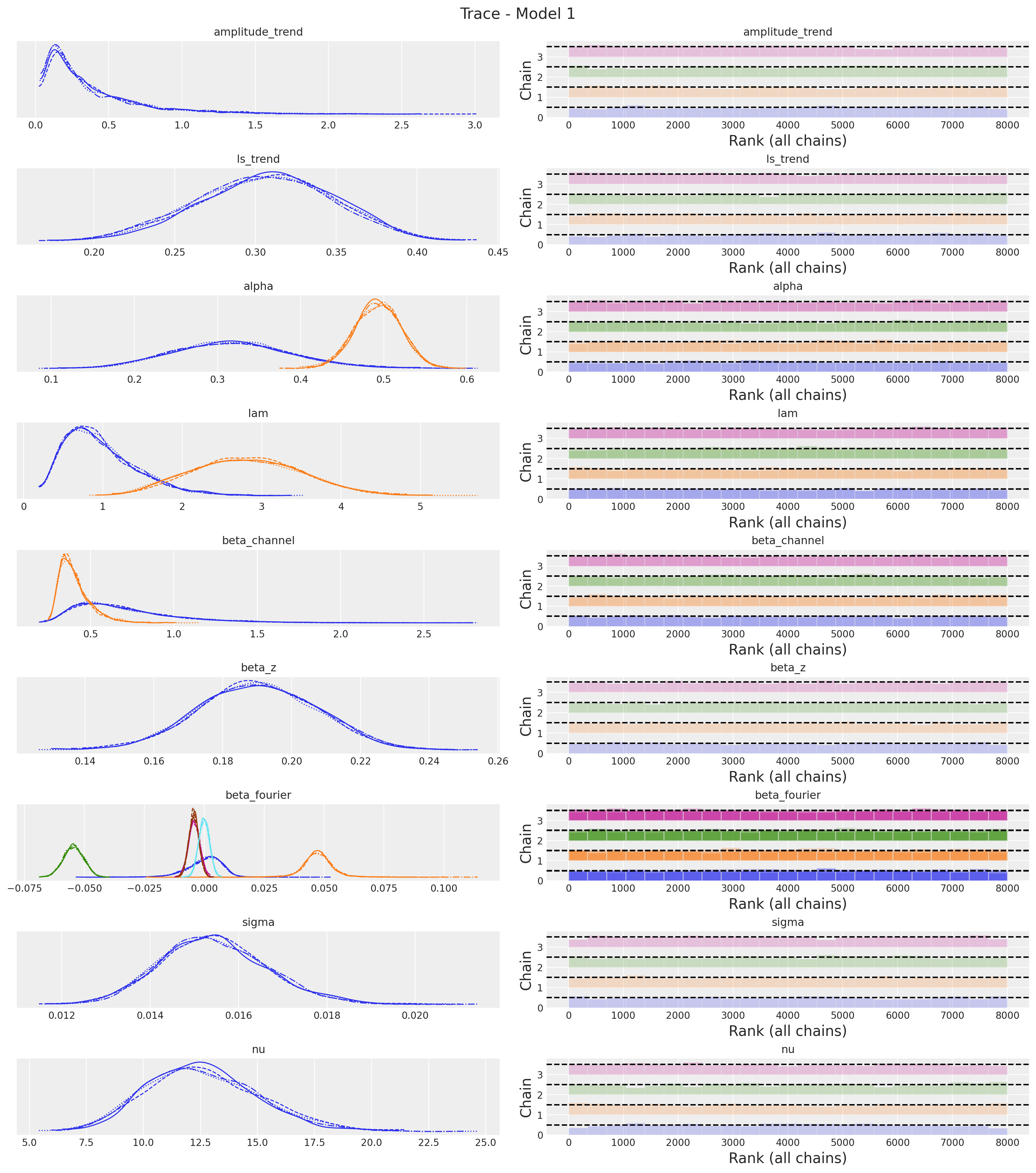
The trace looks fine!
Posterior Predictive Checks
We now want to see the model fit. We want to do it in the original scale. Therefore we need to scale our posterior samples back.
pp_vars_original_scale_1 = {
    var_name: xr.apply_ufunc(
        target_scaler.inverse_transform,
        idata_1["posterior"][var_name].expand_dims(dim={"_": 1}, axis=-1),
        input_core_dims=[["date", "_"]],
        output_core_dims=[["date", "_"]],
        vectorize=True,
    ).squeeze(dim="_")
    for var_name in ["mu", "f_trend", "fourier_contribution", "z_contribution"]
}
pp_vars_original_scale_1["channel_contributions"] = xr.apply_ufunc(
target_scaler.inverse_transform,
idata_1["posterior"]["channel_contributions"],
input_core_dims=[["date", "channel"]],
output_core_dims=[["date", "channel"]],
vectorize=True,
)
# We define the baseline as f_trand + fourier_contribution + z_contribution
pp_vars_original_scale_1["baseline"] = xr.apply_ufunc(
target_scaler.inverse_transform,
(
idata_1["posterior"]["f_trend"]
+ idata_1["posterior"]["fourier_contribution"]
+ idata_1["posterior"]["z_contribution"]
).expand_dims(dim={"_": 1}, axis=-1),
input_core_dims=[["date", "_"]],
output_core_dims=[["date", "_"]],
vectorize=True,
).squeeze(dim="_")We also scale back the likelihood.
pp_likelihood_original_scale_1 = xr.apply_ufunc(
    target_scaler.inverse_transform,
    posterior_predictive_1["posterior_predictive"]["y"].expand_dims(
        dim={"_": 1}, axis=-1
    ),
    input_core_dims=[["date", "_"]],
    output_core_dims=[["date", "_"]],
    vectorize=True,
).squeeze(dim="_")
We can now visualize the results:
fig, ax = plt.subplots()
sns.lineplot(data=model_df, x="date", y="y", color="black", label=target, ax=ax)
az.plot_hdi(
    x=date,
    y=pp_likelihood_original_scale_1,
    hdi_prob=0.94,
    color="C0",
    fill_kwargs={"alpha": 0.1, "label": r"likelihood $94\%$ HDI"},
    smooth=False,
    ax=ax,
)
az.plot_hdi(
    x=date,
    y=pp_vars_original_scale_1["mu"],
    hdi_prob=0.94,
    color="C0",
    fill_kwargs={"alpha": 0.3, "label": r"$\mu$ $94\%$ HDI"},
    smooth=False,
    ax=ax,
)
ax.legend(loc="upper left")
ax.set_title(label="Posterior Predictive - Model 1", fontsize=18, fontweight="bold")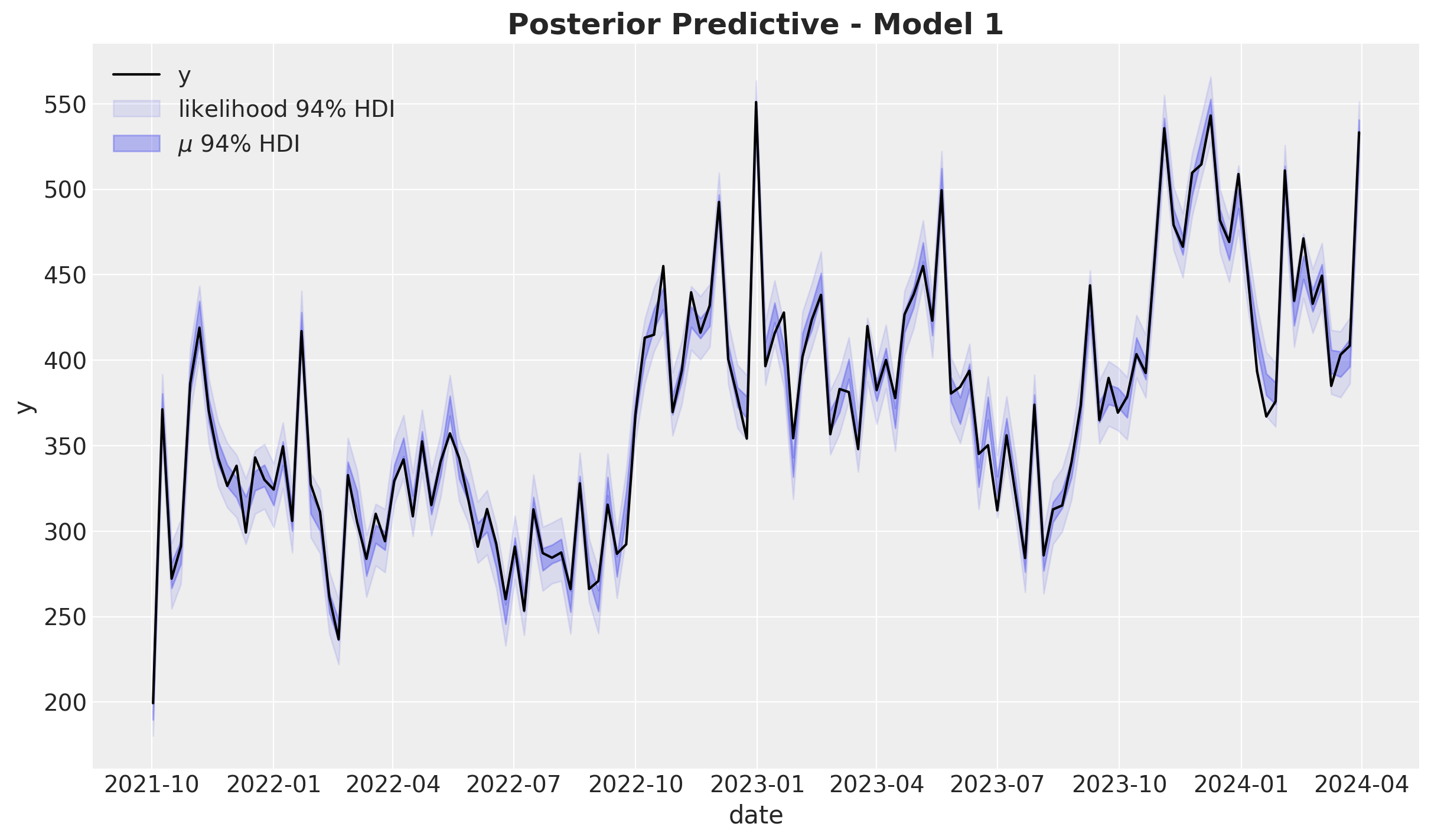
The model does explain the data variance quite well. Let’s look into the distribution:
fig, ax = plt.subplots()
az.plot_ppc(
    data=posterior_predictive_1,
    num_pp_samples=1_000,
    observed_rug=True,
    random_seed=seed,
    ax=ax,
)
ax.set_title(label="Posterior Predictive - Model 1", fontsize=18, fontweight="bold")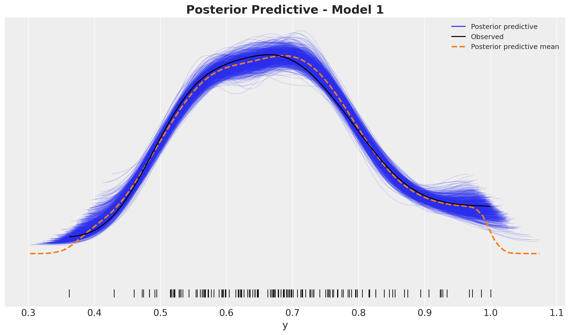
Looks good!
Model Components
We now visualize the model components.
fig, ax = plt.subplots()
sns.lineplot(data=model_df, x="date", y="y", color="black", label=target, ax=ax)
az.plot_hdi(
    x=date,
    y=pp_vars_original_scale_1["channel_contributions"].sel(channel="x1"),
    hdi_prob=0.94,
    color="C0",
    fill_kwargs={"alpha": 0.5, "label": r"$x1$ contribution $94\%$ HDI"},
    smooth=False,
    ax=ax,
)
az.plot_hdi(
    x=date,
    y=pp_vars_original_scale_1["channel_contributions"].sel(channel="x2"),
    hdi_prob=0.94,
    color="C1",
    fill_kwargs={"alpha": 0.5, "label": r"$x2$ contribution $94\%$ HDI"},
    smooth=False,
    ax=ax,
)
az.plot_hdi(
    x=date,
    y=pp_vars_original_scale_1["f_trend"],
    hdi_prob=0.94,
    color="C2",
    fill_kwargs={"alpha": 0.3, "label": r"$f_\text{trend}$ $94\%$ HDI"},
    smooth=False,
    ax=ax,
)
az.plot_hdi(
    x=date,
    y=pp_vars_original_scale_1["fourier_contribution"],
    hdi_prob=0.94,
    color="C3",
    fill_kwargs={"alpha": 0.3, "label": r"seasonality $94\%$ HDI"},
    smooth=False,
    ax=ax,
)
az.plot_hdi(
    x=date,
    y=pp_vars_original_scale_1["z_contribution"],
    hdi_prob=0.94,
    color="C4",
    fill_kwargs={"alpha": 0.3, "label": r"$z$ contribution $94\%$ HDI"},
    smooth=False,
    ax=ax,
)
ax.legend(loc="upper center", bbox_to_anchor=(0.5, -0.1), ncol=3)
ax.set_title(label="Components Contributions - Model 1", fontsize=18, fontweight="bold")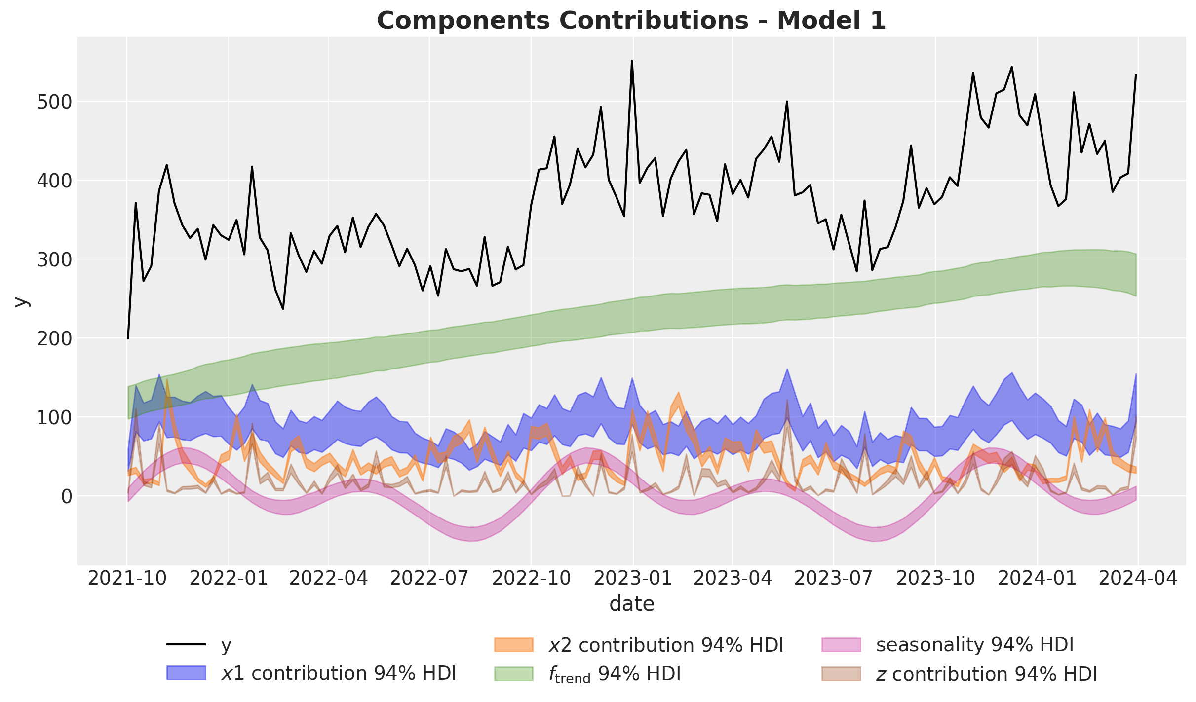
Remarks:
- The Gaussian process is able to capture the trend component quite well.
- Note that the variance of the \(x_1\) estimate is much wider than the one for \(x_2\). This is due to the fact \(x_1\) has a high correlation with the seasonality component. Multicollinearity is a common issue in media mix models.
We now plot the baseline against the media contribution:
fig, ax = plt.subplots()
sns.lineplot(data=model_df, x="date", y="y", color="black", label=target, ax=ax)
az.plot_hdi(
    x=date,
    y=pp_vars_original_scale_1["channel_contributions"].sel(channel="x1"),
    hdi_prob=0.94,
    color="C0",
    fill_kwargs={"alpha": 0.5, "label": r"$x1$ contribution $94\%$ HDI"},
    smooth=False,
    ax=ax,
)
az.plot_hdi(
    x=date,
    y=pp_vars_original_scale_1["channel_contributions"].sel(channel="x2"),
    hdi_prob=0.94,
    color="C1",
    fill_kwargs={"alpha": 0.5, "label": r"$x2$ contribution $94\%$ HDI"},
    smooth=False,
    ax=ax,
)
az.plot_hdi(
    x=date,
    y=pp_vars_original_scale_1["baseline"],
    hdi_prob=0.94,
    color="C7",
    fill_kwargs={"alpha": 0.5, "label": r"baseline $94\%$ HDI"},
    smooth=False,
    ax=ax,
)
ax.legend(loc="upper left")
ax.set_title(label="Baseline vs Channels - Model 1", fontsize=18, fontweight="bold")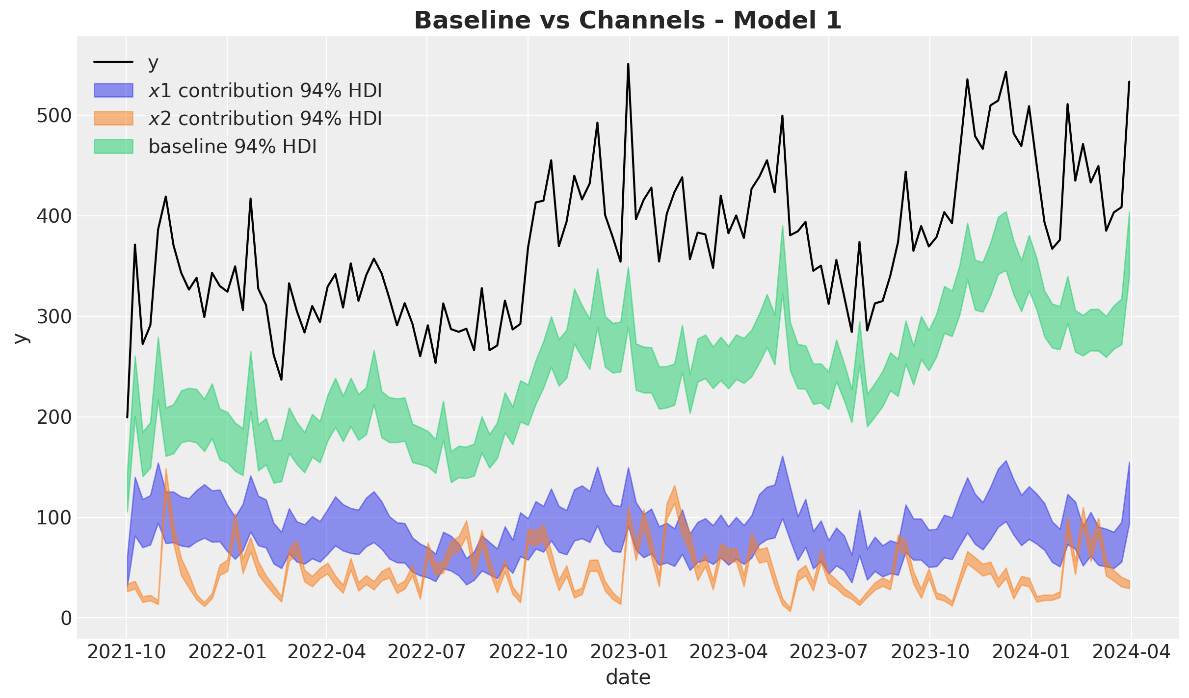
Let’s now deep dive into the media contributions:
fig, ax = plt.subplots(
    nrows=2, ncols=1, figsize=(12, 7), sharex=True, sharey=False, layout="constrained"
)
sns.lineplot(
    x="date",
    y="x1_effect",
    data=data_df.assign(x1_effect=lambda x: amplitude * x["x1_effect"]),
    color="C0",
    label=r"$x1$ effect",
    ax=ax[0],
)
az.plot_hdi(
    x=date,
    y=pp_vars_original_scale_1["channel_contributions"].sel(channel="x1"),
    hdi_prob=0.94,
    color="C0",
    fill_kwargs={"alpha": 0.3, "label": r"$x1$ contribution $94\%$ HDI"},
    smooth=False,
    ax=ax[0],
)
ax[0].legend(loc="upper right")

sns.lineplot(
    x="date",
    y="x2_effect",
    data=data_df.assign(x2_effect=lambda x: amplitude * x["x2_effect"]),
    color="C1",
    label=r"$x2$ effect",
    ax=ax[1],
)
az.plot_hdi(
    x=date,
    y=pp_vars_original_scale_1["channel_contributions"].sel(channel="x2"),
    hdi_prob=0.94,
    color="C1",
    fill_kwargs={"alpha": 0.3, "label": r"$x2$ contribution $94\%$ HDI"},
    smooth=False,
    ax=ax[1],
)
ax[1].legend(loc="upper right")

fig.suptitle("Channel Contributions - Model 1", fontsize=18, fontweight="bold")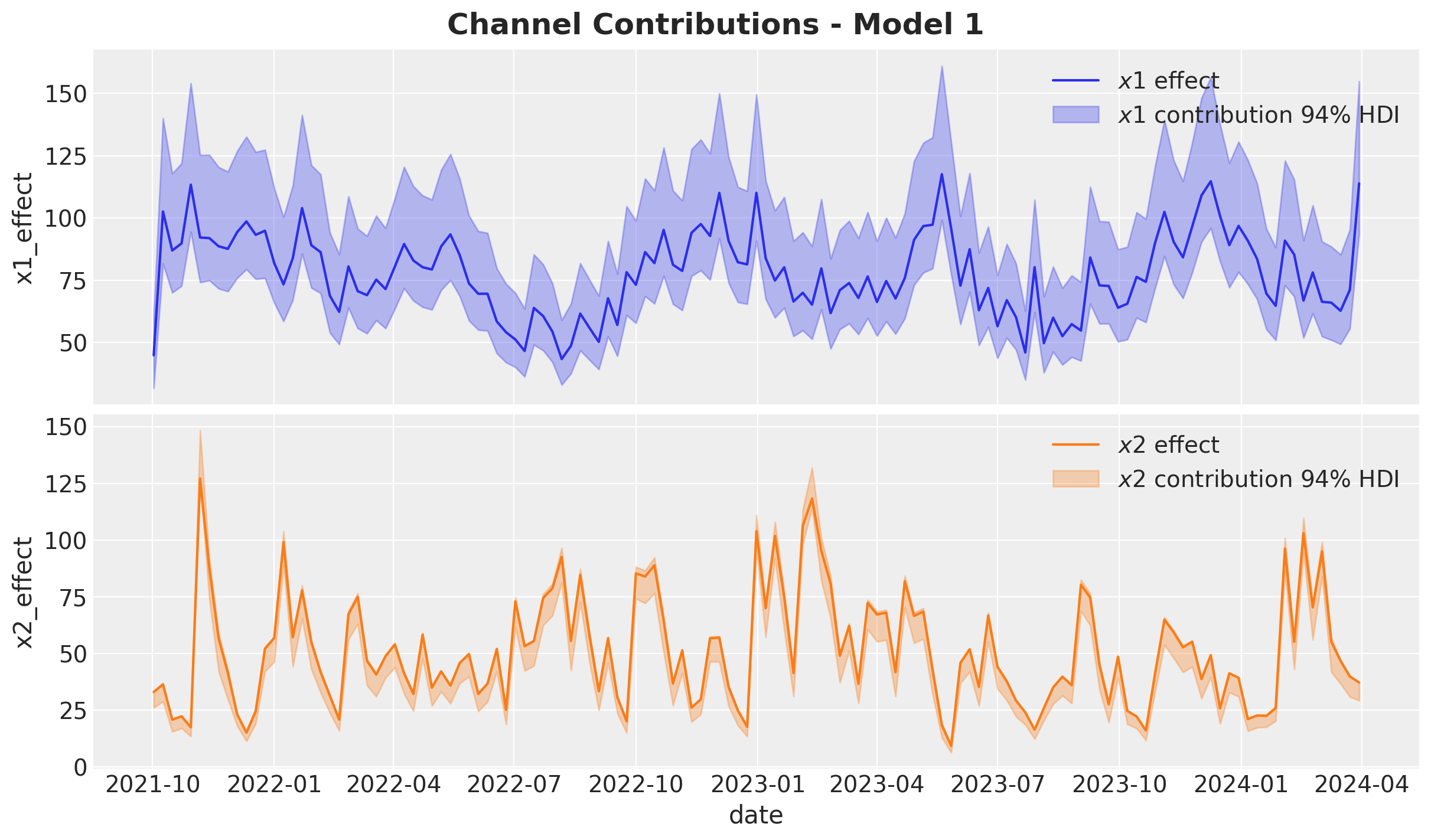
Overall, the model recovered the true effects. Still, the estimate of \(x_2\) is slightly underestimated by the model (the true value is not in the middle of the HDI).
Media Parameters
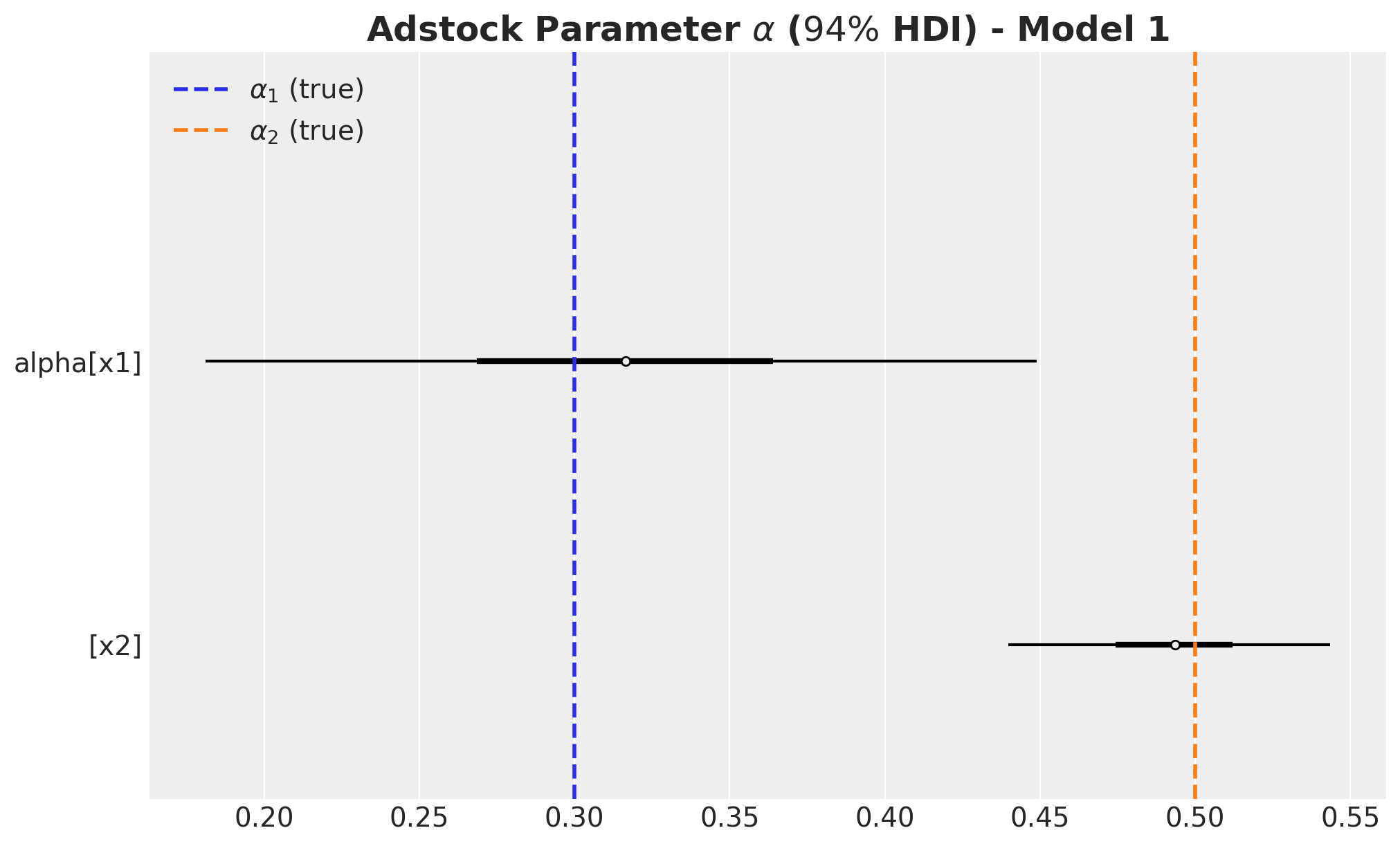
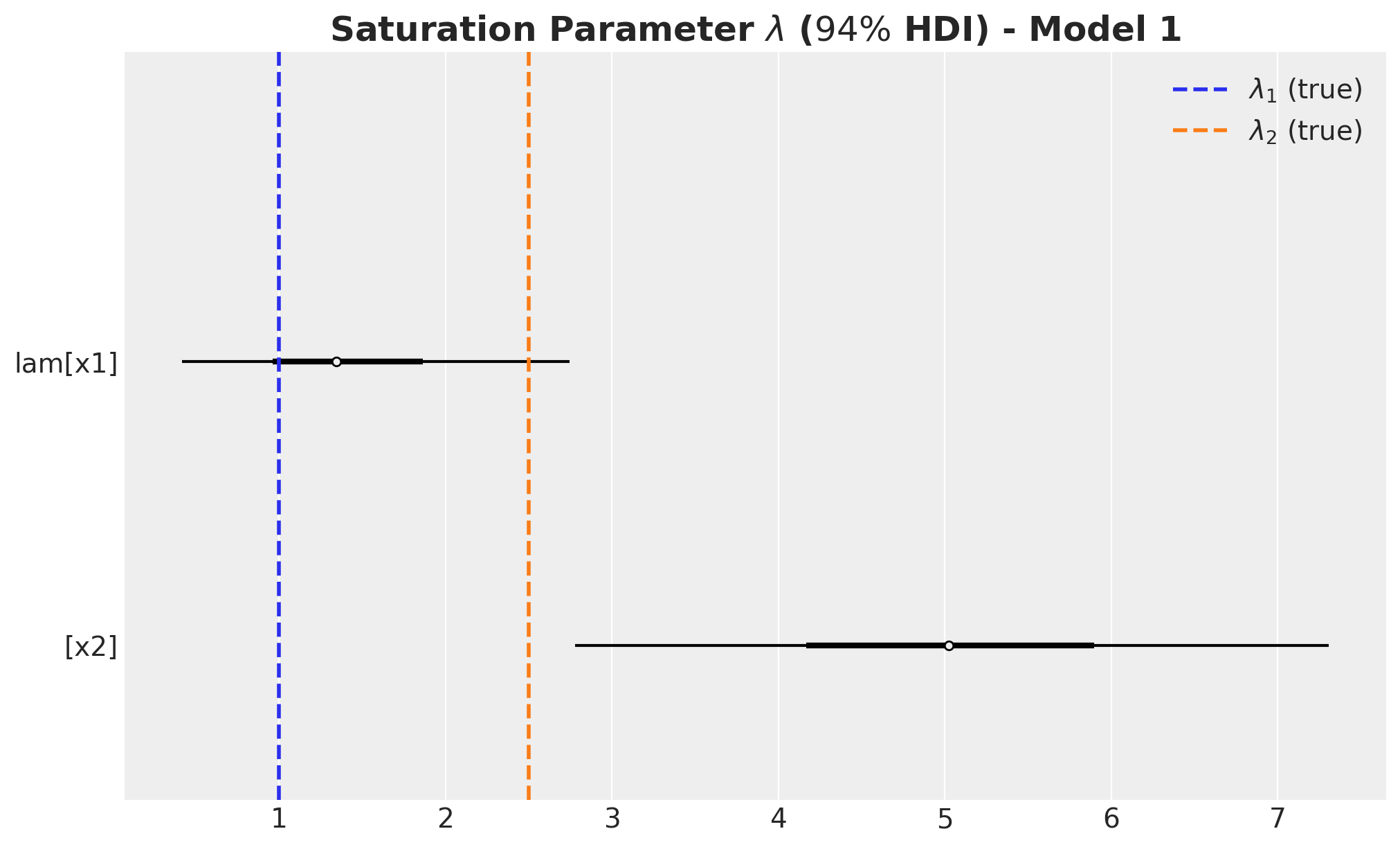
We now compare the estimated against the true values for the parameters \(\alpha\), \(\lambda\) and the regression coefficients \(\beta\). Recall that since we are working on the scaled space we need to scale \(\lambda\) and \(\beta\) back:
alpha_posterior_1 = idata_1["posterior"]["alpha"]
lam_posterior_1 = idata_1["posterior"]["lam"] * channels_scaler.scale_
beta_channel_posterior_1 = (
    idata_1["posterior"]["beta_channel"]
    * (1 / channels_scaler.scale_)
    * (target_scaler.scale_)
    * (1 / amplitude)
)
fig, ax = plt.subplots(figsize=(10, 6))
az.plot_forest(
data=alpha_posterior_1, combined=True, hdi_prob=0.94, colors="black", ax=ax
)
ax.axvline(
x=alpha1, color="C0", linestyle="--", linewidth=2, label=r"$\alpha_1$ (true)"
)
ax.axvline(
x=alpha2, color="C1", linestyle="--", linewidth=2, label=r"$\alpha_2$ (true)"
)
ax.legend(loc="upper left")
ax.set_title(
label=r"Adstock Parameter $\alpha$ ($94\%$ HDI) - Model 1",
fontsize=18,
fontweight="bold",
)
fig, ax = plt.subplots(figsize=(10, 6))
az.plot_forest(
    data=lam_posterior_1, combined=True, hdi_prob=0.94, colors="black", ax=ax
)
ax.axvline(x=lam1, color="C0", linestyle="--", linewidth=2, label=r"$\lambda_1$ (true)")
ax.axvline(x=lam2, color="C1", linestyle="--", linewidth=2, label=r"$\lambda_2$ (true)")
ax.legend(loc="upper right")
ax.set_title(
    label=r"Saturation Parameter $\lambda$ ($94\%$ HDI) - Model 1",
    fontsize=18,
    fontweight="bold",
)
fig, ax = plt.subplots(figsize=(10, 6))
az.plot_forest(
    data=beta_channel_posterior_1, combined=True, hdi_prob=0.94, colors="black", ax=ax
)
ax.axvline(x=beta1, color="C0", linestyle="--", linewidth=2, label=r"$\beta_1$ (true)")
ax.axvline(x=beta2, color="C1", linestyle="--", linewidth=2, label=r"$\beta_2$ (true)")
ax.legend(loc="upper right")
ax.set_title(
    label=r"Channel $\beta$ ($94\%$ HDI) - Model 1", fontsize=18, fontweight="bold"
)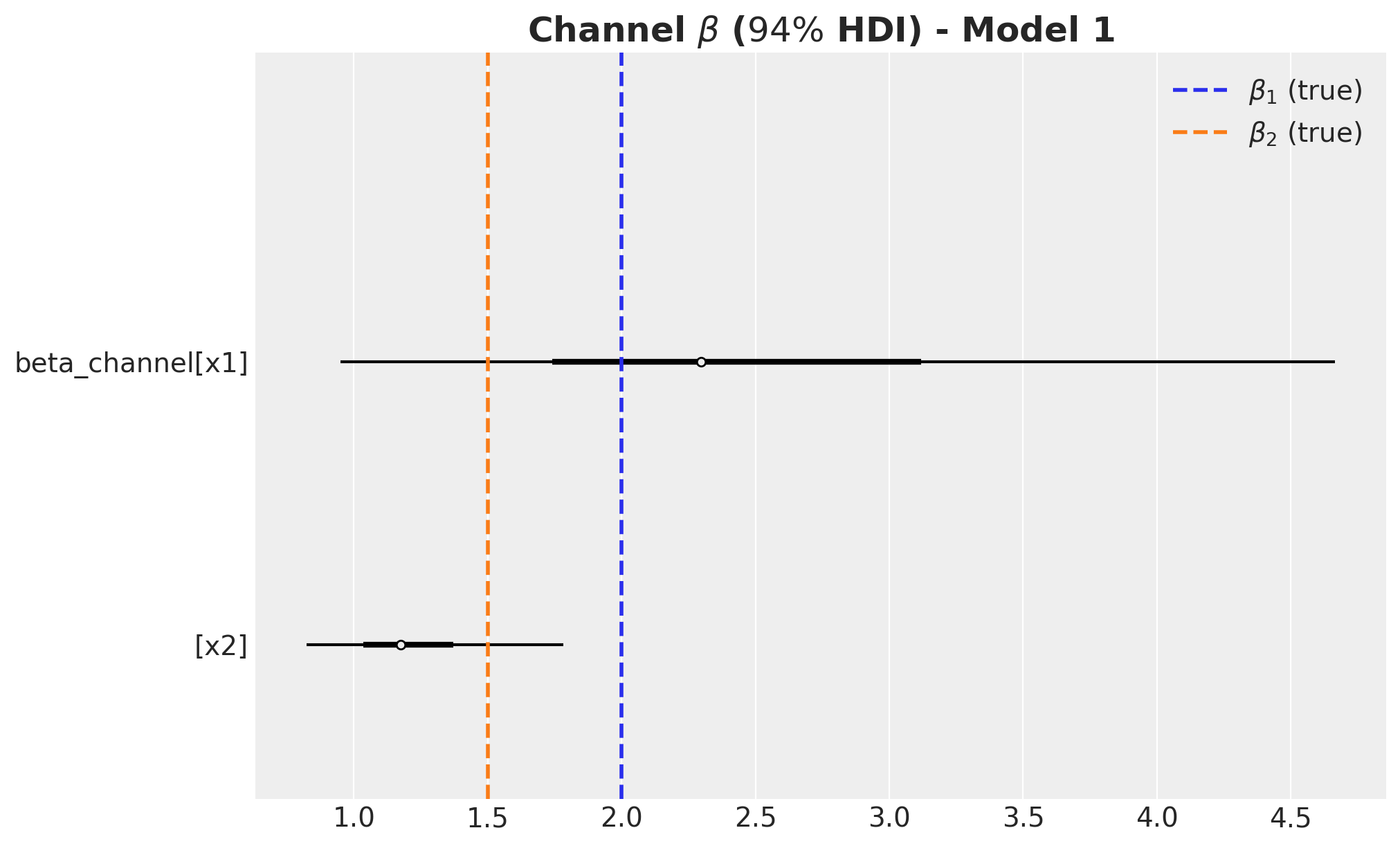
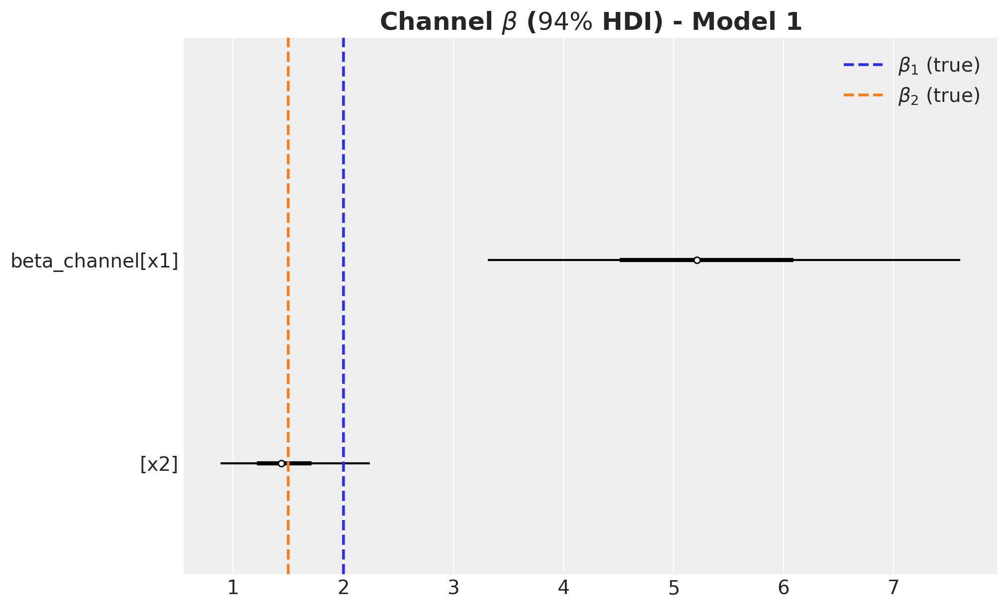
Remarks:
- We wer able to recover the true values of the carryover parameter \(\alpha\).
- For \(x_1\), the true values of \(\lambda\) and \(\beta\) are in the \(94\%\) HDI.
- The \(94\%\) HDI of the regression coefficient \(\beta\) for \(x_1\) is much wider than the one for \(x_2\). As mentioned before, this is probably related with multicollinearity with the seasonal component.
- For \(x_2\) the model overestimated the saturation parameter \(\lambda\) and underestimated the regression coefficient \(\beta\). Maybe we should have had stricter priors? This is a true challenge in practice as we do not know the true values. This is a motivation for this notebook! Being able to easily pass information through ROAS than beta coefficients in the scaled space is a much more convenient way to pass information to the model.
ROAS Estimation
Once the model is fitted, we can use the posterior samples to compute the ROAS as in above. We simply need to generate predictions when setting the media data to zero. Let’s start with the global ROAS:
predictions_roas_data_all_1 = {"x1": {}, "x2": {}}

for channel in tqdm(["x1", "x2"]):
    with model_1:
        pm.set_data(
            new_data={
                "channels_scaled": channels_scaler.transform(
                    data_df[channels].assign(**{channel: 0})
                )
            }
        )
        predictions_roas_data_all_1[channel] = pm.sample_posterior_predictive(
            trace=idata_1, var_names=["y", "mu"], progressbar=False, random_seed=rng
        )
We now scale the predictions back to the original scale:
predictions_roas_data_scaled_diff_all_1 = {"x1": {}, "x2": {}}

for channel in ["x1", "x2"]:
    predictions_roas_data_scaled_diff_all_1[channel] = pp_vars_original_scale_1[
        "mu"
    ] - xr.apply_ufunc(
        target_scaler.inverse_transform,
        predictions_roas_data_all_1[channel]["posterior_predictive"]["mu"].expand_dims(
            dim={"_": 1}, axis=-1
        ),
        input_core_dims=[["date", "_"]],
        output_core_dims=[["date", "_"]],
        vectorize=True,
    ).squeeze(
        dim="_"
    )
We can now visualize the difference iin the potential outcomes:
fig, ax = plt.subplots(
    nrows=2, ncols=1, figsize=(12, 7), sharex=True, sharey=False, layout="constrained"
)
az.plot_hdi(
    x=date,
    y=predictions_roas_data_scaled_diff_all_1["x1"],
    color="C0",
    smooth=False,
    fill_kwargs={"alpha": 0.3, "label": r"$E(y - y_{01})$ $94\%$ HDI"},
    ax=ax[0],
)
sns.lineplot(
    data=data_df.assign(x1_effect=lambda x: amplitude * x["x1_effect"]),
    x="date",
    y="x1_effect",
    color="C0",
    label=r"$x1$ effect",
    ax=ax[0],
)
az.plot_hdi(
    x=date,
    y=predictions_roas_data_scaled_diff_all_1["x2"],
    color="C1",
    smooth=False,
    fill_kwargs={"alpha": 0.3, "label": r"$E(y - y_{02})$ $94\%$ HDI"},
    ax=ax[1],
)
sns.lineplot(
    data=data_df.assign(x2_effect=lambda x: amplitude * x["x2_effect"]),
    x="date",
    y="x2_effect",
    color="C1",
    label=r"$x2$ effect",
    ax=ax[1],
)
ax[0].legend(loc="upper left")
ax[1].legend(loc="upper left")
ax[0].set(ylabel=None)
ax[1].set(ylabel=None)
fig.suptitle("Potential Outcomes Difference - Model 1", fontsize=18, fontweight="bold")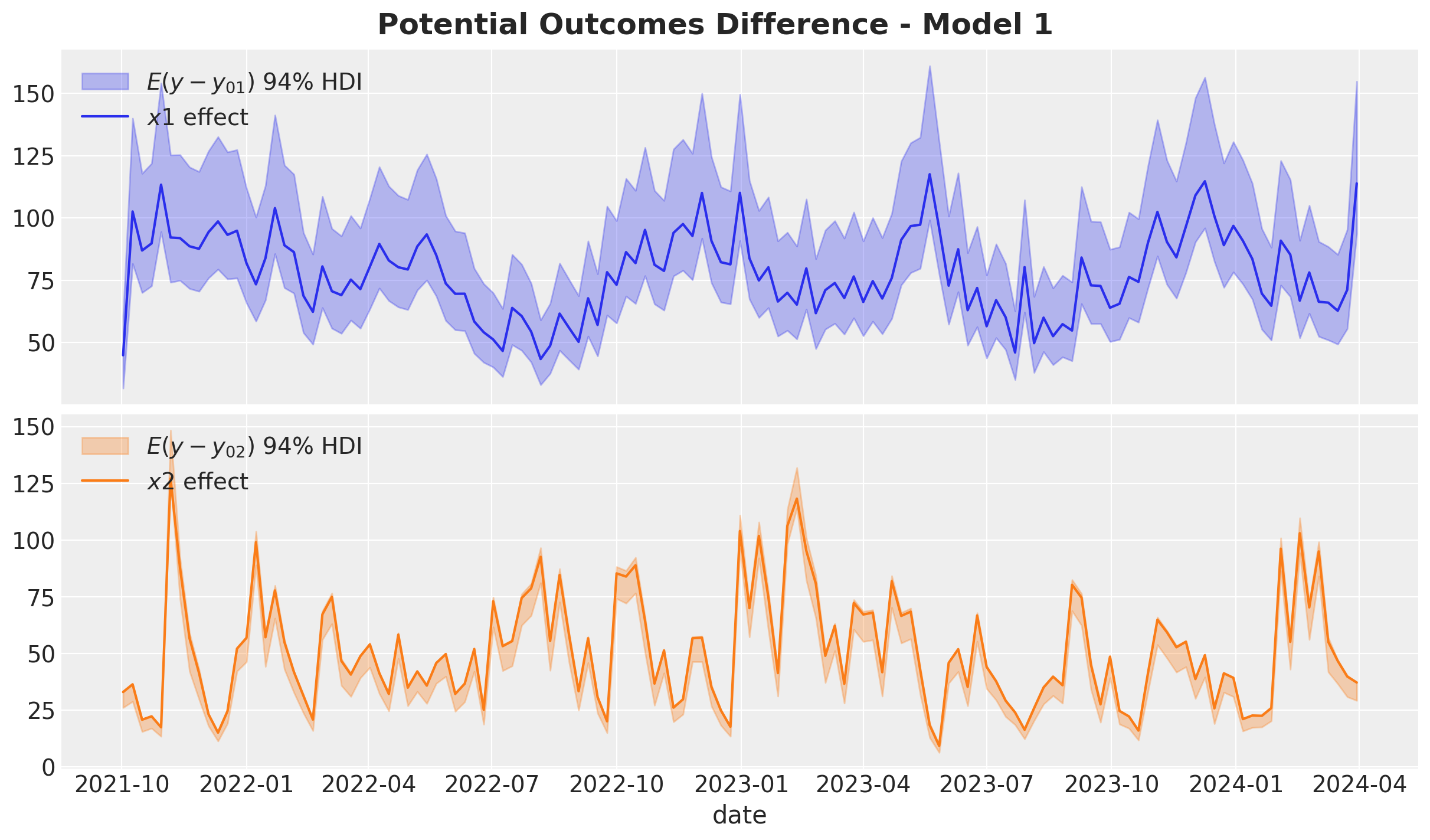
It is not surprise that this is precisely the same plot as the one we saw before. Namely, the media contributions from the model 🙃.
We now compute the ROAS:
predictions_roas_all_1 = {"x1": {}, "x2": {}}

for channel in ["x1", "x2"]:
    predictions_roas_all_1[channel] = (
        predictions_roas_data_scaled_diff_all_1[channel].sum(dim="date")
        / data_df[channel].sum()
    )
fig, ax = plt.subplots(
nrows=2, ncols=1, figsize=(12, 7), sharex=True, sharey=False, layout="constrained"
)
az.plot_posterior(predictions_roas_all_1["x1"], ref_val=roas_all_1, ax=ax[0])
ax[0].set(title="x1")
az.plot_posterior(predictions_roas_all_1["x2"], ref_val=roas_all_2, ax=ax[1])
ax[1].set(title="x2", xlabel="ROAS")
fig.suptitle("Global ROAS - Model 1", fontsize=18, fontweight="bold")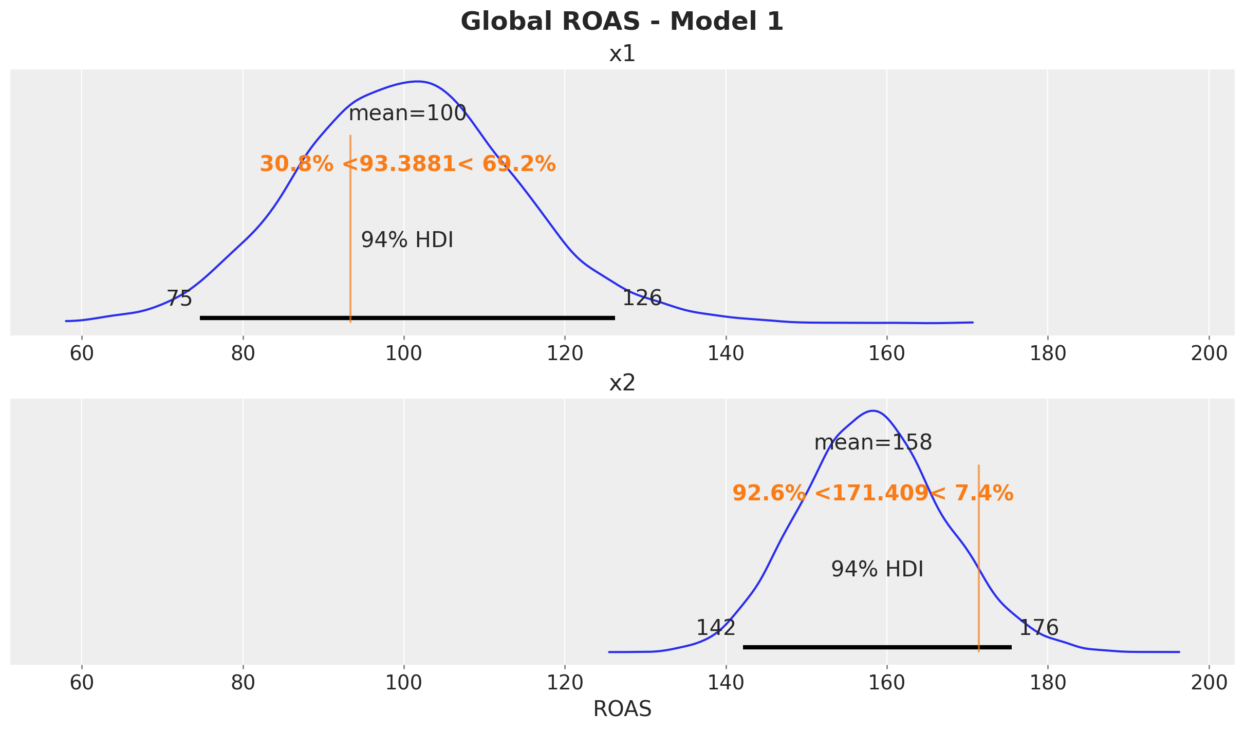
We can proceed in an analogous way for the quarterly ROAS. This time we need to loop ever time series on which we set up the quarterly spend to zero for a given channel.
predictions_roas_data_1 = {"x1": {}, "x2": {}}

for channel in tqdm(["x1", "x2"]):
    for q in tqdm(roas_data[channel].keys()):
        with model_1:
            pm.set_data(
                new_data={
                    "channels_scaled": channels_scaler.transform(
                        roas_data[channel][q][channels]
                    )
                }
            )
            predictions_roas_data_1[channel][q] = pm.sample_posterior_predictive(
                trace=idata_1, var_names=["y", "mu"], progressbar=False, random_seed=rng
            )
predictions_roas_data_scaled_diff_1 = {"x1": {}, "x2": {}}
for channel in ["x1", "x2"]:
predictions_roas_data_scaled_diff_1[channel] = {
q: pp_vars_original_scale_1["mu"]
- xr.apply_ufunc(
target_scaler.inverse_transform,
idata_q["posterior_predictive"]["mu"].expand_dims(dim={"_": 1}, axis=-1),
input_core_dims=[["date", "_"]],
output_core_dims=[["date", "_"]],
vectorize=True,
).squeeze(dim="_")
for q, idata_q in tqdm(predictions_roas_data_1[channel].items())
}In order to have a better understanding on this computation, we can plot one of such time series differences:
fig, ax = plt.subplots()
ax.axvspan(
    xmin=quarter_ranges.loc[quarter_ranges.quarter == "2022Q3"]["date"]["min"].item(),
    xmax=quarter_ranges.loc[quarter_ranges.quarter == "2022Q3"]["date"]["max"].item(),
    color="C1",
    label="2022-Q3",
    alpha=0.2,
)
az.plot_hdi(
    x=date,
    y=predictions_roas_data_scaled_diff_1["x2"]["2022Q3"],
    hdi_prob=0.94,
    color="C0",
    fill_kwargs={"alpha": 0.7, "label": r"$x2$ difference against actuals $94\%$ HDI"},
    smooth=False,
    ax=ax,
)
ax.legend(loc="upper right")
ax.set_title(
    label=r"Potential Outcomes Difference - Model 1 (Channel $x2$ (2023-Q3))",
    fontsize=18,
    fontweight="bold",
)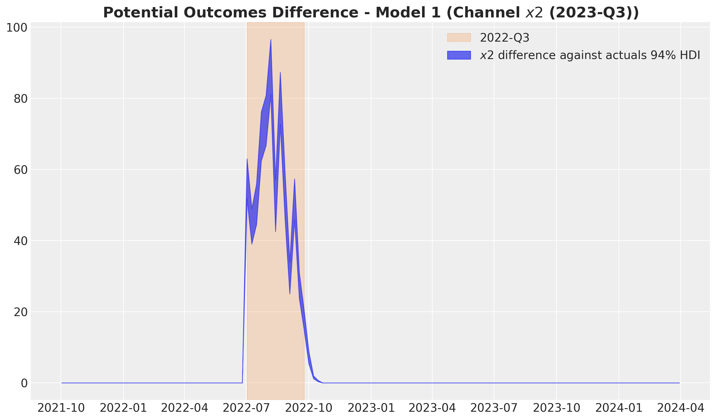
Observe the difference is non-zero just after the selected quarter. This is due to the carryover effect of the media spend.
We now divide the differences by the spend to get the ROAS:
predictions_roas_1 = {"x1": {}, "x2": {}}

for channel in ["x1", "x2"]:
    predictions_roas_1[channel] = {
        q: idata_q.sum(dim="date") / data_df.query("quarter == @q")[channel].sum()
        for q, idata_q in predictions_roas_data_scaled_diff_1[channel].items()
    }
Here are the results for \(x_1\) and compare them with the true values:
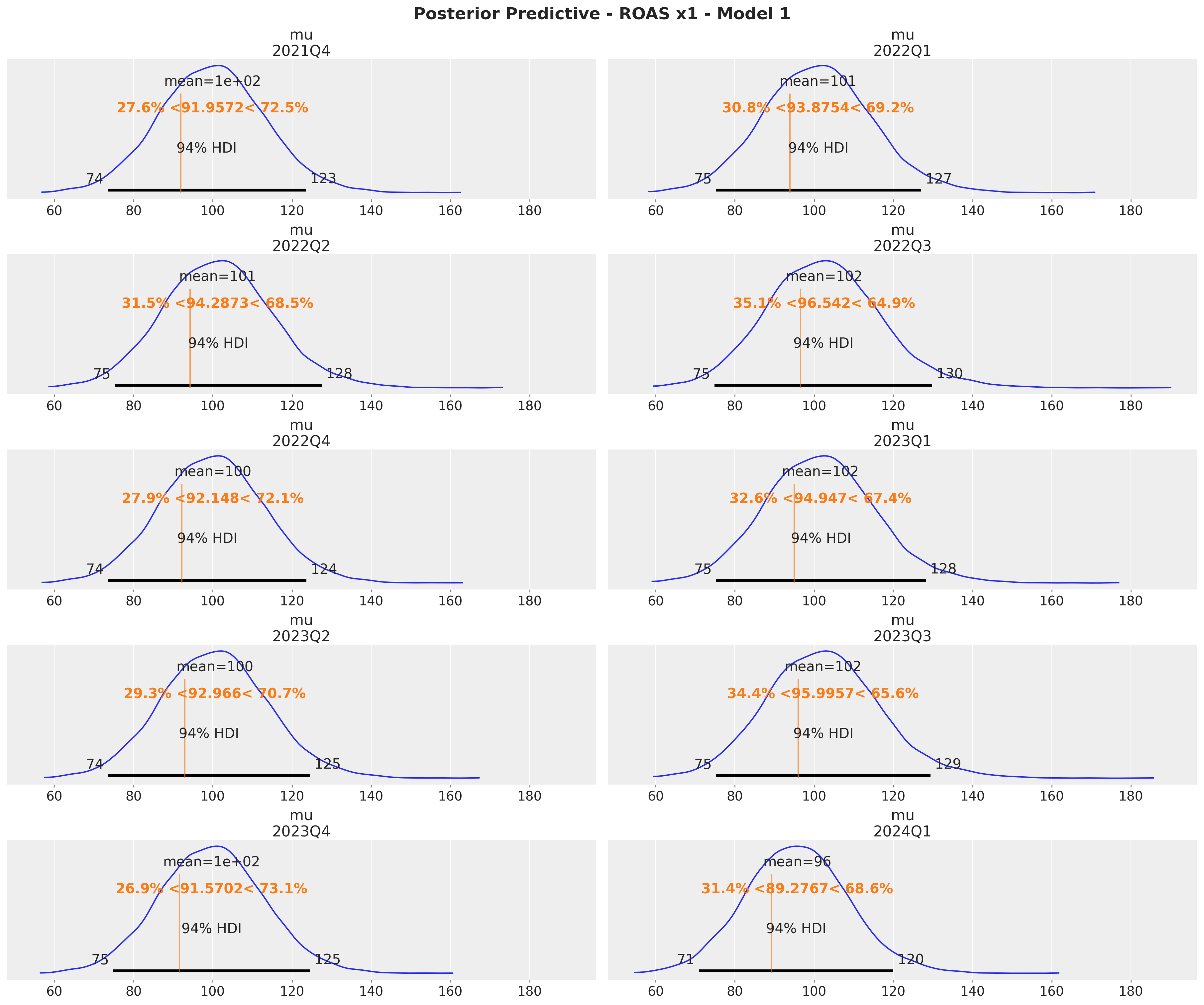
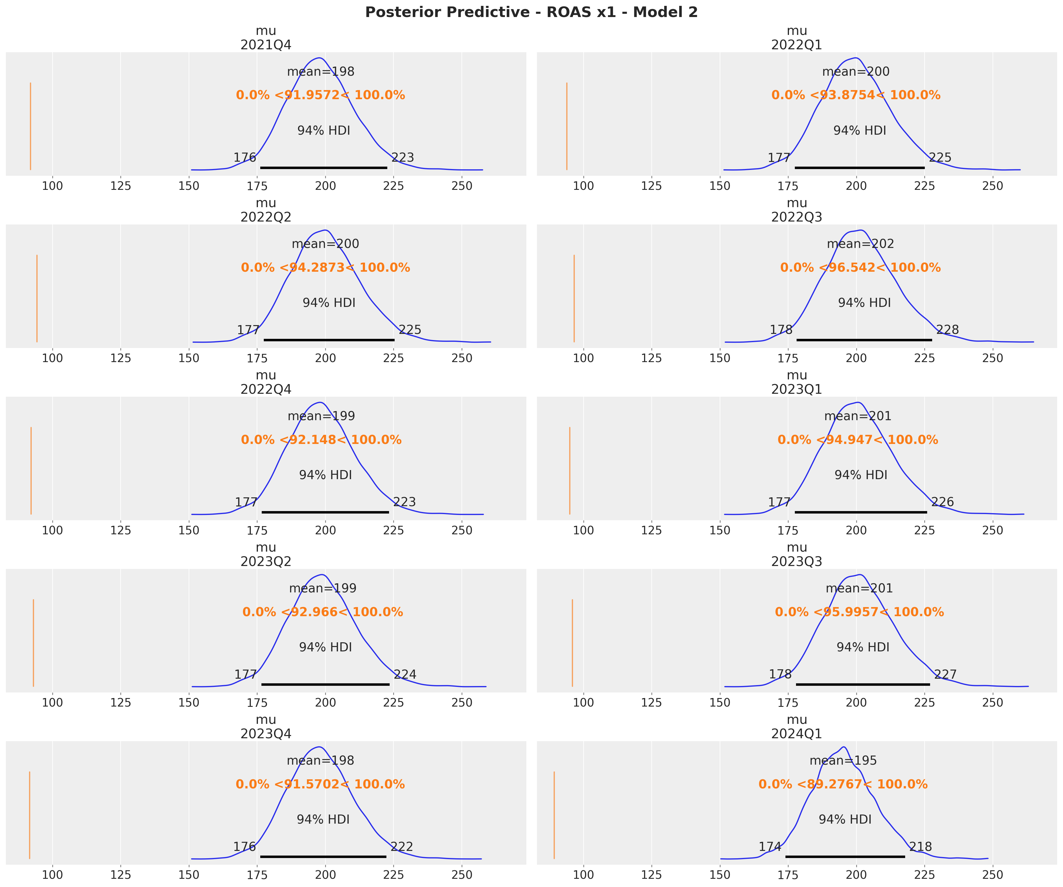
x1_ref_vals = (
    roas.query("channel == 'x1'")
    .drop("channel", axis=1)
    .rename(columns={"roas": "ref_val"})
    .to_dict(orient="records")
)

axes = az.plot_posterior(
    data=xr.concat(
        predictions_roas_1["x1"].values(),
        dim=pd.Index(data=predictions_roas_1["x1"].keys(), name="quarter"),
    ),
    figsize=(18, 15),
    grid=(5, 2),
    ref_val={"mu": x1_ref_vals},
    backend_kwargs={"sharex": True, "layout": "constrained"},
)
fig = axes.ravel()[0].get_figure()
fig.suptitle(
    t="Posterior Predictive - ROAS x1 - Model 1", fontsize=18, fontweight="bold"
)
Here are the results for \(x_2\):
x2_ref_vals = (
    roas.query("channel == 'x2'")
    .drop("channel", axis=1)
    .rename(columns={"roas": "ref_val"})
    .to_dict(orient="records")
)

axes = az.plot_posterior(
    data=xr.concat(
        predictions_roas_1["x2"].values(),
        dim=pd.Index(data=predictions_roas_1["x2"].keys(), name="quarter"),
    ),
    figsize=(18, 15),
    grid=(5, 2),
    ref_val={"mu": x2_ref_vals},
    backend_kwargs={"sharex": True, "layout": "constrained"},
)
fig = axes.ravel()[0].get_figure()
fig.suptitle(
    t="Posterior Predictive - ROAS x2 - Model 1", fontsize=18, fontweight="bold"
)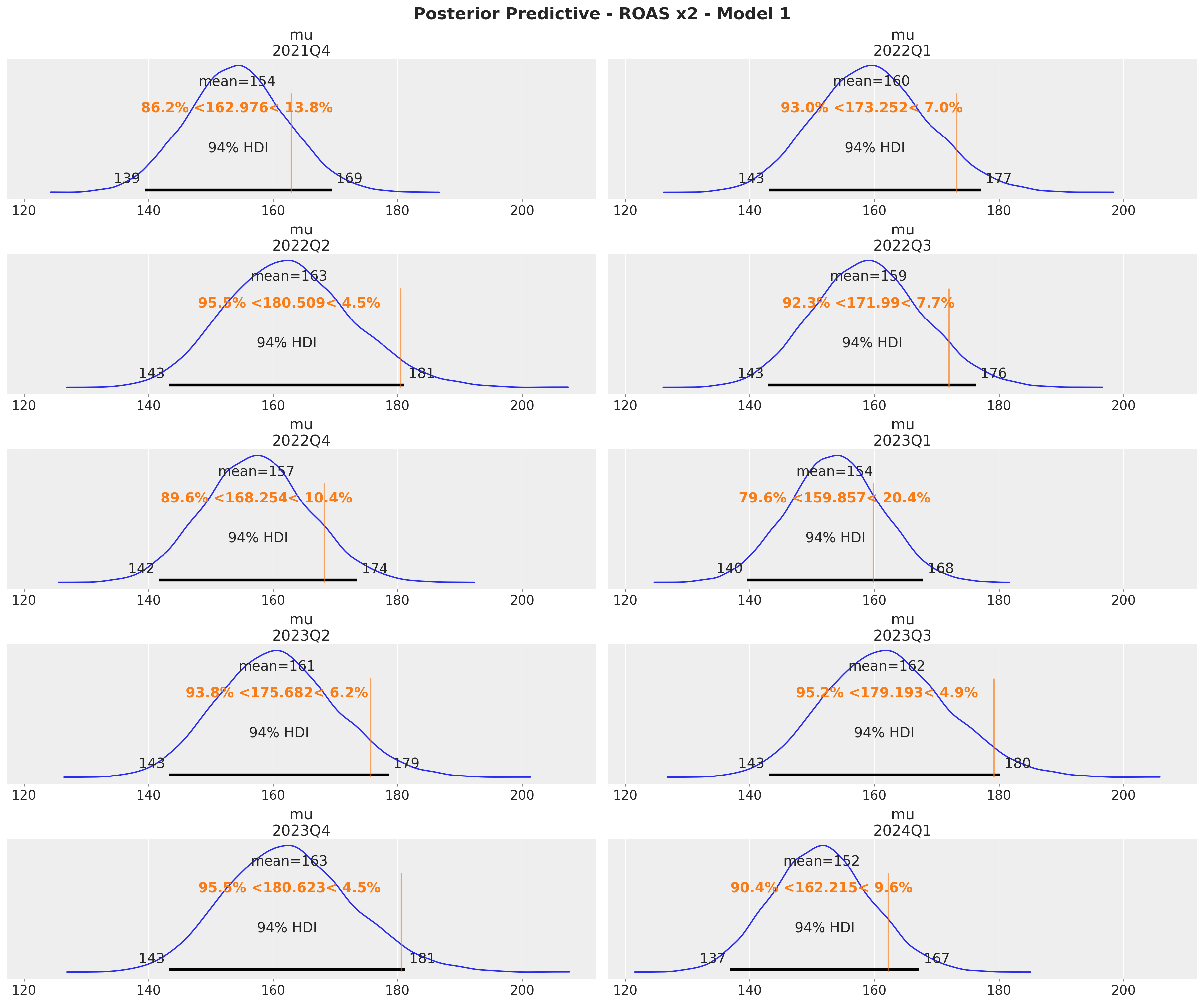
These results are consistent with the ones from the global ROAS. The model underestimates for \(x_2\) (for \(x_1\) the difference lies within the reasonable uncertainty estimates).
Model 2: Unobserved Confounder
In this second model we keep the same model structure as above but we remove the confounder \(z\) as a covariate. We want to see if the model is able to recover the true effects of the media channels. We should expect the model to overestimate the effect of \(x_1\) as a result of omitted variable bias.
with pm.Model(coords=coords) as model_2:
    # --- Data Containers ---

    index_scaled_data = pm.Data(
        name="index_scaled",
        value=index_scaled.to_numpy().flatten(),
        mutable=True,
        dims="date",
    )

    channels_scaled_data = pm.Data(
        name="channels_scaled",
        value=channels_scaled,
        mutable=True,
        dims=("date", "channel"),
    )

    fourier_features_data = pm.Data(
        name="fourier_features",
        value=fourier_features,
        mutable=True,
        dims=("date", "fourier_mode"),
    )

    y_scaled_data = pm.Data(
        name="y_scaled",
        value=target_scaled.to_numpy().flatten(),
        mutable=True,
        dims="date",
    )

    # --- Priors ---

    amplitude_trend = pm.HalfNormal(name="amplitude_trend", sigma=1)
    ls_trend_params = pm.find_constrained_prior(
        distribution=pm.InverseGamma,
        lower=0.1,
        upper=0.9,
        init_guess={"alpha": 3, "beta": 1},
        mass=0.95,
    )
    ls_trend = pm.InverseGamma(name="ls_trend", **ls_trend_params)

    alpha = pm.Beta(name="alpha", alpha=2, beta=3, dims="channel")
    lam = pm.Gamma(name="lam", alpha=2, beta=2, dims="channel")
    beta_channel = pm.HalfNormal(
        name="beta_channel",
        sigma=channel_share.to_numpy(),
        dims="channel",
    )
    beta_fourier = pm.Normal(name="beta_fourier", mu=0, sigma=1, dims="fourier_mode")

    sigma = pm.HalfNormal(name="sigma", sigma=1)
    nu = pm.Gamma(name="nu", alpha=25, beta=2)

    # --- Parametrization ---

    cov_trend = amplitude_trend * pm.gp.cov.ExpQuad(input_dim=1, ls=ls_trend)
    gp_trend = pm.gp.HSGP(m=[20], c=1.5, cov_func=cov_trend)
    f_trend = gp_trend.prior(name="f_trend", X=index_scaled_data[:, None], dims="date")

    channel_adstock = pm.Deterministic(
        name="channel_adstock",
        var=geometric_adstock(
            x=channels_scaled_data,
            alpha=alpha,
            l_max=l_max,
            normalize=True,
        ),
        dims=("date", "channel"),
    )
    channel_adstock_saturated = pm.Deterministic(
        name="channel_adstock_saturated",
        var=logistic_saturation(x=channel_adstock, lam=lam),
        dims=("date", "channel"),
    )
    channel_contributions = pm.Deterministic(
        name="channel_contributions",
        var=channel_adstock_saturated * beta_channel,
        dims=("date", "channel"),
    )

    fourier_contribution = pm.Deterministic(
        name="fourier_contribution",
        var=pt.dot(fourier_features_data, beta_fourier),
        dims="date",
    )

    mu = pm.Deterministic(
        name="mu",
        var=f_trend + channel_contributions.sum(axis=-1) + fourier_contribution,
        dims="date",
    )

    # --- Likelihood ---
    y = pm.StudentT(
        name="y",
        nu=nu,
        mu=mu,
        sigma=sigma,
        observed=y_scaled_data,
        dims="date",
    )

pm.model_to_graphviz(model=model_2)
The prior predictive check should be similar to the one above. We will skip it. We fit the model directly.
with model_2:
    idata_2 = pm.sample(
        target_accept=0.9,
        draws=2_000,
        chains=4,
        nuts_sampler="numpyro",
        random_seed=rng,
    )
    posterior_predictive_2 = pm.sample_posterior_predictive(
        trace=idata_2, random_seed=rng
    )
Model Diagnostics
We inspect for divergences the trace of the model:
idata_2["sample_stats"]["diverging"].sum().item()\(\displaystyle 0\)
var_names = [
    "amplitude_trend",
    "ls_trend",
    "alpha",
    "lam",
    "beta_channel",
    "beta_fourier",
    "sigma",
    "nu",
]

az.summary(data=idata_2, var_names=var_names, round_to=3)| mean | sd | hdi_3% | hdi_97% | mcse_mean | mcse_sd | ess_bulk | ess_tail | r_hat | |
|---|---|---|---|---|---|---|---|---|---|
| amplitude_trend | 0.296 | 0.298 | 0.017 | 0.867 | 0.006 | 0.005 | 1669.534 | 3017.828 | 1.001 |
| ls_trend | 0.337 | 0.049 | 0.243 | 0.426 | 0.001 | 0.001 | 1712.131 | 1506.935 | 1.001 |
| alpha[x1] | 0.140 | 0.037 | 0.068 | 0.206 | 0.000 | 0.000 | 5437.078 | 3453.508 | 1.001 |
| alpha[x2] | 0.481 | 0.043 | 0.396 | 0.560 | 0.000 | 0.000 | 8357.205 | 5956.070 | 1.001 |
| lam[x1] | 0.799 | 0.202 | 0.467 | 1.201 | 0.003 | 0.002 | 4217.968 | 5296.788 | 1.001 |
| lam[x2] | 2.090 | 0.584 | 1.041 | 3.153 | 0.009 | 0.006 | 4337.649 | 3596.350 | 1.001 |
| beta_channel[x1] | 1.485 | 0.334 | 0.915 | 2.099 | 0.005 | 0.004 | 4258.979 | 5367.265 | 1.001 |
| beta_channel[x2] | 0.488 | 0.127 | 0.289 | 0.730 | 0.002 | 0.001 | 4267.566 | 5275.431 | 1.001 |
| beta_fourier[0] | 0.006 | 0.007 | -0.004 | 0.017 | 0.000 | 0.000 | 3971.823 | 2878.822 | 1.001 |
| beta_fourier[1] | 0.028 | 0.007 | 0.016 | 0.038 | 0.000 | 0.000 | 4614.429 | 2660.869 | 1.001 |
| beta_fourier[2] | -0.027 | 0.005 | -0.036 | -0.019 | 0.000 | 0.000 | 6689.125 | 5829.273 | 1.001 |
| beta_fourier[3] | -0.001 | 0.003 | -0.007 | 0.005 | 0.000 | 0.000 | 10266.507 | 4704.094 | 1.000 |
| beta_fourier[4] | -0.004 | 0.003 | -0.009 | 0.002 | 0.000 | 0.000 | 13133.854 | 5397.527 | 1.001 |
| beta_fourier[5] | -0.004 | 0.003 | -0.010 | 0.002 | 0.000 | 0.000 | 11668.364 | 5770.083 | 1.002 |
| sigma | 0.022 | 0.002 | 0.019 | 0.026 | 0.000 | 0.000 | 6113.067 | 5754.287 | 1.000 |
| nu | 12.444 | 2.408 | 7.858 | 16.776 | 0.027 | 0.019 | 7514.359 | 5171.298 | 1.000 |
axes = az.plot_trace(
    data=idata_2,
    var_names=var_names,
    compact=True,
    kind="rank_bars",
    backend_kwargs={"figsize": (15, 17), "layout": "constrained"},
)
plt.gcf().suptitle("Trace - Model 2", fontsize=16)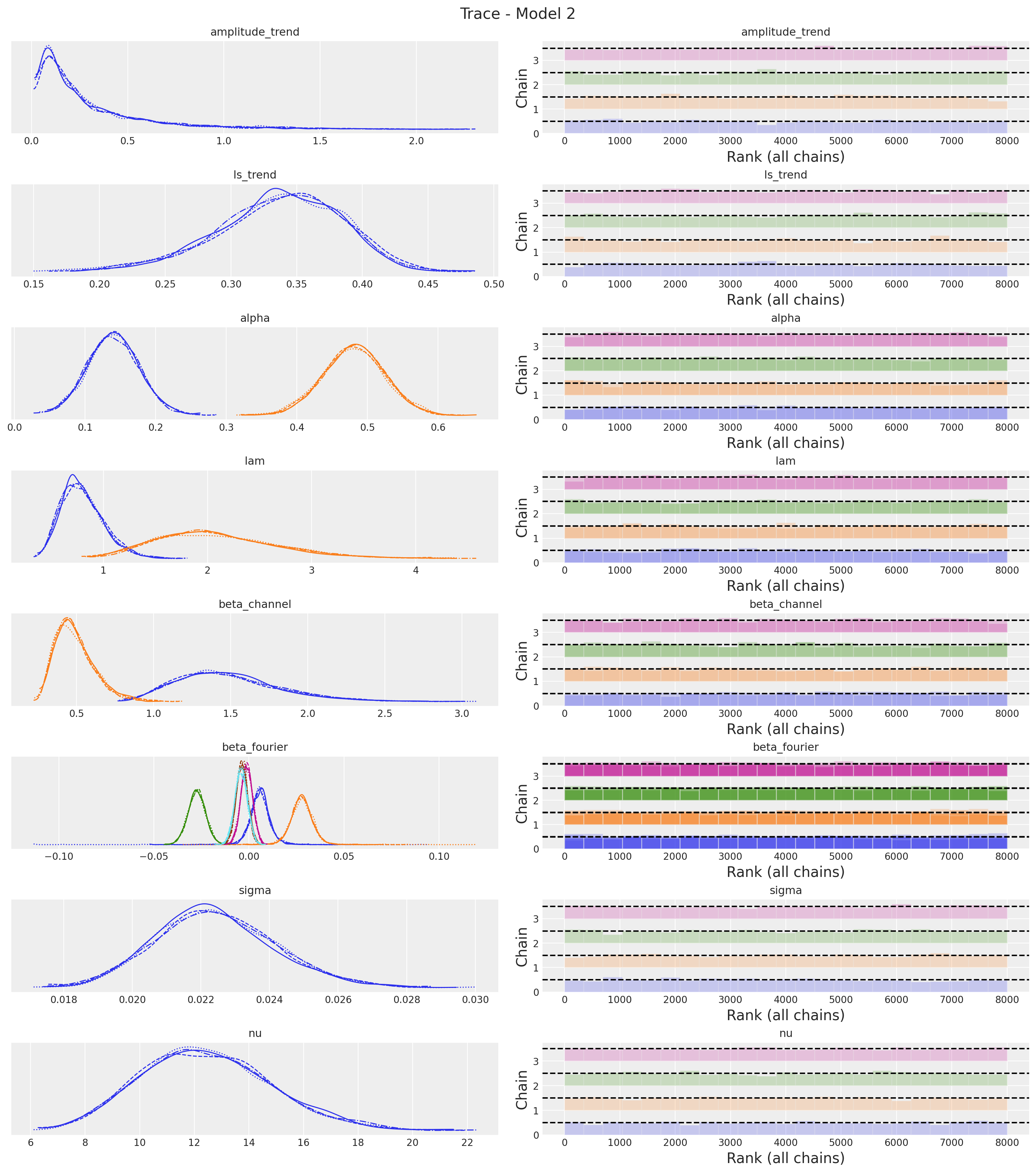
Overall, the trace looks fine. One big difference we immediately see is that the regression coefficient \(\beta_1\) of \(x_1\) increased significantly as compared to the previous model
Posterior Predictive Checks
We run the same analysis to visualize the model fit. As berore, we need to rescale the predictions back to the original scale.
pp_vars_original_scale_2 = {
    var_name: xr.apply_ufunc(
        target_scaler.inverse_transform,
        idata_2["posterior"][var_name].expand_dims(dim={"_": 1}, axis=-1),
        input_core_dims=[["date", "_"]],
        output_core_dims=[["date", "_"]],
        vectorize=True,
    ).squeeze(dim="_")
    for var_name in ["mu", "f_trend", "fourier_contribution"]
}

pp_vars_original_scale_2["channel_contributions"] = xr.apply_ufunc(
    target_scaler.inverse_transform,
    idata_2["posterior"]["channel_contributions"],
    input_core_dims=[["date", "channel"]],
    output_core_dims=[["date", "channel"]],
    vectorize=True,
)

pp_likelihood_original_scale_2 = xr.apply_ufunc(
    target_scaler.inverse_transform,
    posterior_predictive_2["posterior_predictive"]["y"].expand_dims(
        dim={"_": 1}, axis=-1
    ),
    input_core_dims=[["date", "_"]],
    output_core_dims=[["date", "_"]],
    vectorize=True,
).squeeze(dim="_")
fig, ax = plt.subplots()
sns.lineplot(data=model_df, x="date", y="y", color="black", label=target, ax=ax)
az.plot_hdi(
x=date,
y=pp_likelihood_original_scale_2,
hdi_prob=0.94,
color="C0",
fill_kwargs={"alpha": 0.1, "label": r"likelihood $94\%$ HDI"},
smooth=False,
ax=ax,
)
az.plot_hdi(
x=date,
y=pp_vars_original_scale_2["mu"],
hdi_prob=0.94,
color="C0",
fill_kwargs={"alpha": 0.3, "label": r"$\mu$ $94\%$ HDI"},
smooth=False,
ax=ax,
)
ax.legend(loc="upper left")
ax.set_title(label="Posterior Predictive - Model 2", fontsize=18, fontweight="bold")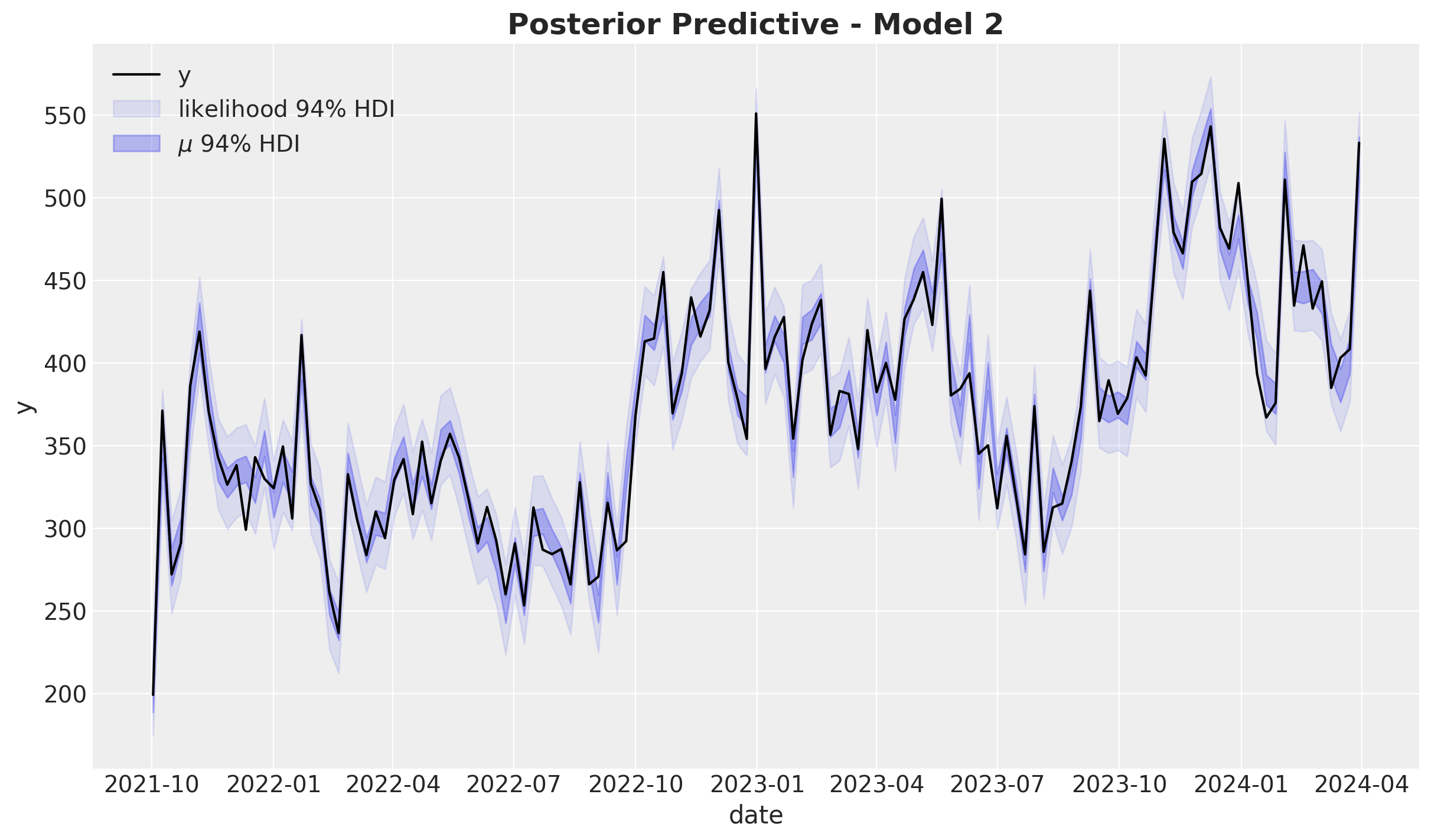
fig, ax = plt.subplots()
az.plot_ppc(
    data=posterior_predictive_2,
    num_pp_samples=1_000,
    observed_rug=True,
    random_seed=seed,
    ax=ax,
)
ax.set_title(label="Posterior Predictive - Model 2", fontsize=18, fontweight="bold")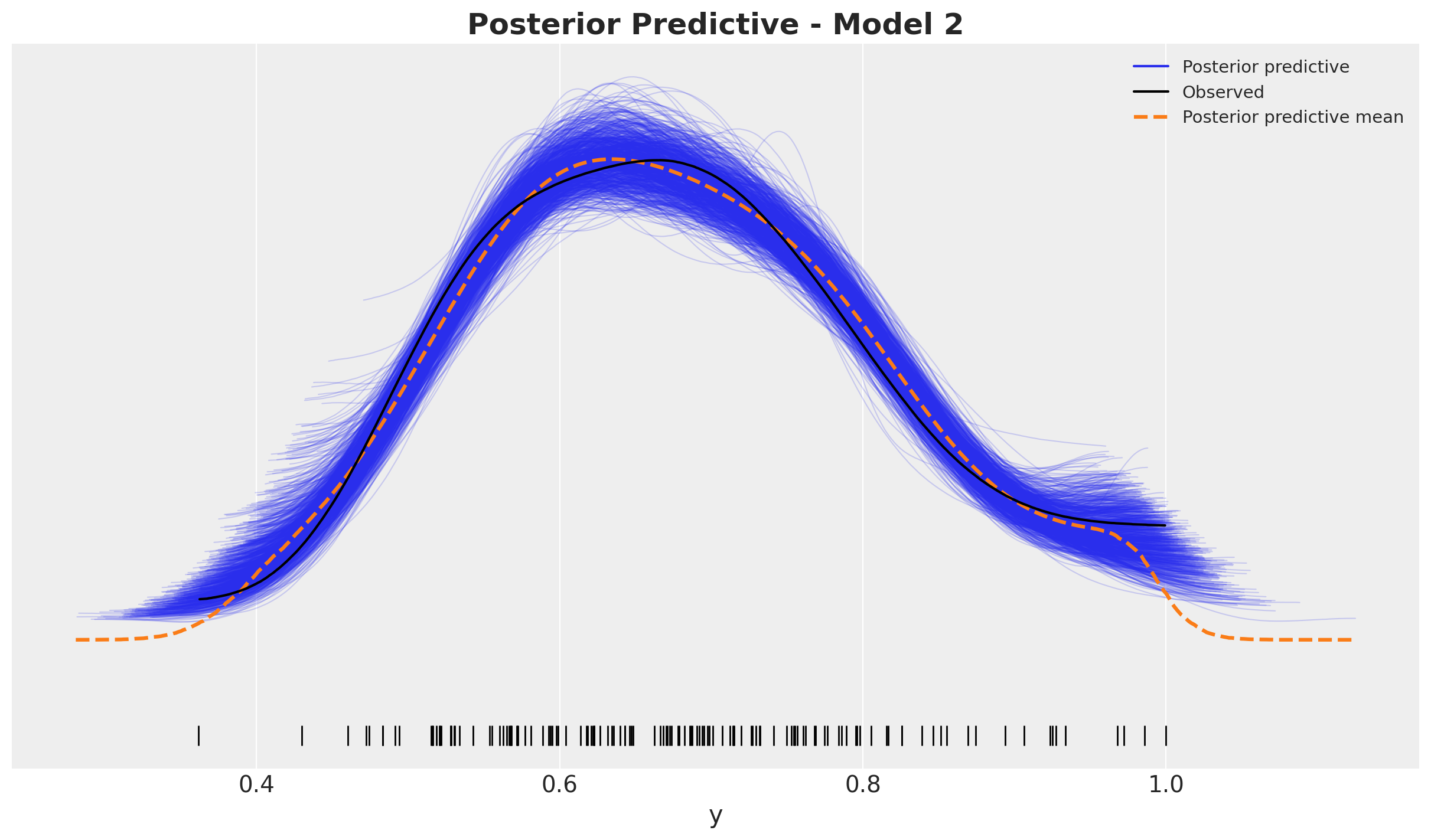
The models seem to have a comparable in-sample fit.
Model Components
Now we inspect the model components.
fig, ax = plt.subplots()
sns.lineplot(data=model_df, x="date", y="y", color="black", label=target, ax=ax)
az.plot_hdi(
    x=date,
    y=pp_vars_original_scale_2["channel_contributions"].sel(channel="x1"),
    hdi_prob=0.94,
    color="C0",
    fill_kwargs={"alpha": 0.5, "label": r"$x1$ contribution $94\%$ HDI"},
    smooth=False,
    ax=ax,
)
az.plot_hdi(
    x=date,
    y=pp_vars_original_scale_2["channel_contributions"].sel(channel="x2"),
    hdi_prob=0.94,
    color="C1",
    fill_kwargs={"alpha": 0.5, "label": r"$x2$ contribution $94\%$ HDI"},
    smooth=False,
    ax=ax,
)
az.plot_hdi(
    x=date,
    y=pp_vars_original_scale_2["f_trend"],
    hdi_prob=0.94,
    color="C2",
    fill_kwargs={"alpha": 0.3, "label": r"$f_\text{trend}$ $94\%$ HDI"},
    smooth=False,
    ax=ax,
)
az.plot_hdi(
    x=date,
    y=pp_vars_original_scale_2["fourier_contribution"],
    hdi_prob=0.94,
    color="C3",
    fill_kwargs={"alpha": 0.3, "label": r"seasonality $94\%$ HDI"},
    smooth=False,
    ax=ax,
)
ax.legend(loc="upper center", bbox_to_anchor=(0.5, -0.1), ncol=3)
ax.set_title(label="Components Contributions - Model 2", fontsize=18, fontweight="bold")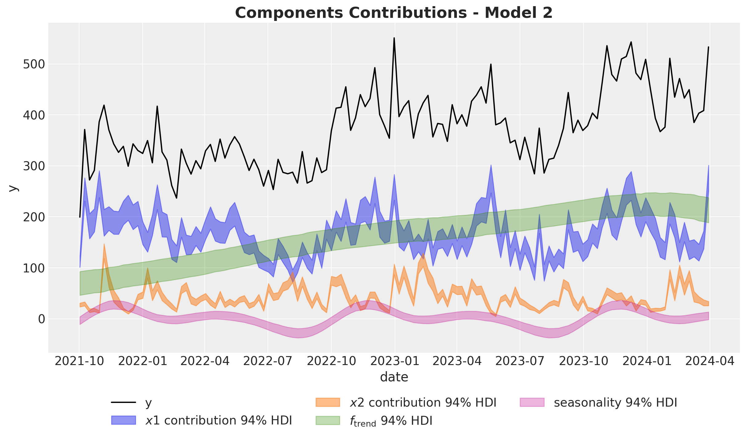
Here we clearly see that the model overestimates the effect of \(x_1\) by a lot! 🫠
Let’s compare against the true values for the media contributions:
fig, ax = plt.subplots(
    nrows=2, ncols=1, figsize=(12, 7), sharex=True, sharey=False, layout="constrained"
)
sns.lineplot(
    x="date",
    y="x1_effect",
    data=data_df.assign(x1_effect=lambda x: amplitude * x["x1_effect"]),
    color="C0",
    label=r"$x1$ effect",
    ax=ax[0],
)
az.plot_hdi(
    x=date,
    y=pp_vars_original_scale_2["channel_contributions"].sel(channel="x1"),
    hdi_prob=0.94,
    color="C0",
    fill_kwargs={"alpha": 0.3, "label": r"$x1$ contribution $94\%$ HDI"},
    smooth=False,
    ax=ax[0],
)
ax[0].legend(loc="upper right")

sns.lineplot(
    x="date",
    y="x2_effect",
    data=data_df.assign(x2_effect=lambda x: amplitude * x["x2_effect"]),
    color="C1",
    label=r"$x2$ effect",
    ax=ax[1],
)
az.plot_hdi(
    x=date,
    y=pp_vars_original_scale_2["channel_contributions"].sel(channel="x2"),
    hdi_prob=0.94,
    color="C1",
    fill_kwargs={"alpha": 0.3, "label": r"$x2$ contribution $94\%$ HDI"},
    smooth=False,
    ax=ax[1],
)
ax[1].legend(loc="upper right")

fig.suptitle("Channel Contributions - Model 2", fontsize=18, fontweight="bold")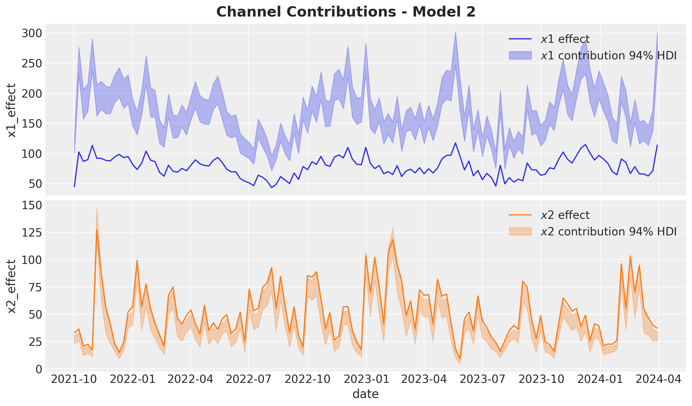
The overestimation of \(x_1\) is close to \(100\%\)! Note that the estimate of \(x_2\) is not that bad, but still underestimated.
Media Parameters
We now
alpha_posterior_2 = idata_2["posterior"]["alpha"]
lam_posterior_2 = idata_2["posterior"]["lam"] * channels_scaler.scale_
beta_channel_posterior_2 = idata_2["posterior"]["beta_channel"] * channels_scaler.scale_
fig, ax = plt.subplots(figsize=(10, 6))
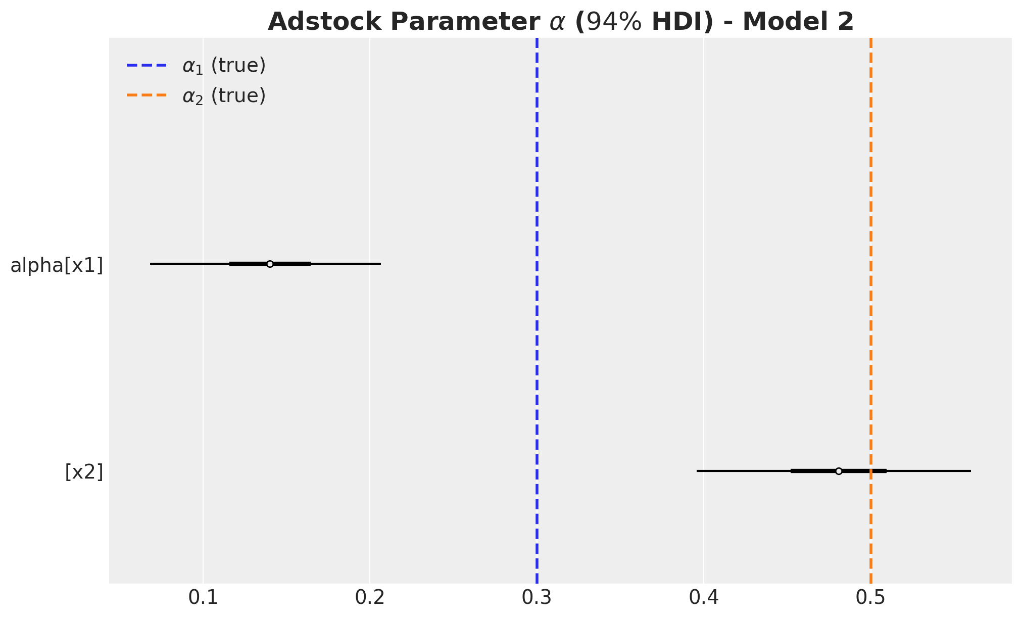
az.plot_forest(
data=[alpha_posterior_2], combined=True, hdi_prob=0.94, colors="black", ax=ax
)
ax.axvline(
x=alpha1, color="C0", linestyle="--", linewidth=2, label=r"$\alpha_1$ (true)"
)
ax.axvline(
x=alpha2, color="C1", linestyle="--", linewidth=2, label=r"$\alpha_2$ (true)"
)
ax.legend(loc="upper left")
ax.set_title(
label=r"Adstock Parameter $\alpha$ ($94\%$ HDI) - Model 2",
fontsize=18,
fontweight="bold",
)
fig, ax = plt.subplots(figsize=(10, 6))
az.plot_forest(
data=lam_posterior_2, combined=True, hdi_prob=0.94, colors="black", ax=ax
)
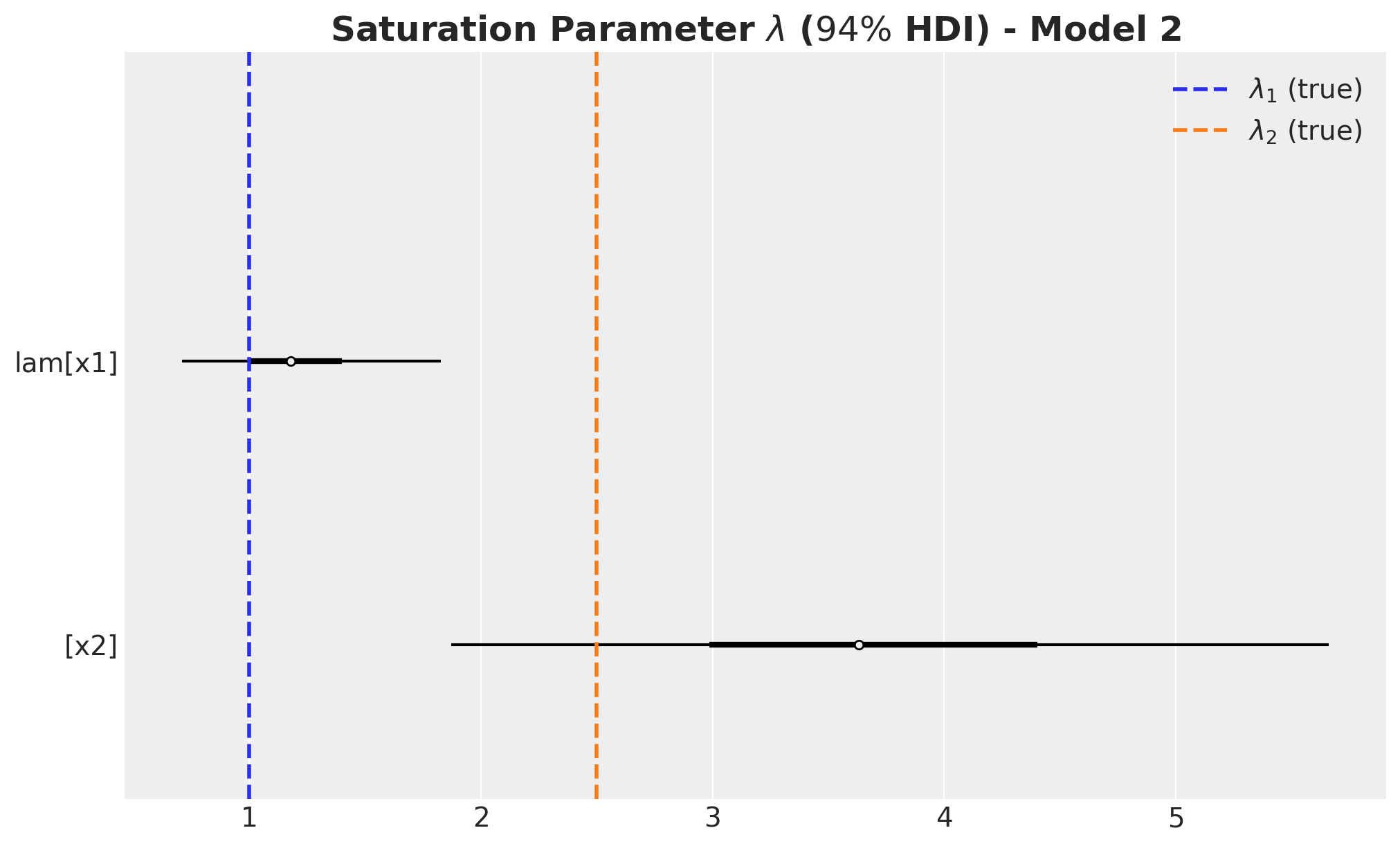
ax.axvline(x=lam1, color="C0", linestyle="--", linewidth=2, label=r"$\lambda_1$ (true)")
ax.axvline(x=lam2, color="C1", linestyle="--", linewidth=2, label=r"$\lambda_2$ (true)")
ax.legend(loc="upper right")
ax.set_title(
label=r"Saturation Parameter $\lambda$ ($94\%$ HDI) - Model 2",
fontsize=18,
fontweight="bold",
)
beta_channel_posterior_2 = (
    idata_2["posterior"]["beta_channel"]
    * (1 / channels_scaler.scale_)
    * (target_scaler.scale_)
    * (1 / amplitude)
)
fig, ax = plt.subplots(figsize=(10, 6))
az.plot_forest(
data=beta_channel_posterior_2, combined=True, hdi_prob=0.94, colors="black", ax=ax
)
ax.axvline(x=beta1, color="C0", linestyle="--", linewidth=2, label=r"$\beta_1$ (true)")
ax.axvline(x=beta2, color="C1", linestyle="--", linewidth=2, label=r"$\beta_2$ (true)")
ax.legend(loc="upper right")
ax.set_title(
label=r"Channel $\beta$ ($94\%$ HDI) - Model 1", fontsize=18, fontweight="bold"
)
The carryover parameter \(\alpha_1\) and the regression coefficient \(\beta_1\) for \(x_1\) are the ones that are most affected by the omitted variable bias. For \(x_2\) the model is able to recover the true values within the \(94\%\) HDI.
ROAS Estimation
We now compute the ROAS as before. We start with the global ROAS:
predictions_roas_data_all_2 = {"x1": {}, "x2": {}}

for channel in tqdm(["x1", "x2"]):
    with model_2:
        pm.set_data(
            new_data={
                "channels_scaled": channels_scaler.transform(
                    data_df[channels].assign(**{channel: 0})
                )
            }
        )
        predictions_roas_data_all_2[channel] = pm.sample_posterior_predictive(
            trace=idata_2, var_names=["y", "mu"], progressbar=False, random_seed=rng
        )
predictions_roas_data_scaled_diff_all_2 = {"x1": {}, "x2": {}}
for channel in ["x1", "x2"]:
predictions_roas_data_scaled_diff_all_2[channel] = pp_vars_original_scale_2[
"mu"
] - xr.apply_ufunc(
target_scaler.inverse_transform,
predictions_roas_data_all_2[channel]["posterior_predictive"]["mu"].expand_dims(
dim={"_": 1}, axis=-1
),
input_core_dims=[["date", "_"]],
output_core_dims=[["date", "_"]],
vectorize=True,
).squeeze(
dim="_"
)fig, ax = plt.subplots(
nrows=2, ncols=1, figsize=(12, 7), sharex=True, sharey=False, layout="constrained"
)
az.plot_hdi(
x=date,
y=predictions_roas_data_scaled_diff_all_2["x1"],
color="C0",
smooth=False,
fill_kwargs={"alpha": 0.3, "label": r"$E(y - y_{01})$ $94\%$ HDI"},
ax=ax[0],
)
sns.lineplot(
data=data_df.assign(x1_effect=lambda x: amplitude * x["x1_effect"]),
x="date",
y="x1_effect",
color="C0",
label=r"$x1$ effect",
ax=ax[0],
)
az.plot_hdi(
x=date,
y=predictions_roas_data_scaled_diff_all_2["x2"],
color="C1",
smooth=False,
fill_kwargs={"alpha": 0.3, "label": r"$E(y - y_{02})$ $94\%$ HDI"},
ax=ax[1],
)
sns.lineplot(
data=data_df.assign(x2_effect=lambda x: amplitude * x["x2_effect"]),
x="date",
y="x2_effect",
color="C1",
label=r"$x2$ effect",
ax=ax[1],
)
ax[0].legend(loc="upper left")
ax[1].legend(loc="upper left")
ax[0].set(ylabel=None)
ax[1].set(ylabel=None)
fig.suptitle("Potential Outcomes Difference - Model 2", fontsize=18, fontweight="bold")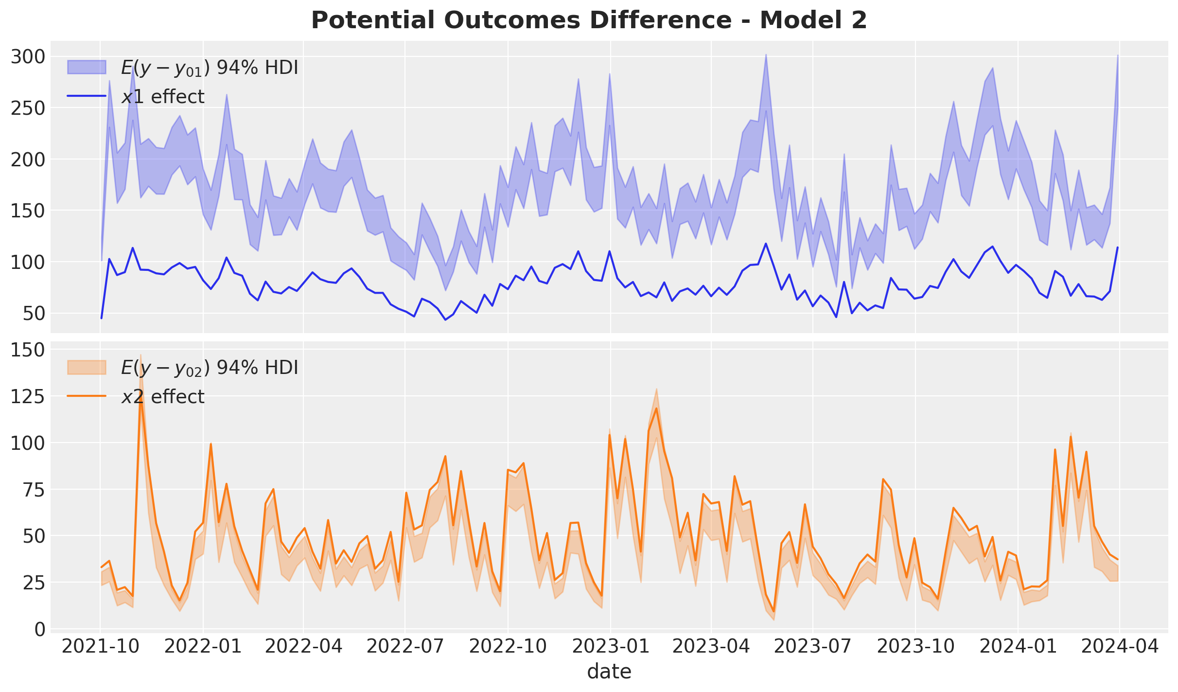
predictions_roas_all_2 = {"x1": {}, "x2": {}}

for channel in ["x1", "x2"]:
    predictions_roas_all_2[channel] = (
        predictions_roas_data_scaled_diff_all_2[channel].sum(dim="date")
        / data_df[channel].sum()
    )
fig, ax = plt.subplots(
nrows=2, ncols=1, figsize=(12, 7), sharex=True, sharey=False, layout="constrained"
)
az.plot_posterior(predictions_roas_all_2["x1"], ref_val=roas_all_1, ax=ax[0])
ax[0].set(title="x1")
az.plot_posterior(predictions_roas_all_2["x2"], ref_val=roas_all_2, ax=ax[1])
ax[1].set(title="x2", xlabel="ROAS")
fig.suptitle("Global ROAS - Model 2", fontsize=18, fontweight="bold")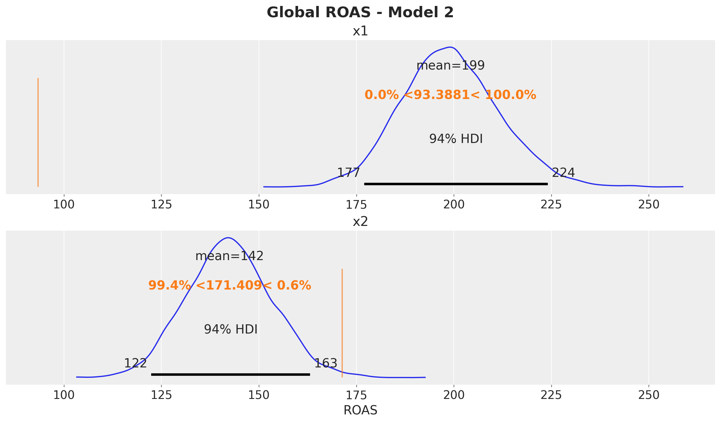
The ROAS overestimation of \(x_1\) is massive! It is of the order of \(100\%\). For \(x_2\) the estimated global is less than the true value (but less dramatic than \(x_1\)).
We now compute the quarterly ROAS as before.
predictions_roas_data_2 = {"x1": {}, "x2": {}}

for channel in tqdm(["x1", "x2"]):
    for q in tqdm(roas_data[channel].keys()):
        with model_2:
            pm.set_data(
                new_data={
                    "channels_scaled": channels_scaler.transform(
                        roas_data[channel][q][channels]
                    )
                }
            )
            predictions_roas_data_2[channel][q] = pm.sample_posterior_predictive(
                trace=idata_2, var_names=["y", "mu"], progressbar=False, random_seed=rng
            )
predictions_roas_data_scaled_diff_2 = {"x1": {}, "x2": {}}
for channel in ["x1", "x2"]:
predictions_roas_data_scaled_diff_2[channel] = {
q: pp_vars_original_scale_2["mu"]
- xr.apply_ufunc(
target_scaler.inverse_transform,
idata_q["posterior_predictive"]["mu"].expand_dims(dim={"_": 1}, axis=-1),
input_core_dims=[["date", "_"]],
output_core_dims=[["date", "_"]],
vectorize=True,
).squeeze(dim="_")
for q, idata_q in tqdm(predictions_roas_data_2[channel].items())
}predictions_roas_2 = {"x1": {}, "x2": {}}
for channel in ["x1", "x2"]:
predictions_roas_2[channel] = {
q: idata_q.sum(dim="date") / data_df.query("quarter == @q")[channel].sum()
for q, idata_q in predictions_roas_data_scaled_diff_2[channel].items()
}axes = az.plot_posterior(
data=xr.concat(
predictions_roas_2["x1"].values(),
dim=pd.Index(data=predictions_roas_2["x1"].keys(), name="quarter"),
),
figsize=(18, 15),
grid=(5, 2),
ref_val={"mu": x1_ref_vals},
backend_kwargs={"sharex": True, "layout": "constrained"},
)
fig = axes.ravel()[0].get_figure()
fig.suptitle(
t="Posterior Predictive - ROAS x1 - Model 2", fontsize=18, fontweight="bold"
)
axes = az.plot_posterior(
    data=xr.concat(
        predictions_roas_2["x2"].values(),
        dim=pd.Index(data=predictions_roas_2["x2"].keys(), name="quarter"),
    ),
    figsize=(18, 15),
    grid=(5, 2),
    ref_val={"mu": x2_ref_vals},
    backend_kwargs={"sharex": True, "layout": "constrained"},
)
fig = axes.ravel()[0].get_figure()
fig.suptitle(
    t="Posterior Predictive - ROAS x2 - Model 2", fontsize=18, fontweight="bold"
)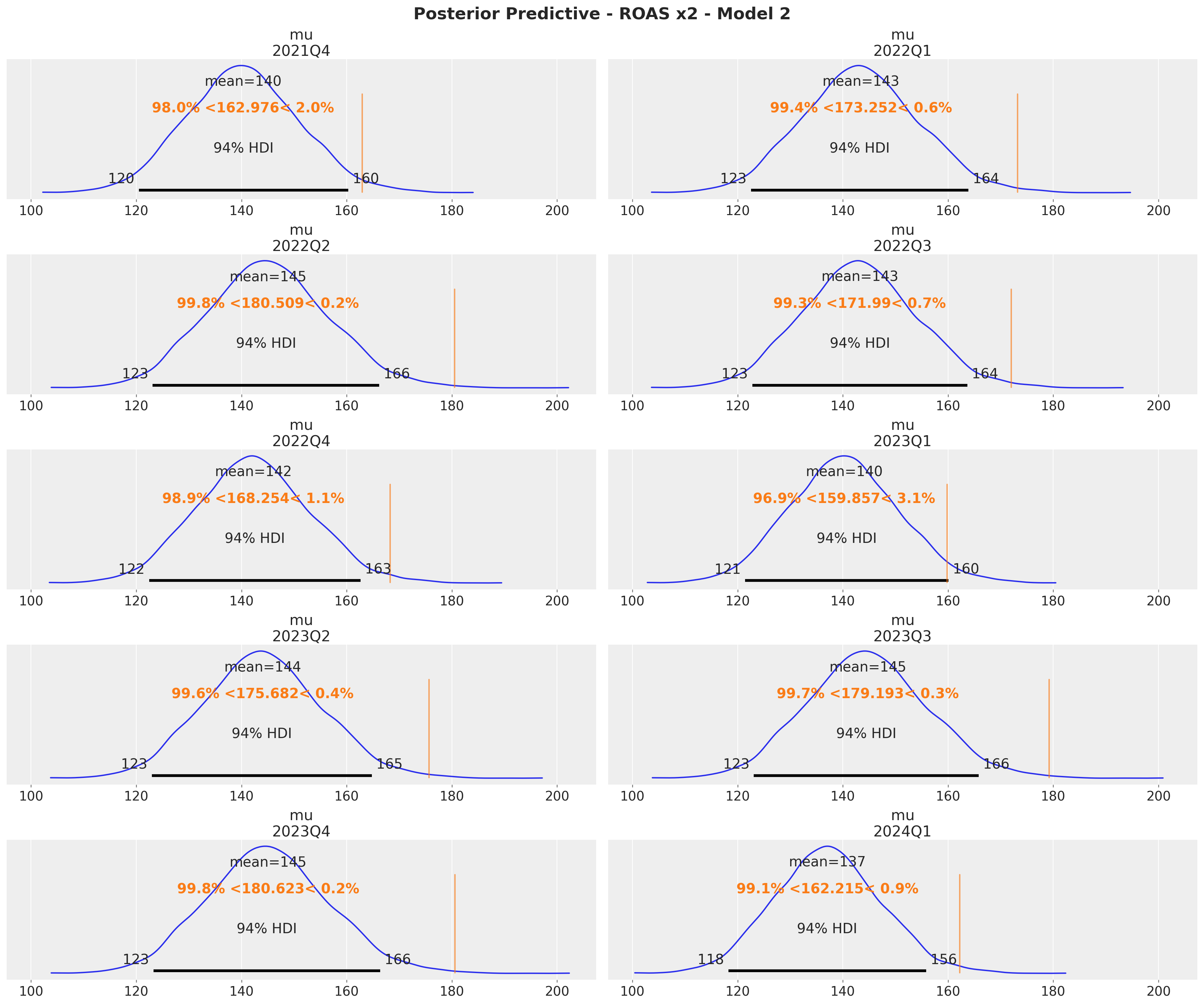
The quarterly ROAS present the same pattern as the global ROAS. The model overestimates the ROAS for \(x_1\) heavily!
Model 3: ROAS Calibration
In this third model we use the parametrization presented in the paper “Media Mix Model Calibration With Bayesian Priors”, by Zhang, et al.. Here is the description from the paper:
Remark: In the paper they use a Hill saturation function instead of a logistic one. This is not important for the method. It works in both cases.
We show that by adding ROAS estimations (e.g. coming from previous experiments or domain knowledge) as priors we are able to mitigate a significant amount of the omitted variable bias.
We start with the estimation of the ROAS in the original scale. We set them so that they are close to the true values (i.e. assuming the experiment worked). In order to include them into the model we need to scale them (as always, the devil is in the details).
roas_x1_bar = 95
roas_x2_bar = 170

roas_x1_bar_scaled = roas_x1_bar / target_scaler.scale_.item()
roas_x2_bar_scaled = roas_x2_bar / target_scaler.scale_.item()

roas_bar_scaled = np.array([roas_x1_bar_scaled, roas_x2_bar_scaled])
For the prior distribution we choose a distribution which is centered at the (scaled) ROAS and has a standard deviation approximately equal to the uncertainty error of the estimation. We can use a log-normal distribution to ensure the ROAS values are positive.
error = 30
error_scaled = error / target_scaler.scale_.item()

fig, ax = plt.subplots(figsize=(10, 6))
pz.LogNormal(mu=np.log(roas_x1_bar_scaled), sigma=error_scaled).plot_pdf(
    color="C0", ax=ax
)
ax.axvline(x=roas_x1_bar_scaled, color="C0", linestyle="--", linewidth=2)
pz.LogNormal(mu=np.log(roas_x2_bar_scaled), sigma=error_scaled).plot_pdf(
    color="C1", ax=ax
)
ax.axvline(x=roas_x2_bar_scaled, color="C1", linestyle="--", linewidth=2)
ax.set(xlabel="ROAS (scaled)")
ax.set_title(label=r"Prior Distribution ROAS", fontsize=18, fontweight="bold")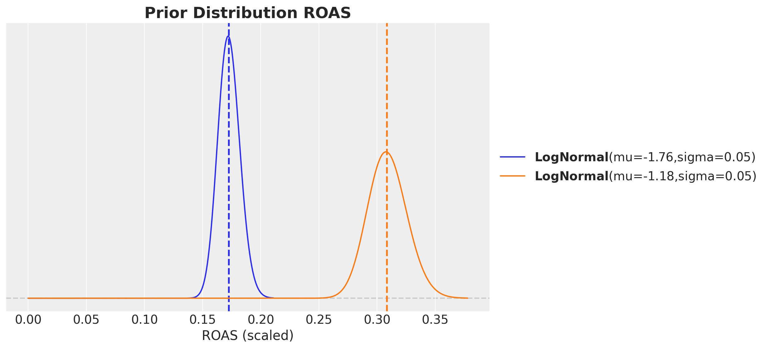
Model Specification
In the following model we set priors on the ROAS instead of the regression coefficients.
eps = np.finfo(float).eps


with pm.Model(coords=coords) as model_3:
    # --- Data Containers ---

    index_scaled_data = pm.Data(
        name="index_scaled",
        value=index_scaled.to_numpy().flatten(),
        mutable=True,
        dims="date",
    )

    channels_scaled_data = pm.Data(
        name="channels_scaled",
        value=channels_scaled,
        mutable=True,
        dims=("date", "channel"),
    )

    channels_cost_data = pm.Data(
        name="channels_cost",
        value=data_df[channels].to_numpy(),
        mutable=True,
        dims=("date", "channel"),
    )

    fourier_features_data = pm.Data(
        name="fourier_features",
        value=fourier_features,
        mutable=True,
        dims=("date", "fourier_mode"),
    )

    y_scaled_data = pm.Data(
        name="y_scaled",
        value=target_scaled.to_numpy().flatten(),
        mutable=True,
        dims="date",
    )

    # --- Priors ---

    amplitude_trend = pm.HalfNormal(name="amplitude_trend", sigma=1)
    ls_trend_params = pm.find_constrained_prior(
        distribution=pm.InverseGamma,
        lower=0.1,
        upper=0.9,
        init_guess={"alpha": 3, "beta": 1},
        mass=0.95,
    )
    ls_trend = pm.InverseGamma(name="ls_trend", **ls_trend_params)

    alpha = pm.Beta(name="alpha", alpha=2, beta=3, dims="channel")
    lam = pm.Gamma(name="lam", alpha=2, beta=2, dims="channel")
    roas = pm.LogNormal(
        name="roas",
        mu=np.log(roas_bar_scaled),
        sigma=error_scaled,
        dims="channel",
    )
    beta_fourier = pm.Normal(name="beta_fourier", mu=0, sigma=1, dims="fourier_mode")

    sigma = pm.HalfNormal(name="sigma", sigma=1)
    nu = pm.Gamma(name="nu", alpha=25, beta=2)

    # --- Parametrization ---

    cov_trend = amplitude_trend * pm.gp.cov.ExpQuad(input_dim=1, ls=ls_trend)
    gp_trend = pm.gp.HSGP(m=[20], c=1.5, cov_func=cov_trend)
    f_trend = gp_trend.prior(name="f_trend", X=index_scaled_data[:, None], dims="date")

    channel_adstock = pm.Deterministic(
        name="channel_adstock",
        var=geometric_adstock(
            x=channels_scaled_data,
            alpha=alpha,
            l_max=l_max,
            normalize=True,
        ),
        dims=("date", "channel"),
    )
    channel_adstock_saturated = pm.Deterministic(
        name="channel_adstock_saturated",
        var=logistic_saturation(x=channel_adstock, lam=lam),
        dims=("date", "channel"),
    )
    beta_channel = pm.Deterministic(
        name="beta_channel",
        var=(channels_cost_data.sum(axis=0) * roas)
        / (channel_adstock_saturated.sum(axis=0) + eps),
        dims="channel",
    )
    channel_contributions = pm.Deterministic(
        name="channel_contributions",
        var=channel_adstock_saturated * beta_channel,
        dims=("date", "channel"),
    )

    fourier_contribution = pm.Deterministic(
        name="fourier_contribution",
        var=pt.dot(fourier_features_data, beta_fourier),
        dims="date",
    )

    mu = pm.Deterministic(
        name="mu",
        var=f_trend + channel_contributions.sum(axis=-1) + fourier_contribution,
        dims="date",
    )

    # --- Likelihood ---
    y = pm.StudentT(
        name="y",
        nu=nu,
        mu=mu,
        sigma=sigma,
        observed=y_scaled_data,
        dims="date",
    )

pm.model_to_graphviz(model=model_3)
Remark: The channels_cost_data has the cost of each channel without any scaling. Note that you could use impressions to model the contribution of each channel (channels_scaled_data). This method is agnostic to the type of data you use.
Prior Predictive Checks
Let’s see how this parametrization changes the prior predictive distribution:
with model_3:
    prior_predictive_3 = pm.sample_prior_predictive(samples=2_000, random_seed=rng)
fig, ax = plt.subplots()
az.plot_ppc(data=prior_predictive_3, group="prior", kind="kde", ax=ax)
ax.set_title(label="Prior Predictive - Model 3", fontsize=18, fontweight="bold")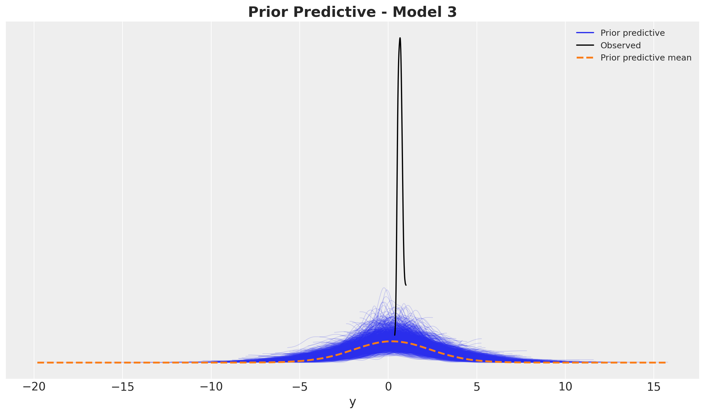
It actually looks very similar to the first model.
Model Fitting
We now fit the model.
with model_3:
    idata_3 = pm.sample(
        target_accept=0.9,
        draws=2_000,
        chains=4,
        nuts_sampler="numpyro",
        random_seed=rng,
    )
    posterior_predictive_3 = pm.sample_posterior_predictive(
        trace=idata_3, random_seed=rng
    )
The sampling time is comparable with the models above.
Model Diagnostics
We now take a look into the results.
idata_3["sample_stats"]["diverging"].sum().item()\(\displaystyle 0\)
var_names = [
    "amplitude_trend",
    "ls_trend",
    "alpha",
    "lam",
    "roas",
    "beta_channel",
    "beta_fourier",
    "sigma",
    "nu",
]

az.summary(data=idata_3, var_names=var_names, round_to=3)| mean | sd | hdi_3% | hdi_97% | mcse_mean | mcse_sd | ess_bulk | ess_tail | r_hat | |
|---|---|---|---|---|---|---|---|---|---|
| amplitude_trend | 0.390 | 0.354 | 0.026 | 1.066 | 0.008 | 0.005 | 1577.531 | 2360.063 | 1.002 |
| ls_trend | 0.328 | 0.047 | 0.235 | 0.410 | 0.001 | 0.001 | 1510.604 | 1477.460 | 1.003 |
| alpha[x1] | 0.035 | 0.022 | 0.002 | 0.074 | 0.000 | 0.000 | 8148.597 | 4067.383 | 1.000 |
| alpha[x2] | 0.527 | 0.041 | 0.452 | 0.603 | 0.000 | 0.000 | 8590.509 | 6258.338 | 1.000 |
| lam[x1] | 0.288 | 0.160 | 0.020 | 0.569 | 0.002 | 0.001 | 7728.718 | 3689.815 | 1.001 |
| lam[x2] | 1.362 | 0.880 | 0.073 | 2.986 | 0.010 | 0.007 | 6400.545 | 4857.139 | 1.000 |
| roas[x1] | 0.217 | 0.012 | 0.194 | 0.239 | 0.000 | 0.000 | 7185.918 | 6334.511 | 1.000 |
| roas[x2] | 0.294 | 0.013 | 0.269 | 0.319 | 0.000 | 0.000 | 9086.750 | 5634.668 | 1.000 |
| beta_channel[x1] | 3.640 | 4.206 | 0.713 | 8.634 | 0.071 | 0.050 | 7509.496 | 3694.108 | 1.001 |
| beta_channel[x2] | 1.600 | 7.306 | 0.256 | 3.892 | 0.131 | 0.093 | 6502.806 | 4805.879 | 1.000 |
| beta_fourier[0] | 0.008 | 0.008 | -0.009 | 0.020 | 0.000 | 0.000 | 2930.040 | 1823.914 | 1.002 |
| beta_fourier[1] | 0.042 | 0.008 | 0.029 | 0.055 | 0.000 | 0.000 | 3880.937 | 2236.211 | 1.000 |
| beta_fourier[2] | -0.051 | 0.004 | -0.059 | -0.043 | 0.000 | 0.000 | 9493.599 | 6236.470 | 1.001 |
| beta_fourier[3] | -0.002 | 0.004 | -0.009 | 0.005 | 0.000 | 0.000 | 17322.683 | 5873.648 | 1.000 |
| beta_fourier[4] | -0.003 | 0.004 | -0.010 | 0.004 | 0.000 | 0.000 | 16458.519 | 5724.276 | 1.000 |
| beta_fourier[5] | 0.002 | 0.004 | -0.005 | 0.009 | 0.000 | 0.000 | 14683.029 | 5765.216 | 1.001 |
| sigma | 0.027 | 0.002 | 0.023 | 0.031 | 0.000 | 0.000 | 7344.703 | 5838.703 | 1.000 |
| nu | 12.098 | 2.441 | 7.685 | 16.658 | 0.025 | 0.018 | 9119.262 | 4900.607 | 1.001 |
axes = az.plot_trace(
    data=idata_3,
    var_names=var_names,
    compact=True,
    backend_kwargs={"figsize": (15, 17), "layout": "constrained"},
)
plt.gcf().suptitle("Trace - Model 3", fontsize=16)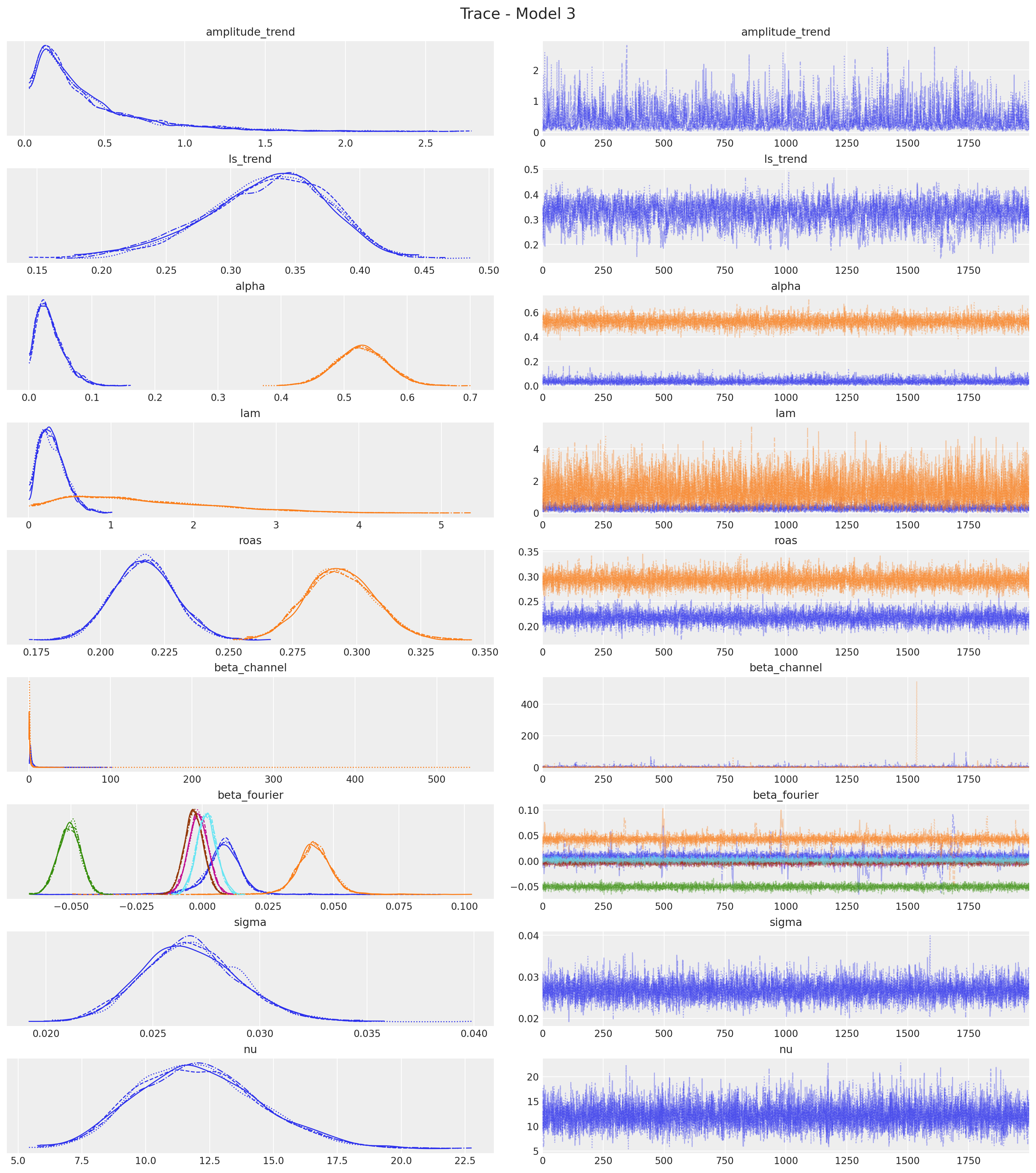
Everything looks in order. Note that the ROAS posterior distribution is very close to the prior.
Posterior Predictive Checks
We now evaluate the model fit.
pp_vars_original_scale_3 = {
    var_name: xr.apply_ufunc(
        target_scaler.inverse_transform,
        idata_3["posterior"][var_name].expand_dims(dim={"_": 1}, axis=-1),
        input_core_dims=[["date", "_"]],
        output_core_dims=[["date", "_"]],
        vectorize=True,
    ).squeeze(dim="_")
    for var_name in ["mu", "f_trend", "fourier_contribution"]
}
pp_vars_original_scale_3["channel_contributions"] = xr.apply_ufunc(
target_scaler.inverse_transform,
idata_3["posterior"]["channel_contributions"],
input_core_dims=[["date", "channel"]],
output_core_dims=[["date", "channel"]],
vectorize=True,
)
pp_vars_original_scale_3["baseline"] = xr.apply_ufunc(
target_scaler.inverse_transform,
(
idata_3["posterior"]["f_trend"] + idata_3["posterior"]["fourier_contribution"]
).expand_dims(dim={"_": 1}, axis=-1),
input_core_dims=[["date", "_"]],
output_core_dims=[["date", "_"]],
vectorize=True,
).squeeze(dim="_")pp_likelihood_original_scale_3 = xr.apply_ufunc(
target_scaler.inverse_transform,
posterior_predictive_3["posterior_predictive"]["y"].expand_dims(
dim={"_": 1}, axis=-1
),
input_core_dims=[["date", "_"]],
output_core_dims=[["date", "_"]],
vectorize=True,
).squeeze(dim="_")fig, ax = plt.subplots()
sns.lineplot(data=model_df, x="date", y="y", color="black", label=target, ax=ax)
az.plot_hdi(
x=date,
y=pp_likelihood_original_scale_3,
hdi_prob=0.94,
color="C0",
fill_kwargs={"alpha": 0.1, "label": r"likelihood $94\%$ HDI"},
smooth=False,
ax=ax,
)
az.plot_hdi(
x=date,
y=pp_vars_original_scale_3["mu"],
hdi_prob=0.94,
color="C0",
fill_kwargs={"alpha": 0.3, "label": r"$\mu$ $94\%$ HDI"},
smooth=False,
ax=ax,
)
ax.legend(loc="upper left")
ax.set_title(label="Posterior Predictive - Model 3", fontsize=18, fontweight="bold")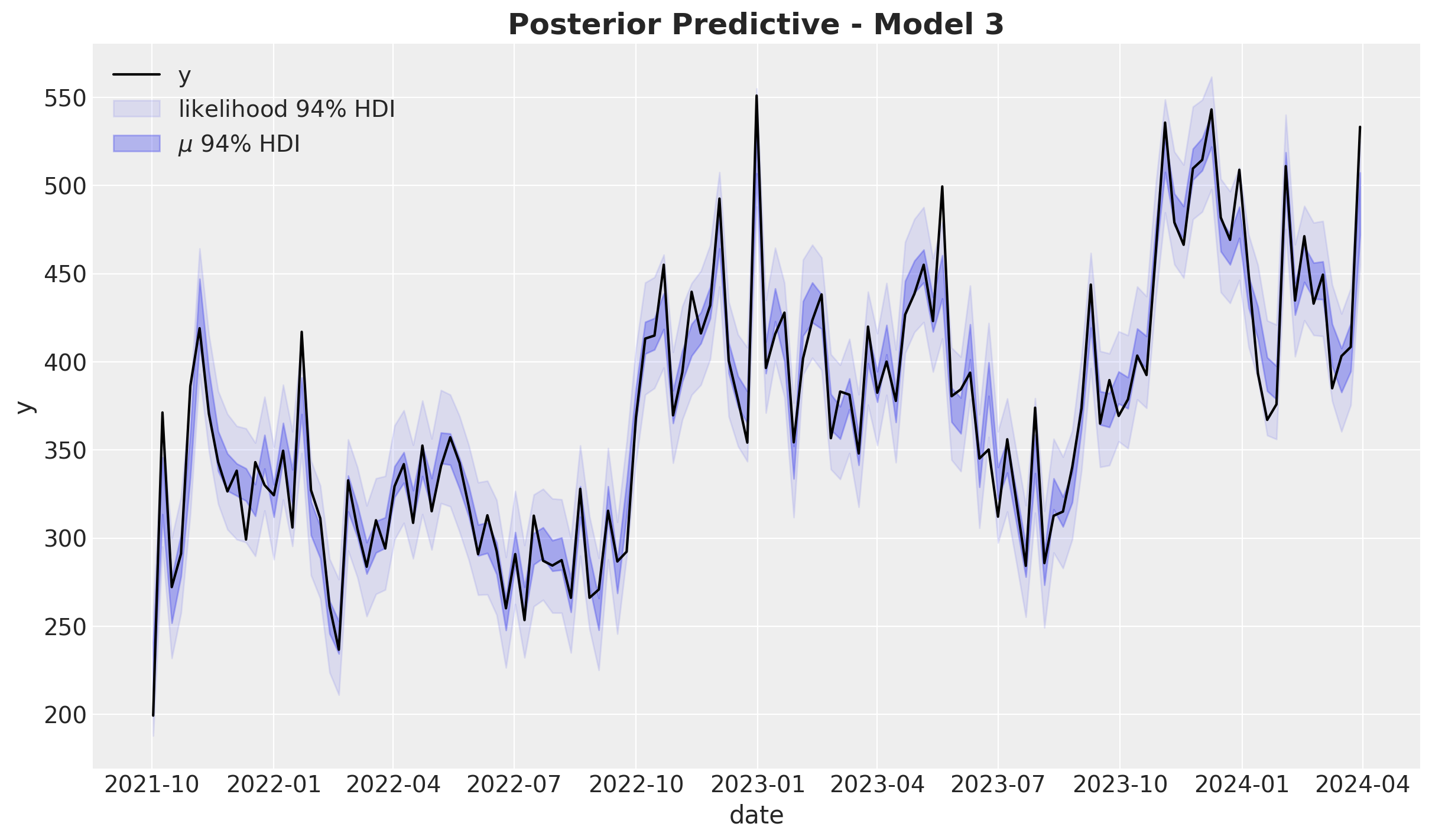
fig, ax = plt.subplots()
az.plot_ppc(
    data=posterior_predictive_3,
    num_pp_samples=1_000,
    observed_rug=True,
    random_seed=seed,
    ax=ax,
)
ax.set_title(label="Posterior Predictive - Model 3", fontsize=18, fontweight="bold")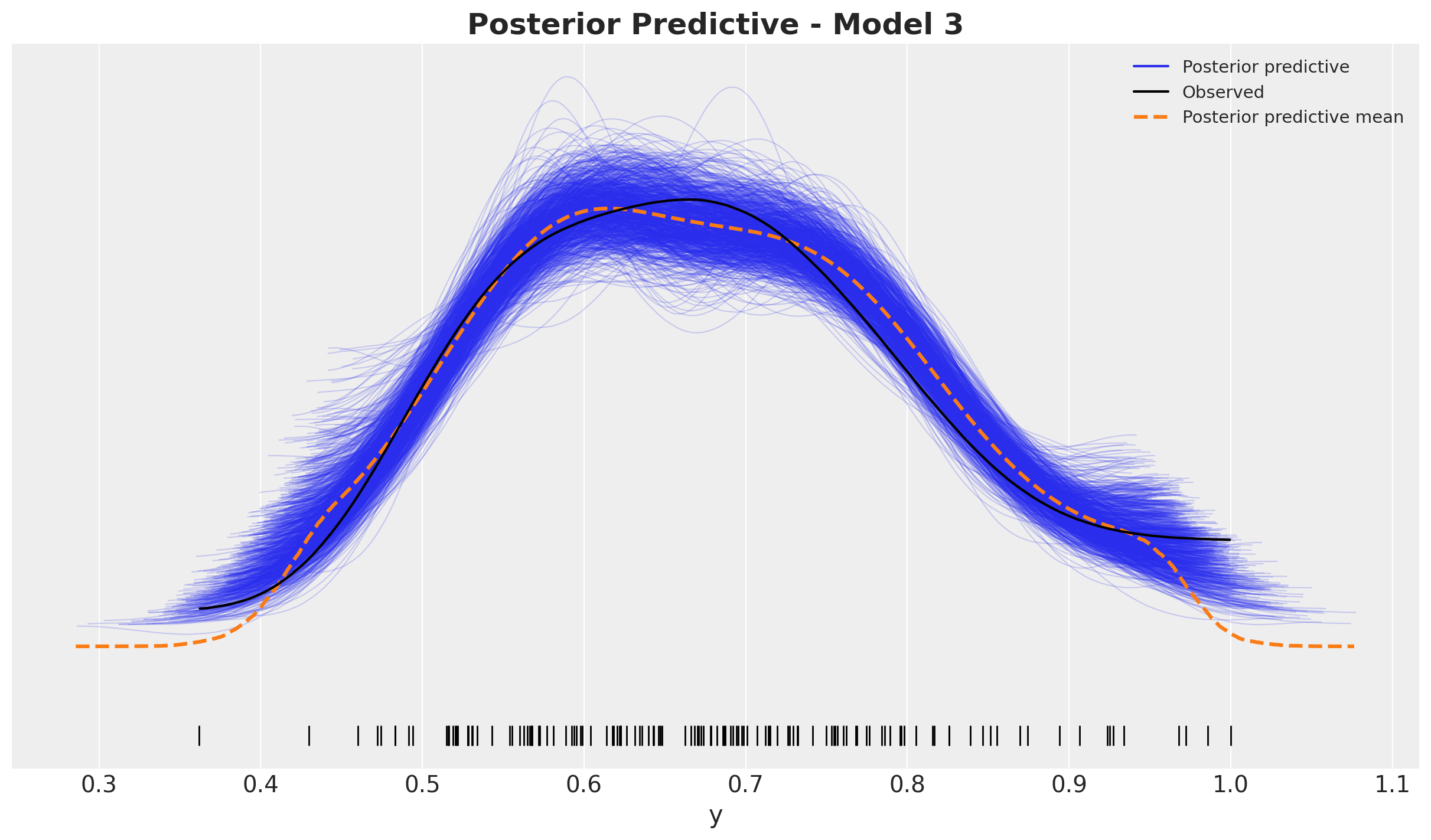
The posterior predictive distribution looks worse than the previous models.
Model Components
We now plot the model components.
fig, ax = plt.subplots()
sns.lineplot(data=model_df, x="date", y="y", color="black", label=target, ax=ax)
az.plot_hdi(
    x=date,
    y=pp_vars_original_scale_3["channel_contributions"].sel(channel="x1"),
    hdi_prob=0.94,
    color="C0",
    fill_kwargs={"alpha": 0.5, "label": r"$x1$ contribution $94\%$ HDI"},
    smooth=False,
    ax=ax,
)
az.plot_hdi(
    x=date,
    y=pp_vars_original_scale_3["channel_contributions"].sel(channel="x2"),
    hdi_prob=0.94,
    color="C1",
    fill_kwargs={"alpha": 0.5, "label": r"$x2$ contribution $94\%$ HDI"},
    smooth=False,
    ax=ax,
)
az.plot_hdi(
    x=date,
    y=pp_vars_original_scale_3["f_trend"],
    hdi_prob=0.94,
    color="C2",
    fill_kwargs={"alpha": 0.3, "label": r"$f_\text{trend}$ $94\%$ HDI"},
    smooth=False,
    ax=ax,
)
az.plot_hdi(
    x=date,
    y=pp_vars_original_scale_3["fourier_contribution"],
    hdi_prob=0.94,
    color="C3",
    fill_kwargs={"alpha": 0.3, "label": r"seasonality $94\%$ HDI"},
    smooth=False,
    ax=ax,
)
ax.legend(loc="upper center", bbox_to_anchor=(0.5, -0.1), ncol=3)
ax.set_title(label="Components Contributions - Model 3", fontsize=18, fontweight="bold")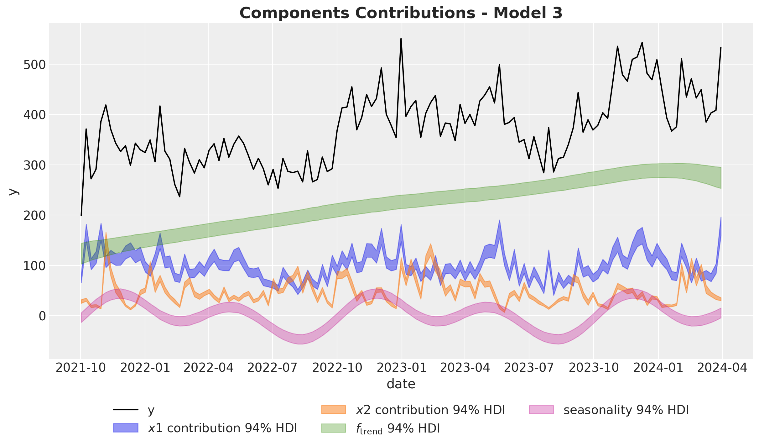
Observe that the \(94\%\) HDI for both channels is much narrower than the previous models. This is because we are constraining the values through the ROAS tight priors.
Let’s compare now the media contributions against the true values:
fig, ax = plt.subplots(
    nrows=2, ncols=1, figsize=(12, 7), sharex=True, sharey=False, layout="constrained"
)
sns.lineplot(
    x="date",
    y="x1_effect",
    data=data_df.assign(x1_effect=lambda x: amplitude * x["x1_effect"]),
    color="C0",
    label=r"$x1$ effect",
    ax=ax[0],
)
az.plot_hdi(
    x=date,
    y=pp_vars_original_scale_3["channel_contributions"].sel(channel="x1"),
    hdi_prob=0.94,
    color="C0",
    fill_kwargs={"alpha": 0.3, "label": r"$x1$ contribution $94\%$ HDI"},
    smooth=False,
    ax=ax[0],
)
ax[0].legend(loc="upper right")

sns.lineplot(
    x="date",
    y="x2_effect",
    data=data_df.assign(x2_effect=lambda x: amplitude * x["x2_effect"]),
    color="C1",
    label=r"$x2$ effect",
    ax=ax[1],
)
az.plot_hdi(
    x=date,
    y=pp_vars_original_scale_3["channel_contributions"].sel(channel="x2"),
    hdi_prob=0.94,
    color="C1",
    fill_kwargs={"alpha": 0.3, "label": r"$x2$ contribution $94\%$ HDI"},
    smooth=False,
    ax=ax[1],
)
ax[1].legend(loc="upper right")

fig.suptitle("Channel Contributions - Model 3", fontsize=18, fontweight="bold")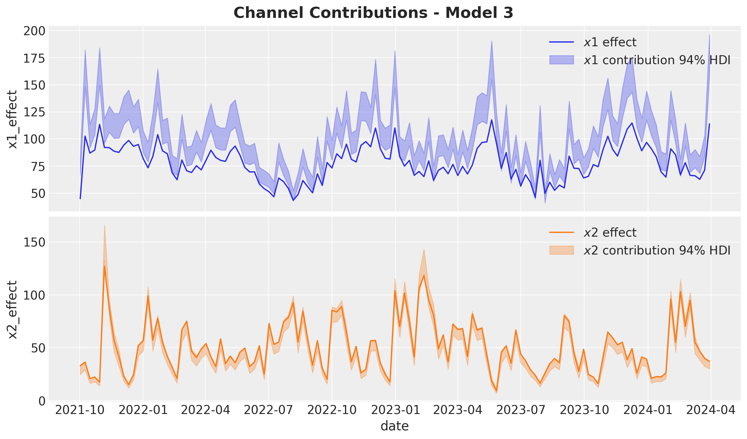
The result for both channels is much better than the previous models *remember we do not have \(z\) in the model).
Media Parameters
alpha_posterior_3 = idata_3["posterior"]["alpha"]
lam_posterior_3 = idata_3["posterior"]["lam"] * channels_scaler.scale_
beta_channel_posterior_3 = idata_3["posterior"]["beta_channel"] * channels_scaler.scale_
fig, ax = plt.subplots(figsize=(10, 6))
az.plot_forest(
data=alpha_posterior_3, combined=True, hdi_prob=0.94, colors="black", ax=ax
)
ax.axvline(
x=alpha1, color="C0", linestyle="--", linewidth=2, label=r"$\alpha_1$ (true)"
)
ax.axvline(
x=alpha2, color="C1", linestyle="--", linewidth=2, label=r"$\alpha_2$ (true)"
)
ax.legend(loc="upper left")
ax.set_title(
label=r"Adstock Parameter $\alpha$ ($94\%$ HDI) - Model 2",
fontsize=18,
fontweight="bold",
)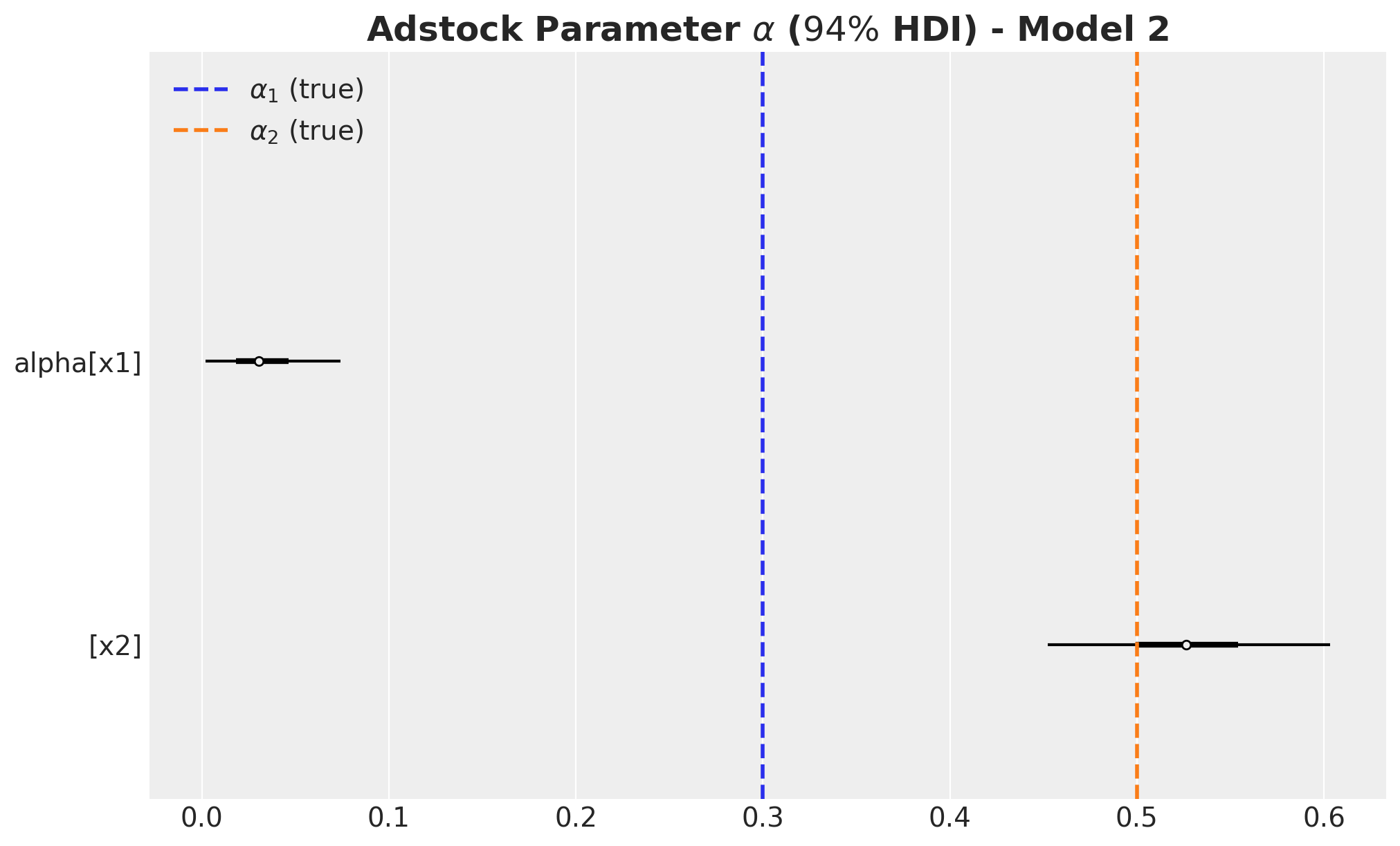
fig, ax = plt.subplots(figsize=(10, 6))
az.plot_forest(
    data=lam_posterior_3, combined=True, hdi_prob=0.94, colors="black", ax=ax
)
ax.axvline(x=lam1, color="C0", linestyle="--", linewidth=2, label=r"$\lambda_1$ (true)")
ax.axvline(x=lam2, color="C1", linestyle="--", linewidth=2, label=r"$\lambda_2$ (true)")
ax.legend(loc="upper right")
ax.set_title(
    label=r"Saturation Parameter $\lambda$ ($94\%$ HDI) - Model 2",
    fontsize=18,
    fontweight="bold",
)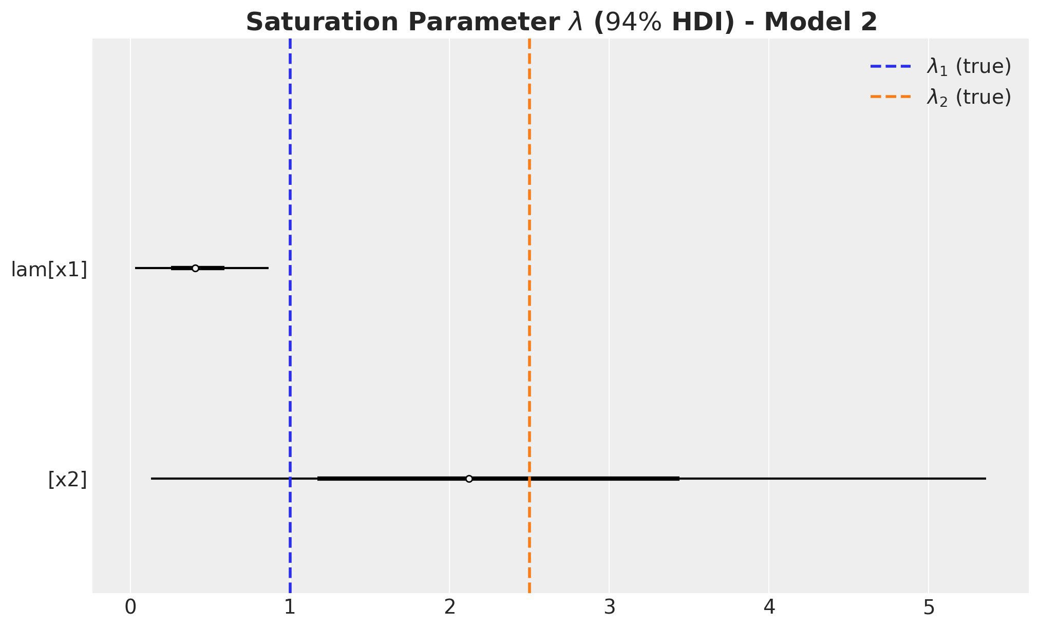
beta_channel_posterior_3 = (
    idata_3["posterior"]["beta_channel"]
    * (1 / channels_scaler.scale_)
    * (target_scaler.scale_)
    * (1 / amplitude)
)
fig, ax = plt.subplots(figsize=(10, 6))
az.plot_forest(
data=beta_channel_posterior_3, combined=True, hdi_prob=0.94, colors="black", ax=ax
)
ax.axvline(x=beta1, color="C0", linestyle="--", linewidth=2, label=r"$\beta_1$ (true)")
ax.axvline(x=beta2, color="C1", linestyle="--", linewidth=2, label=r"$\beta_2$ (true)")
ax.legend(loc="upper right")
ax.set_title(
label=r"Channel $\beta$ ($94\%$ HDI) - Model 1", fontsize=18, fontweight="bold"
)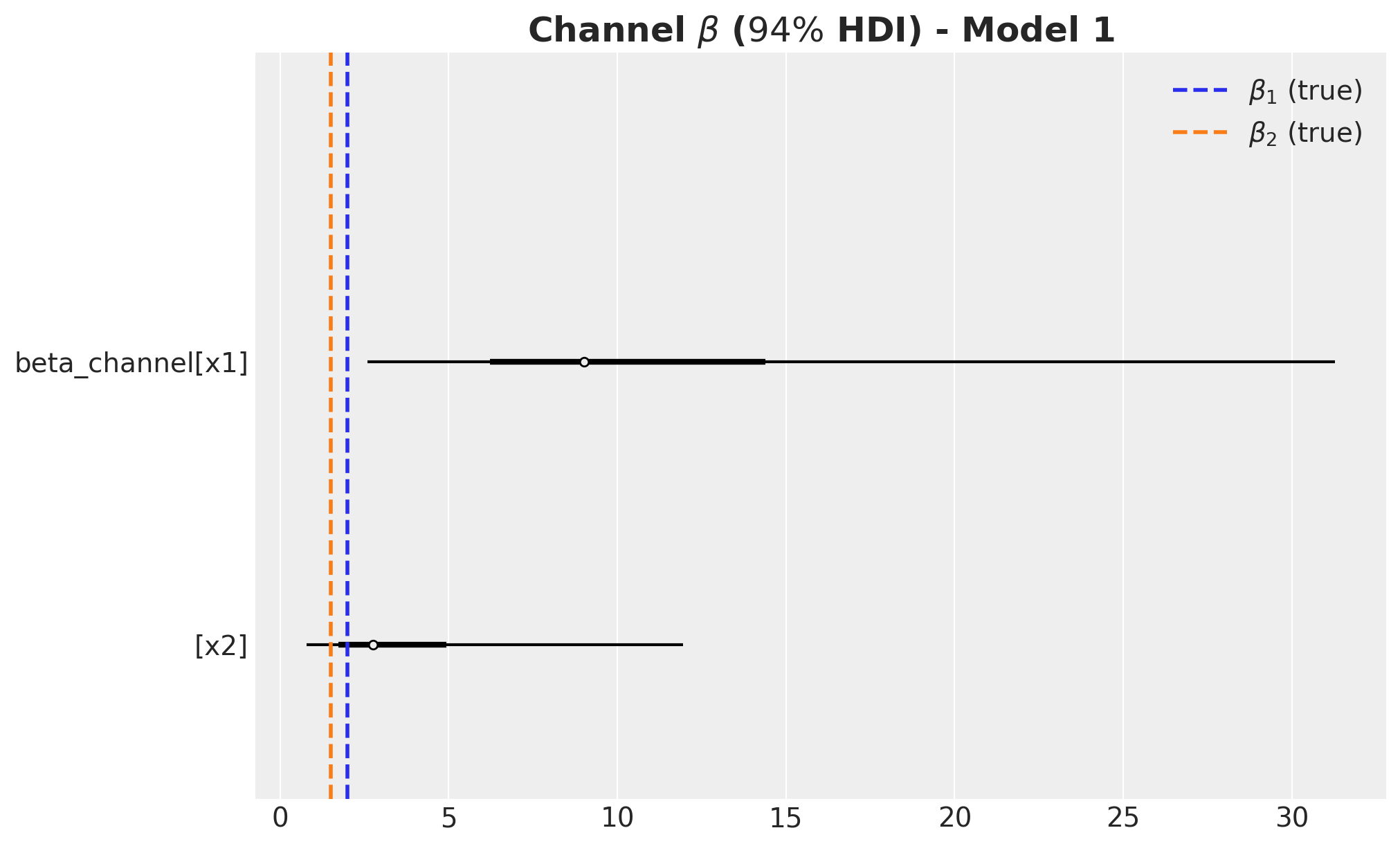
- For \(x_2\) we recovered all the media parameters within the \(94\%\) HDI.
- For \(x_1\) the model heavily underestimated the carryover parameter \(\alpha_1\) and on the other hand overestimated the regression coefficient \(\beta_1\). The saturation parameter \(\lambda_1\) was closer to the true value, but still outside of the \(94\%\) HDI.
ROAS Estimation
Finally, we compute the ROAS. We should expect them to be much closer to the true values than model 2 since we have explicit tight priors over them. Let’s start with the global ROAS:
predictions_roas_data_all_3 = {"x1": {}, "x2": {}}

for channel in tqdm(["x1", "x2"]):
    with model_3:
        pm.set_data(
            new_data={
                "channels_scaled": channels_scaler.transform(
                    data_df[channels].assign(**{channel: 0}),
                ),
                "channels_cost": data_df[channels].assign(**{channel: 0}),
            }
        )
        predictions_roas_data_all_3[channel] = pm.sample_posterior_predictive(
            trace=idata_3, var_names=["y", "mu"], progressbar=False, random_seed=rng
        )
Note we hat to replace the media model data (channels_scaled) and the media cost data (channels_cost). Here you can see that we could use impressions instead of cost to model the contribution of each channel.
predictions_roas_data_scaled_diff_all_3 = {"x1": {}, "x2": {}}

for channel in ["x1", "x2"]:
    predictions_roas_data_scaled_diff_all_3[channel] = pp_vars_original_scale_3[
        "mu"
    ] - xr.apply_ufunc(
        target_scaler.inverse_transform,
        predictions_roas_data_all_3[channel]["posterior_predictive"]["mu"].expand_dims(
            dim={"_": 1}, axis=-1
        ),
        input_core_dims=[["date", "_"]],
        output_core_dims=[["date", "_"]],
        vectorize=True,
    ).squeeze(dim="_")
fig, ax = plt.subplots(
nrows=2, ncols=1, figsize=(12, 7), sharex=True, sharey=False, layout="constrained"
)
az.plot_hdi(
x=date,
y=predictions_roas_data_scaled_diff_all_3["x1"],
color="C0",
smooth=False,
fill_kwargs={"alpha": 0.3, "label": r"$E(y - y_{01})$ $94\%$ HDI"},
ax=ax[0],
)
sns.lineplot(
data=data_df.assign(x1_effect=lambda x: amplitude * x["x1_effect"]),
x="date",
y="x1_effect",
color="C0",
label=r"$x1$ effect",
ax=ax[0],
)
az.plot_hdi(
x=date,
y=predictions_roas_data_scaled_diff_all_3["x2"],
color="C1",
smooth=False,
fill_kwargs={"alpha": 0.3, "label": r"$E(y - y_{02})$ $94\%$ HDI"},
ax=ax[1],
)
sns.lineplot(
data=data_df.assign(x2_effect=lambda x: amplitude * x["x2_effect"]),
x="date",
y="x2_effect",
color="C1",
label=r"$x2$ effect",
ax=ax[1],
)
ax[0].legend(loc="upper left")
ax[1].legend(loc="upper left")
ax[0].set(ylabel=None)
ax[1].set(ylabel=None)
fig.suptitle("Potential Outcomes Difference - Model 3", fontsize=18, fontweight="bold")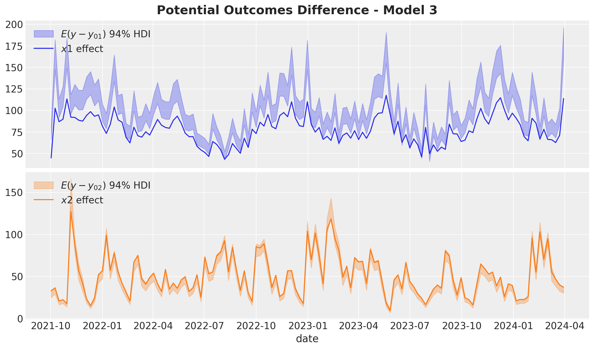
predictions_roas_all_3 = {"x1": {}, "x2": {}}

for channel in ["x1", "x2"]:
    predictions_roas_all_3[channel] = (
        predictions_roas_data_scaled_diff_all_3[channel].sum(dim="date")
        / data_df[channel].sum()
    )
fig, ax = plt.subplots(
nrows=2, ncols=1, figsize=(12, 7), sharex=True, sharey=False, layout="constrained"
)
az.plot_posterior(predictions_roas_all_3["x1"], ref_val=roas_all_1, ax=ax[0])
ax[0].set(title="x1")
az.plot_posterior(predictions_roas_all_3["x2"], ref_val=roas_all_2, ax=ax[1])
ax[1].set(title="x2", xlabel="ROAS")
fig.suptitle("Global ROAS - Model 3", fontsize=18, fontweight="bold")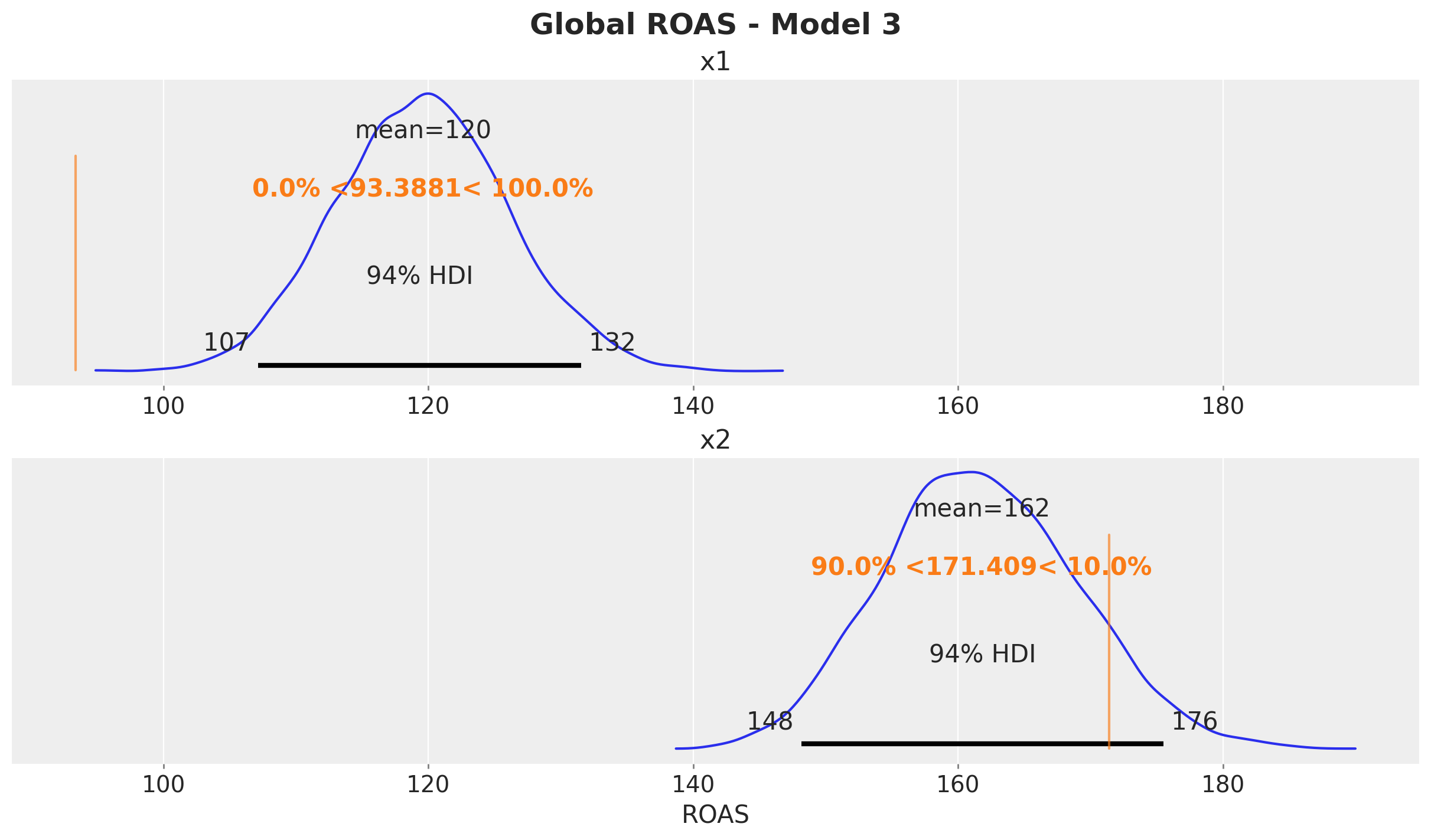
The results look as expected 🚀! The ROAS estimate for \(x_1\) is much closer to the true value than in the second model.
We wrap up the analysis by computing the quarterly ROAS.
predictions_roas_data_3 = {"x1": {}, "x2": {}}

for channel in tqdm(["x1", "x2"]):
    for q in tqdm(roas_data[channel].keys()):
        with model_3:
            pm.set_data(
                new_data={
                    "channels_scaled": channels_scaler.transform(
                        roas_data[channel][q][channels]
                    ),
                    "channels_cost": roas_data[channel][q][channels],
                }
            )
            predictions_roas_data_3[channel][q] = pm.sample_posterior_predictive(
                trace=idata_3, var_names=["y", "mu"], progressbar=False, random_seed=rng
            )
predictions_roas_data_scaled_diff_3 = {"x1": {}, "x2": {}}
for channel in ["x1", "x2"]:
predictions_roas_data_scaled_diff_3[channel] = {
q: pp_vars_original_scale_3["mu"]
- xr.apply_ufunc(
target_scaler.inverse_transform,
idata_q["posterior_predictive"]["mu"].expand_dims(dim={"_": 1}, axis=-1),
input_core_dims=[["date", "_"]],
output_core_dims=[["date", "_"]],
vectorize=True,
).squeeze(dim="_")
for q, idata_q in tqdm(predictions_roas_data_3[channel].items())
}predictions_roas_3 = {"x1": {}, "x2": {}}
for channel in ["x1", "x2"]:
predictions_roas_3[channel] = {
q: idata_q.sum(dim="date") / data_df.query("quarter == @q")[channel].sum()
for q, idata_q in predictions_roas_data_scaled_diff_3[channel].items()
}axes = az.plot_posterior(
data=xr.concat(
predictions_roas_3["x1"].values(),
dim=pd.Index(data=predictions_roas_3["x1"].keys(), name="quarter"),
),
figsize=(18, 15),
grid=(5, 2),
ref_val={"mu": x1_ref_vals},
backend_kwargs={"sharex": True, "layout": "constrained"},
)
fig = axes.ravel()[0].get_figure()
fig.suptitle(
t="Posterior Predictive - ROAS x1 - Model 3", fontsize=18, fontweight="bold"
)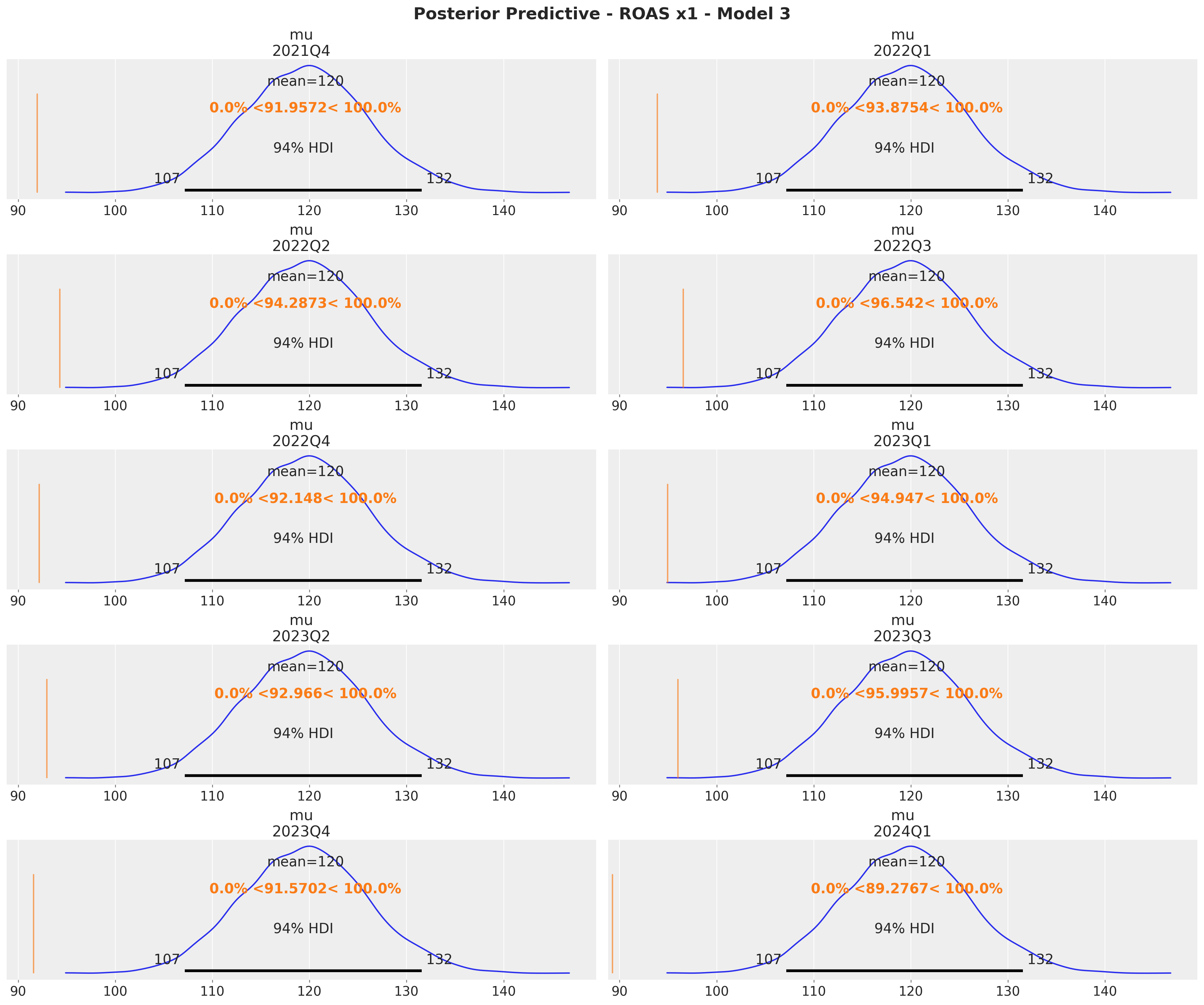
axes = az.plot_posterior(
    data=xr.concat(
        predictions_roas_3["x2"].values(),
        dim=pd.Index(data=predictions_roas_3["x2"].keys(), name="quarter"),
    ),
    figsize=(18, 15),
    grid=(5, 2),
    ref_val={"mu": x2_ref_vals},
    backend_kwargs={"sharex": True, "layout": "constrained"},
)
fig = axes.ravel()[0].get_figure()
fig.suptitle(
    t="Posterior Predictive - ROAS x2 - Model 3", fontsize=18, fontweight="bold"
)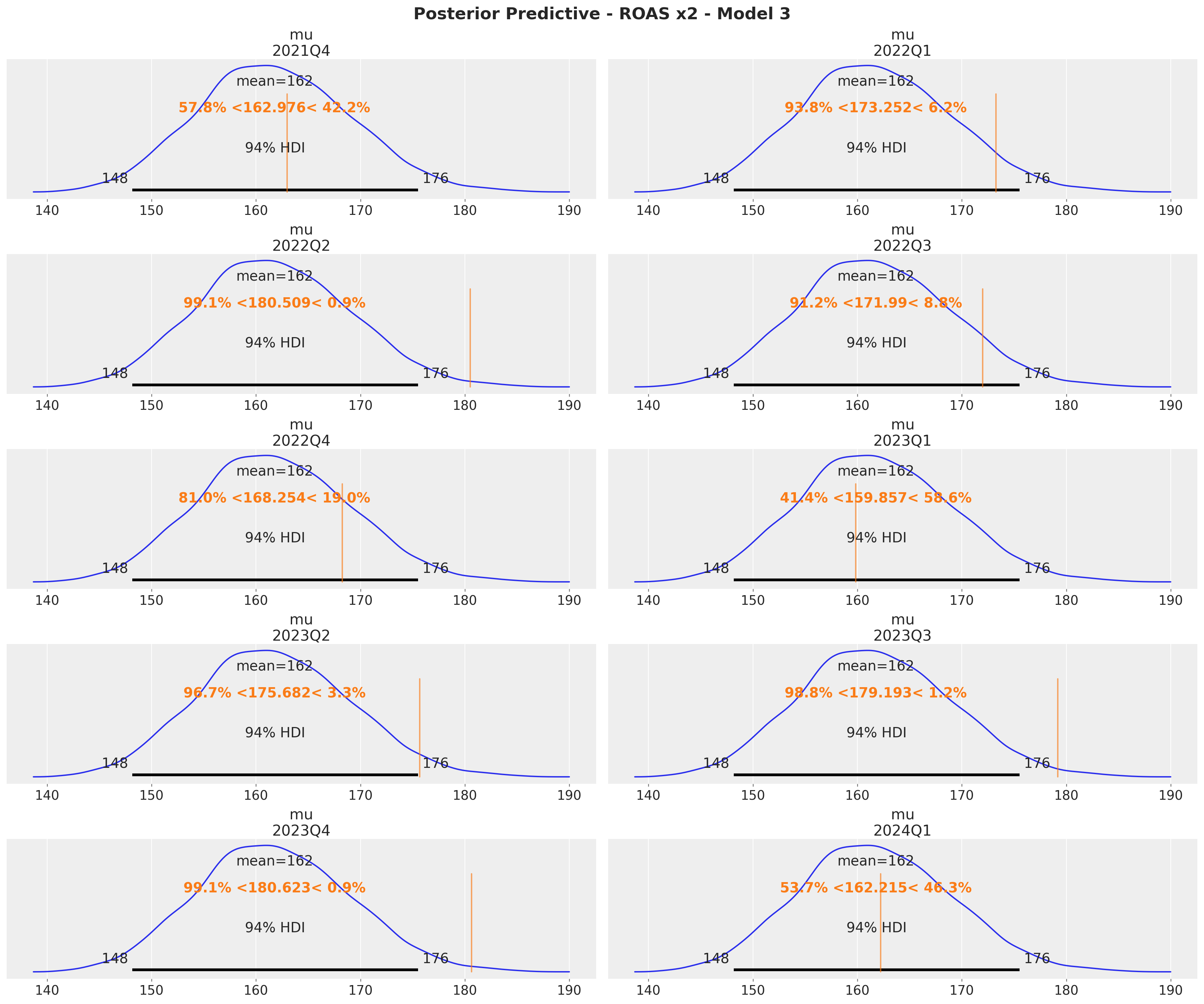
The results at quarterly level are consistent with the global ROAS.
Model Comparison
In this final section we compare the posterior distribution of the channel ROAS for the three models.
fig, ax = plt.subplots(
    nrows=2, ncols=1, figsize=(12, 9), sharex=True, sharey=False, layout="constrained"
)

az.plot_forest(
    data=[
        predictions_roas_all_1["x1"].rename("roas"),
        predictions_roas_all_2["x1"].rename("roas"),
        predictions_roas_all_3["x1"].rename("roas"),
    ],
    model_names=[
        "Model 1 (causal)",
        "Model 2 (unobserved confounder)",
        "Model 3 (roas prior)",
    ],
    combined=True,
    ax=ax[0],
)
ax[0].get_legend().update({"loc": "upper right"})
ax[0].axvline(x=roas_all_1, color="black", linestyle="--", linewidth=2)
ax[0].set(title="x1")

az.plot_forest(
    data=[
        predictions_roas_all_1["x2"].rename("roas"),
        predictions_roas_all_2["x2"].rename("roas"),
        predictions_roas_all_3["x2"].rename("roas"),
    ],
    model_names=[
        "Model 1 (causal)",
        "Model 2 (unobserved confounder)",
        "Model 3 (roas prior)",
    ],
    combined=True,
    ax=ax[1],
)
ax[1].get_legend().update({"loc": "upper left"})
ax[1].axvline(x=roas_all_2, color="black", linestyle="--", linewidth=2)
ax[1].set(title="x2")

fig.suptitle("Global ROAS - Model Comparison", fontsize=18, fontweight="bold")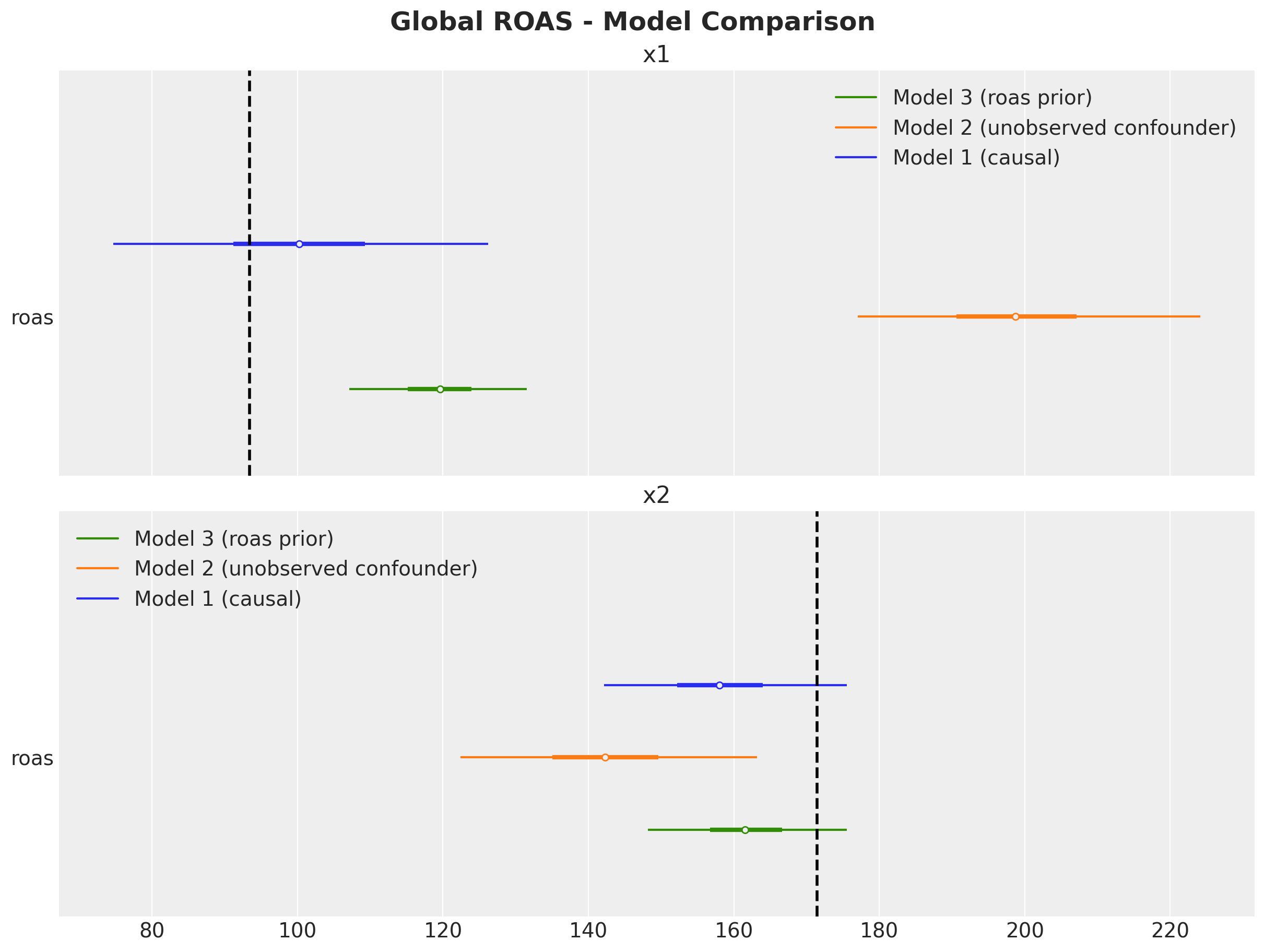
Lastly, we compare the estimated quarterly ROAS for \(x_1\):
fig, ax = plt.subplots()
az.plot_forest(
    data=[
        xr.concat(
            predictions_roas_1["x1"].values(),
            dim=pd.Index(data=predictions_roas_1["x2"].keys(), name="quarter"),
        ).rename("roas"),
        xr.concat(
            predictions_roas_2["x1"].values(),
            dim=pd.Index(data=predictions_roas_2["x2"].keys(), name="quarter"),
        ).rename("roas"),
        xr.concat(
            predictions_roas_3["x1"].values(),
            dim=pd.Index(data=predictions_roas_2["x2"].keys(), name="quarter"),
        ).rename("roas"),
    ],
    model_names=[
        "Model 1 (causal)",
        "Model 2 (unobserved confounder)",
        "Model 3 (roas prior)",
    ],
    combined=True,
    ax=ax,
)
ax.axvline(x=roas_all_1, color="black", linestyle="--", linewidth=2)
ax.get_legend().update({"loc": "center left", "bbox_to_anchor": (1, 0.5)})
ax.set_title(
    label=r"Posterior Predictive - $x_1$ ROAS - Model Comparison",
    fontsize=18,
    fontweight="bold",
)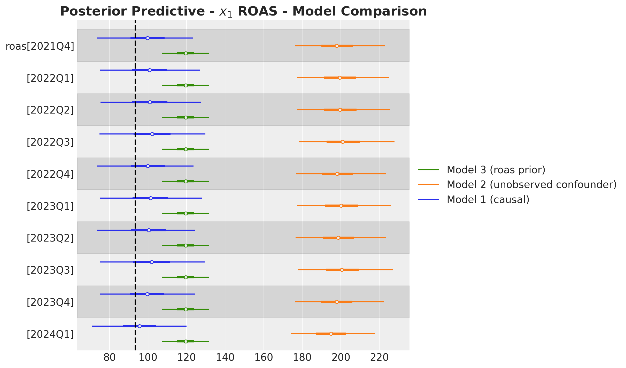
Conclusion
With this simulated case study we have seen the benefit of using ROAS priors instead of regression coefficients. We have seen that the model with the ROAS priors was able to partially recover the true values of the ROAS in the presence of unobserved confounders. We also see that the ROAS are not the same as the specified prior since it balances out with the evidence from the media mix regression model. Hence, this approach serves as a more holistic ROAS estimation for real world scenarios.