Causal inference asks a deceptively simple question: “What would have happened if things were different?” Whether we’re evaluating a job training program, testing a new medical treatment, or analyzing the impact of a policy change, we want to understand the causal effect of an intervention not just observe correlations in the data.
Traditional statistical methods often struggle with causal questions because they conflate correlation with causation. When confounders variables that affect both treatment assignment and outcomes are present, naive comparisons can lead us astray. This notebook demonstrates how probabilistic programming languages (PPLs) provide a powerful framework for causal inference that makes confounding explicit, quantifies uncertainty properly, and enables us to answer counterfactual questions directly.
Why Probabilistic Programming Languages?
Probabilistic Programming Languages (PPLs) like NumPyro, PyMC, and Stan offer several compelling advantages for causal inference:
Express causal models naturally: We can explicitly model both the treatment assignment mechanism and the outcome process, making confounding relationships transparent in our code. This aligns perfectly with Pearl’s structural causal models and the backdoor criterion.
Quantify uncertainty rigorously: Bayesian inference gives us full posterior distributions, not just point estimates. We get credible intervals that properly account for all sources of uncertainty, from parameter estimation to model specification.
Implement the
dooperator directly: PPLs let us implement Pearl’s do-calculus naturally, allowing us to compute counterfactuals (“what if everyone received treatment?”) by simply conditioning on interventions rather than observations.Flexible modeling without sacrificing interpretability: We can use non-linear models, hierarchical structures, and other sophisticated approaches while maintaining clear causal interpretability. The same framework works for simple linear models and complex hierarchical designs.
How can notebook help you?
Through hands-on examples, this notebook will guide you through the process of building causal models using PPLs. Concretely:
- Build causal models that explicitly account for confounders using both linear and generalized linear models
- Estimate the Average Treatment Effect (ATE) using Bayesian inference, complete with uncertainty quantification
- Compare naive vs. adjusted estimates to see firsthand how confounding can bias results
- Use the
dooperator to compute counterfactual outcomes and estimate causal effects - Validate models rigorously using prior predictive checks, convergence diagnostics, and posterior predictive checks
- Compare model specifications to understand when more sophisticated models (like GLMs) improve upon simpler approaches
The Lalonde Dataset
We’ll work with the famous Lalonde dataset which studies the effect of a job training program on earnings. This dataset is a classic in causal inference because it vividly demonstrates how naive comparisons can be misleading when confounders are present. The treated and control groups differ systematically in pre-treatment characteristics (age, education, prior earnings, etc.), making a simple comparison of means unreliable. By properly adjusting for these confounders, we can uncover the true causal effect of the training program.
Reference: Robert Lalonde, “Evaluating the Econometric Evaluations of Training Programs”, American Economic Review, Vol. 76, pp. 604-620
Approach
This notebook reproduces and extends the approach from ChiRho’s backdoor adjustment tutorial, implementing the same causal modeling strategy using PyMC (this example can be easily implemented in NumPyro, see here). We’ll build models step-by-step, validate them thoroughly, and compare different estimation approaches to build intuition for causal inference with probabilistic programming.
This approach is very similar to the one presented in the great blog post Causal inference with gamma regression or: The problem is with the link function,
not the likelihood (Part 6 of the GLM and causal inference series.). The main difference, is that we rely on PyMC and the do operator to compute counterfactuals.
Remark [Resources]:
Solomon Kurz’s blog is a fantastic resource to learn about Bayesian methods and causal inference(he mainly uses Stan and
brms).The book Causal AI by Robert Ness privides an extensive introduction to causal inference with PPLs. The book as an associated repository causalML, where you can find a lot of great examples.
Prepare Notebook
import arviz as az
import graphviz as gr
import matplotlib.pyplot as plt
import numpy as np
import pandas as pd
import pymc as pm
import pytensor.tensor as pt
import seaborn as sns
from pymc.model.transform.conditioning import do, observe
from sklearn.compose import ColumnTransformer
from sklearn.preprocessing import StandardScaler

seed: int = 42
rng: np.random.Generator = np.random.default_rng(seed=seed)

az.style.use("arviz-darkgrid")
plt.rcParams["figure.figsize"] = [10, 6]
plt.rcParams["figure.dpi"] = 100
plt.rcParams["figure.facecolor"] = "white"

%load_ext autoreload
%autoreload 2
%load_ext jaxtyping
%jaxtyping.typechecker beartype.beartype
%config InlineBackend.figure_format = "retina"
Read and Preprocess Data
We load the data and preprocess it following the same approach as the original tutorial, preparing it for use in our causal models.
data_path = "https://raw.githubusercontent.com/rugg2/rugg2.github.io/master/lalonde.csv"
data = pd.read_csv(data_path)


# Convert the data to the right format
data["re75"] = data["re75"] / 1_000
# Add a small constant to avoid log(0) in the model
data["re78"] = data["re78"] / 1_000 + 1e-6
data = data.rename(columns={"educ": "education", "hispan": "hispanic"})

# Define the covariates
covariates_names = [
    "education",
    "age",
    "re75",
    "black",
    "hispanic",
    "married",
    "nodegree",
]

# Extract treatment, covariates and earnings from the dataframe
df = data[["treat", *covariates_names, "re78"]]

n_obs = df.shape[0]

df.head()| treat | education | age | re75 | black | hispanic | married | nodegree | re78 | |
|---|---|---|---|---|---|---|---|---|---|
| 0 | 1 | 11 | 37 | 0.0 | 1 | 0 | 1 | 1 | 9.930047 |
| 1 | 1 | 9 | 22 | 0.0 | 0 | 1 | 0 | 1 | 3.595895 |
| 2 | 1 | 12 | 30 | 0.0 | 1 | 0 | 0 | 0 | 24.909451 |
| 3 | 1 | 11 | 27 | 0.0 | 1 | 0 | 0 | 1 | 7.506147 |
| 4 | 1 | 8 | 33 | 0.0 | 1 | 0 | 0 | 1 | 0.289791 |
Understanding the Data Structure
The following are the main feature groups in the dataset:
- Treatment variable (
treat): The intervention we’re studying (job training program) - Outcome variable (
re78): What we want to measure the effect on (earnings in 1978) - Covariates: Pre-treatment variables that might confound the relationship
Causal DAG
Before building our models, we need to establish a clear understanding of the causal relationships in the data. Following the ChiRho tutorial:
Specifically, we have written our
causal_modelmethod below such that covariates influencetrainingandearnings, andtraininginfluencesearnings. To align this model with the specific parametric assumptions used in our case study [LaLonde, 1986], we have chosen to use a logistic function to describe the mechanism for generating training random variables, and a linear Gaussian model for generating earnings.
Hence, we have the following structure:
dag = gr.Digraph()

dag.node("treat", color="#2a2eec80", style="filled")
dag.node("re78", color="#fa7c1780", style="filled")
dag.node("covariates")

dag.edge("treat", "re78")
dag.edge("covariates", "treat")
dag.edge("covariates", "re78")

dag
Here’s the concrete structure with all covariates shown:
dag = gr.Digraph()

dag.node("treat", color="#2a2eec80", style="filled")
dag.node("re78", color="#fa7c1780", style="filled")

dag.edge("treat", "re78")

for covariate in covariates_names:
    dag.edge(covariate, "treat")
    dag.edge(covariate, "re78")

dag
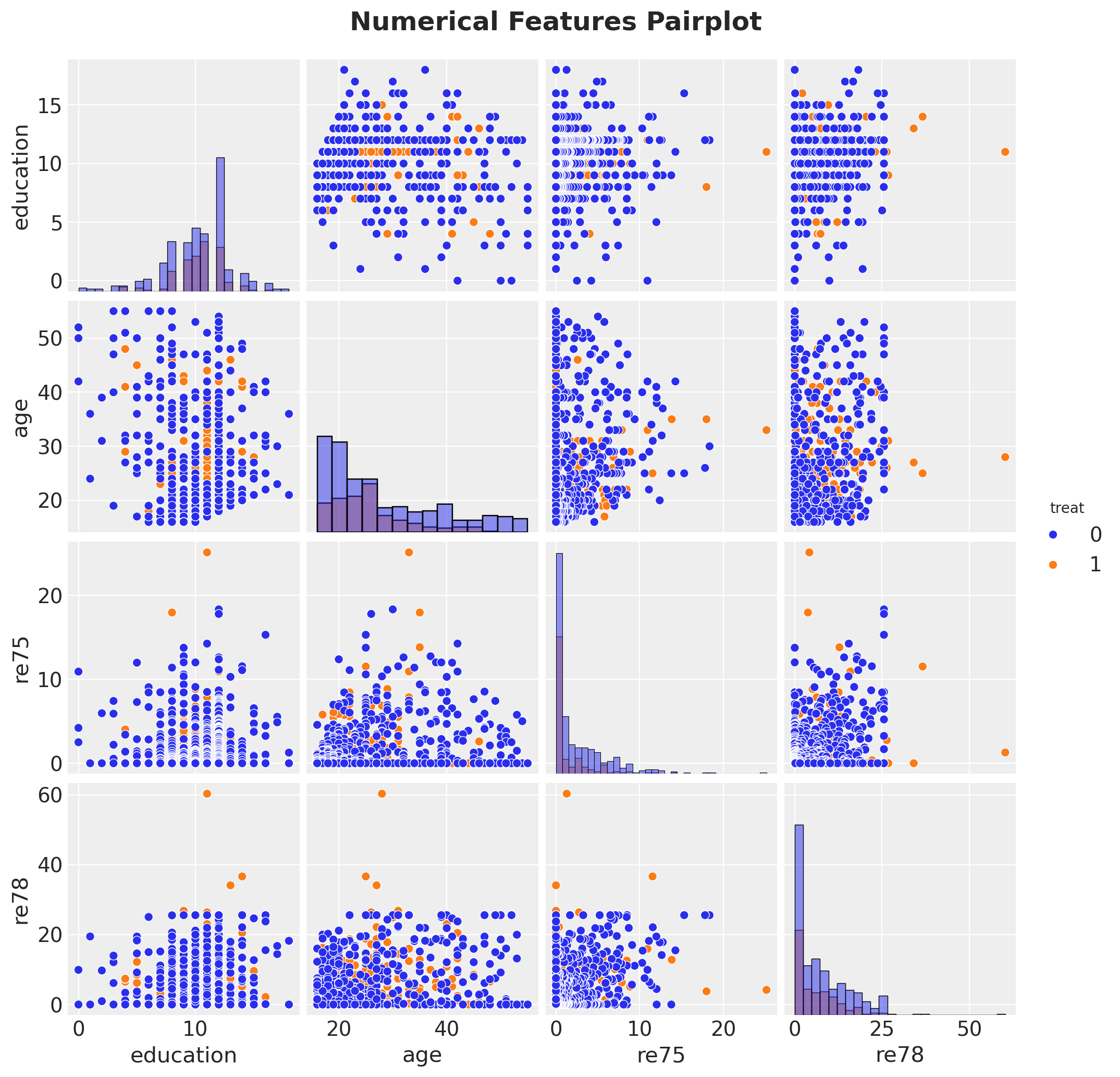
Exploratory Data Analysis
g = sns.pairplot(
    df[["treat", "education", "age", "re75", "re78"]], hue="treat", diag_kind="hist"
)
g.figure.suptitle(
    "Numerical Features Pairplot", fontsize=18, fontweight="bold", y=1.03
);
# Evaluate what our answer would be if we just naively predicted the average earnings
# of treated and untreated individuals, without accounting for the
# potential confounders.
treated_individuals = df[df["treat"] == 1]
untreated_individuals = df[df["treat"] == 0]

naive_prediction = (
    treated_individuals["re78"].mean() - untreated_individuals["re78"].mean()
)
naive_predictionnp.float64(-0.6350262120374222)The Confounding Problem
The naive estimate simply compares average earnings between treated and untreated groups. However, if these groups differ systematically in pre-treatment characteristics (confounders), the naive estimate will be biased. For example, if the training program targeted individuals with lower prior earnings, we’d expect them to have lower earnings regardless of treatment.
This is why we need to adjust for confounders—variables that affect both treatment assignment and the outcome. Our model will account for these by conditioning on covariates.
df_agg = df.groupby("treat").agg(
    count_edu=("education", "count"),
    count_age=("age", "count"),
    count_black=("black", "count"),
    count_hisp=("hispanic", "count"),
    count_marr=("married", "count"),
    count_nodeg=("nodegree", "count"),
    mean_age=("age", "mean"),
    mean_re75=("re75", "mean"),
)

df_agg.style.background_gradient(cmap="viridis", axis=0)| count_edu | count_age | count_black | count_hisp | count_marr | count_nodeg | mean_age | mean_re75 | |
|---|---|---|---|---|---|---|---|---|
| treat | ||||||||
| 0 | 429 | 429 | 429 | 429 | 429 | 429 | 28.030 | 2.466 |
| 1 | 185 | 185 | 185 | 185 | 185 | 185 | 25.816 | 1.532 |
Scale Numerical Features
In general, it is recommended to scale numerical features to help MCMC sampling converge faster and to think about priors in terms of standard deviations. See Statistical Rethinking by Richard McElreath for more details.
num_features = ["education", "age", "re75"]

preprocessor = ColumnTransformer(
    [
        ("num", StandardScaler(with_mean=False), num_features),
    ],
    remainder="passthrough",
).set_output(transform="pandas")


df_transformed = preprocessor.fit_transform(df)
df_transformed.columns = [col.split("__")[-1] for col in df_transformed.columns]
# Convert to arrays
covariates_obs = df_transformed[covariates_names]
training_obs = df_transformed["treat"]
earnings_obs = df_transformed["re78"]Specify Model
Now we proceed to specify the model in PyMC.
coords = {
    "covariate": covariates_names,
    "obs_idx": df.index,
}

with pm.Model(coords=coords) as earnings_model:
    # TREATMENT MODEL
    # --- Data Containers ---
    covariates_data = pm.Data(
        "covariates_data", covariates_obs, dims=("obs_idx", "covariate")
    )
    # --- Priors ---
    intercept_treat = pm.Normal("intercept_treat", mu=0, sigma=10)
    beta_covariate_treat = pm.Normal(
        "beta_covariate_treat", mu=0, sigma=1, dims=("covariate",)
    )
    # --- Parametrization ---
    logit_p_treat = intercept_treat + pm.math.dot(covariates_data, beta_covariate_treat)
    p_treat = pm.math.sigmoid(logit_p_treat)
    # --- Likelihood ---
    treat = pm.Bernoulli("treat", p=p_treat, dims=("obs_idx",))

    # EARNINGS MODEL
    # --- Priors ---
    intercept_earnings = pm.Normal("intercept_earnings", mu=0, sigma=10)
    beta_treat_earnings = pm.Normal("beta_treat_earnings", mu=0, sigma=1)
    beta_covariate_earnings = pm.Normal(
        "beta_covariate_earnings", mu=0, sigma=1, dims=("covariate",)
    )
    sigma_earnings = pm.HalfNormal("sigma_earnings", sigma=10.0)

    mu_earnings = pm.Deterministic(
        "mu_earnings",
        intercept_earnings
        + beta_treat_earnings * treat
        + pm.math.dot(covariates_data, beta_covariate_earnings),
        dims=("obs_idx",),
    )
    # --- Likelihood ---
    pm.Normal(
        "earnings",
        mu=mu_earnings,
        sigma=sigma_earnings,
        dims=("obs_idx",),
    )

pm.model_to_graphviz(earnings_model)
Prior Predictive Checks
Before we fit the model, we can check samples from the prior distribution and compare them with the observed data.
with earnings_model:
    idata = pm.sample_prior_predictive(samples=2_000, random_seed=rng)
Sampling: [beta_covariate_earnings, beta_covariate_treat, beta_treat_earnings, earnings, intercept_earnings, intercept_treat, sigma_earnings, treat]fig, ax = plt.subplots()
az.plot_dist(idata["prior"]["earnings"].to_numpy().flatten(), color="C0", ax=ax)
for i in range(50):
az.plot_dist(
idata["prior"]["earnings"].sel(draw=i, chain=0),
color="C0",
plot_kwargs={"alpha": 0.1},
ax=ax,
)
az.plot_dist(earnings_obs, color="black", ax=ax)
ax.set(xlabel="ATE estimate", ylabel="Frequency")
fig.suptitle(
"Prior Predictive Checks (earnings) - OLS", fontsize=18, fontweight="bold"
);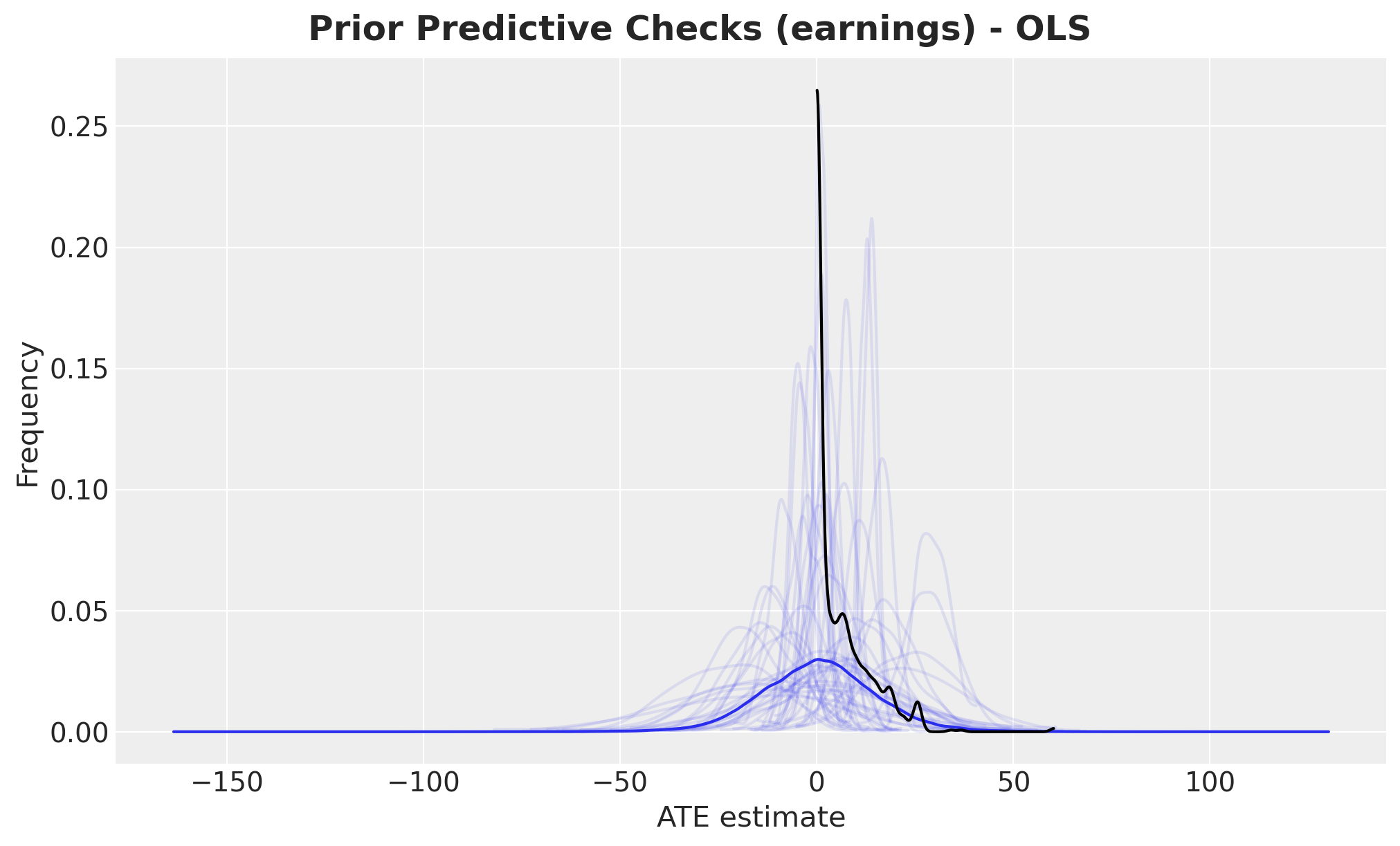
Overall, the prior predictive distribution looks reasonable. However, we notice that this simple linear model allows negative earnings, which is unrealistic. We’ll address this limitation later when we introduce a generalized linear model.
Next, let’s examine the prior predictive distribution of the beta_treat_earnings coefficient,
which represents the average treatment effect (ATE).
fig, ax = plt.subplots()
az.plot_posterior(idata["prior"], var_names=["beta_treat_earnings"], ax=ax)
ax.set(xlabel="ATE estimate", ylabel="Frequency")
fig.suptitle("Prior Predictive Checks (ATE) - OLS", fontsize=18, fontweight="bold");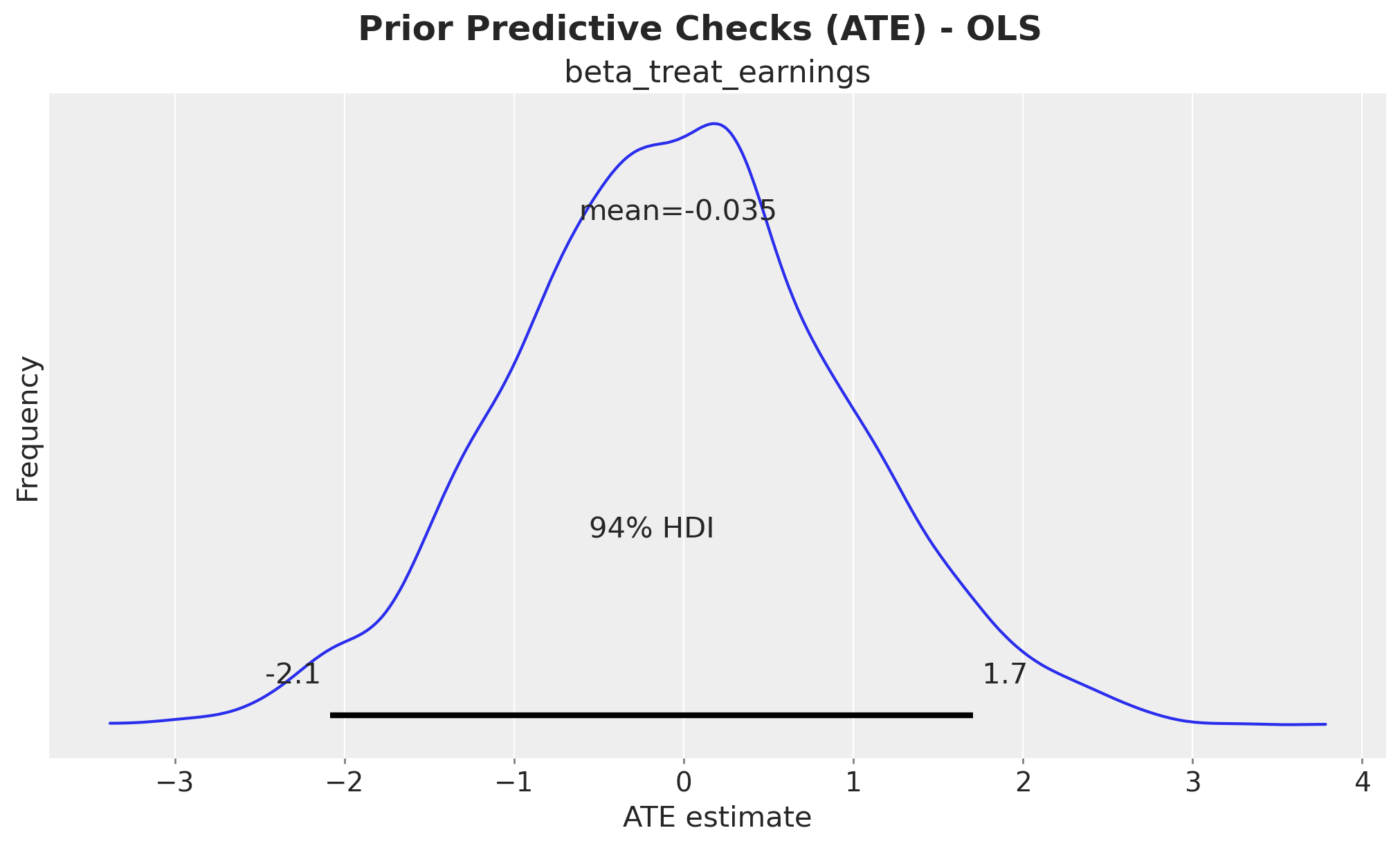
The prior distribution of beta_treat_earnings is centered around \(0\), which is expected since
we haven’t conditioned the model on the data yet. The \(94\%\) high density interval (HDI) spans
approximately \(-2\) to \(2\), which is not very informative but provides reasonable regularization.
Model Fit
Now we condition the model on the observed data and sample from the posterior distribution using MCMC (we could also use stochastic variational inference or other methods to scale up).
Let’s take a look at the conditioned model:
conditioned_earnings_model = observe(
    earnings_model, {"treat": training_obs, "earnings": earnings_obs}
)

pm.model_to_graphviz(conditioned_earnings_model)
We run NUTS to sample from the posterior distribution.
sample_kwargs = {
    "draws": 2_000,
    "tune": 1_000,
    "chains": 4,
    "cores": 4,
    "idata_kwargs": {"log_likelihood": True},
    "random_seed": rng,
}

with conditioned_earnings_model:
    idata.extend(pm.sample(**sample_kwargs))
Diagnostics
We need to assess the quality of our posterior samples. First, let’s examine the trace plots to verify that the chains are mixing well.
axes = az.plot_trace(
    data=idata,
    var_names=["~mu_earnings"],
    compact=True,
    backend_kwargs={"figsize": (12, 10), "layout": "constrained"},
)
plt.gcf().suptitle("Trace OLS", fontsize=18, fontweight="bold");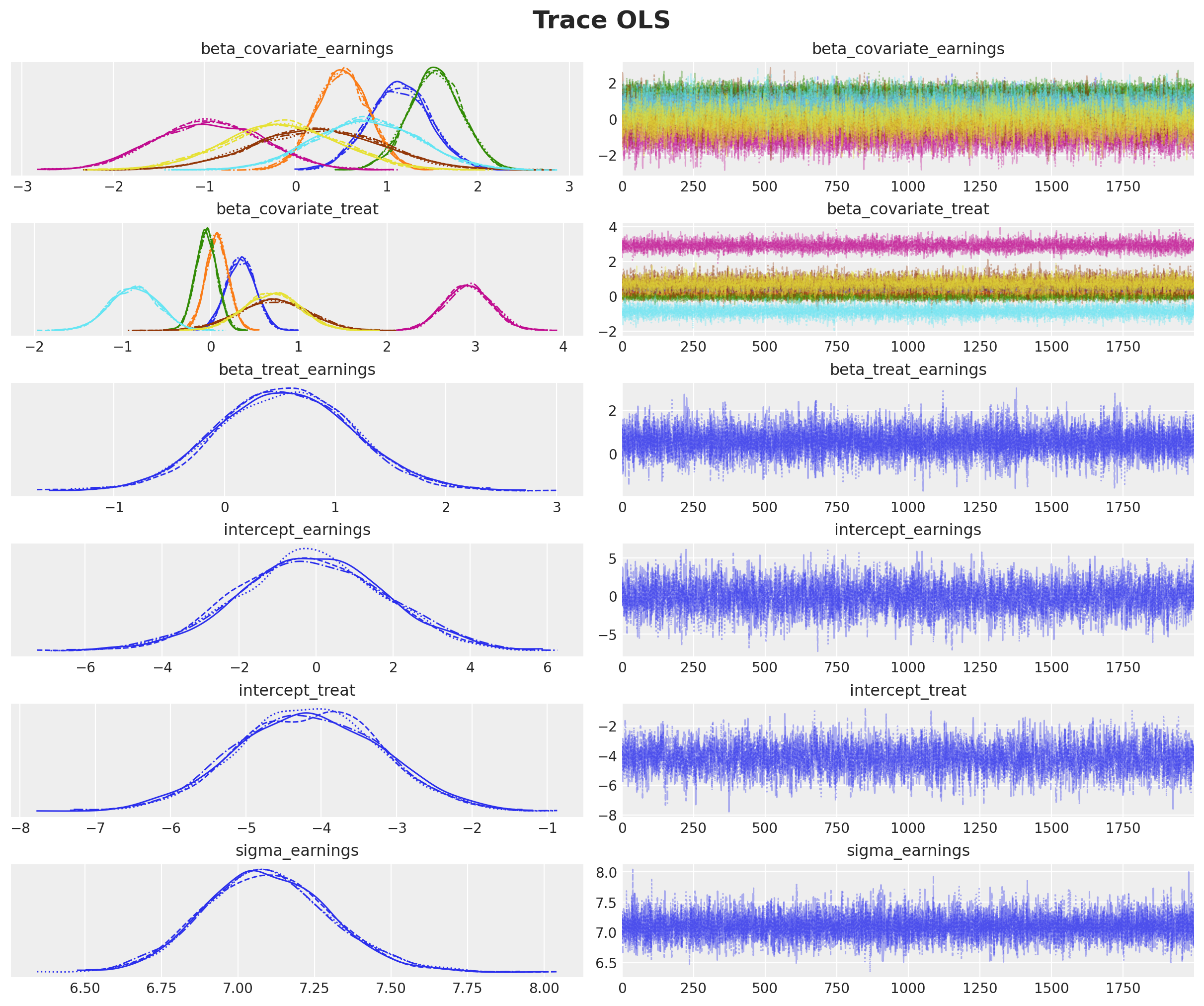
az.summary(idata, var_names=["~mu_earnings"])| mean | sd | hdi_3% | hdi_97% | mcse_mean | mcse_sd | ess_bulk | ess_tail | r_hat | |
|---|---|---|---|---|---|---|---|---|---|
| beta_covariate_earnings[education] | 1.138 | 0.338 | 0.509 | 1.779 | 0.005 | 0.003 | 5015.0 | 6027.0 | 1.0 |
| beta_covariate_earnings[age] | 0.511 | 0.291 | -0.028 | 1.062 | 0.003 | 0.003 | 9449.0 | 6066.0 | 1.0 |
| beta_covariate_earnings[re75] | 1.530 | 0.292 | 0.977 | 2.082 | 0.003 | 0.004 | 10929.0 | 5306.0 | 1.0 |
| beta_covariate_earnings[black] | -0.950 | 0.585 | -2.020 | 0.157 | 0.006 | 0.006 | 9958.0 | 6330.0 | 1.0 |
| beta_covariate_earnings[hispanic] | 0.241 | 0.705 | -1.051 | 1.573 | 0.007 | 0.008 | 10817.0 | 5873.0 | 1.0 |
| beta_covariate_earnings[married] | 0.771 | 0.568 | -0.274 | 1.851 | 0.006 | 0.007 | 9867.0 | 5652.0 | 1.0 |
| beta_covariate_earnings[nodegree] | -0.149 | 0.631 | -1.346 | 1.010 | 0.008 | 0.006 | 6092.0 | 6278.0 | 1.0 |
| beta_covariate_treat[education] | 0.345 | 0.162 | 0.036 | 0.637 | 0.002 | 0.002 | 4276.0 | 5184.0 | 1.0 |
| beta_covariate_treat[age] | 0.074 | 0.127 | -0.157 | 0.319 | 0.001 | 0.001 | 7512.0 | 6169.0 | 1.0 |
| beta_covariate_treat[re75] | -0.049 | 0.122 | -0.284 | 0.172 | 0.001 | 0.002 | 10216.0 | 5178.0 | 1.0 |
| beta_covariate_treat[black] | 2.919 | 0.261 | 2.440 | 3.411 | 0.003 | 0.003 | 9331.0 | 6283.0 | 1.0 |
| beta_covariate_treat[hispanic] | 0.707 | 0.393 | -0.039 | 1.439 | 0.004 | 0.004 | 9969.0 | 6337.0 | 1.0 |
| beta_covariate_treat[married] | -0.869 | 0.271 | -1.360 | -0.352 | 0.003 | 0.003 | 10465.0 | 6317.0 | 1.0 |
| beta_covariate_treat[nodegree] | 0.696 | 0.314 | 0.124 | 1.295 | 0.004 | 0.003 | 4986.0 | 5839.0 | 1.0 |
| beta_treat_earnings | 0.552 | 0.604 | -0.547 | 1.723 | 0.006 | 0.007 | 11845.0 | 6154.0 | 1.0 |
| intercept_earnings | -0.135 | 1.927 | -3.581 | 3.682 | 0.028 | 0.020 | 4608.0 | 5419.0 | 1.0 |
| intercept_treat | -4.166 | 0.952 | -5.932 | -2.355 | 0.015 | 0.010 | 3836.0 | 5116.0 | 1.0 |
| sigma_earnings | 7.095 | 0.205 | 6.728 | 7.497 | 0.002 | 0.003 | 13129.0 | 5184.0 | 1.0 |
R-hat (Gelman-Rubin statistic): Measures agreement between chains. R-hat ≈ 1.0 means chains have converged to the same distribution. Values > 1.1 suggest the sampler hasn’t converged yet.
ESS (Effective Sample Size): Measures how many independent samples we effectively have. Low ESS means samples are highly correlated, reducing the information we can extract. We want ESS > 400 for reliable credible intervals.
Posterior Predictive Sampling
We now extend the InferenceData object with posterior predictive samples to assess model fit.
with conditioned_earnings_model:
    pm.sample_posterior_predictive(idata, extend_inferencedata=True, random_seed=rng)

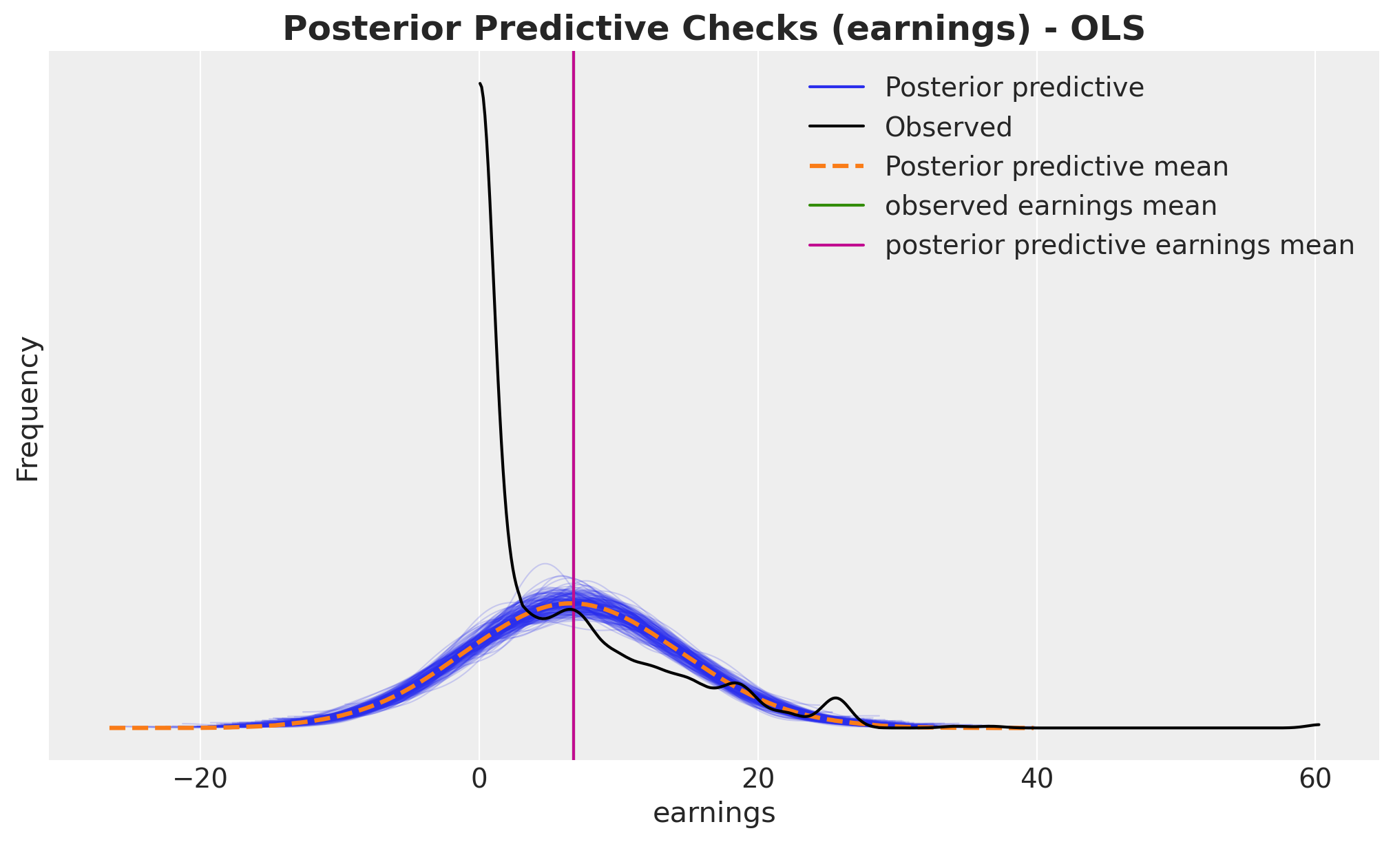
fig, ax = plt.subplots()
az.plot_ppc(idata, var_names=["earnings"], num_pp_samples=200, ax=ax)
ax.axvline(earnings_obs.mean(), color="C2", label="observed earnings mean")
ax.axvline(
    idata["posterior_predictive"]["earnings"].mean().item(),
    color="C3",
    label="posterior predictive earnings mean",
)
ax.legend()
ax.set(xlabel="earnings", ylabel="Frequency")
ax.set_title(
    "Posterior Predictive Checks (earnings) - OLS", fontsize=18, fontweight="bold"
);
ATE Estimation from Coefficient
In our linear model, beta_treat_earnings directly represents the Average Treatment Effect.
Since we’ve adjusted for confounders, this coefficient tells us the expected change in earnings
from treatment while holding all covariates constant exactly the causal interpretation we want.
Following the ChiRho tutorial, we compare our ATE estimate with results from other methods.
# https://rugg2.github.io/Lalonde%20dataset%20-%20Causal%20Inference.html
blog_prediction_ols = (
    1_548.24 / 1_000
)  # Scaled by 1000 to be consistent with data preprocessing above.
blog_prediction_matching = 1_027.087 / 1_000
blog_prediction_matching_ci95 = [-705.131 / 1_000, 2_759.305 / 1_000]
Let’s visualize the ATE estimates:
fig, ax = plt.subplots(figsize=(12, 7))
ax.axvline(naive_prediction, color="C3", label="naive estimate")
ax.axvline(blog_prediction_ols, color="C2", label="OLS estimate")
ax.axvline(blog_prediction_matching, color="C1", label="matching estimate")
ax.axvline(
    blog_prediction_matching_ci95[0],
    color="C1",
    linestyle="dashed",
    label="matching estimate 95% confidence",
)
ax.axvline(
    blog_prediction_matching_ci95[1],
    color="C1",
    linestyle="dashed",
)
az.plot_posterior(
    idata["posterior"], var_names=["beta_treat_earnings"], kind="hist", bins=100, ax=ax
)
ax.legend(loc="upper center", bbox_to_anchor=(0.5, -0.1), ncol=4)
ax.set(xlabel="ATE estimate", ylabel="Frequency");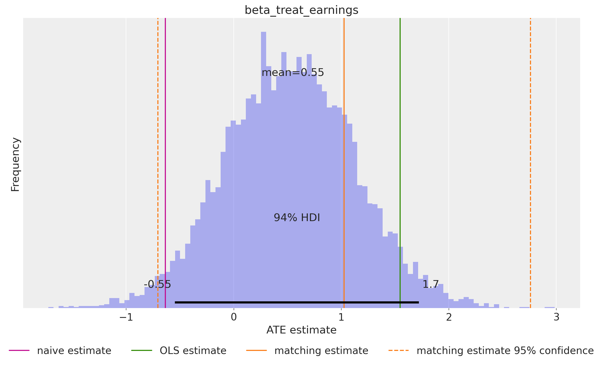
ATE Estimation using the do Operator
The do operator represents an intervention: we force treatment to a specific value,
breaking any dependence on confounders. This is the mathematical representation of
“what if everyone received treatment?” vs “what if no one received treatment?”
The difference between these counterfactual outcomes is the ATE. This approach is more general than coefficient interpretation—it works even with non-linear models. In our linear case, it should match the coefficient-based estimate.
Let’s apply the do operator to our model.
do_0_earnings_model = do(
    conditioned_earnings_model, {"treat": np.zeros(shape=(n_obs,), dtype=np.int32)}
)

do_1_earnings_model = do(
    conditioned_earnings_model, {"treat": np.ones(shape=(n_obs,), dtype=np.int32)}
)

pm.model_to_graphviz(do_0_earnings_model)
We now generate posterior predictive samples for both counterfactual scenarios (do(treat = 0) and do(treat = 1)) using the posterior samples from our MCMC fit. These represent the inferred counterfactual outcomes.
with do_0_earnings_model:
    do_0_idata = pm.sample_posterior_predictive(
        idata, random_seed=rng, var_names=["mu_earnings"]
    )

with do_1_earnings_model:
    do_1_idata = pm.sample_posterior_predictive(
        idata, random_seed=rng, var_names=["mu_earnings"]
    )
Let’s extract the posterior predictions and visualize the individual posterior predictive distributions.
expected_do_1 = do_1_idata["posterior_predictive"]["mu_earnings"]
expected_do_0 = do_0_idata["posterior_predictive"]["mu_earnings"]
# Compute the HDIs
do_0_hdi = az.hdi(expected_do_0)["mu_earnings"]
do_1_hdi = az.hdi(expected_do_1)["mu_earnings"]
We can now visualize and compare the two posterior predictive distributions for each individual in the dataset.
# For visualization purposes, we sort the HDIs by the mean of the HDI
sorted_indices = np.argsort(do_0_hdi.mean(dim="hdi").to_numpy())

fig, ax = plt.subplots(figsize=(10, 12))

for i, row in enumerate(do_0_hdi[sorted_indices]):
    do_0_label = "do(treat = 0)" if i == 0 else None
    ax.hlines(
        y=i,
        xmin=row.sel(hdi="lower"),
        xmax=row.sel(hdi="higher"),
        linestyle="solid",
        linewidth=0.3,
        color="C0",
    )

    ax.plot(row.mean(), i, marker="o", markersize=2, color="C0", label=do_0_label)

for i, row in enumerate(do_1_hdi[sorted_indices]):
    do_1_label = "do(treat = 1)" if i == 0 else None
    ax.hlines(
        y=i,
        xmin=row.sel(hdi="lower"),
        xmax=row.sel(hdi="higher"),
        linestyle="solid",
        linewidth=0.3,
        color="C1",
    )

    ax.plot(row.mean(), i, marker="o", markersize=2, color="C1", label=do_1_label)

ax.legend(loc="upper left")
ax.set(
    xlabel="earnings", ylabel="index", title="Posterior Predictive Checks (earnings)"
)
ax.set_title(
    "Posterior Predictive - OLS\nEarnings | do(treat = 0) vs Earnings | do(treat = 1)",
    fontsize=18,
    fontweight="bold",
);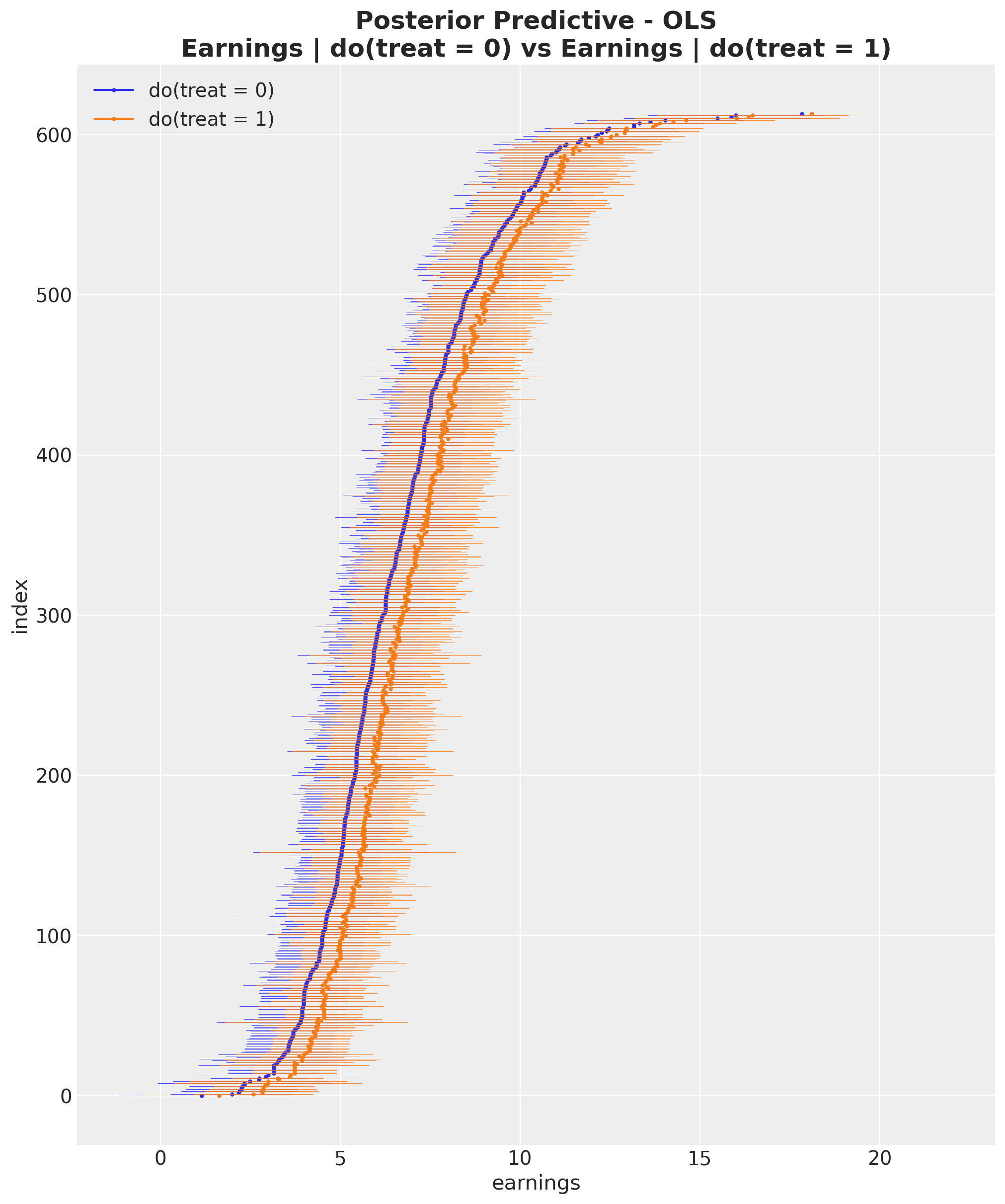
From this visualization, it is clear that the inferred average treatment effect is positive.
We can compute the ATE using the do operator by calculating the individual differences between
counterfactual outcomes and then averaging over the entire dataset.
ate = (expected_do_1 - expected_do_0).mean(dim="obs_idx").rename("ate")This gives us the posterior distribution of the ATE.
fig, ax = plt.subplots(figsize=(12, 7))
ax.axvline(naive_prediction, color="C3", label="naive estimate")
ax.axvline(blog_prediction_ols, color="C2", label="OLS estimate")
ax.axvline(blog_prediction_matching, color="C1", label="matching estimate")
ax.axvline(
    blog_prediction_matching_ci95[0],
    color="C1",
    linestyle="dashed",
    label="matching estimate 95% confidence",
)
ax.axvline(
    blog_prediction_matching_ci95[1],
    color="C1",
    linestyle="dashed",
)
az.plot_posterior(ate, kind="hist", bins=100, ax=ax)
ax.legend(loc="upper center", bbox_to_anchor=(0.5, -0.1), ncol=4)
ax.set(xlabel="ATE estimate", ylabel="Frequency");
ATE Estimation Comparison
We compare the ATE estimation using the coefficient method and the do operator.
ax, *_ = az.plot_forest(
    data=[idata["posterior"].rename({"beta_treat_earnings": "ate"})["ate"], ate],
    model_names=["Coefficient", "Do-Operator"],
    var_names=["ate"],
    combined=True,
    hdi_prob=0.94,
    figsize=(7, 5),
)
ax.set_title(r"ATE Estimation Comparison ($94\%$ HDI)", fontsize=18, fontweight="bold");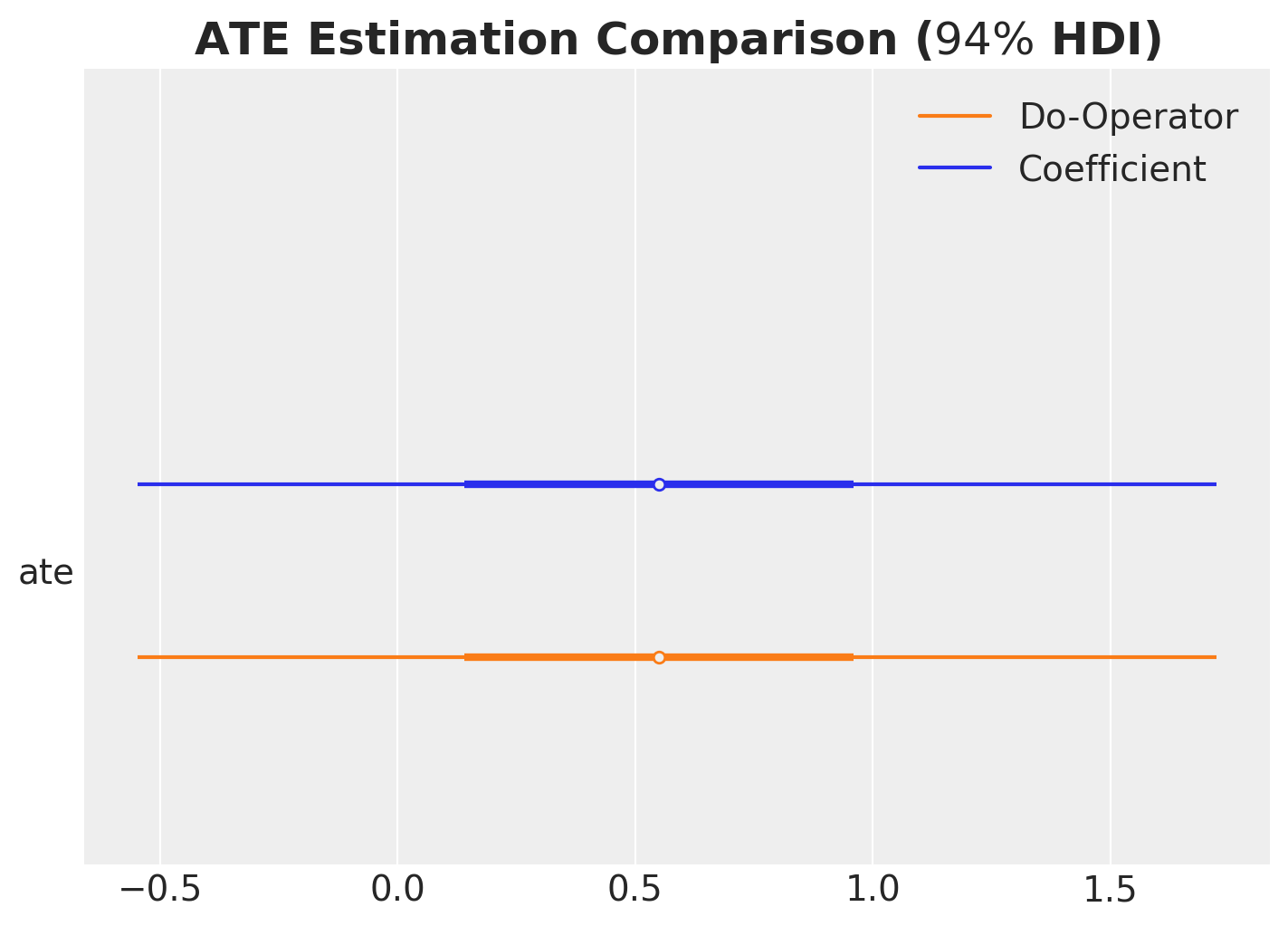
As expected, the two methods yield consistent results, confirming that both approaches correctly estimate the ATE.
Generalized Linear Model
Now let’s extend our analysis using a generalized linear model that ensures non-negative earnings. The overall structure remains similar, but we use a different likelihood and parametrization that better respects the domain constraints of our outcome variable.
with pm.Model(coords=coords) as glm_earnings_model:
    # TREATMENT MODEL
    # --- Data Containers ---
    covariates_data = pm.Data(
        "covariates_data", covariates_obs, dims=("obs_idx", "covariate")
    )
    # --- Priors ---
    intercept_treat = pm.Normal("intercept_treat", mu=0, sigma=10)
    beta_covariate_treat = pm.Normal(
        "beta_covariate_treat", mu=0, sigma=1, dims=("covariate",)
    )
    # --- Parametrization ---
    logit_p_treat = intercept_treat + pm.math.dot(covariates_data, beta_covariate_treat)
    p_treat = pm.math.sigmoid(logit_p_treat)
    # --- Likelihood ---
    treat = pm.Bernoulli("treat", p=p_treat, dims=("obs_idx",))

    # EARNINGS MODEL
    # --- Priors ---
    intercept_earnings = pm.Normal("intercept_earnings", mu=0, sigma=10)
    beta_treat_earnings = pm.Normal("beta_treat_earnings", mu=0, sigma=1)
    beta_covariate_earnings = pm.Normal(
        "beta_covariate_earnings", mu=0, sigma=1, dims=("covariate",)
    )
    sigma_earnings = pm.HalfNormal("sigma_earnings", sigma=10)
    # --- Parametrization ---
    raw_mu_earnings = (
        intercept_earnings
        + beta_treat_earnings * treat
        + pm.math.dot(covariates_data, beta_covariate_earnings)
    )
    mu_earnings = pm.Deterministic(
        "mu_earnings", pt.softplus(raw_mu_earnings), dims=("obs_idx",)
    )
    # --- Likelihood ---
    pm.Gamma(
        "earnings",
        mu=mu_earnings,
        sigma=sigma_earnings,
        dims=("obs_idx",),
    )

pm.model_to_graphviz(glm_earnings_model)
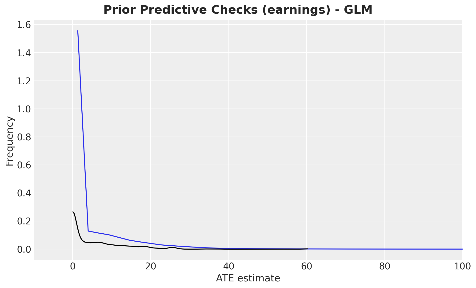
Let’s perform prior predictive checks for the GLM:
with glm_earnings_model:
    glm_idata = pm.sample_prior_predictive(samples=2_000, random_seed=rng)

fig, ax = plt.subplots()
az.plot_dist(glm_idata["prior"]["earnings"].to_numpy().flatten(), color="C0", ax=ax)
az.plot_dist(earnings_obs, color="black", ax=ax)
ax.set(xlabel="ATE estimate", ylabel="Frequency", xlim=(-10, 100))
fig.suptitle(
    "Prior Predictive Checks (earnings) - GLM", fontsize=18, fontweight="bold"
);
We condition the GLM on the observed data and sample from the posterior distribution using MCMC.
glm_conditioned_earnings_model = observe(
    glm_earnings_model, {"treat": training_obs, "earnings": earnings_obs}
)

with glm_conditioned_earnings_model:
    glm_idata = pm.sample(**sample_kwargs)
    pm.sample_posterior_predictive(
        glm_idata, extend_inferencedata=True, random_seed=rng
    )


axes = az.plot_trace(
    data=glm_idata,
    var_names=["~mu_earnings"],
    compact=True,
    backend_kwargs={"figsize": (12, 10), "layout": "constrained"},
)
plt.gcf().suptitle("Trace GLM", fontsize=18, fontweight="bold");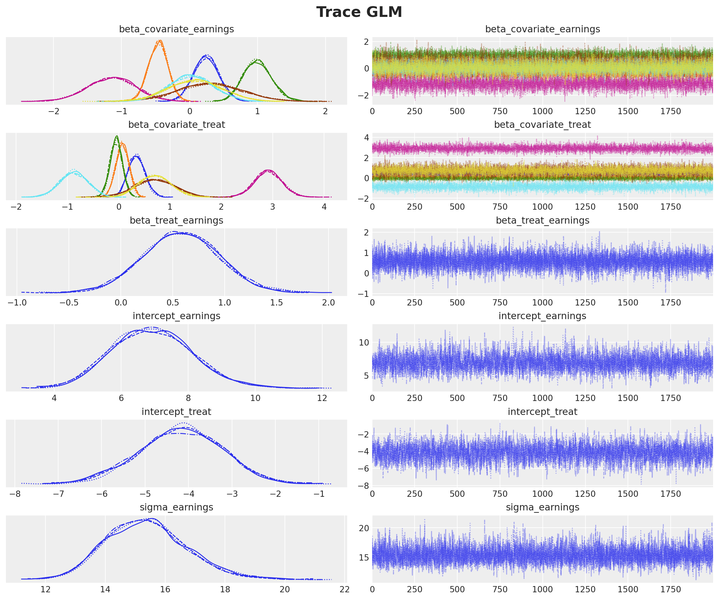
The trace plots indicate good convergence and mixing across all chains.
Let’s examine the posterior predictive distribution to assess model fit.
fig, ax = plt.subplots()
az.plot_ppc(glm_idata, var_names=["earnings"], num_pp_samples=200, ax=ax)
ax.axvline(earnings_obs.mean(), color="C2", label="observed earnings mean")
ax.axvline(
    glm_idata["posterior_predictive"]["earnings"].mean().item(),
    color="C3",
    label="posterior predictive earnings mean",
)
ax.legend()
ax.set(xlabel="earnings", ylabel="Frequency", xlim=(None, 50))
ax.set_title(
    "Posterior Predictive Checks (earnings) - GLM", fontsize=18, fontweight="bold"
);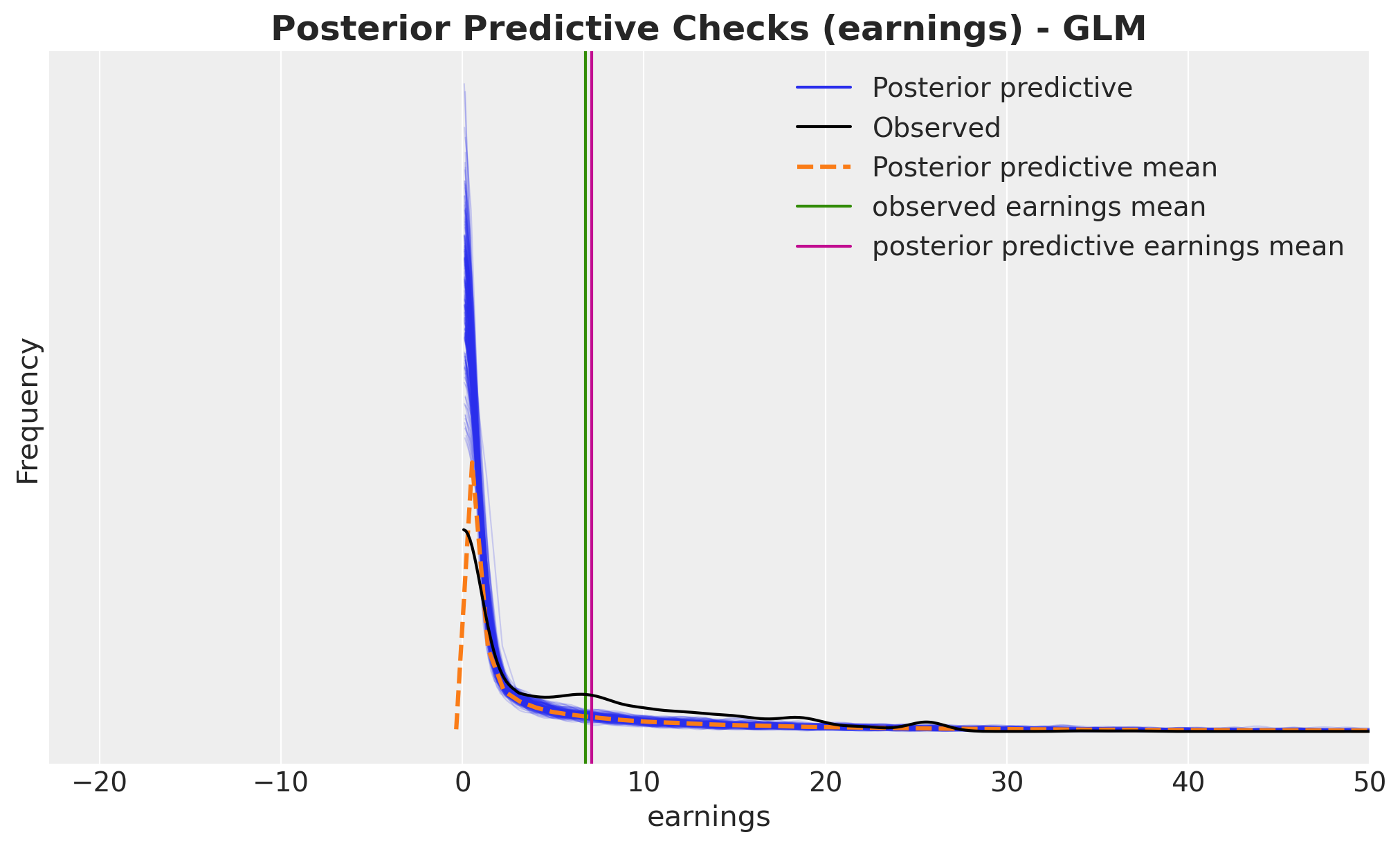
The GLM provides a much better fit than the linear model, with predictions that align more closely with the observed data distribution.
Now let’s compute the counterfactual outcomes using the do operator, just as we did for
the linear model.
glm_do_0_earnings_model = do(
    glm_conditioned_earnings_model, {"treat": np.zeros(shape=(n_obs,), dtype=np.int32)}
)
glm_do_1_earnings_model = do(
    glm_conditioned_earnings_model, {"treat": np.ones(shape=(n_obs,), dtype=np.int32)}
)

with glm_do_0_earnings_model:
    glm_do_0_idata = pm.sample_posterior_predictive(
        glm_idata, random_seed=rng, var_names=["mu_earnings"]
    )

with glm_do_1_earnings_model:
    glm_do_1_idata = pm.sample_posterior_predictive(
        glm_idata, random_seed=rng, var_names=["mu_earnings"]
    )


glm_expected_do_1 = glm_do_1_idata["posterior_predictive"]["mu_earnings"]

glm_expected_do_0 = glm_do_0_idata["posterior_predictive"]["mu_earnings"]
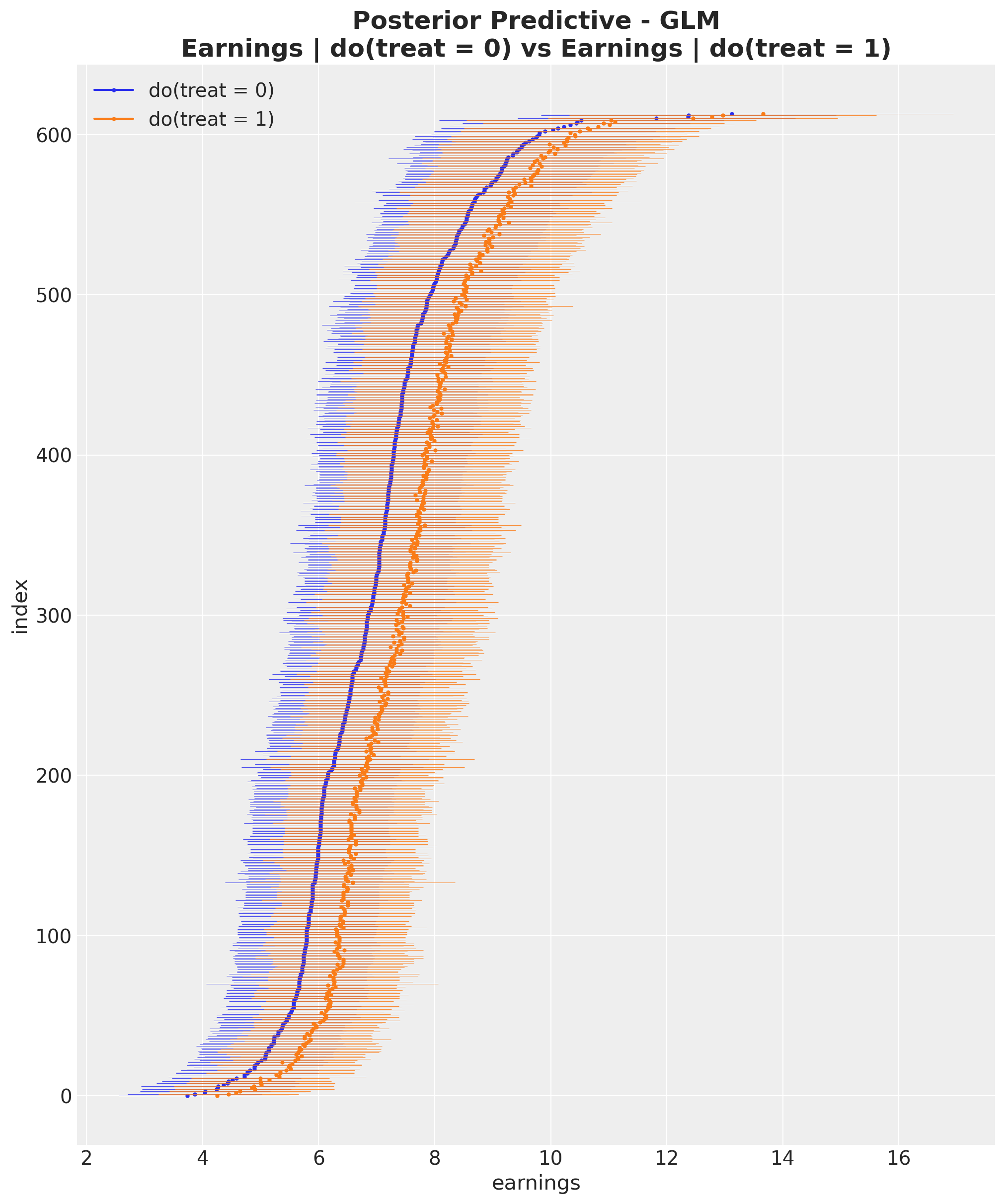
Let’s visualize the posterior predictive distributions for both counterfactual scenarios.
glm_do_0_hdi = az.hdi(glm_expected_do_0)["mu_earnings"]
glm_do_1_hdi = az.hdi(glm_expected_do_1)["mu_earnings"]

glm_sorted_indices = np.argsort(glm_do_0_hdi.mean(dim="hdi").to_numpy())

fig, ax = plt.subplots(figsize=(10, 12))

for i, row in enumerate(glm_do_0_hdi[glm_sorted_indices]):
    do_0_label = "do(treat = 0)" if i == 0 else None
    ax.hlines(
        y=i,
        xmin=row.sel(hdi="lower"),
        xmax=row.sel(hdi="higher"),
        linestyle="solid",
        linewidth=0.3,
        color="C0",
    )

    ax.plot(row.mean(), i, marker="o", markersize=2, color="C0", label=do_0_label)

for i, row in enumerate(glm_do_1_hdi[glm_sorted_indices]):
    do_1_label = "do(treat = 1)" if i == 0 else None
    ax.hlines(
        y=i,
        xmin=row.sel(hdi="lower"),
        xmax=row.sel(hdi="higher"),
        linestyle="solid",
        linewidth=0.3,
        color="C1",
    )

    ax.plot(row.mean(), i, marker="o", markersize=2, color="C1", label=do_1_label)

ax.legend(loc="upper left")
ax.set(
    xlabel="earnings", ylabel="index", title="Posterior Predictive Checks (earnings)"
)
ax.set_title(
    "Posterior Predictive - GLM\nEarnings | do(treat = 0) vs Earnings | do(treat = 1)",
    fontsize=18,
    fontweight="bold",
);
For easier comparison, let’s plot the posterior predictive distributions from both models side by side.
fig, ax = plt.subplots(
    nrows=1,
    ncols=2,
    figsize=(12, 12),
    sharex=True,
    sharey=True,
    layout="constrained",
)

for i, row in enumerate(do_0_hdi[sorted_indices]):
    do_0_label = "do(treat = 0)" if i == 0 else None
    ax[0].hlines(
        y=i,
        xmin=row.sel(hdi="lower"),
        xmax=row.sel(hdi="higher"),
        linestyle="solid",
        linewidth=0.3,
        color="C0",
    )

    ax[0].plot(row.mean(), i, marker="o", markersize=2, color="C0", label=do_0_label)

for i, row in enumerate(do_1_hdi[sorted_indices]):
    do_1_label = "do(treat = 1)" if i == 0 else None
    ax[0].hlines(
        y=i,
        xmin=row.sel(hdi="lower"),
        xmax=row.sel(hdi="higher"),
        linestyle="solid",
        linewidth=0.3,
        color="C1",
    )

    ax[0].plot(row.mean(), i, marker="o", markersize=2, color="C1", label=do_1_label)

ax[0].legend(loc="upper left")
ax[0].set(xlabel="earnings", ylabel="index", title="OLS")

for i, row in enumerate(glm_do_0_hdi[glm_sorted_indices]):
    do_0_label = "do(treat = 0)" if i == 0 else None
    ax[1].hlines(
        y=i,
        xmin=row.sel(hdi="lower"),
        xmax=row.sel(hdi="higher"),
        linestyle="solid",
        linewidth=0.3,
        color="C0",
    )

    ax[1].plot(row.mean(), i, marker="o", markersize=2, color="C0", label=do_0_label)


for i, row in enumerate(glm_do_1_hdi[glm_sorted_indices]):
    do_1_label = "do(treat = 1)" if i == 0 else None
    ax[1].hlines(
        y=i,
        xmin=row.sel(hdi="lower"),
        xmax=row.sel(hdi="higher"),
        linestyle="solid",
        linewidth=0.3,
        color="C1",
    )

    ax[1].plot(row.mean(), i, marker="o", markersize=2, color="C1", label=do_1_label)

ax[1].legend(loc="upper left")
ax[1].set(xlabel="earnings", title="GLM")

fig.suptitle(
    "Posterior Predictive Checks (earnings)\nEarnings | do(treat = 0) vs Earnings | do(treat = 1)",  # noqa: E501
    fontsize=18,
    fontweight="bold",
    y=1.07,
);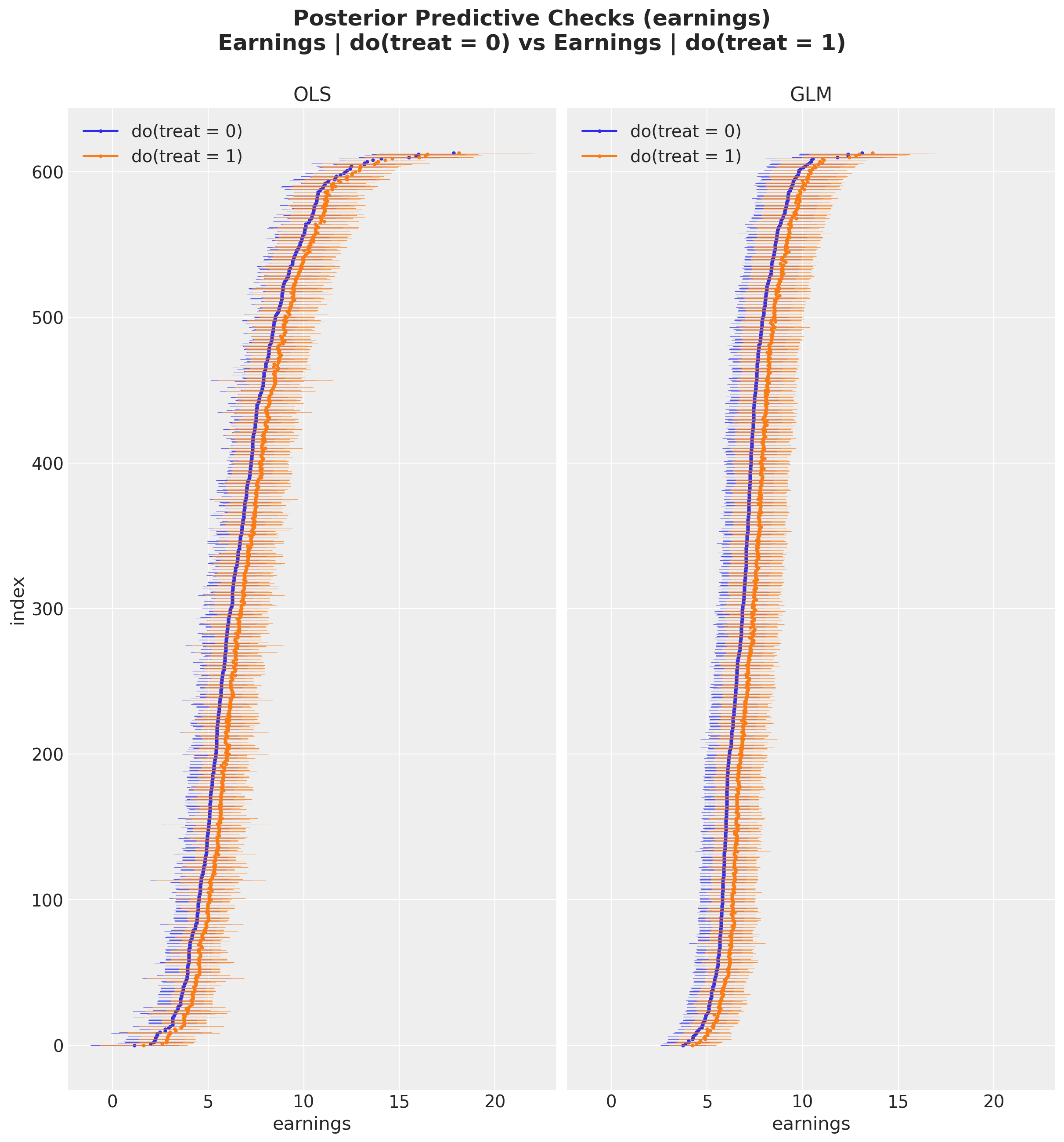
By visual inspection, we can see that the GLM produces tighter credible intervals than the OLS model, suggesting lower variance in the ATE estimate.
We now compute the ATE using the same approach as before.
glm_ate = (glm_expected_do_1 - glm_expected_do_0).mean(dim="obs_idx").rename("ate")Remark: With generalized linear models, the ATE can theoretically be computed from the coefficient, but the computation is more complex due to the non-linear link function. For details, see Causal inference with gamma regression or: The problem is with the link function, not the likelihood (Part 6 of the GLM and causal inference series.)
Let’s visualize the results and compare them with the previous model.
fig, ax = plt.subplots(
    nrows=2,
    figsize=(12, 10),
    sharex=True,
    sharey=True,
    layout="constrained",
)

ax[0].axvline(naive_prediction, color="C3", label="naive estimate")
ax[0].axvline(blog_prediction_ols, color="C2", label="OLS estimate")
ax[0].axvline(blog_prediction_matching, color="C1", label="matching estimate")
ax[0].axvline(
    blog_prediction_matching_ci95[0],
    color="C1",
    linestyle="dashed",
    label="matching estimate 95% confidence",
)
ax[0].axvline(
    blog_prediction_matching_ci95[1],
    color="C1",
    linestyle="dashed",
)
az.plot_posterior(ate, kind="hist", bins=100, color="C0", ax=ax[0])
ax[0].set(title="OLS Model", ylabel="Frequency")


ax[1].axvline(naive_prediction, color="C3", label="naive estimate")
ax[1].axvline(blog_prediction_ols, color="C2", label="OLS estimate")
ax[1].axvline(blog_prediction_matching, color="C1", label="matching estimate")
ax[1].axvline(
    blog_prediction_matching_ci95[0],
    color="C1",
    linestyle="dashed",
    label="matching estimate 95% confidence",
)
ax[1].axvline(
    blog_prediction_matching_ci95[1],
    color="C1",
    linestyle="dashed",
)
az.plot_posterior(glm_ate, kind="hist", bins=100, color="C0", ax=ax[1])
ax[1].legend(loc="upper center", bbox_to_anchor=(0.5, -0.15), ncol=4)
ax[1].set(title="GLM Model", xlabel="ATE estimate", ylabel="Frequency")
fig.suptitle("ATE Estimation Comparison", fontsize=18, fontweight="bold");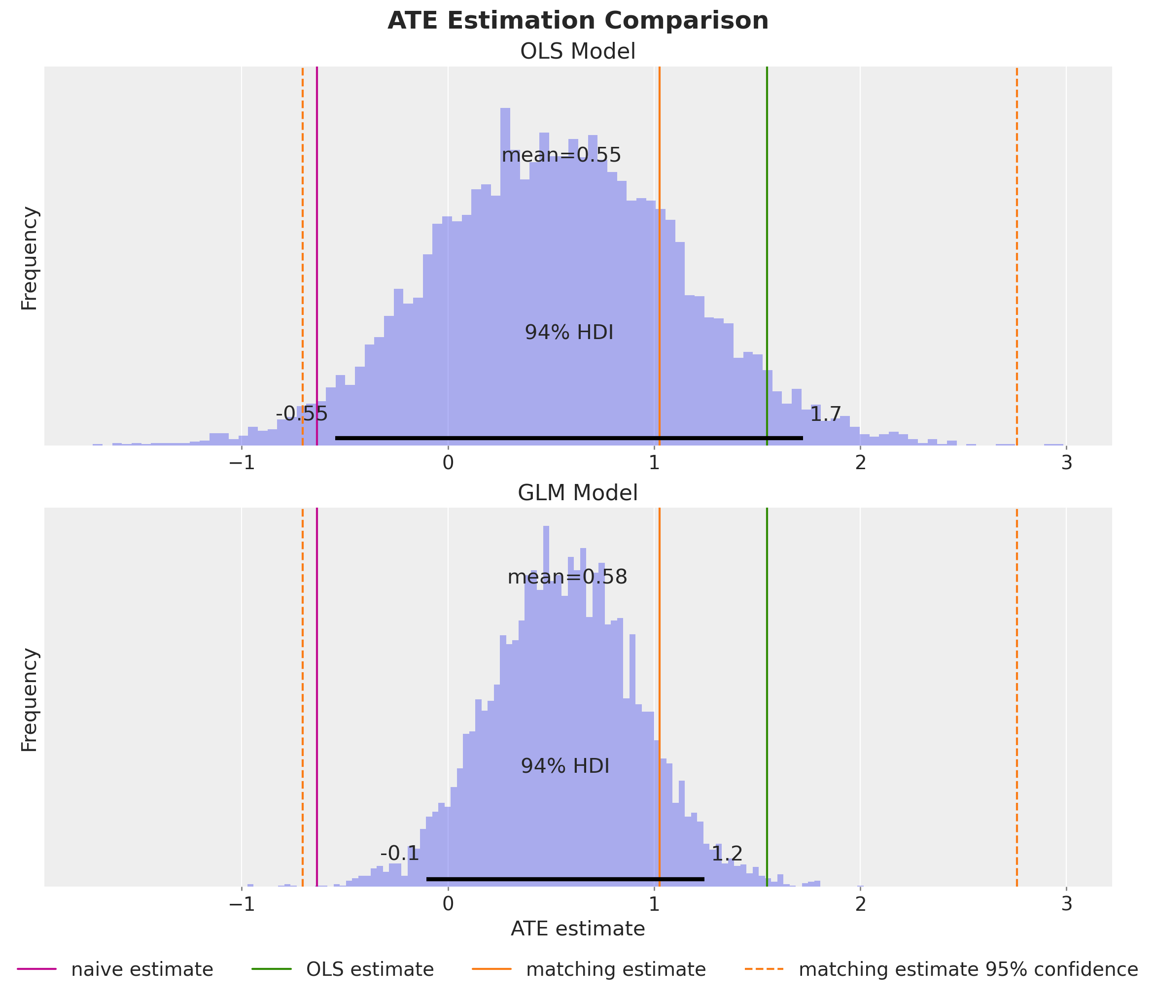
We obtain a very similar posterior mean, but the GLM provides estimates with lower variance, reflecting the improved model fit.
Let’s perform a final comparison of all the methods we’ve used to compute the ATE.
ax, *_ = az.plot_forest(
    data=[
        idata["posterior"].rename({"beta_treat_earnings": "ate"})["ate"],
        ate,
        glm_ate,
    ],
    model_names=["Coefficient", "Do-Operator", "GLM"],
    var_names=["ate"],
    combined=True,
    hdi_prob=0.94,
    figsize=(7, 5),
)
ax.set_title(r"ATE Estimation Comparison ($94\%$ HDI)", fontsize=18, fontweight="bold");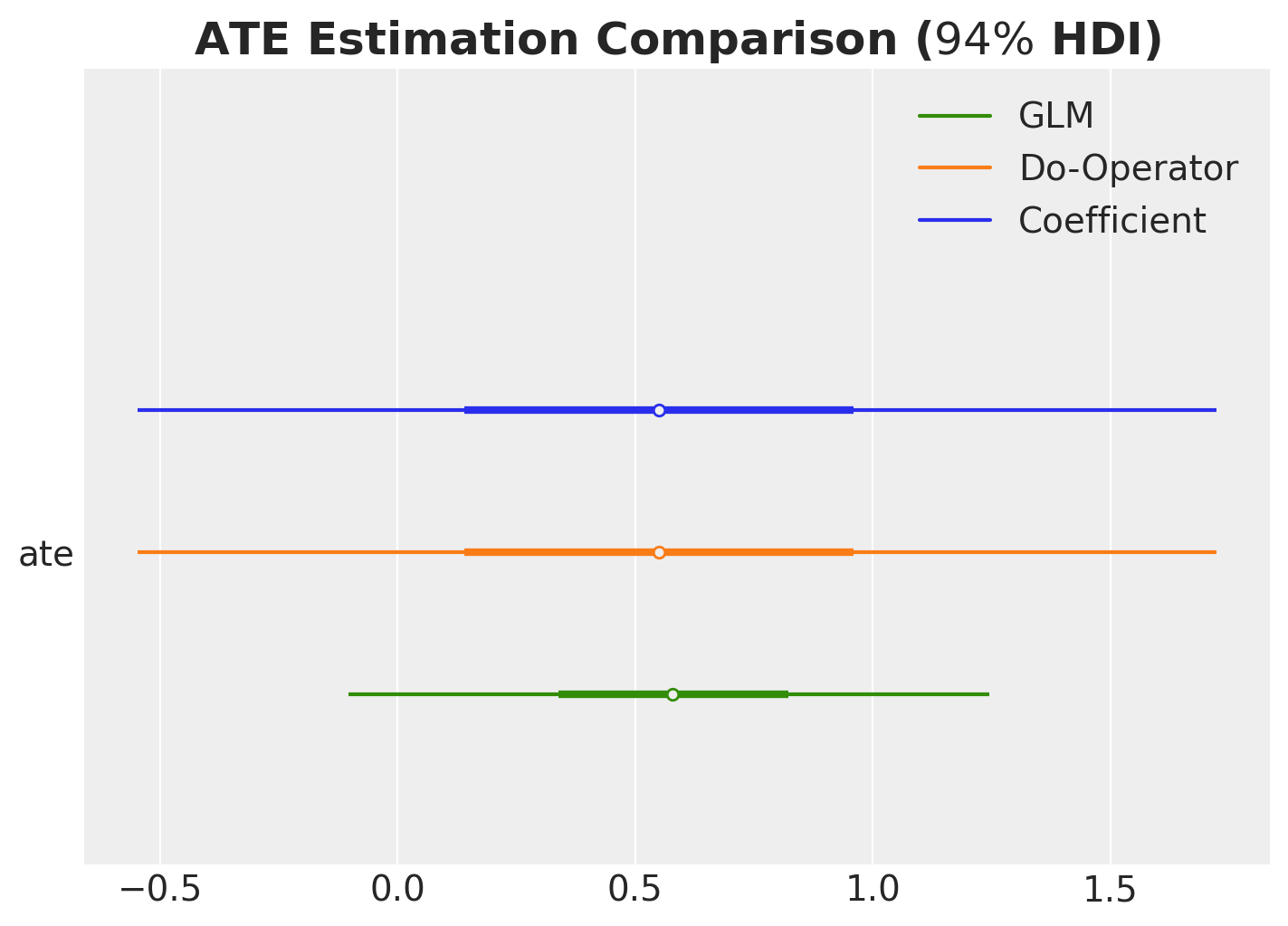
Finally, let’s compare the models using leave-one-out cross-validation (LOO-CV).
compare_df = az.compare(
    compare_dict={
        "OLS": idata,
        "GLM": glm_idata,
    },
    var_name="earnings",
    ic="loo",
)

az.plot_compare(compare_df, figsize=(7, 5));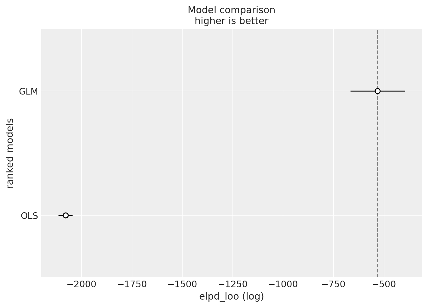
As expected, the GLM model outperforms the OLS model, which makes sense given that it better respects the domain constraints of the earnings outcome variable.
Conclusion
In this notebook, we’ve explored how probabilistic programming languages, specifically PyMC, provide a powerful and intuitive framework for causal inference. Through our analysis of the Lalonde dataset, we’ve demonstrated several key principles:
Key Takeaways
Confounding matters: The naive comparison of treated and untreated groups gave a misleading estimate of the treatment effect. By explicitly modeling confounders—variables that affect both treatment assignment and outcomes—we obtained more reliable causal estimates.
Bayesian inference provides full uncertainty quantification: Rather than just point estimates and confidence intervals, we obtained full posterior distributions for the Average Treatment Effect (ATE), giving us a richer understanding of uncertainty that accounts for all sources of variation.
The
dooperator enables counterfactual reasoning: By implementing Pearl’s do-calculus directly in PyMC, we could answer “what if” questions—computing counterfactual outcomes under different treatment scenarios. This approach is more general than coefficient interpretation and works seamlessly with non-linear models.Model validation is essential: Through prior predictive checks, convergence diagnostics, and posterior predictive checks, we ensured our models were well-specified and our inferences were reliable. The comparison between OLS and GLM models highlighted the importance of choosing appropriate likelihood functions that respect domain constraints.
Why Use PPLs Over Traditional OLS methods for Causal Inference?
For most basic causal inference problems, you can use traditional OLS methods. They have nothing wrong anf you should always start with them.
However, when the problem is more complex, PPLs can offer several advantages:
- Flexibility for Complex Models
- Extending to non-linear models (e.g., GLMs with non-identity link functions) makes ATE interpretation complex. The treatment coefficient no longer directly represents the ATE, and computing counterfactuals becomes mathematically challenging.
- We can use custom Double ML methods with PPLs: see Double ML in Numpyro using scope.
- The
dooperator approach works identically for linear models, GLMs, hierarchical models, and even complex non-parametric models. You can use the same counterfactual reasoning framework regardless of model complexity.- Example [Pyro Example Using Neural Networks and a more complex DAG]: Chapter 11, Part 2 - Bayesian Causal Graphical Inference Workflow from the book Causal AI.
- Incorporating Prior Knowledge
- Traditional OLS methods, don’t have a natural way to incorporate domain expertise or previous study results.
- Bayesian framework naturally incorporates prior knowledge through prior distributions.
This is especially valuable when you have small samples or want to combine evidence from
multiple sources.
- Here is an example to use a prior experiments to reduce variance of the ATE estimate through instrumental variables: Experimentation, Non-Compliance and Instrumental Variables with PyMC.
- Example of Prior specification for A/B tests: Prior Predictive Modeling in Bayesian AB Testing (and an indication on how to do Bayesian power analysis: Introduction to Bayesian Power Analysis: Exclude a Null Value).
- We can combnine this with methods like CUPED: Bayesian CUPED & Sensitivity Analysis.
- Model Calibration
- Using Bayesian models, you can calibrate models with additional likelihoods. This is especially useful when you have unobserved confounders (very common in marketing).
- Example in Marketing Mix Modeling: Unobserved Confounders, ROAS and Lift Tests in Media Mix Models.
- Example constraining a Gaussian Process: Electricity Demand Forecast: Dynamic Time-Series Model with Prior Calibration.
- Using Bayesian models, you can calibrate models with additional likelihoods. This is especially useful when you have unobserved confounders (very common in marketing).