In this notebook, we work out an example of how to interpret and communicate statistical models. We follow the ideas and techniques from the amazing book “Model to Meaning: How to Interpret Statistical Models with marginaleffects for R and Python”. This exposition is by no means exhaustive, but it should give you a good starting point. For more details, check the book!
Motivating Example: Ads, ROAS and Budgets
The following example is motivated by real applications in the ad-tech industry. We keep it simple, as we are not interested in a detailed statistical model, but rather in the interpretation and communication of the model results:
An ad platform offers advertising services to stores (say, to promote their products). It charges its stores per click and reports back ROAS (return on ad spend). The business strategy is that these stores are paying to get incremental orders. Stores keep spending while ROAS makes the campaigns worth it; when it doesn’t, they pause for a month(s). The ad platform wants to predict next month’s budget from this month’s signals: ROAS, where the store is in its life-cycle, and the time of year. Their analytics team has seen that these factors help explain whether a store stays engaged and keeps investing. One main question is the relationship between ROAS and budget. ROAS larger than one is good for the stores. Less than one simply means that the campaign is not profitable. One could wonder if the bidding algorithm should just push high ROAS on the marketplace to make it healthy and profitable. Nevertheless, the ad platform has seen that very high ROAS often leads to a drop in the following month’s budget. The reason is simple: as the stores have a fixed daily production capacity, they can just serve a limited number of orders. Hence, we expect a non-linear relationship between ROAS and next month’s budget.
For this example, we generate synthetic data to mimic the mechanism described above. We generate a panel dataset for \(100\) stores. We’ll fit three models of increasing flexibility on the same panel (a Gaussian linear baseline, a Hurdle-Gamma GLM with a linear ROAS coefficient, and a Hurdle-Gamma GLM with a Gaussian process on ROAS) to better understand the relationship between ROAS and next month’s budget. We will do this using bambi to specify the models and the marginaleffects framework to interpret the results. We will also show how these two packages are integrated through the interpret module in bambi.
Warning: This is an oversimplified example. We are ignoring cannibalization, other drivers and a more complex causal structure. In practice, this problem is much harder.
Prepare Notebook
from typing import NamedTuple

import arviz as az
import bambi as bmb
import graphviz as gr
import matplotlib.pyplot as plt
import numpy as np
import polars as pl
import preliz as pz
from marginaleffects.datagrid import datagrid

az.style.use("arviz-darkgrid")
plt.rcParams["figure.figsize"] = [10, 6]
plt.rcParams["figure.dpi"] = 100
plt.rcParams["figure.facecolor"] = "white"

%load_ext autoreload
%autoreload 2
%config InlineBackend.figure_format = "retina"
seed: int = sum(map(ord, "marginaleffects"))
rng: np.random.Generator = np.random.default_rng(seed=seed)Data Generation Process
For this specific example, we consider the following (simple) causal DAG:
g = gr.Digraph()
g.node(name="seasonality", label="seasonality", color="lightgray", style="filled")
g.node(name="roas", label="roas", color="#2a2eec80", style="filled")
g.node(name="cohort_age", label="cohort_age", color="#fa7c1780", style="filled")
g.node(name="budget_next", label="budget_next", color="#328c0680", style="filled")
g.edge(tail_name="seasonality", head_name="budget_next")
g.edge(tail_name="cohort_age", head_name="budget_next")
g.edge(tail_name="roas", head_name="budget_next")
g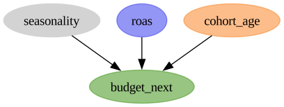
Let’s proceed with generating the data. As budgets are positive, we model them through a gamma distribution. On the log scale, next month’s expected budget is simulated as follows:
\[ \log \mu_{t+1} \;=\; \beta_0 \;+\; \text{season}(\text{month}_t) \;+\; \gamma \cdot \text{cohort_age}_t \;+\; \beta(\text{roas}_t) \cdot g(\text{month}_t, \text{cohort_age}_t) \cdot \text{roas}_t \]
- The first terms are the intercept, a seasonal effect, and a cohort effect. These are classical additive terms.
- The interesting piece is \(\beta(\text{roas})\): a coefficient that varies with ROAS itself. Below \(\text{ROAS}=1\) stores are losing money, so the marginal effect of ROAS on next month’s budget is negative; in the sweet spot between 1 and 4 each extra unit of ROAS pulls more budget in; past \(\text{ROAS}=4\) stores hit inventory or capacity ceilings and the effect saturates.
- The term \(g(\text{month}_t, \text{cohort_age}_t)\) is just a funky interaction term that we use to generate some additional non-linearity.
A smooth \(\beta(\text{roas})\) by construction
We build \(\beta\) as a product of two analytic pieces (a smooth rise and a smooth saturation window), so the function is \(C^{\infty}\) everywhere with no joining knots.
def beta_roas(roas: np.ndarray) -> np.ndarray:
    rise = -0.5 + 1.0 / (1.0 + np.exp(-3.0 * (roas - 1.0)))
    saturation = 1.0 / (1.0 + np.exp(0.6 * (roas - 4.0)))
    return rise * saturation


def f_roas(roas: np.ndarray) -> np.ndarray:
    return beta_roas(roas) * roas
Let’s visualize the \(\beta(\text{roas})\) function and the product \(\beta(\text{roas}) \cdot \text{roas}\):
roas_grid = np.linspace(0.0, 10.0, 100)

beta_roas_grid = beta_roas(roas_grid)
f_roas_grid = f_roas(roas_grid)

fig, axes = plt.subplots(
    nrows=1,
    ncols=2,
    figsize=(12, 7),
    sharex=True,
    sharey=True,
    layout="constrained",
)
axes[0].plot(roas_grid, beta_roas_grid, color="C0")
axes[0].axhline(0.0, color="black", linewidth=0.8)
axes[0].set(
    title=r"$\beta(\mathrm{roas})$: the varying coefficient",
    xlabel="roas",
    ylabel=r"$\beta$",
)

axes[1].plot(roas_grid, f_roas_grid, color="C1")
axes[1].axhline(0.0, color="black", linewidth=0.8)
axes[1].set(
    title=r"$\beta(\mathrm{roas}) \cdot \mathrm{roas}$: contribution to $\log \mu$",
    xlabel="roas",
)
fig.suptitle("Ground truth ROAS effect", fontsize=18, fontweight="bold");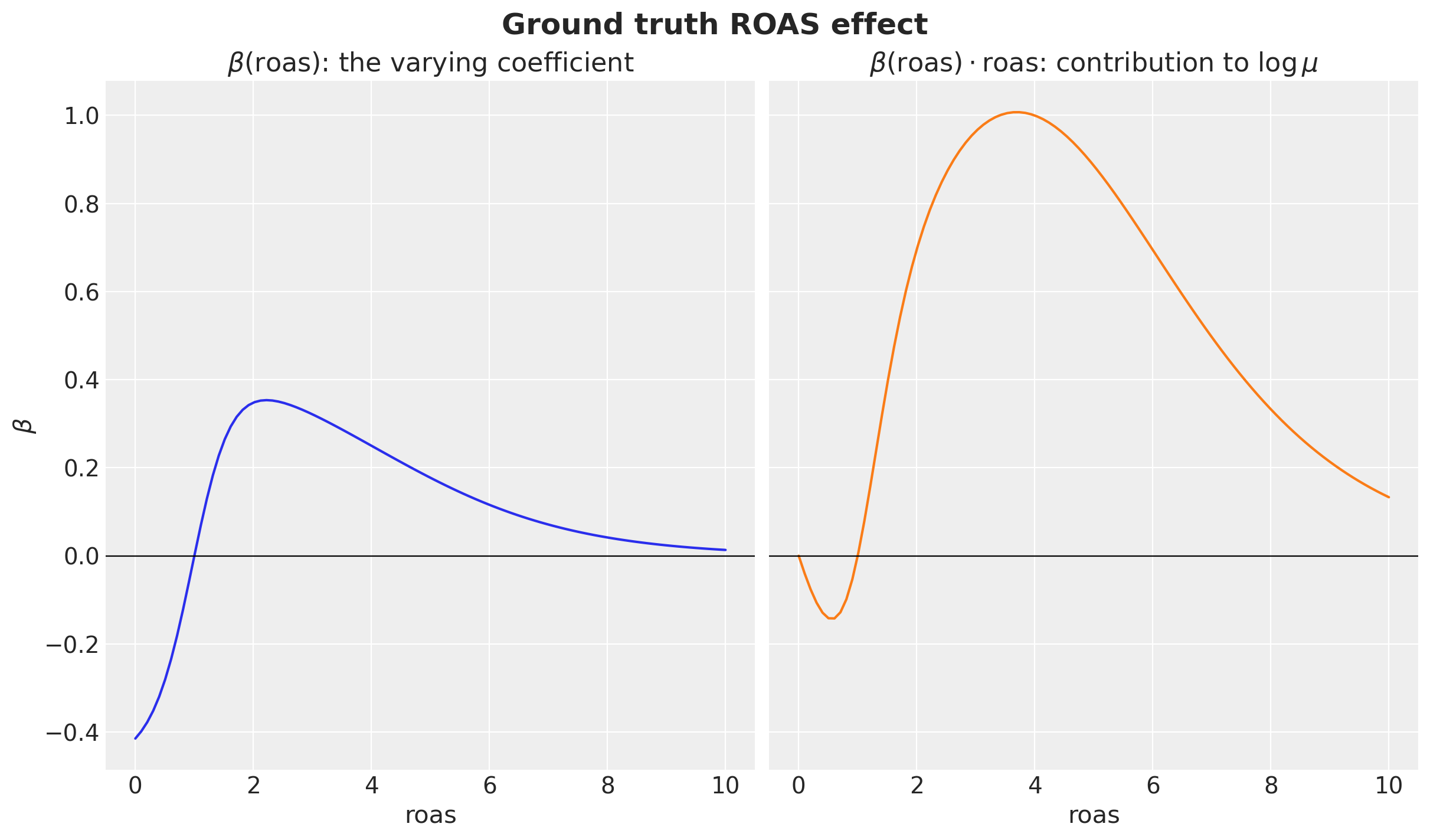
Negative for low ROAS, rising through zero around break-even, peaking in the sweet spot, then pulled back toward zero as the platform saturates. This is the curve we’ll later try to recover from a Gaussian process.
Generating the Panel Data
We consider \(100\) stores observed for \(24\) months. Each store has its own cohort start (so cohort age varies across the panel) and its own ROAS process.
Remark: The lag matters! Each row pairs this month’s signals with next month’s budget, the leading indicators a store could act on. When a store is inactive in a given month (no spend), it has no ROAS to report; that’s encoded as NaN, and rows whose lagged ROAS is NaN are dropped at modeling time.
Remark: We could have added variation across stores: fixed or random effects. We do not do it here to keep things simple. However, in real use cases, we should model the heterogeneity across stores.
class DGPParams(NamedTuple):
    """Parameters of the synthetic data-generating process.

    Attributes
    ----------
    n_stores
        Number of stores in the panel.
    n_months
        Number of months observed per store.
    intercept
        Baseline contribution to $\\log \\mu$ (response mean on the log scale).
    cohort_slope
        Per-month slope on $\\log \\mu$ for cohort age; older stores drift down.
    gamma_sigma
        Relative noise scale for the Gamma response (coefficient of variation).
        Per-row standard deviation is $\\sigma = \\text{gamma\\_sigma} \\cdot \\mu$,
        so shape $= 1 / \\text{gamma\\_sigma}^2$ is constant across rows. The default
        $1/\\sqrt{8}$ matches the original `gamma_shape = 8` parameterization.
    inactive_base_prob
        Per-month baseline probability that a store has no spend at all (the
        zero point-mass in the response).
    inactive_summer_bonus
        Extra inactivity probability layered on top of the baseline in July
        and August (a seasonal dip in active stores).
    """

    n_stores: int = 100
    n_months: int = 24
    intercept: float = 0.5
    cohort_slope: float = -0.02
    gamma_sigma: float = 1.0 / np.sqrt(8.0)
    inactive_base_prob: float = 0.05
    inactive_summer_bonus: float = 0.10


class DGP:
    def __init__(self, rng: np.random.Generator) -> None:
        self.rng = rng

    @staticmethod
    def season(month_of_year: np.ndarray) -> np.ndarray:
        return 0.4 * np.sin(2 * np.pi * month_of_year / 12) + 0.2 * np.cos(
            4 * np.pi * month_of_year / 12
        )

    @staticmethod
    def true_mu(
        roas: np.ndarray,
        cohort_age: np.ndarray,
        month_of_year: np.ndarray,
        params: "DGPParams",
    ) -> np.ndarray:
        """Ground-truth Gamma-conditional mean budget at the given predictor values.

        Inputs may be scalars or arrays, including the (n_stores, n_months)
        panel arrays used during simulation. NumPy broadcasting handles both
        cases.
        """
        season_term = DGP.season(np.asarray(month_of_year, dtype=float))
        roas_term = (
            f_roas(np.asarray(roas, dtype=float))
            * (1.0 + 1.0 / (1.0 + cohort_age))
            * (1.0 + 0.5 * season_term)
        )
        log_mu = (
            params.intercept
            + season_term
            + params.cohort_slope * cohort_age
            + roas_term
        )
        return np.exp(log_mu)

    def _simulate_features(
        self, params: DGPParams
    ) -> tuple[np.ndarray, np.ndarray, np.ndarray, np.ndarray, np.ndarray]:
        store_ids = np.arange(params.n_stores)
        store_starts = self.rng.integers(low=-12, high=1, size=params.n_stores)
        store_log_roas_mean = self.rng.normal(
            loc=np.log(2.5), scale=0.4, size=params.n_stores
        )

        log_roas = np.empty(shape=(params.n_stores, params.n_months))
        log_roas[:, 0] = store_log_roas_mean + self.rng.normal(
            scale=0.3, size=params.n_stores
        )
        for t in range(1, params.n_months):
            log_roas[:, t] = (
                0.6 * log_roas[:, t - 1]
                + 0.4 * store_log_roas_mean
                + self.rng.normal(scale=0.3, size=params.n_stores)
            )
        roas = np.clip(np.exp(log_roas), 0.0, 8.0)

        month_idx = np.broadcast_to(
            np.arange(params.n_months), (params.n_stores, params.n_months)
        )
        month_of_year = (month_idx % 12) + 1
        cohort_age = month_idx - store_starts[:, None]

        inactive_prob = params.inactive_base_prob + params.inactive_summer_bonus * (
            np.isin(month_of_year, [7, 8])
        ).astype(float)
        inactive = (
            self.rng.uniform(size=(params.n_stores, params.n_months)) < inactive_prob
        )

        return roas, month_of_year, cohort_age, store_ids, inactive

    def _draw_response(
        self,
        roas: np.ndarray,
        month_of_year: np.ndarray,
        cohort_age: np.ndarray,
        inactive: np.ndarray,
        params: DGPParams,
    ) -> tuple[np.ndarray, np.ndarray]:
        mu_next = self.true_mu(
            roas=roas[:, :-1],
            cohort_age=cohort_age[:, :-1],
            month_of_year=month_of_year[:, :-1],
            params=params,
        )
        sigma_next = params.gamma_sigma

        shape = mu_next**2 / sigma_next**2
        scale = sigma_next**2 / mu_next

        budget_pos = self.rng.gamma(
            shape=shape,
            scale=scale,
        )
        inactive_next = inactive[:, 1:]
        budget_next = np.where(inactive_next, 0.0, budget_pos)
        return budget_next, inactive_next

    def _build_panel(
        self,
        store_ids: np.ndarray,
        roas: np.ndarray,
        month_of_year: np.ndarray,
        cohort_age: np.ndarray,
        inactive: np.ndarray,
        budget_next: np.ndarray,
        inactive_next: np.ndarray,
        params: DGPParams,
    ) -> pl.DataFrame:
        roas_observed = np.where(inactive, np.nan, roas)
        n_pred = params.n_months - 1
        return pl.DataFrame(
            {
                "store_id": np.repeat(store_ids, n_pred),
                "predictor_month_idx": np.tile(np.arange(n_pred), params.n_stores),
                "month_of_year": month_of_year[:, :-1].ravel(),
                "cohort_age": cohort_age[:, :-1].ravel(),
                "roas": roas_observed[:, :-1].ravel(),
                "budget_next": budget_next.ravel(),
                "inactive_next": inactive_next.ravel(),
            }
        )

    def run(self, params: DGPParams) -> pl.DataFrame:
        roas, month_of_year, cohort_age, store_ids, inactive = self._simulate_features(
            params
        )
        budget_next, inactive_next = self._draw_response(
            roas, month_of_year, cohort_age, inactive, params
        )
        return self._build_panel(
            store_ids,
            roas,
            month_of_year,
            cohort_age,
            inactive,
            budget_next,
            inactive_next,
            params,
        )


params = DGPParams()
panel = DGP(rng=rng).run(params)

panel.head()| store_id | predictor_month_idx | month_of_year | cohort_age | roas | budget_next | inactive_next |
|---|---|---|---|---|---|---|
| i64 | i64 | i64 | i64 | f64 | f64 | bool |
| 0 | 0 | 1 | 9 | 3.837695 | 7.053046 | false |
| 0 | 1 | 2 | 10 | 2.518261 | 5.239541 | false |
| 0 | 2 | 3 | 11 | 2.659978 | 4.747273 | false |
| 0 | 3 | 4 | 12 | 3.115095 | 5.135168 | false |
| 0 | 4 | 5 | 13 | 2.326126 | 4.932751 | false |
Exploratory Data Analysis
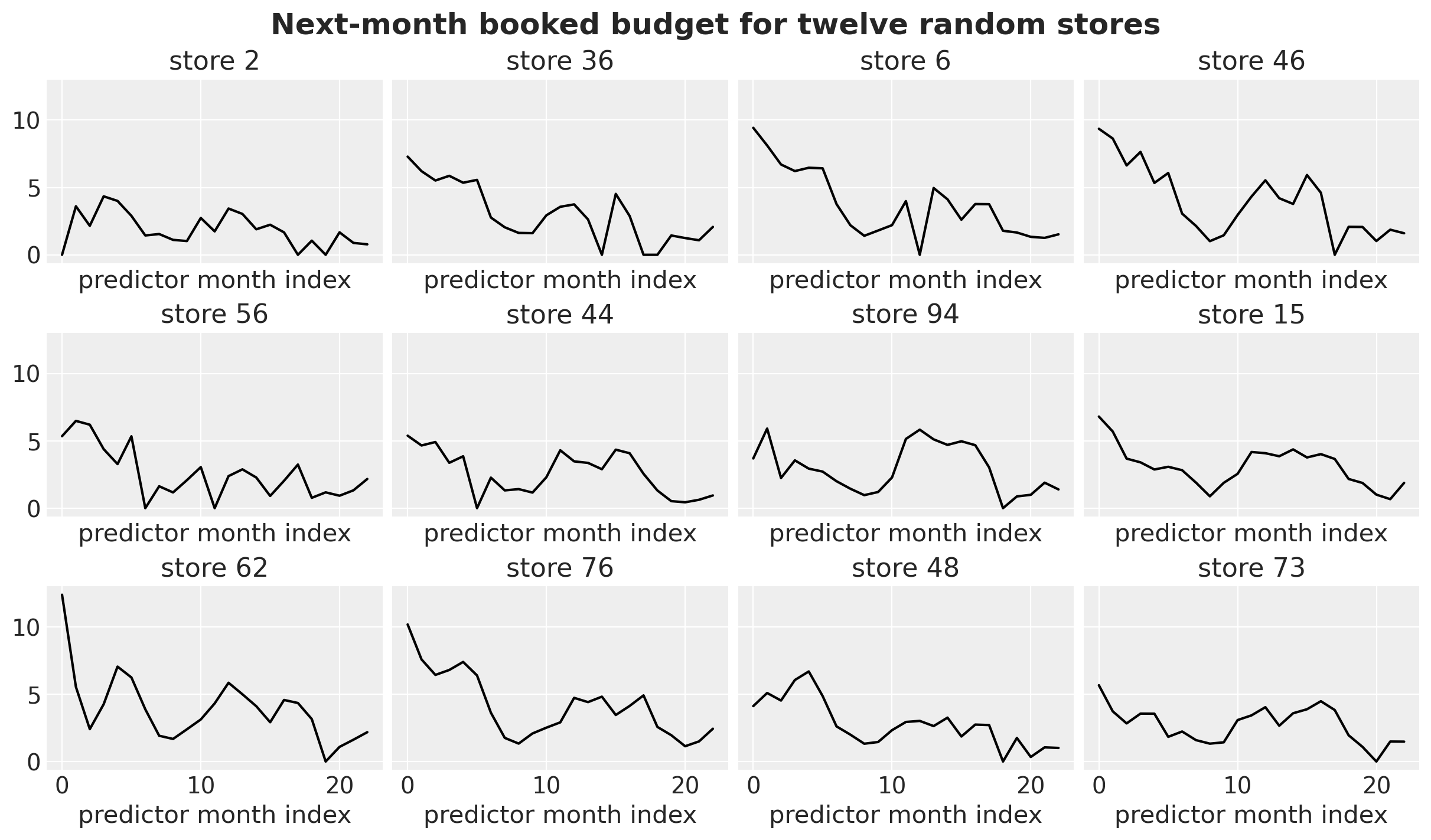
Before fitting any model, let’s look at the panel and check the structure we put in is actually visible. Let’s start by taking twelve random stores over time, each store’s monthly budget; the model regresses each point on the prior month’s predictors. Watch for seasonal humps and the occasional zero month.
n_random_stores = 12

sample_ids = rng.choice(
    panel["store_id"].unique().to_numpy(), size=n_random_stores, replace=False
)

fig, axes = plt.subplots(
    nrows=3,
    ncols=4,
    figsize=(12, 7),
    sharex=True,
    sharey=True,
    layout="constrained",
)

for ax, sid in zip(axes.flat, sample_ids, strict=True):
    sub = panel.filter(pl.col("store_id").eq(pl.lit(sid))).sort("predictor_month_idx")
    ax.plot(
        sub["predictor_month_idx"].to_numpy(),
        sub["budget_next"].to_numpy(),
        color="black",
    )
    ax.set(title=f"store {sid}", xlabel="predictor month index")
fig.suptitle(
    "Next-month booked budget for twelve random stores", fontsize=18, fontweight="bold"
);
We now plot the histograms for next month’s budget and ROAS.
fig, axes = plt.subplots(nrows=1, ncols=2, figsize=(10, 4), layout="constrained")
axes[0].hist(panel["budget_next"].to_numpy(), bins=40, color="C0")
axes[0].set(xlabel="budget_next (active months)")
axes[1].hist(
    panel.filter(pl.col("roas").is_not_nan())["roas"].to_numpy(), bins=40, color="C1"
)
axes[1].set(xlabel="roas (predictor month)");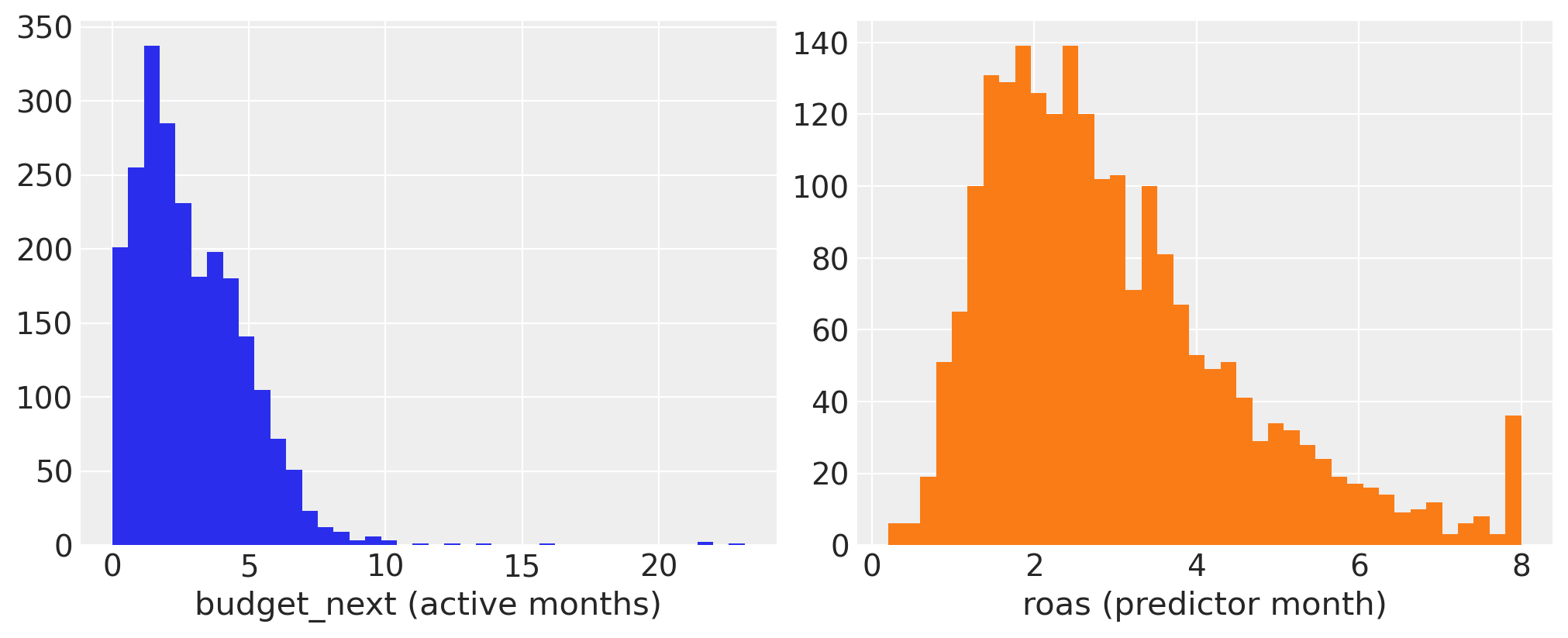
Let’s visualize their relationship via a scatter plot.
roas_bins = np.linspace(0, 8, 21)
bin_centers = 0.5 * (roas_bins[:-1] + roas_bins[1:])
scatter_df = panel.filter(pl.col("roas").is_not_nan())
roas_arr = scatter_df["roas"].to_numpy()
budget_arr = scatter_df["budget_next"].to_numpy()
bin_idx = np.digitize(roas_arr, roas_bins) - 1
bin_idx = np.clip(bin_idx, 0, len(bin_centers) - 1)
medians = np.array(
    [
        np.median(budget_arr[bin_idx == i]) if np.any(bin_idx == i) else np.nan
        for i in range(len(bin_centers))
    ]
)

fig, ax = plt.subplots()
ax.scatter(roas_arr, budget_arr, alpha=0.15, s=10)
ax.plot(bin_centers, medians, color="C3", linewidth=2, label="binned median")
ax.legend()
ax.set(
    xlabel="roas (predictor month)",
    ylabel="budget_next",
)
ax.set_title("Next-month budget vs this-month's ROAS", fontsize=18, fontweight="bold");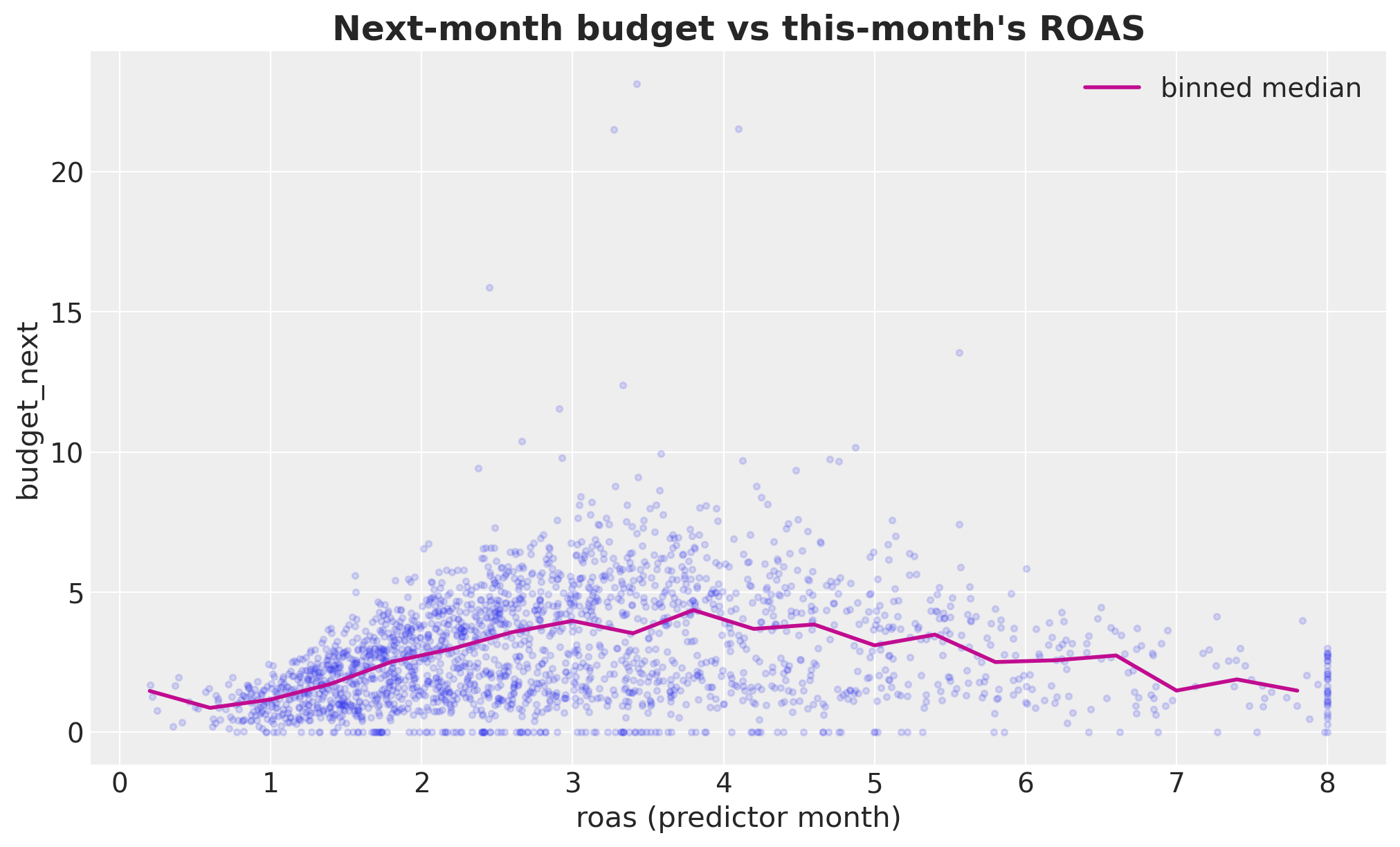
The non-linear shape is visible to the eye: budget rises with ROAS, levels off past ROAS≈4. That’s the signal we want the model to pick up.
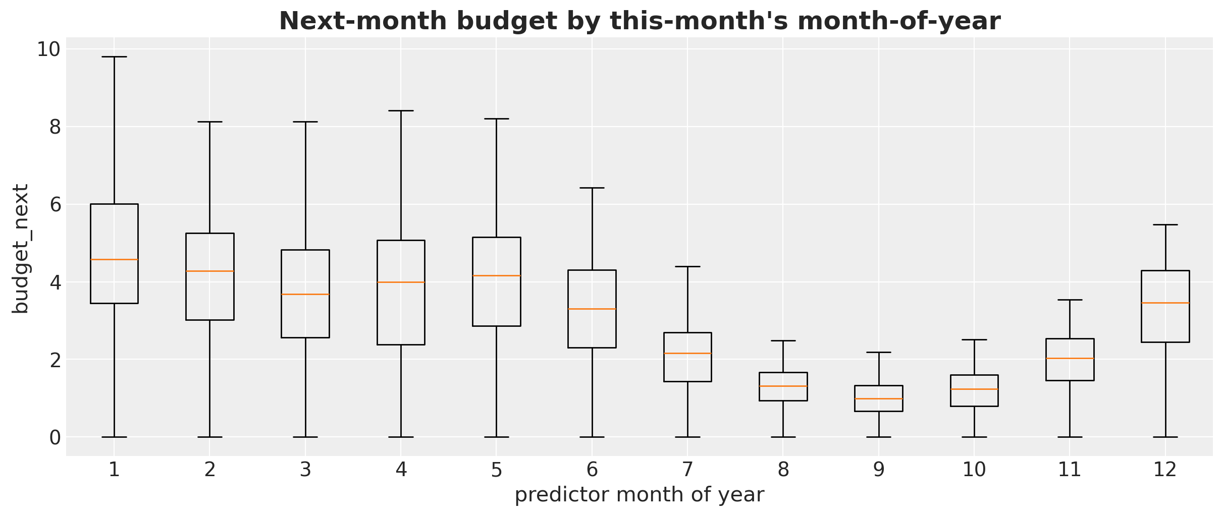
Next, we look into the distribution of the response (next month’s budget) by month. Yearly seasonality should be visible by month.
fig, ax = plt.subplots(figsize=(12, 5))
month_groups = [
    panel.filter(pl.col("month_of_year").eq(pl.lit(m)))["budget_next"].to_numpy()
    for m in range(1, 13)
]
ax.boxplot(month_groups, tick_labels=list(range(1, 13)), showfliers=False)
ax.set(
    xlabel="predictor month of year",
    ylabel="budget_next",
)
ax.set_title(
    "Next-month budget by this-month's month-of-year",
    fontsize=18,
    fontweight="bold",
);
Cohort age vs budget: a mild downward drift as stores get older.
cohort_summary = (
    panel.group_by("cohort_age")
    .agg(pl.col("budget_next").mean().alias("mean_budget"))
    .sort("cohort_age")
)

fig, ax = plt.subplots()
ax.scatter(
    panel["cohort_age"].to_numpy(),
    panel["budget_next"].to_numpy(),
    alpha=0.2,
    s=10,
)
ax.plot(
    cohort_summary["cohort_age"].to_numpy(),
    cohort_summary["mean_budget"].to_numpy(),
    marker="o",
    color="C1",
    linewidth=2,
    label="binned mean",
)
ax.legend()
ax.set(
    xlabel="cohort age (months)",
    ylabel="budget_next",
)
ax.set_title("Cohort-age trend in next-month budget", fontsize=18, fontweight="bold");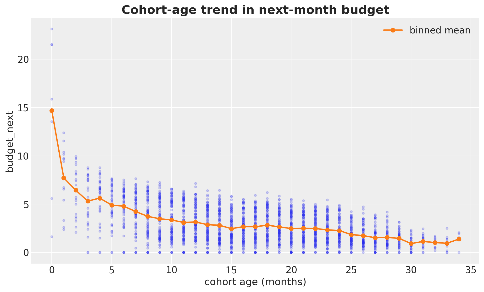
Baseline 1: linear Gaussian (identity link)
We start with the simplest thing that could work: a plain linear regression on the three predictors, Gaussian noise, identity link.
\[\begin{align*} y_i & \sim \text{Normal}(\mu_i, \sigma^2),\\ \mu_i & = \beta_0 + \beta_{\text{age}} \, \text{cohort_age}_i + \sum_{m=2}^{12} \beta_m \, \mathbb{1}[\text{month}_i = m] + \beta_{\text{roas}} \, \text{roas}_i \end{align*}\]
# Dataframe for fitting the Bambi models
model_df = panel.filter(
    pl.col("roas").is_not_nan()
).select(  # Only rows with observed lagged ROAS
    [
        "budget_next",
        "roas",
        "cohort_age",
        "month_of_year",
    ]
)

formula_lm = bmb.Formula("budget_next ~ 1 + cohort_age + C(month_of_year) + roas")

priors_lm = {
    "Intercept": bmb.Prior("Normal", mu=0.0, sigma=2.0),
    "cohort_age": bmb.Prior("Normal", mu=0.0, sigma=1.0),
    "C(month_of_year)": bmb.Prior("ZeroSumNormal", sigma=1.0),
    "roas": bmb.Prior("Normal", mu=0.0, sigma=2.0),
    "sigma": bmb.Prior("HalfNormal", sigma=5.0),
}

model_lm = bmb.Model(
    formula=formula_lm,
    data=model_df.to_pandas(),
    family="gaussian",
    link="identity",
    priors=priors_lm,
)
model_lm.build()

model_lm
Formula: budget_next ~ 1 + cohort_age + C(month_of_year) + roas
Family: gaussian
Link: mu = identity
Observations: 2169
Priors:
target = mu
Common-level effects
Intercept ~ Normal(mu: 0.0, sigma: 2.0)
cohort_age ~ Normal(mu: 0.0, sigma: 1.0)
C(month_of_year) ~ ZeroSumNormal(sigma: 1.0)
roas ~ Normal(mu: 0.0, sigma: 2.0)
Auxiliary parameters
sigma ~ HalfNormal(sigma: 5.0)Prior Predictive
Let’s start by looking at the prior predictive distribution.
idata_prior_lm = model_lm.prior_predictive(draws=1_000, random_seed=rng)

fig, ax = plt.subplots()
az.plot_ppc(idata_prior_lm, group="prior", observed=True, ax=ax)
ax.set_title("Linear Regression: Prior Predictive", fontsize=18, fontweight="bold");
Sampling: [C(month_of_year), Intercept, budget_next, cohort_age, roas, sigma]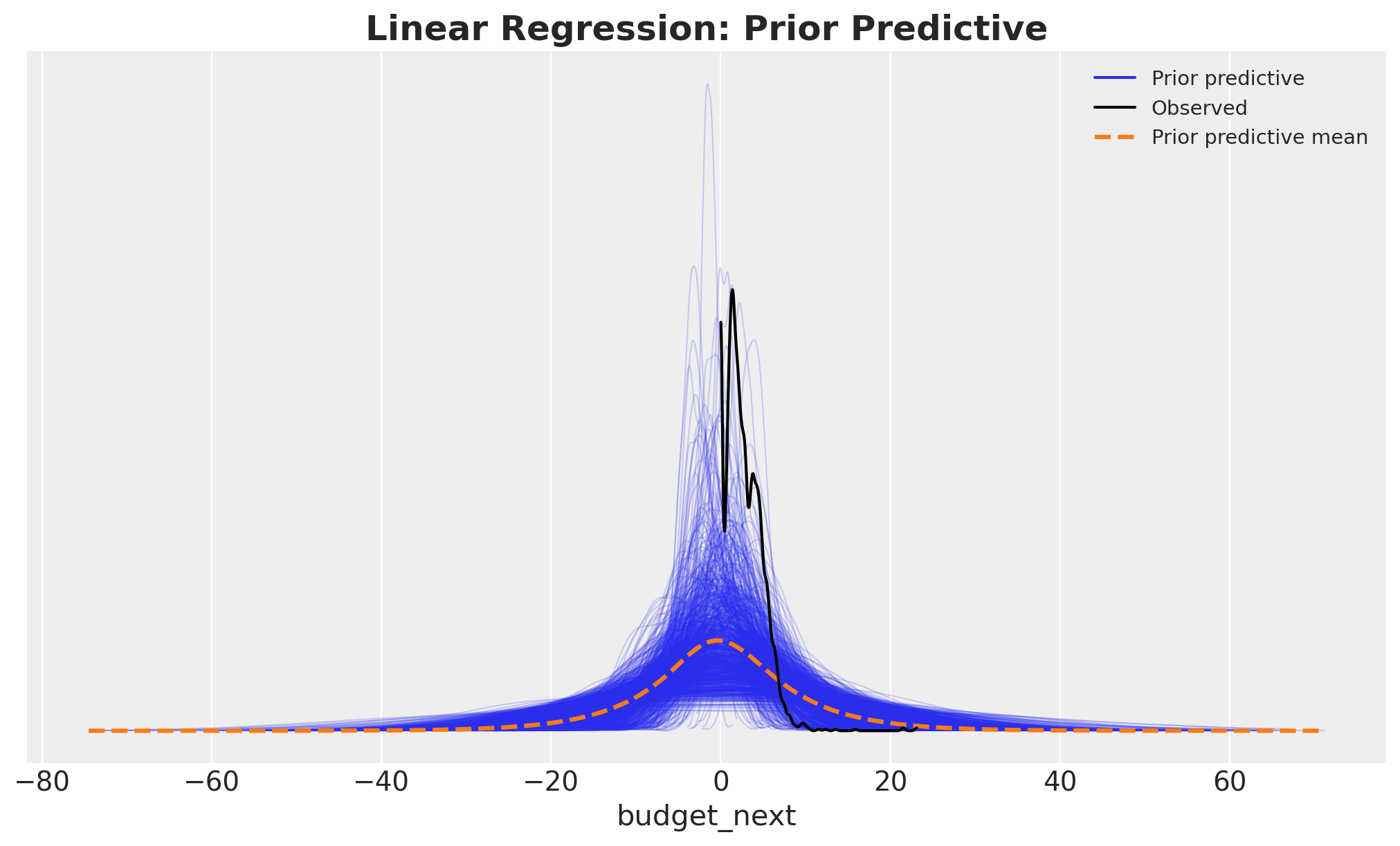
Overall, the prior predictive looks reasonable. Still, we see a conceptual problem with our model: we are allowing negative values for budget_next, which we know is non-negative. We will tackle this issue in the next model iteration below.
Model Fit
We now fit the model to the data.
idata_lm = model_lm.fit(
    draws=1_000,
    tune=1_000,
    chains=4,
    target_accept=0.8,
    inference_method="numpyro",
    random_seed=rng,
    idata_kwargs={"log_likelihood": True},
)
Diagnostics
Let’s look now at the model diagnostics.
# Number of divergences
idata_lm["sample_stats"]["diverging"].sum().item()0axes = az.plot_trace(
idata_lm,
var_names=[
"Intercept",
"cohort_age",
"C(month_of_year)",
"roas",
"sigma",
],
compact=True,
figsize=(12, 9),
backend_kwargs={"layout": "constrained"},
)
plt.gcf().suptitle("Linear Regression: Traceplot", fontsize=18, fontweight="bold");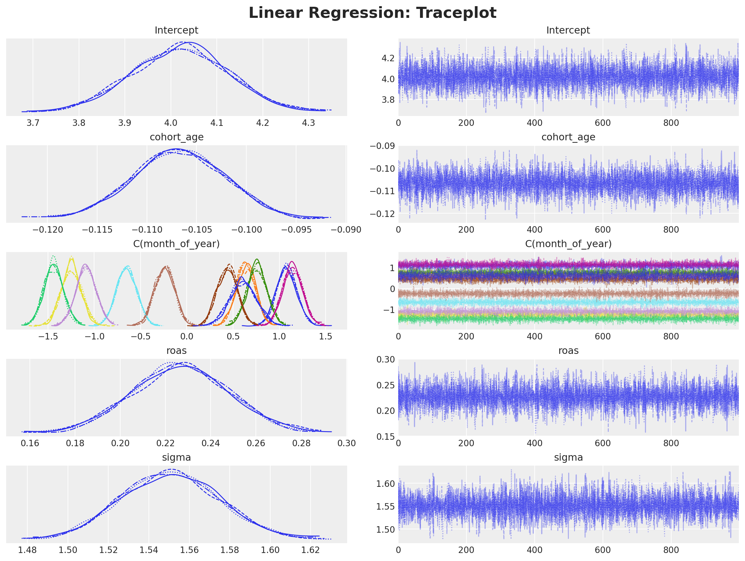
We do not see any divergences and the traceplots look good. Let’s look now at the posterior predictive distribution.
model_lm.predict(idata_lm, kind="response", inplace=True)

fig, ax = plt.subplots()
az.plot_ppc(idata_lm, num_pp_samples=1_000, ax=ax)
ax.set_title("Linear Regression: Posterior Predictive", fontsize=18, fontweight="bold");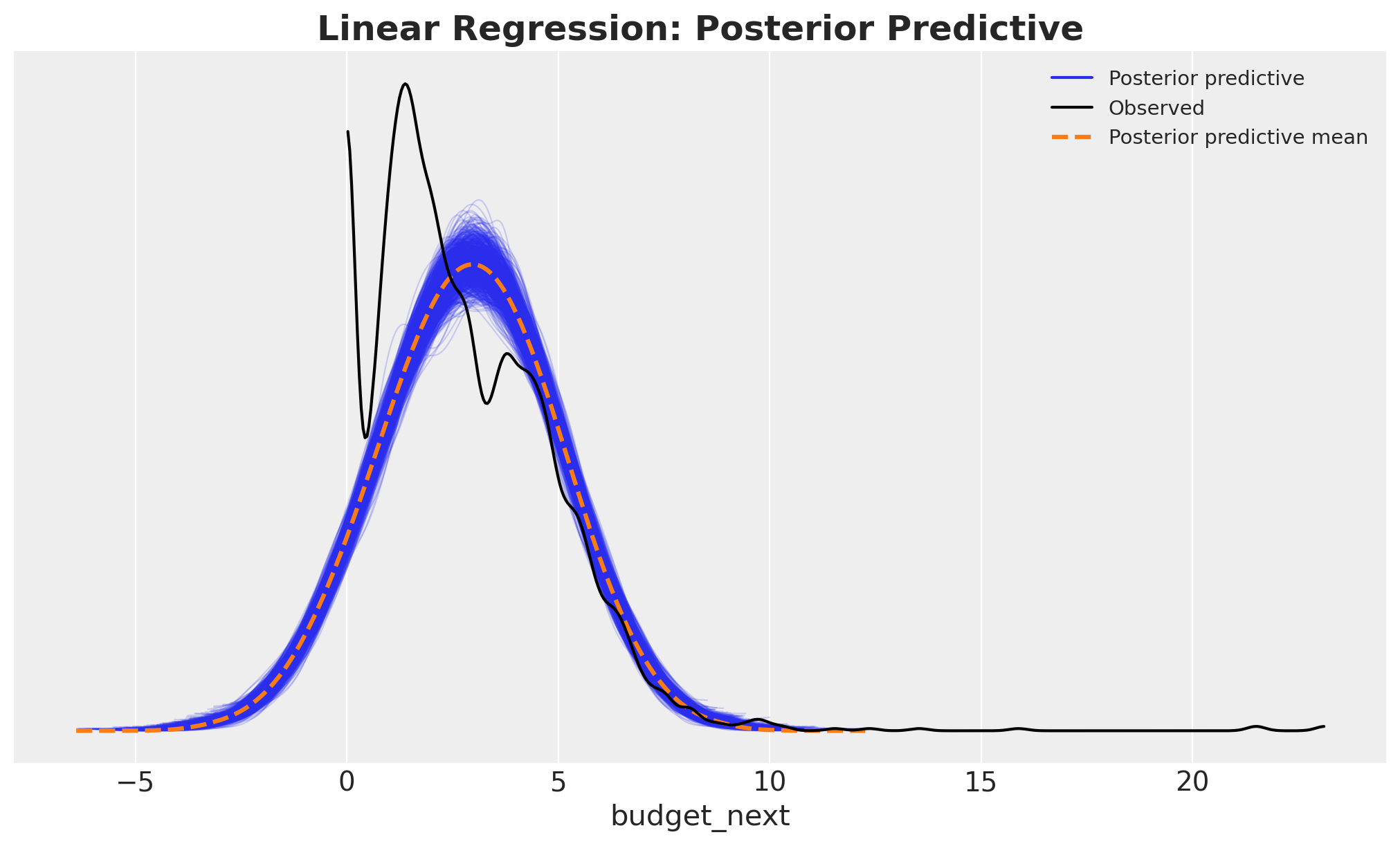
Besides the negative values, the posterior predictive distribution shows another issue: we are not capturing the large amount of zeros. We will also tackle this issue in the next model iteration below.
ROAS Effect on Next Month’s Budget
We are now interested in inspecting the inferred relationship between ROAS and next month’s budget from this baseline linear model. In this case, because the model is linear and there is no link function, we can simply extract this information from the regression coefficient.
fig, ax = plt.subplots()
az.plot_posterior(idata_lm, var_names="roas", ax=ax)
ax.set_title(
    "Linear Regression: ROAS Regression Coefficient", fontsize=18, fontweight="bold"
);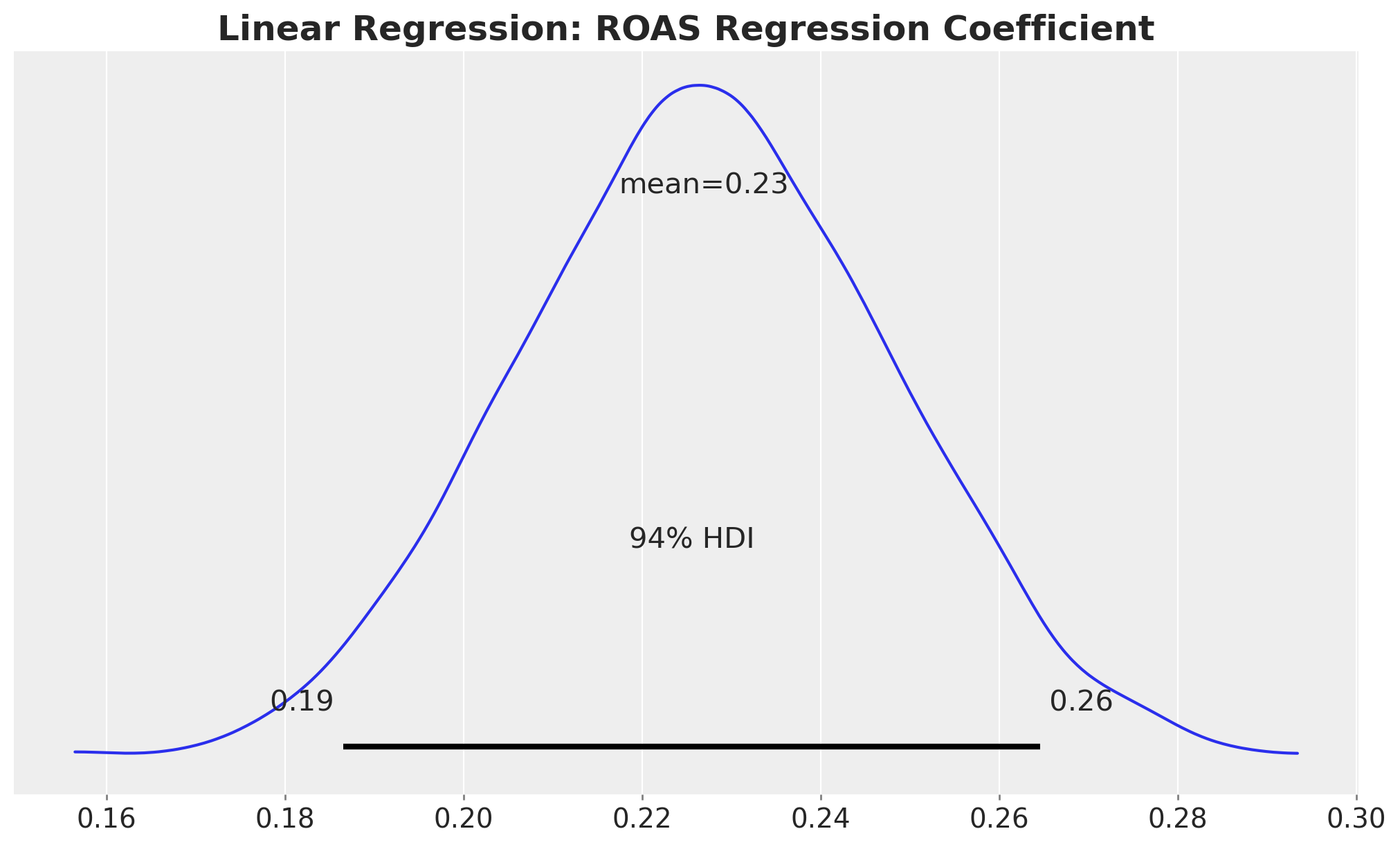
We can interpret this as follows: an increase of one unit in ROAS is associated with an increase of \(0.23\) units in next month’s budget, while holding the rest of the features constant. Note that, by design, this holds true regardless of the ROAS level. This goes against what we have seen in the exploratory data analysis above.
An alternative way to communicate this result is to study the posterior over a grid of values \(\mathbb{E}[Y \mid \text{grid}]\). The idea is to explicitly show how varying ROAS affects the response. This method is described in detail in the book “Model to Meaning: How to Interpret Statistical Models with marginaleffects for R and Python”.
We need to start by defining individual grids for each feature:
roas_grid = np.linspace(0.0, panel["roas"].max(), 20)
month_of_year_grid = np.arange(1, 13)
cohort_age_grid = np.arange(panel["cohort_age"].min(), panel["cohort_age"].max(), 1)

cohort_age_default = np.mean(cohort_age_grid).round()
month_of_year_default = np.mean(month_of_year_grid).round()
To generate predictions for this model we need to specify all values for the input features. In this case: roas, cohort_age and month_of_year. This is where the thinking happens! Which type of information we want to convey? This question should define the grid structure. For example, to simply showcase how next month’s budget varies with ROAS, we can use the roas_grid above and the mean values for the other features. We can use the datagrid function from the marginaleffects package to do this very easily.
roas_datagrid = datagrid(
    roas=roas_grid,
    cohort_age=cohort_age_default,
    month_of_year=month_of_year_default,
    newdata=model_df,
)

roas_datagrid.head()| budget_next | roas | cohort_age | month_of_year |
|---|---|---|---|
| f64 | f64 | f64 | f64 |
| 2.891686 | 0.0 | 16.0 | 6.0 |
| 2.891686 | 0.421053 | 16.0 | 6.0 |
| 2.891686 | 0.842105 | 16.0 | 6.0 |
| 2.891686 | 1.263158 | 16.0 | 6.0 |
| 2.891686 | 1.684211 | 16.0 | 6.0 |
Next, we define a helper function to generate posterior samples of the response mean over a grid.
def predict_mu(model: bmb.Model, idata, grid_pl: pl.DataFrame) -> np.ndarray:
    new_idata = model.predict(
        idata, data=grid_pl.to_pandas(), kind="response_params", inplace=False
    )
    return new_idata["posterior"]["mu"]
We are ready to generate predictions over the grid to visualize the relationship between ROAS and next month’s budget.
idata_lm_mu_grid = predict_mu(model_lm, idata_lm, roas_datagrid)

fig, ax = plt.subplots()

for j, hdi_prob in enumerate([0.94, 0.5]):
    az.plot_hdi(
        roas_grid,
        idata_lm_mu_grid,
        hdi_prob=hdi_prob,
        color="C0",
        fill_kwargs={
            "alpha": 0.2 + 0.2 * j,
            "label": f"{hdi_prob: .0%} CI",
        },
        ax=ax,
    )
ax.legend(loc="center left", bbox_to_anchor=(1, 0.5))
ax.set(
    xlabel="roas",
    ylabel="expected budget next month",
)
ax.set_title(
    """Linear Regression: ROAS Effect on Next Month's Budget
    (other features held constant at their mean)
    """,
    fontsize=18,
    fontweight="bold",
);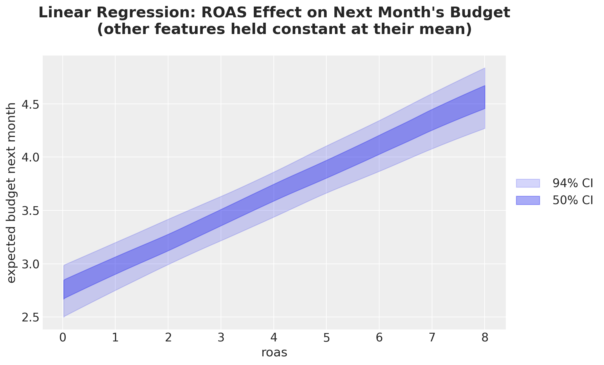
We see that the slope of this posterior predictive line is exactly \(0.23\), the same value we got from the regression coefficient.
We can generalize this idea by considering more granular grids. For instance, we could evaluate the ROAS effect split by cohort age.
cohort_roas_grids = {
    x: datagrid(
        roas=roas_grid,
        cohort_age=x,
        month_of_year=np.mean(month_of_year_grid).round(),
        newdata=model_df,
    )
    for x in cohort_age_grid[::6]
}

fig, ax = plt.subplots()

for i, (cohort_age, grid_roas) in enumerate(cohort_roas_grids.items()):
    idata_lm_mu_grid = predict_mu(model_lm, idata_lm, grid_roas)

    for j, hdi_prob in enumerate([0.94, 0.5]):
        az.plot_hdi(
            roas_grid,
            idata_lm_mu_grid,
            hdi_prob=hdi_prob,
            color=f"C{i}",
            fill_kwargs={
                "alpha": 0.2 + 0.2 * j,
                "label": f"cohort_age={cohort_age} {hdi_prob: .0%} CI",
            },
            ax=ax,
        )
ax.legend(loc="center left", bbox_to_anchor=(1, 0.5))
ax.set(
    xlabel="roas",
    ylabel="expected budget next month",
)
ax.set_title(
    """Linear Regression
    ROAS Effect on Next Month's Budget split by Cohort Age
    (other features held constant at their mean)
    """,
    fontsize=18,
    fontweight="bold",
);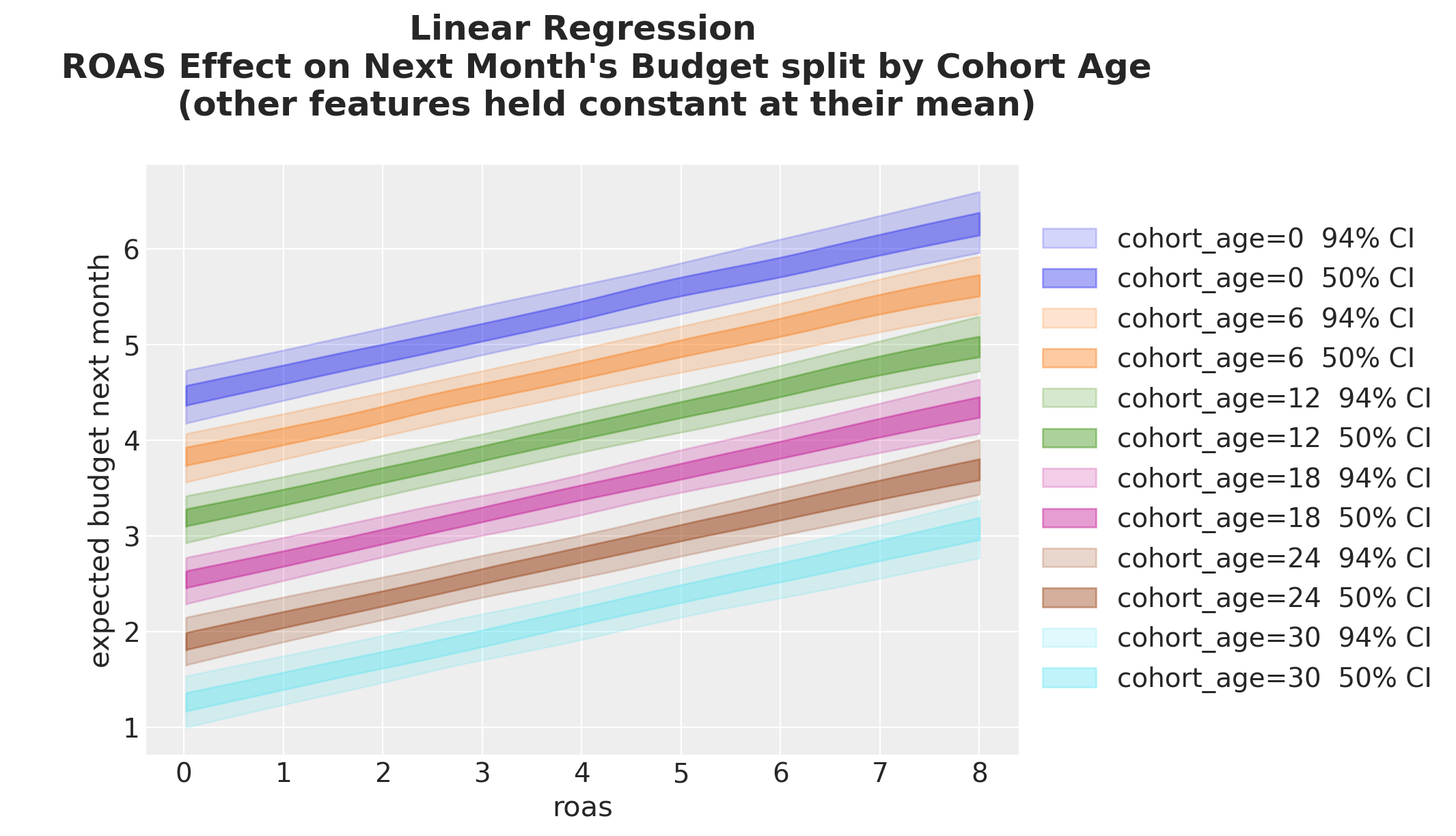
We see that the ROAS effect, as the slope of the lines, is the same across all cohort ages. The only difference is the intercept, which varies with cohort age: the older the cohort the lower the estimated budget.
We can do something similar for the month of year.
month_roas_grids = {
    x: datagrid(
        roas=roas_grid,
        cohort_age=np.mean(cohort_age_grid),
        month_of_year=x,
        newdata=model_df,
    )
    for x in month_of_year_grid[::2]
}

fig, ax = plt.subplots()

for i, (month_of_year, grid_roas) in enumerate(month_roas_grids.items()):
    idata_lm_mu_grid = predict_mu(model_lm, idata_lm, grid_roas)

    for j, hdi_prob in enumerate([0.94, 0.5]):
        az.plot_hdi(
            roas_grid,
            idata_lm_mu_grid,
            hdi_prob=hdi_prob,
            color=f"C{i}",
            fill_kwargs={
                "alpha": 0.2 + 0.2 * j,
                "label": f"month_of_year={month_of_year} {hdi_prob: .0%} CI",
            },
            ax=ax,
        )
ax.legend(loc="center left", bbox_to_anchor=(1, 0.5))
ax.set(xlabel="roas", ylabel="expected budget next month")
ax.set_title(
    """Linear Regression
    ROAS Effect on Next Month's Budget split by Month of Year
    (other features held constant at their mean)
    """,
    fontsize=18,
    fontweight="bold",
);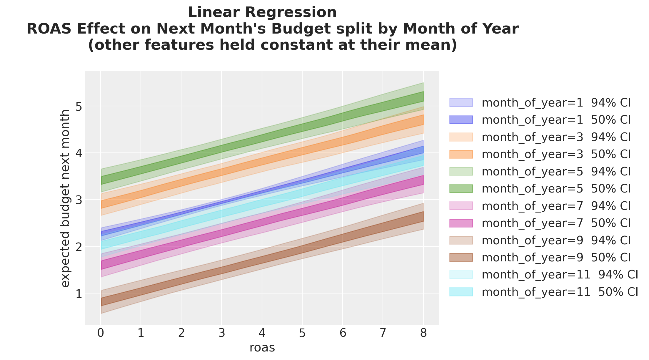
We see that the ROAS effect is the same across all months of year. However, the intercept varies with the month of year. This variation is non-linear: the intercept for month \(11\) is in between the intercepts for month \(1\) and month \(9\).
Besides comparing predictions across grids, we can also compare them via differences or ratios. For example, let’s compute the difference between the ROAS grid predictions for month \(3\) and month \(9\).
month_of_year_0 = 3
month_of_year_1 = 9

_diff = predict_mu(model_lm, idata_lm, month_roas_grids[month_of_year_0]) - predict_mu(
    model_lm, idata_lm, month_roas_grids[month_of_year_1]
)

fig, ax = plt.subplots()

for j, hdi_prob in enumerate([0.94, 0.5]):
    az.plot_hdi(
        roas_grid,
        _diff,
        hdi_prob=hdi_prob,
        color="C0",
        fill_kwargs={
            "alpha": 0.2 + 0.2 * j,
            "label": f"{hdi_prob: .0%} CI",
        },
        ax=ax,
    )
ax.set(
    xlabel="roas",
    ylabel="expected budget next month",
)
ax.legend(loc="center left", bbox_to_anchor=(1, 0.5))
ax.set_title(
    """Linear Regression
    Difference between ROAS Effect on Next Month's Budget
    for Month $3$ and Month $9$
    """,
    fontsize=18,
    fontweight="bold",
);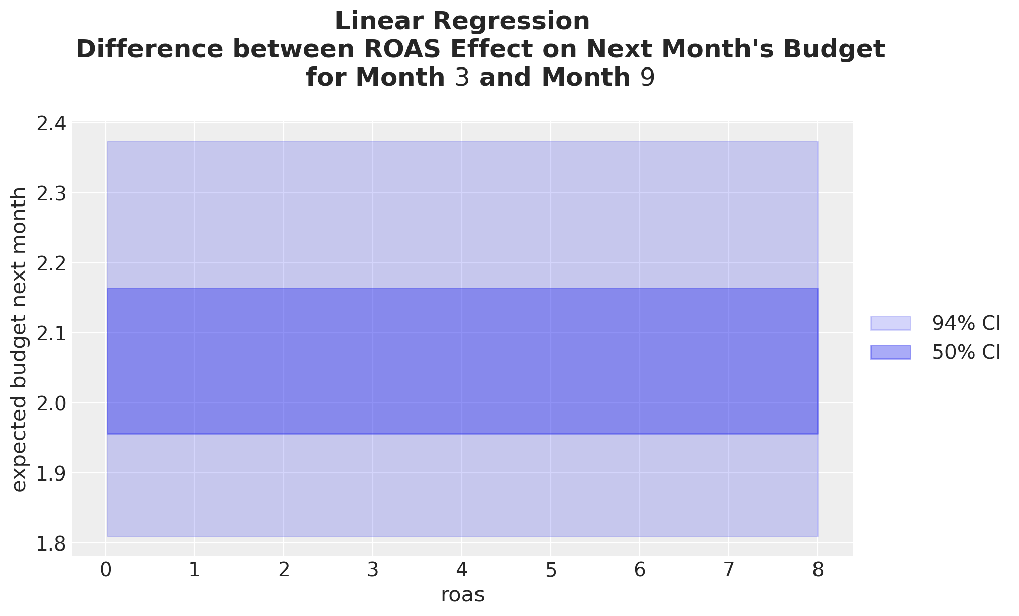
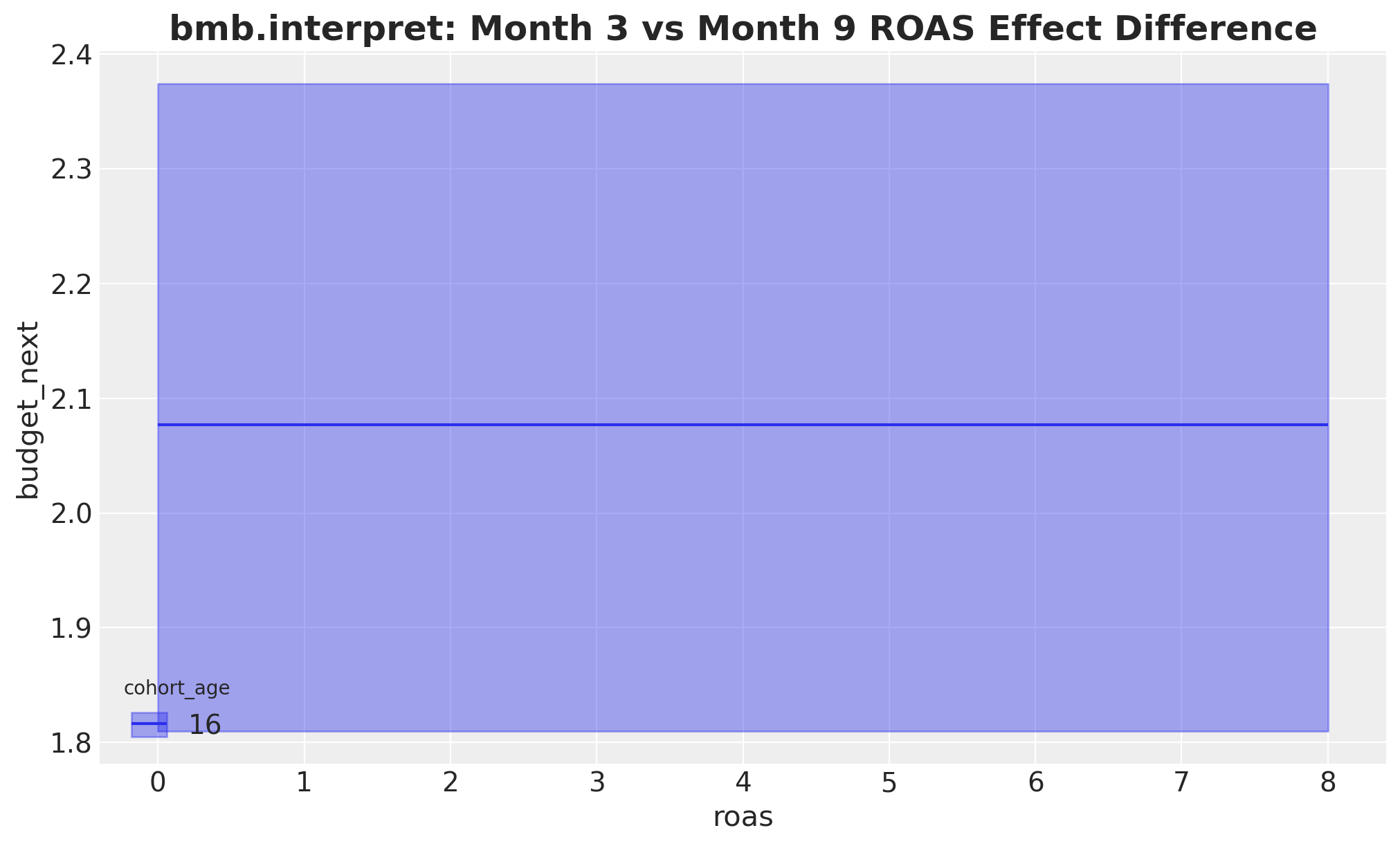
It is not surprising that the difference is constant across ROAS. This is just because of the linearity of the model. As a matter of fact this constant value is nothing other than the difference between the regression coefficients for month \(3\) and month \(9\):
month_of_year_beta_0 = (
    idata_lm["posterior"]["C(month_of_year)"]
    .sel({"C(month_of_year)_dim": np.array([month_of_year_0], dtype="<U2")})
    .squeeze()
)

month_of_year_beta_1 = (
    idata_lm["posterior"]["C(month_of_year)"]
    .sel({"C(month_of_year)_dim": np.array([month_of_year_1], dtype="<U2")})
    .squeeze()
)

fig, ax = plt.subplots()
az.plot_posterior(month_of_year_beta_0 - month_of_year_beta_1, ax=ax)
ax.set(xlabel=r"$\beta_{month=3} - \beta_{month=9}$")
ax.set_title(
    """Linear Regression
    Difference between ROAS Effect on Next Month's Budget
    for Month $3$ and Month $9$
    """,
    fontsize=18,
    fontweight="bold",
);
Cohort Age Effect on Next Month’s Budget
We can do a similar analysis for the cohort age feature.
# We do not explicitly need to set the ROAS values.
# By default, the `datagrid` function will use the mean.
cohort_age_datagrid = datagrid(
    cohort_age=cohort_age_grid,
    month_of_year=np.mean(month_of_year_grid).round(),
    newdata=model_df,
)

idata_lm_mu_cohort_age_grid = predict_mu(model_lm, idata_lm, cohort_age_datagrid)

fig, ax = plt.subplots()

for j, hdi_prob in enumerate([0.94, 0.5]):
    az.plot_hdi(
        cohort_age_grid,
        idata_lm_mu_cohort_age_grid,
        hdi_prob=hdi_prob,
        color="C0",
        fill_kwargs={
            "alpha": 0.2 + 0.2 * j,
            "label": f"{hdi_prob: .0%} CI",
        },
        ax=ax,
    )
ax.legend(loc="center left", bbox_to_anchor=(1, 0.5))
ax.set_title(
    """Linear Regression
    Cohort Age Effect on Next Month's Budget
    (other features held constant at their mean)
    """,
    fontsize=18,
    fontweight="bold",
);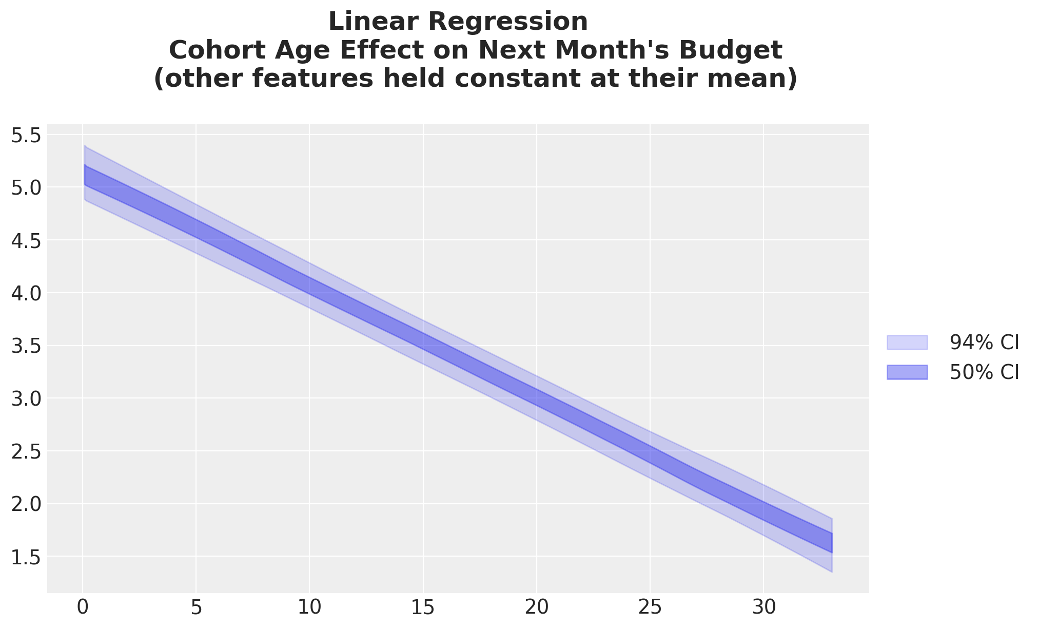
Again, this is not surprising given the regression coefficient is negative (see trace plot above).
Month of Year Effect on Next Month’s Budget
Lastly, let’s do the same for the month of year feature. As this is a categorical variable, we use a forest plot to visualize the effect.
month_of_year_datagrid = datagrid(
    cohort_age=np.mean(cohort_age_grid).round(),
    month_of_year=month_of_year_grid,
    newdata=model_df,
)

idata_lm_mu_month_of_year_grid = predict_mu(model_lm, idata_lm, month_of_year_datagrid)

ax, *_ = az.plot_forest(idata_lm_mu_month_of_year_grid, combined=True, figsize=(8, 6))
ax.set_title(
    """Linear Regression
    Month of Year Effect on Next Month's Budget
    (other features held constant at their mean)
    """,
    fontsize=18,
    fontweight="bold",
);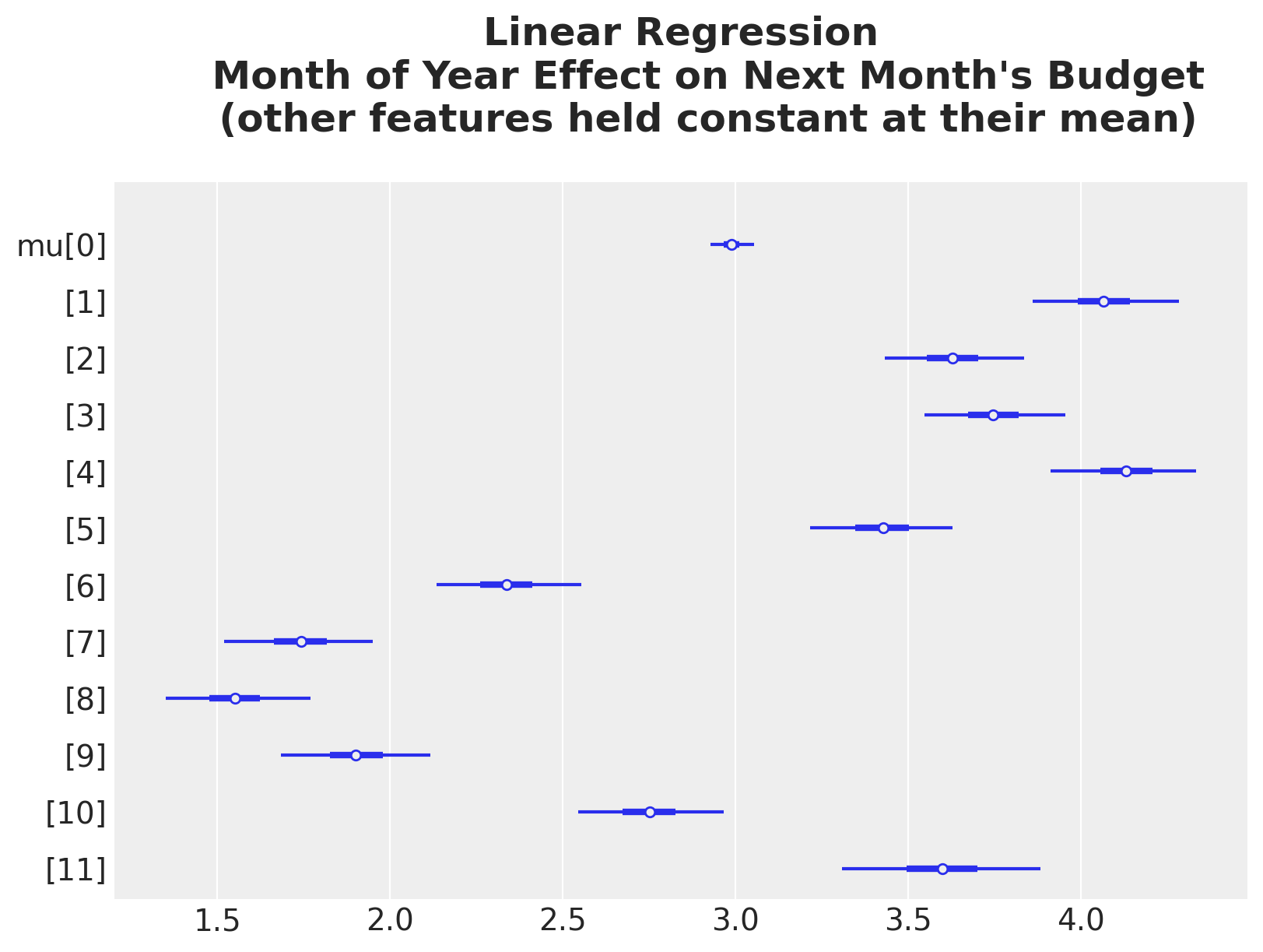
Here are some observations on this result:
- Observe the HDI for month \(1\) (index \(0\), i.e. January) is much narrower than the other months. This is also reflected in the ROAS effect plot above, when we split by month of year.
- All of these effects are centered around zero. The reason for this is because we are using a
ZeroSumNormaldistribution for this categorical variable. This means the sum of the coefficients is zero.
The same answers via Bambi’s interpret module
Everything above we built by hand: a datagrid, a predict_mu pass through the posterior, and an ArviZ summary. Seeing that mechanic once is worth it because it makes explicit what a marginal-effects plot actually is. Fortunately, Bambi ships an interpret module that packages the very same recipe behind three primitives: predictions (“what does the model predict over this grid?”), comparisons (“how does the prediction change from A to B?”), and slopes (“what is the local derivative?”). Each one takes a conditional dictionary in place of the polars grid we wrote by hand: the first key becomes the horizontal axis, a second key becomes the color grouping, and a third becomes the panel. Covariates we leave out are held at their mean (numeric) or mode (categorical), exactly like the defaults we chose above. The plotting helpers plot_predictions, plot_comparisons, and plot_slopes draw a single \(94\%\) HDI band where the custom plots layered a \(94\%\) and a \(50\%\) band, but the underlying numbers are identical: same posterior idata_lm, same grid, same \(\mu\).
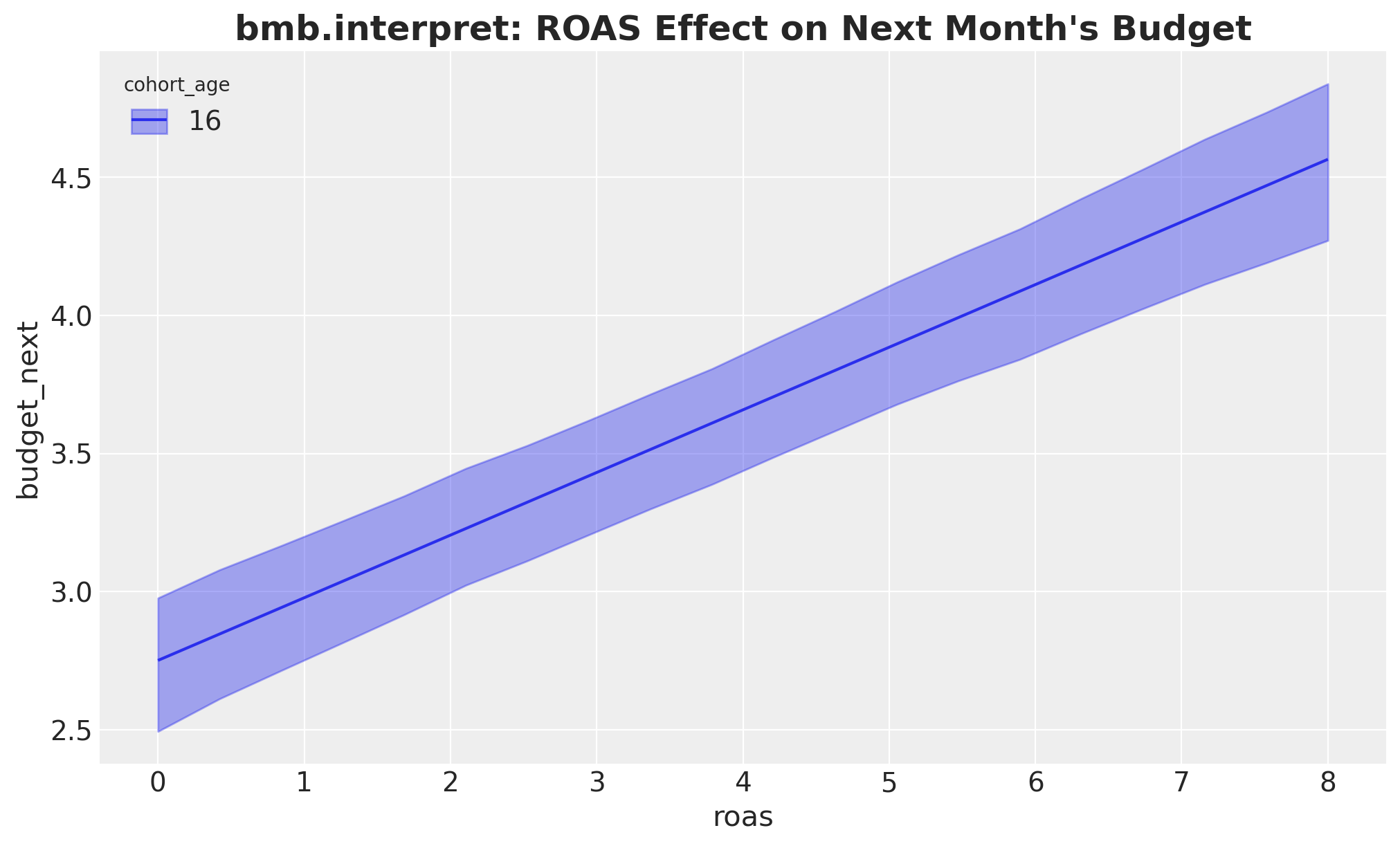
We introduce the module here on the linear baseline and reuse it for the next two models. Let’s reproduce each plot from this section in turn, starting with the ROAS effect.
fig, ax = plt.subplots()
bmb.interpret.plot_predictions(
    model_lm,
    idata_lm,
    conditional={
        "roas": roas_grid,
        "cohort_age": cohort_age_default,
        "month_of_year": month_of_year_default,
    },
    ax=ax,
)
ax.set_title(
    "bmb.interpret: ROAS Effect on Next Month's Budget",
    fontsize=18,
    fontweight="bold",
);
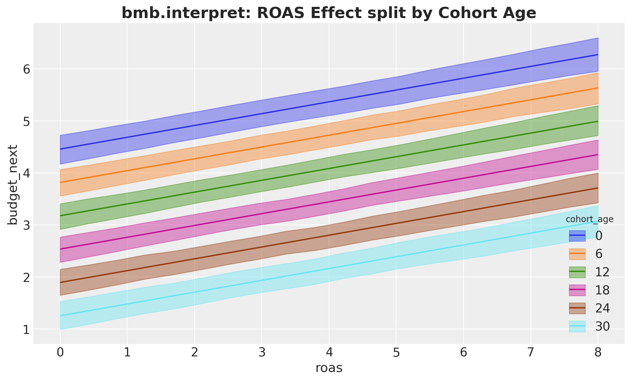
Splitting the ROAS effect by cohort age is just a second key in conditional, which Bambi maps to the color grouping. Compare this with the by-hand version above that stacked the HDI bands.
fig, ax = plt.subplots()
bmb.interpret.plot_predictions(
    model_lm,
    idata_lm,
    conditional={
        "roas": roas_grid,
        "cohort_age": list(cohort_age_grid[::6]),
        "month_of_year": month_of_year_default,
    },
    ax=ax,
)
ax.set_title(
    "bmb.interpret: ROAS Effect split by Cohort Age",
    fontsize=18,
    fontweight="bold",
);
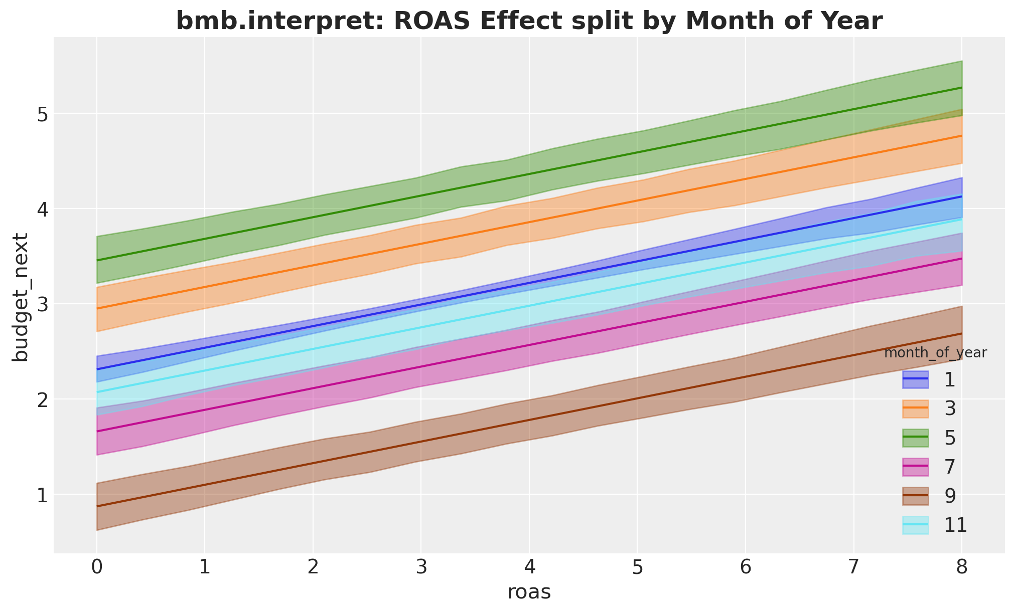
The same idea split by month of year:
fig, ax = plt.subplots()
bmb.interpret.plot_predictions(
    model_lm,
    idata_lm,
    conditional={
        "roas": roas_grid,
        "month_of_year": list(month_of_year_grid[::2]),
        "cohort_age": cohort_age_default,
    },
    ax=ax,
)
ax.set_title(
    "bmb.interpret: ROAS Effect split by Month of Year",
    fontsize=18,
    fontweight="bold",
);
The month-\(3\) versus month-\(9\) contrast is a comparisons call: contrast names the variable and the two levels to difference (ordered low then high, so [9, 3] yields month-\(3\) minus month-\(9\)), while conditional sets the grid over which we evaluate the difference. As before, the difference is constant in ROAS because the model is linear.
fig, ax = plt.subplots()
bmb.interpret.plot_comparisons(
    model_lm,
    idata_lm,
    contrast={"month_of_year": [month_of_year_1, month_of_year_0]},
    conditional={"roas": roas_grid, "cohort_age": cohort_age_default},
    ax=ax,
)
ax.set_title(
    "bmb.interpret: Month 3 vs Month 9 ROAS Effect Difference",
    fontsize=18,
    fontweight="bold",
);
The cohort-age effect: now cohort_age is the horizontal axis and ROAS, left unspecified, is held at its mean.
fig, ax = plt.subplots()
bmb.interpret.plot_predictions(
    model_lm,
    idata_lm,
    conditional={
        "cohort_age": cohort_age_grid,
        "month_of_year": month_of_year_default,
    },
    ax=ax,
)
ax.set_title(
    "bmb.interpret: Cohort Age Effect on Next Month's Budget",
    fontsize=18,
    fontweight="bold",
);
Default computed for unspecified variable: roas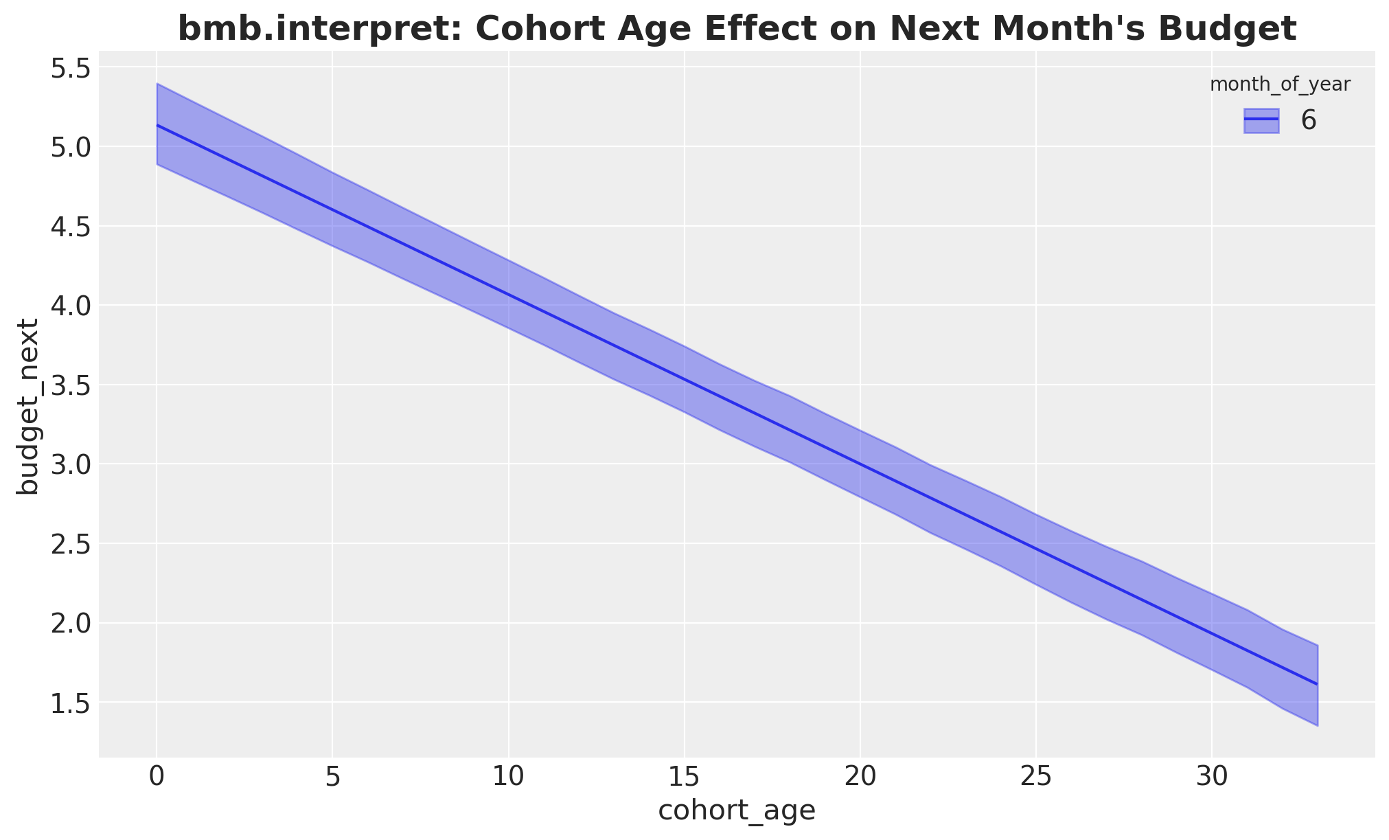
And the month-of-year effect. Because month_of_year enters the formula through C(...), Bambi treats it as categorical and draws a point with an interval per level, the same information carried by the forest plot above.
fig, ax = plt.subplots()
bmb.interpret.plot_predictions(
    model_lm,
    idata_lm,
    conditional={
        "month_of_year": month_of_year_grid,
        "cohort_age": cohort_age_default,
    },
    ax=ax,
)
ax.set_title(
    "bmb.interpret: Month of Year Effect on Next Month's Budget",
    fontsize=18,
    fontweight="bold",
);
Default computed for unspecified variable: roas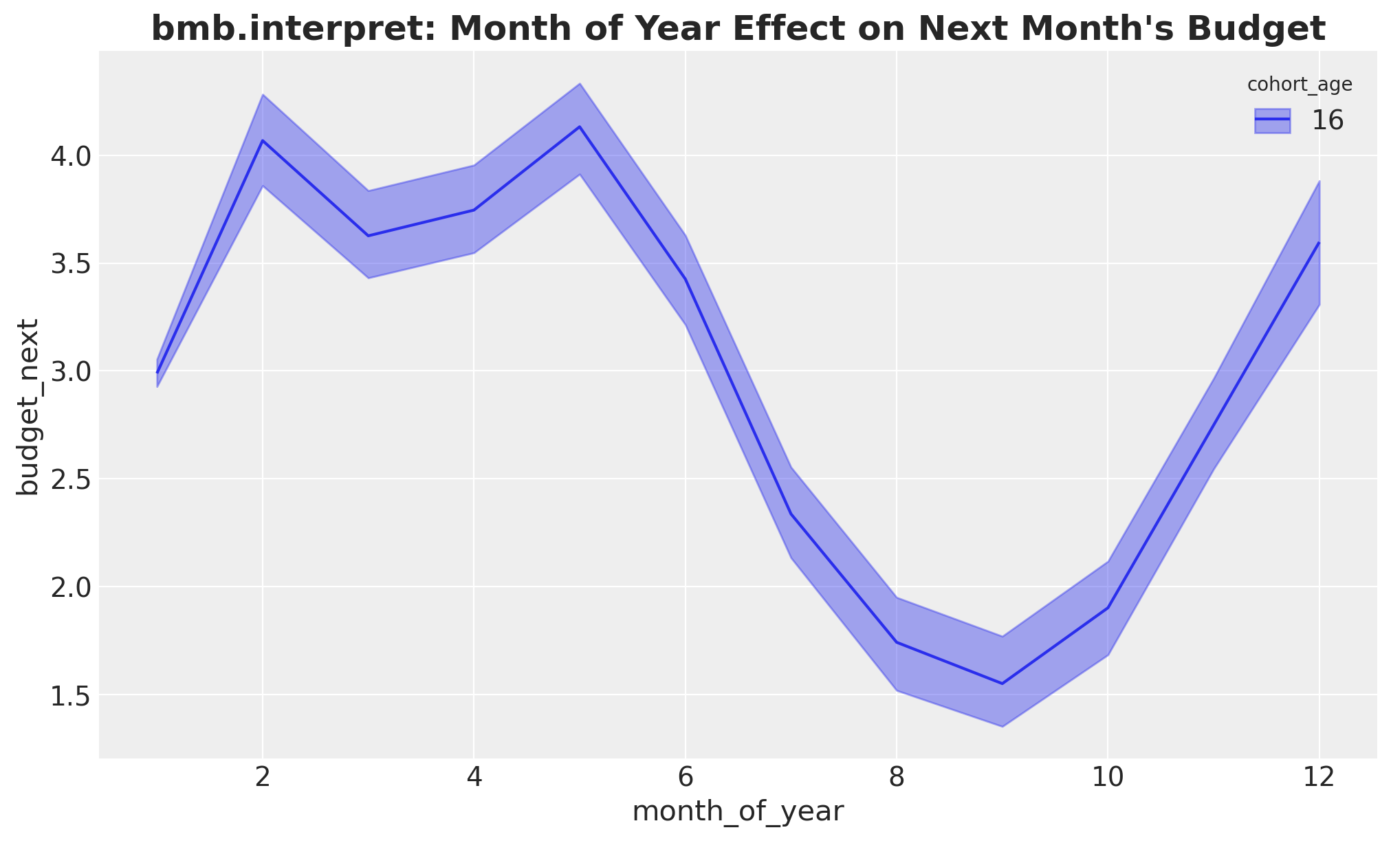
Finally the third primitive, slopes, which we skipped in the by-hand tour. It returns the local derivative \(\partial \mu / \partial \text{roas}\). For a linear identity-link model this derivative is constant and equal to the ROAS regression coefficient we read off the trace plot, so the table below reports a single number that matches that posterior mean.
bmb.interpret.slopes(
    model_lm,
    idata_lm,
    wrt="roas",
    conditional={
        "cohort_age": cohort_age_default,
        "month_of_year": month_of_year_default,
    },
)
Default computed for wrt variable: roas| term | estimate_type | value | cohort_age | month_of_year | estimate | lower_3.0% | upper_97.0% | |
|---|---|---|---|---|---|---|---|---|
| 0 | roas | dydx | (2.9794, 2.9795) | 16.0 | 6.0 | 0.226888 | 0.1865 | 0.264585 |
Same shapes, same intervals, a handful of lines instead of dozens. The by-hand datagrid plus predict_mu recipe stays the tool to reach for when a question does not map onto a built-in primitive; for everything that does, interpret is the faster path, and we lean on it for the next two models.
Baseline 2: Hurdle Gamma with a linear ROAS coefficient
In this second model we address a key fact: the budgets can not be negative! Hence, we use a likelihood family that has support on the positive real line: a Gamma distribution. Moreover, we have seen we have a lot of zeros coming from stores that are not active next month. To account for this we actually use a Hurdle Gamma distribution. The idea is to have a way to estimate these zeros while still using a likelihood family that has support on the positive real line. For these generalized linear models, we need a link function to map the regression-like outcomes to the support of the likelihood family. In this case we use the log link function. The log link turns the linear coefficient into a multiplicative effect: exp(linear) is monotone, so we get a curve rather than a line.
By default Bambi drives the Gamma mean via the formula and keeps the zero-inflation probability \(\psi\) as a single scalar; that is the form we use here. Bambi also supports a multi-formula if we want different drivers per component, but for this use-case the activity gate is well captured by a single scalar (we could always iterate).
\[\begin{align*} y_i &\sim \text{HurdleGamma}(\psi, \mu_i, \alpha) \\ \log \mu_i & = \beta_0 + \beta_{\text{age}} \, \text{cohort_age}_i + \sum_{m} \beta_m \, \mathbb{1}[\text{month}_i = m] + \beta_{\text{roas}} \, \text{roas}_i \end{align*}\]
Here \(\psi\) is the (scalar) probability that a store is active next month and \(\mu_i\) is the Gamma-conditional mean budget given activity.
formula_hgl = bmb.Formula(
    "budget_next ~ 1 + cohort_age + C(month_of_year) + roas",
)
Priors
A few short notes on each choice. The priors are tied to the data scale rather than left at Bambi’s defaults so the sampler does not have to discover the right magnitudes on its own.
Intercept ~ Normal(0, 0.5): on the log scale the DGP intercept is around \(0.5\), so the prior is centered near the right order of magnitude and gently regularizes.cohort_age ~ Normal(0, 0.1):cohort_ageis unscaled with range roughly \(-12\) to \(23\), so a \(1\sigma\) swing of \(0.1\) still allows log-\(\mu\) moves of \(\pm 3.5\) across the panel without being absurd.C(month_of_year) ~ ZeroSumNormal(sigma=1): matches the linear-Gaussian baseline. The sum-to-zero contrast keeps the monthly effects identified against the intercept and reads cleanly in the forest plot.roas ~ Normal(0, 1.0): ROAS spans \(0\) to \(8\) and the true effect on log-\(\mu\) stays roughly within \(\pm 1\), so a unit prior on the multiplicative slope is wide but reasonable.alpha ~ HalfNormal(sigma=1.0): Gamma shape; tight enough to avoid extreme dispersion without pinning it.- \(\psi\) is left at Bambi’s default
Beta(2, 2)scalar prior; we have plenty of data on the activity gate.
priors_hgl = {
    "Intercept": bmb.Prior("Normal", mu=0.0, sigma=0.5),
    "cohort_age": bmb.Prior("Normal", mu=0.0, sigma=0.1),
    "C(month_of_year)": bmb.Prior("ZeroSumNormal", sigma=1),
    "roas": bmb.Prior("Normal", mu=0.0, sigma=1.0),
    "alpha": bmb.Prior("HalfNormal", sigma=0.1),
}

model_hgl = bmb.Model(
    formula=formula_hgl,
    data=model_df.to_pandas(),
    family="hurdle_gamma",
    link="log",
    priors=priors_hgl,
)
model_hgl.build()
model_hgl
Formula: budget_next ~ 1 + cohort_age + C(month_of_year) + roas
Family: hurdle_gamma
Link: mu = log
Observations: 2169
Priors:
target = mu
Common-level effects
Intercept ~ Normal(mu: 0.0, sigma: 0.5)
cohort_age ~ Normal(mu: 0.0, sigma: 0.1)
C(month_of_year) ~ ZeroSumNormal(sigma: 1.0)
roas ~ Normal(mu: 0.0, sigma: 1.0)
Auxiliary parameters
alpha ~ HalfNormal(sigma: 0.1)
psi ~ Beta(alpha: 2.0, beta: 2.0)Prior Predictive
idata_prior_hgl = model_hgl.prior_predictive(draws=1_000, random_seed=rng)Sampling: [C(month_of_year), Intercept, alpha, budget_next, cohort_age, psi, roas]fig, ax = plt.subplots(figsize=(10, 5))
az.plot_ppc(idata_prior_hgl, group="prior", kind="cumulative", ax=ax)
ax.set(xlim=(0, 20))
ax.set_title(
"Hurdle Gamma (linear ROAS): Prior Predictive",
fontsize=18,
fontweight="bold",
);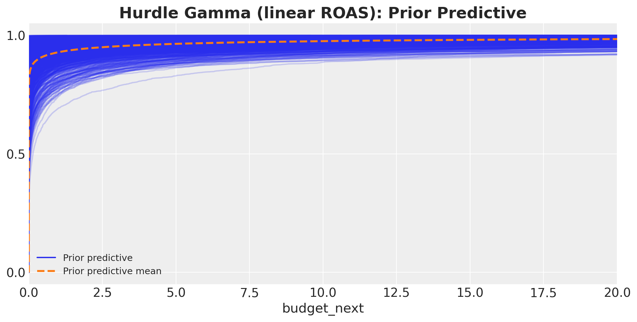
This prior predictive has some very large values. However, most of the mass lies in the expected range of the data.
Model Fit
idata_hgl = model_hgl.fit(
    draws=1_000,
    tune=1_000,
    chains=4,
    target_accept=0.8,
    inference_method="numpyro",
    random_seed=rng,
    idata_kwargs={"log_likelihood": True},
)
Diagnostics
# Number of divergences
idata_hgl["sample_stats"]["diverging"].sum().item()0az.summary(
idata_hgl,
var_names=[
"Intercept",
"cohort_age",
"C(month_of_year)",
"roas",
"alpha",
"psi",
],
filter_vars="like",
)| mean | sd | hdi_3% | hdi_97% | mcse_mean | mcse_sd | ess_bulk | ess_tail | r_hat | |
|---|---|---|---|---|---|---|---|---|---|
| C(month_of_year)[2] | 0.378 | 0.046 | 0.291 | 0.462 | 0.001 | 0.001 | 7976.0 | 3190.0 | 1.0 |
| C(month_of_year)[3] | 0.286 | 0.045 | 0.205 | 0.373 | 0.001 | 0.001 | 7837.0 | 3069.0 | 1.0 |
| C(month_of_year)[4] | 0.359 | 0.045 | 0.276 | 0.448 | 0.001 | 0.001 | 6453.0 | 3217.0 | 1.0 |
| C(month_of_year)[5] | 0.436 | 0.045 | 0.357 | 0.523 | 0.001 | 0.001 | 7855.0 | 3324.0 | 1.0 |
| C(month_of_year)[6] | 0.316 | 0.046 | 0.230 | 0.406 | 0.001 | 0.001 | 6459.0 | 3110.0 | 1.0 |
| C(month_of_year)[7] | -0.113 | 0.047 | -0.198 | -0.023 | 0.001 | 0.001 | 6673.0 | 3088.0 | 1.0 |
| C(month_of_year)[8] | -0.595 | 0.046 | -0.676 | -0.505 | 0.001 | 0.001 | 6520.0 | 2849.0 | 1.0 |
| C(month_of_year)[9] | -0.804 | 0.046 | -0.891 | -0.719 | 0.001 | 0.001 | 7275.0 | 3080.0 | 1.0 |
| C(month_of_year)[10] | -0.561 | 0.046 | -0.652 | -0.479 | 0.000 | 0.001 | 8483.0 | 3062.0 | 1.0 |
| C(month_of_year)[11] | -0.059 | 0.043 | -0.141 | 0.021 | 0.001 | 0.001 | 6591.0 | 3080.0 | 1.0 |
| C(month_of_year)[12] | 0.357 | 0.064 | 0.240 | 0.480 | 0.001 | 0.001 | 3733.0 | 3158.0 | 1.0 |
| Intercept | 1.257 | 0.047 | 1.168 | 1.344 | 0.001 | 0.001 | 5345.0 | 3841.0 | 1.0 |
| alpha | 2.589 | 0.062 | 2.479 | 2.710 | 0.001 | 0.001 | 6265.0 | 2877.0 | 1.0 |
| cohort_age | -0.034 | 0.002 | -0.038 | -0.031 | 0.000 | 0.000 | 4396.0 | 3478.0 | 1.0 |
| psi | 0.941 | 0.005 | 0.932 | 0.951 | 0.000 | 0.000 | 6385.0 | 3089.0 | 1.0 |
| roas | 0.104 | 0.011 | 0.084 | 0.123 | 0.000 | 0.000 | 6780.0 | 3036.0 | 1.0 |
axes = az.plot_trace(
    idata_hgl,
    var_names=[
        "Intercept",
        "cohort_age",
        "roas",
        "C(month_of_year)",
        "alpha",
        "psi",
    ],
    compact=True,
    figsize=(12, 9),
    backend_kwargs={"layout": "constrained"},
)
plt.gcf().suptitle(
    "Hurdle Gamma (linear ROAS): Traceplot", fontsize=18, fontweight="bold"
);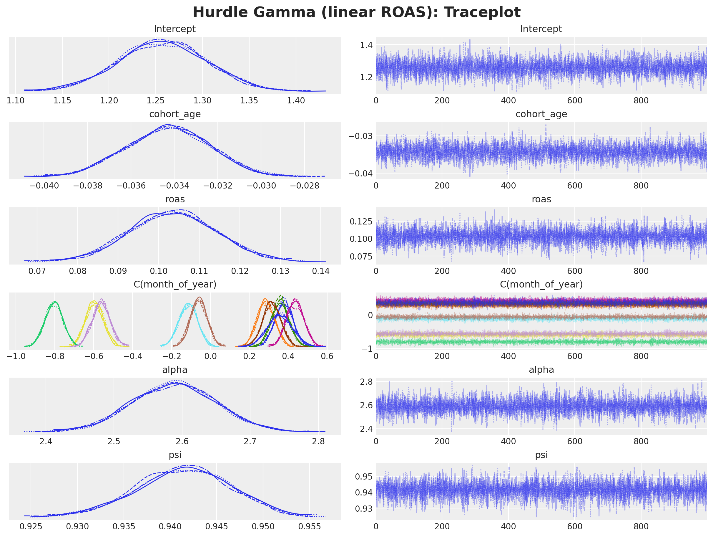
Overall, we get a good fit and no divergences.
model_hgl.predict(idata_hgl, kind="response", inplace=True)

fig, ax = plt.subplots(figsize=(10, 5))
az.plot_ppc(idata_hgl, ax=ax)
ax.set_title(
    "Hurdle Gamma (linear ROAS): Posterior Predictive",
    fontsize=18,
    fontweight="bold",
);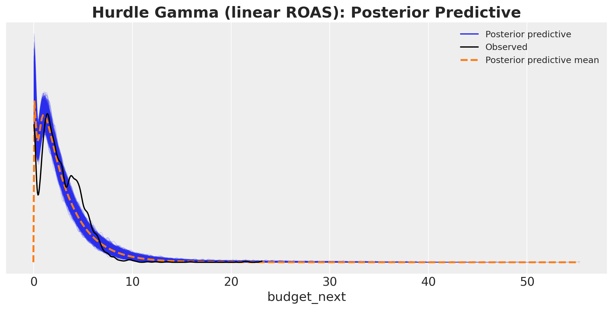
This posterior predictive is better than the linear baseline. However, it still does not really match the data.
ROAS Effect on Next Month’s Budget
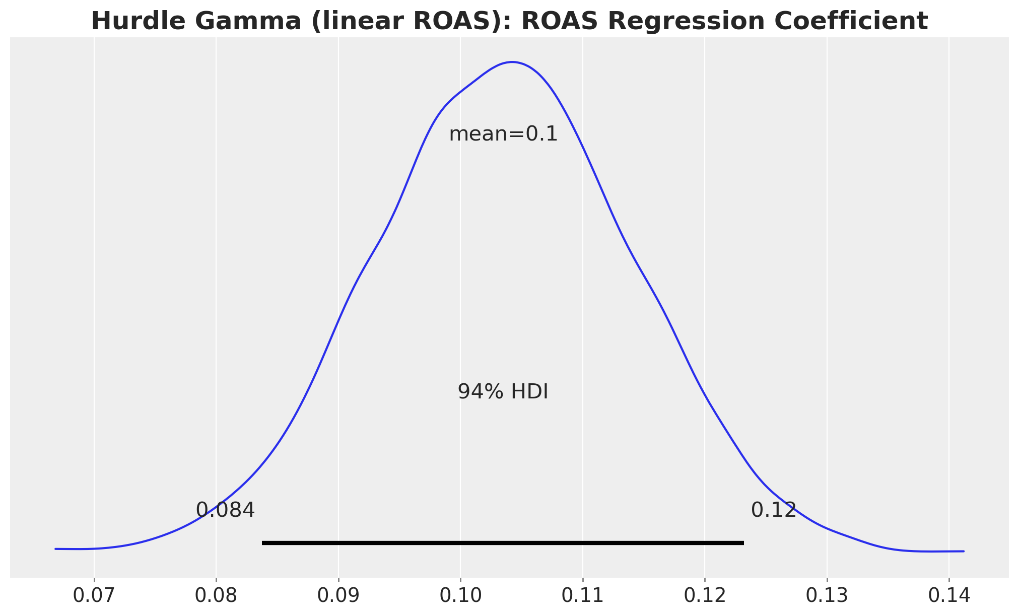
Let’s start with the ROAS coefficient posterior. Because the link is logarithmic, this is now a multiplicative effect on \(\mu\): a one-unit ROAS increase multiplies next month’s budget by \(\exp(\beta_{\text{roas}})\).
fig, ax = plt.subplots()
az.plot_posterior(idata_hgl, var_names="roas", ax=ax)
ax.set_title(
    "Hurdle Gamma (linear ROAS): ROAS Regression Coefficient",
    fontsize=18,
    fontweight="bold",
);
Let’s look at the exponential of the ROAS coefficient posterior.
fig, ax = plt.subplots()
az.plot_posterior(np.exp(idata_hgl["posterior"]["roas"]), var_names="roas", ax=ax)
ax.set_title(
    "Hurdle Gamma (linear ROAS)\nExponential of ROAS Regression Coefficient",
    fontsize=18,
    fontweight="bold",
);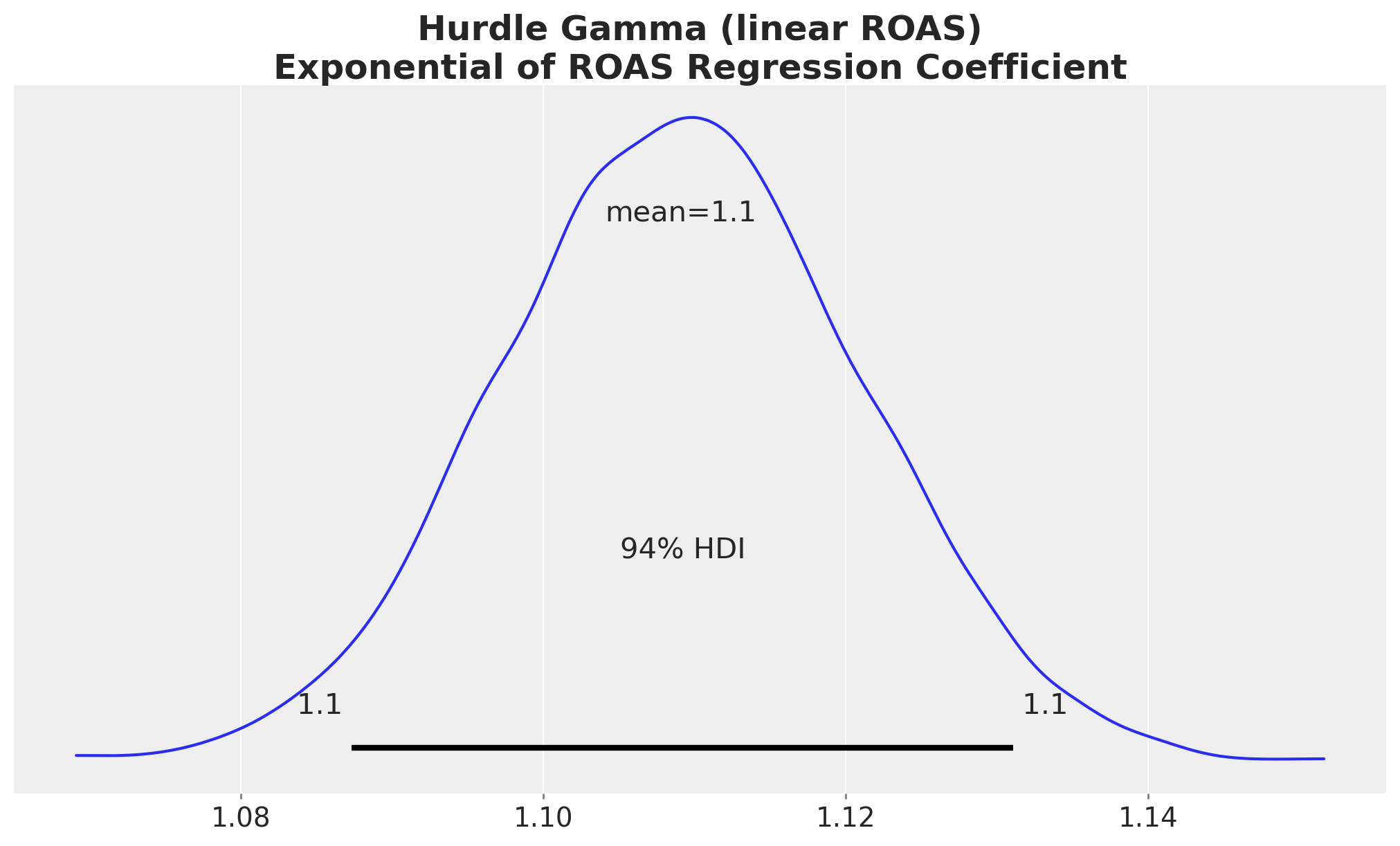
Most of these transformed posterior samples are larger than one, so the model implies a positive relationship between ROAS and next month’s budget. However, this is hard to interpret and to communicate to stakeholders. Even if we take the exponential, the ROAS effect is not linear.
Instead of trying to interpret the coefficients directly (or any transformation), we can simply follow the same recipe as in the linear baseline; we just swap the model in predict_mu. Plots show the Gamma-conditional mean \(\mu\) (expected budget given the store is active next month).
We keep the by-hand datagrid plus predict_mu plots as the explanatory thread for this model too, but each of them could be reproduced in a single line with the Bambi interpret module introduced on the linear baseline, simply by pointing plot_predictions and comparisons at model_hgl. Let’s start by the simpler ROAS to budget relationship.
idata_hgl_mu_grid = predict_mu(model_hgl, idata_hgl, roas_datagrid)

fig, ax = plt.subplots()

for j, hdi_prob in enumerate([0.94, 0.5]):
    az.plot_hdi(
        roas_grid,
        idata_hgl_mu_grid,
        hdi_prob=hdi_prob,
        color="C0",
        fill_kwargs={
            "alpha": 0.2 + 0.2 * j,
            "label": f"{hdi_prob: .0%} CI",
        },
        ax=ax,
    )
ax.legend(loc="center left", bbox_to_anchor=(1, 0.5))
ax.set(
    xlabel="roas",
    ylabel="expected budget next month",
)
ax.set_title(
    """Hurdle Gamma (linear ROAS): ROAS Effect on Next Month's Budget
    (other features held constant at their mean)
    """,
    fontsize=18,
    fontweight="bold",
);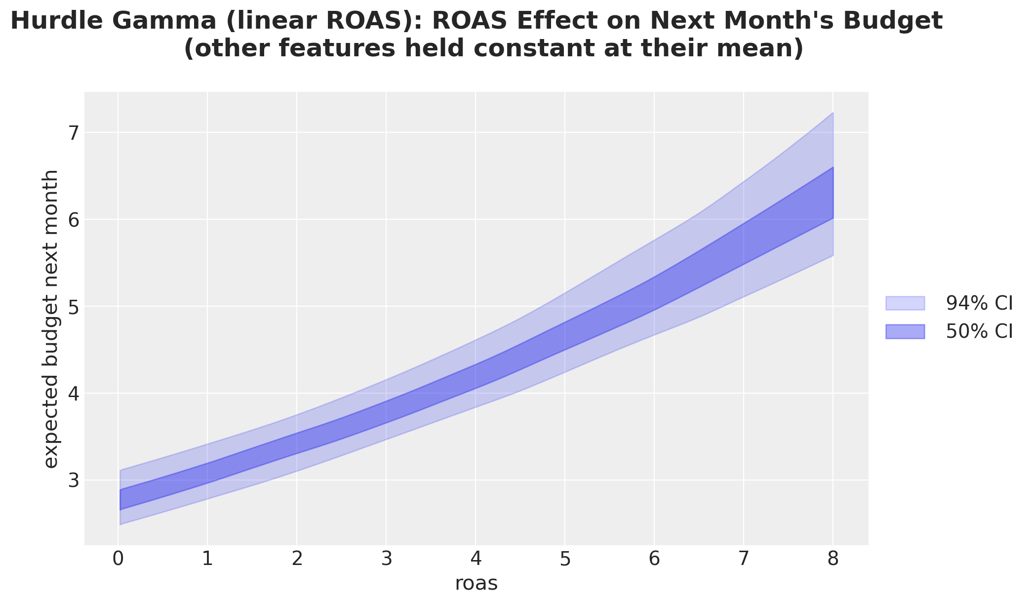
This plot shows that the model implies a stronger growth strength at higher ROAS levels. This is just the multiplicative nature of the model (via the log-link function).
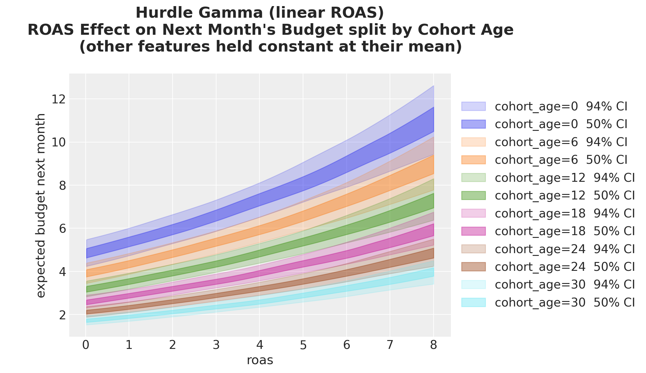
Splitting by cohort age now produces curves that are parallel on the log scale but fan out on the response scale: this is the visible signature of the log link. In the linear baseline the same plot was just a shifted line.
fig, ax = plt.subplots()

for i, (cohort_age, grid_roas) in enumerate(cohort_roas_grids.items()):
    idata_hgl_mu_grid_i = predict_mu(model_hgl, idata_hgl, grid_roas)

    for j, hdi_prob in enumerate([0.94, 0.5]):
        az.plot_hdi(
            roas_grid,
            idata_hgl_mu_grid_i,
            hdi_prob=hdi_prob,
            color=f"C{i}",
            fill_kwargs={
                "alpha": 0.2 + 0.2 * j,
                "label": f"cohort_age={cohort_age} {hdi_prob: .0%} CI",
            },
            ax=ax,
        )
ax.legend(loc="center left", bbox_to_anchor=(1, 0.5))
ax.set(
    xlabel="roas",
    ylabel="expected budget next month",
)
ax.set_title(
    """Hurdle Gamma (linear ROAS)
    ROAS Effect on Next Month's Budget split by Cohort Age
    (other features held constant at their mean)
    """,
    fontsize=18,
    fontweight="bold",
);
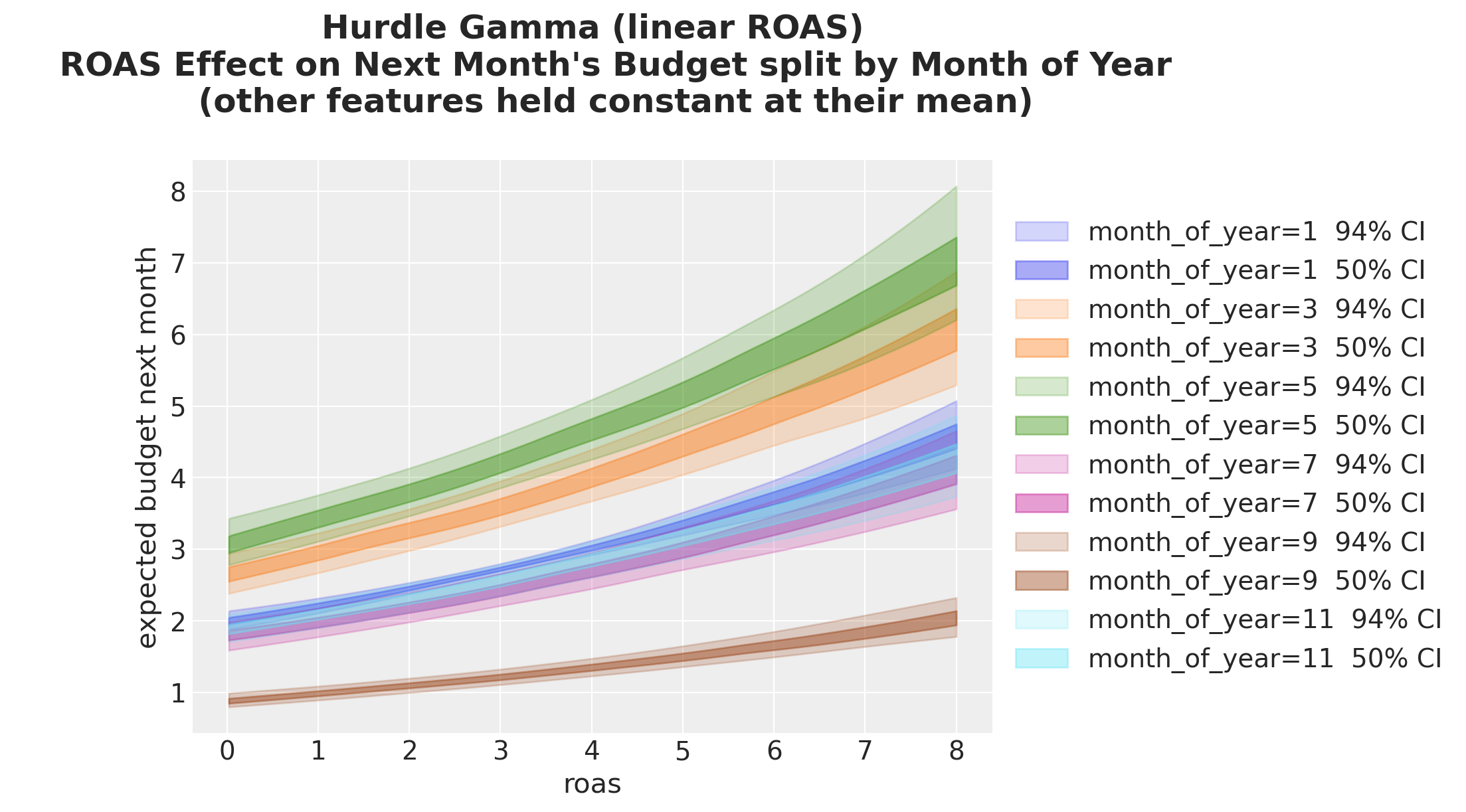
Same story split by month of year:
fig, ax = plt.subplots()

for i, (month_of_year, grid_roas) in enumerate(month_roas_grids.items()):
    idata_hgl_mu_grid_i = predict_mu(model_hgl, idata_hgl, grid_roas)

    for j, hdi_prob in enumerate([0.94, 0.5]):
        az.plot_hdi(
            roas_grid,
            idata_hgl_mu_grid_i,
            hdi_prob=hdi_prob,
            color=f"C{i}",
            fill_kwargs={
                "alpha": 0.2 + 0.2 * j,
                "label": f"month_of_year={month_of_year} {hdi_prob: .0%} CI",
            },
            ax=ax,
        )
ax.legend(loc="center left", bbox_to_anchor=(1, 0.5))
ax.set(xlabel="roas", ylabel="expected budget next month")
ax.set_title(
    """Hurdle Gamma (linear ROAS)
    ROAS Effect on Next Month's Budget split by Month of Year
    (other features held constant at their mean)
    """,
    fontsize=18,
    fontweight="bold",
);
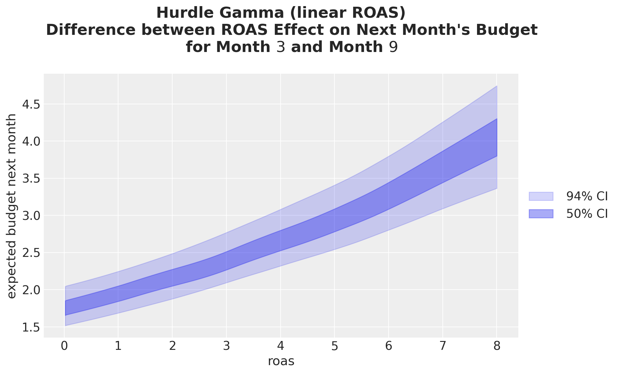
Now the month-3 vs month-9 contrast on the response scale. Unlike the linear baseline (where the contrast was a constant), here the gap grows with ROAS because the seasonal contrast acts multiplicatively after the log link.
_diff_hgl = predict_mu(
    model_hgl, idata_hgl, month_roas_grids[month_of_year_0]
) - predict_mu(model_hgl, idata_hgl, month_roas_grids[month_of_year_1])

fig, ax = plt.subplots()

for j, hdi_prob in enumerate([0.94, 0.5]):
    az.plot_hdi(
        roas_grid,
        _diff_hgl,
        hdi_prob=hdi_prob,
        color="C0",
        fill_kwargs={
            "alpha": 0.2 + 0.2 * j,
            "label": f"{hdi_prob: .0%} CI",
        },
        ax=ax,
    )
ax.set(
    xlabel="roas",
    ylabel="expected budget next month",
)
ax.legend(loc="center left", bbox_to_anchor=(1, 0.5))
ax.set_title(
    """Hurdle Gamma (linear ROAS)
    Difference between ROAS Effect on Next Month's Budget
    for Month $3$ and Month $9$
    """,
    fontsize=18,
    fontweight="bold",
);
Cohort Age Effect on Next Month’s Budget
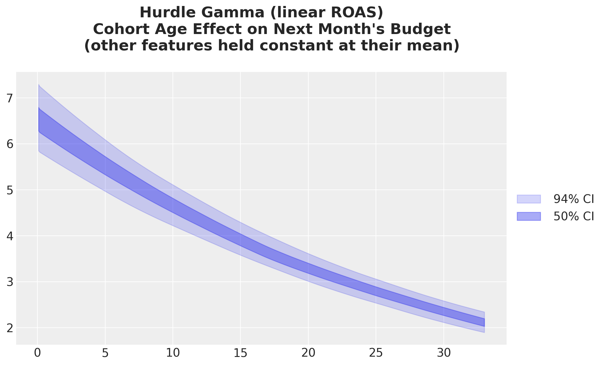
As expected from the results above, we get a non-linear decay in the budget growth as a function of cohort age.
idata_hgl_mu_cohort_age_grid = predict_mu(model_hgl, idata_hgl, cohort_age_datagrid)

fig, ax = plt.subplots()

for j, hdi_prob in enumerate([0.94, 0.5]):
    az.plot_hdi(
        cohort_age_grid,
        idata_hgl_mu_cohort_age_grid,
        hdi_prob=hdi_prob,
        color="C0",
        fill_kwargs={
            "alpha": 0.2 + 0.2 * j,
            "label": f"{hdi_prob: .0%} CI",
        },
        ax=ax,
    )
ax.legend(loc="center left", bbox_to_anchor=(1, 0.5))
ax.set_title(
    """Hurdle Gamma (linear ROAS)
    Cohort Age Effect on Next Month's Budget
    (other features held constant at their mean)
    """,
    fontsize=18,
    fontweight="bold",
);
Month of Year Effect on Next Month’s Budget
Similar non-linearity in the month of year effect.
idata_hgl_mu_month_of_year_grid = predict_mu(
    model_hgl, idata_hgl, month_of_year_datagrid
)

ax, *_ = az.plot_forest(idata_hgl_mu_month_of_year_grid, combined=True, figsize=(8, 6))
ax.set_title(
    """Hurdle Gamma (linear ROAS)
    Month of Year Effect on Next Month's Budget
    (other features held constant at their mean)
    """,
    fontsize=18,
    fontweight="bold",
);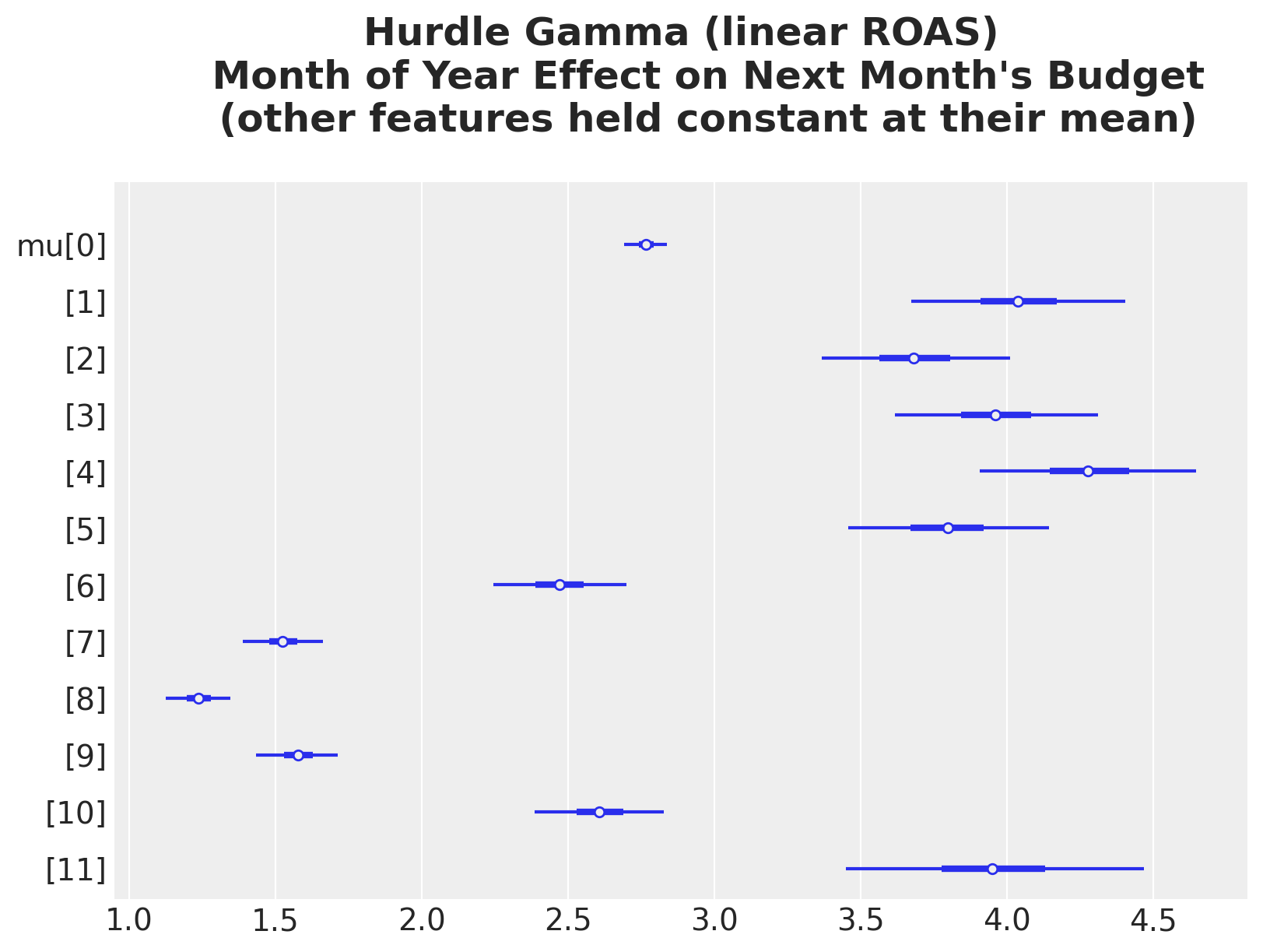
The seasonal pattern is now expressed as multiplicative shifts on the budget scale. We’ve extracted everything the linear hurdle-Gamma model can offer; the shape of the ROAS effect is still wrong. Model 3 fixes that by replacing the linear ROAS term with a Gaussian-process basis.
Model 3: Hurdle Gamma + HSGP on ROAS
Coming back to the nature of the problem, we expect the ROAS to next month’s budget relationship (regression coefficient) to vary as a function of the ROAS. Not simply because of the log-link function. We want to allow a more flexible mechanism. Hence, we keep the hurdle-Gamma likelihood from baseline 2, with the same scalar \(\psi\), and replace the linear roas term with a Hilbert-space Gaussian-process basis (for an introduction to this topic see “A Conceptual and Practical Introduction to Hilbert Space GPs Approximation Methods”). The GP lets the data shape the curve: no linearity, no polynomial form, no knot locations to pick.
\[\begin{align*} y_i & \sim \text{HurdleGamma}(\psi, \mu_i, \alpha) \\ \log \mu_i & = \beta_0 + \beta_{\text{age}} \, \text{cohort_age}_i + \sum_{m} \beta_m \, \mathbb{1}[\text{month}_i = m] + f(\text{roas}_i) \\ f & \sim \text{HSGP}(m, c) \end{align*}\]
Priors
The HSGP introduces two new hyperparameters: \(\sigma\) (GP amplitude) and \(\ell\) (length scale). Bambi’s defaults (Exponential(1) for \(\sigma\) and InverseGamma(3, 2) for \(\ell\), the latter peaking around \(\ell \approx 0.5\)) push the sampler toward very wiggly functions on our \([0, 8]\) ROAS span and produce a funnel between \((\sigma, \ell)\) and the basis weights. That funnel is the main source of divergences. We calibrate both hyperpriors to the data domain.
- \(\sigma \sim \text{HalfNormal}(0.5)\): prior mean \(\approx 0.4\). The ground-truth GP contribution to \(\log \mu\) stays roughly within \([-0.4, 1.2]\), so amplitude \(\sim 0.4\) is the right order of magnitude. The Gaussian upper tail is much less aggressive than
Exponential(1). - \(\ell \sim \text{InverseGamma}(5, 10)\): mode \(\approx 1.67\), mean \(= 2.5\). Strong mass on length scales \(1\) to \(4\). With ROAS spanning \(8\) units we expect roughly one peak and one plateau, which corresponds to a length scale of order \(2\).
- \(\text{HSGP_M} = 20\), \(\text{HSGP_C} = 1.5\): \(20\) basis functions are plenty for a smooth function with the chosen length-scale prior; fewer high-frequency weights means a shorter funnel between the hyperparameters and the weight vector. \(c = 1.5\) widens the synthetic boundary so the basis covers the data domain comfortably.
Intercept,cohort_age,C(month_of_year),alpha: same priors and same reasoning as in baseline 2.target_accept = 0.95: held fixed. The prior calibration above, not a tighter step size, is what tames the divergences.
# HSGP Parameters
HSGP_M = 20
HSGP_C = 1.5
HSGP_COV = "Matern52"
HSGP_CENTERED = True

formula = bmb.Formula(
    f"budget_next ~ 1 + cohort_age + C(month_of_year) + hsgp(roas, m={HSGP_M}, c={HSGP_C}, cov='{HSGP_COV}', centered={HSGP_CENTERED})",
)
fig, ax = plt.subplots(
nrows=2,
ncols=1,
figsize=(10, 7),
sharex=False,
sharey=False,
constrained_layout=True,
)
pz.InverseGamma(5, 10).plot_pdf(ax=ax[0])
ax[0].set(title="Length Scale Prior")
pz.HalfNormal(0.5).plot_pdf(ax=ax[1])
ax[1].set(title="Amplitude Prior")
fig.suptitle("Prior Distributions HSGP", fontsize=18, fontweight="bold");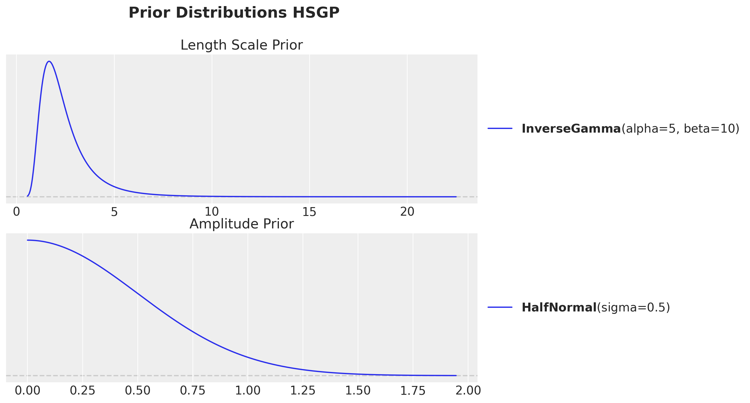
hsgp_term = (
    f"hsgp(roas, m={HSGP_M}, c={HSGP_C}, cov='{HSGP_COV}', centered={HSGP_CENTERED})"
)
hsgp_cov_priors = {
    "sigma": bmb.Prior("HalfNormal", sigma=0.5),
    "ell": bmb.Prior("InverseGamma", alpha=5, beta=10),
}
priors = {
    "Intercept": bmb.Prior("Normal", mu=0.0, sigma=0.5),
    "cohort_age": bmb.Prior("Normal", mu=0.0, sigma=0.1),
    "C(month_of_year)": bmb.Prior("ZeroSumNormal", sigma=1),
    hsgp_term: hsgp_cov_priors,
    "alpha": bmb.Prior("HalfNormal", sigma=1.0),
}

model = bmb.Model(
    formula=formula,
    data=model_df.to_pandas(),
    family="hurdle_gamma",
    link="log",
    priors=priors,
)
model.build()
model
Formula: budget_next ~ 1 + cohort_age + C(month_of_year) + hsgp(roas, m=20, c=1.5, cov='Matern52', centered=True)
Family: hurdle_gamma
Link: mu = log
Observations: 2169
Priors:
target = mu
Common-level effects
Intercept ~ Normal(mu: 0.0, sigma: 0.5)
cohort_age ~ Normal(mu: 0.0, sigma: 0.1)
C(month_of_year) ~ ZeroSumNormal(sigma: 1.0)
HSGP contributions
hsgp(roas, m=20, c=1.5, cov='Matern52', centered=True)
cov: Matern52
sigma ~ HalfNormal(sigma: 0.5)
ell ~ InverseGamma(alpha: 5.0, beta: 10.0)
Auxiliary parameters
alpha ~ HalfNormal(sigma: 1.0)
psi ~ Beta(alpha: 2.0, beta: 2.0)Prior Predictive
Are the implied budgets in a sensible order of magnitude before the data is touched?
idata_prior = model.prior_predictive(draws=1_000, random_seed=rng)Sampling: [C(month_of_year), Intercept, alpha, budget_next, cohort_age, hsgp(roas, m=20, c=1.5, cov='Matern52', centered=True)_ell, hsgp(roas, m=20, c=1.5, cov='Matern52', centered=True)_sigma, hsgp(roas, m=20, c=1.5, cov='Matern52', centered=True)_weights, psi]fig, ax = plt.subplots(figsize=(10, 5))
az.plot_ppc(idata_prior, group="prior", kind="cumulative", ax=ax)
ax.set(xlim=(0, 20))
ax.set_title("Hurdle Gamma + HSGP: Prior Predictive", fontsize=18, fontweight="bold");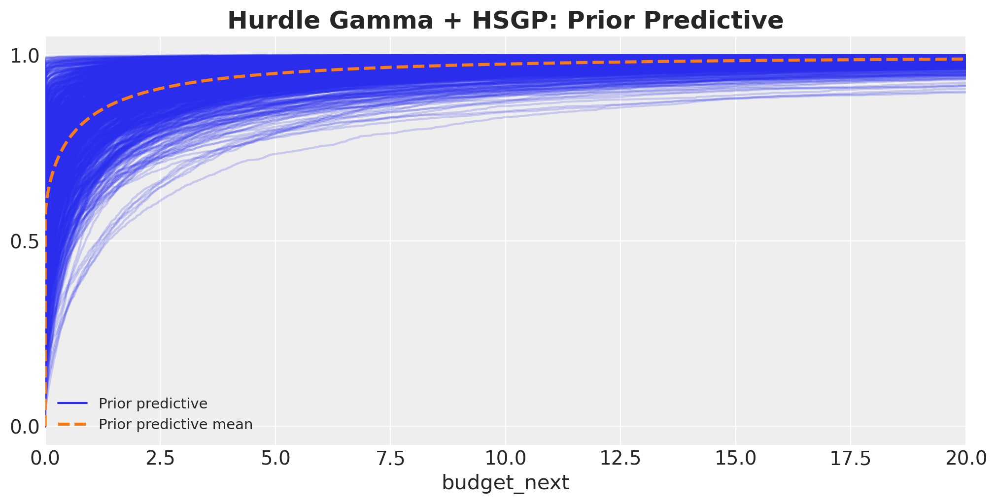
This looks very similar to the Hurdle Gamma + Linear ROAS prior predictive from before.
Model Fit
idata = model.fit(
    draws=1_000,
    tune=1_000,
    chains=4,
    target_accept=0.95,
    inference_method="numpyro",
    random_seed=rng,
    idata_kwargs={"log_likelihood": True},
)
Diagnostics
# Number of divergences
idata["sample_stats"]["diverging"].sum().item()0az.summary(
idata,
var_names=[
"Intercept",
"cohort_age",
"C(month_of_year)",
f"{hsgp_term}_ell",
f"{hsgp_term}_sigma",
"alpha",
"psi",
],
filter_vars="like",
)| mean | sd | hdi_3% | hdi_97% | mcse_mean | mcse_sd | ess_bulk | ess_tail | r_hat | |
|---|---|---|---|---|---|---|---|---|---|
| C(month_of_year)[2] | 0.354 | 0.022 | 0.315 | 0.395 | 0.000 | 0.000 | 5349.0 | 3246.0 | 1.0 |
| C(month_of_year)[3] | 0.289 | 0.022 | 0.250 | 0.330 | 0.000 | 0.000 | 6271.0 | 2621.0 | 1.0 |
| C(month_of_year)[4] | 0.355 | 0.022 | 0.315 | 0.397 | 0.000 | 0.000 | 5474.0 | 3218.0 | 1.0 |
| C(month_of_year)[5] | 0.444 | 0.022 | 0.404 | 0.484 | 0.000 | 0.000 | 5593.0 | 2922.0 | 1.0 |
| C(month_of_year)[6] | 0.310 | 0.022 | 0.267 | 0.350 | 0.000 | 0.000 | 4925.0 | 2847.0 | 1.0 |
| C(month_of_year)[7] | -0.118 | 0.023 | -0.163 | -0.076 | 0.000 | 0.000 | 5649.0 | 2954.0 | 1.0 |
| C(month_of_year)[8] | -0.565 | 0.022 | -0.607 | -0.523 | 0.000 | 0.000 | 5539.0 | 3076.0 | 1.0 |
| C(month_of_year)[9] | -0.789 | 0.021 | -0.830 | -0.749 | 0.000 | 0.000 | 6031.0 | 2659.0 | 1.0 |
| C(month_of_year)[10] | -0.533 | 0.022 | -0.576 | -0.493 | 0.000 | 0.000 | 4975.0 | 2829.0 | 1.0 |
| C(month_of_year)[11] | -0.087 | 0.023 | -0.129 | -0.044 | 0.000 | 0.000 | 5497.0 | 3021.0 | 1.0 |
| C(month_of_year)[12] | 0.340 | 0.031 | 0.283 | 0.398 | 0.001 | 0.000 | 3216.0 | 2718.0 | 1.0 |
| Intercept | 1.048 | 0.300 | 0.445 | 1.561 | 0.007 | 0.005 | 2186.0 | 2515.0 | 1.0 |
| alpha | 11.364 | 0.336 | 10.720 | 11.956 | 0.005 | 0.005 | 5136.0 | 2994.0 | 1.0 |
| cohort_age | -0.031 | 0.001 | -0.033 | -0.029 | 0.000 | 0.000 | 4187.0 | 2778.0 | 1.0 |
| hsgp(roas, m=20, c=1.5, cov=‘Matern52’, centered=True)_ell | 1.765 | 0.403 | 1.101 | 2.546 | 0.011 | 0.007 | 1380.0 | 2342.0 | 1.0 |
| hsgp(roas, m=20, c=1.5, cov=‘Matern52’, centered=True)_sigma | 0.581 | 0.199 | 0.272 | 0.950 | 0.005 | 0.004 | 2049.0 | 2233.0 | 1.0 |
| psi | 0.942 | 0.005 | 0.932 | 0.951 | 0.000 | 0.000 | 4734.0 | 2989.0 | 1.0 |
az.plot_trace(
    idata,
    var_names=[
        "Intercept",
        "cohort_age",
        "C(month_of_year)",
        f"{hsgp_term}_sigma",
        f"{hsgp_term}_ell",
        "alpha",
        "psi",
    ],
    compact=True,
    figsize=(12, 9),
    backend_kwargs={"layout": "constrained"},
)
plt.gcf().suptitle("Hurdle Gamma + HSGP: Traceplot", fontsize=18, fontweight="bold");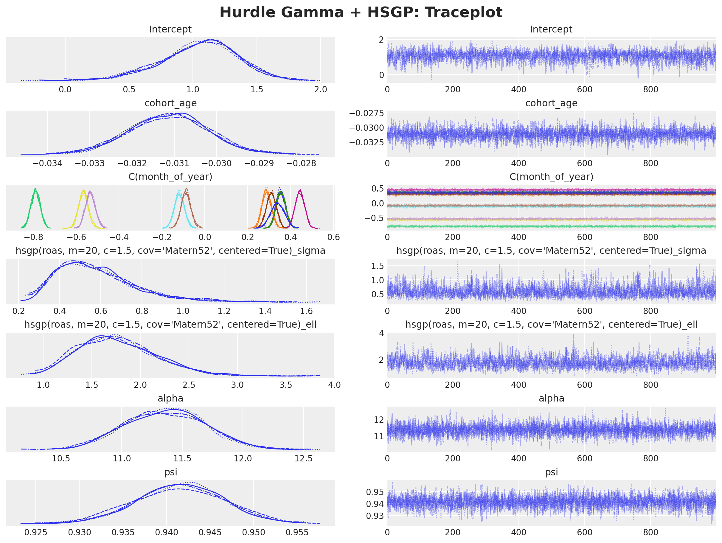
The model samples well and we do not see divergences.
model.predict(idata, kind="response", inplace=True)

fig, ax = plt.subplots(figsize=(10, 5))
az.plot_ppc(idata, ax=ax)
ax.set(xlim=(0, np.quantile(model_df["budget_next"], 0.99) * 2))
ax.set_title(
    "Hurdle Gamma + HSGP: Posterior Predictive", fontsize=18, fontweight="bold"
);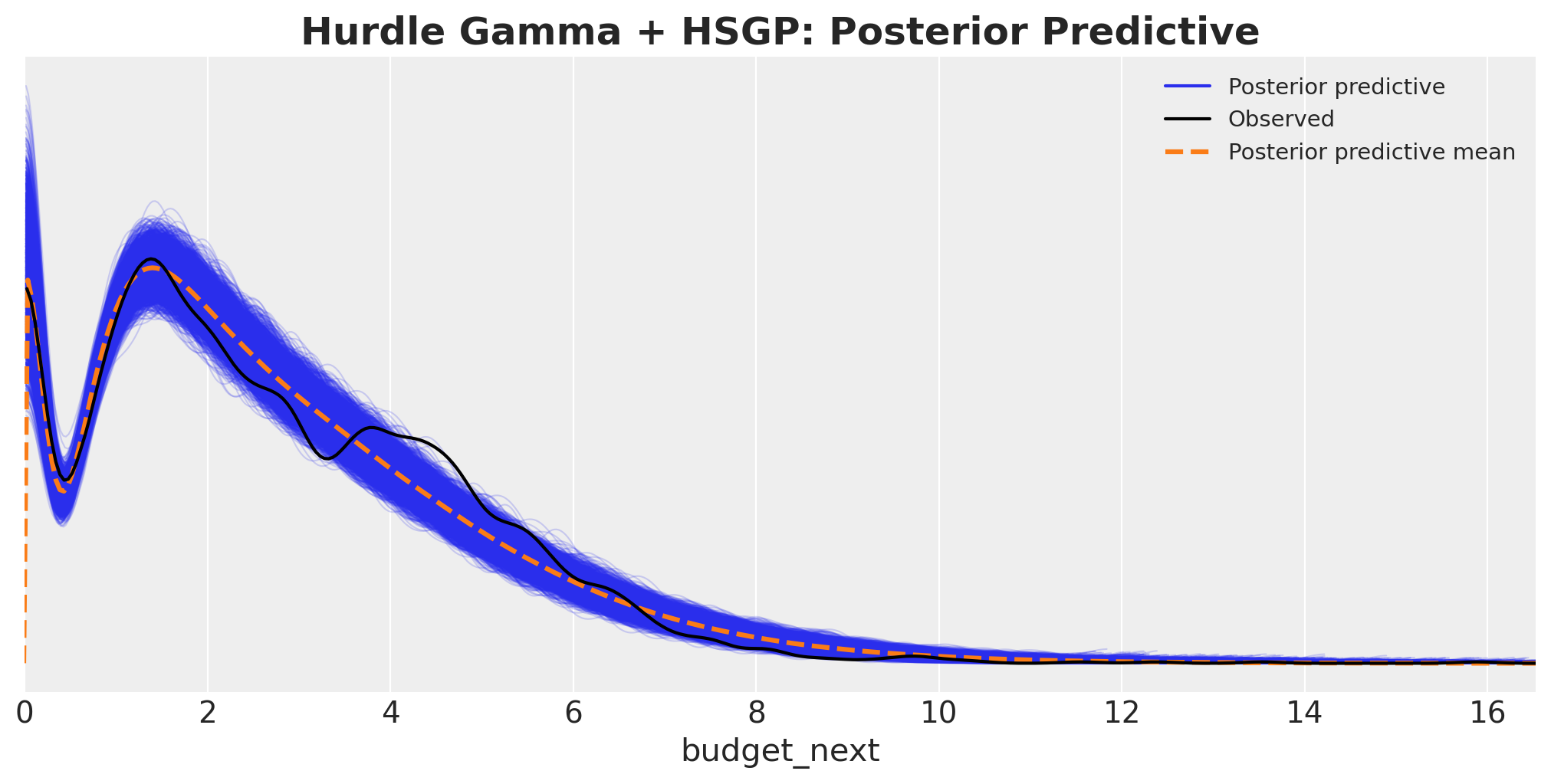
This posterior predictive is much better than the other baseline models.
ROAS Effect on Next Month’s Budget
Same recipe as in the previous models; we just swap the model in predict_mu. There is no single ROAS coefficient to inspect anymore: the HSGP basis weights have no individual meaning, so we go straight to grid-based predictions.
idata_mu_grid = predict_mu(model, idata, roas_datagrid)

fig, ax = plt.subplots()

for j, hdi_prob in enumerate([0.94, 0.5]):
    az.plot_hdi(
        roas_grid,
        idata_mu_grid,
        hdi_prob=hdi_prob,
        color="C0",
        fill_kwargs={
            "alpha": 0.2 + 0.2 * j,
            "label": f"{hdi_prob: .0%} CI",
        },
        ax=ax,
    )
ax.legend(loc="center left", bbox_to_anchor=(1, 0.5))
ax.set(
    xlabel="roas",
    ylabel="expected budget next month",
)
ax.set_title(
    """Hurdle Gamma + HSGP: ROAS Effect on Next Month's Budget
    (other features held constant at their mean)
    """,
    fontsize=18,
    fontweight="bold",
);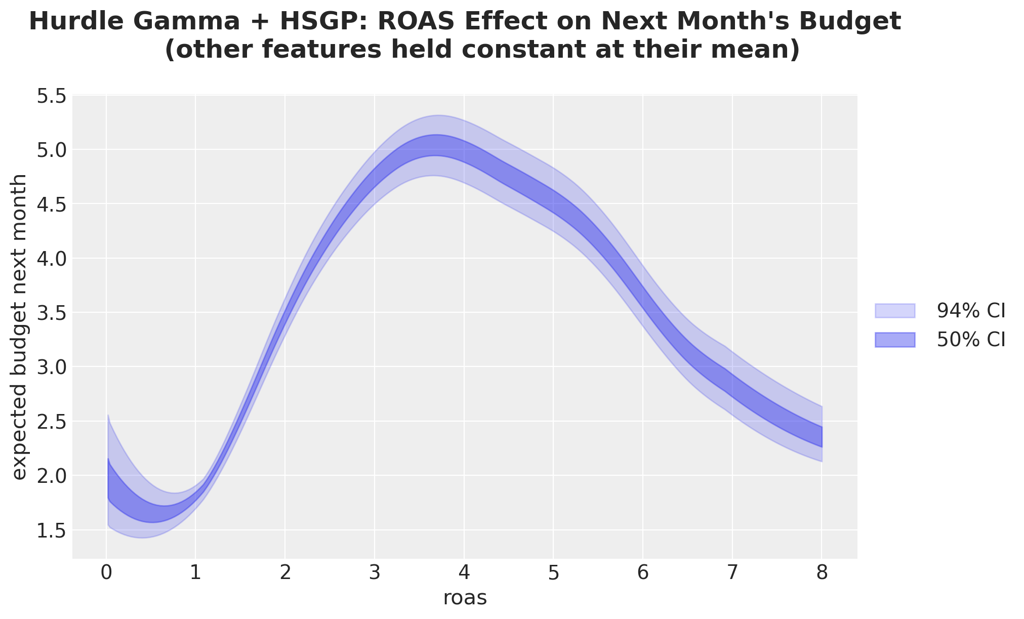
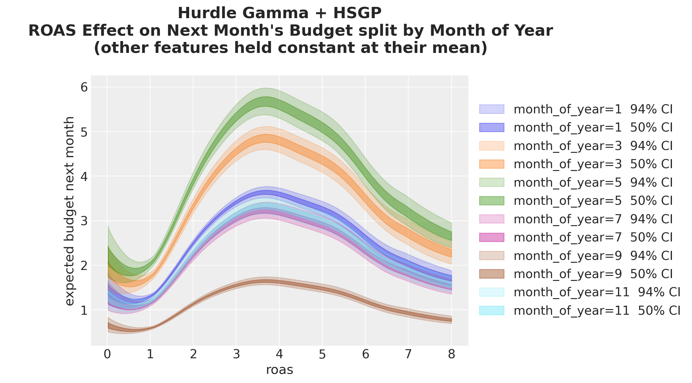
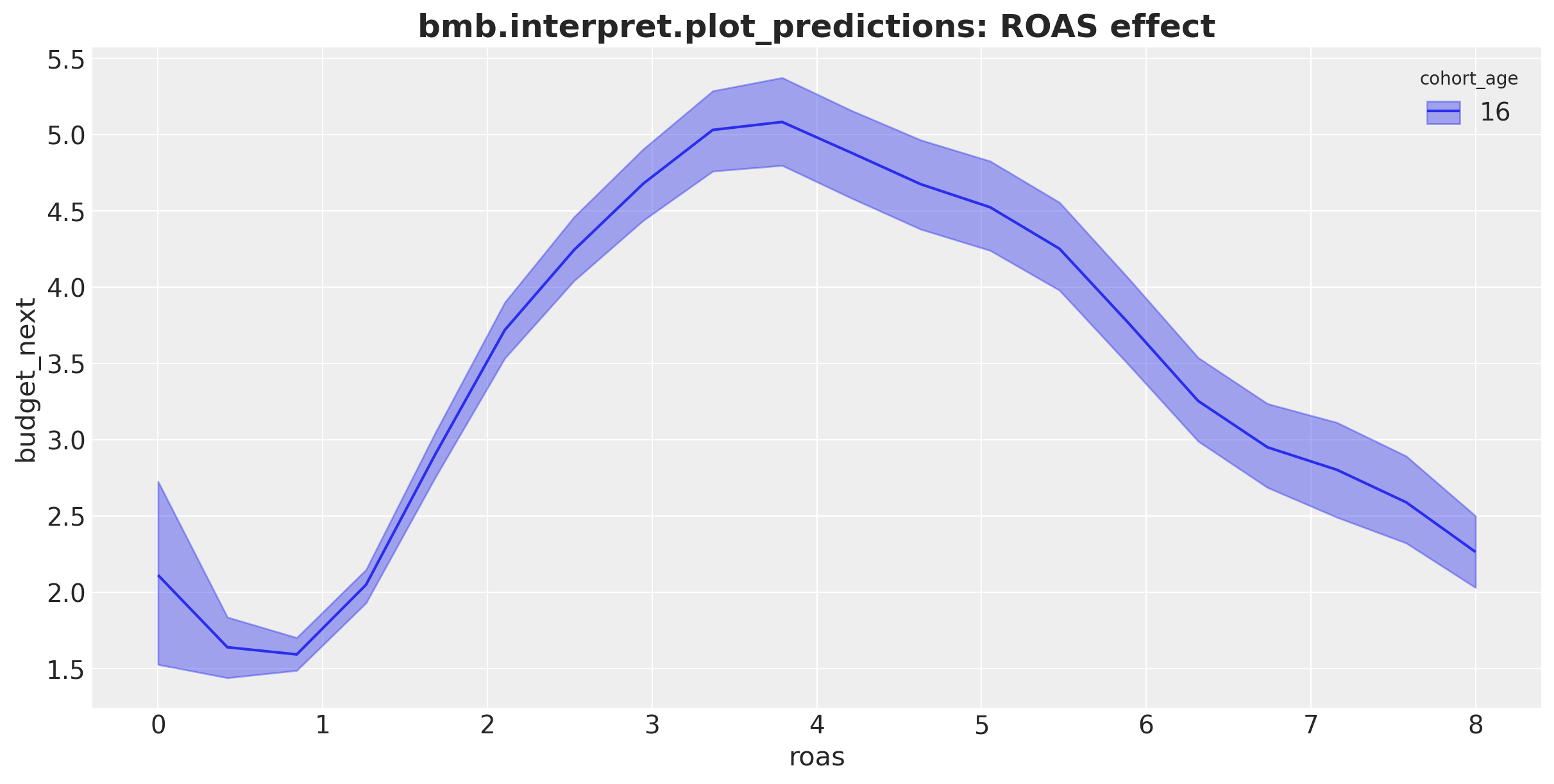
This model extracts the ROAS effect on next month’s budget with a flexible non-linear curve. The results match what we expected from the problem context: the higher the ROAS, the higher next month’s budget until a point: after a value of approximately \(4\) the budget does not grow anymore and starts to decrease.
Next, we split by cohort age:
fig, ax = plt.subplots()

for i, (cohort_age, grid_roas) in enumerate(cohort_roas_grids.items()):
    idata_hsgp_mu_grid_i = predict_mu(model, idata, grid_roas)

    for j, hdi_prob in enumerate([0.94, 0.5]):
        az.plot_hdi(
            roas_grid,
            idata_hsgp_mu_grid_i,
            hdi_prob=hdi_prob,
            color=f"C{i}",
            fill_kwargs={
                "alpha": 0.2 + 0.2 * j,
                "label": f"cohort_age={cohort_age} {hdi_prob: .0%} CI",
            },
            ax=ax,
        )
ax.legend(loc="center left", bbox_to_anchor=(1, 0.5))
ax.set(
    xlabel="roas",
    ylabel="expected budget next month",
)
ax.set_title(
    """Hurdle Gamma + HSGP
    ROAS Effect on Next Month's Budget split by Cohort Age
    (other features held constant at their mean)
    """,
    fontsize=18,
    fontweight="bold",
);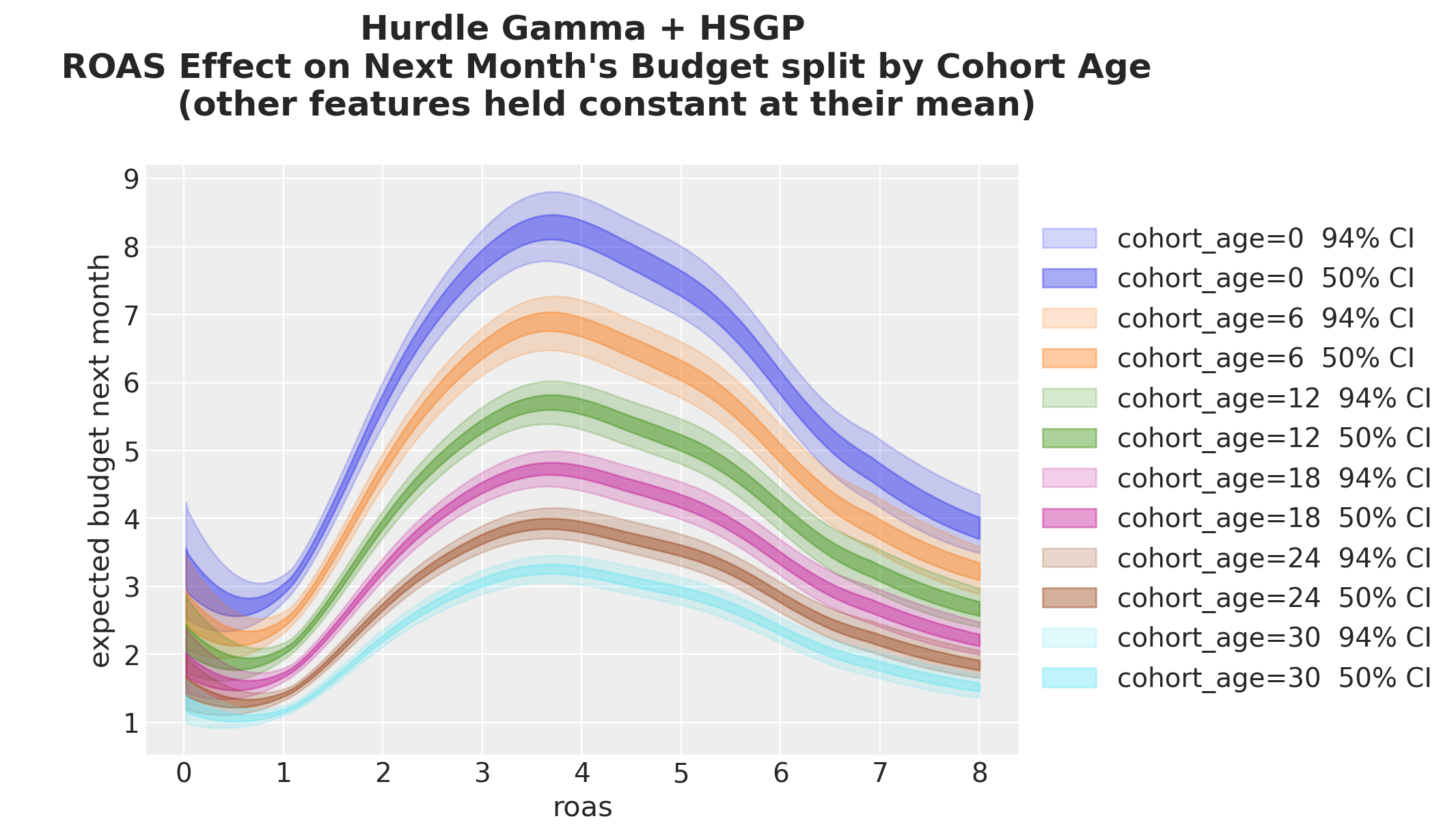
We see the same general shape, but the curves’ amplitude changes with cohort age. The older the cohort, the less sensitive to ROAS changes.
We do an analogous split by month of year:
fig, ax = plt.subplots()

for i, (month_of_year, grid_roas) in enumerate(month_roas_grids.items()):
    idata_hsgp_mu_grid_i = predict_mu(model, idata, grid_roas)

    for j, hdi_prob in enumerate([0.94, 0.5]):
        az.plot_hdi(
            roas_grid,
            idata_hsgp_mu_grid_i,
            hdi_prob=hdi_prob,
            color=f"C{i}",
            fill_kwargs={
                "alpha": 0.2 + 0.2 * j,
                "label": f"month_of_year={month_of_year} {hdi_prob: .0%} CI",
            },
            ax=ax,
        )
ax.legend(loc="center left", bbox_to_anchor=(1, 0.5))
ax.set(xlabel="roas", ylabel="expected budget next month")
ax.set_title(
    """Hurdle Gamma + HSGP
    ROAS Effect on Next Month's Budget split by Month of Year
    (other features held constant at their mean)
    """,
    fontsize=18,
    fontweight="bold",
);
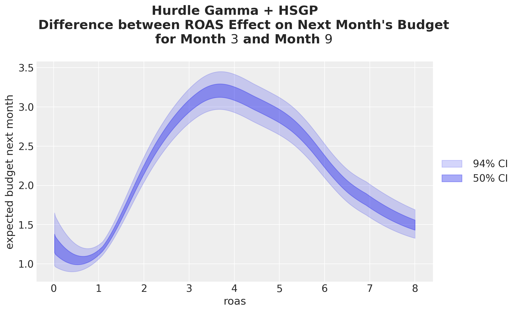
Now, we look at the contrast between month-\(3\) and month-\(9\). The shape now reflects the curved \(\log \mu\) pushed through the exponential link: the difference is non-constant even though the GP is on ROAS alone, because the multiplicative seasonal shift compounds with the GP’s curvature.
_diff_hsgp = predict_mu(model, idata, month_roas_grids[month_of_year_0]) - predict_mu(
    model, idata, month_roas_grids[month_of_year_1]
)

fig, ax = plt.subplots()

for j, hdi_prob in enumerate([0.94, 0.5]):
    az.plot_hdi(
        roas_grid,
        _diff_hsgp,
        hdi_prob=hdi_prob,
        color="C0",
        fill_kwargs={
            "alpha": 0.2 + 0.2 * j,
            "label": f"{hdi_prob: .0%} CI",
        },
        ax=ax,
    )
ax.set(
    xlabel="roas",
    ylabel="expected budget next month",
)
ax.legend(loc="center left", bbox_to_anchor=(1, 0.5))
ax.set_title(
    """Hurdle Gamma + HSGP
    Difference between ROAS Effect on Next Month's Budget
    for Month $3$ and Month $9$
    """,
    fontsize=18,
    fontweight="bold",
);
Cohort Age Effect on Next Month’s Budget
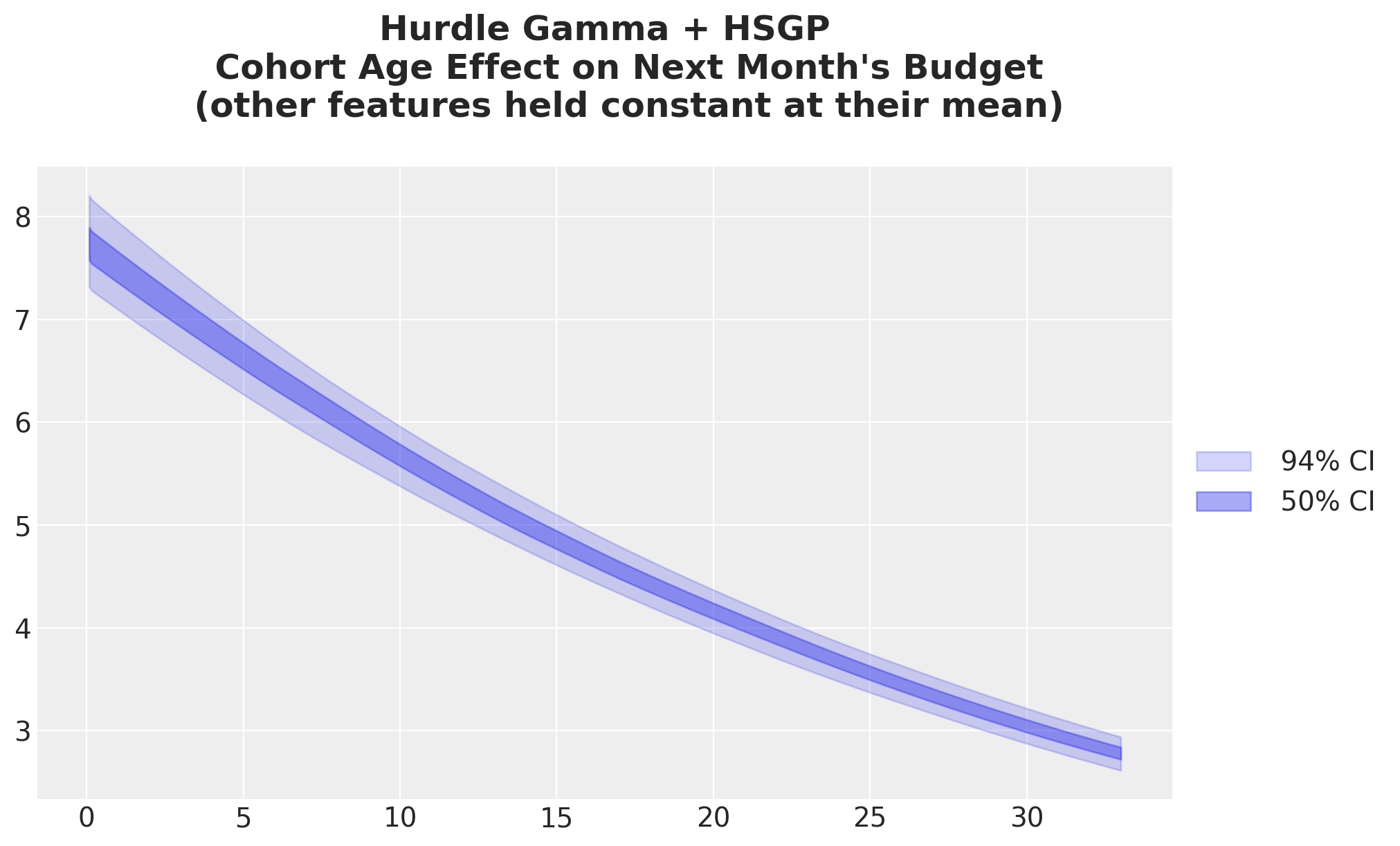
This plot does not change much from the previous model. It is just mildy shifted upwards.
idata_hsgp_mu_cohort_age_grid = predict_mu(model, idata, cohort_age_datagrid)

fig, ax = plt.subplots()

for j, hdi_prob in enumerate([0.94, 0.5]):
    az.plot_hdi(
        cohort_age_grid,
        idata_hsgp_mu_cohort_age_grid,
        hdi_prob=hdi_prob,
        color="C0",
        fill_kwargs={
            "alpha": 0.2 + 0.2 * j,
            "label": f"{hdi_prob: .0%} CI",
        },
        ax=ax,
    )
ax.legend(loc="center left", bbox_to_anchor=(1, 0.5))
ax.set_title(
    """Hurdle Gamma + HSGP
    Cohort Age Effect on Next Month's Budget
    (other features held constant at their mean)
    """,
    fontsize=18,
    fontweight="bold",
);
Month of Year Effect on Next Month’s Budget
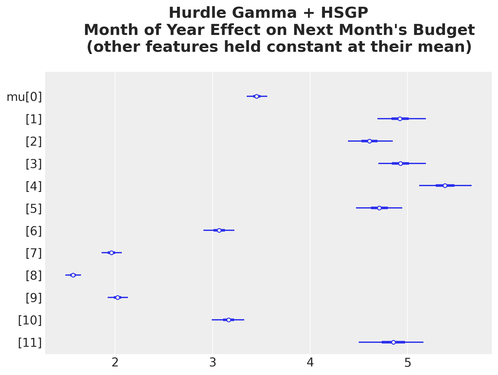
The month of year effect is also similar to the previous model.
idata_hsgp_mu_month_of_year_grid = predict_mu(model, idata, month_of_year_datagrid)

ax, *_ = az.plot_forest(idata_hsgp_mu_month_of_year_grid, combined=True, figsize=(8, 6))
ax.set_title(
    """Hurdle Gamma + HSGP
    Month of Year Effect on Next Month's Budget
    (other features held constant at their mean)
    """,
    fontsize=18,
    fontweight="bold",
);
The same answers via Bambi’s interpret module
We introduced this module on the linear baseline, so here we simply point it at the HSGP model. The same plot_predictions and comparisons calls now trace the recovered non-linear ROAS curve with no extra work.
fig, ax = plt.subplots(figsize=(12, 6))
bmb.interpret.plot_predictions(
    model,
    idata,
    conditional={
        "roas": roas_grid,
        "cohort_age": cohort_age_default,
        "month_of_year": month_of_year_default,
    },
    ax=ax,
)
ax.set_title(
    "bmb.interpret.plot_predictions: ROAS effect", fontsize=18, fontweight="bold"
);
fig, ax = plt.subplots()
bmb.interpret.plot_predictions(
    model,
    idata,
    conditional={
        "roas": roas_grid,
        "cohort_age": list(cohort_age_grid[::6]),
        "month_of_year": month_of_year_default,
    },
    ax=ax,
)
ax.set_title(
    "bmb.interpret: ROAS Effect split by Cohort Age",
    fontsize=18,
    fontweight="bold",
);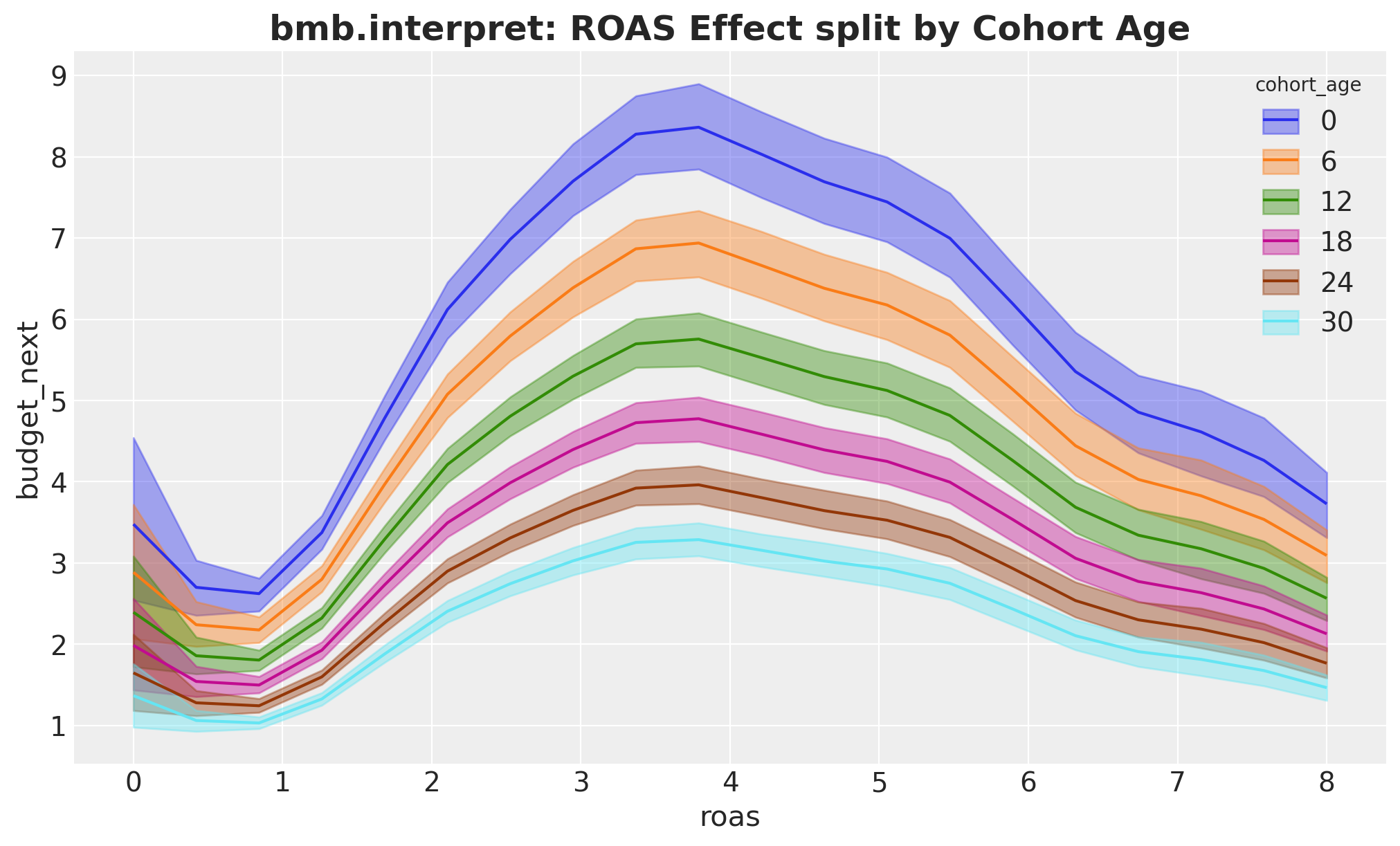
We get the exact same results!
We can also compute the derivative of the ROAS effect with respect to ROAS. That is, the slopes in the previous plot:
slopes_df = bmb.interpret.slopes(
    model,
    idata,
    wrt={"roas": roas_grid},
    conditional={
        "cohort_age": cohort_age_default,
        "month_of_year": month_of_year_default,
    },
)

slopes_df["roas"] = slopes_df["value"].str[0]

fig, ax = plt.subplots(figsize=(12, 6))
ax.plot(slopes_df["roas"], slopes_df["estimate"], color="C0")
ax.fill_between(
    slopes_df["roas"],
    slopes_df["lower_3.0%"],
    slopes_df["upper_97.0%"],
    color="C0",
    alpha=0.3,
)
ax.axhline(0, color="black", linestyle="--", linewidth=1)
ax.set(
    xlabel="roas",
    ylabel=r"$\partial\,\mathrm{budget\_next}\,/\,\partial\,\mathrm{roas}$",
)
ax.set_title(
    "bmb.interpret.slopes: marginal effect of ROAS",
    fontsize=18,
    fontweight="bold",
);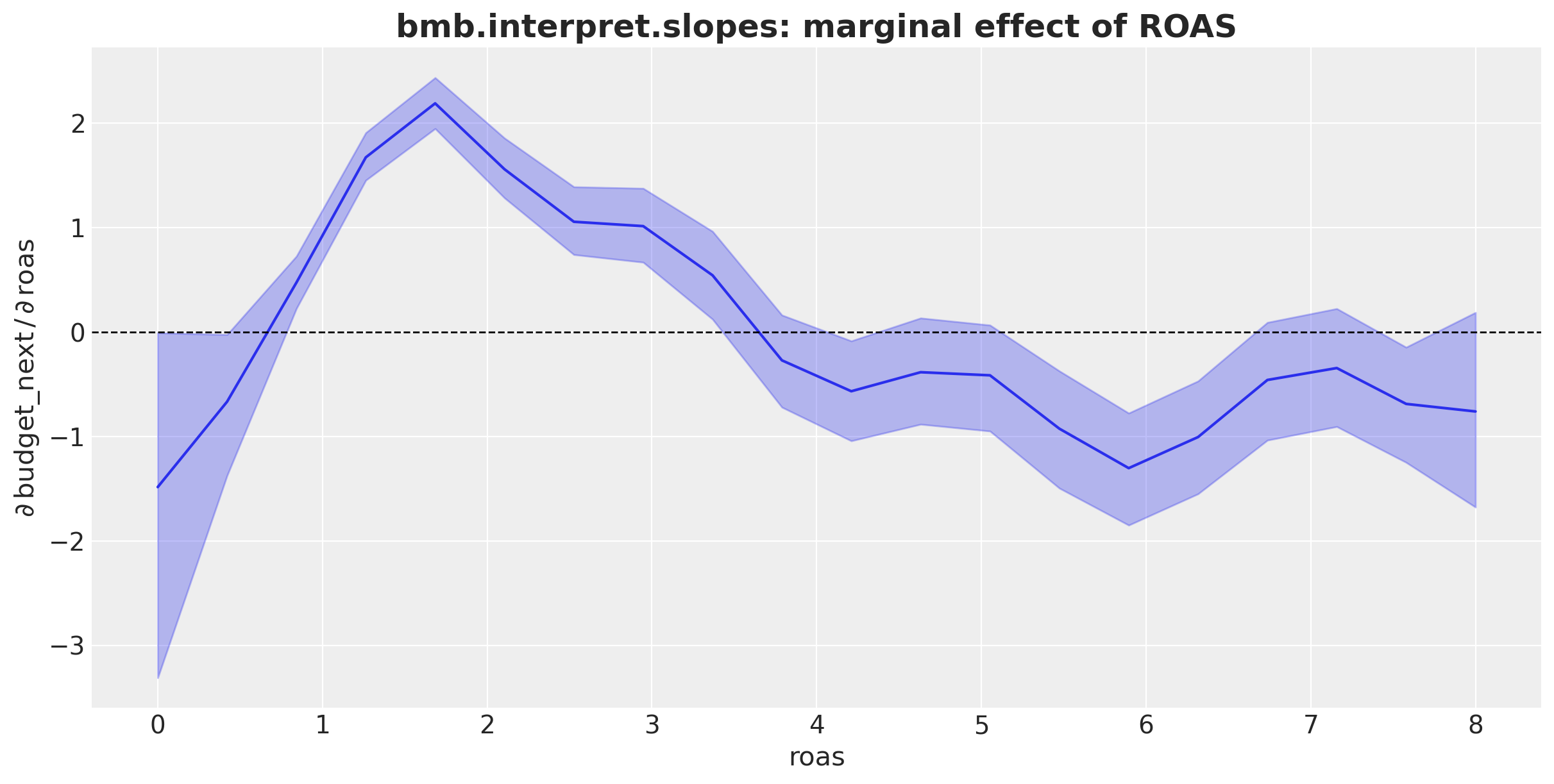
Here we get important information:
- From a ROAS values close to zero, the ROAS effect is negative.
- ROAS values close to \(1.5\) have the largest sensitivity to ROAS changes (steeper slope).
- We get a maximum ROAS effect of about \(3.5\) and then the effect decreases (negative slope).
Model Comparison
In this final section, we compare the three models. We do this across two dimensions: 1. Out-of-sample generalization, via leave-one-out cross validation (LOO). 2. Curve recovery: how close are the three recovered ROAS effects to the ground truth on the response scale.
Leave-one-out cross-validation
Higher elpd_loo is better. elpd_diff is the gap to the top-ranked model on the same scale, and dse is the standard error of that gap: differences smaller than \(\sim 2\) dse are not strongly distinguished.
compare_df = az.compare(
    {
        "linear_gaussian": idata_lm,
        "hgamma_linear": idata_hgl,
        "hgamma_hsgp": idata,
    },
    ic="loo",
)
az.plot_compare(compare_df, insample_dev=False);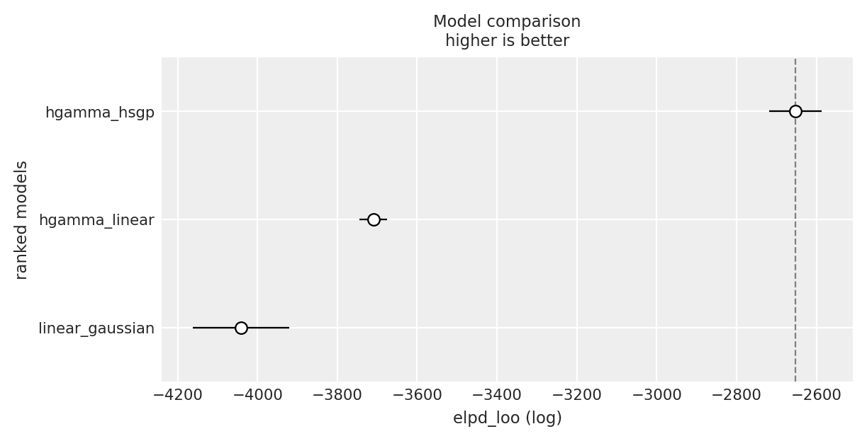
The hurdle-Gamma + HSGP model is the best model, followed by the linear hurdle-Gamma model. The linear Gaussian model is the worst performing model.
Recovered ROAS curves vs ground truth
LOO ranks models by likelihood. The complementary check is to see, on the response scale, how close each model’s ROAS effect is to the ground-truth curve from the DGP.
truth_budget_default = DGP.true_mu(
    roas=roas_grid,
    cohort_age=cohort_age_default,
    month_of_year=month_of_year_default,
    params=params,
)

recovered_curves = {
    "linear_gaussian": (predict_mu(model_lm, idata_lm, roas_datagrid), "C0"),
    "hgamma_linear": (predict_mu(model_hgl, idata_hgl, roas_datagrid), "C1"),
    "hgamma_hsgp": (predict_mu(model, idata, roas_datagrid), "C2"),
}

fig, ax = plt.subplots()

for name, (mu_grid, color) in recovered_curves.items():
    for j, hdi_prob in enumerate([0.94, 0.5]):
        az.plot_hdi(
            roas_grid,
            mu_grid,
            hdi_prob=hdi_prob,
            color=color,
            fill_kwargs={
                "alpha": 0.15 + 0.2 * j,
                "label": f"{name} {hdi_prob: .0%} CI",
            },
            ax=ax,
        )
ax.plot(
    roas_grid, truth_budget_default, color="black", linestyle="--", label="ground truth"
)
ax.legend(loc="center left", bbox_to_anchor=(1, 0.5))
ax.set(
    xlabel="roas",
    ylabel="expected budget next month",
)
ax.set_title(
    """Recovered ROAS Effect across Models
    (other features held constant at their mean)
    """,
    fontsize=18,
    fontweight="bold",
);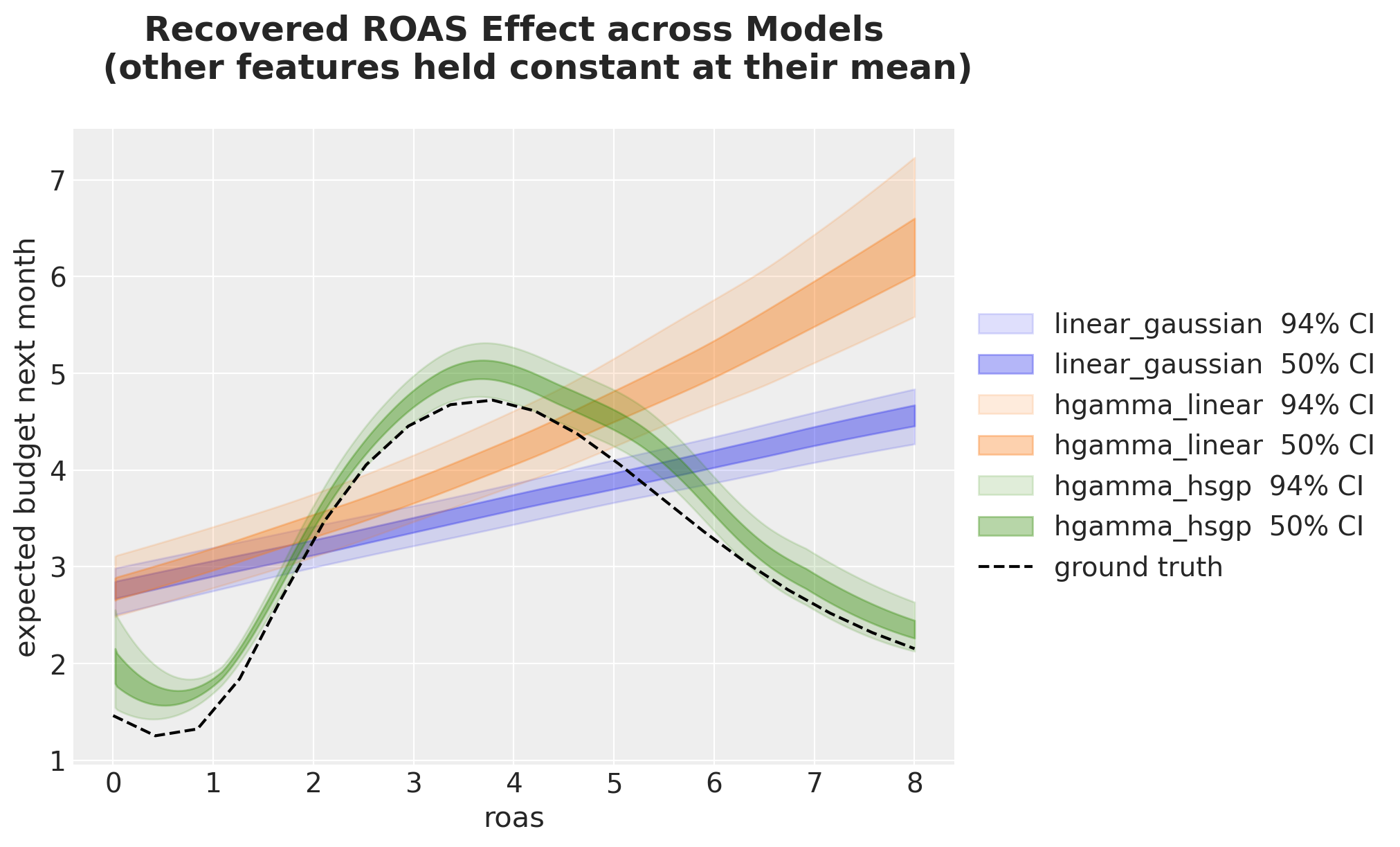
We clearly see the Hurdle-Gamma + HSGP model is very close to the ground truth.
Conclusion
We worked through three models of increasing flexibility on the same ad-tech panel. Each modeling choice bought us one thing:
- Linear Gaussian gave us a single regression coefficient for ROAS but the wrong likelihood (allowed negative budgets, missed the zero mass) and the wrong shape (a line where the truth has a peak and a saturation).
- Hurdle Gamma with a linear ROAS coefficient fixed the likelihood: non-negative response, an explicit zero point-mass through \(\psi\), and a log link that turned the coefficient into a multiplicative effect. The shape was still monotone, missing the peak and the saturation.
- Hurdle Gamma with an HSGP on ROAS kept the right likelihood and let the data shape the curve. The recovered \(\mathbb{E}[\text{budget}_{t+1} \mid \text{roas}_t]\) tracked the true non-linearity, and the LOO comparison ranked it on top.
Across all three models the interpretation recipe was identical: build a reference grid with datagrid, push it through the posterior with predict_mu, summarize on the response scale. This is the marginaleffects mental model: predictions (“what does the model say here?”), comparisons (“what changes from A to B?”), and slopes (“what is \(\partial \hat{Y} / \partial X\) here?”, which we met through bmb.interpret.slopes on the linear baseline rather than by hand, but is the same recipe with a finite-difference twist). Raw coefficients answer the wrong question once you leave identity-link land; data-grid summaries answer the right one.
For more depth see the book “Model to Meaning” and the Bambi interpret module, which ships a one-liner version of every plot we built by hand.