In this notebook we explore regression discontinuity design using generalized linear models (GLMs) and kernel weighting from a bayesian perspective. The motivation comes from applications when:
- The data does not fit the usual linear regression OLS normal likelihood (e.g. modeling count data).
- The data size is limited.
In addition, we experiment with kernel weighting to weight the data points near the cutoff more heavily. This is a common technique in RD analysis, but it is not always clear how to do this with GLMs in the bayesian framework. We show how to do this with the PyMC.
TL;DR:
- I took quite a while to run various experiments by changing the data size and the data generation process. Overall, my personal take is that the vanilla regression discontinuity approach via OLS is quite robust and might fit most of the cases (of course, it really depends on the data and the context).
- The power of the GLM bayesian approach comes when one (or both) of the conditions mentioned above hold. Moreover, the approach presented is quite flexible and can be tailored to the specific problem at hand.
Remark: There were two main reasons that motivated to look into this topic:
- A real life application in the context of epidemiology where I was an adviser.
- The sequence of blog posts by Solomon Kruz on causal inference and bayesian GLMs (strongly recommended!). For an introduction to the topic please see my two notes replicating Solomon’s great work in Python: ATE Estimation with Logistic Regression and ATE Estimation for Count Data.
References
Here we do not go into a detailed discussion of regression discontinuity, but we refer the reader to the following great online resources:
- Causal Inference for The Brave and True - Chapter 16
- Causal Inference: The Mixtape - Chapter 6
- The Effect: An Introduction to Research Design and Causality - Chapter 20
Please also check out CausalPy for a basic bayesian implementation of regression discontinuity for normal likelihoods.
Prepare Notebook
import arviz as az
import matplotlib.pyplot as plt
import numpy as np
import pandas as pd
import pymc as pm
import seaborn as sns

plt.style.use("bmh")
plt.rcParams["figure.figsize"] = [10, 6]
plt.rcParams["figure.dpi"] = 100
plt.rcParams["figure.facecolor"] = "white"

%load_ext autoreload
%autoreload 2
%config InlineBackend.figure_format = "retina"
# set seed to make the results fully reproducible!
seed: int = sum(map(ord, "regression_discontinuity_glm"))
rng: np.random.Generator = np.random.default_rng(seed=seed)
Data Generation
We use a synthetic data set to illustrate the ideas. The approach is an adaptation of the data generation process presented in the Causal Inference: The Mixtape - Chapter 6. The main difference is that we add higher order polynomial terms to add non-linearity to the data.
# number of observations
n = 80
# cutoff index
c = 40
# treatment effect
delta = 40

# running variable
x = rng.uniform(low=-20, high=80, size=n)
# treatment indicator
d = (x > c).astype(float)

# polynomial coefficients
intercept = 25
slope = 2
quadratic = -4e-3
cubic = 3e-4

# outcome without treatment
y0 = (
    intercept
    + slope * x
    + quadratic * x**2
    + cubic * x**3
    + 0 * d
    + rng.normal(loc=0, scale=30, size=n)
)
# outcome with treatment
y = y0 + delta * d

data = pd.DataFrame(data={"x": x, "d": d, "y0": y0, "y": y})
mask = "0 < y0 and 0 < y"
data = data.query(expr=mask).sort_values(by="x").reset_index(drop=True)
# add centered running variable
data["x_c"] = data["x"] - c

# (re)compute the true discontinuity
y_minus = intercept + slope * c + quadratic * c**2
y_plus = y_minus + delta
delta_true = y_plus - y_minus

print(
    f"""
Discontinuity at x = {c}
-----------------------
y_minus: {y_minus:.2f}
-----------------------
y_plus: {y_plus:.2f}
-----------------------
delta_true: {delta_true:.2f}
-----------------------
"""
)
Discontinuity at x = 40
-----------------------
y_minus: 98.60
-----------------------
y_plus: 138.60
-----------------------
delta_true: 40.00
-----------------------
Let’s look into the data with and without the treatment effect.
fig, ax = plt.subplots(
    nrows=2, ncols=1, sharex=True, sharey=True, figsize=(10, 9), layout="constrained"
)
sns.scatterplot(data=data, x="x", y="y0", hue="d", ax=ax[0])
ax[0].legend(loc="upper left")
ax[0].set(title="No Treatment Effect", xlabel="x", ylabel="y")
sns.scatterplot(data=data, x="x", y="y", hue="d", ax=ax[1])
ax[1].axvline(x=c, color="black", linestyle="--", label="cutoff")
ax[1].axhline(
    y=y_minus,
    xmax=0.6,
    color="C2",
    linestyle="--",
    label="y_minus",
)
ax[1].axhline(
    y=y_plus,
    xmax=0.6,
    color="C3",
    linestyle="--",
    label="y_plus",
)
ax[1].legend(loc="upper left")
ax[1].set(title="Treatment Effect", xlabel="x", ylabel="y")

Here are some comments and remarks about this synthetic data set:
- We do not have a lot of observations (not uncommon in real applications).
- We are assuming the \(y\) variable is non-negative by nature (e.g. university scores). Hence, any model used to explain the data should ideally reflect this fact as there is some non-linearity in the data coming from this fact.
- We do see an apparent discontinuity in the data: both in the intercept and the slope. We are not interested in the point estimate of the treatment effect, but rather in the uncertainty around it.
We can zoom in and focus on the variable \(y\). As explained below, it is convenient to work with the centered version of the running variable \(x\), so that the cutoff is at zero.
fig, ax = plt.subplots()
sns.scatterplot(data=data, x="x_c", y="y", hue="d", ax=ax)
ax.axvline(x=0, color="black", linestyle="--", label="cutoff")
ax.axhline(
    y=y_minus,
    xmax=0.6,
    color="C2",
    linestyle="--",
    label="y_minus",
)
ax.axhline(
    y=y_plus,
    xmax=0.6,
    color="C3",
    linestyle="--",
    label="y_plus",
)
ax.legend(loc="upper left")
ax.set(title="Centered Synthetic Data", xlabel="x", ylabel="y")
Just to have an order of magnitude in our minds, let’s compute the consecutive differences when sorting out by \(x\) and \(y\) respectively.
fig, ax = plt.subplots(
    nrows=2, ncols=1, sharex=True, sharey=True, figsize=(9, 6), layout="constrained"
)
(
    data.sort_values(by="y")
    .assign(
        y_lag=lambda x: x["y"].shift(1),
        y_delta=lambda x: x["y"] - x["y_lag"],
    )
    .filter(items=["y_delta"])
    .plot(
        kind="hist",
        bins=20,
        color="C2",
        title=r"Histogram of $y_{\Delta} = y_{t} - y_{t - 1}$ - Sorted by $y$",
        ax=ax[0],
    )
)
(
    data.sort_values(by="x")
    .assign(
        y_lag=lambda x: x["y"].shift(1),
        y_delta=lambda x: x["y"] - x["y_lag"],
    )
    .filter(items=["y_delta"])
    .plot(
        kind="hist",
        bins=20,
        color="C3",
        title=r"Histogram of $y_{\Delta} = y_{t} - y_{t - 1}$ - Sorted by $x$",
        ax=ax[1],
    )
)
We see that a discontinuity estimation of more than \(70\) is large in this context. This should guide us when setting priors in the bayesian models below.
Now we present three models to estimate the treatment effect: OLS, GLM and GLM with kernel weighting.
Linear Regression (OLS)
Recall that the OLS estimator aims to fit straight lines for the pre and post intervention periods. The idea is to use a single model to achieve this. The strategy is well known: consider a linear model with an interaction term between the running variable \(x\) and the treatment indicator \(d\). Specifically,
\[\begin{align*} y & \sim \text{Normal}(\mu, \sigma) \\ \mu & = \beta_0 + \beta_1 x + \beta_2 d + \beta_3 x d \end{align*}\]
Note that the intercept \(\beta_2\) is precisely the treatment effect as we are assuming the cutoff is at zero.
Now that the strategy is clear, let’s prepare the data.
obs_idx = data.index.to_numpy()
x_c = data["x_c"].to_numpy()
d = data["d"].to_numpy()
y = data["y"].to_numpy()
Now we specify the model in PyMC.
with pm.Model(coords={"obs": obs_idx}) as gaussian_model:
    # --- Data Containers ---
    x_ = pm.MutableData(name="x", value=x_c, dims="obs")
    d_ = pm.MutableData(name="d", value=d, dims="obs")
    y_ = pm.MutableData(name="y", value=y, dims="obs")
    # --- Priors ---
    b_intercept = pm.Normal(name="b_intercept", mu=120, sigma=50)
    b_x = pm.Normal(name="b_x", mu=0, sigma=4)
    b_d = pm.Normal(name="b_d", mu=0, sigma=50)
    b_dx = pm.Normal(name="b_dx", mu=0, sigma=4)
    sigma = pm.Exponential(name="sigma", lam=1 / 50)
    # --- Deterministic Variables ---
    mu = pm.Deterministic(
        name="mu",
        var=b_intercept + b_x * x_ + b_d * d_ + b_dx * d_ * x_,
        dims="obs",
    )
    # --- Likelihood ---
    pm.Normal(
        name="likelihood",
        mu=mu,
        sigma=sigma,
        observed=y_,
        dims="obs",
    )

pm.model_to_graphviz(model=gaussian_model)

A fundamental component of the model(s) are the prior specifications. This is one of the key advantages of the bayesian approach! For this model, use non-informative priors for the parameters. We can verify this through prior predictive checks.
with gaussian_model:
    gaussian_prior_predictive = pm.sample_prior_predictive(
        samples=1_000, random_seed=rng
    )
Let’s visualize the prior predictive distribution.
alpha = 0.05

fig, ax = plt.subplots()
sns.scatterplot(data=data, x="x_c", y="y", color="C0", alpha=0.5, ax=ax)
ax.axvline(x=0, color="black", linestyle="--", label="cutoff")
az.plot_hdi(
    x_c,
    gaussian_prior_predictive["prior_predictive"]["likelihood"],
    hdi_prob=1 - alpha,
    smooth=False,
    fill_kwargs={
        "label": f"prior predictive obs ({1 - alpha: .0%} HDI)",
        "alpha": 0.2,
    },
    ax=ax,
)
az.plot_hdi(
    x_c,
    gaussian_prior_predictive["prior"]["mu"],
    hdi_prob=1 - alpha,
    smooth=False,
    fill_kwargs={
        "label": f"prior predictive mean ({1 - alpha: .0%} HDI)",
        "alpha": 0.4,
    },
    ax=ax,
)
ax.legend(loc="center left", bbox_to_anchor=(1, 0.5))
ax.set(title="Linear Regression Model - Prior Predictive Distribution")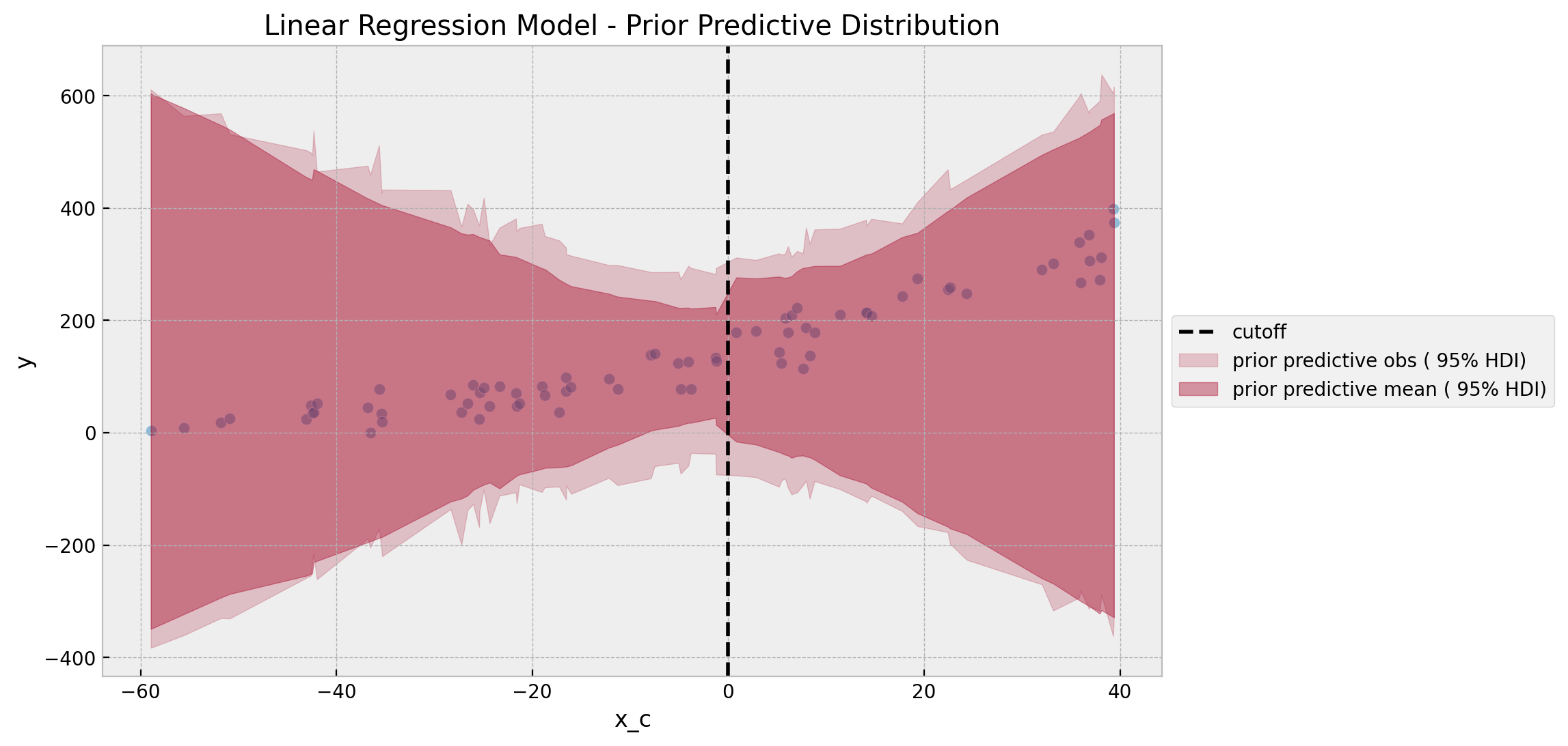
Overall, it looks like a reasonable prior specification. Note however that the prior predictive distribution does allow for the negative values, which in view of the data context it makes no sense (so it should not be plausible!). This can not be fixed completely by constraining the priors as it is more of a fundamental consequence of the normal likelihood. We will see how to address this issue with the GLM approach below.
Next, we proceed to sample from the posterior distribution.
with gaussian_model:
    gaussian_idata = pm.sample(
        tune=2_000, draws=6_000, chains=5, nuts_sampler="numpyro", random_seed=rng
    )
    gaussian_posterior_predictive = pm.sample_posterior_predictive(
        trace=gaussian_idata, random_seed=rng
    )
We can now look into the diagnostics and resulting trace plots.
gaussian_idata["sample_stats"]["diverging"].sum().item()
0az.summary(
data=gaussian_idata,
var_names=["b_intercept", "b_x", "b_d", "b_dx", "sigma"],
)| mean | sd | hdi_3% | hdi_97% | mcse_mean | mcse_sd | ess_bulk | ess_tail | r_hat | |
|---|---|---|---|---|---|---|---|---|---|
| b_intercept | 116.365 | 7.863 | 101.937 | 131.648 | 0.072 | 0.051 | 12104.0 | 14376.0 | 1.0 |
| b_x | 2.033 | 0.267 | 1.553 | 2.555 | 0.002 | 0.002 | 12252.0 | 15504.0 | 1.0 |
| b_d | 28.270 | 11.335 | 7.427 | 49.845 | 0.092 | 0.065 | 15226.0 | 17264.0 | 1.0 |
| b_dx | 2.831 | 0.454 | 1.982 | 3.687 | 0.004 | 0.003 | 14803.0 | 16801.0 | 1.0 |
| sigma | 26.969 | 2.351 | 22.706 | 31.340 | 0.017 | 0.013 | 18936.0 | 16808.0 | 1.0 |
axes = az.plot_trace(
    data=gaussian_idata,
    var_names=["b_intercept", "b_x", "b_d", "b_dx", "sigma"],
    compact=True,
    kind="rank_bars",
    backend_kwargs={"figsize": (12, 9), "layout": "constrained"},
)
plt.gcf().suptitle("Linear Regression Model - Trace", fontsize=16)

Overall, the diagnostics look good. The parameter of interest, which encodes the discontinuity at the cutoff is b_d. The posterior predictive mean of the estimated treatment effect is \(\sim 28.3\) (recall that the true value is \(40\)).
Finally, we can visualize the posterior predictive distribution.
fig, ax = plt.subplots()
sns.scatterplot(data=data, x="x_c", y="y", color="C0", alpha=0.5, ax=ax)
ax.axvline(x=0, color="black", linestyle="--", label="cutoff")
az.plot_hdi(
    x_c,
    gaussian_posterior_predictive["posterior_predictive"]["likelihood"],
    hdi_prob=1 - alpha,
    smooth=False,
    fill_kwargs={
        "label": f"posterior predictive obs ({1 - alpha: .0%} HDI)",
        "alpha": 0.2,
    },
    ax=ax,
)
az.plot_hdi(
    x_c,
    gaussian_idata["posterior"]["mu"],
    hdi_prob=1 - alpha,
    smooth=False,
    fill_kwargs={
        "label": f"posterior predictive mean ({1 - alpha: .0%} HDI)",
        "alpha": 0.4,
    },
    ax=ax,
)
sns.lineplot(
    x=x_c,
    y=gaussian_idata["posterior"]["mu"].mean(dim=("chain", "draw")),
    color="C1",
    label="posterior mean",
    ax=ax,
)
ax.legend(loc="center left", bbox_to_anchor=(1, 0.5))
ax.set(title="Linear Regression Model")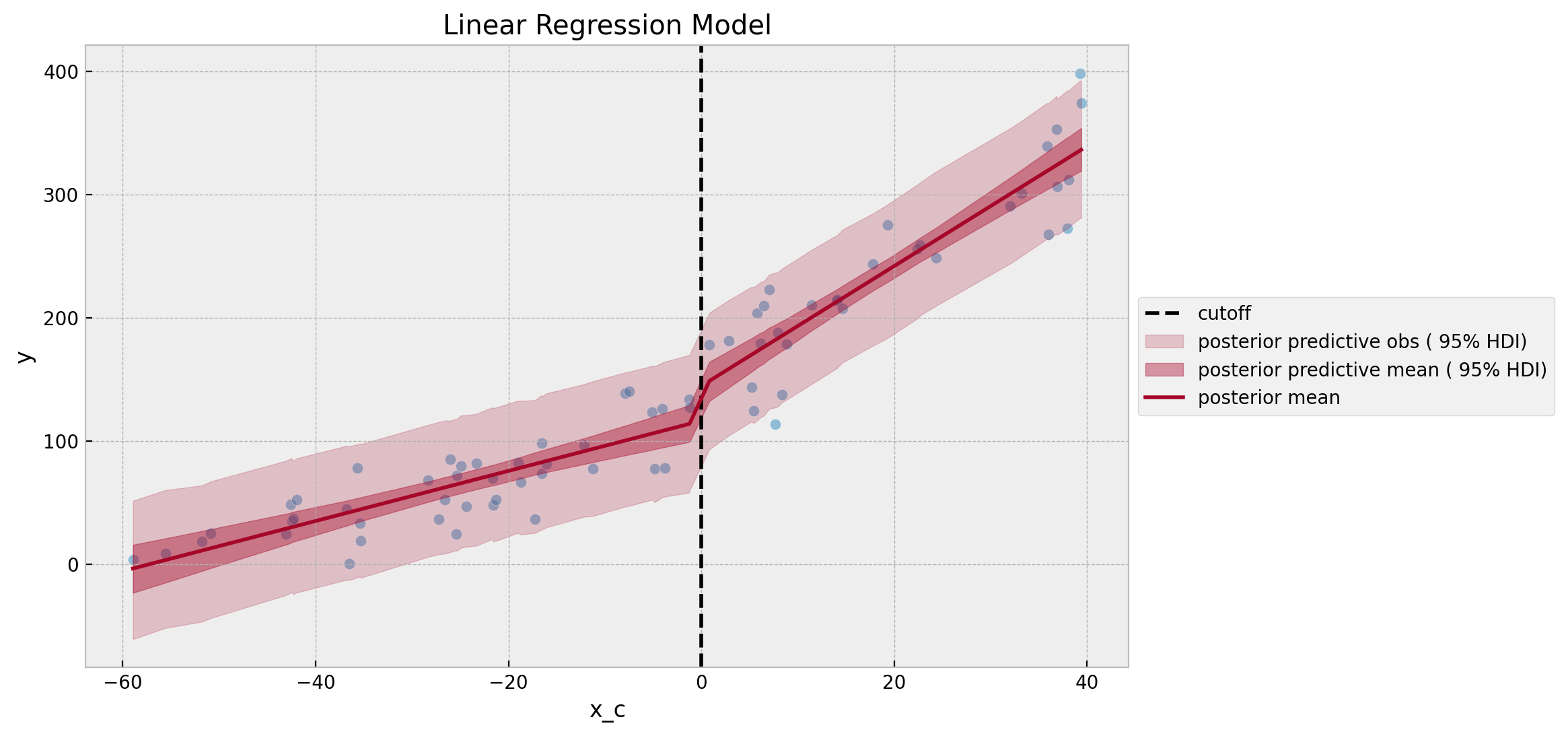
Both linear fits look quite reasonable. Still, the fact that the model predictions are not constrained to be non-negative is a bit annoying. We will see how to address this issue with the GLM approach below.
Gamma Regression Model
Now we want to use a Gamma likelihood with a log link function. This is a common choice for positive data. The specification is as follows:
\[\begin{align*} y & \sim \text{Gamma}(\mu, \sigma) \\ \log(\mu) & = \beta_0 + \beta_1 x + \beta_2 d + \beta_3 x d \end{align*}\]
In view of the log link function, the intercept \(\beta_2\) is not the treatment effect. Instead, the treatment effect is given by
\[ \exp(\beta_0 + \beta_2) - \exp(\beta_0) \]
This is similar as the estimation presented in the blog posts ATE Estimation with Logistic Regression and ATE Estimation for Count Data (we are still assuming the running variable is centered!).
Now let’s look into the PyMC model specification.
with pm.Model(coords={"obs": obs_idx}) as gamma_model:
    # --- Data Containers ---
    x_ = pm.MutableData(name="x", value=x_c, dims="obs")
    d_ = pm.MutableData(name="d", value=d, dims="obs")
    y_ = pm.MutableData(name="y", value=y, dims="obs")
    # --- Priors ---
    b_intercept = pm.Normal(name="b_intercept", mu=np.log(100), sigma=np.log(2.2))
    b_x = pm.Normal(name="b_x", mu=0, sigma=np.log(1 + 0.01))
    b_d = pm.Normal(name="b_d", mu=0, sigma=np.log(1.5))
    b_dx = pm.Normal(name="b_dx", mu=0, sigma=np.log(1 + 0.01))
    sigma = pm.Exponential(name="sigma", lam=1 / 20)
    # --- Deterministic Variables ---
    log_mu = pm.Deterministic(
        name="log_mu",
        var=b_intercept + b_x * x_ + b_d * d_ + b_dx * d_ * x_,
        dims="obs",
    )
    mu = pm.Deterministic(name="mu", var=pm.math.exp(log_mu))
    pm.Deterministic(
        name="b_gap", var=pm.math.exp(b_intercept) * (pm.math.exp(b_d) - 1)
    )
    # --- Likelihood ---
    pm.Gamma(
        name="likelihood",
        mu=mu,
        sigma=sigma,
        observed=y_,
        dims="obs",
    )

pm.model_to_graphviz(model=gamma_model)

The prior specifications look a bit cumbersome. However they come from an prior predictive check iteration process. Note that as we need to take \(\exp\) of the resulting linear model, if one is not careful these priors can lead to numerical issues. Let’s look into the prior predictive distribution.
with gamma_model:
    gamma_prior_predictive = pm.sample_prior_predictive(samples=1_000, random_seed=rng)
fig, ax = plt.subplots()
sns.scatterplot(data=data, x="x_c", y="y", color="C0", alpha=0.5, ax=ax)
ax.axvline(x=0, color="black", linestyle="--", label="cutoff")
az.plot_hdi(
    x_c,
    gamma_prior_predictive["prior_predictive"]["likelihood"],
    hdi_prob=1 - alpha,
    smooth=False,
    fill_kwargs={
        "label": f"prior predictive obs ({1 - alpha: .0%} HDI)",
        "alpha": 0.2,
    },
    ax=ax,
)
az.plot_hdi(
    x_c,
    gamma_prior_predictive["prior"]["mu"],
    hdi_prob=1 - alpha,
    smooth=False,
    fill_kwargs={
        "label": f"prior predictive mean ({1 - alpha: .0%} HDI)",
        "alpha": 0.4,
    },
    ax=ax,
)
ax.legend(loc="center left", bbox_to_anchor=(1, 0.5))
ax.set(title="Gamma Regression Model - Prior Predictive Distribution")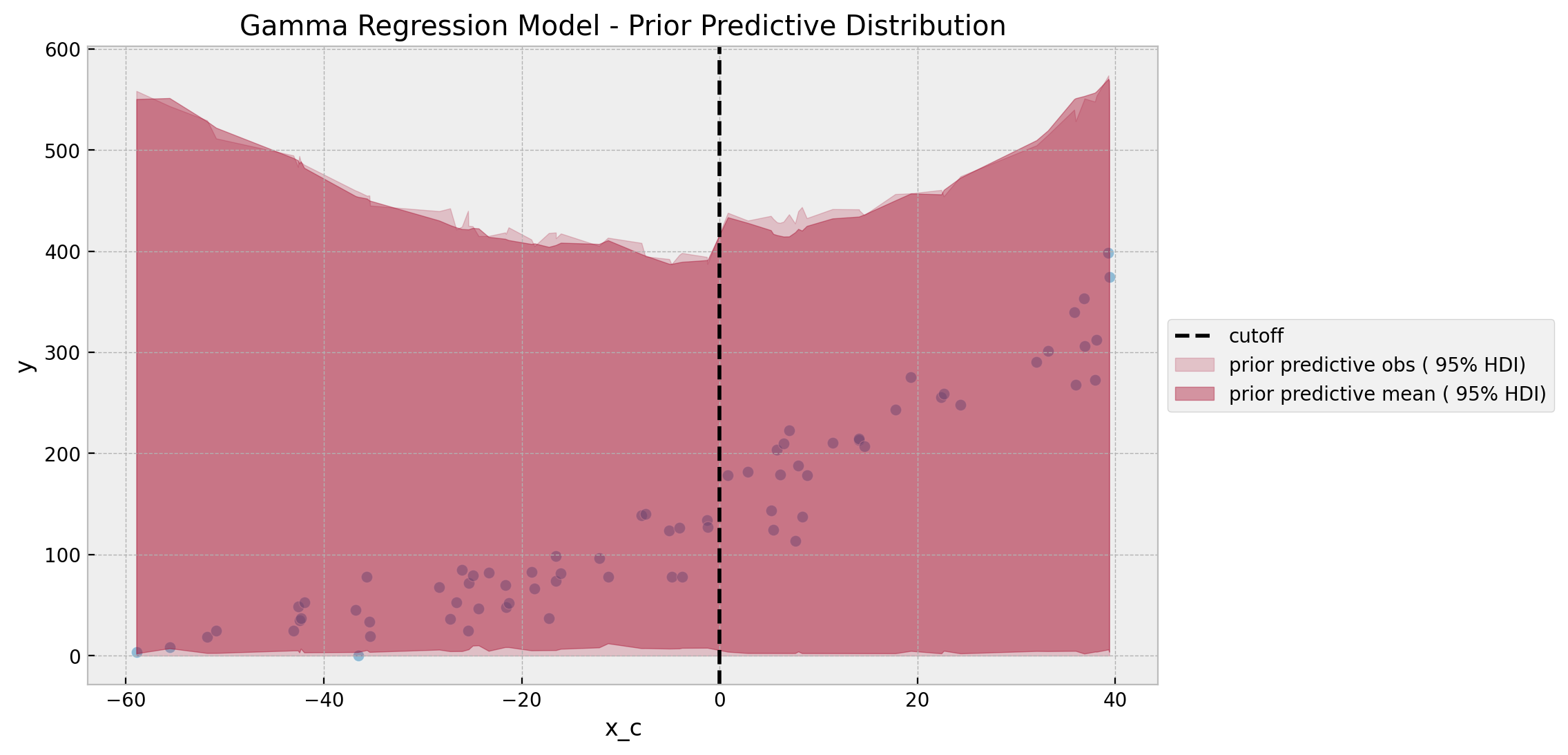
The prior predictive distribution looks reasonable and not very restrictive. Also note that the predictions are constrained to be non-negative, which is a desirable property for this data set.
It is also important to see the resulting prior for the treatment effect as it is not directly interpretable from the model specification.
fig, ax = plt.subplots(figsize=(9, 6))
az.plot_dist(
    values=az.extract(data=gamma_prior_predictive, group="prior", var_names=["b_gap"]),
    rug=True,
    ax=ax,
)
ax.set(
    title="Gamma Regression Model - Discontinuity Prior Predictive Distribution",
    xlim=(-2e2, 2e2),
)
Even though is centered around zero, it does not seem very restrictive in view of the scale and nature of the data.
Remark: Depending on the application and domain knowledge, this prior predictive check step can be crucial to constrain and fine-tune the model whenever we do not have enough data or if the data is very noisy!
We now proceed to fit the model.
with gamma_model:
    gamma_idata = pm.sample(
        tune=2_000, draws=6_000, chains=5, nuts_sampler="numpyro", random_seed=rng
    )
    gamma_posterior_predictive = pm.sample_posterior_predictive(
        trace=gamma_idata, random_seed=rng
    )
We now look into diagnostics and the resulting trace plots.
gamma_idata["sample_stats"]["diverging"].sum().item()
0az.summary(
data=gamma_idata,
var_names=["b_intercept", "b_x", "b_d", "b_dx", "sigma", "b_gap"],
)| mean | sd | hdi_3% | hdi_97% | mcse_mean | mcse_sd | ess_bulk | ess_tail | r_hat | |
|---|---|---|---|---|---|---|---|---|---|
| b_intercept | 4.810 | 0.089 | 4.643 | 4.979 | 0.001 | 0.001 | 7322.0 | 9661.0 | 1.0 |
| b_x | 0.026 | 0.004 | 0.020 | 0.033 | 0.000 | 0.000 | 7523.0 | 10393.0 | 1.0 |
| b_d | 0.237 | 0.103 | 0.043 | 0.431 | 0.001 | 0.001 | 7905.0 | 10676.0 | 1.0 |
| b_dx | -0.006 | 0.004 | -0.013 | 0.001 | 0.000 | 0.000 | 8680.0 | 12628.0 | 1.0 |
| sigma | 31.405 | 3.037 | 26.098 | 37.350 | 0.027 | 0.019 | 13223.0 | 14963.0 | 1.0 |
| b_gap | 32.516 | 13.557 | 7.286 | 58.195 | 0.147 | 0.106 | 8475.0 | 12103.0 | 1.0 |
axes = az.plot_trace(
    data=gamma_idata,
    var_names=["b_intercept", "b_x", "b_d", "b_dx", "sigma", "b_gap"],
    compact=True,
    kind="rank_bars",
    backend_kwargs={"figsize": (12, 9), "layout": "constrained"},
)
plt.gcf().suptitle("Gamma Regression Model - Trace", fontsize=16)

The estimated treatment effect posterior mean is \(\sim 32.5\), but the overall distribution is overall very similar to the linear regression model.
Finally, we can visualize the posterior predictive distribution.
fig, ax = plt.subplots()
sns.scatterplot(data=data, x="x_c", y="y", color="C0", alpha=0.5, ax=ax)
ax.axvline(x=0, color="black", linestyle="--", label="cutoff")
az.plot_hdi(
    x_c,
    gamma_posterior_predictive["posterior_predictive"]["likelihood"],
    hdi_prob=1 - alpha,
    smooth=False,
    fill_kwargs={
        "label": f"posterior predictive obs ({1 - alpha: .0%} HDI)",
        "alpha": 0.2,
    },
    ax=ax,
)
az.plot_hdi(
    x_c,
    gamma_idata["posterior"]["mu"],
    hdi_prob=1 - alpha,
    smooth=False,
    fill_kwargs={
        "label": f"posterior predictive mean ({1 - alpha: .0%} HDI)",
        "alpha": 0.4,
    },
    ax=ax,
)
sns.lineplot(
    x=x_c,
    y=gamma_idata["posterior"]["mu"].mean(dim=("chain", "draw")),
    color="C1",
    label="posterior mean",
    ax=ax,
)
ax.legend(loc="center left", bbox_to_anchor=(1, 0.5))
ax.set(title="Gamma Regression Model")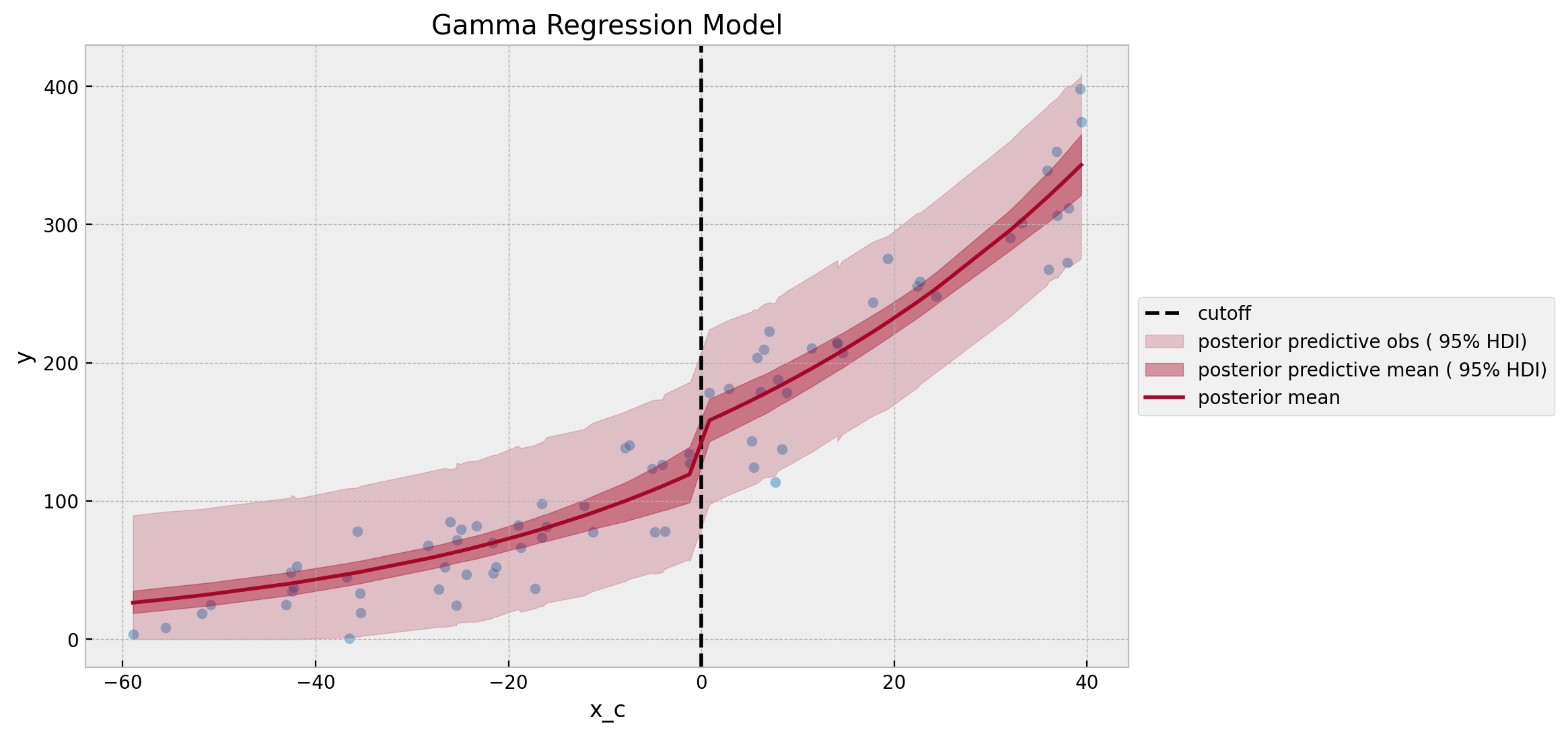
It is nice to see that the posterior predictive distribution is constrained to be non-negative. Moreover, due the fact we have a non-linear link function, we see that the posterior predictive mean is not a straight line. This could be a desirable property for this data set, but in practice it depends on the assumptions and domain knowledge.
Weighted Gamma Regression Model
In this last model we add weights to the previous gamma regression model so that we weight more points which are closer to the cutoff. This is a common strategy to improve the estimation of the treatment effect as we are actually trying to estimate a local treatment effect. Hence, points far away from the cutoff might not be as informative as points close to the cutoff. This, again, depends on the context of the problem.
There are many families of kernels used to define the relative importance of each point. Here we use the triangular kernel as it is simple and easy to implement and has a very transparent interpretation. The idea is to define a bandwidth \(h\) and then define the weights decaying linearly and symmetrically from the cutoff. Specifically, the weights are defined as follows:
\[\begin{align*} k(r, c, h) & = 1\{|r - c| < h\}\left(1 - \frac{|r - c|}{h}\right) \\ \end{align*}\]
where \(h >0\) is the bandwidth and \(c\) is the cutoff. Let’s visualize the kernel function for \(h=80\).
def kernel(r, c, h):
    indicator = (np.abs(r - c) <= h).astype(float)
    return indicator * (1 - np.abs(r - c) / h)


data["kernel"] = kernel(r=data["x_c"], c=0, h=80)
kernel = data["kernel"].to_numpy()

fig, ax = plt.subplots()
sns.lineplot(data=data, x="x_c", y="kernel", color="C2", ax=ax)
ax.set(title="Kernel Function", xlabel="time centered", ylabel="kernel value")

Note that this choice of \(h\) ensures that the later point from the cutoff have a relative weight of around \(25\%\) .
Remark: How to add weights to a bayesian GLM? There many ways of doing this, one which I find very intuitive is to scale the scale parameter of the likelihood through the weights as explained in the PyMC Discourse thread How to add weights to data in bayesian linear regression? (special thanks to Christian Luhmann for the tip!). The intuition is that:
Adjusting the scale parameter of my observed variable, which allows for more heavily weighted observations to contribute more model’s logp.
Remark: I could have used bambi package to implement the models above in a much simpler way. However, as there is no straight forward way to add weights (but there is a way! see this Discourse thread), I decided to work in PyMC directly.
Let’s now look into the concrete implementation.
with pm.Model(coords={"obs": obs_idx}) as weighted_gamma_model:
    # --- Data Containers ---
    x_ = pm.MutableData(name="x", value=x_c, dims="obs")
    d_ = pm.MutableData(name="d", value=d, dims="obs")
    y_ = pm.MutableData(name="y", value=y, dims="obs")
    kernel_ = pm.MutableData(name="kernel", value=kernel, dims="obs")
    # --- Priors ---
    b_intercept = pm.Normal(name="b_intercept", mu=np.log(100), sigma=np.log(2.2))
    b_x = pm.Normal(name="b_x", mu=0, sigma=np.log(1 + 0.01))
    b_d = pm.Normal(name="b_d", mu=0, sigma=np.log(1.5))
    b_dx = pm.Normal(name="b_dx", mu=0, sigma=np.log(1 + 0.01))
    sigma = pm.Exponential(name="sigma", lam=1 / 20)
    # --- Deterministic Variables ---
    log_mu = pm.Deterministic(
        name="log_mu",
        var=b_intercept + b_x * x_ + b_d * d_ + b_dx * d_ * x_,
        dims="obs",
    )
    mu = pm.Deterministic(name="mu", var=pm.math.exp(log_mu))
    pm.Deterministic(
        name="b_gap", var=pm.math.exp(b_intercept) * (pm.math.exp(b_d) - 1)
    )
    eps = np.finfo(float).eps
    sigma_weighted = pm.Deterministic(
        name="sigma_weighted", var=sigma / (kernel_ + eps), dims="obs"
    )
    # --- Likelihood ---
    pm.Gamma(
        name="likelihood",
        mu=mu,
        sigma=sigma_weighted,
        observed=y_,
        dims="obs",
    )

pm.model_to_graphviz(model=weighted_gamma_model)

We keep the same prior specifications as in the previous model. The prior predictive distribution remains overall stable.
with weighted_gamma_model:
    weighted_gamma_prior_predictive = pm.sample_prior_predictive(
        samples=1_000, random_seed=rng
    )
fig, ax = plt.subplots()
sns.scatterplot(data=data, x="x_c", y="y", color="C0", alpha=0.5, ax=ax)
ax.axvline(x=0, color="black", linestyle="--", label="cutoff")
az.plot_hdi(
    x_c,
    weighted_gamma_prior_predictive["prior_predictive"]["likelihood"],
    hdi_prob=1 - alpha,
    smooth=False,
    fill_kwargs={
        "label": f"prior predictive obs ({1 - alpha: .0%} HDI)",
        "alpha": 0.2,
    },
    ax=ax,
)
az.plot_hdi(
    x_c,
    weighted_gamma_prior_predictive["prior"]["mu"],
    hdi_prob=1 - alpha,
    smooth=False,
    fill_kwargs={
        "label": f"prior predictive mean ({1 - alpha: .0%} HDI)",
        "alpha": 0.4,
    },
    ax=ax,
)
ax.legend(loc="center left", bbox_to_anchor=(1, 0.5))
ax.set(title="Weighted Gamma Regression Model - Prior Predictive Distribution")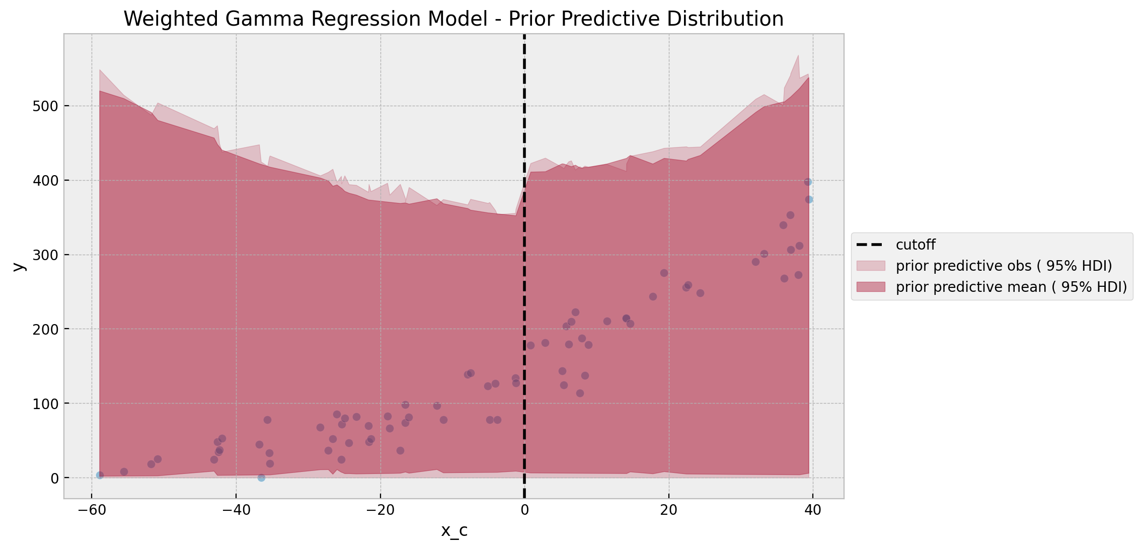
fig, ax = plt.subplots(figsize=(9, 6))
az.plot_dist(
    values=az.extract(
        data=weighted_gamma_prior_predictive, group="prior", var_names=["b_gap"]
    ),
    rug=True,
    ax=ax,
)
ax.set(
    title="Weighted Gamma Regression Model - Discontinuity Prior Predictive Distribution",
    xlim=(-2e2, 2e2),
)

The prior for the treatment effect is also very similar to the previous model (and not very restrictive in view of the data).
We proceed to fit our final model.
with weighted_gamma_model:
    weighted_gamma_idata = pm.sample(
        tune=2_000, draws=6_000, chains=5, nuts_sampler="numpyro", random_seed=rng
    )
    weighted_gamma_posterior_predictive = pm.sample_posterior_predictive(
        trace=weighted_gamma_idata, random_seed=rng
    )
weighted_gamma_idata["sample_stats"]["diverging"].sum().item()
0az.summary(
data=weighted_gamma_idata,
var_names=["b_intercept", "b_x", "b_d", "b_dx", "sigma", "b_gap"],
)| mean | sd | hdi_3% | hdi_97% | mcse_mean | mcse_sd | ess_bulk | ess_tail | r_hat | |
|---|---|---|---|---|---|---|---|---|---|
| b_intercept | 4.765 | 0.080 | 4.612 | 4.911 | 0.001 | 0.001 | 8755.0 | 10043.0 | 1.0 |
| b_x | 0.020 | 0.004 | 0.013 | 0.027 | 0.000 | 0.000 | 9046.0 | 10834.0 | 1.0 |
| b_d | 0.268 | 0.092 | 0.098 | 0.446 | 0.001 | 0.001 | 9451.0 | 10646.0 | 1.0 |
| b_dx | 0.000 | 0.004 | -0.007 | 0.008 | 0.000 | 0.000 | 10170.0 | 13089.0 | 1.0 |
| sigma | 23.767 | 2.348 | 19.580 | 28.267 | 0.021 | 0.015 | 13089.0 | 14338.0 | 1.0 |
| b_gap | 35.905 | 11.684 | 13.556 | 57.531 | 0.116 | 0.083 | 10188.0 | 12396.0 | 1.0 |
axes = az.plot_trace(
    data=weighted_gamma_idata,
    var_names=["b_intercept", "b_x", "b_d", "b_dx", "sigma", "b_gap"],
    compact=True,
    kind="rank_bars",
    backend_kwargs={"figsize": (12, 9), "layout": "constrained"},
)
plt.gcf().suptitle("Weighted Gamma Regression Model - Trace", fontsize=16)
The estimated posterior predictive mean of the discontinuity estimate \(\sim 36\) is the closest one to the real value.
fig, ax = plt.subplots()
sns.scatterplot(data=data, x="x_c", y="y", color="C0", alpha=0.5, ax=ax)
ax.axvline(x=0, color="black", linestyle="--", label="cutoff")
az.plot_hdi(
    x_c,
    weighted_gamma_posterior_predictive["posterior_predictive"]["likelihood"],
    hdi_prob=1 - alpha,
    smooth=False,
    fill_kwargs={
        "label": f"posterior predictive obs ({1 - alpha: .0%} HDI)",
        "alpha": 0.2,
    },
    ax=ax,
)
az.plot_hdi(
    x_c,
    weighted_gamma_idata["posterior"]["mu"],
    hdi_prob=1 - alpha,
    smooth=False,
    fill_kwargs={
        "label": f"posterior predictive mean ({1 - alpha: .0%} HDI)",
        "alpha": 0.4,
    },
    ax=ax,
)
sns.lineplot(
    x=x_c,
    y=weighted_gamma_idata["posterior"]["mu"].mean(dim=("chain", "draw")),
    color="C1",
    label="posterior mean",
    ax=ax,
)
ax.legend(loc="center left", bbox_to_anchor=(1, 0.5))
ax.set(title="Weighted Gamma Regression Model")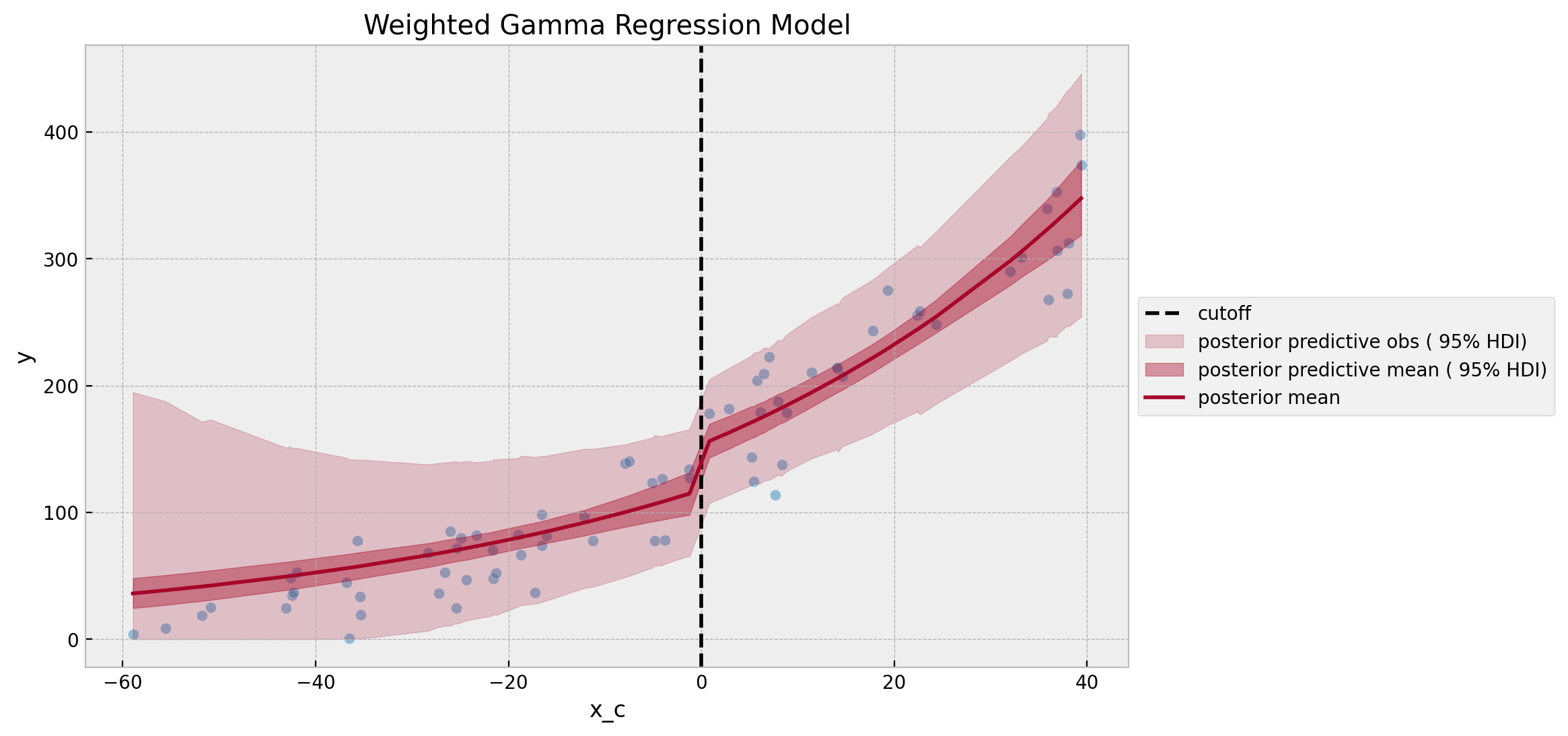
Note how the variance increases as we get further away from the cutoff.
In order to have a more visual comparison of the results of all three models, we can plot the posterior predictive distributions of the discontinuity all together.
fig, ax = plt.subplots(
    nrows=3, ncols=1, sharex=True, sharey=True, figsize=(10, 8), layout="constrained"
)
az.plot_posterior(data=gaussian_idata, var_names=["b_d"], ref_val=delta_true, ax=ax[0])
ax[0].set(title="Linear Regression Model")
az.plot_posterior(data=gamma_idata, var_names=["b_gap"], ref_val=delta_true, ax=ax[1])
ax[1].set(title="Gamma Regression Model")
az.plot_posterior(
    data=weighted_gamma_idata, var_names=["b_gap"], ref_val=delta_true, ax=ax[2]
)
ax[2].set(title="Weighted Gamma Regression Model")
fig.suptitle("Estimated Discontinuity Posterior Distributions", fontsize=18, y=1.06)
We do see how using a GLM and adding weights improves the estimation of the treatment effect for this specific case. Note in particular that the estimation variance of the weighted gamma regression model is smaller than for the unweighted one. This is an effect of the weighting procedure.
In spite of the results, by looking into the posterior predictive checks below we see how, conceptually speaking, using a GLM to model the data constrains can bring some benefit. In particular setting priors for the model parameters.
fig, ax = plt.subplots(
    nrows=3, ncols=1, sharex=True, sharey=False, figsize=(10, 8), layout="constrained"
)
az.plot_ppc(
    data=gaussian_posterior_predictive, num_pp_samples=2_000, random_seed=seed, ax=ax[0]
)
ax[0].set(title="Linear Regression Model", xlabel="count")
az.plot_ppc(
    data=gamma_posterior_predictive, num_pp_samples=2_000, random_seed=seed, ax=ax[1]
)
ax[1].set(title="Gamma Regression Model", xlabel="count")
az.plot_ppc(
    data=weighted_gamma_posterior_predictive,
    num_pp_samples=2_000,
    random_seed=seed,
    ax=ax[2],
)
ax[2].set(title="Weighted Gamma Regression Model", xlabel="count")
fig.suptitle("Posterior Predictive Check", y=1.05, fontsize=18)

That being said, the linear regression model is not that far away from the other two models. For most applications, the linear regression approach should be tested as a a baseline model. There is no silver bullet for regression discontinuity estimation, that is what makes it so interesting!